


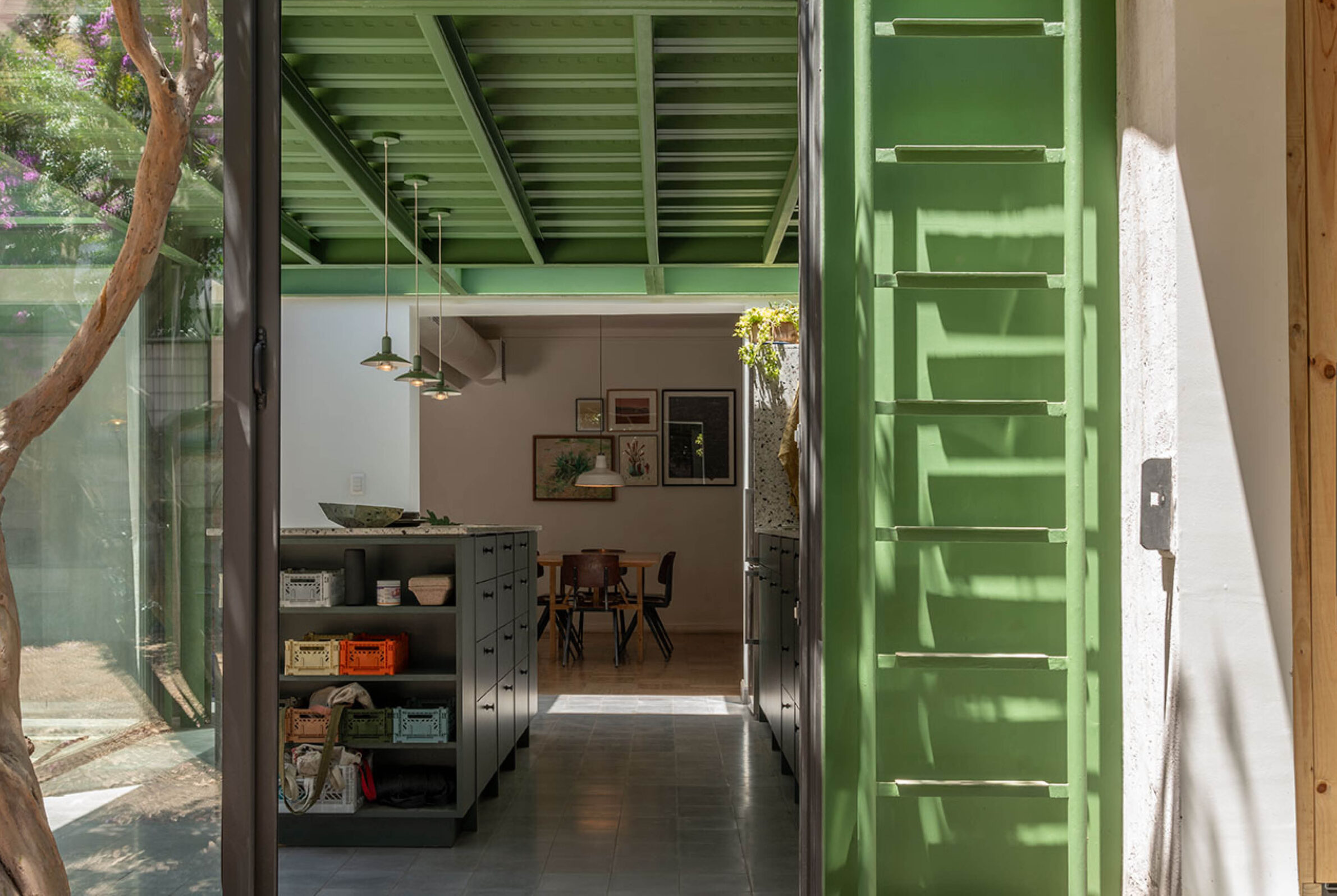
Colour does not need to dominate a house to define it.
A painted frame, a door, a ceiling or a small added volume can be enough to change the way architecture is perceived, giving emphasis to particular spaces while leaving the larger material composition intact. In these projects, colour is used selectively and with purpose. It distinguishes new interventions from existing buildings, strengthens connections between interiors and gardens, marks thresholds or gives individual rooms their own atmosphere. Sometimes a single vivid tone is placed against timber, cork or masonry; elsewhere, a broader palette is developed from the surrounding landscape. The effect comes from precision rather than quantity: colour appears where it can clarify, connect or deliberately interrupt the architecture.
1. Kidman Lane by Plus Minus Design
Australia, 2023
Photography: © Clinton Weaver
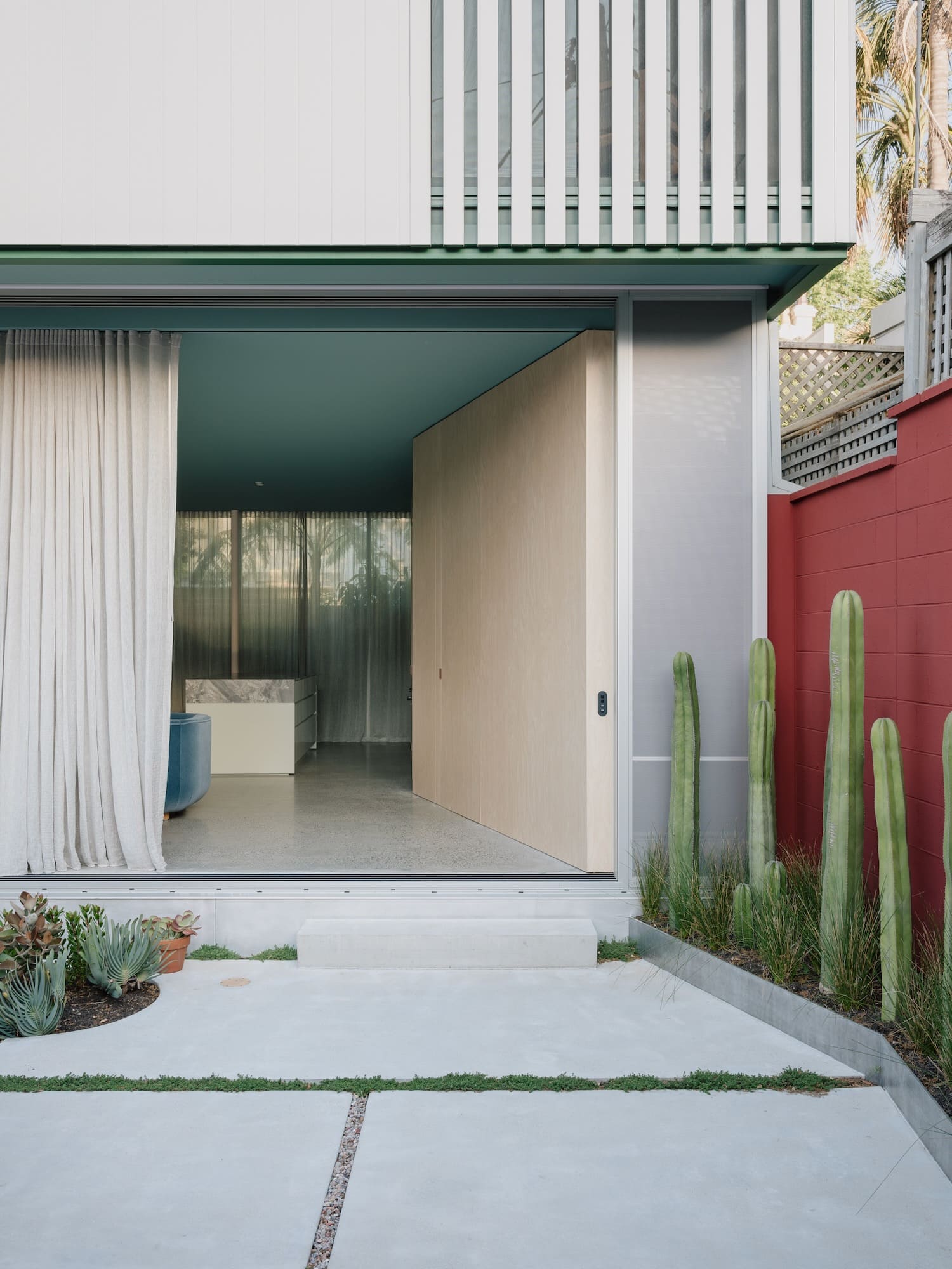
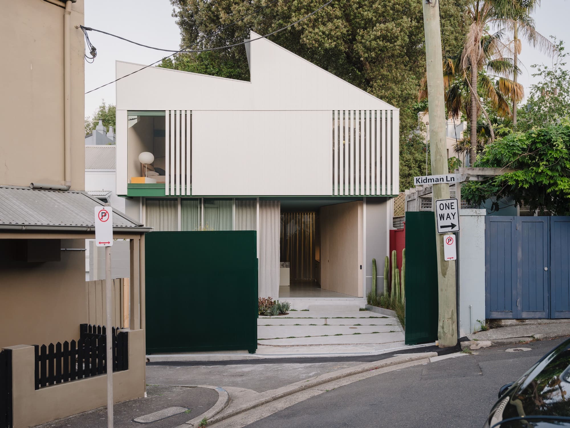
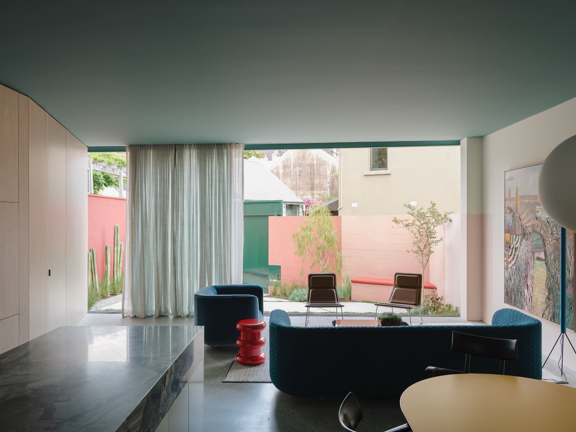
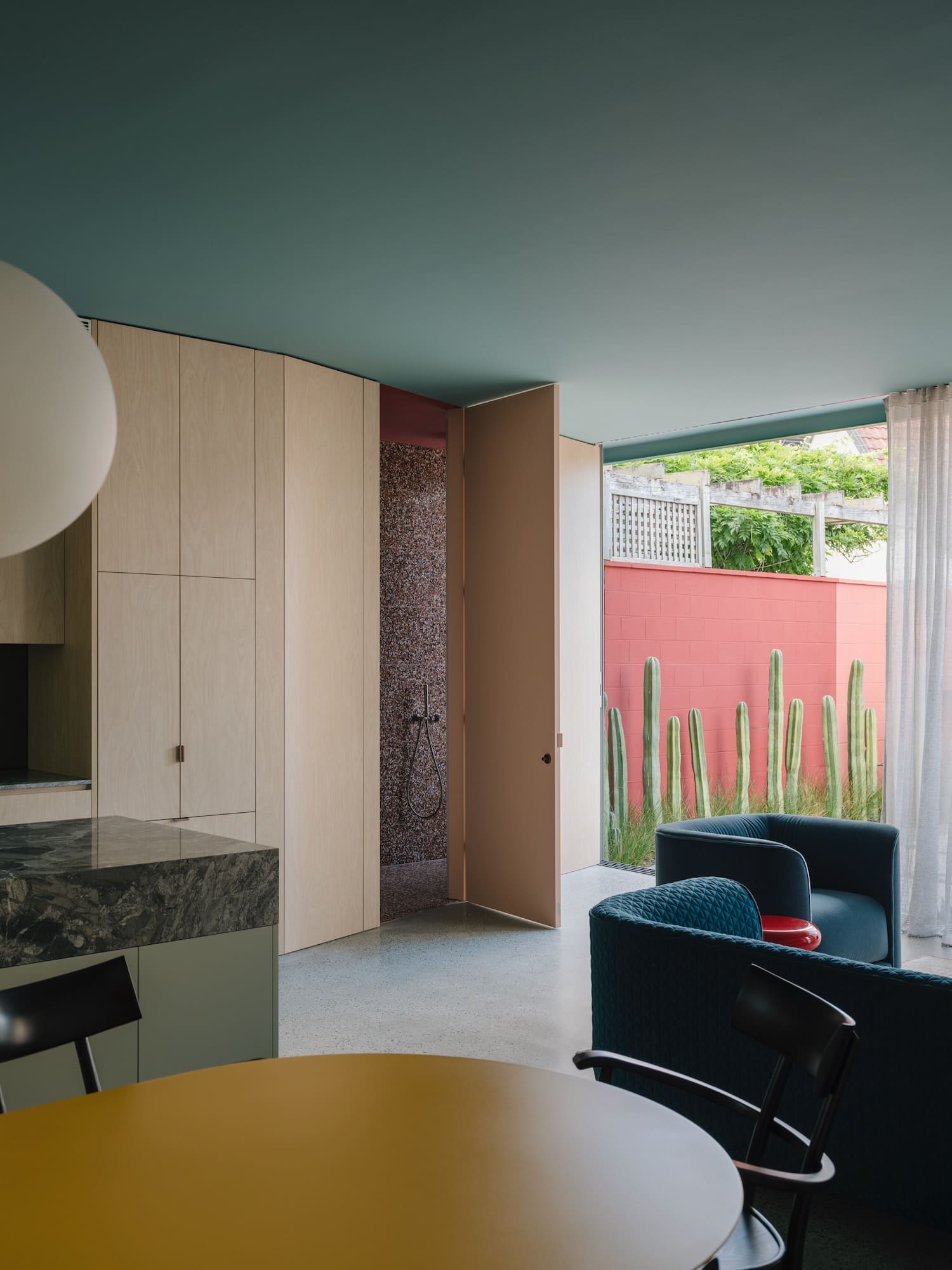
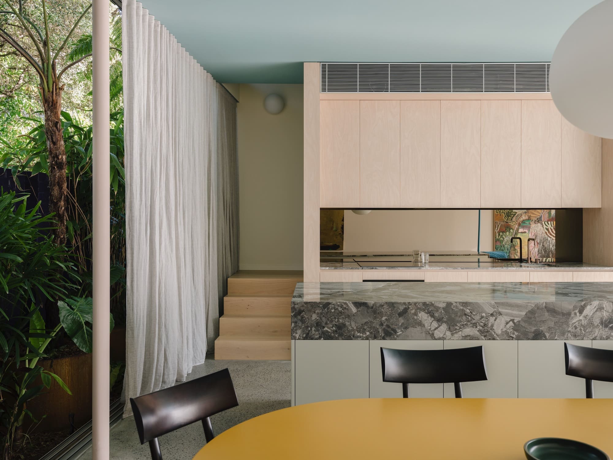
At Kidman Lane, colour is treated as part of the spatial organisation rather than as a finishing layer. The Sydney house combines a largely open ground floor with a sequence of more individual rooms above, where natural light, orientation and colour give each space a distinct identity. The palette was developed together with the landscape design: colours from the garden inform walls and ceilings, while an internal colour datum aligns with the height of the exterior garden walls, visually extending the ground floor between front and rear yards. Vibrant surfaces animate otherwise direct detailing and standard materials, allowing colour to carry much of the house’s character without relying on elaborate finishes.
2. Machikado Project in Asahi-cho by Plan 21
Japan, 2024
Photography: © Akira Ueda
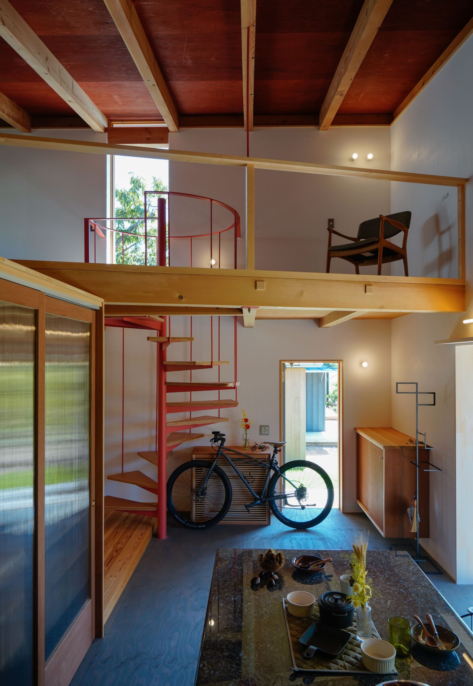
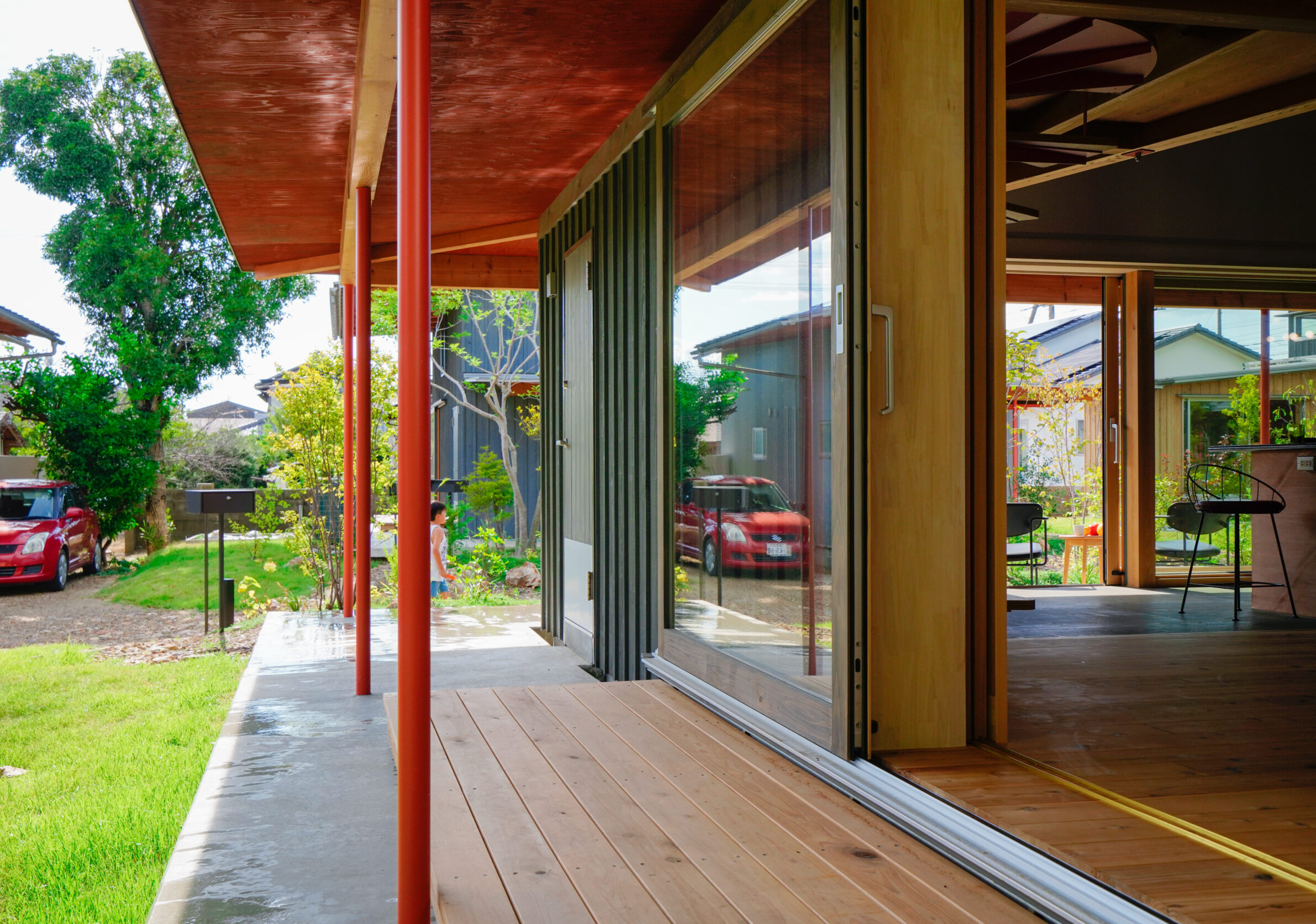
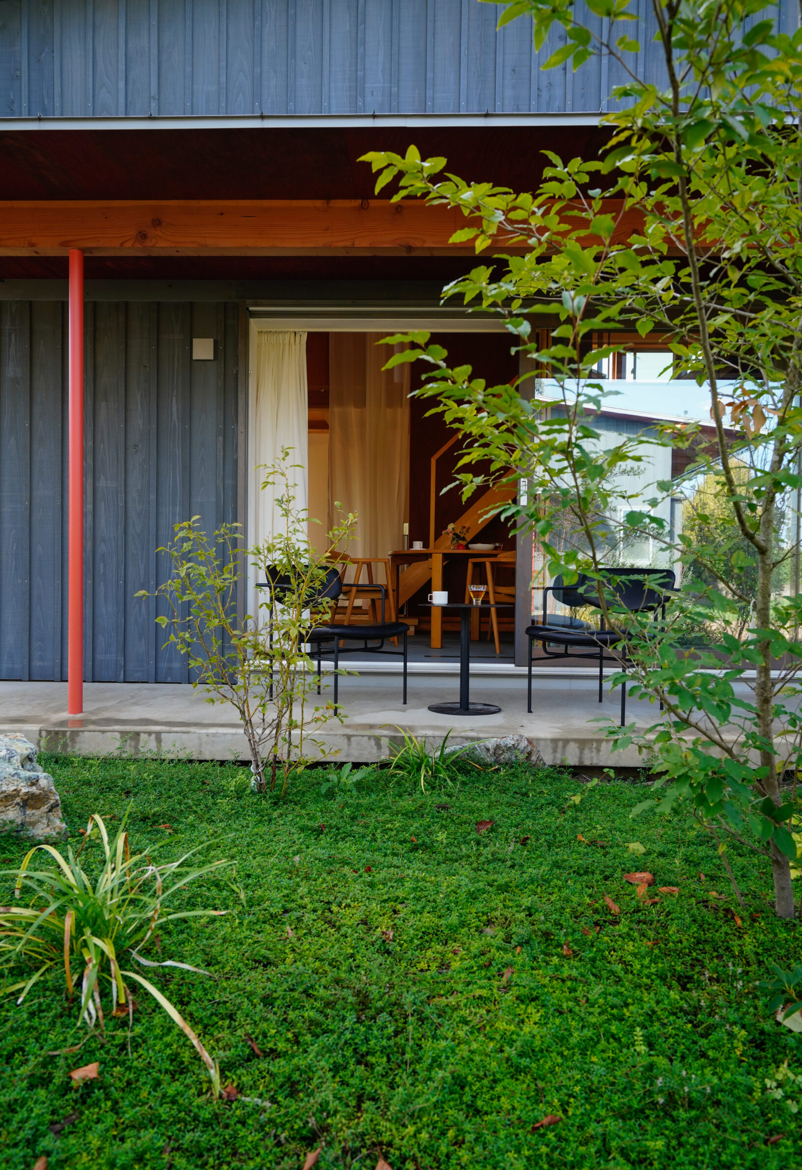
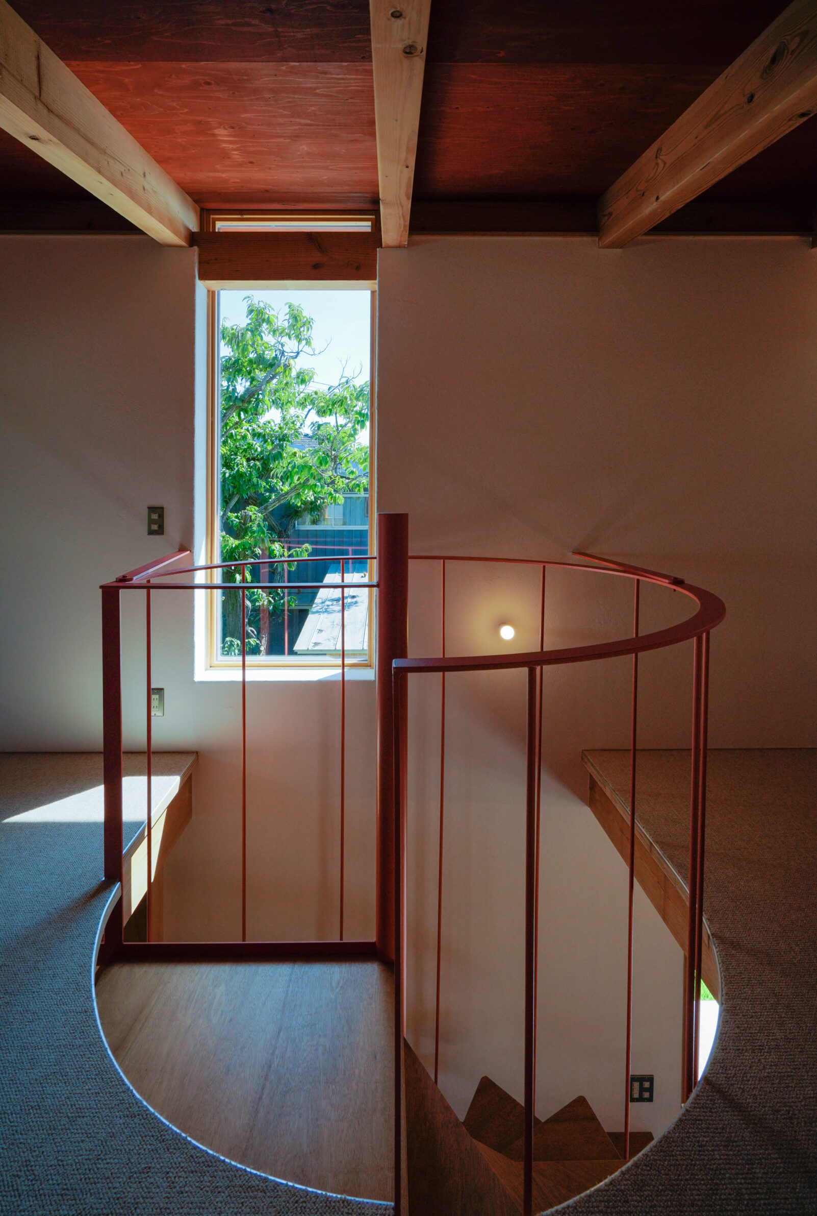
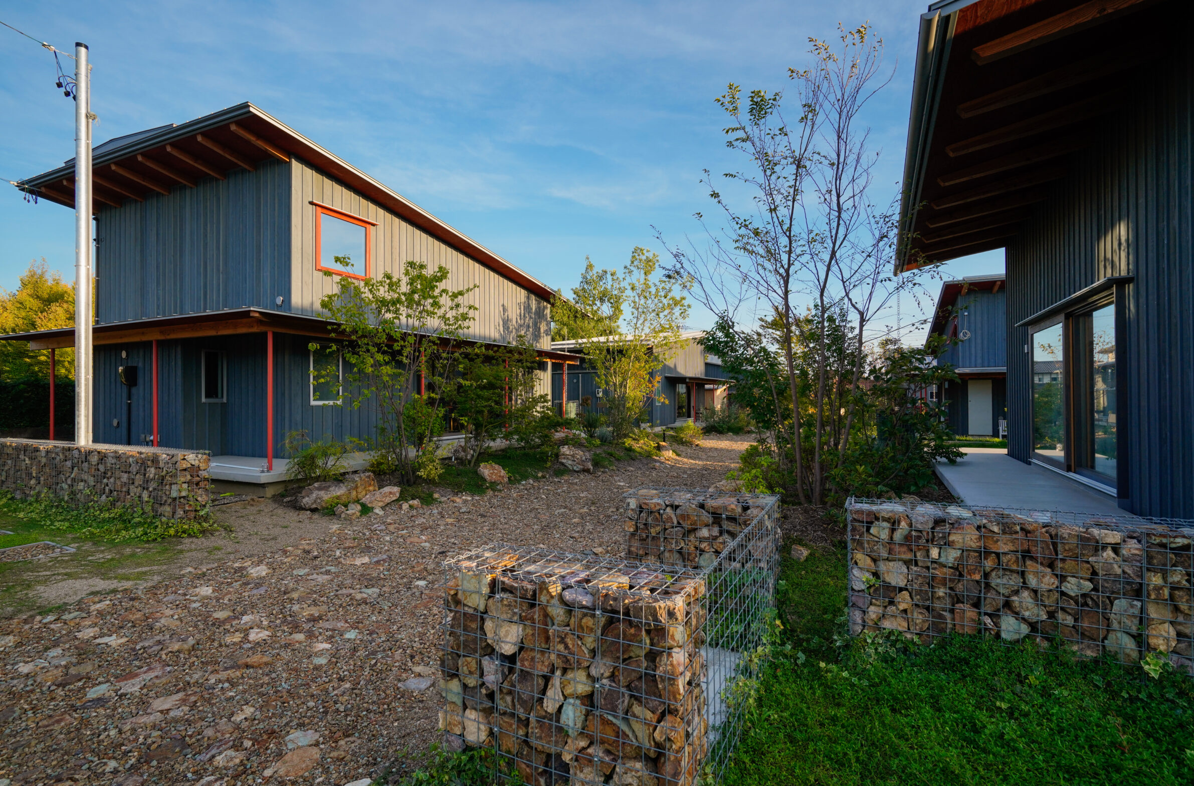
Machikado Project treats six houses as parts of one shared residential landscape. Instead of separating the plots with conventional roads and boundaries, the required access space is gathered into a broad communal garden planted with existing and new fruit trees. The houses share a restrained timber language and single-pitch roofs, while contrasting painted frames and smaller architectural elements introduce flashes of colour against the darker façades. These accents help individual buildings retain their identity without disrupting the continuity of the group. Colour therefore operates at the scale of the neighbourhood as much as the individual house, punctuating a larger composition held together by timber, planting and the wave-like rhythm of the roofs.
3. Camberwell Cork House by Delve Architects
United Kingdom, 2023
Photography: © Fred Howarth
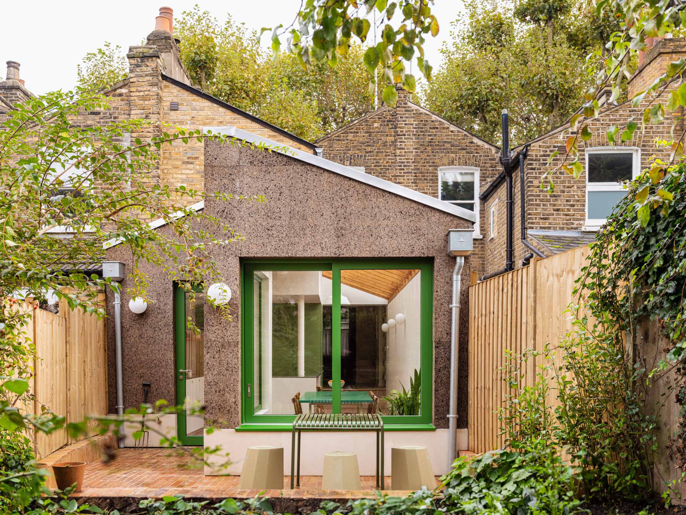
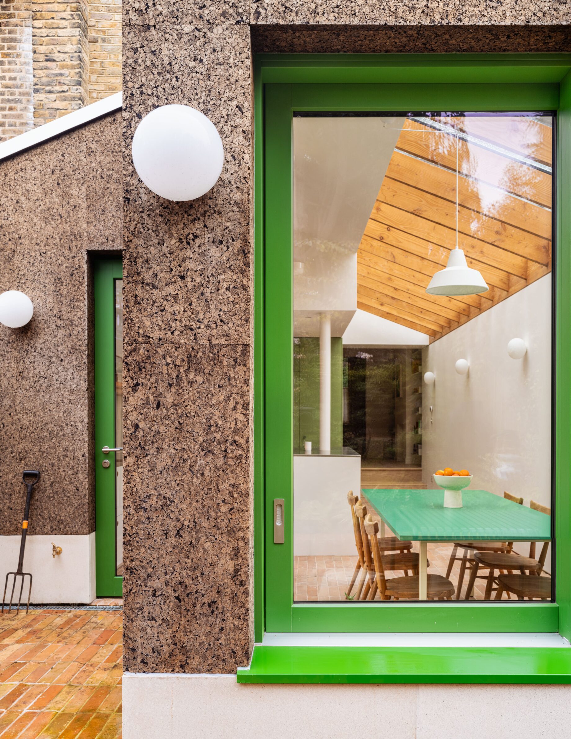
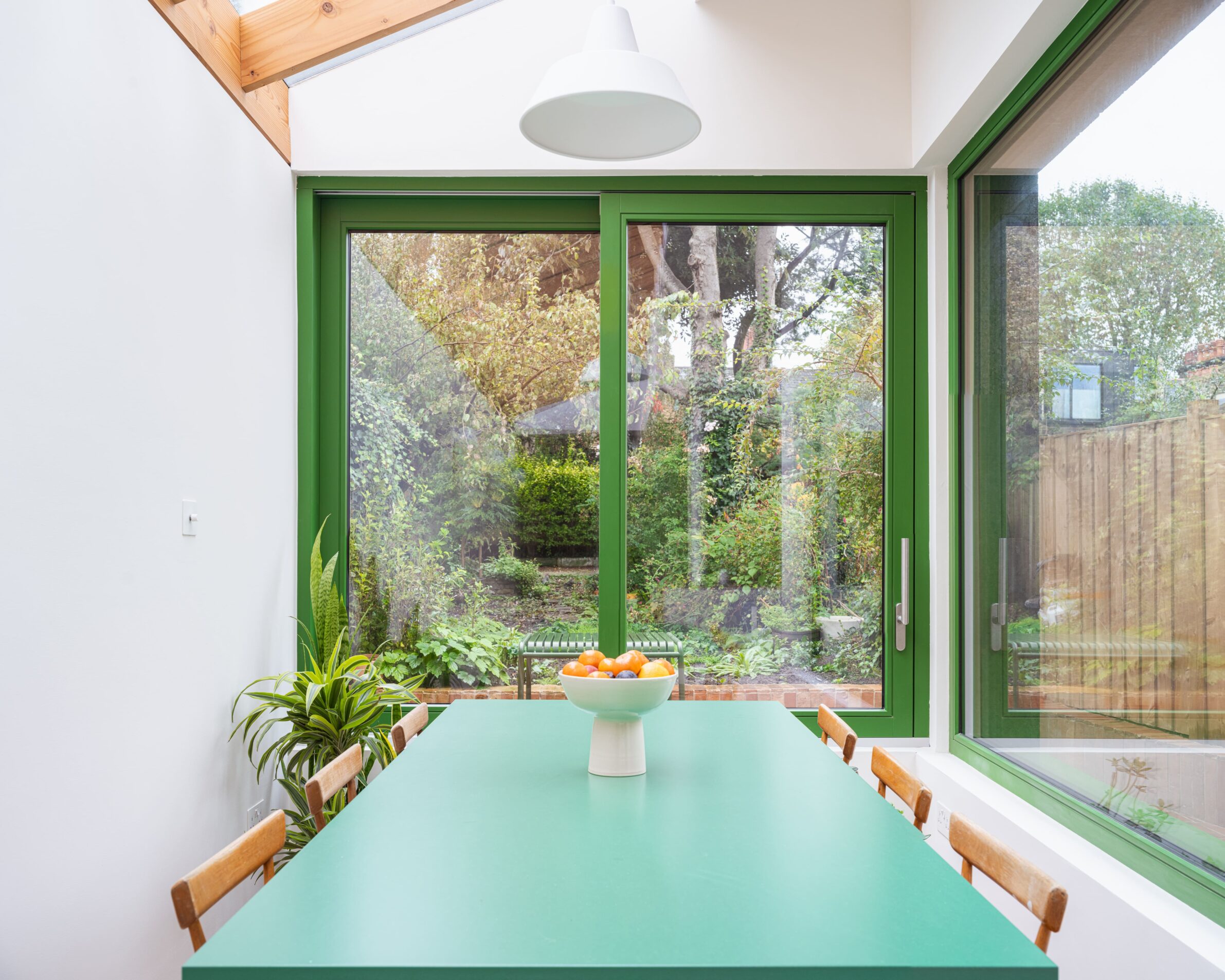
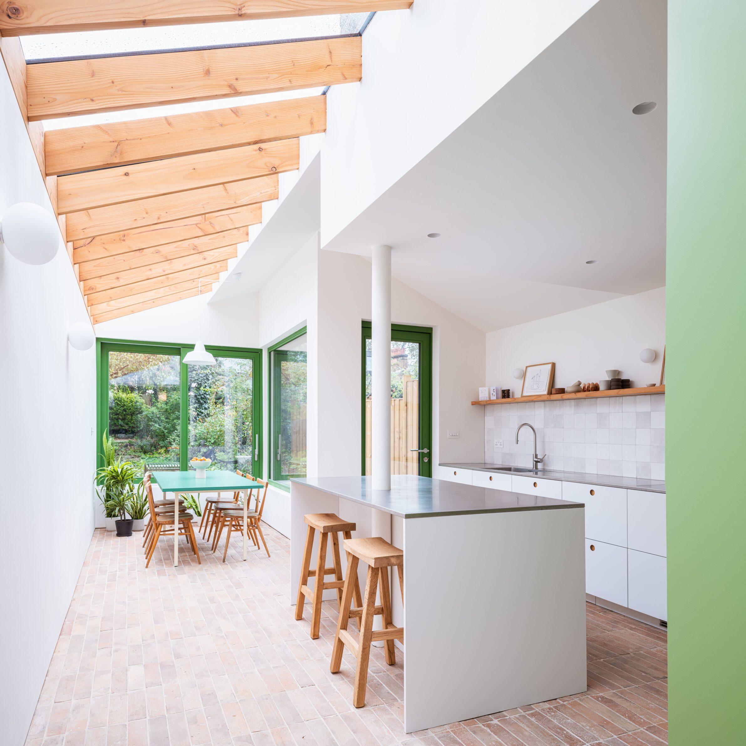
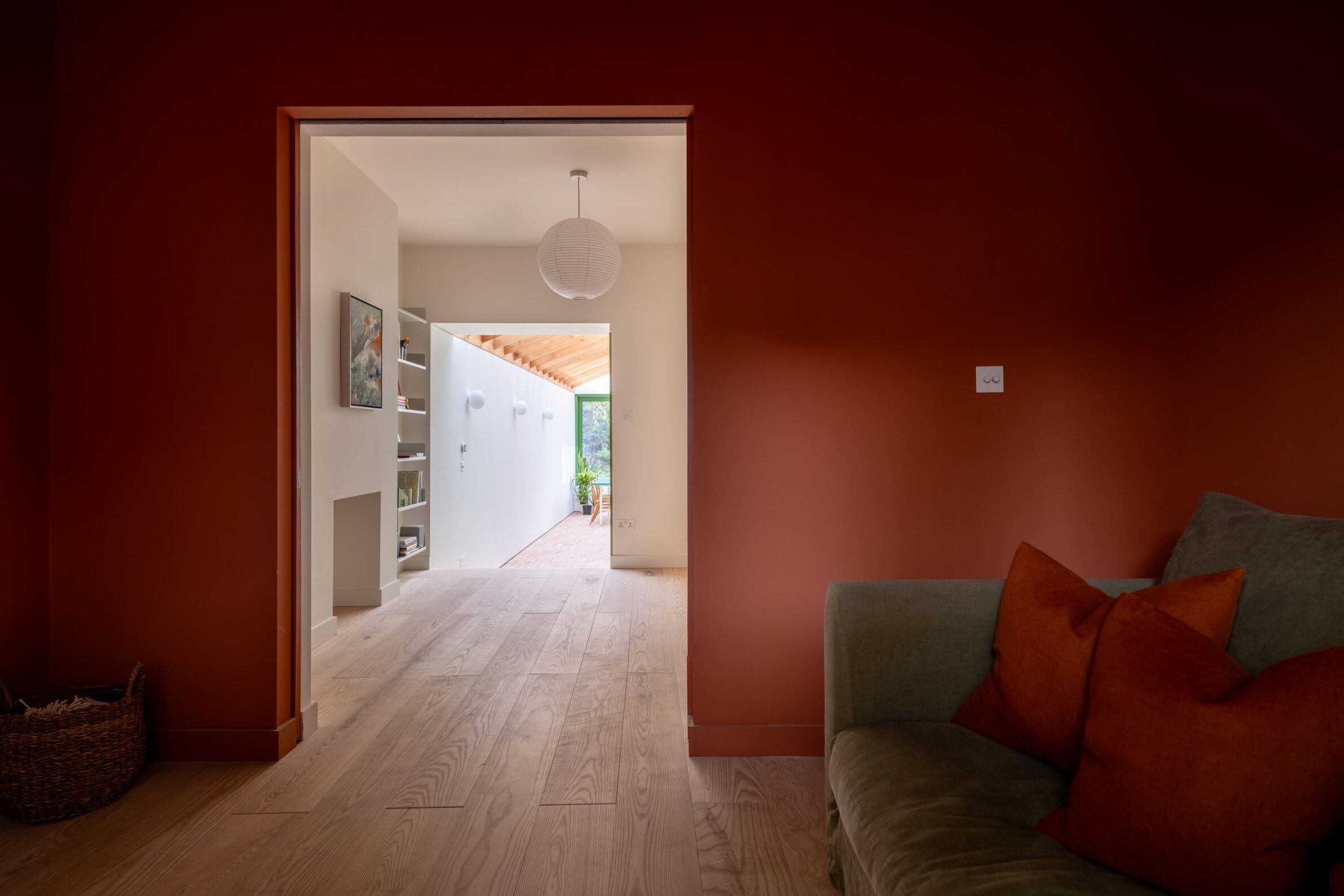
Camberwell Cork House places a vivid green accent against the deliberately natural materiality of a Victorian terrace extension. Cork forms both the insulation and external cladding of the new rear volume, giving it a warm, textured surface, while bright green aluminium window and door frames sharpen the openings within it. The colour continues the clients’ interest in combining functional natural materials with more playful interventions and turns the glazing into a recognisable architectural element. Inside, the same openings frame the garden and bring daylight into the previously constrained rear of the house. The green therefore works simultaneously as contrast, focal point and visual connection to the vegetation beyond.
4. The Green House by Boniface Oleksiuk Politano Architects
Canada, 2023
Photography: © Brett Hitchins
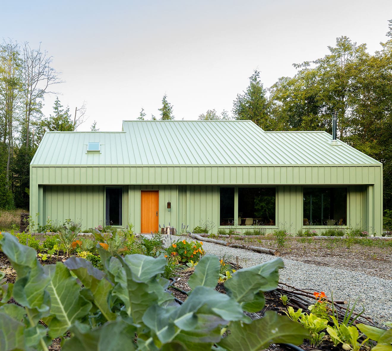
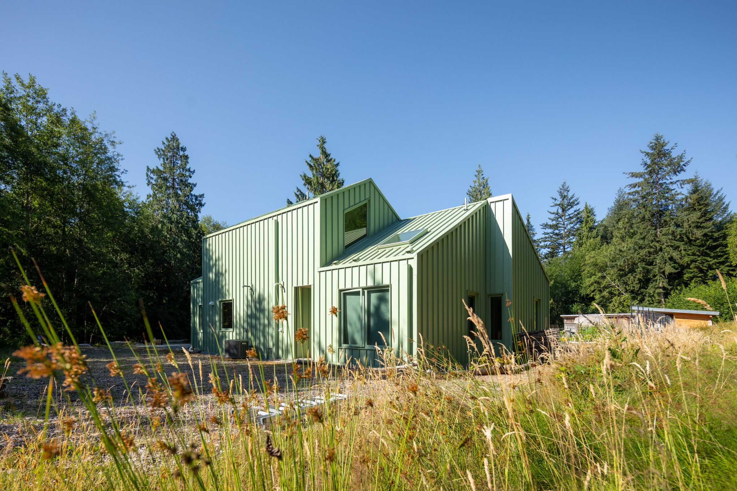
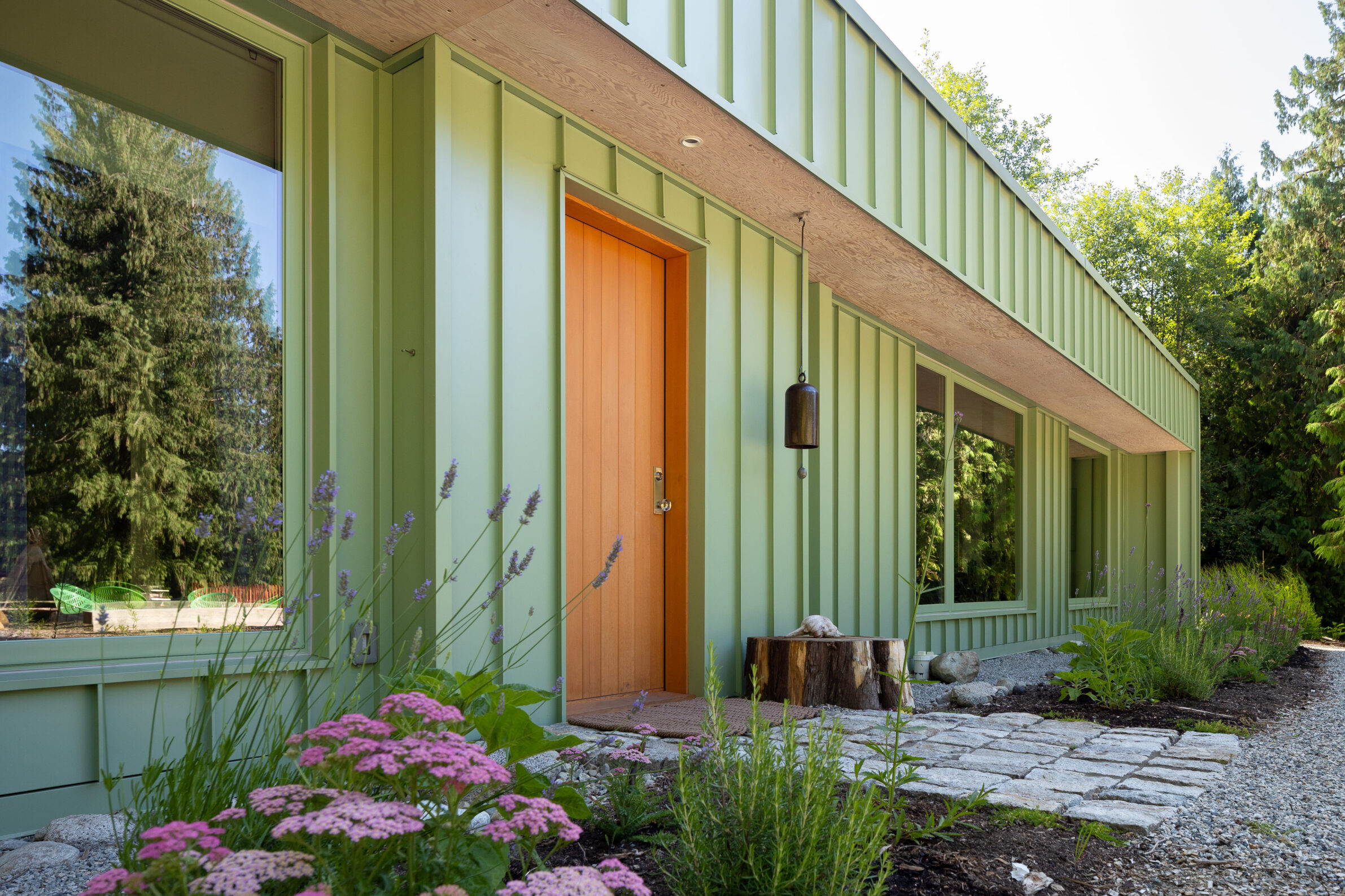
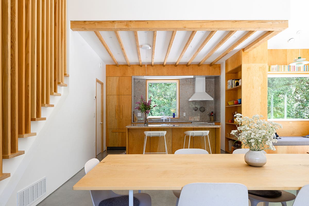
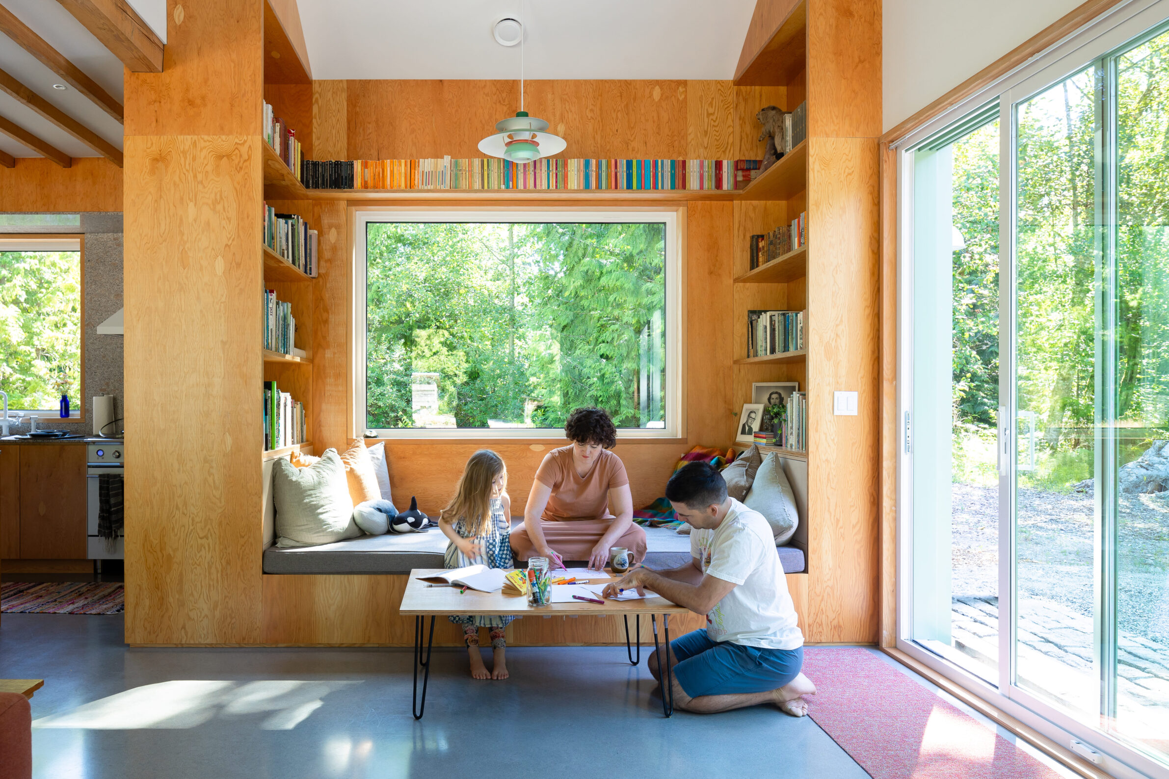
Set beside a forest and stream on a small farm in Gibsons, The Green House turns colour into part of its relationship with the landscape. Its simple, familiar form is wrapped in a green exterior that establishes an immediate connection with the meadow and trees, while a contrasting orange entrance door gives the otherwise restrained façade a precise point of emphasis. The plan is organised around a double-height central spine, with private spaces facing the trees and creek and the main living area opening south towards the field and patio. Colour reinforces this straightforward architecture rather than competing with it: the house remains modest in form, but gains a distinct identity within its rural setting.
5. Three Apartments on Ricardo Matte Pérez Street by Oficina Bravo
Chile, 2023
Photography: © Bruno Giliberto
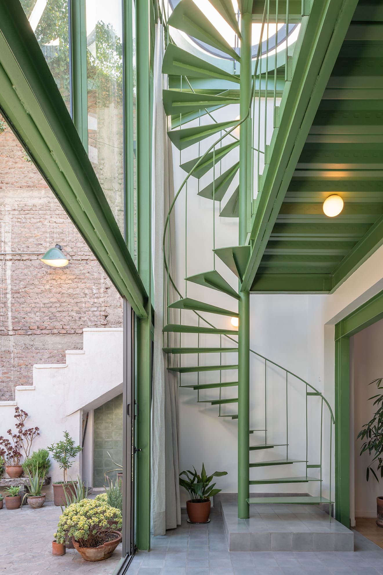
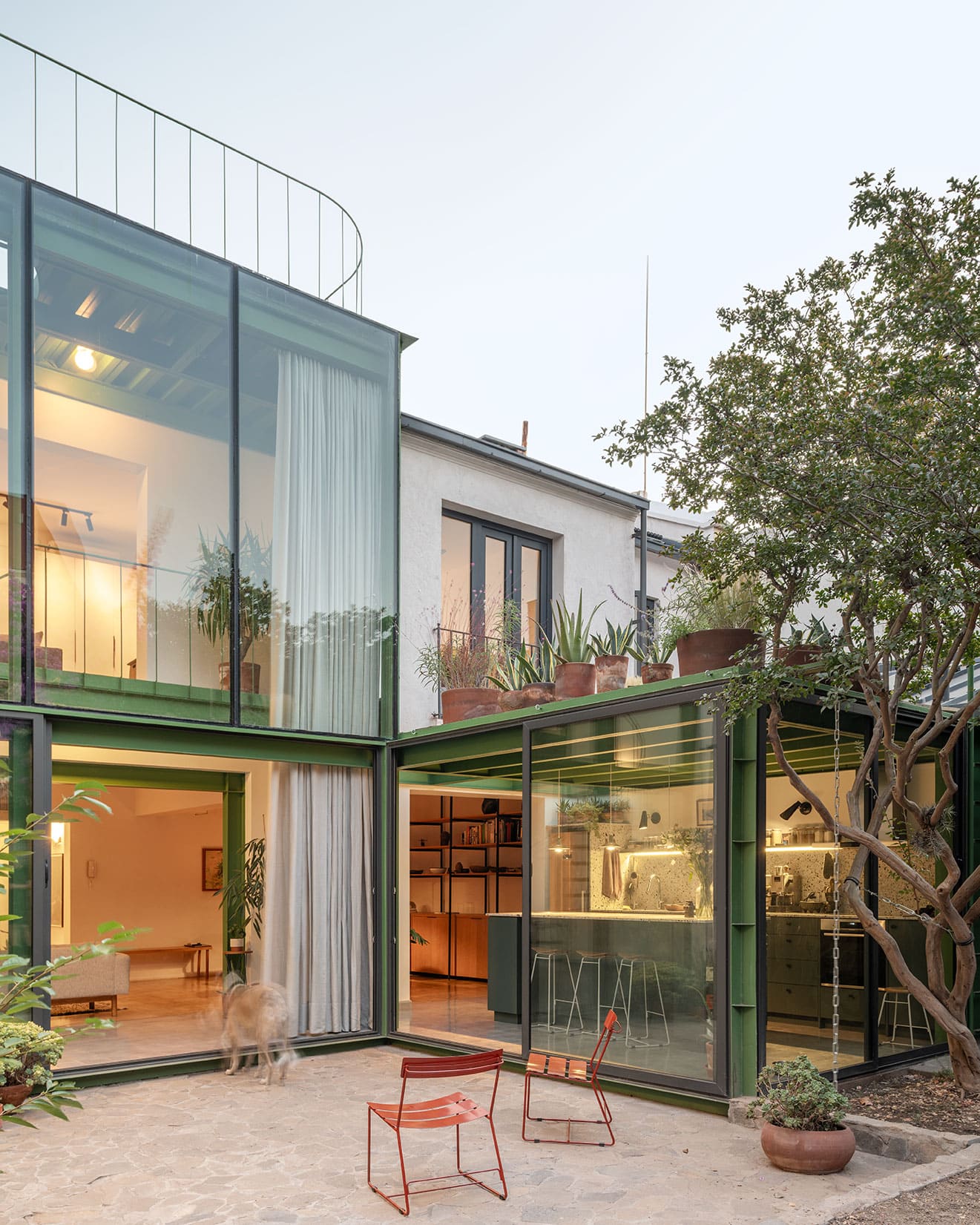
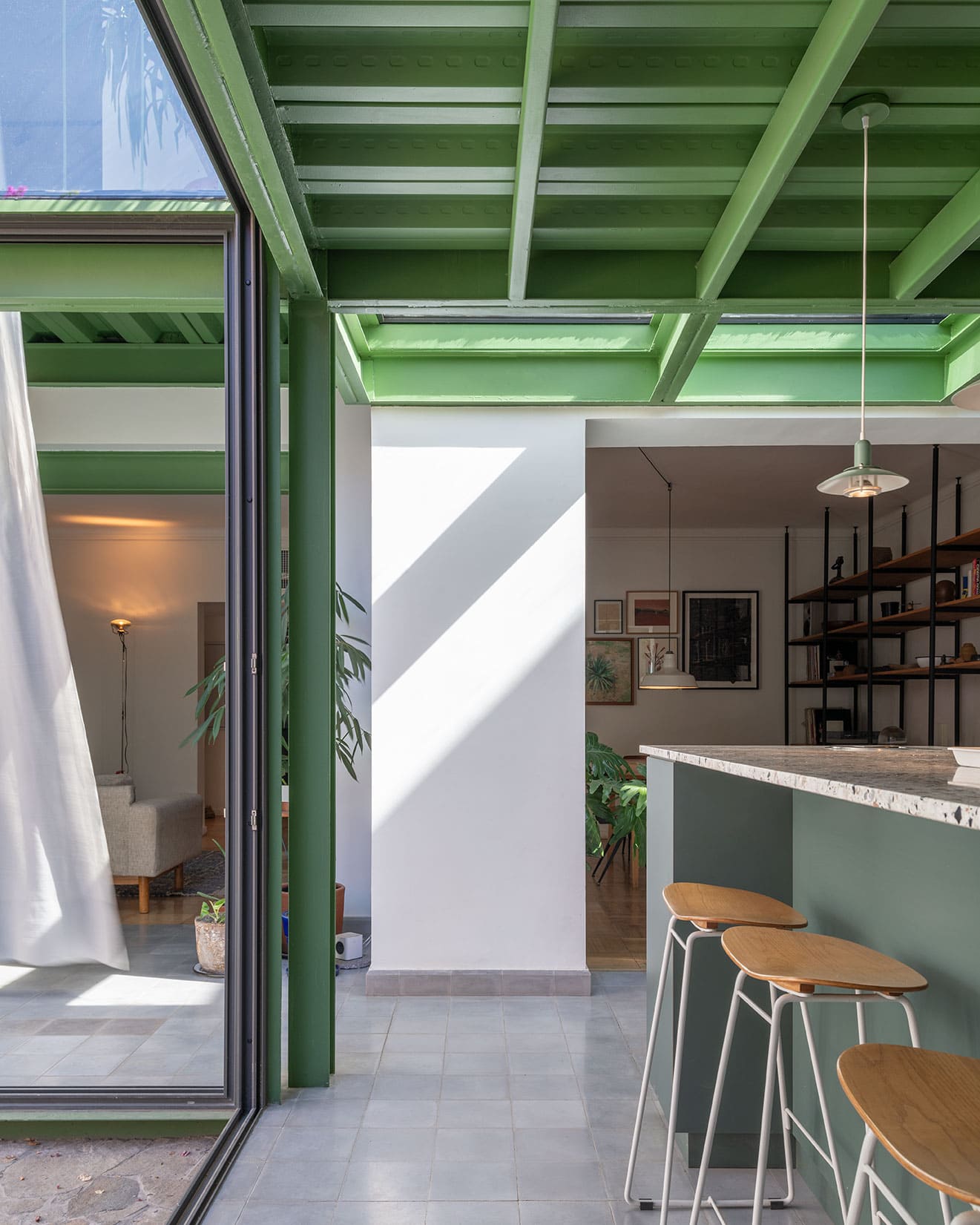
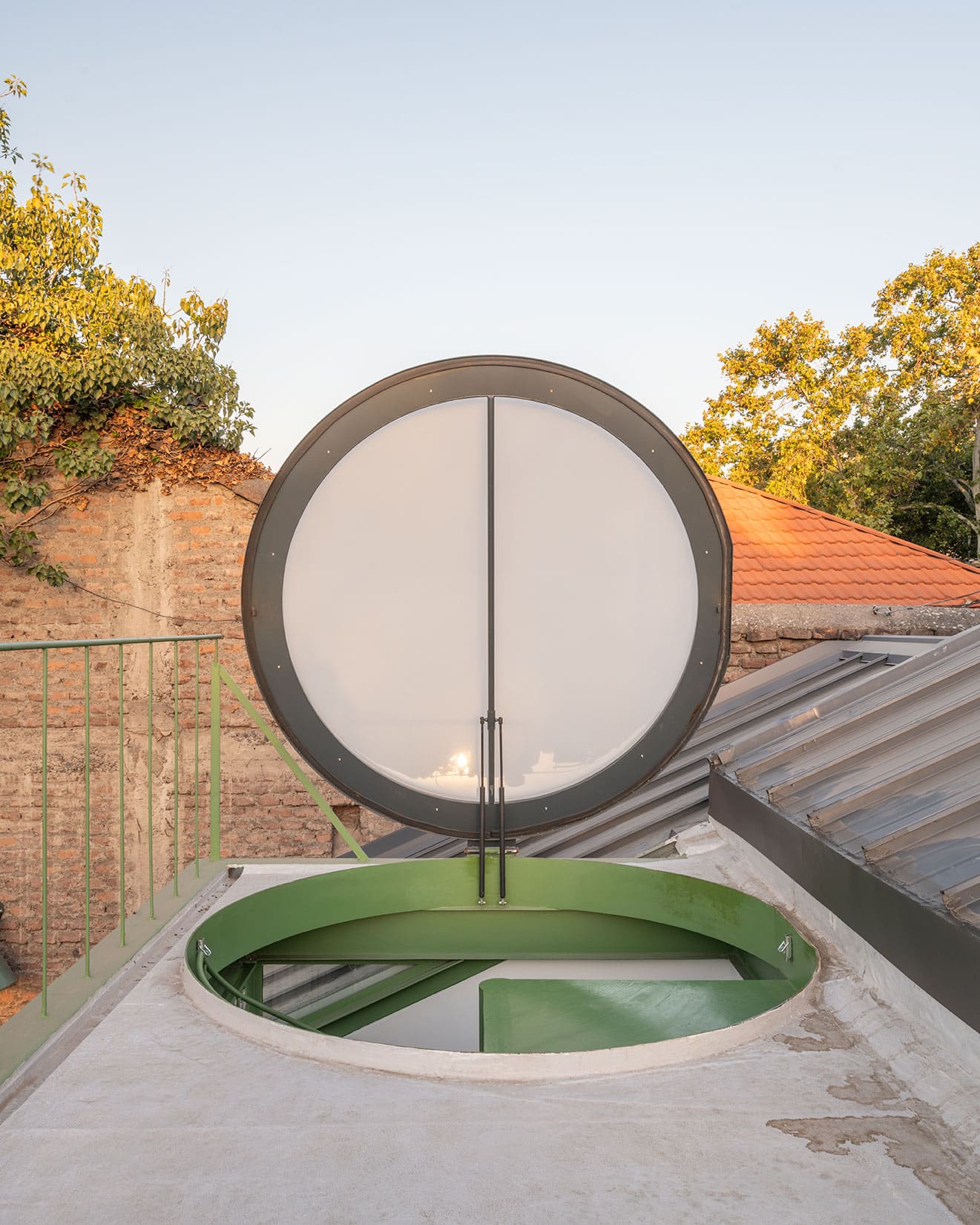
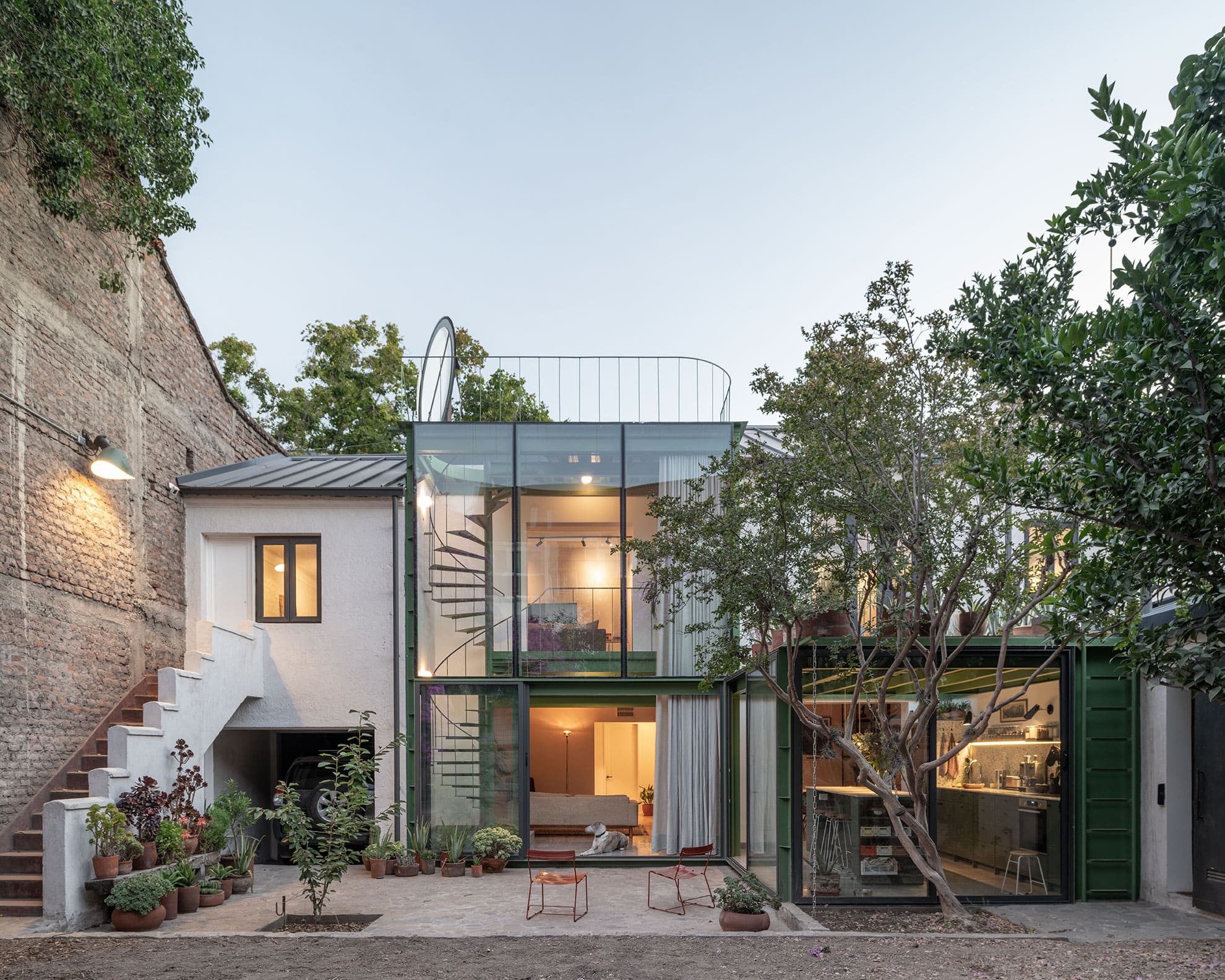
The conversion of this 1935 Santiago house into three independent dwellings uses colour to make a new architectural intervention legible within the existing fabric. The original masonry structure is retained and reorganised, while a new steel-and-glass pavilion restores the kitchen and staircase required by the main dwelling and reconnects it with the rear garden. Its slender steel structure, painted in a muted green, establishes a clear distinction from the older white masonry while remaining sympathetic to the vegetation around it. Rather than disguising the addition as part of the original house, the project gives it its own material and chromatic identity, allowing old and new to coexist as visibly different moments in the building’s history.
6. House T / Buds on Window by Satoshi Ohtaki
Japan, 2023
Photography: © Satoshi Shigeta
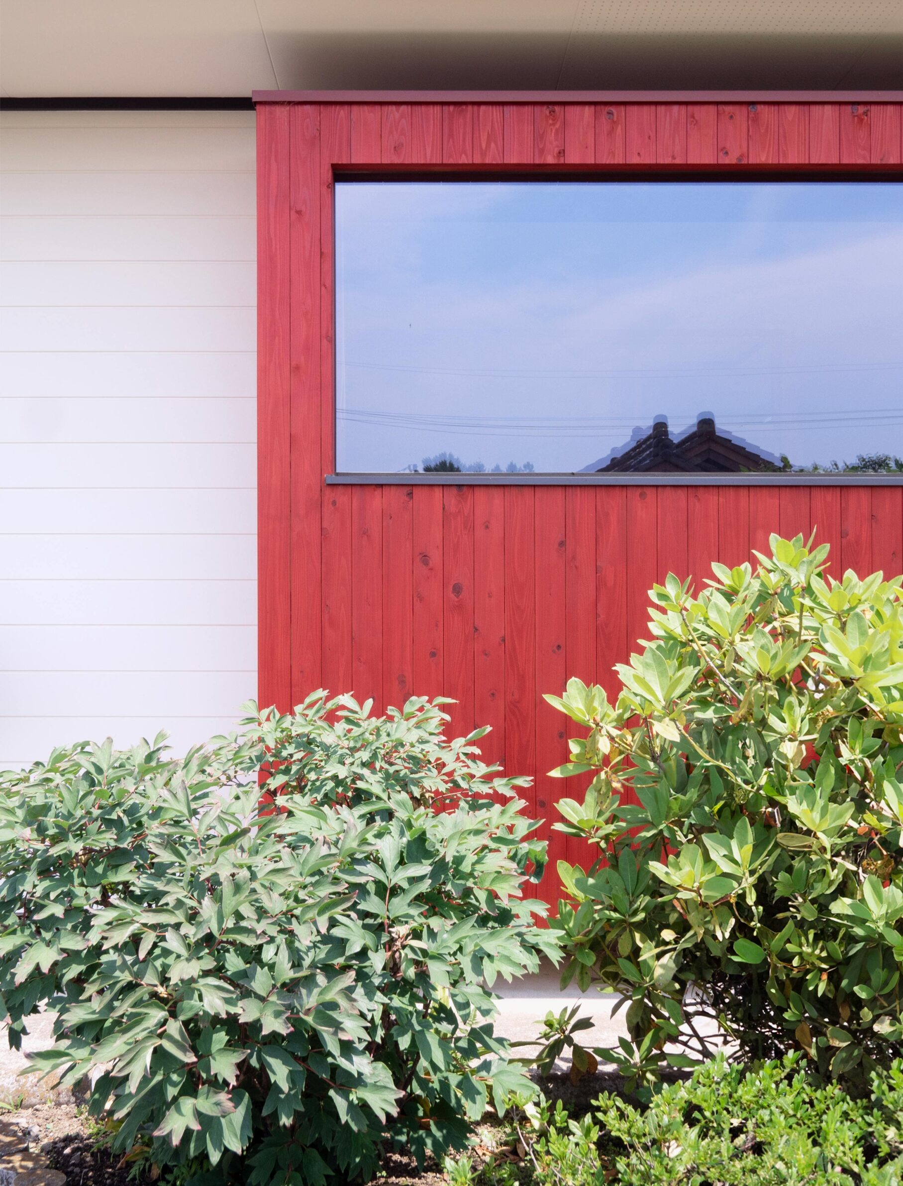
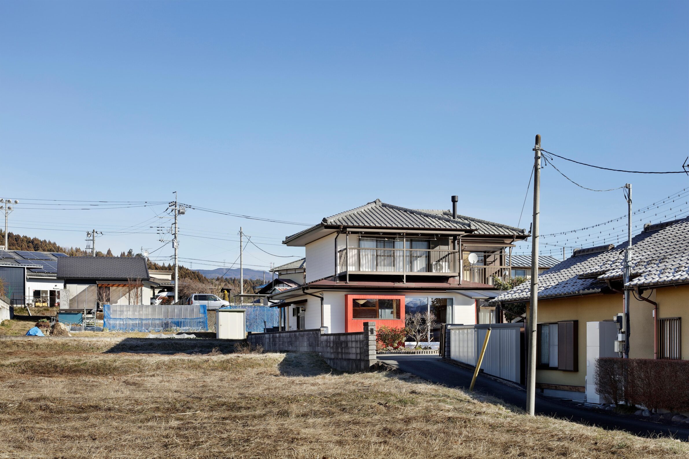
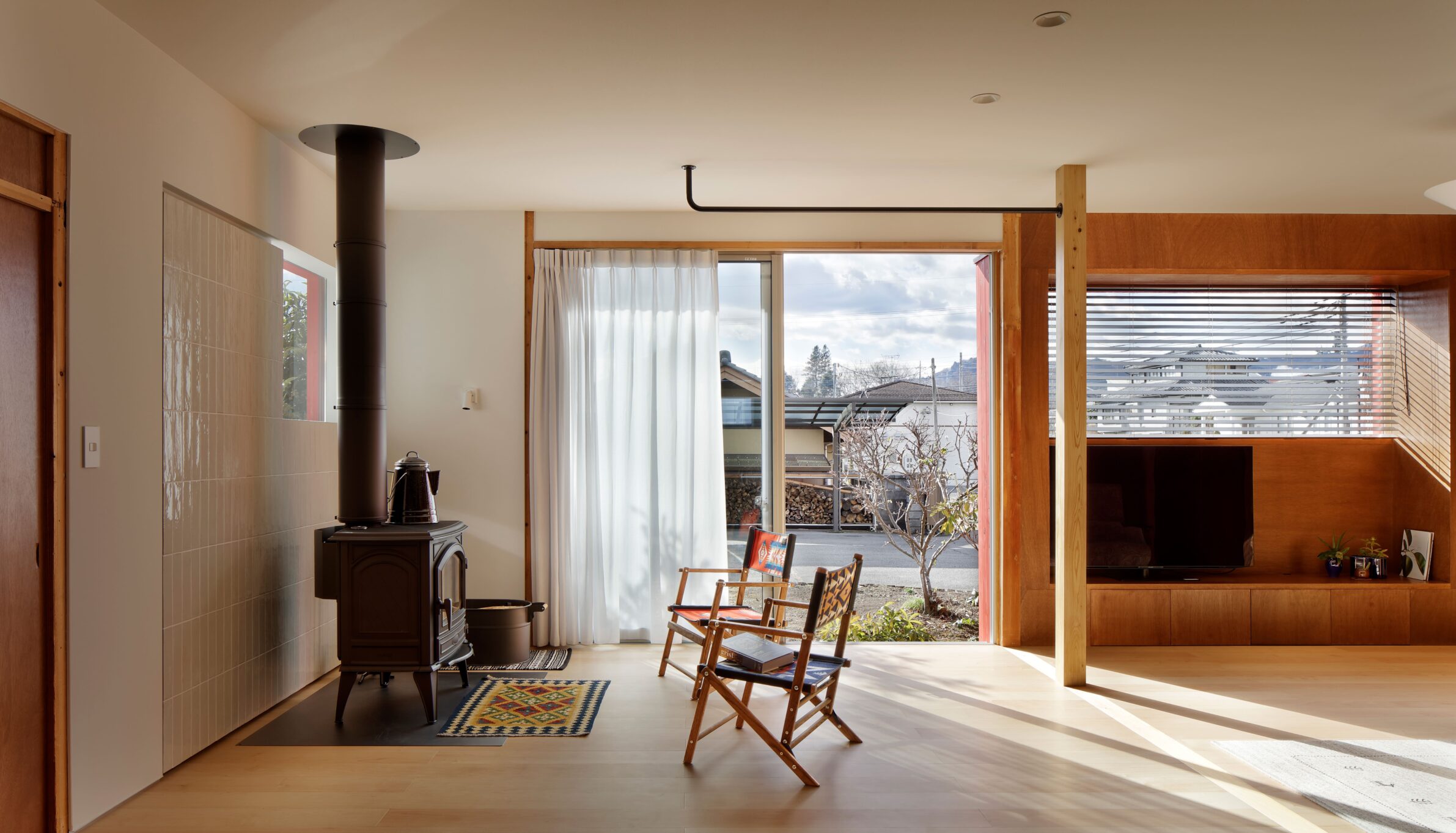
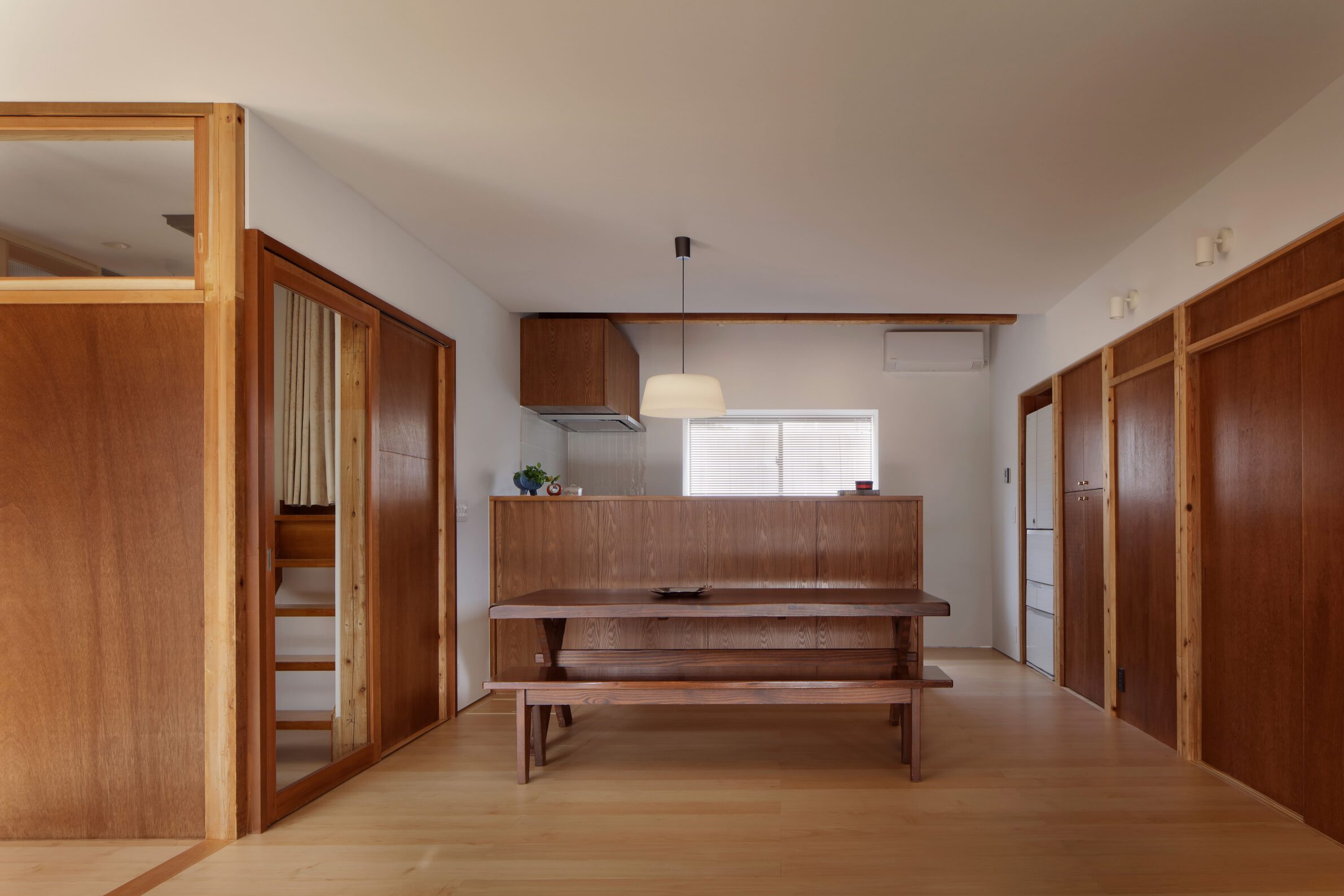
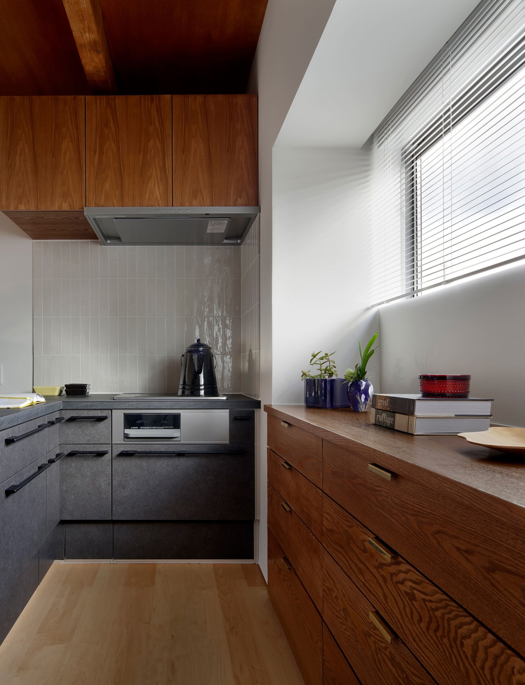
House T demonstrates how a very small amount of colour can transform the perception of an existing building. During the renovation of the 35-year-old timber house, several small rooms were combined into a more generous living space, while three window areas were extended outward to provide additional space for a television, cupboard and stove. These new projections are painted vivid red, deliberately chosen as a complement to the greenery cultivated by the owners. Almost all of the original exterior remains untouched, so the intervention is concentrated in just three elements. Their colour is enough to distinguish the additions and visually renew the entire house, turning practical extensions into its most recognisable feature.
Edited by: Tanja Završki; Cover image: © Mahani Siqueira
______
Selections is an editorial series that presents carefully curated architecture, interior, and product design projects. Each article explores a specific theme, question or typology. Sometimes through a collection of projects, sometimes through a single work that deserves closer attention. Rather than aiming for completeness, Selections highlights projects that help us better understand the ideas, values and directions shaping the built environment today.
What do you believe is still worth creating?
You are part of the creative community shaping what comes next. Share your perspective on the ideas, challenges and possibilities that deserve attention now. Selected contributions will be shared through our channels, and every contributor will receive a complimentary Festival Pass.
Selected Works
___
Edited by:
Tanja Završki
Cover image:
© Mahani Siqueira
Be There.


Powered by