The form of the building itself is dominant with its attractive appearance, but at the same time integrated into the environment in order to raise the quality of neighboring existing, as well as the quality of the future buildings. The basic idea, in addition to the form and cordination of urban requirements, is to functionally meet all the needs of future users, in order to provide a pleasant feeling to every one of them, both in residential units and in the facilities around this building. The primary aspiration of the designer is not to disturb and burden this space, but certainly, to fully define the immediate environment around the building and raise the level and standard of living in this part of the city.
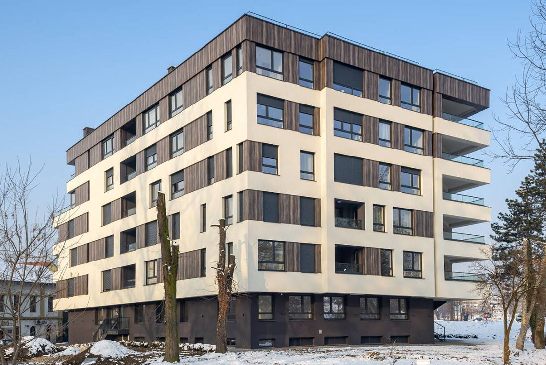
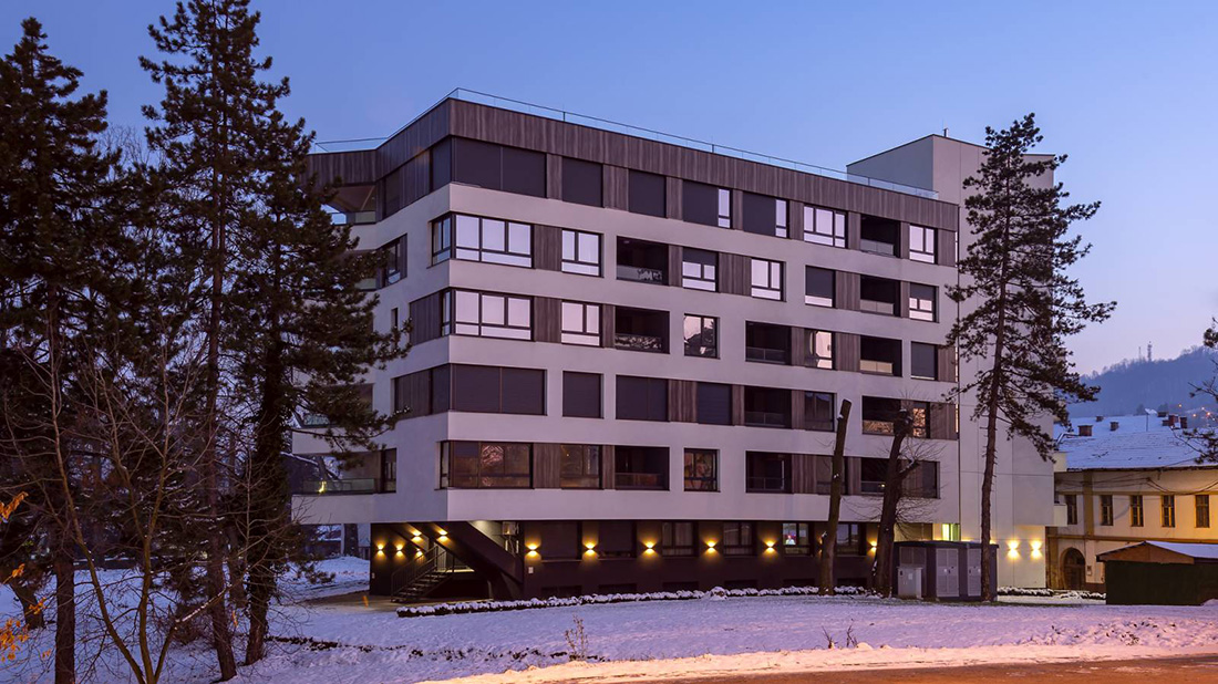
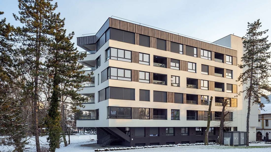
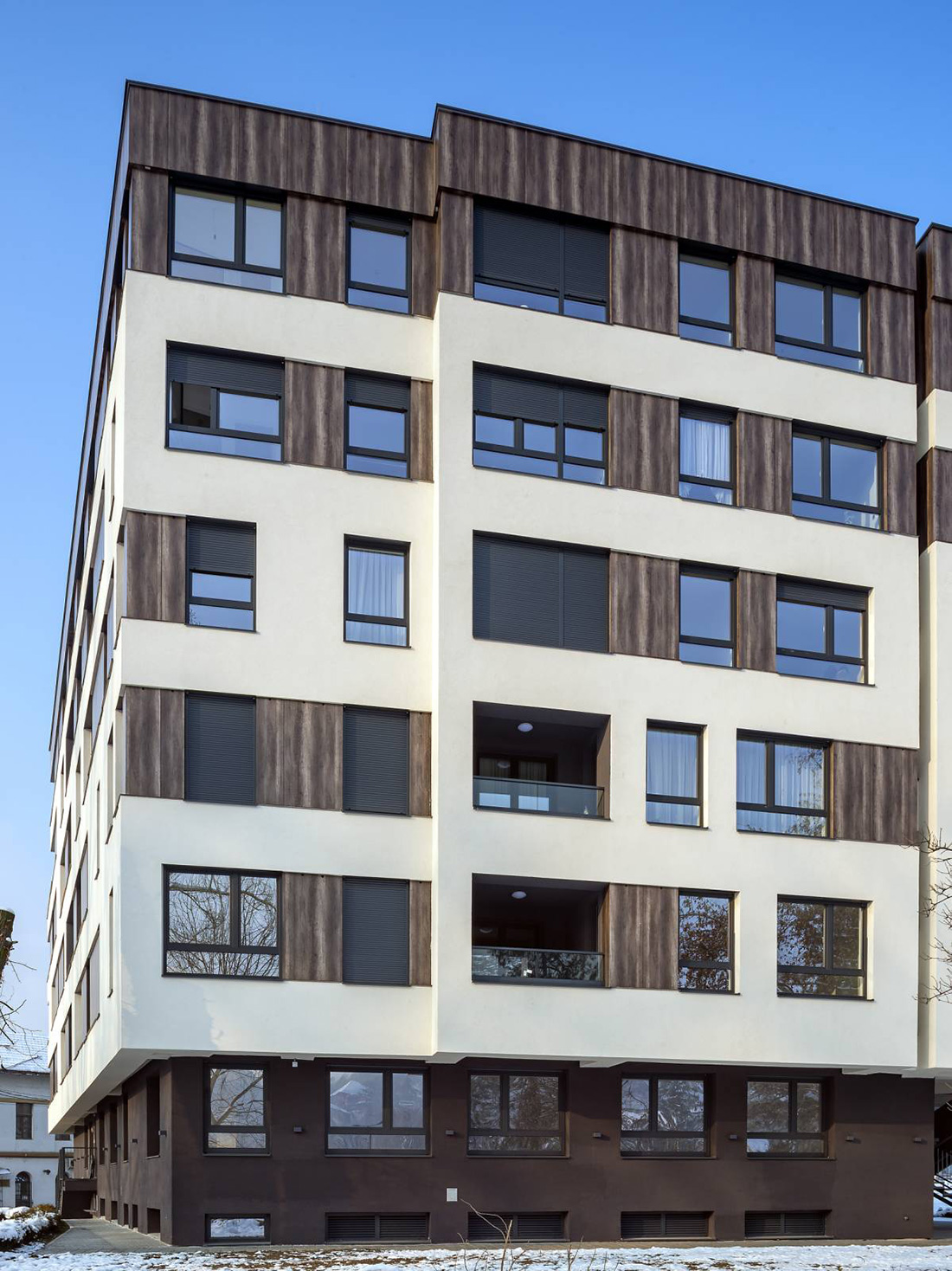
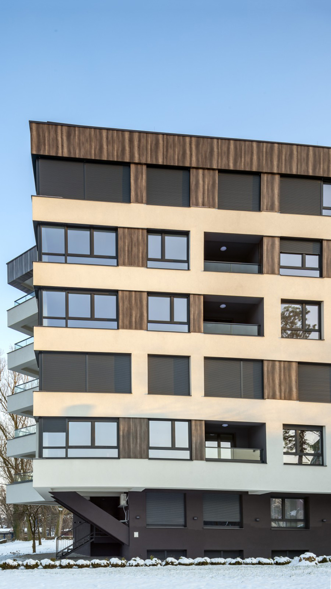
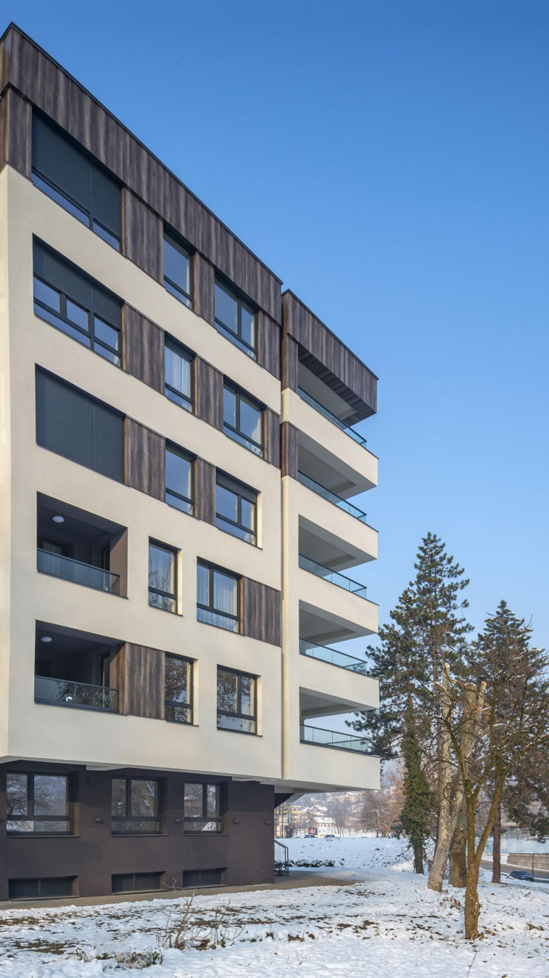
As a result, the basic idea and constant pursuit of a nicer living environment was realized in this location. The very thought of living in a park overlooking the Pannonian Lakes separates this residential and business building from any in the City of Tuzla. The building has disparate trapezoidal volume of irregular shape, with a total of five facades. The main goal of the building’s appearance was the designer’s desire to replicate the park’s appearance on the building’s facade, so a wooden print on Fundermax compact facades was used, as well as large glass surfaces to reflect the park on the building’s facades. As the main contrast to the wooden details on the facade and the park, was used dirty white thermal Baumit facade, which symbolically represents a network that includes the trees and painted pictures of the park on the facade of the building.
The ground floor of the building, as well as the part of the basment floor that is visible, is indented in relation to the floors above the ground floor. The upper floors are cantilevered on all sides of the building. The cantilevered part of the building also serves as a canopy, and thus allows covering the space for users who communicate around the building. The whole building is quite unusual and irregular in shape, which is not typical for a residential buildings. In the end, an interesting volume of the building itself was achieved in combination with different materials on the facade. The design of the building, the position of the openings, the dynamic arrangement of different materials on the facade have led to a unique final appearance of the building, which is quite different from the usual appearance of these type of buildings.
The diverse rhythm of the position of the openings and the position of the facade cladding, different on all floors, achieved a dynamic playfulness that makes the building compositionally and aesthetically pleasing to the eye of the beholder. Between all the floors, a horizontal white strip is formed around the building, visually emphasized, separating all the floors above the
ground floor. Between these horizontal divisions, the openings are positioned in different places along the vertical of the building. It all comes to a facade game of full and empty spaces with different angles of extraction and retraction, regarding different materialization of the facade, which is diverse and differently formed on each floor. This way of shearing different materializations, produces a separate story of each floor, so that a dynamic facade with an interesting presentation of different materials was achieved. The height of this horizontal strip in the form of a horizontal division that goes around all sides of the building, appearing on each floor vertically is approximately 100 cm. Only in one place was the continuity of this type of façade interrupted, due to the positioning of the vertical stretch of the Fundermax façade. This facade has a completely different print than the other facades, extending entirely from the ground floor to the top of the building. This part of the facade is where the elevator and the vertical communications of the main staircase are located. Spaces on the facade, between which there are openings for rooms and loggias of residental units are interrupted and uniquely intertwined with different positions of the Baumit and Fundermax thermal facade, so that each floor tells its own story and looks unique in relation to the overall picture of the building. The use of different materials at different lengths on the facades of the building, sought an interesting form in order to give the overall image of the building a dynamic and attractive look. The volume of the ground floor and part of the basement floor that are visible and located above ground level, are indented in relation to the size of the floors above the ground floor. They are cantilevered on all sides of the building, while the exception is only in the position of the main stairwell. Its appearance is accomplished in a single stroke without any change of dimensions in the horizontal sense, and it extends from the elevation of the terrain to the elevation of the attic.
Credits
Authors
Projektni biro Arhitekt d.o.o.
Year
2020
Location
City of Tuzla, Tuzla Canton, Bosnia and Herzegovina
Basement + Ground floor + 5 floors


