


In these eight interiors, colour and material do more than finish a room. They set its mood, help organise its plan and tie it to the place outside.
Interior design is easily read as a matter of taste: a palette chosen, a finish applied. The projects gathered here use colour and material in a more structural way. A wall colour is taken from the sky at dusk, a hotel changes tone from floor to floor, a neutral room is left waiting for books and paintings, a run of oak or a walnut floor sets the character of a home.
They range from a 50-square-metre newsstand to a hotel in a 19th-century building, and move from saturated colour to almost none. Yet the approach stays the same: a small number of decisions about surface carries a large part of the design. Colour and material are often discussed as a finishing layer. In these interiors they read as part of the architecture, marking where a space begins, how it is understood and what it feels like.
1. Day and Night Park by CATS
China, 2024
Photography: Yumeng Zhu, Fan Gao
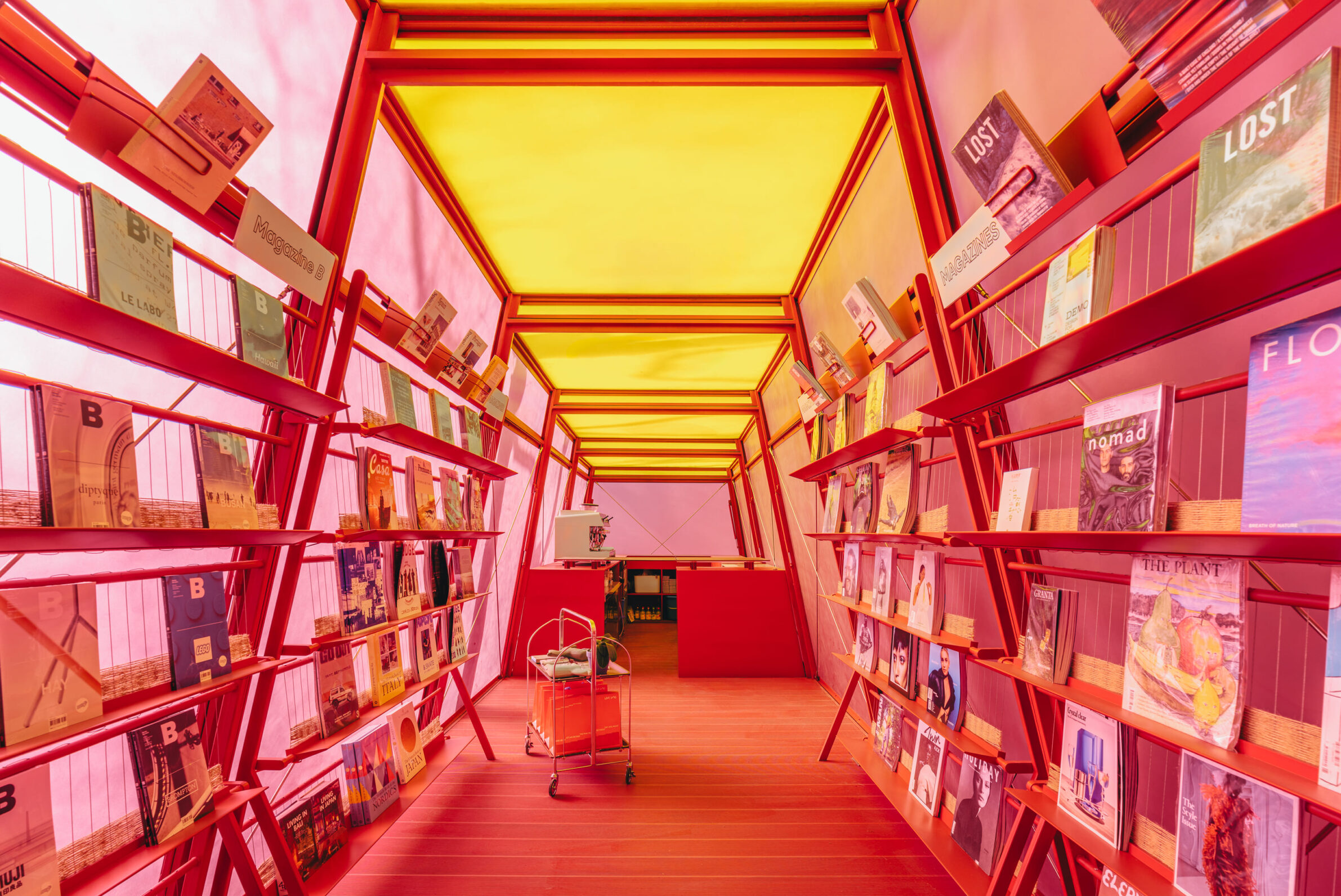
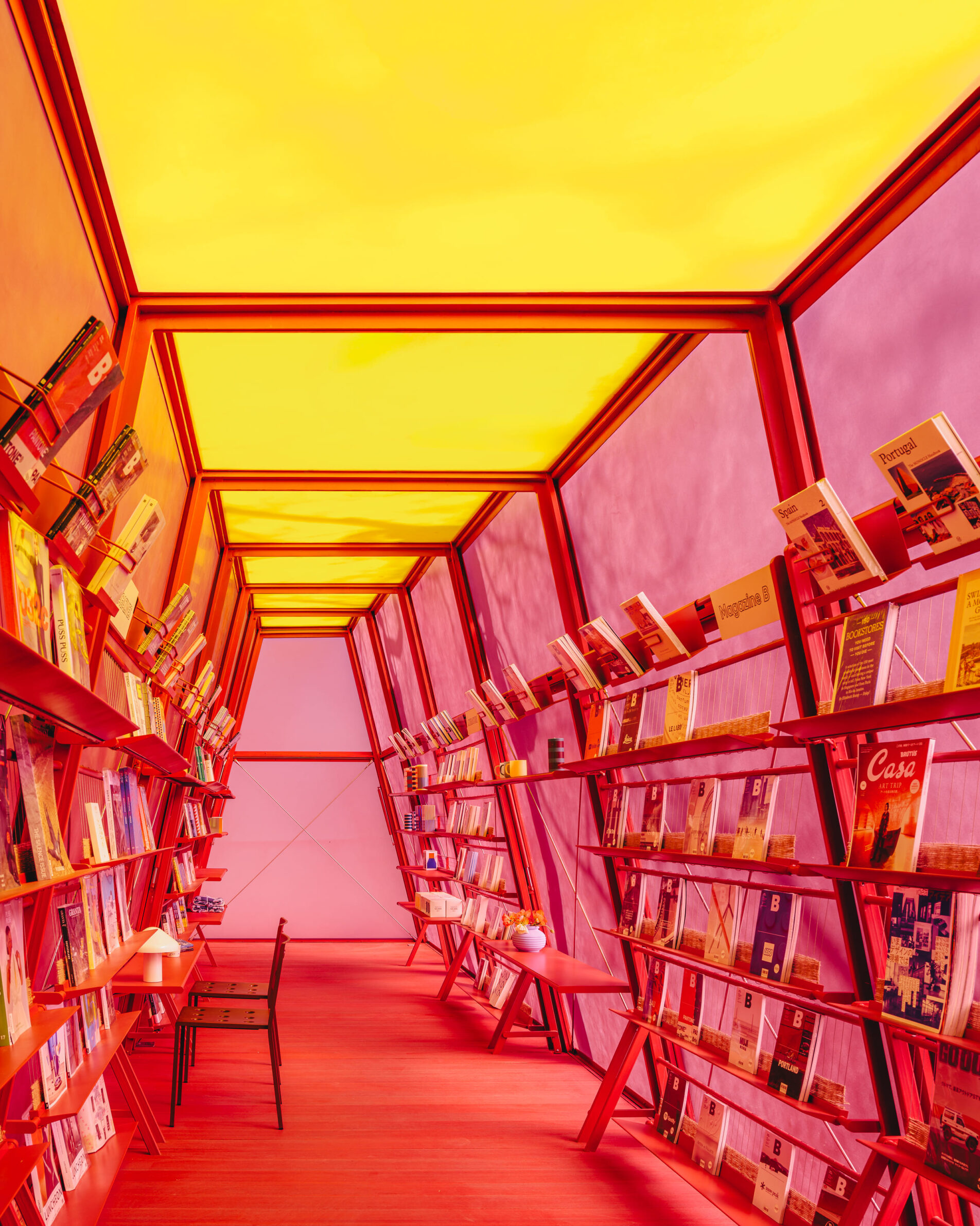
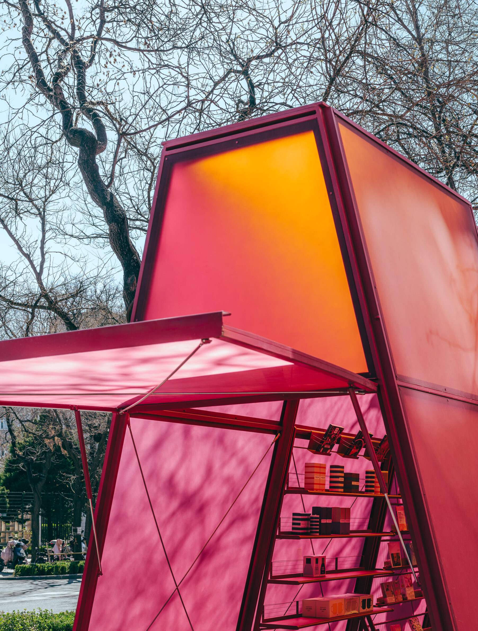
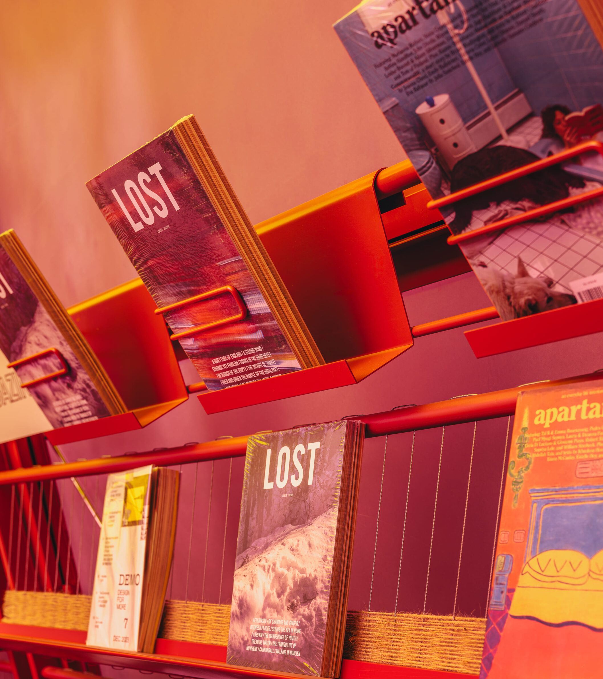
In Beijing’s Sanlitun, this temporary newsstand for the independent bookstore Jetlag Books takes its palette from the Belt of Venus, the pink band of sky seen just before sunrise and after sunset. Walls are rose-red and the ceiling a deep yellow, and translucent panels on a steel structure diffuse sunlight and the shadows of the locust trees on either side, so the colours shift through the day. The 50-square-metre structure is 20.6 metres long and 2.7 metres wide, proportions borrowed from an aircraft cabin, with a ceiling rising from 2.15 to 3.4 metres. Bookshelves are woven with handmade hemp rope, and side panels open like wings to shade a small pocket park around it.
2. Resyn Gallery by MNDA Studio
Italy, 2025
Images: MNDA Studio
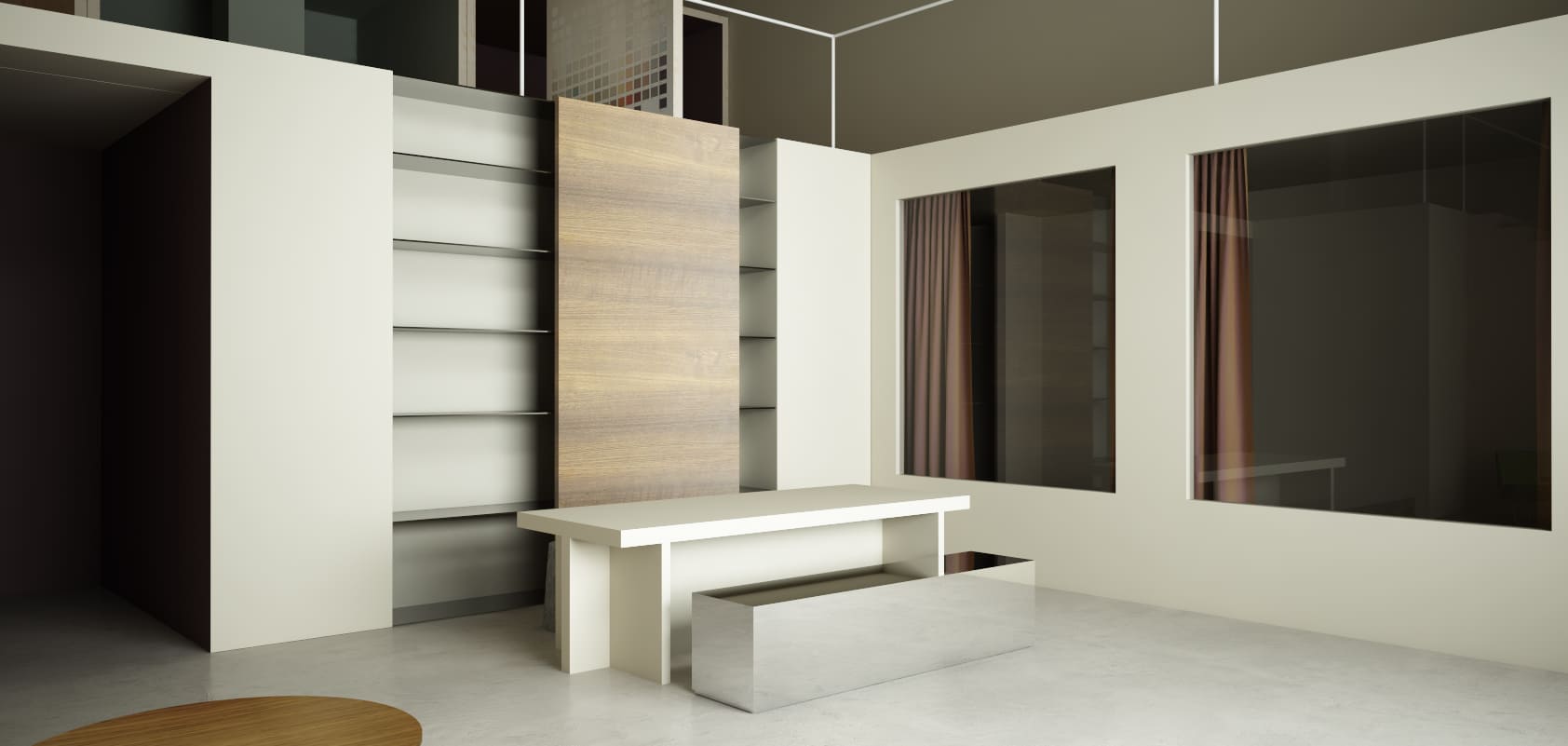
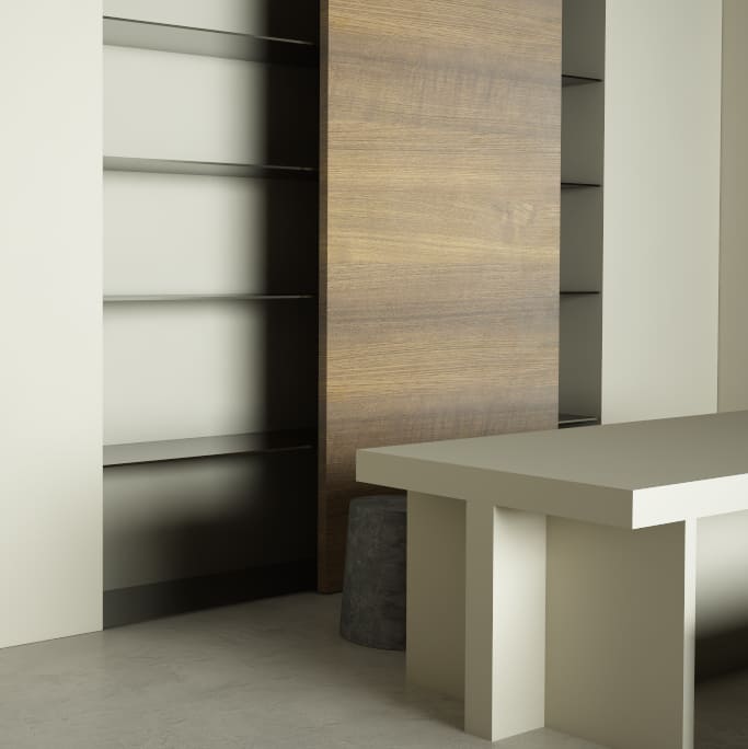
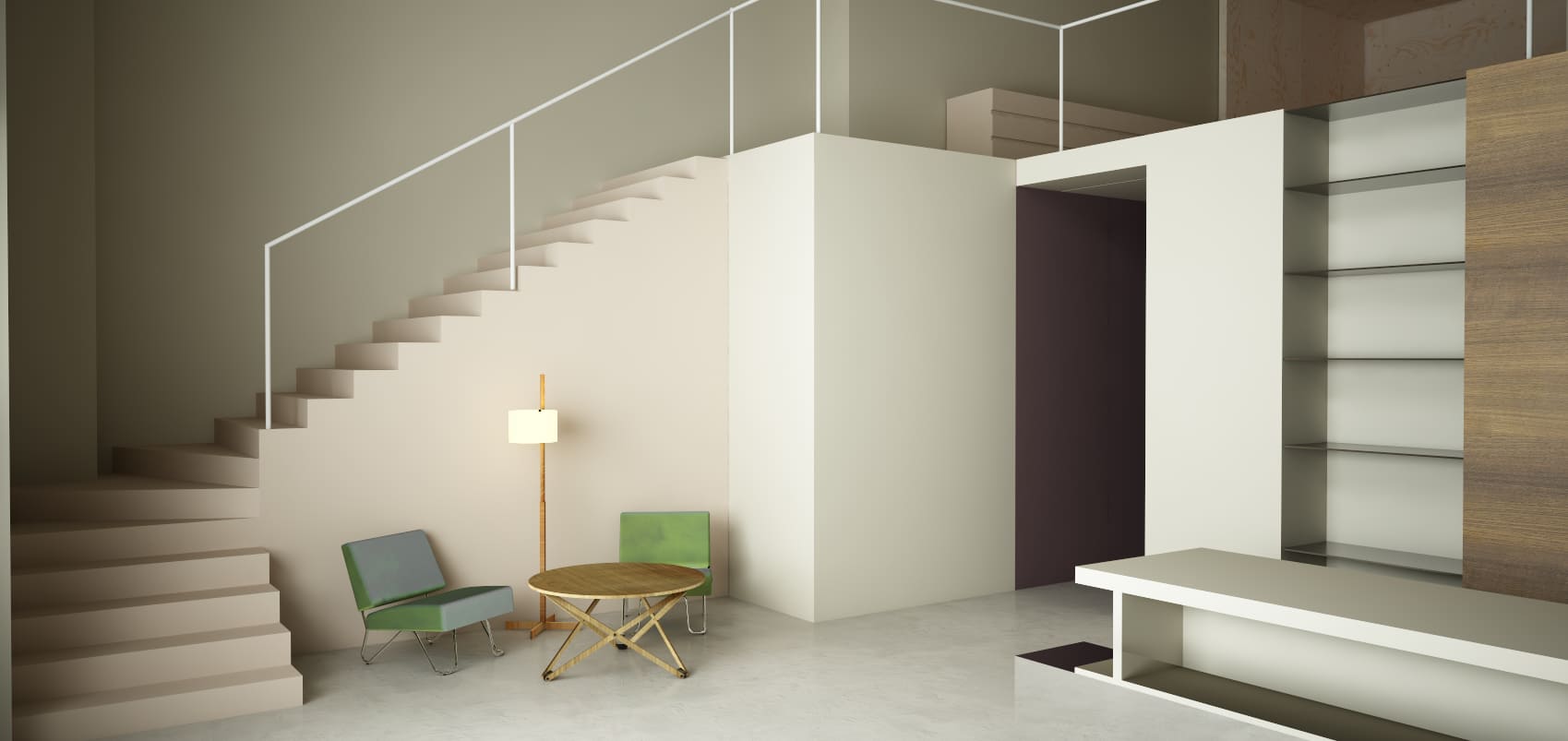
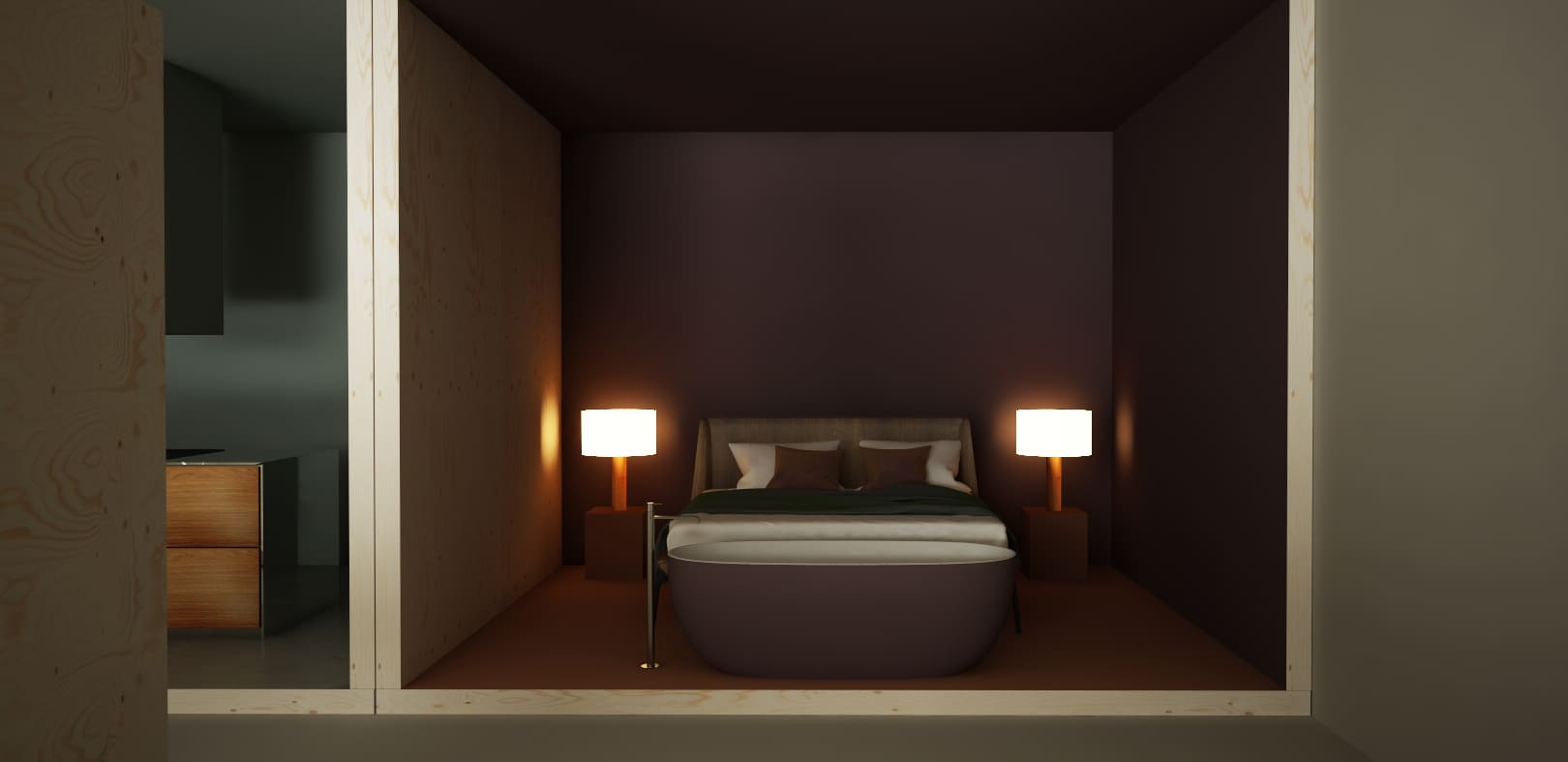
In Guardamiglio, near Lodi, MNDA Studio designed this showroom as a “house of colour”, starting from Le Corbusier’s idea that colours reach their full effect only in dialogue with one another. A soft chromatic base runs throughout, and selected colours identify each zone. Visitors move from a reception area past the production laboratory, left visible and presented as a gallery of colour, to an upper exhibition level. The link between the two floors is the project’s strongest gesture: a monolithic staircase in pink resin. Colour here does the work that walls and signs usually do, telling people where they are and how each space should feel.
3. Casa Foscolo by I-AM
Türkiye, 2024
Photography: Kemal Olca
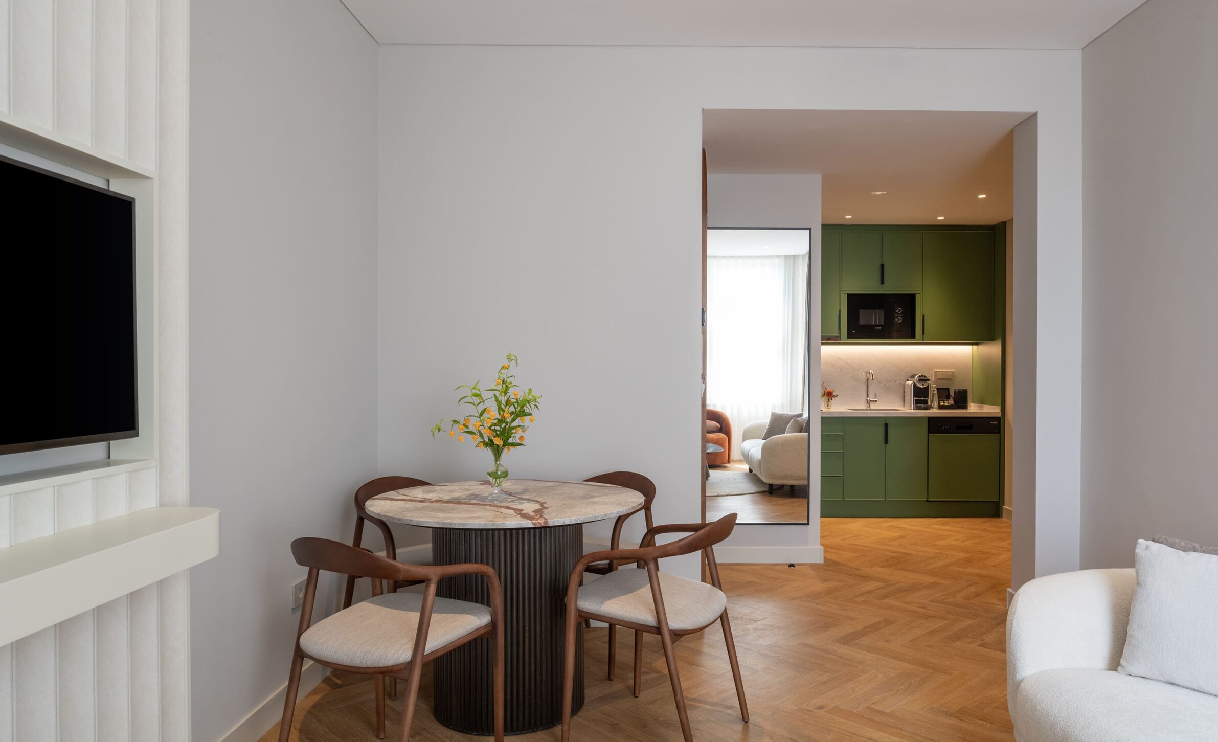
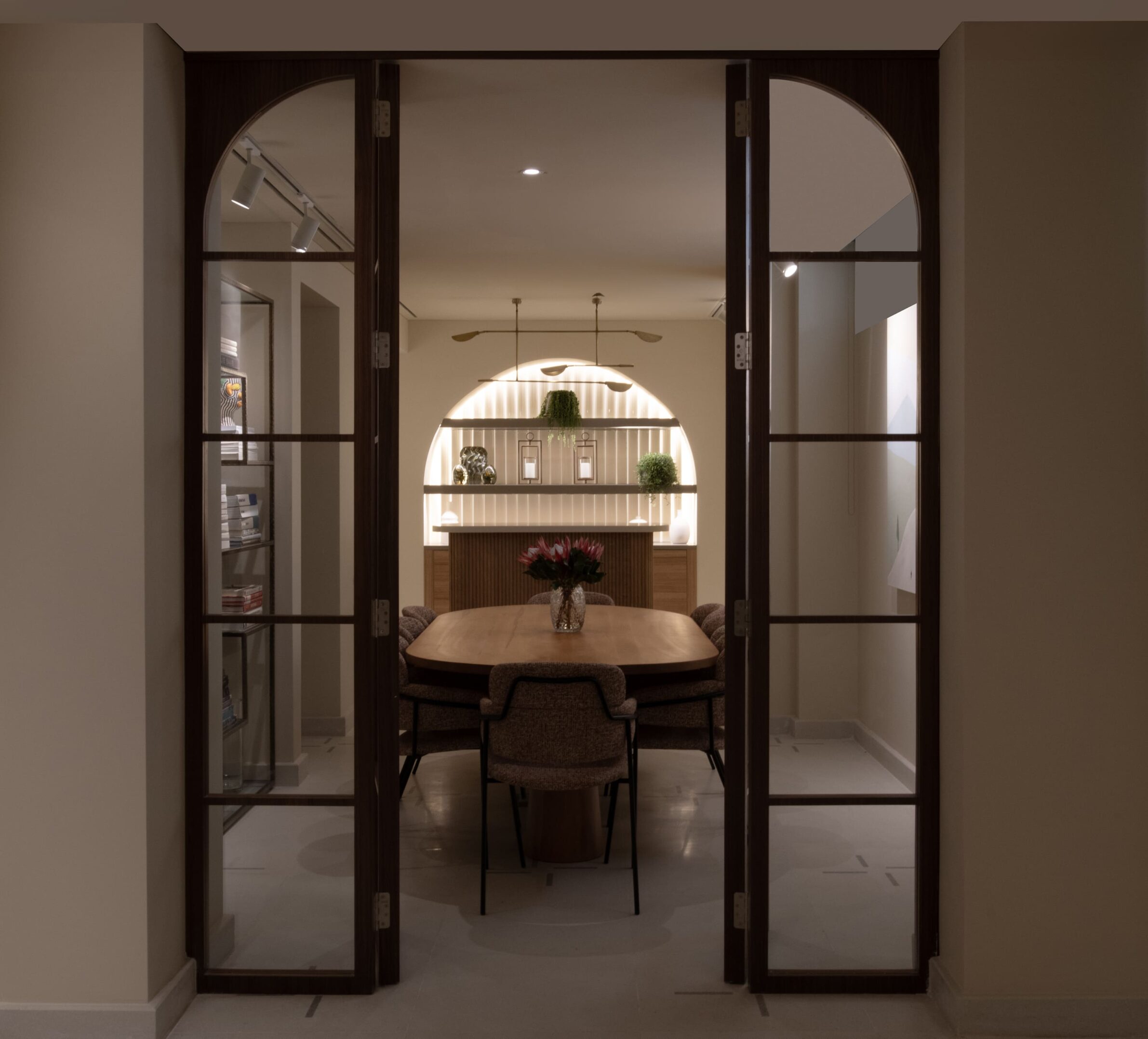
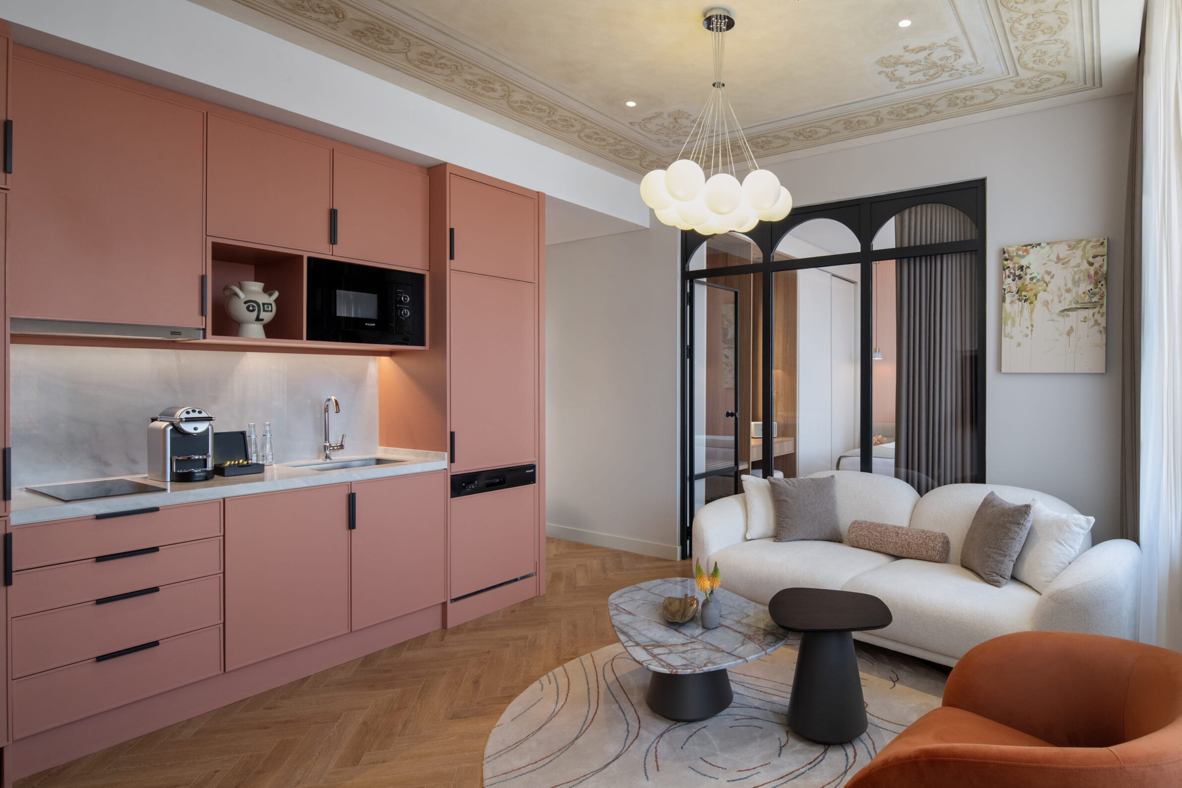
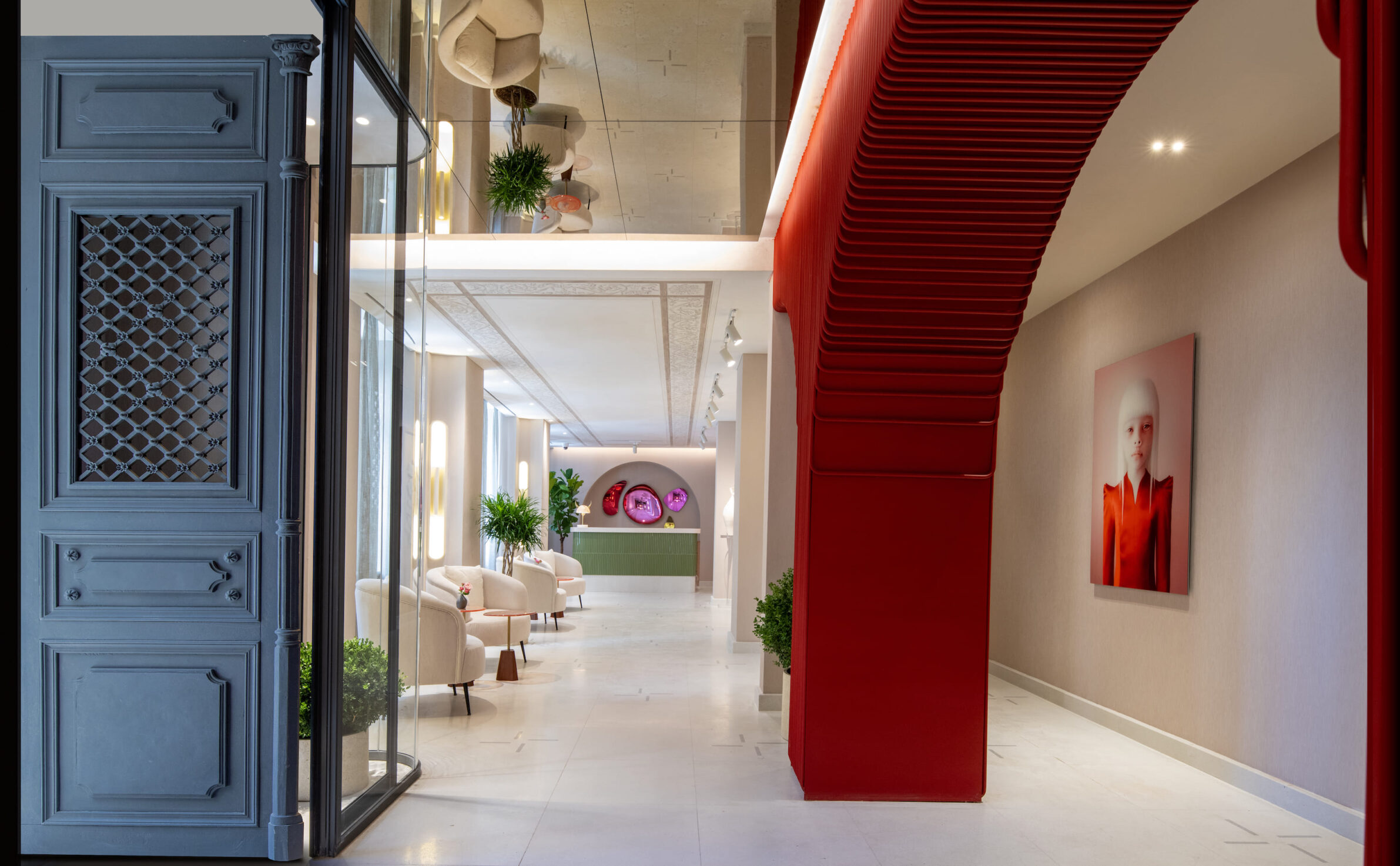
In Istanbul’s Asmalımescit quarter, a neoclassical 19th-century building has been restored as a boutique hotel with an art gallery, café and co-working space. Arched hallways, handcrafted ceilings and stone walls were kept, and a contemporary layer of custom furniture, curated artworks and local materials was added. Each floor has its own palette: tones shift, materials vary and textures change from level to level. Local artisans contributed ceramics, lighting and handmade elements, and the guest rooms are treated as small galleries. The ground and lower levels stay open to the neighbourhood, with a lobby, exhibition zone and café for locals as well as guests.
4. Edgar Allan Poe by De Rungs Arquitectos + Firmaa
Mexico, 2023
Photography: Ariadna Polo
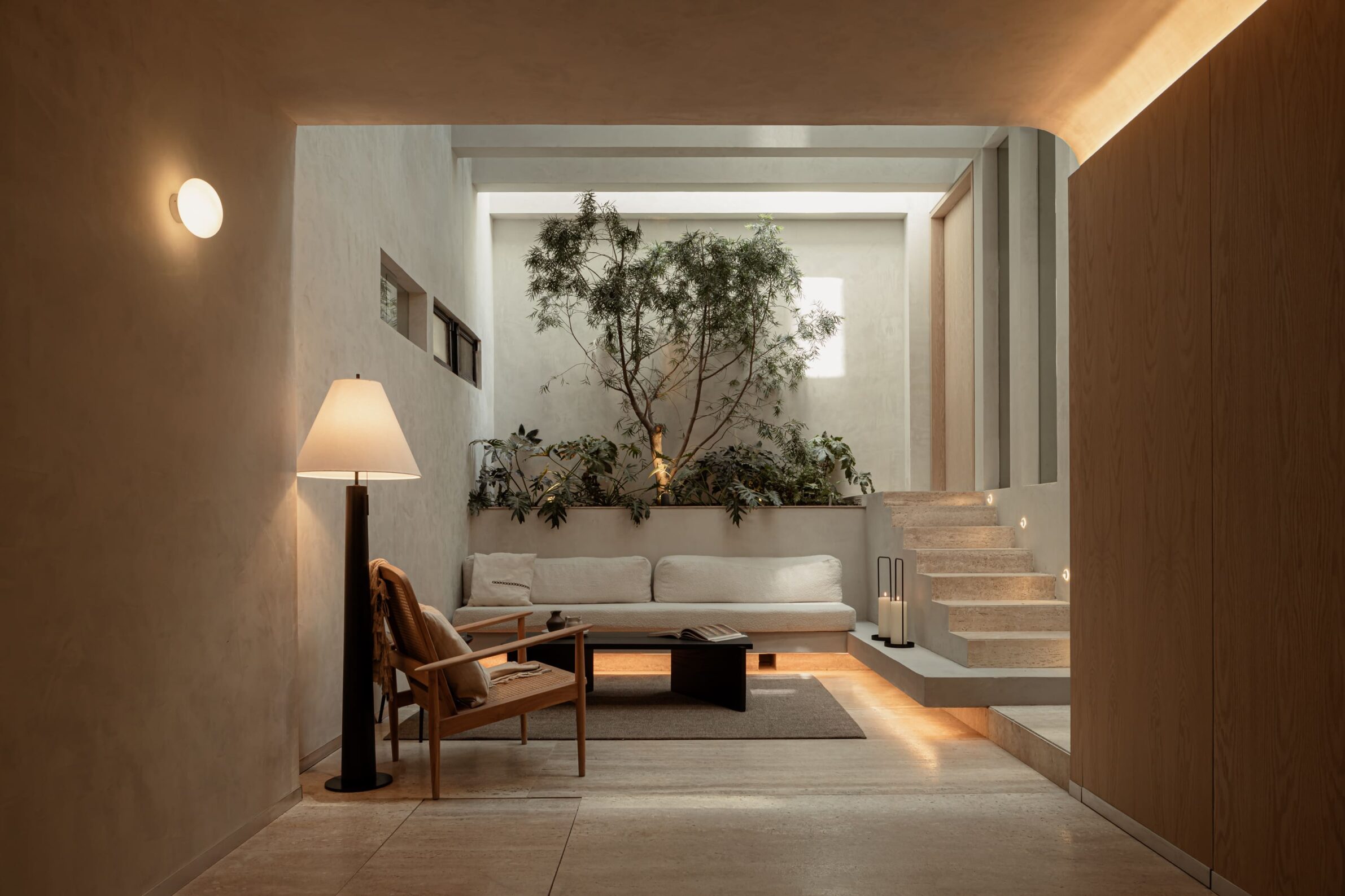
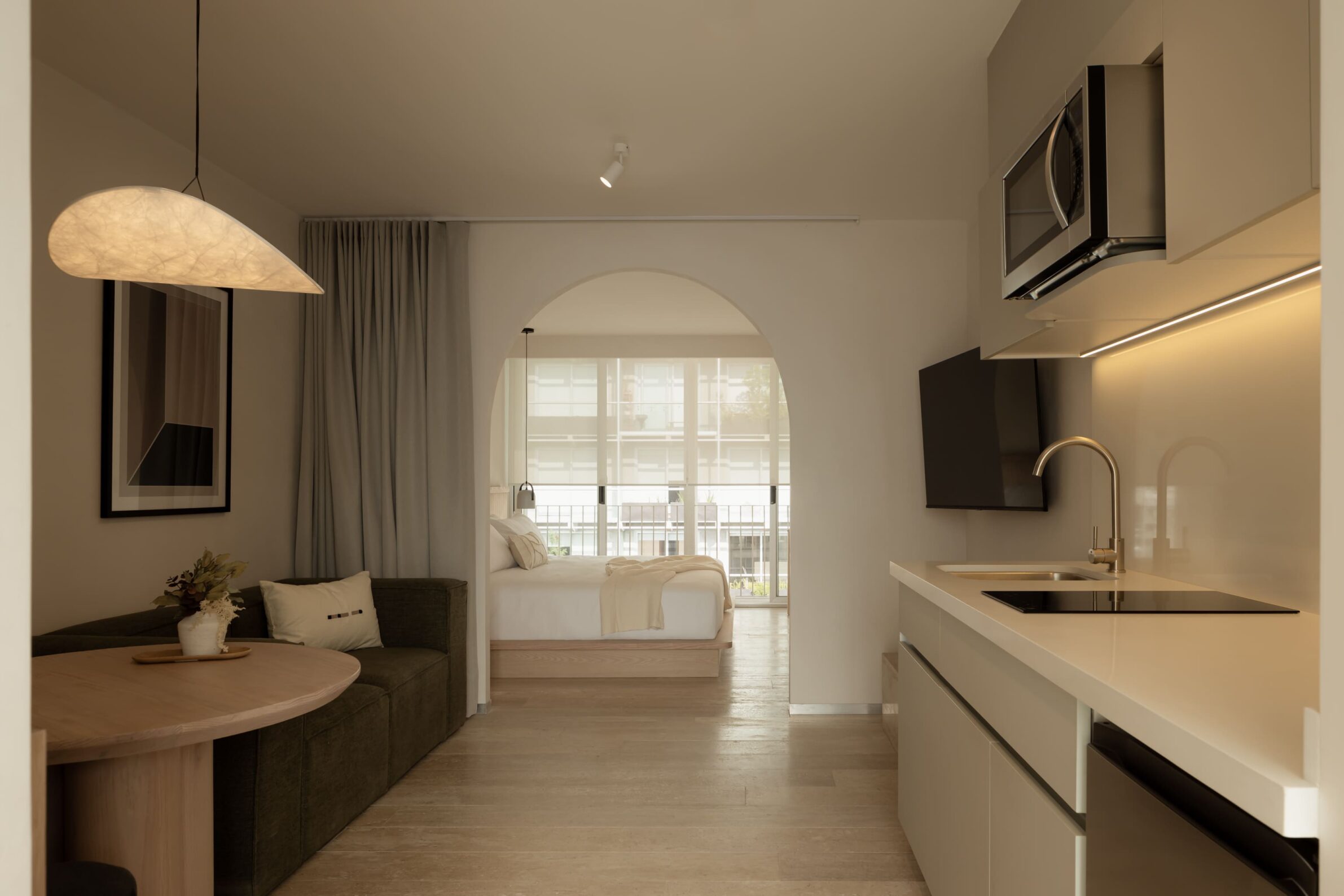
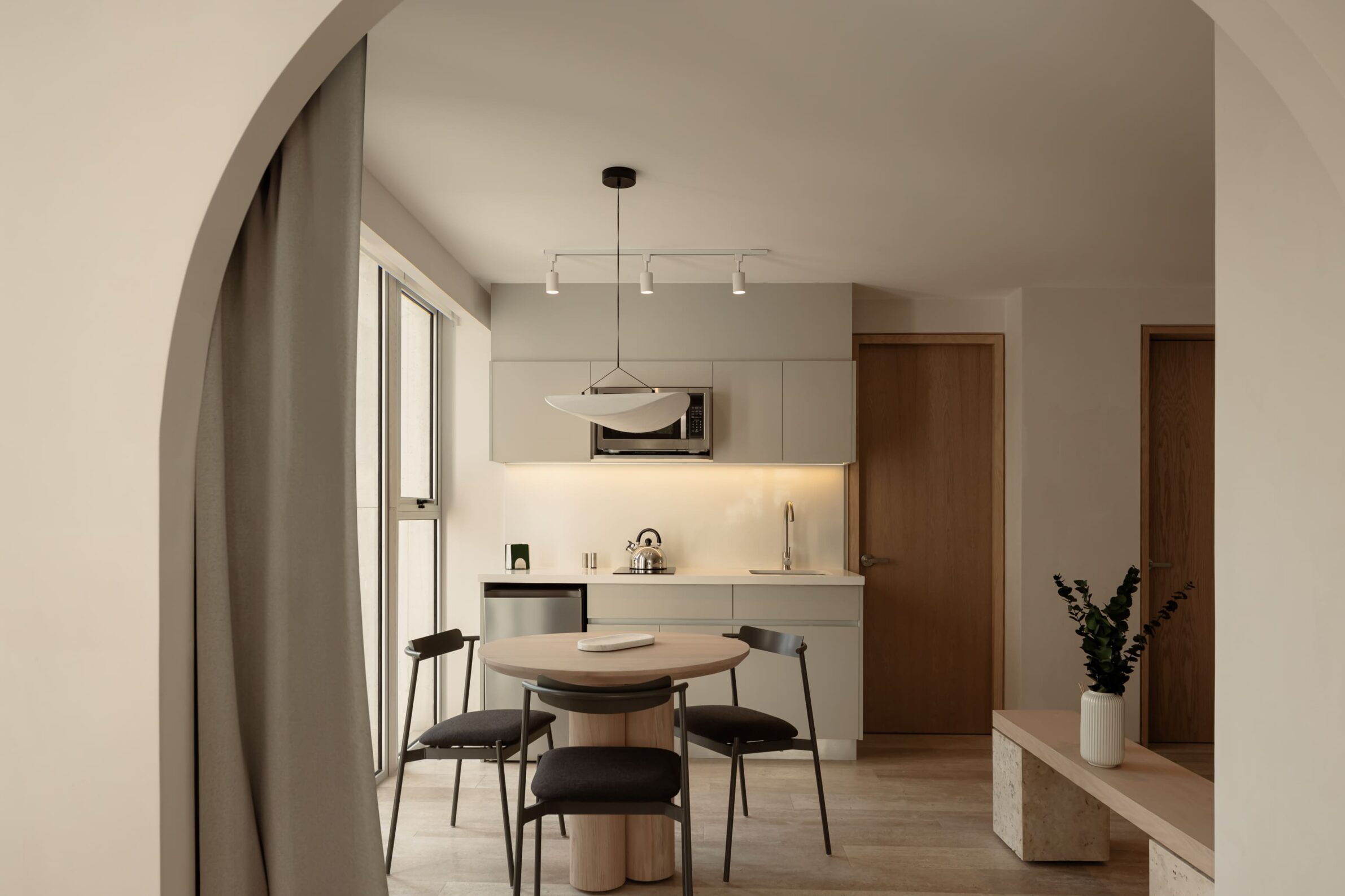
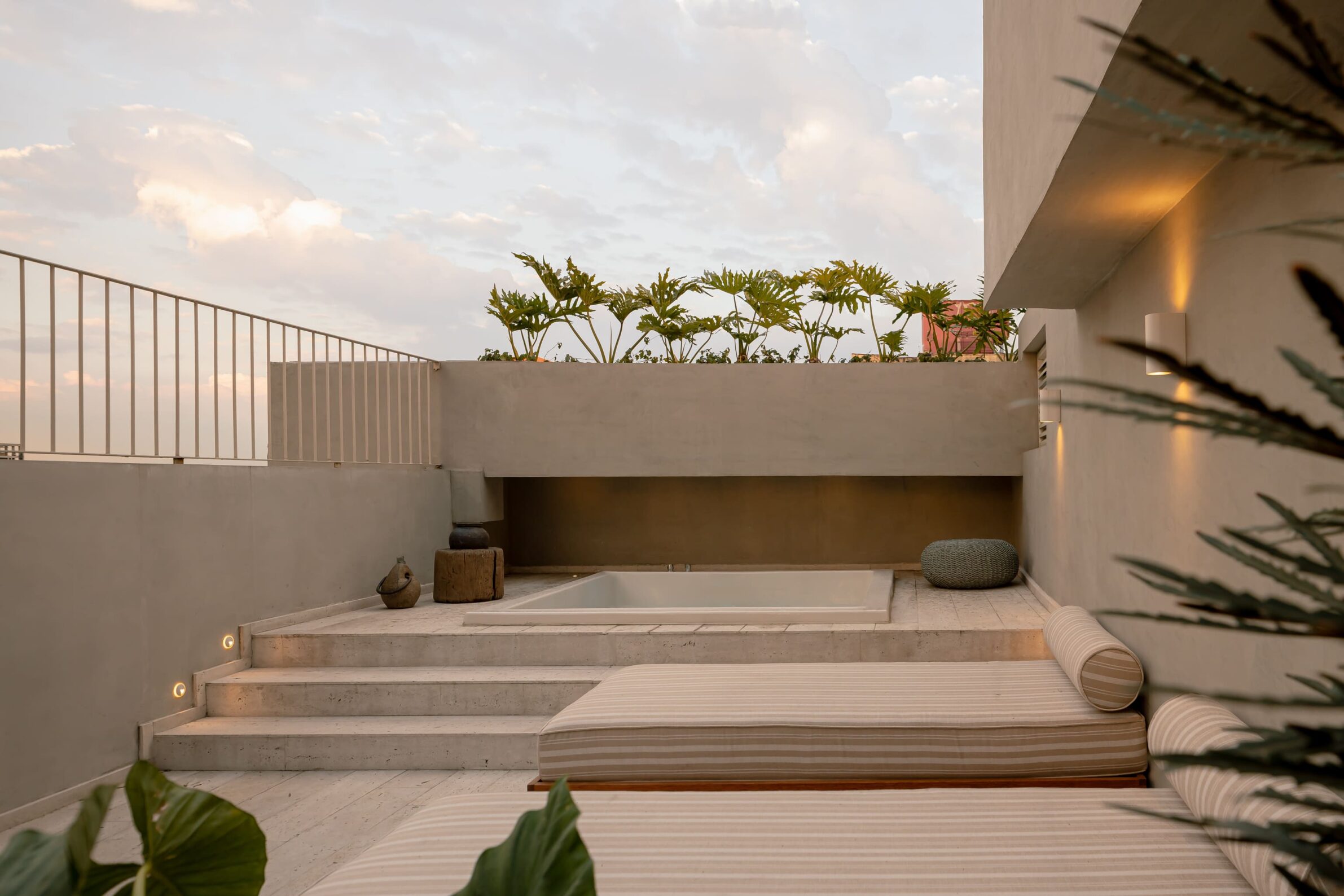
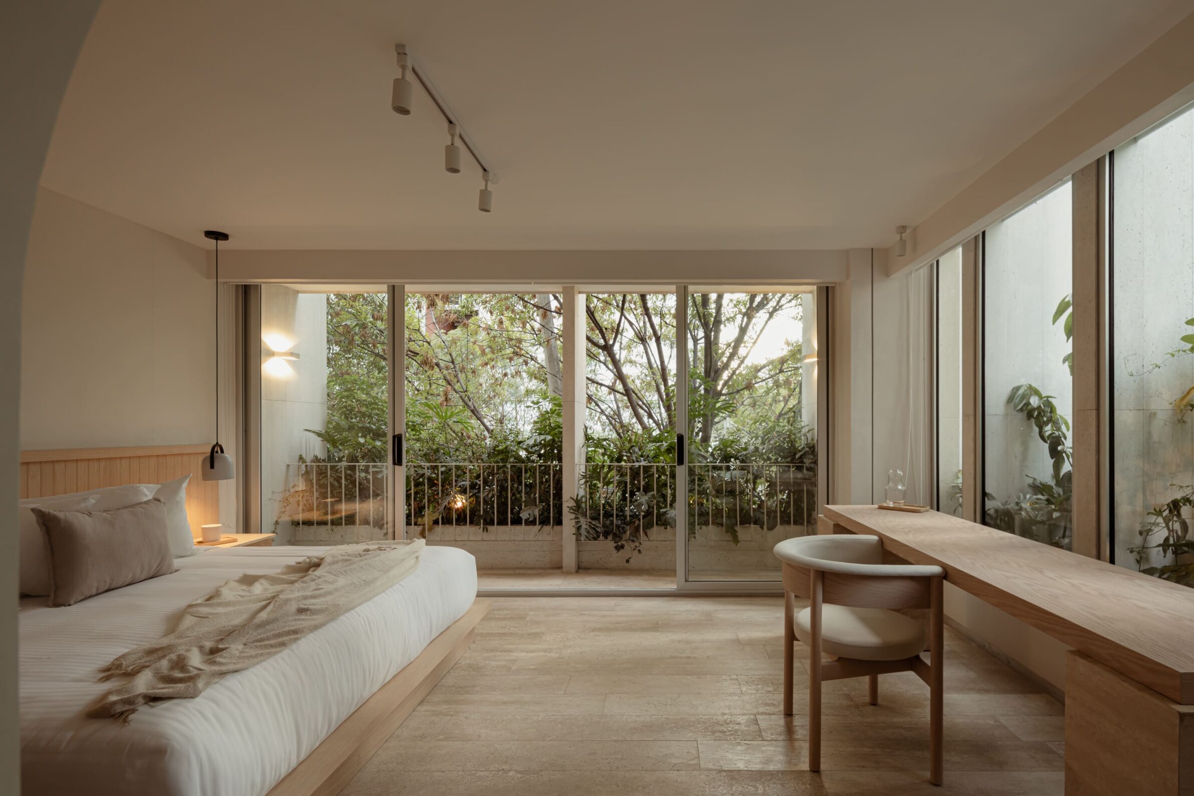
Built in 1957 as offices in Mexico City’s Polanco district, this building had fallen into disuse while its structure remained sound. It now holds compact apartments of 30 to 45 square metres for short stays, on seven floors above a ground floor. Columns, the vertical core and service ducts were kept, while the layout, façades and material palette were redefined. Inside, locally sourced materials, warm tones and natural textures set the atmosphere. The new envelope filters light, noise and views between two very different streets: quiet Edgar Allan Poe Street and the busy Ejército Nacional Avenue.
5. Apartment Lavrica by Studio Formica
Slovenia, 2025
Photography: Taja Harris
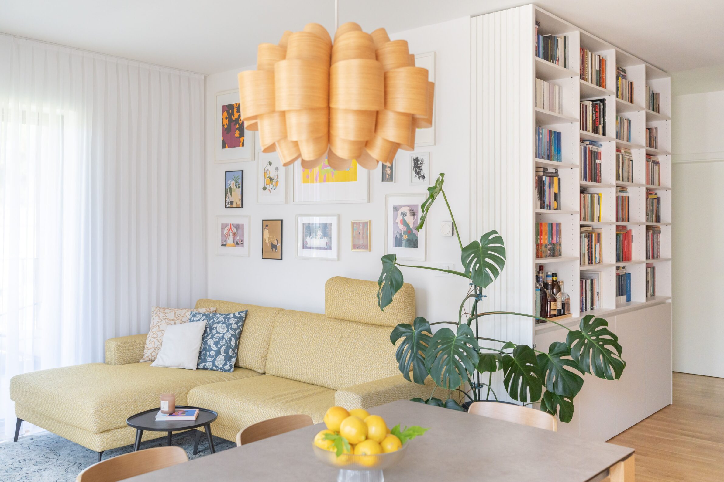
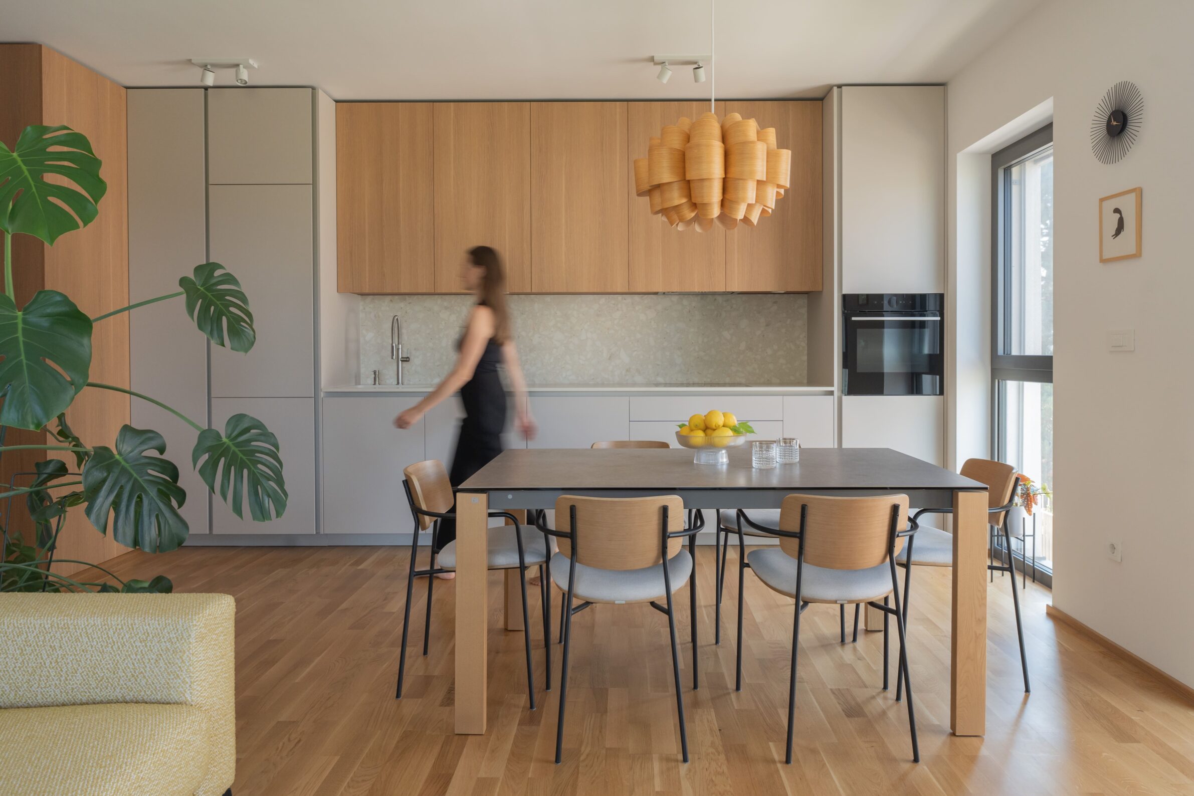
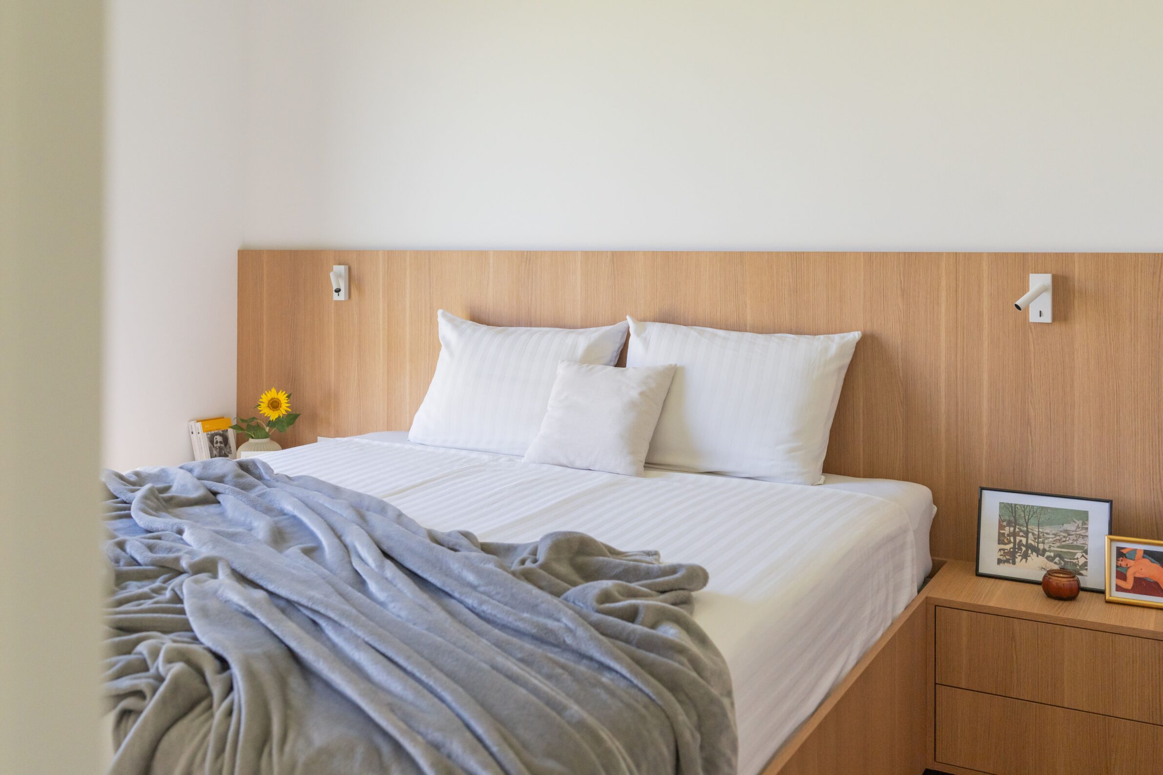
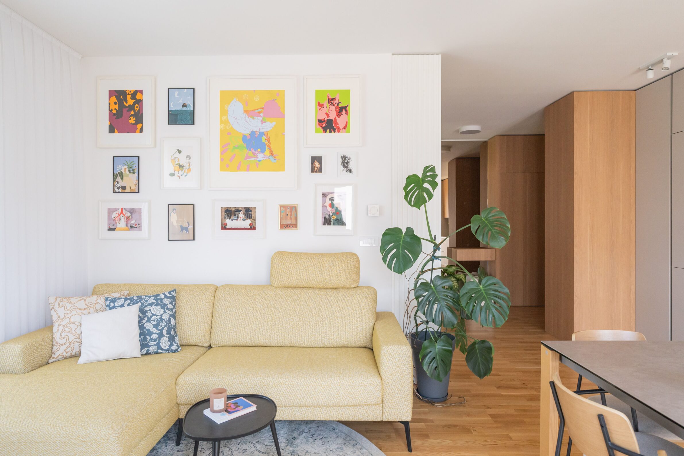
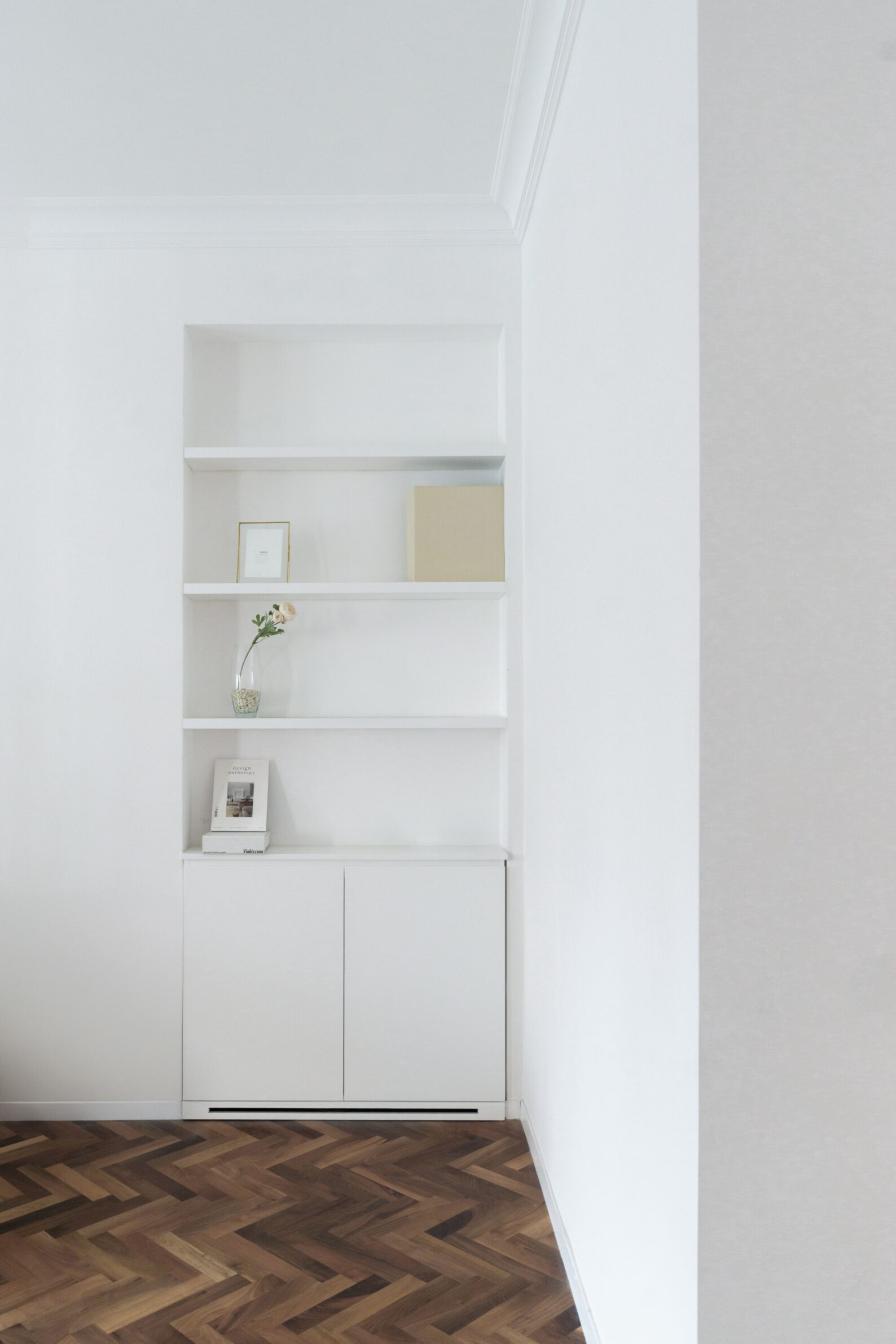
In a new residential neighbourhood in Lavrica, this 70-square-metre apartment was designed as a calm base for its owners’ art and books. Custom joinery in light, neutral tones with wood detailing forms the background, and selected walls were left bare so a growing collection of colourful artworks can shape the rooms over time. The main bookcase is the focal point of the living area. Wardrobes set perpendicular to the kitchen wall separate the windowless entrance from the living space without closing it off, and a tinted mirror reflects the available daylight deeper into the plan. A vintage rug, a veneer pendant lamp and dining chairs with the outline of classroom chairs add a note of the familiar.
6. The Lilac House by assemblage studio
Canada, 2024
Photography: Maxime Brouillet
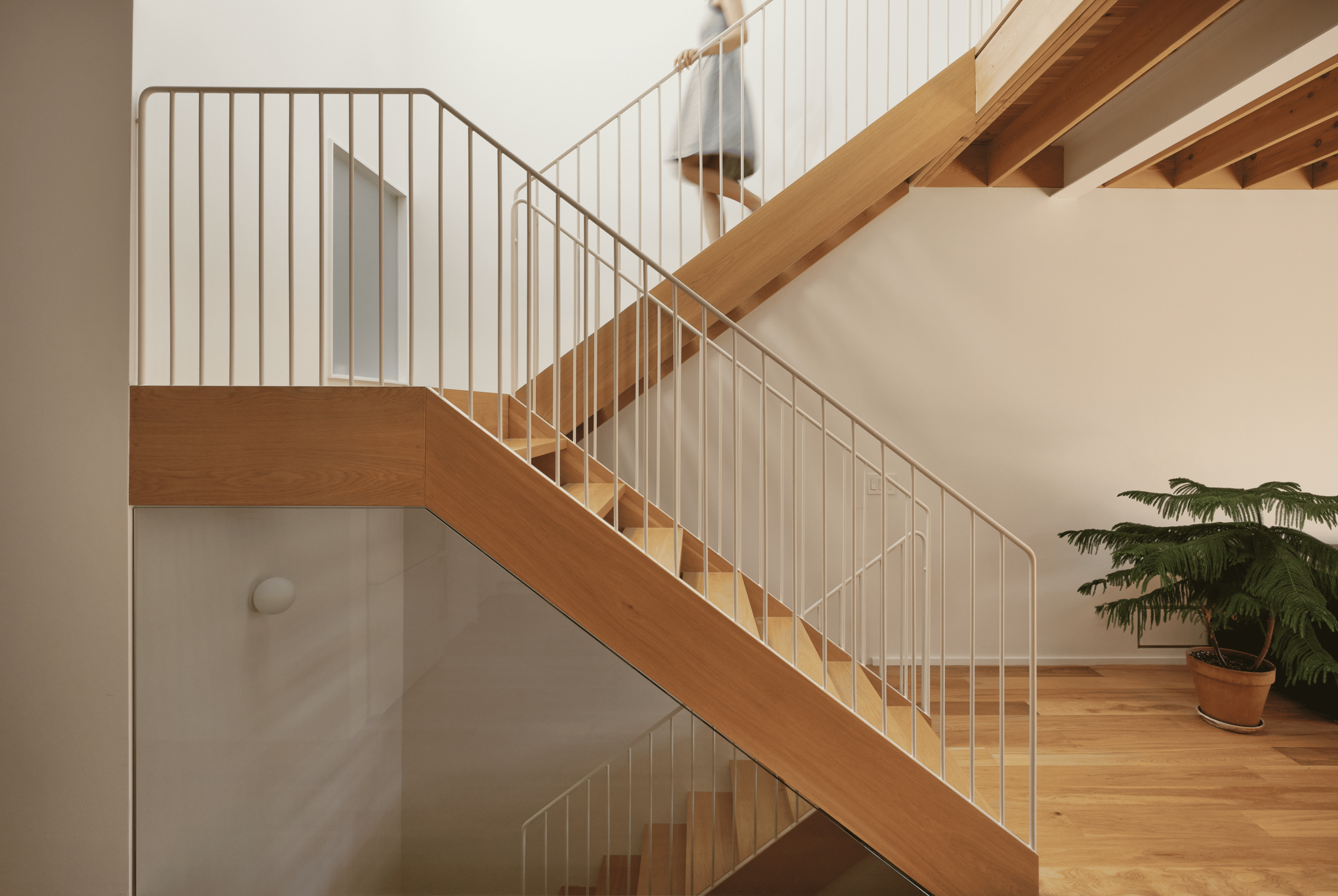
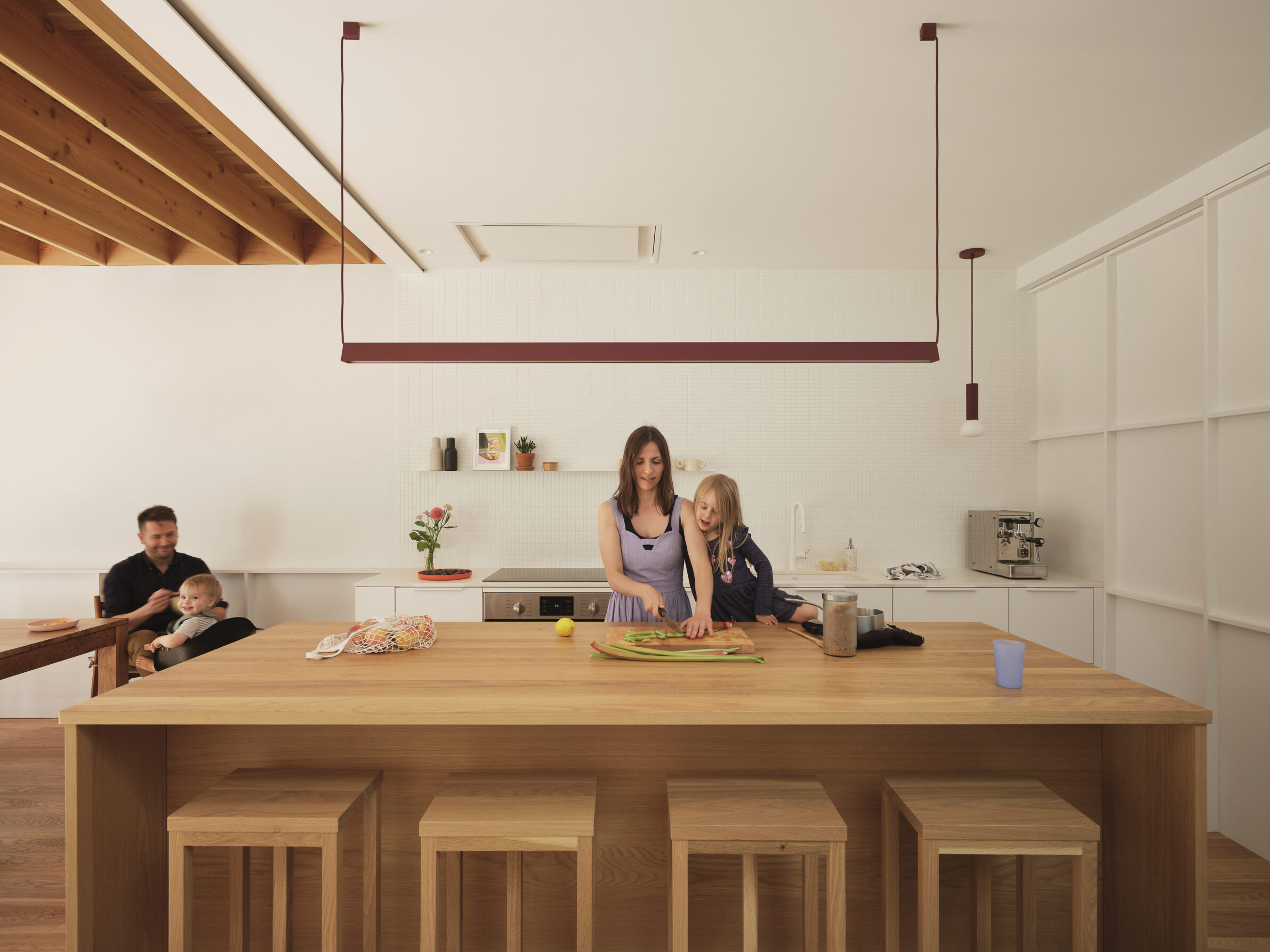
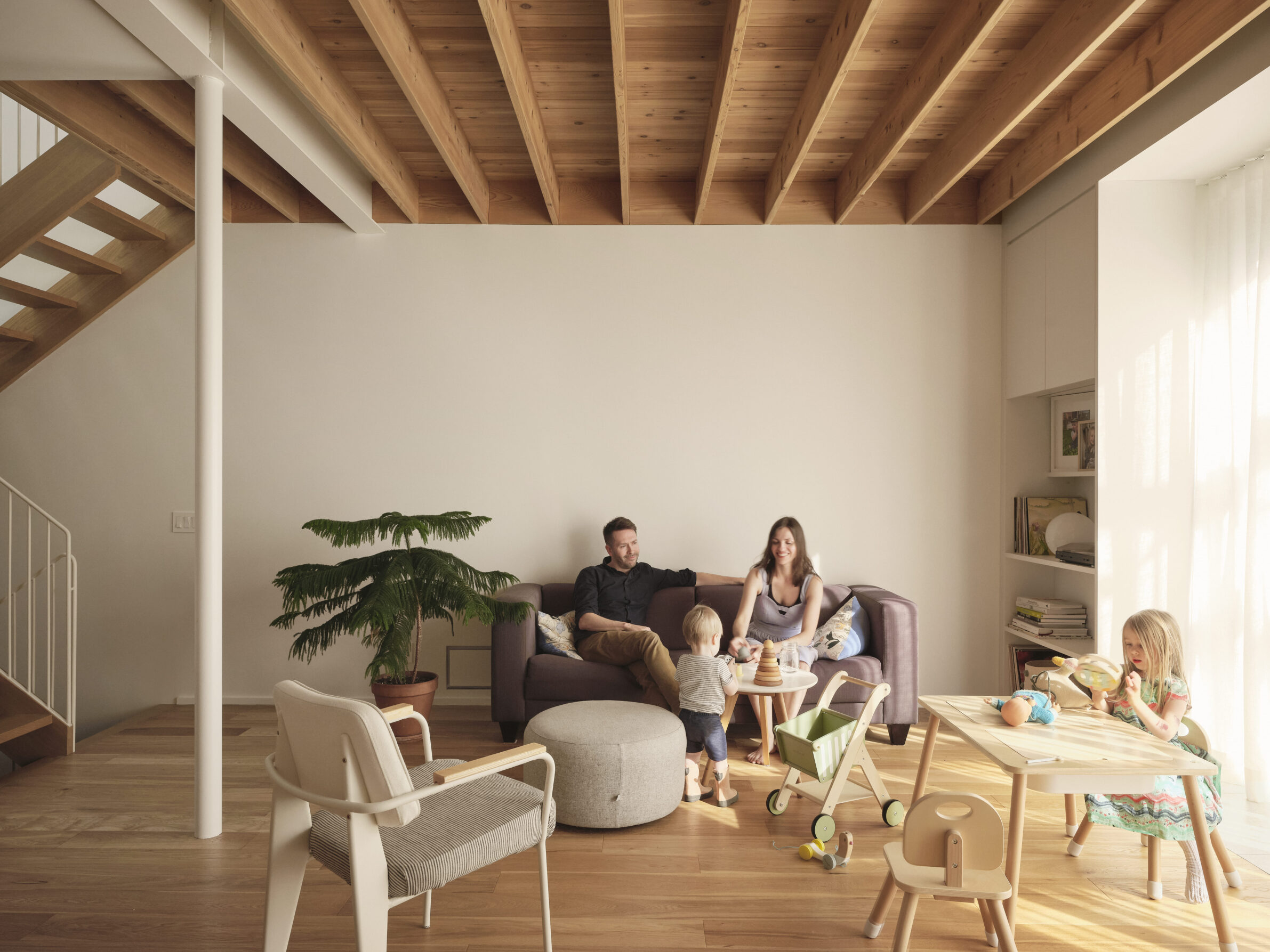
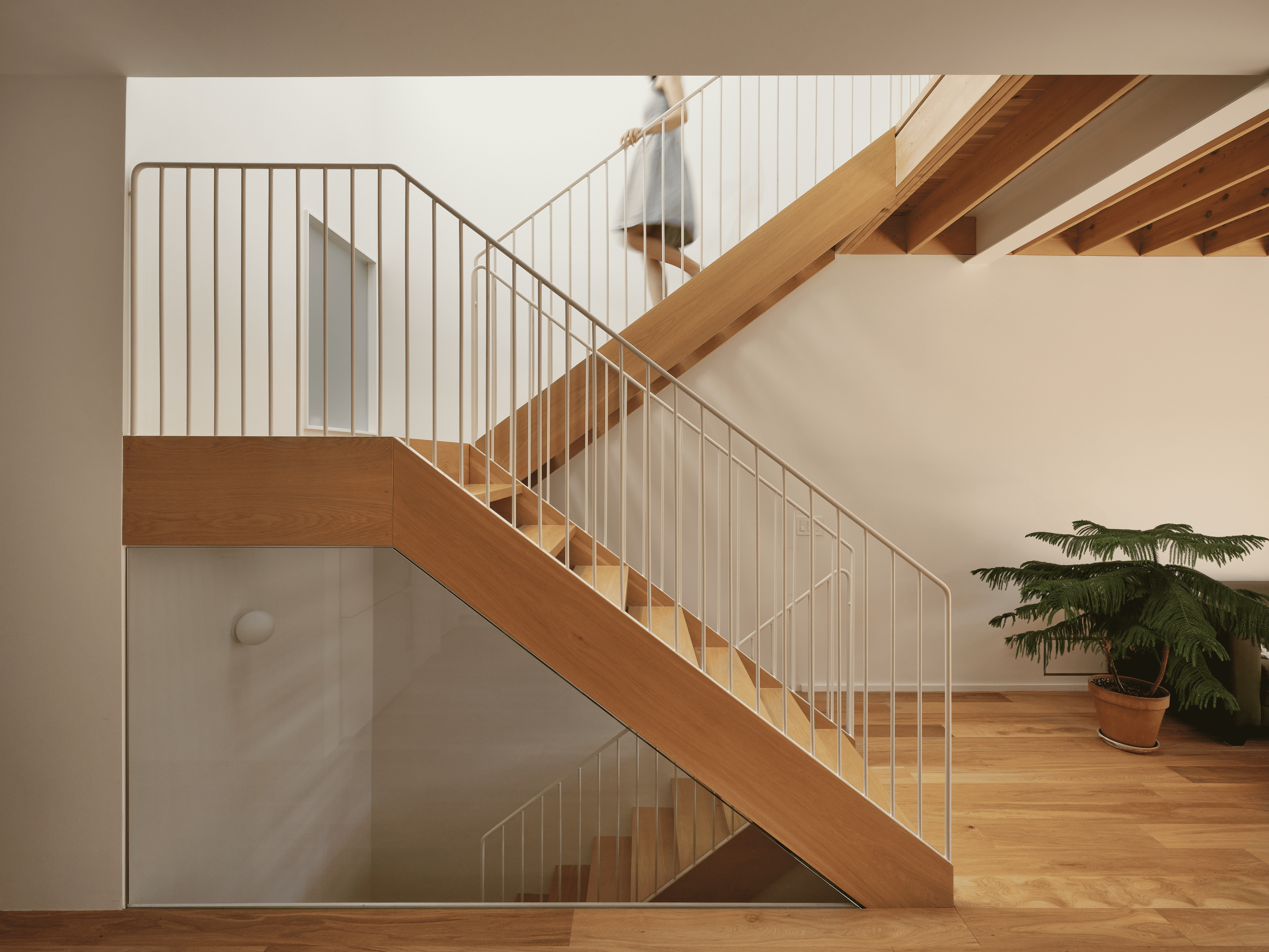
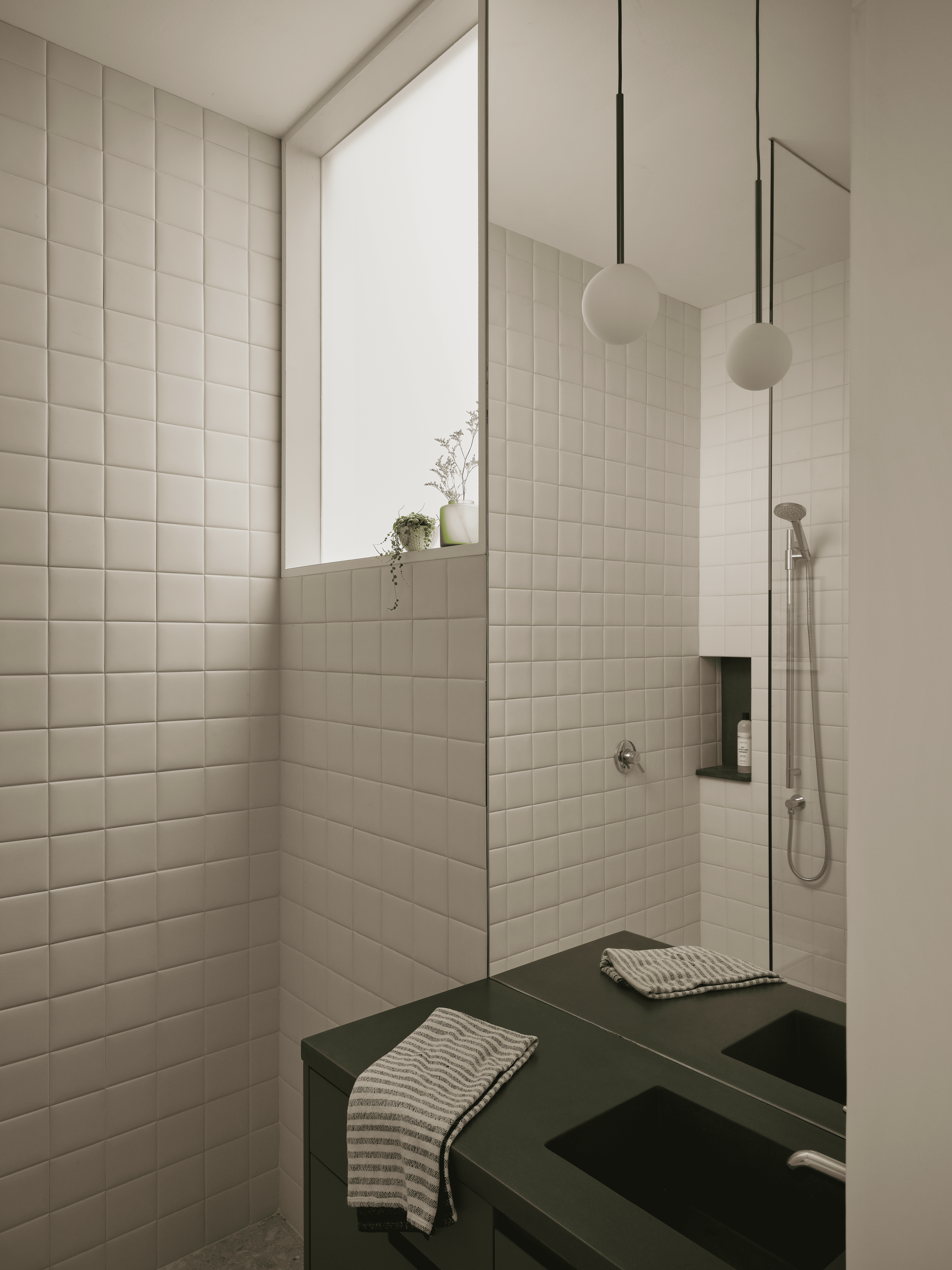
In Montreal’s Villeray neighbourhood, an architect has transformed a narrow duplex into a single-family home for her own family. The ground floor is reorganised into three successive zones that open progressively toward the backyard. The kitchen is treated as a blank canvas of textures and light, against which only two elements stand out as objects: the central island and the staircase, both in white oak. Above the stair, a skylit void framed by a curved form brings in soft light that changes through the day and the seasons. Exposed cedar beams mark the dining and living area, and cedar returns on the restored front balconies. In the backyard, a planted pergola inspired by the neighbourhood’s grapevine supports shelters a new terrace.
7. Casa BO by Alessia Iacovoni
Italy, 2025
Photography: Alessia Iacovoni
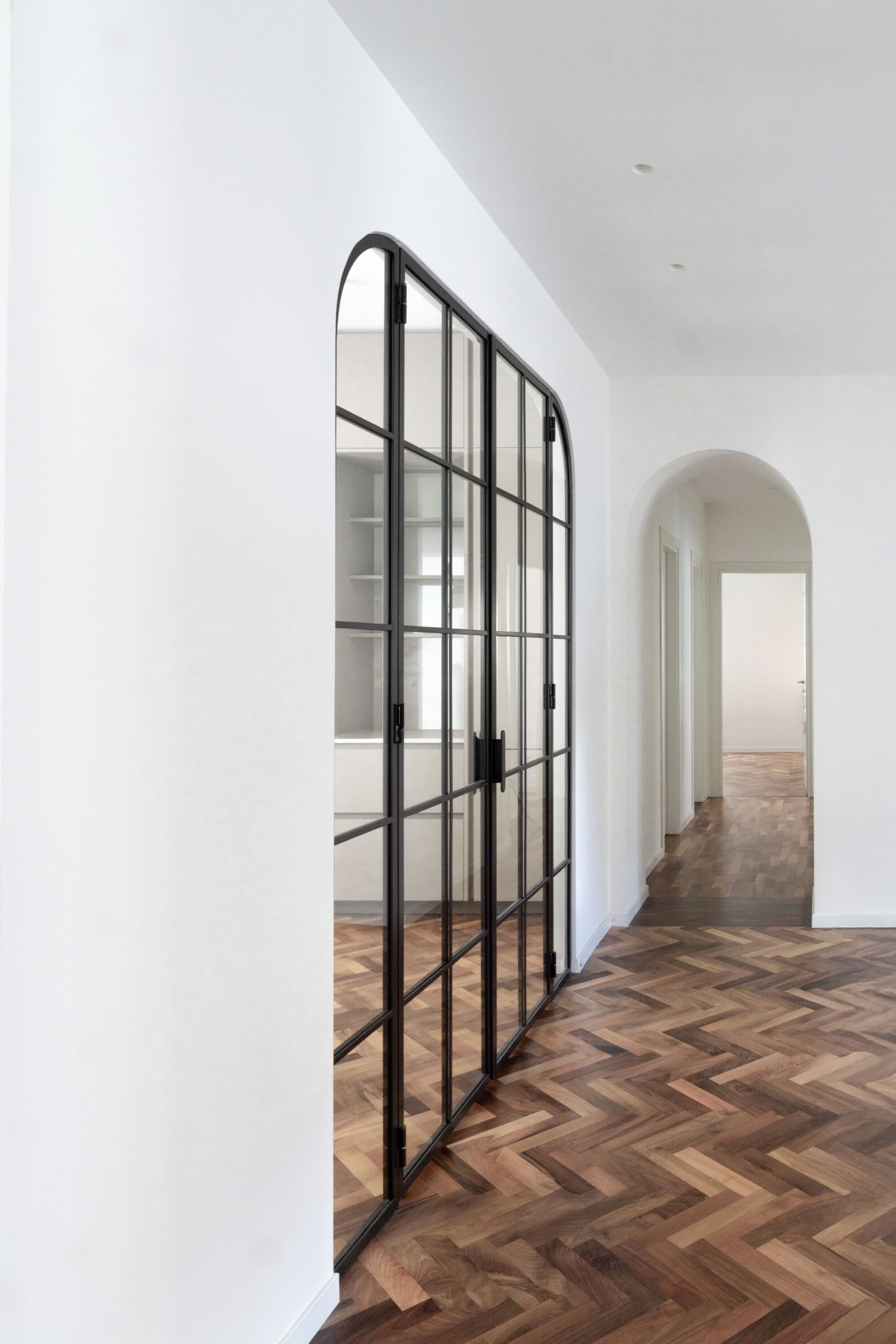
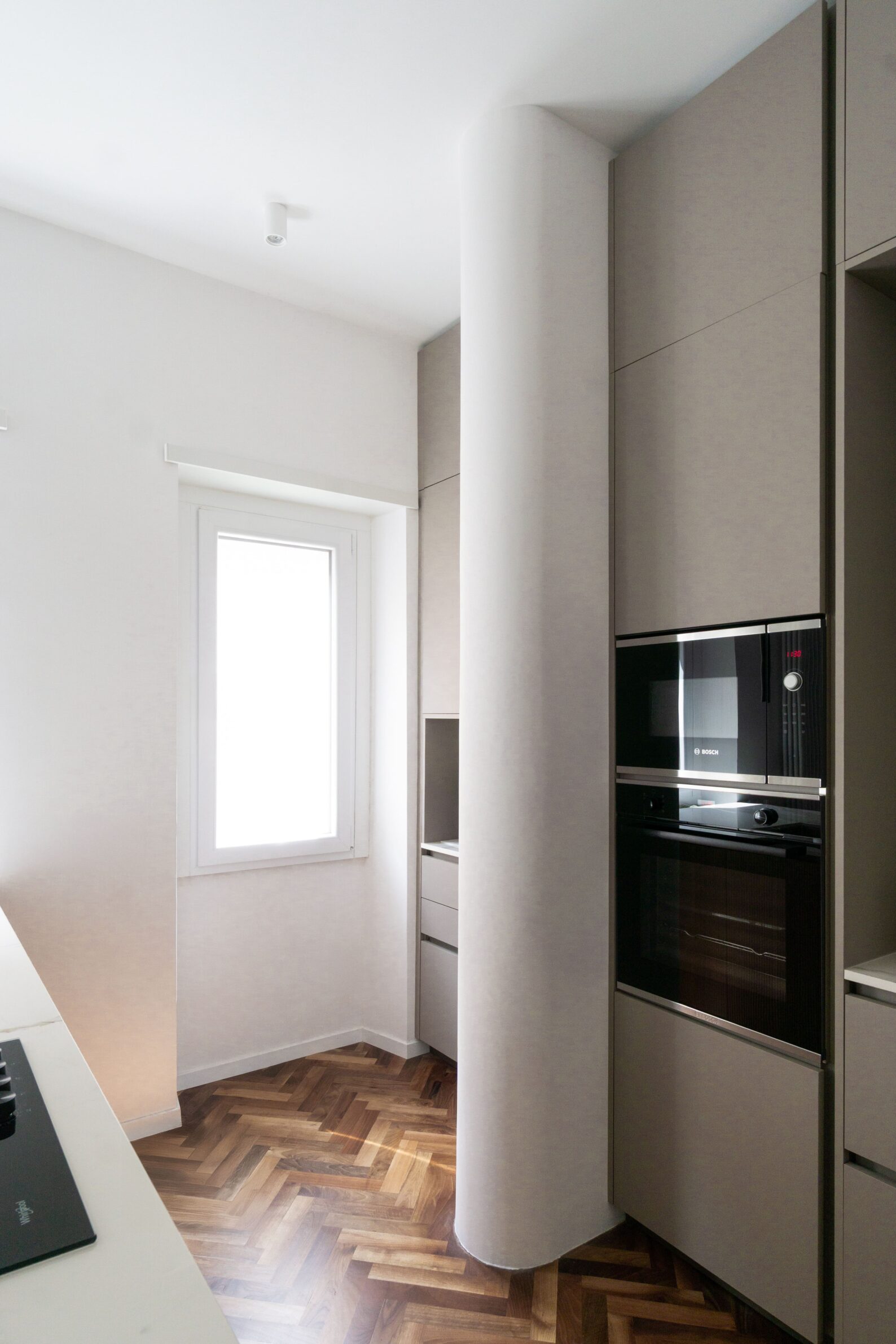
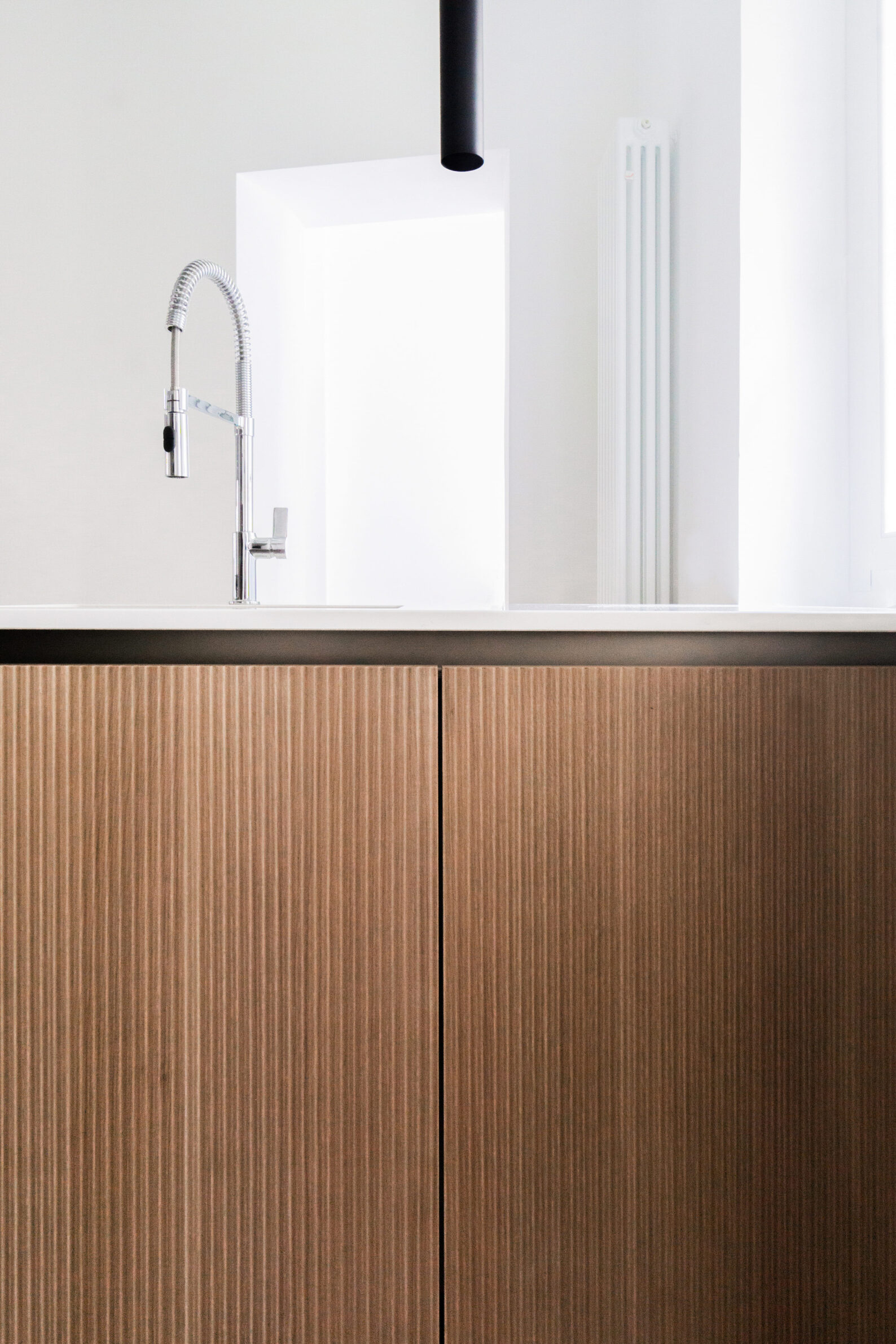
This 145-square-metre apartment in Rome’s Balduina neighbourhood was renovated to open the living area into one continuous space. Living room, dining room and kitchen are linked visually by a handcrafted glass partition in a dark brown iron frame. The palette is built from a few warm materials: walnut parquet laid in an Italian herringbone pattern, a central kitchen module on a light-oak panelled base, and a Calacatta marble island top with curved edges. Soft curves recur throughout the apartment, and neutral wall tones leave the wood and stone to set the atmosphere.
8. Casa 01 by Supersonic Architects
Italy, 2025
Photography: Marcello Mariana
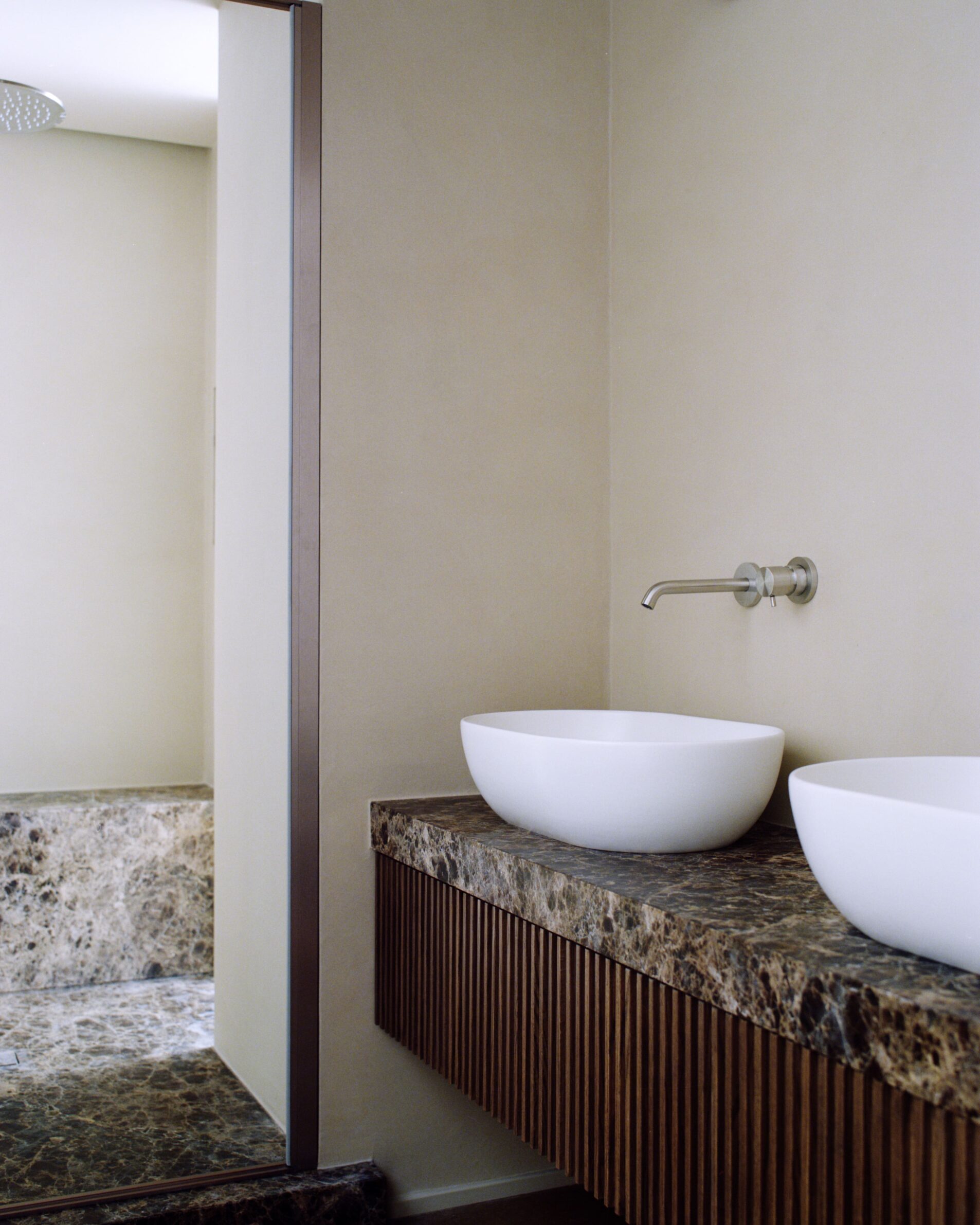
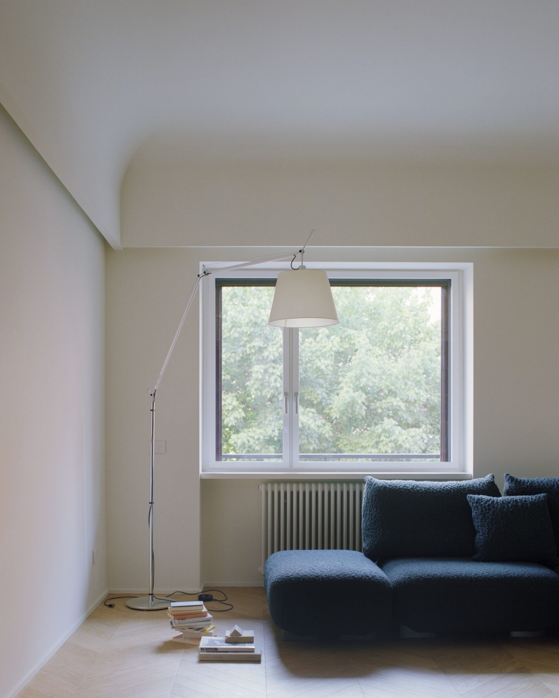
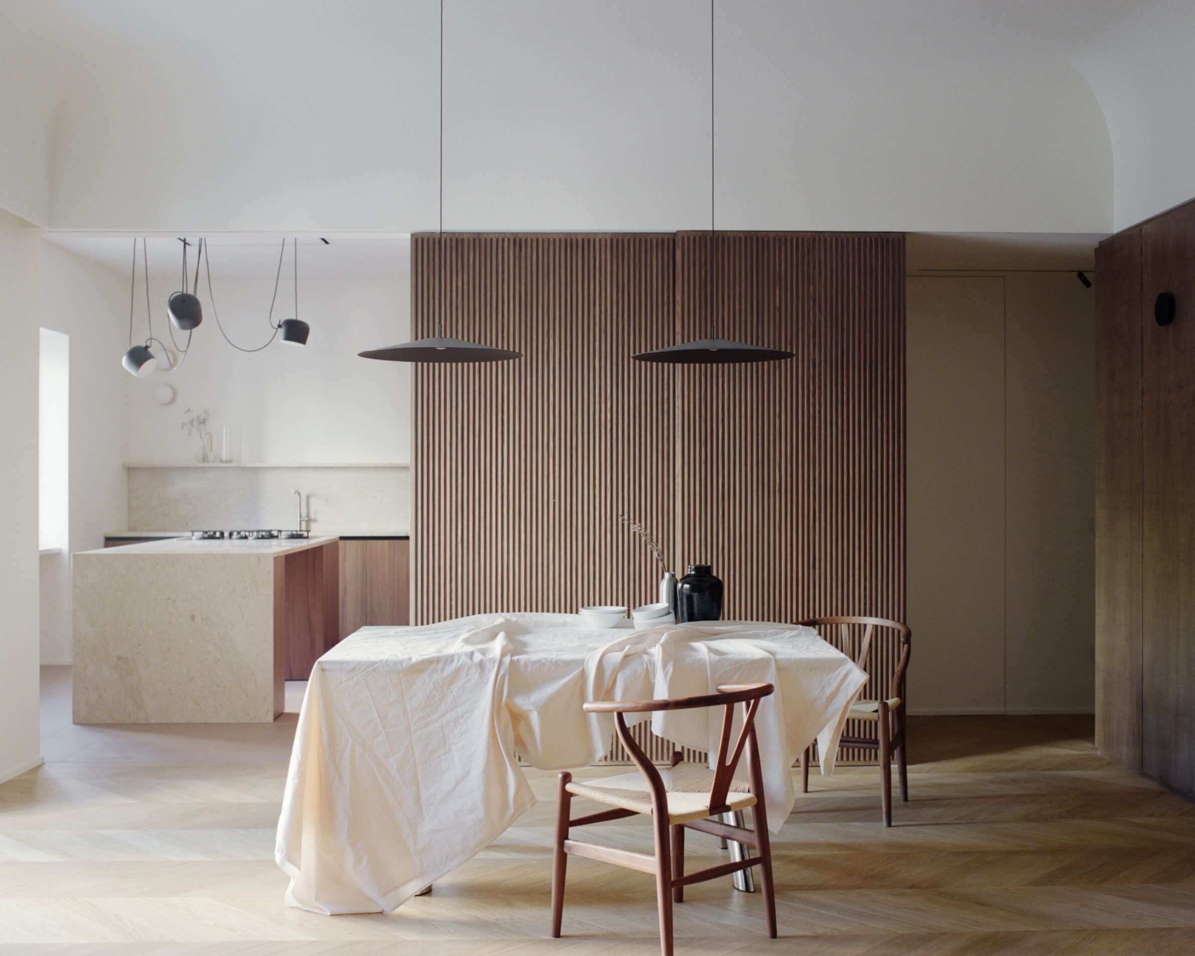
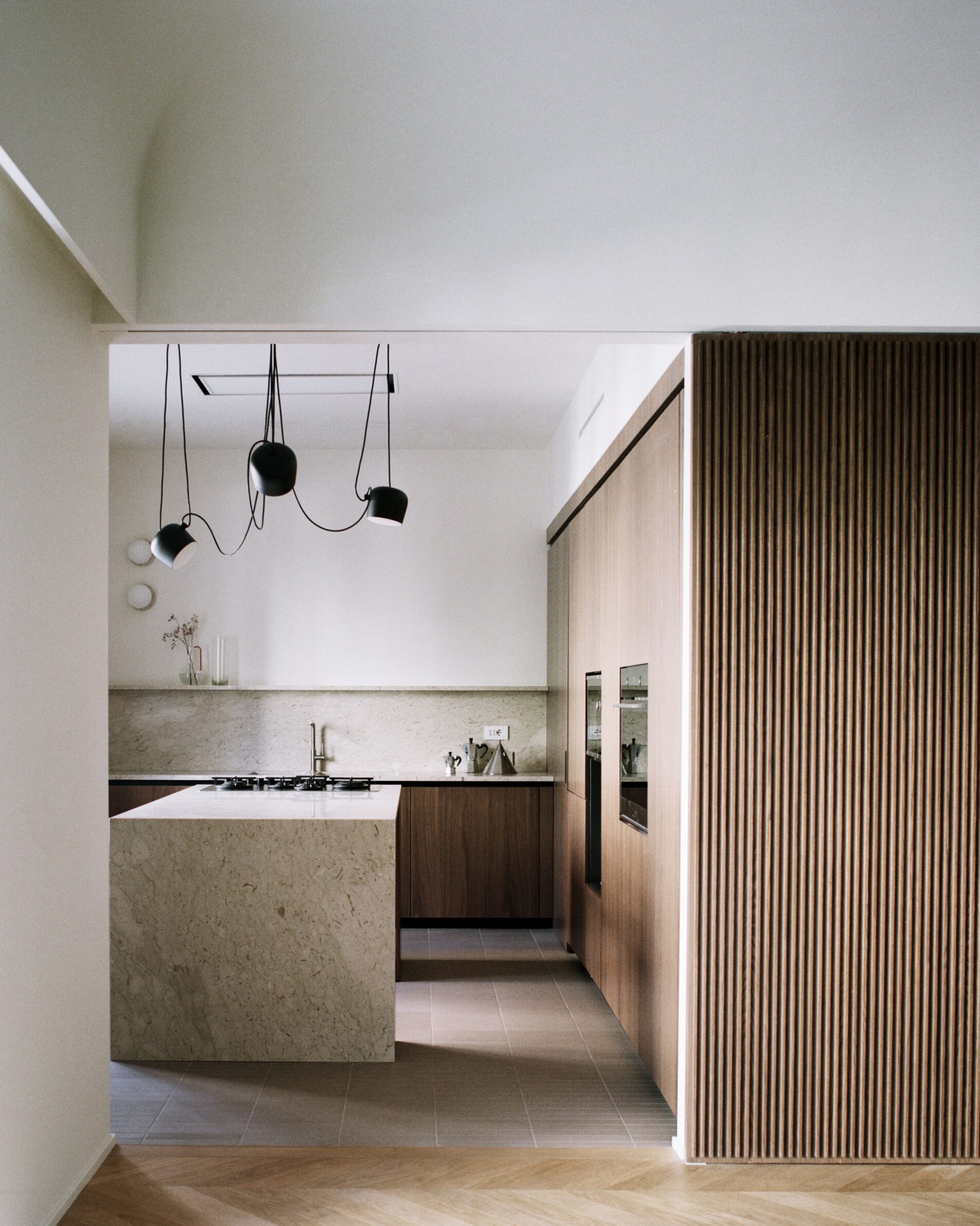
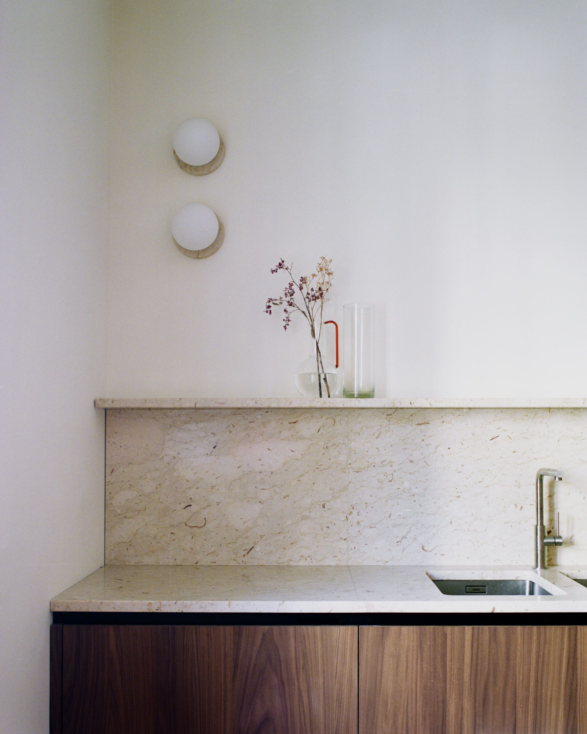
Also in Rome, this apartment renovation uses the ceiling as its main device. A series of vaults shapes the atmosphere of each room while connecting them into a single continuum, guiding movement through the home. A custom wardrobe system works as both storage and organiser, drawing a path from the entrance through the living areas to the private rooms. The materials are few: natural marble surfaces set against precise wood joinery. With no added decoration, the apartment relies on proportion, rhythm and craft for its character.
Edited by: Kristina Beltram; Cover image: ADD COVER IMAGE CREDIT
______
Selections is an editorial series in BIG SEE Magazine that presents carefully curated architecture, interior, and product design projects. Each article explores a specific theme, question or typology, highlighting projects that help us better understand the ideas, values and directions shaping the built environment today.
What do you believe is still worth creating?
We invite you to share your perspective on this season’s question. Your response will help us understand the ideas, challenges and aspirations shaping today’s creative community. As a thank-you for your contribution, participants will receive a complimentary ticket to the upcoming BIG SEE event.
Selected Works
___
Edited by:
Kristina Beltram
Cover image:
Maxime Brouillet
Be There.

Powered by