


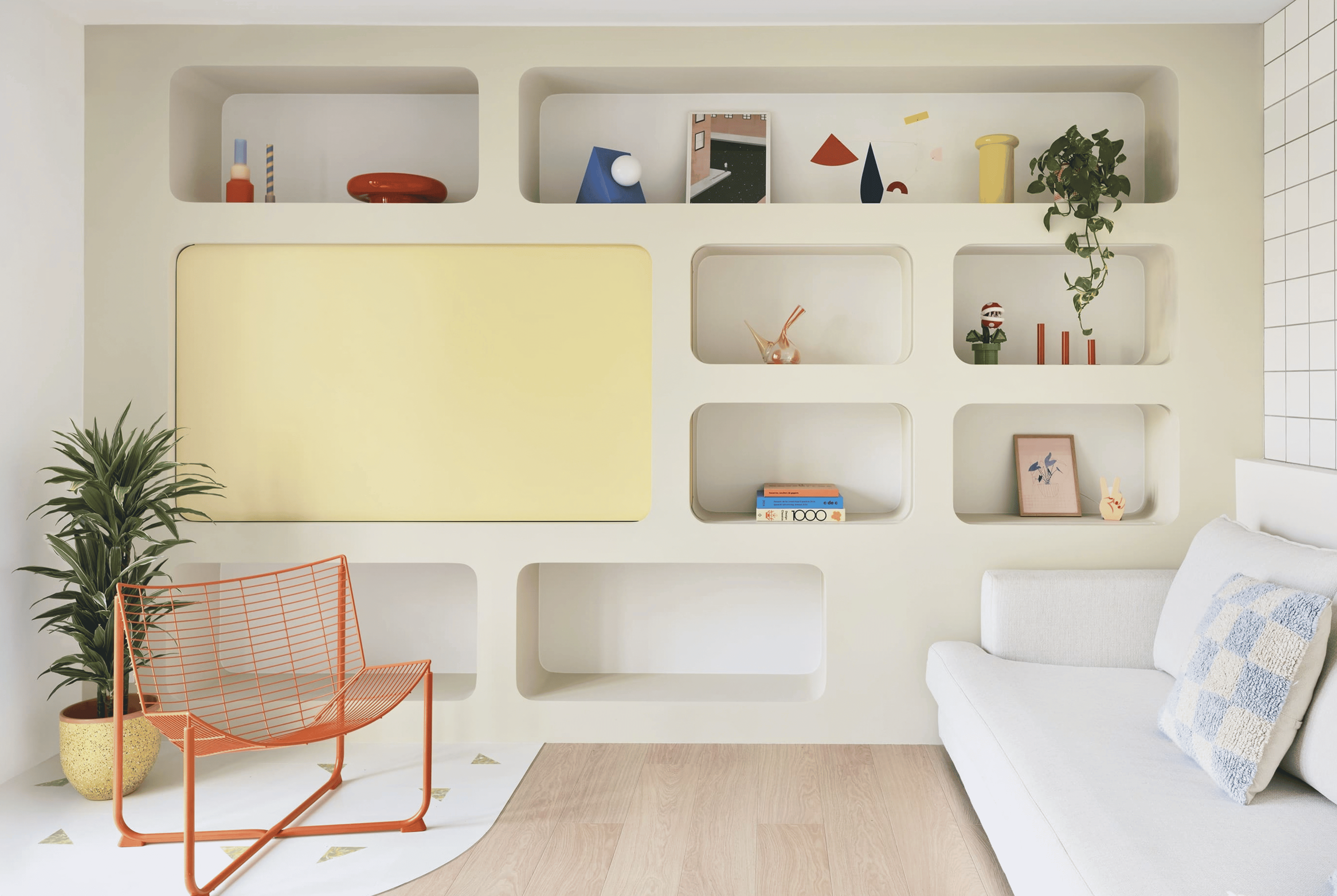
The strategies vary. Some architects took walls out and let a single element organise the room: a storage column in Tokyo, a loft deck in Singapore, a curved kitchen counter in Barcelona. Others kept the original plan and worked through surface and light, with continuous terrazzo or timber floors, curved ceilings and a deliberately short list of materials. Built-in furniture appears in almost every project, folding desks, hidden televisions and wardrobes that frame a bed, so that storage becomes part of the architecture rather than something added to it.
The projects are ordered roughly by size, from the smallest to the largest. Small is relative: at 86 or 110 square metres, a flat may be generous by one city’s standards and tight by another’s. What links them is the attention paid to each square metre, and the evidence that a home’s quality depends less on its area than on how carefully that area is used.
1. Two colors in 26 m2 by Paola Sola architetto
Italy, 2024
Photography: Dario Borruto
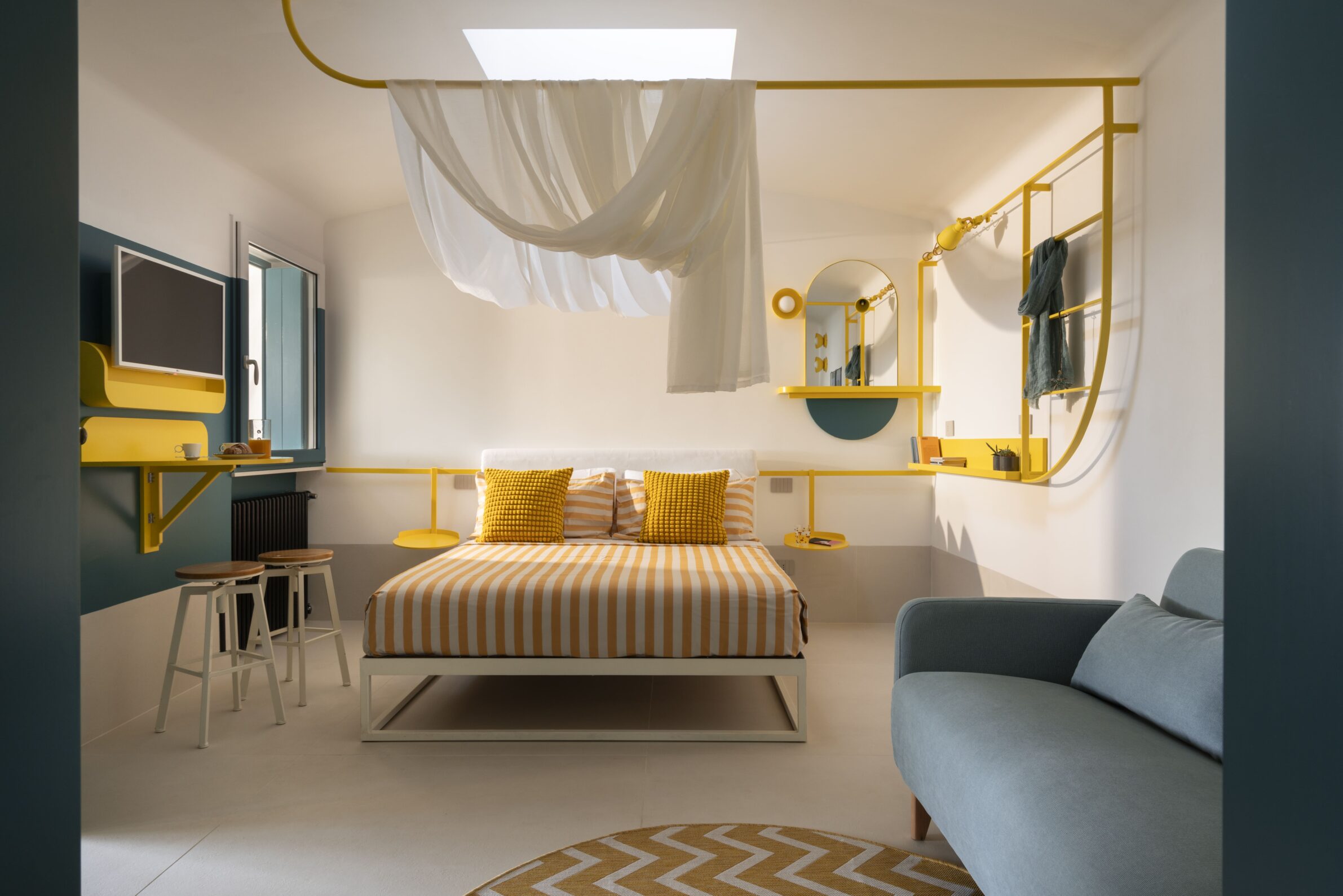
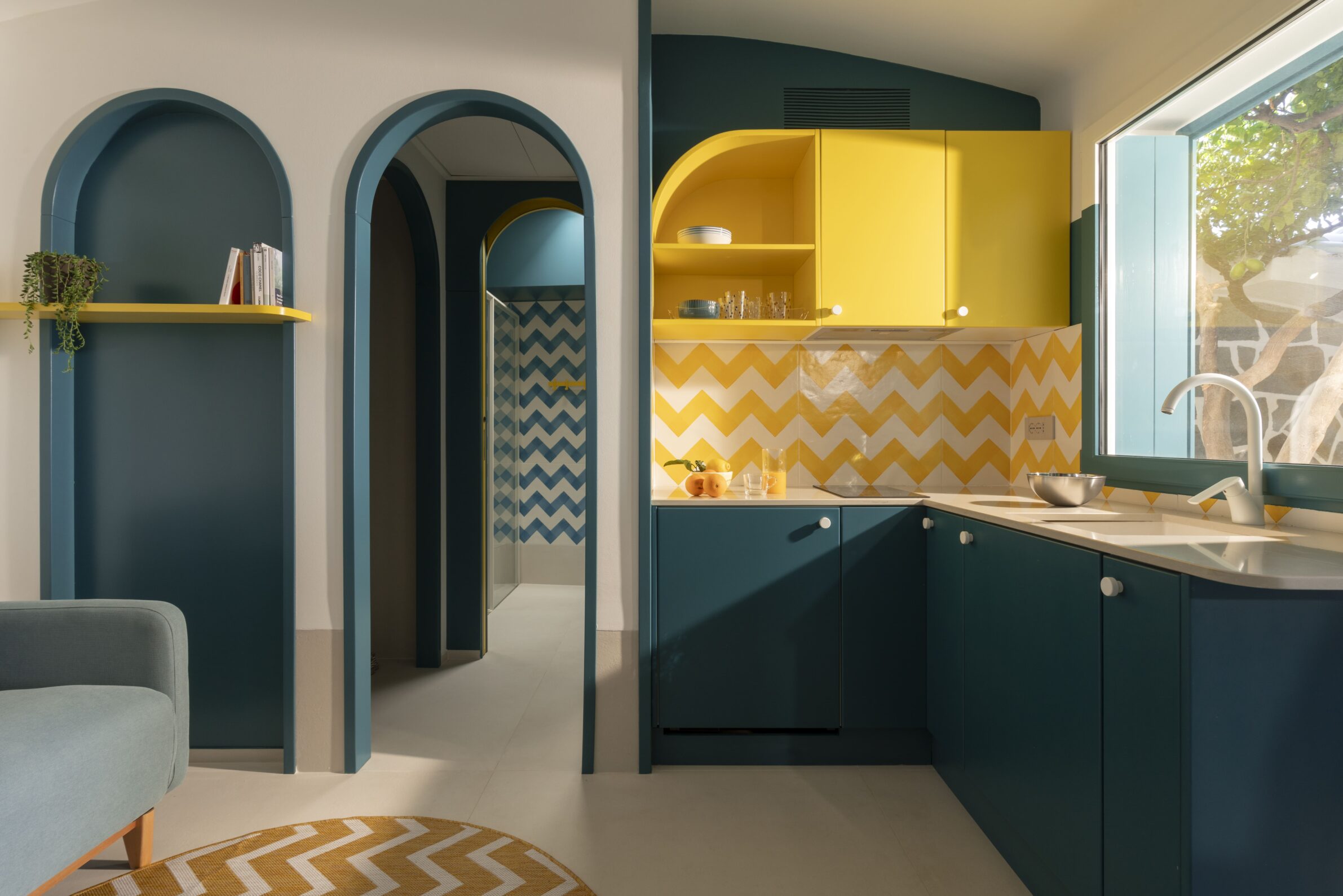
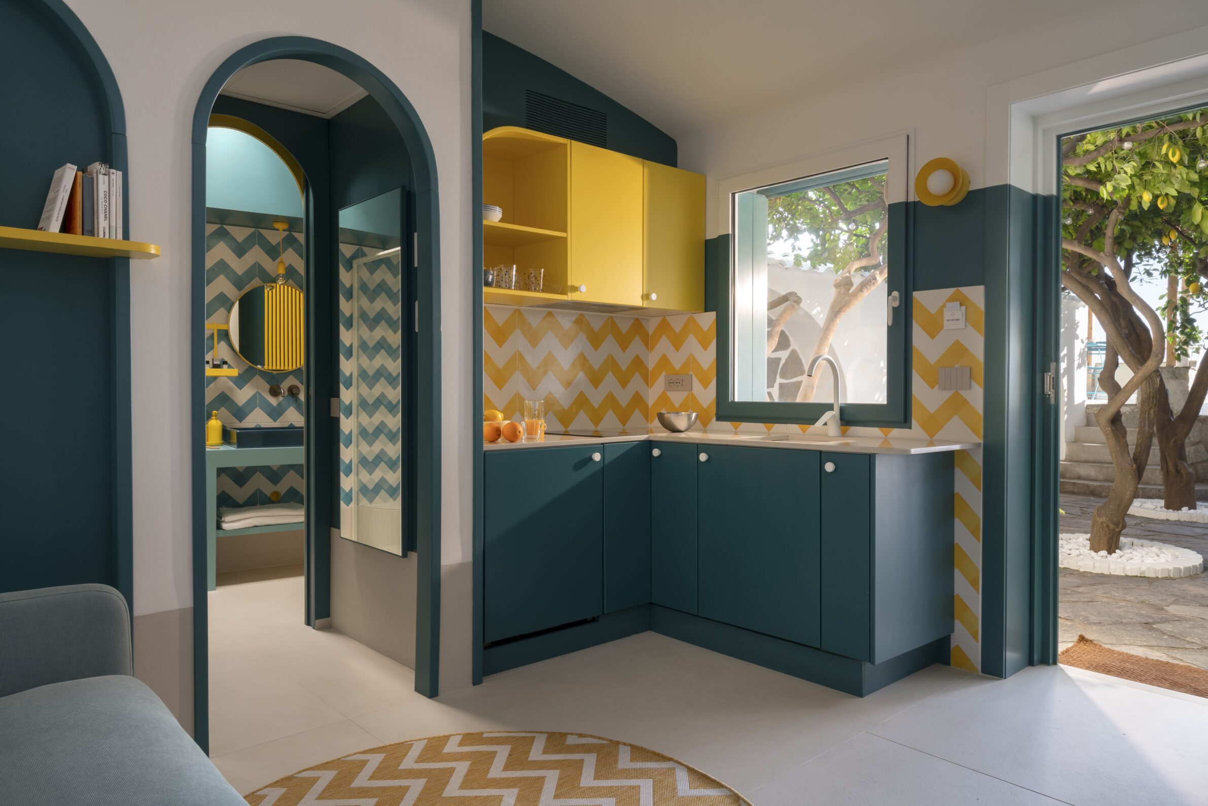
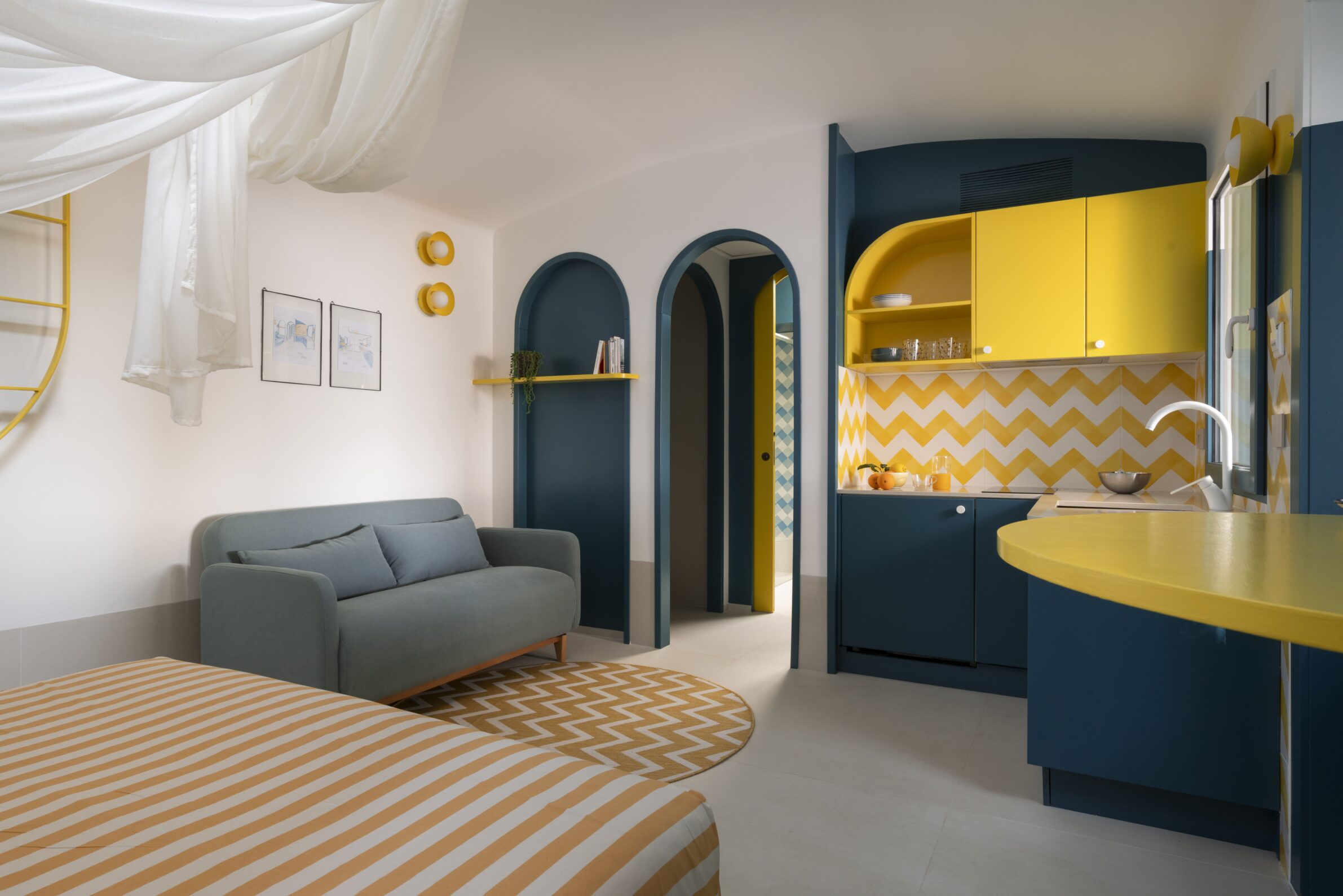
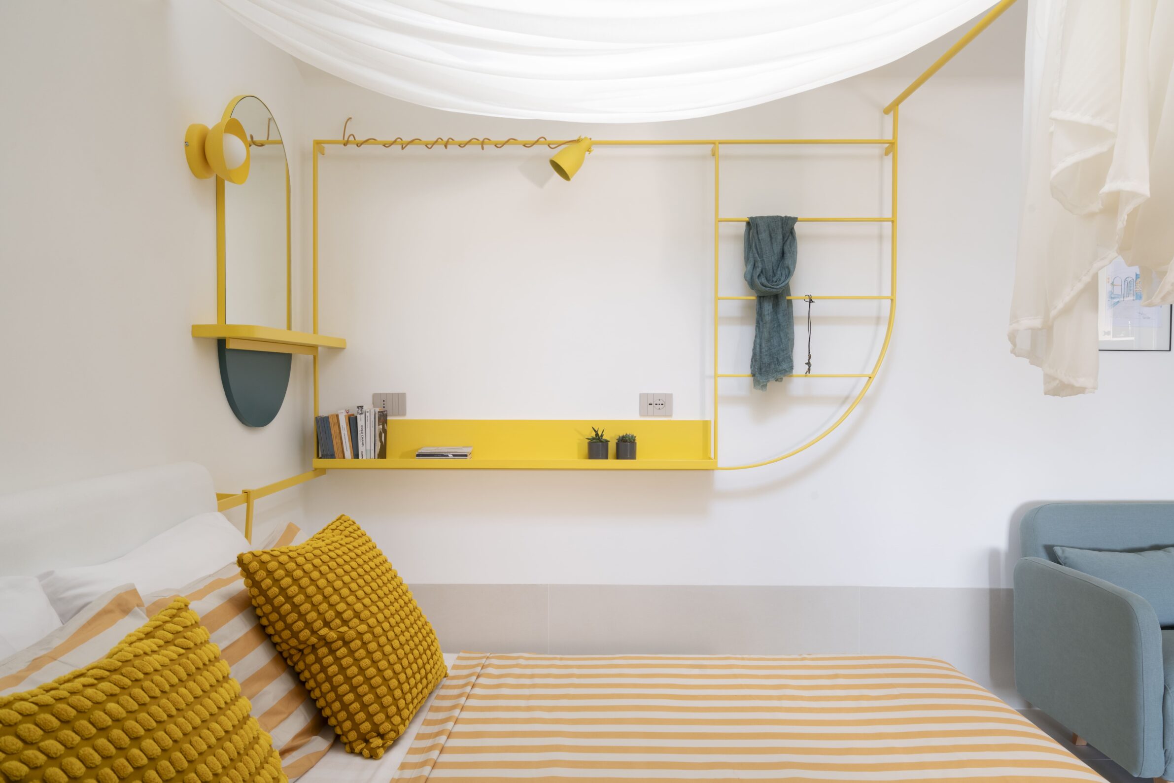
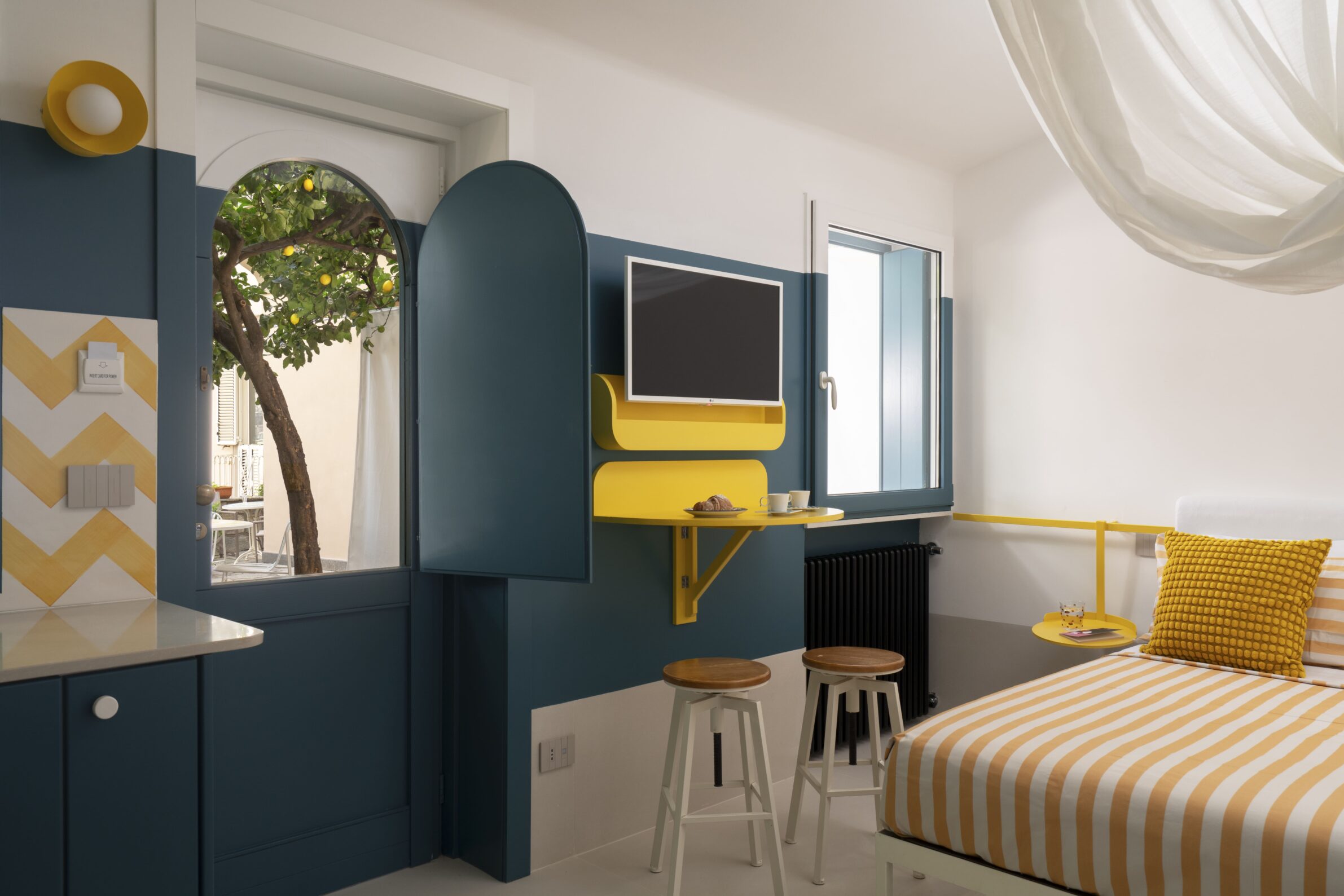
On the Posillipo hill in Naples, an annex of a large villa, once a family pied-à-terre with three blind sides, has become a 26-square-metre holiday home. It is reached through a courtyard of about 50 square metres, shaded by lemon trees that form a natural pergola and used for meals outdoors. Inside, a sequence of arched openings separates the bedroom from the bathroom and holds a small walk-in wardrobe, with technical equipment hidden behind mirrored panels. The single room combines a kitchenette beside the entrance, a folding snack table, a sofa bed and a double bed beneath a skylight. Windows, doors and shutters are painted blue, while yellow appears in custom iron rails that carry shelves, a mirror and the canopy over the bed. Vietri ceramics by Arcea line the kitchen and bathroom.
2. Room in Nishiogikubo – A Column in the Room by Office Yuki Konko + texte
Japan, 2021
Photography: Yuki Konko
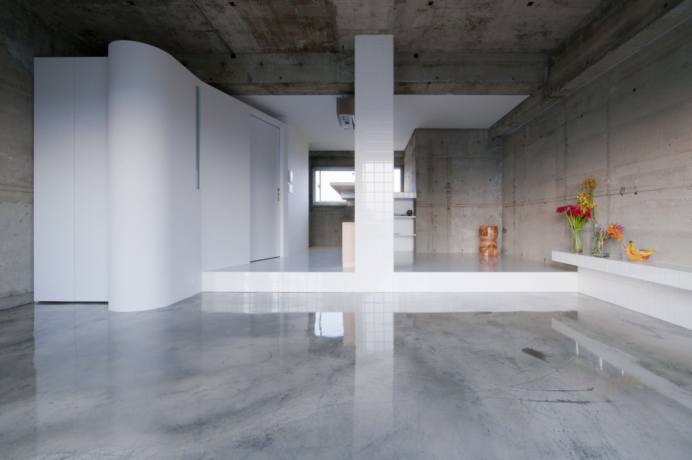
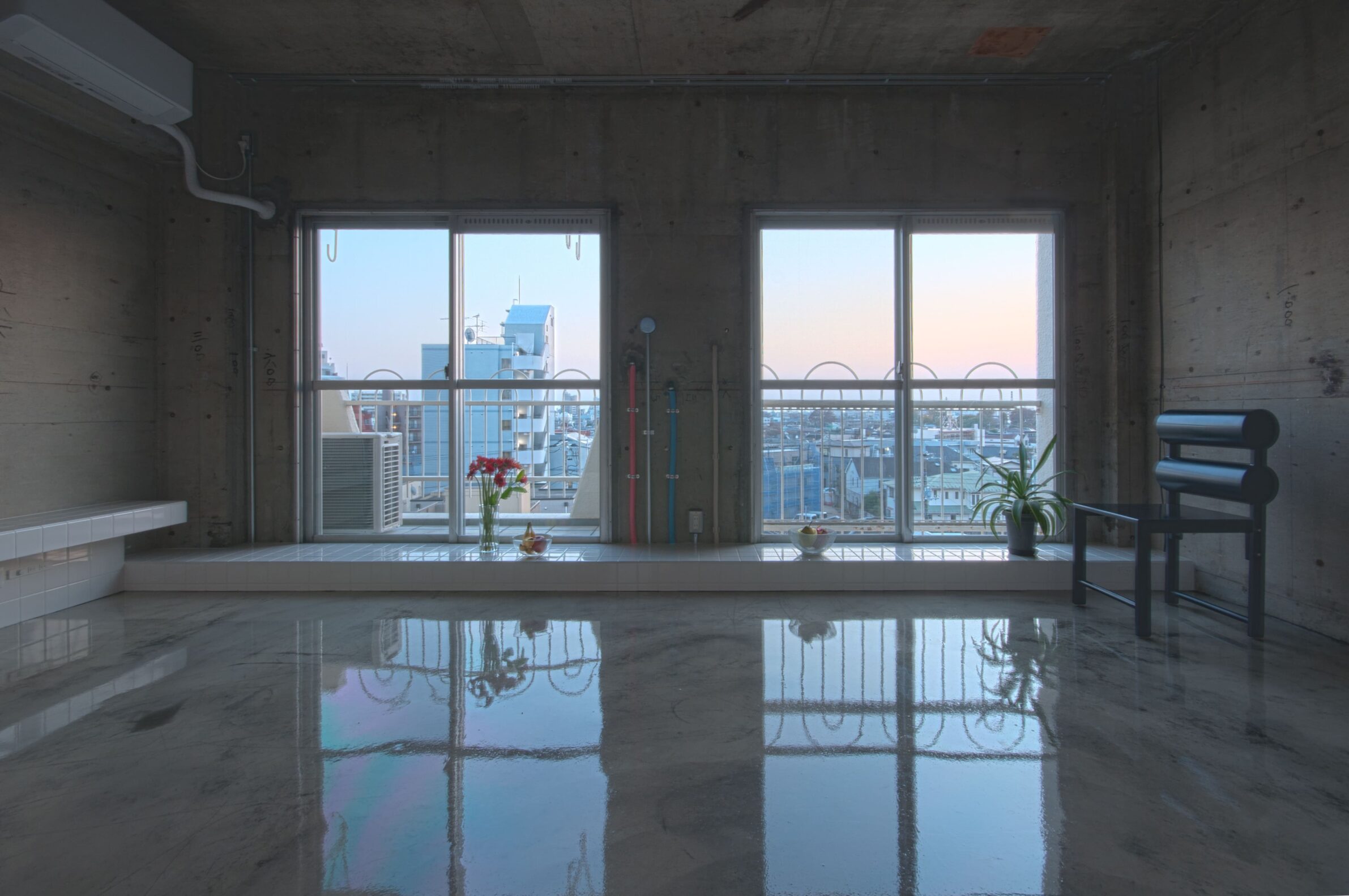
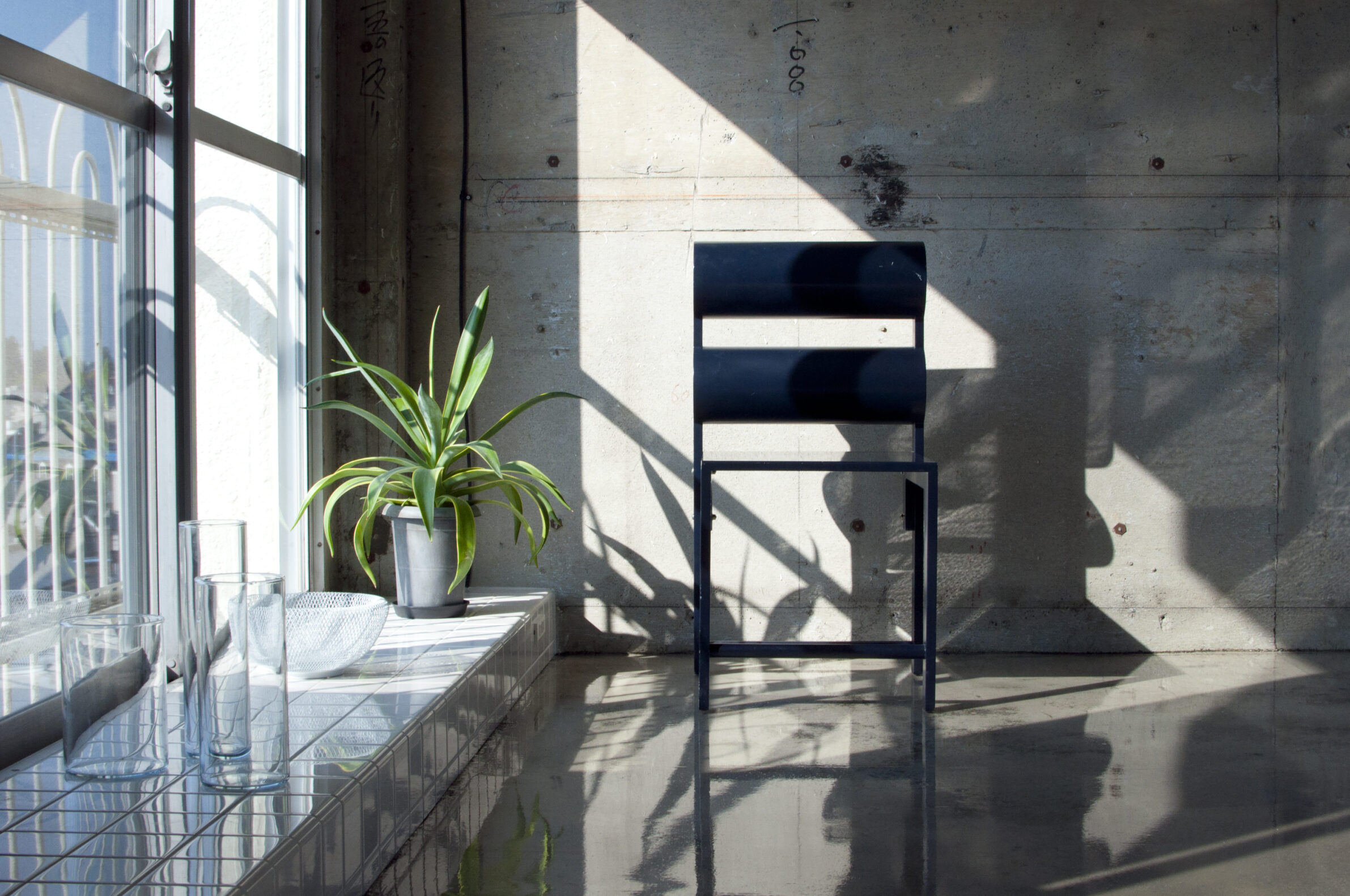
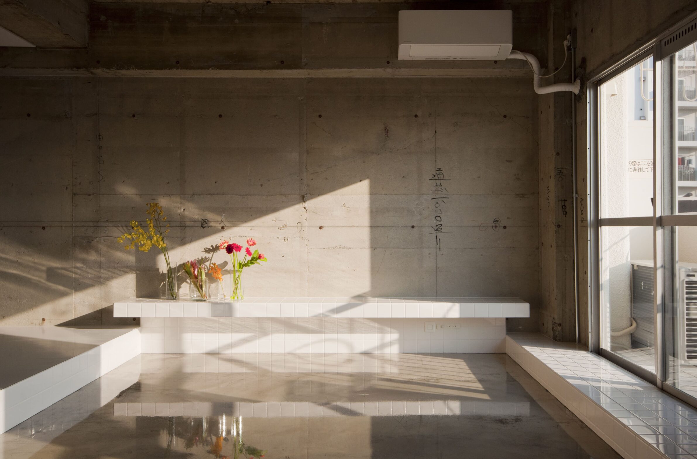
This 36-square-metre apartment in Tokyo had the “dining kitchen plus two rooms” layout that was mass-produced in Japan after the war and still survives in many buildings. The architects removed all the partitions and placed a single column, 400 millimetres square, in the middle of the room. It contains storage and organises the space around it, linking the areas and loosely separating them without walls. The studio compares it to the daikoku-bashira, the main column of a traditional Japanese timber house. With the partitions gone, light and air move through the whole flat, and daylight reflected from the glossy floor plays across walls and ceiling, setting the 50-year-old rough concrete against new white wallpaper and tiles.
3. IP039 apartment with river view by GIKU
Lithuania, 2025
Photography: GIKU
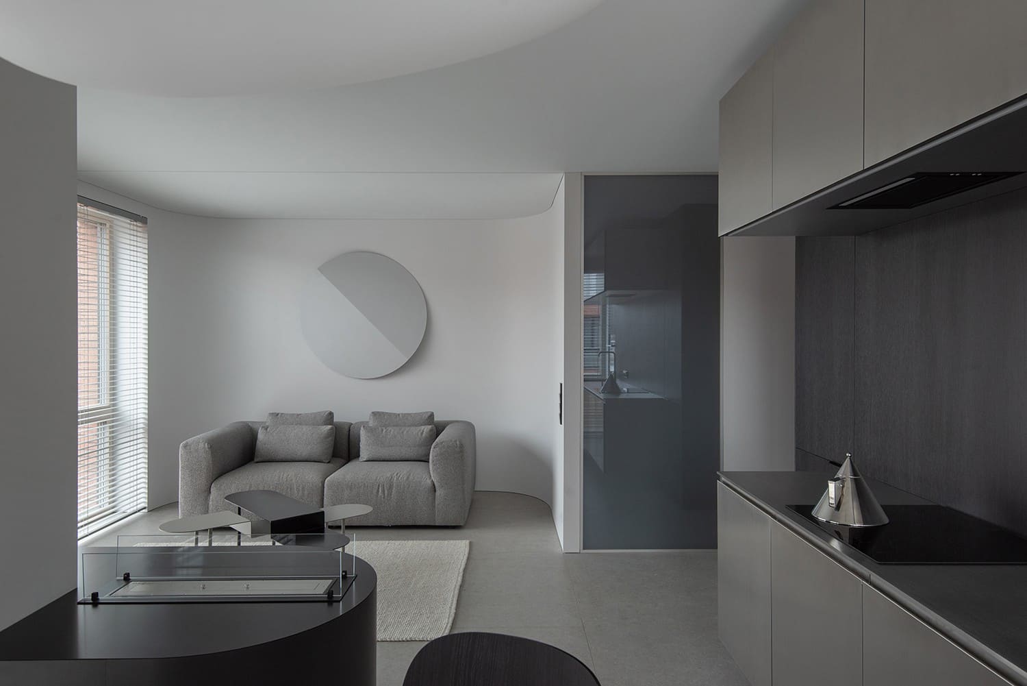
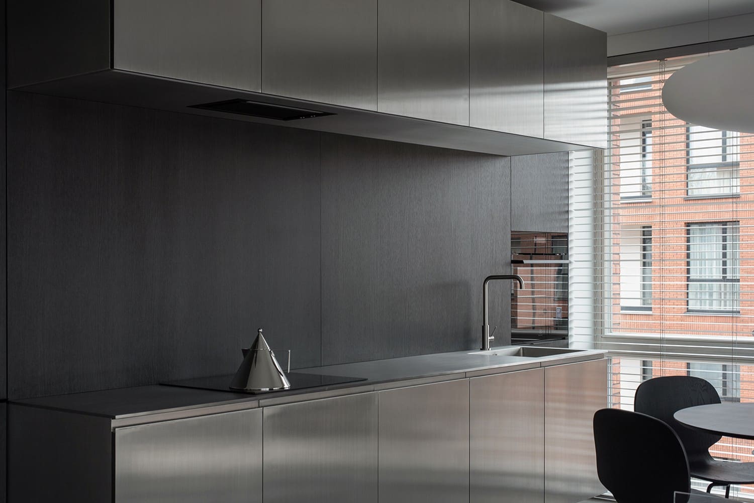
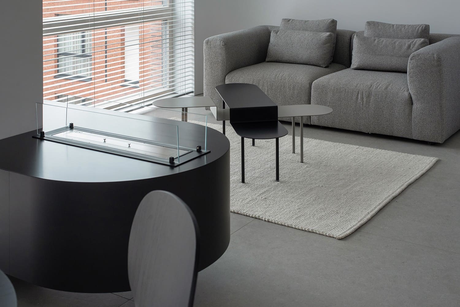
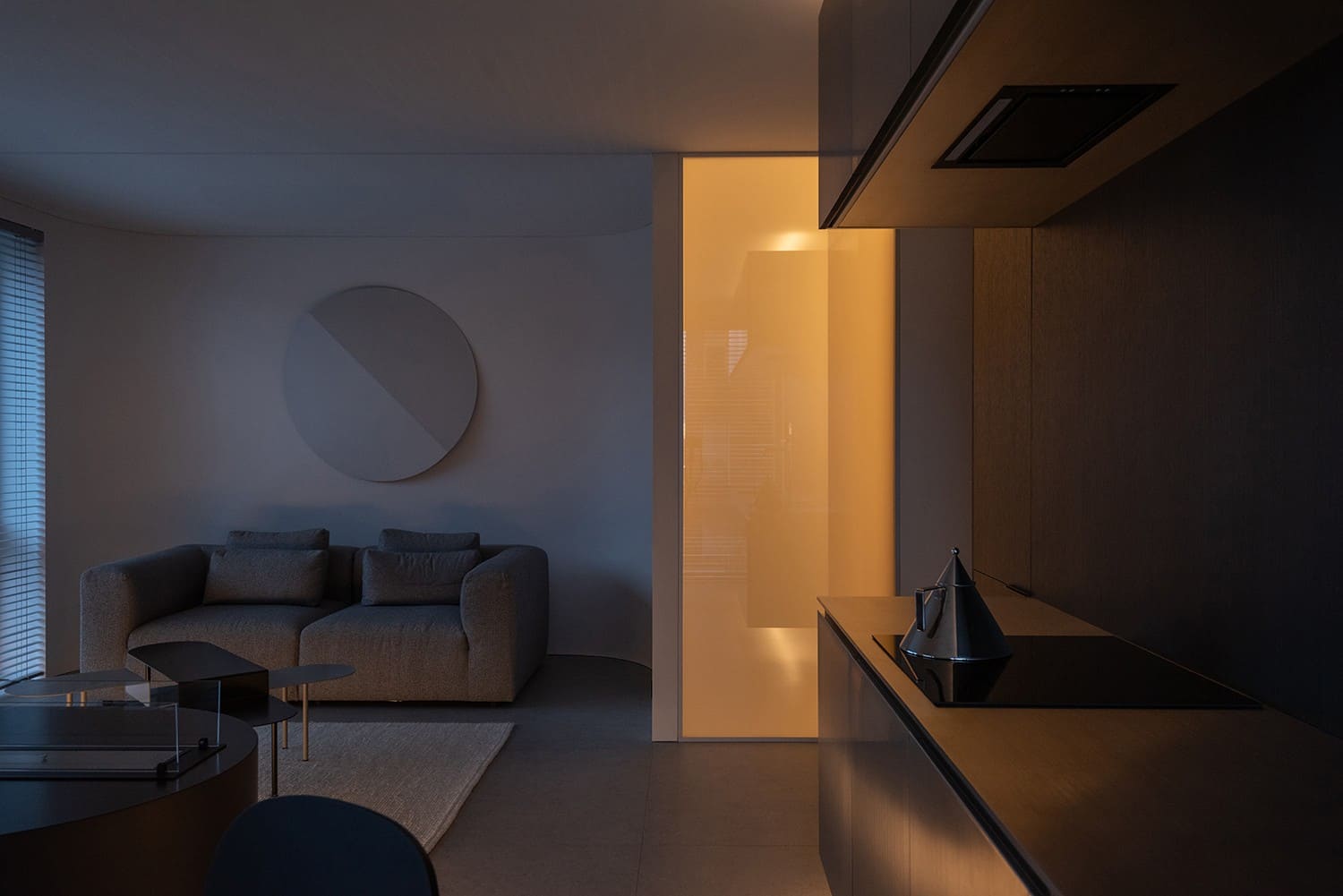
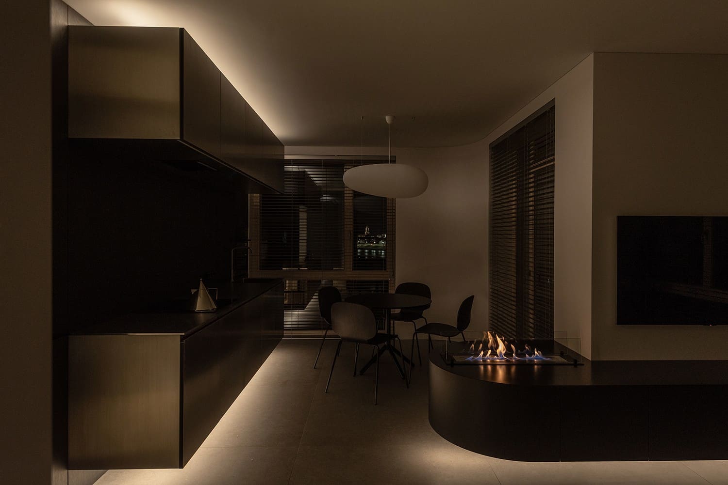
On the bank of the Nemunas in Kaunas, this compact apartment is designed as one continuous space. Walls and ceilings meet in soft curves, so that the small plan reads as larger than it is. The palette is limited to brushed stainless steel kitchen fronts, dark-stained oak panelling, grey porcelain floors and a rounded black volume housing a bioethanol fireplace. Venetian blinds filter daylight; at night, concealed cove lighting follows the curved ceiling and a translucent glass partition is lit from within. Handleless joinery and a freestanding cylindrical washbasin with a ceiling-mounted spout follow the same restraint, leaving the view of the river as the main feature.
4. Pri Mýte by Zly architekt
Slovakia, 2026
Photography: Zly architekt
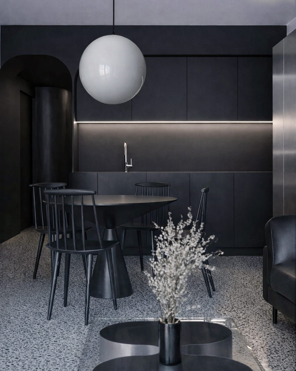
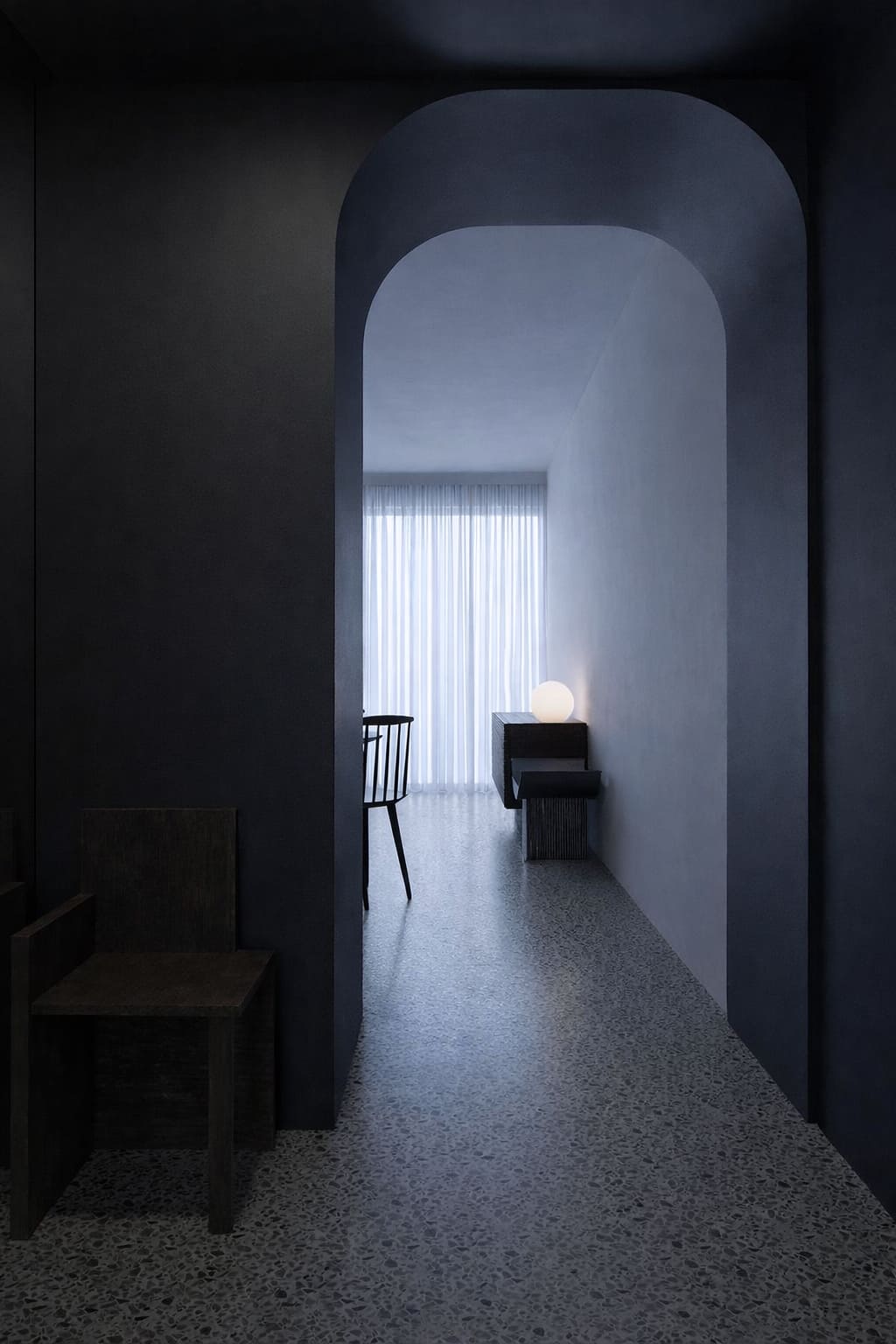
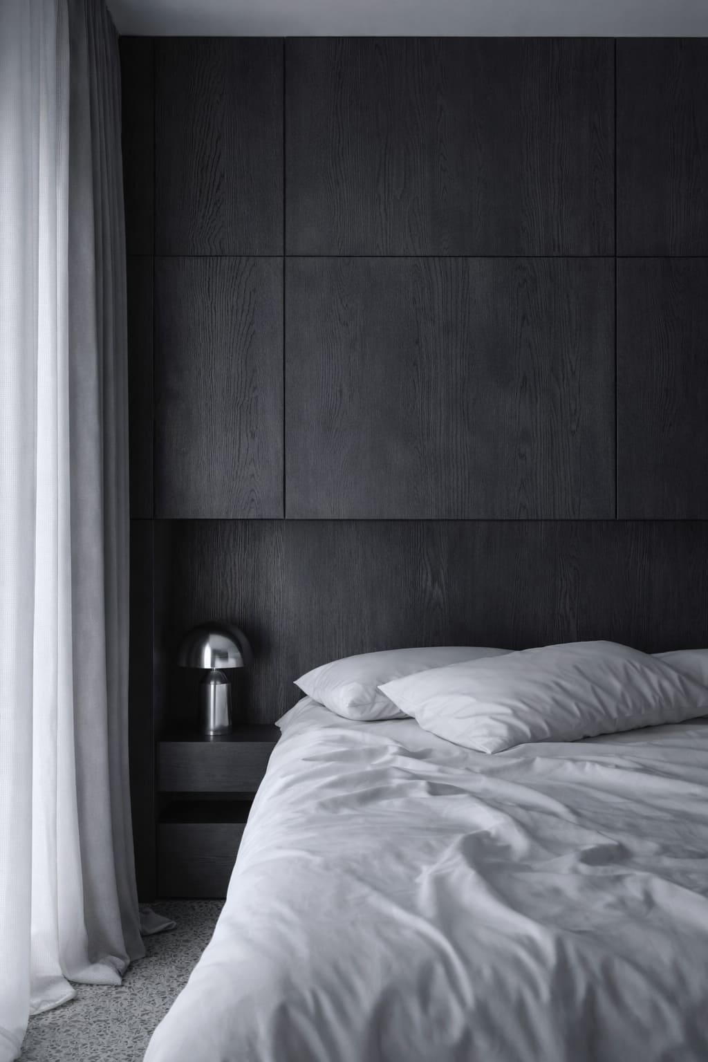
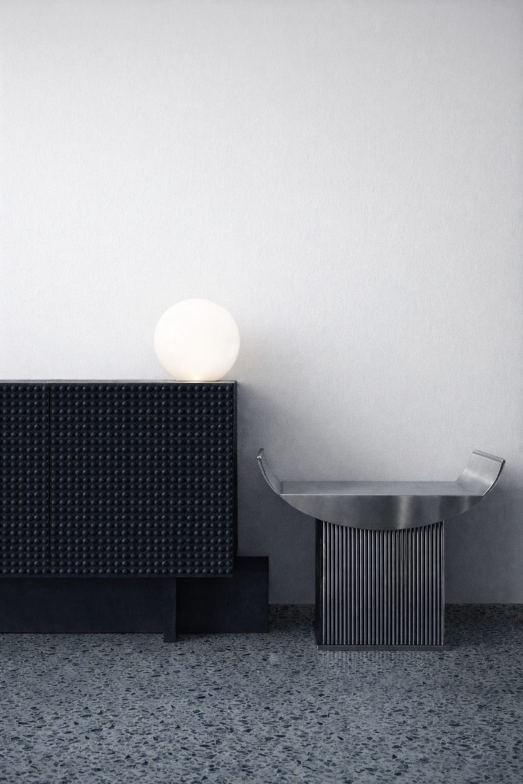
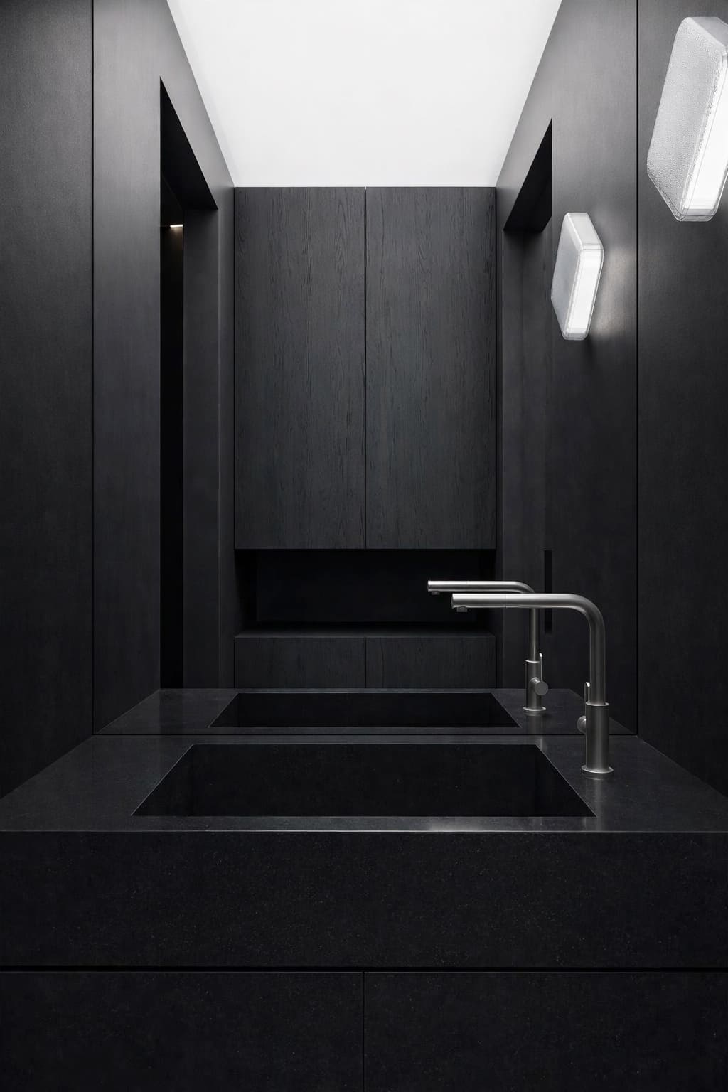
In this compact apartment in Bratislava, the original floor plan was kept, except for the bathroom, and the change was made through materials, light, proportion and detail. The architects refer to Frank Lloyd Wright’s principle of “compression and release”: dark, enclosed transitional zones alternate with lighter, more open living spaces. Arched openings and curved elements mark the transitions, and a continuous terrazzo floor ties the rooms together. Black is used to absorb visual clutter and set the hierarchy of the spaces, so that lit objects, reflective metal and translucent surfaces stand out against it. Built-in furniture and a short list of materials make the furnishings part of the architecture.
5. TG APT by Studio Gal Gerber
Israel, 2024
Photography: Gadi Yosef
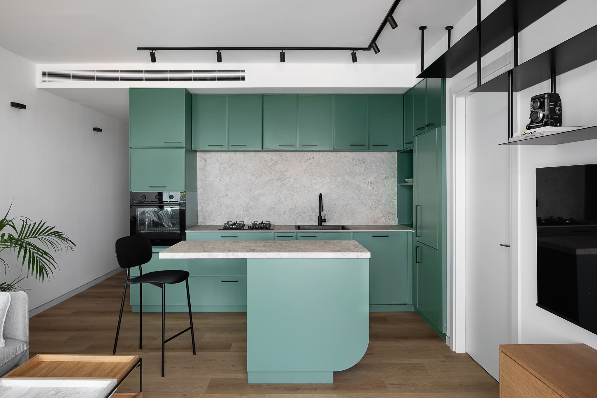
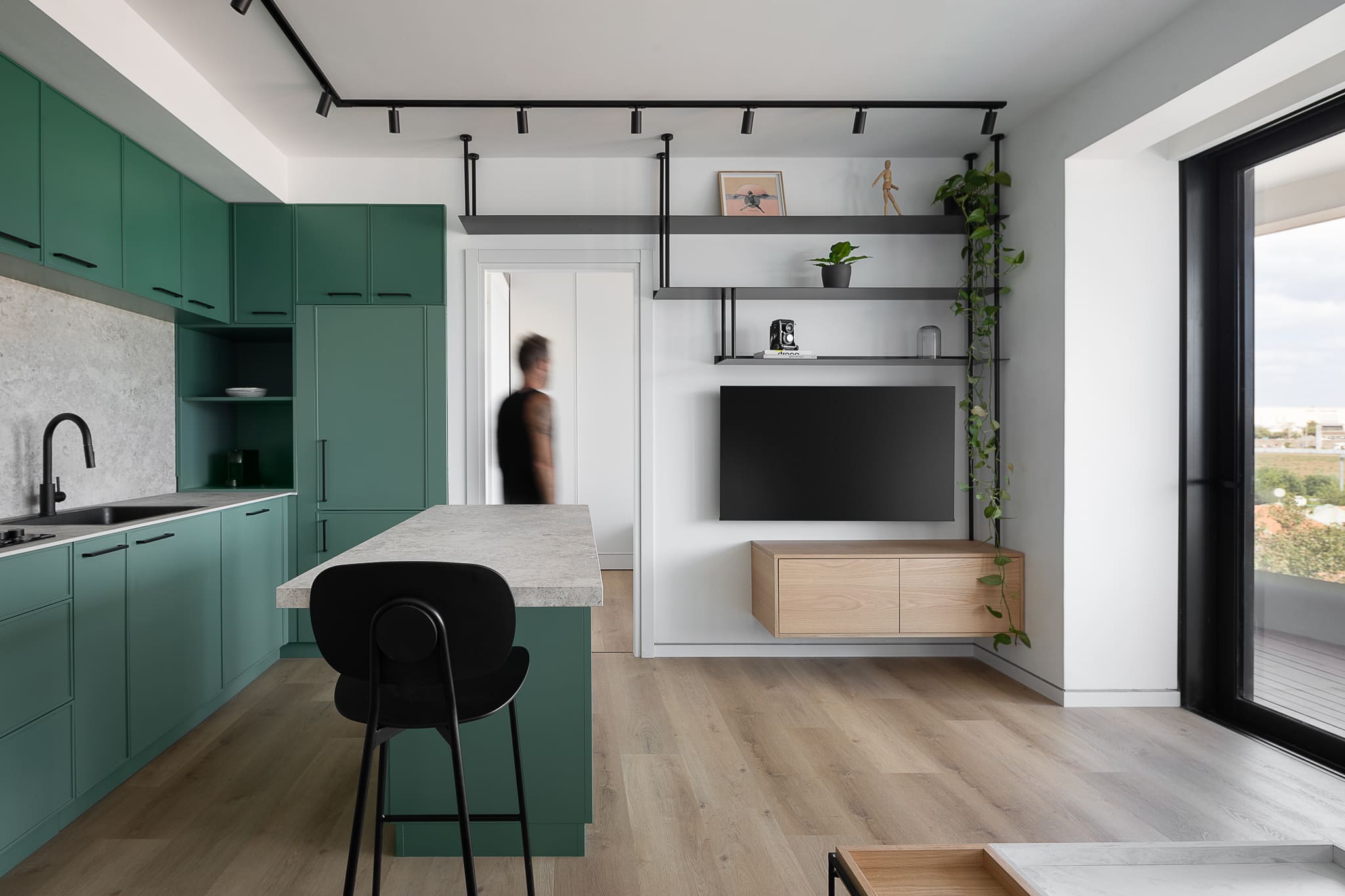
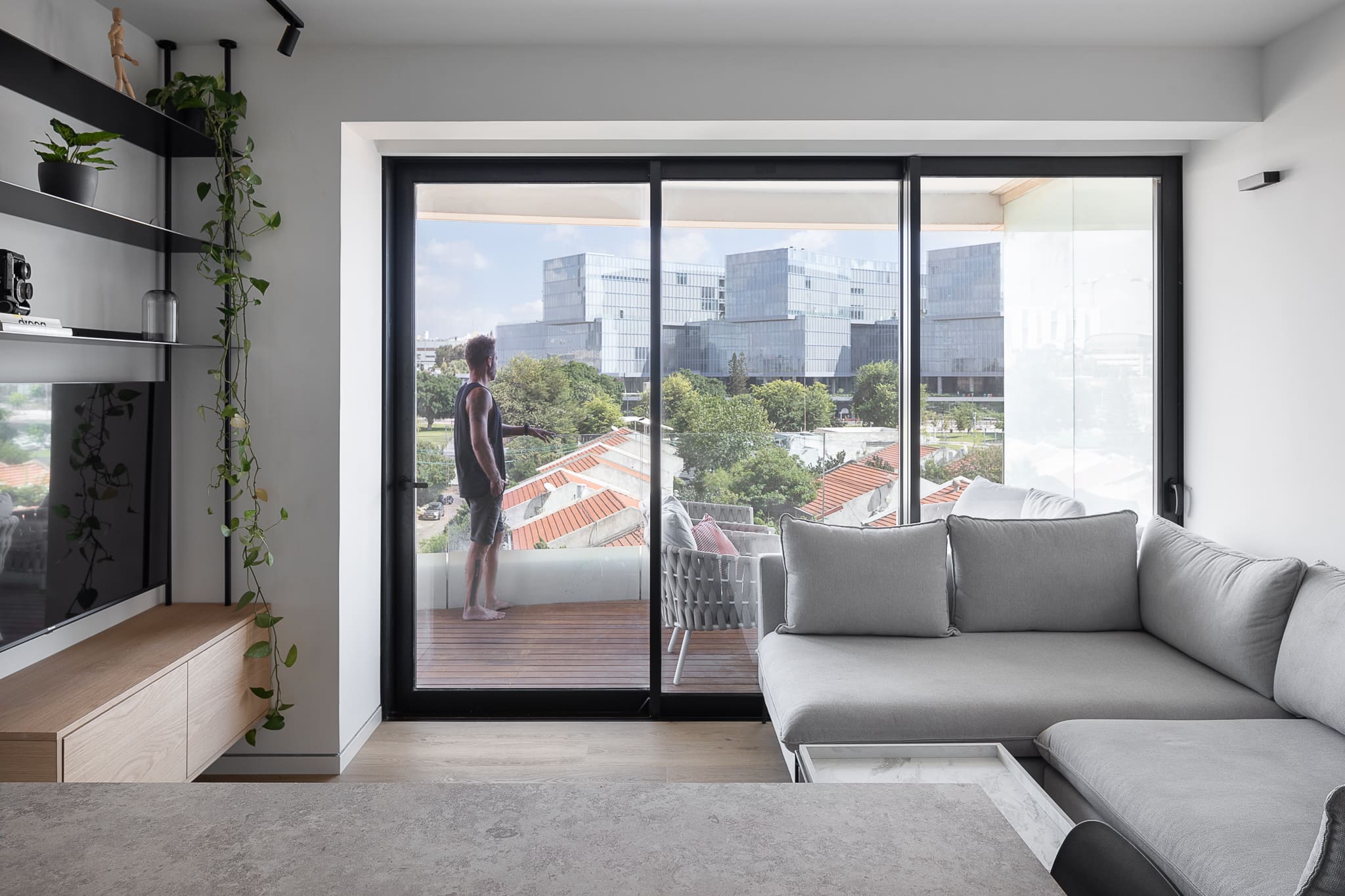
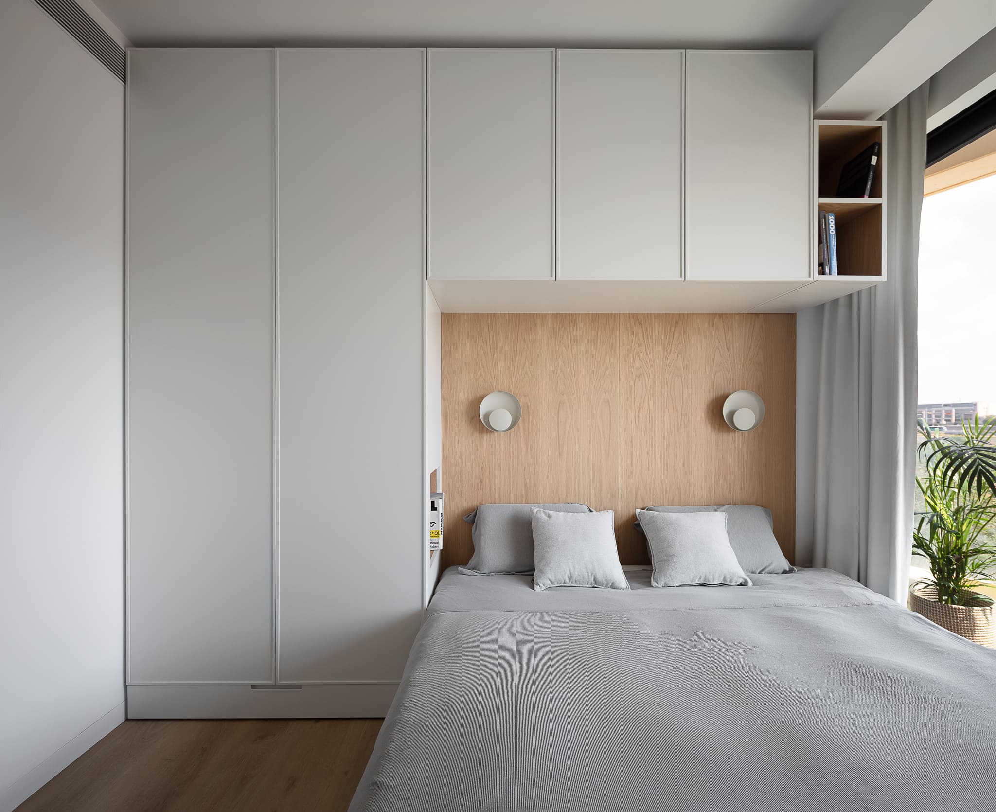
Redesigned for a young client, this small apartment was rebuilt around custom joinery and metalwork. In the kitchen, painted in two shades of green, the studio fitted a work island into a limited area and added storage that the flat did not have before. The bathtub was replaced with a large shower. In the bedroom, a large wardrobe frames a niche for the bed platform, lined with white oak veneer that continues into the side table and upper niches. Throughout the apartment, the flooring panels were laid on a base aligned with the walls, a small detail the studio considers essential in a space of this size.
6. Vessel by Metre Architects
Singapore, 2024
Photography: Shiya Creative Studio
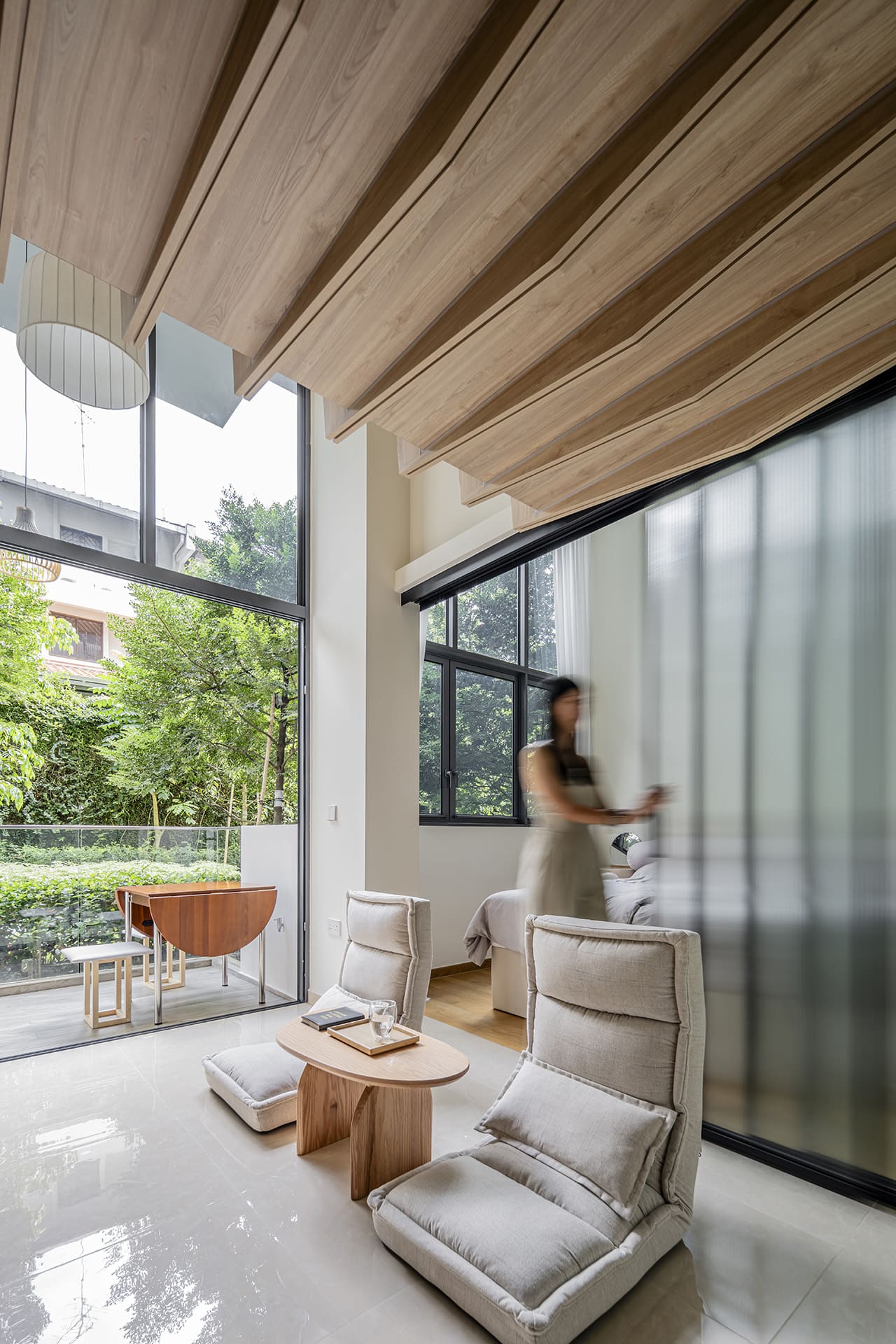
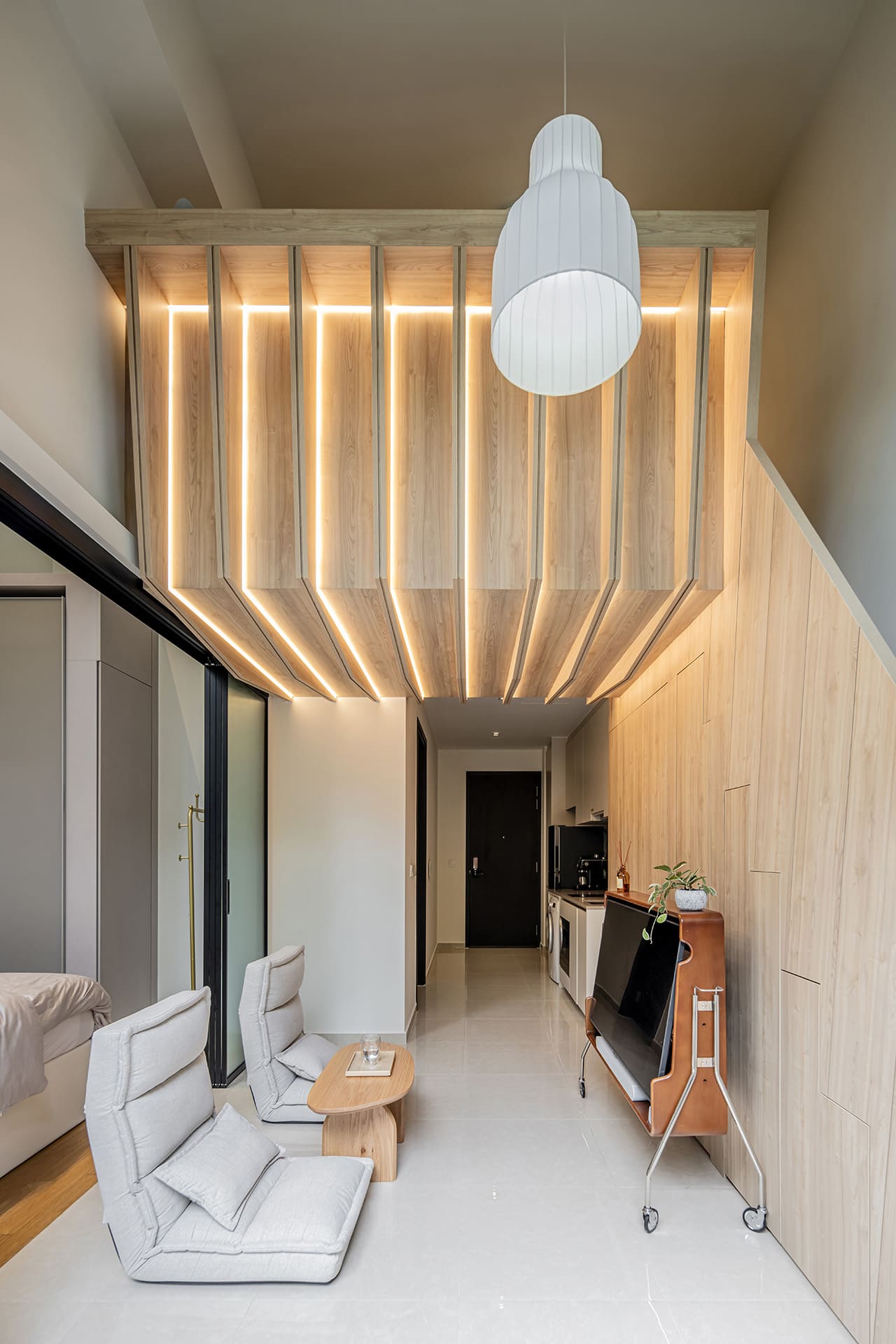
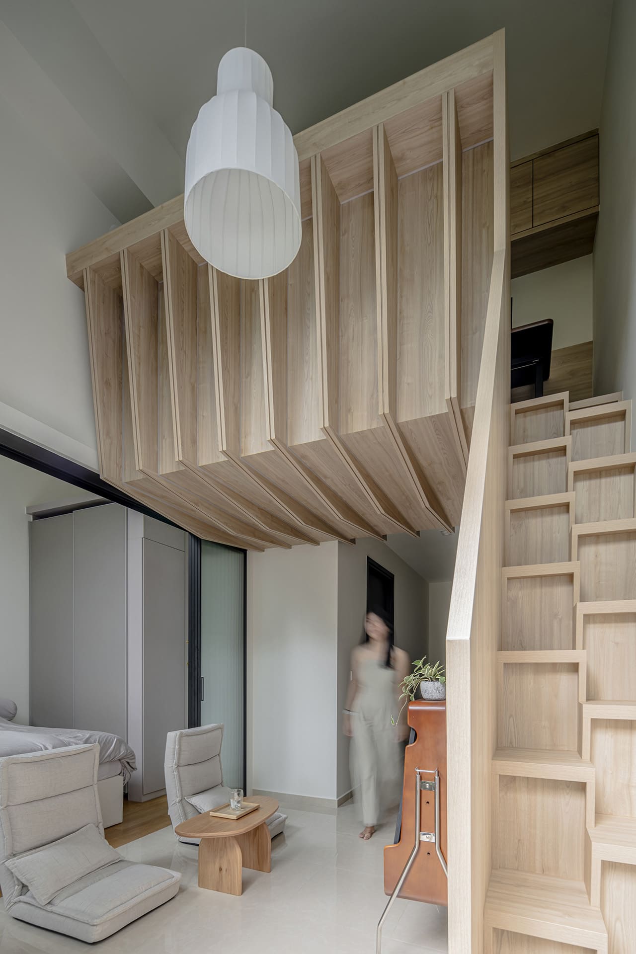
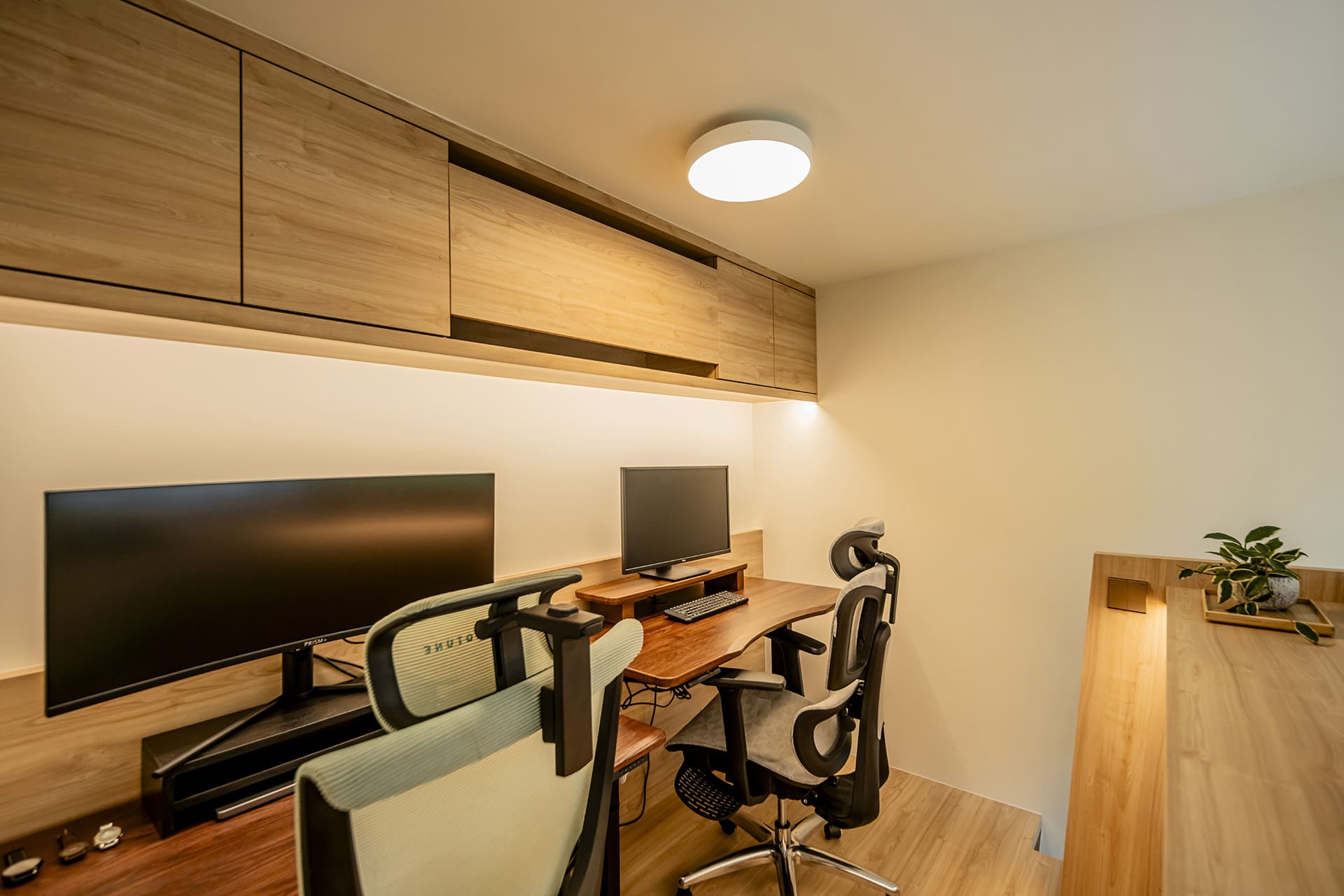
The owners of this new condominium apartment, a young professional couple, asked for one thing: a loft within the 4.7-metre-high living space. The existing floors, kitchen and bathroom were kept for financial and sustainability reasons, and the loft deck became the main intervention. Its soffit, at 2.4 metres, is lower than the 2.7-metre kitchen corridor that leads to it, and is lined with rib-like joinery and LED strips, a construction the architects compare to a boat. Two floor recliners replace a sofa to keep the seated height low. Sliding fluted-glass panels can join the living room and bedroom, and a steep staircase of alternating half-steps, with push-to-open storage below, leads to the loft, used as a home office.
7. Neptù by NOT A STUDIO
Spain, 2024
Photography: German Saiz
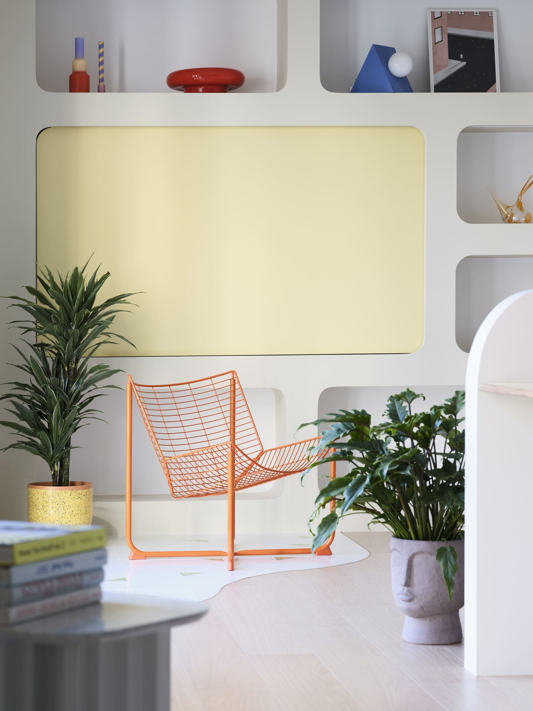
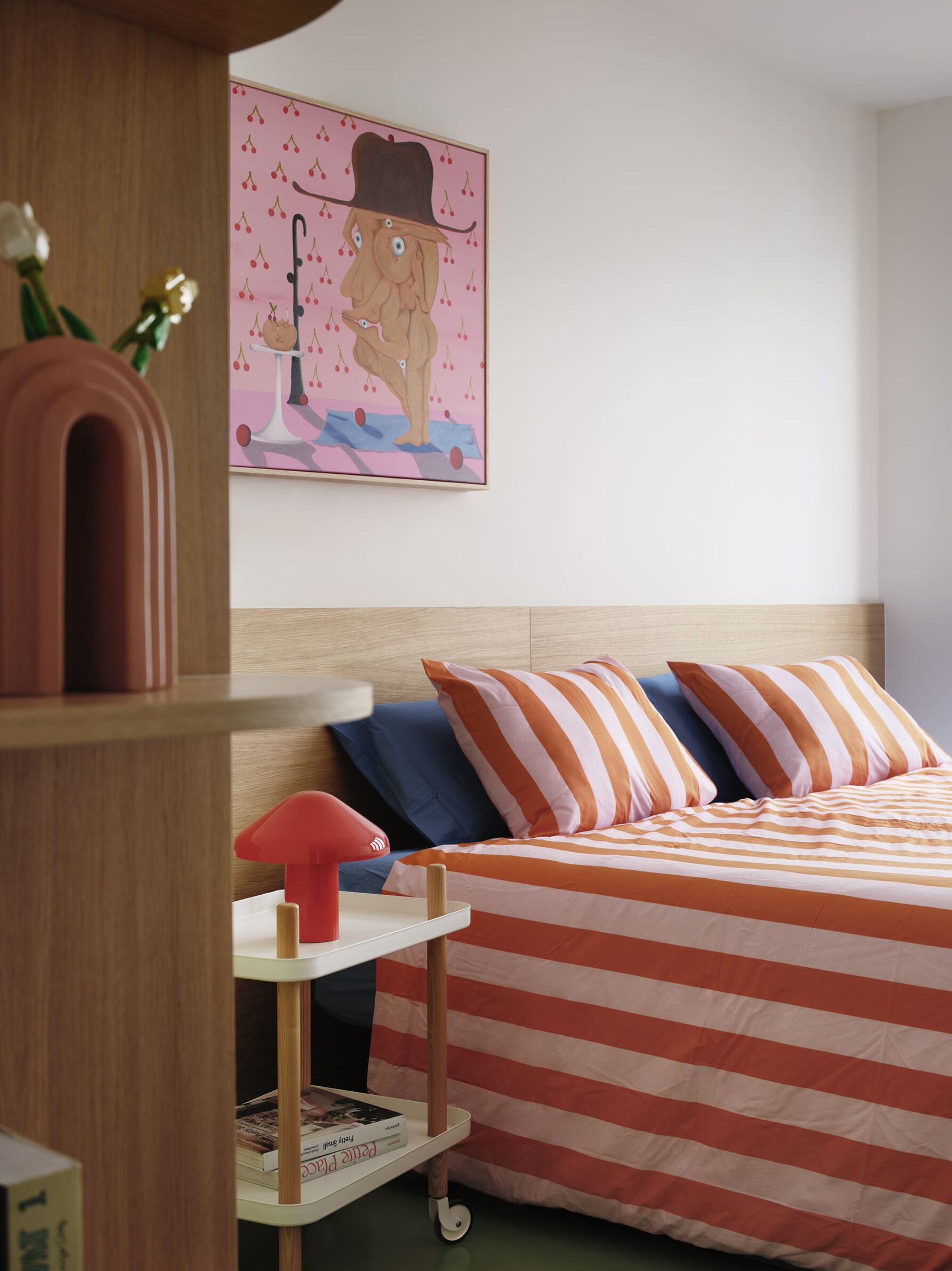
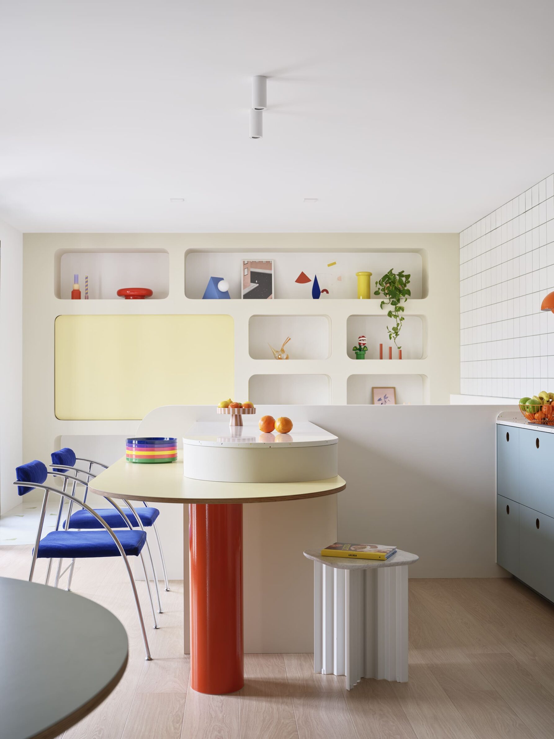
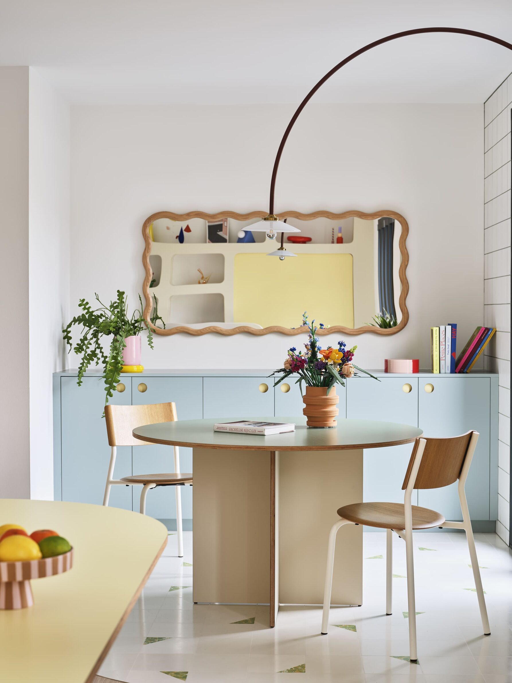
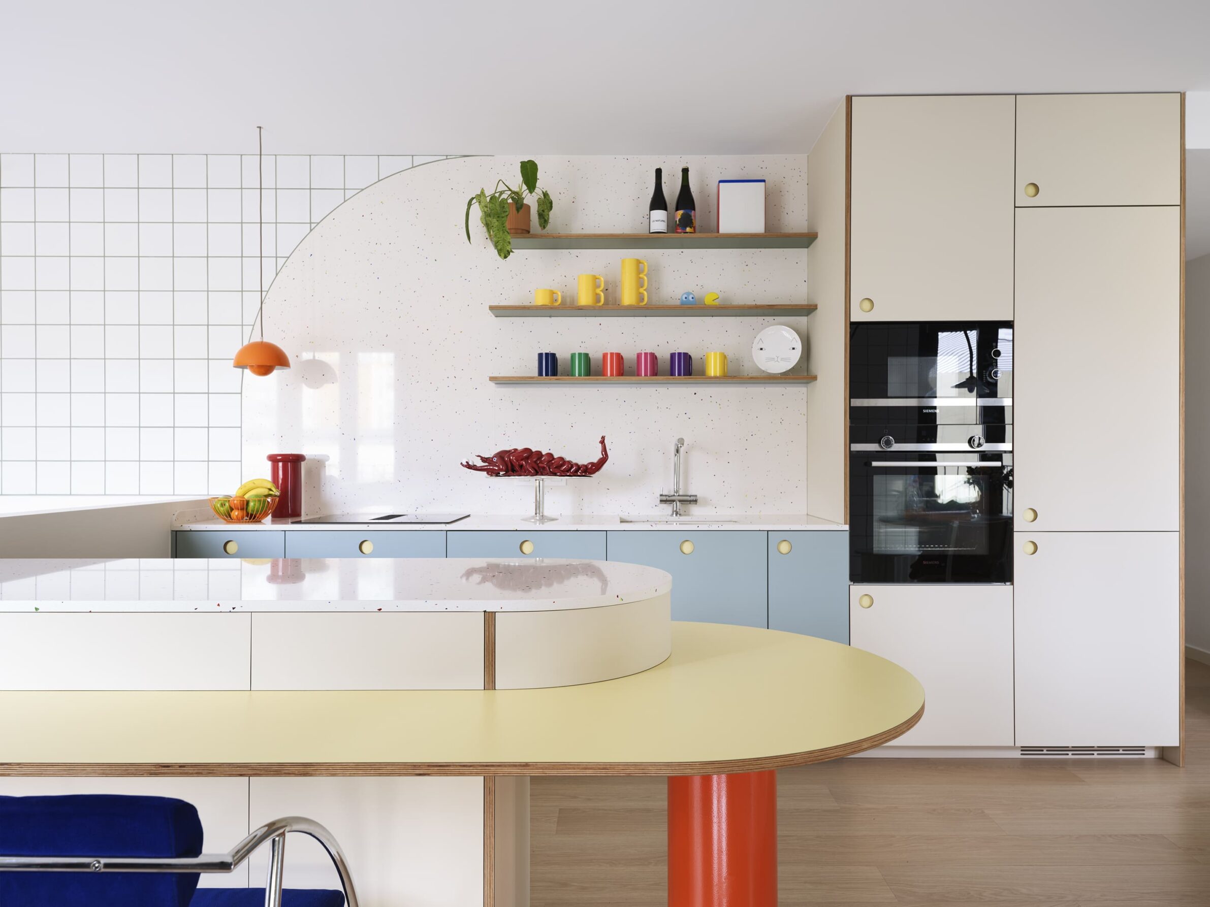
The young family who owned this 86-square-metre apartment in Barcelona’s Gràcia district, completed in 2023 as part of a new development, never felt at home with its finishes or layout. NOT A STUDIO concentrated on the day areas, redesigning the kitchen around a semicircular, split-level counter in Cubro wood and RMC terrazzo that serves as a worktop, a second desk and a place to sit together. Its curve is picked up by Mosaic Factory floor tiles laid in organic patterns, a round dining table and rounded 1970s-style niches, one of which hides the television on wheels. Small adjustments to the partitions improved the bedrooms. Yellow and blue lead the palette, with green, orange and red in the details.
8. Casa Lia by Doori Architettura
Italy, 2026
Photography: Anna Positano
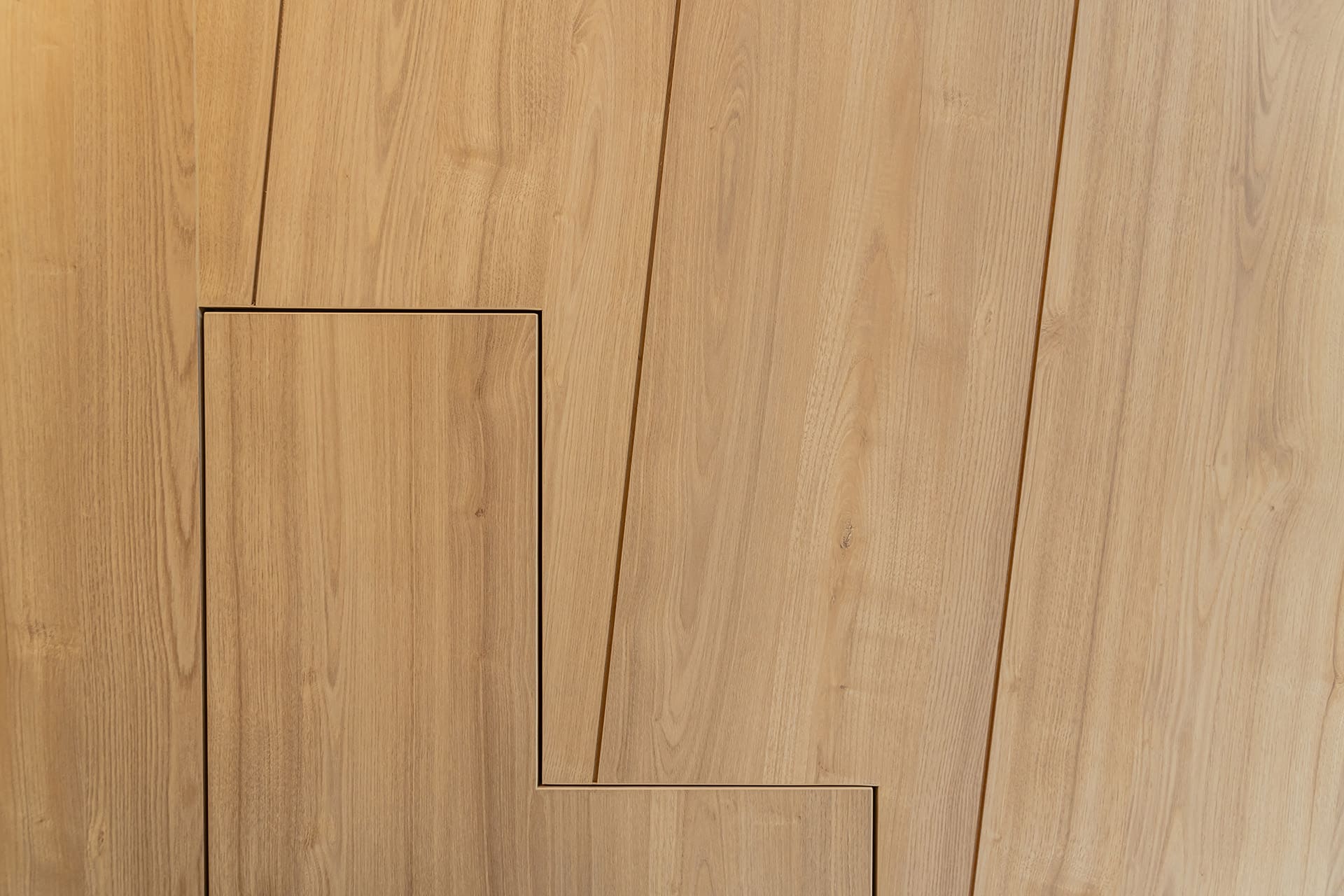
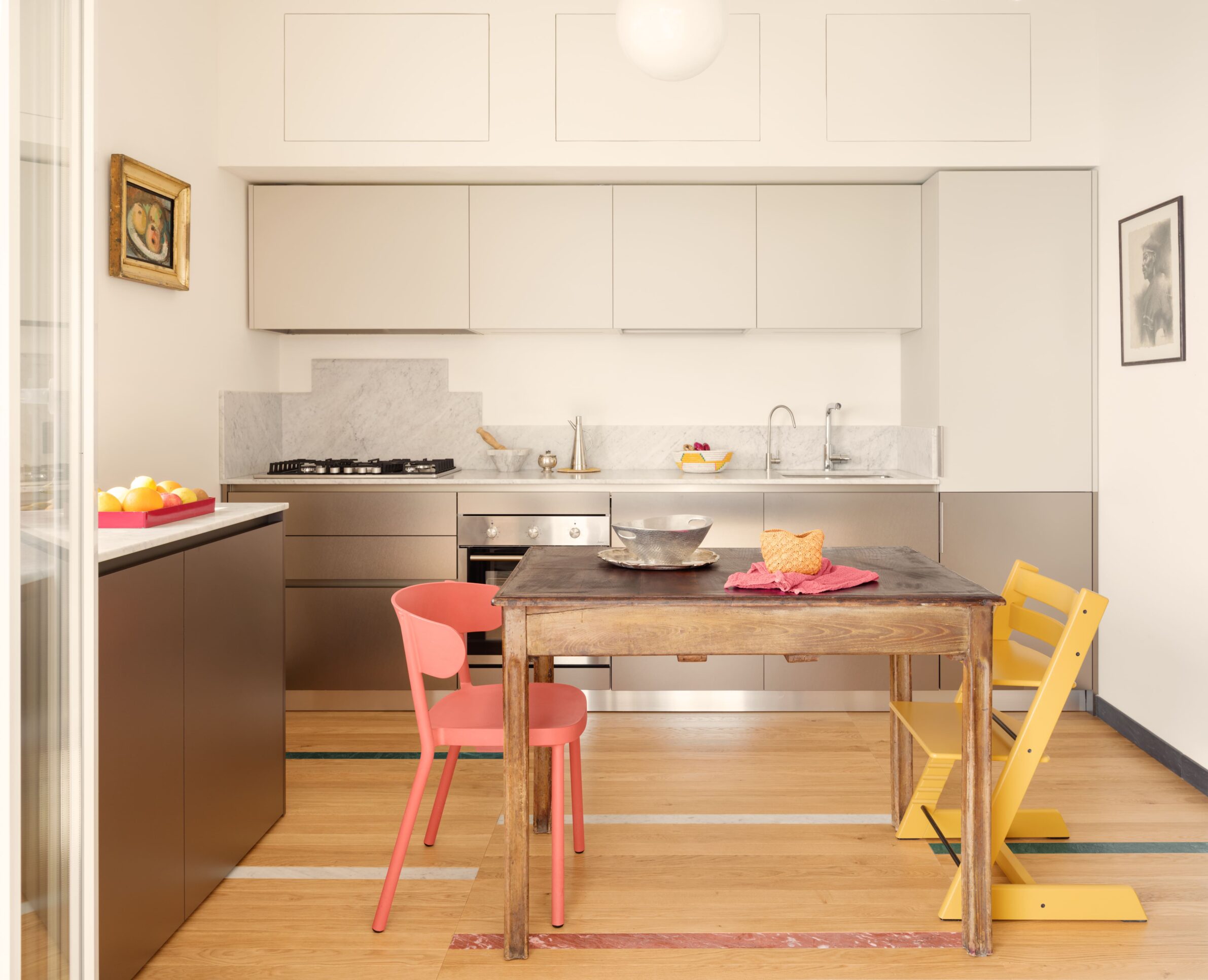
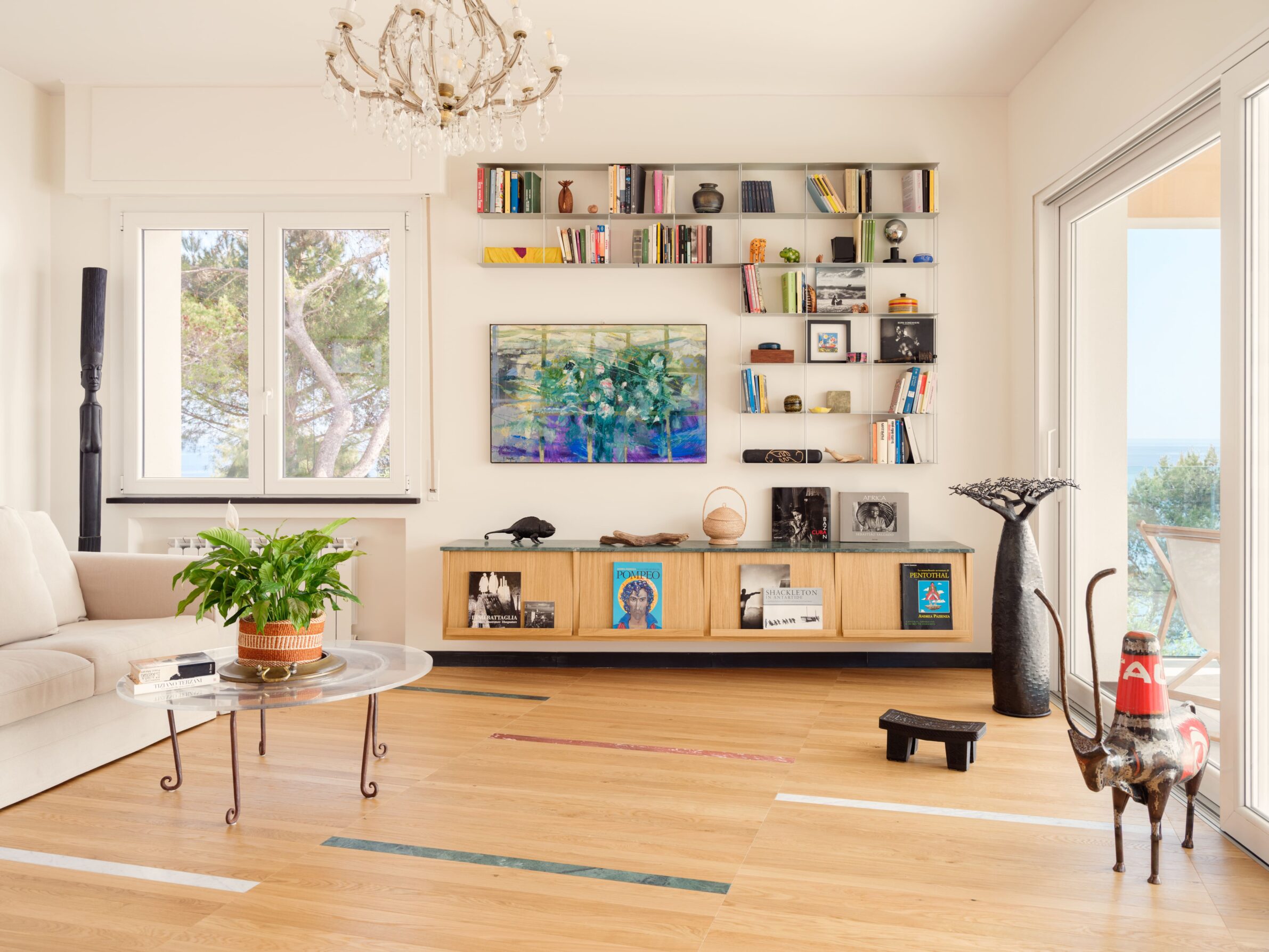
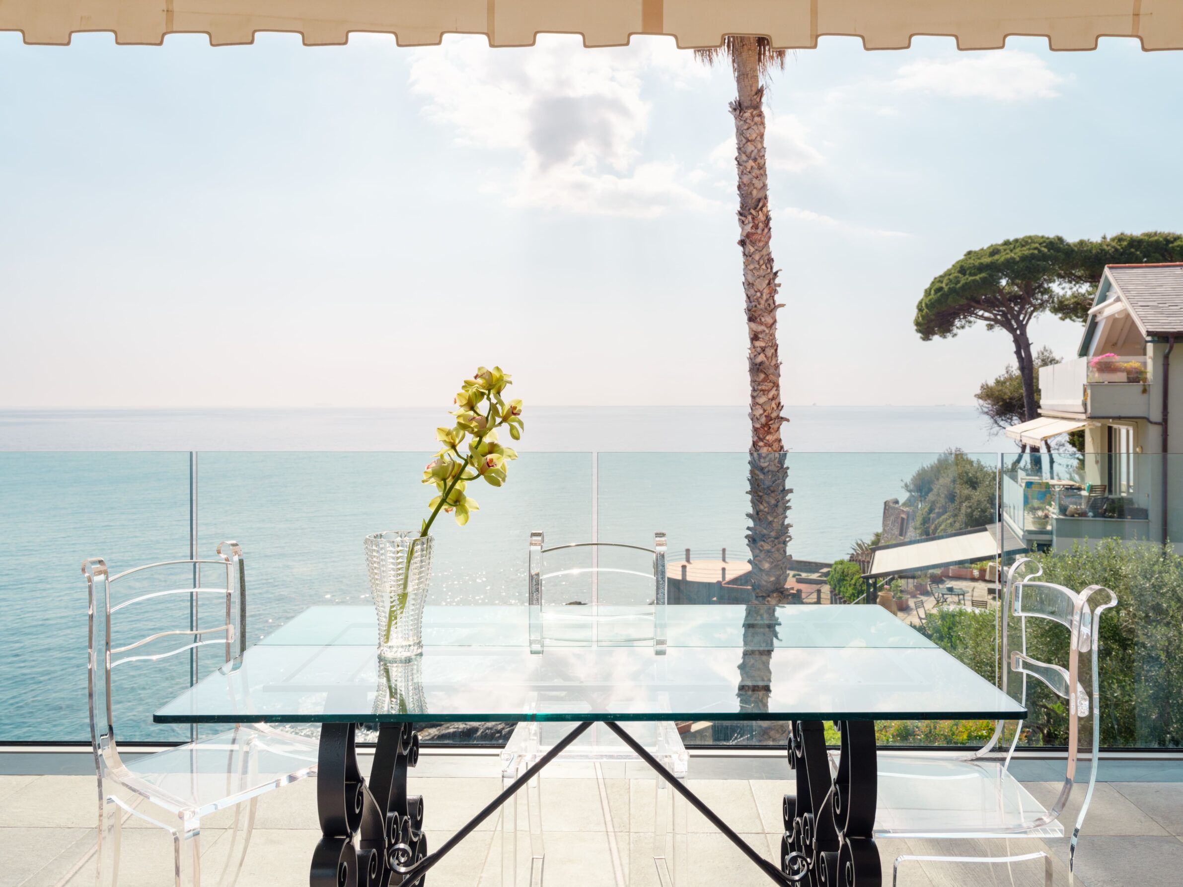
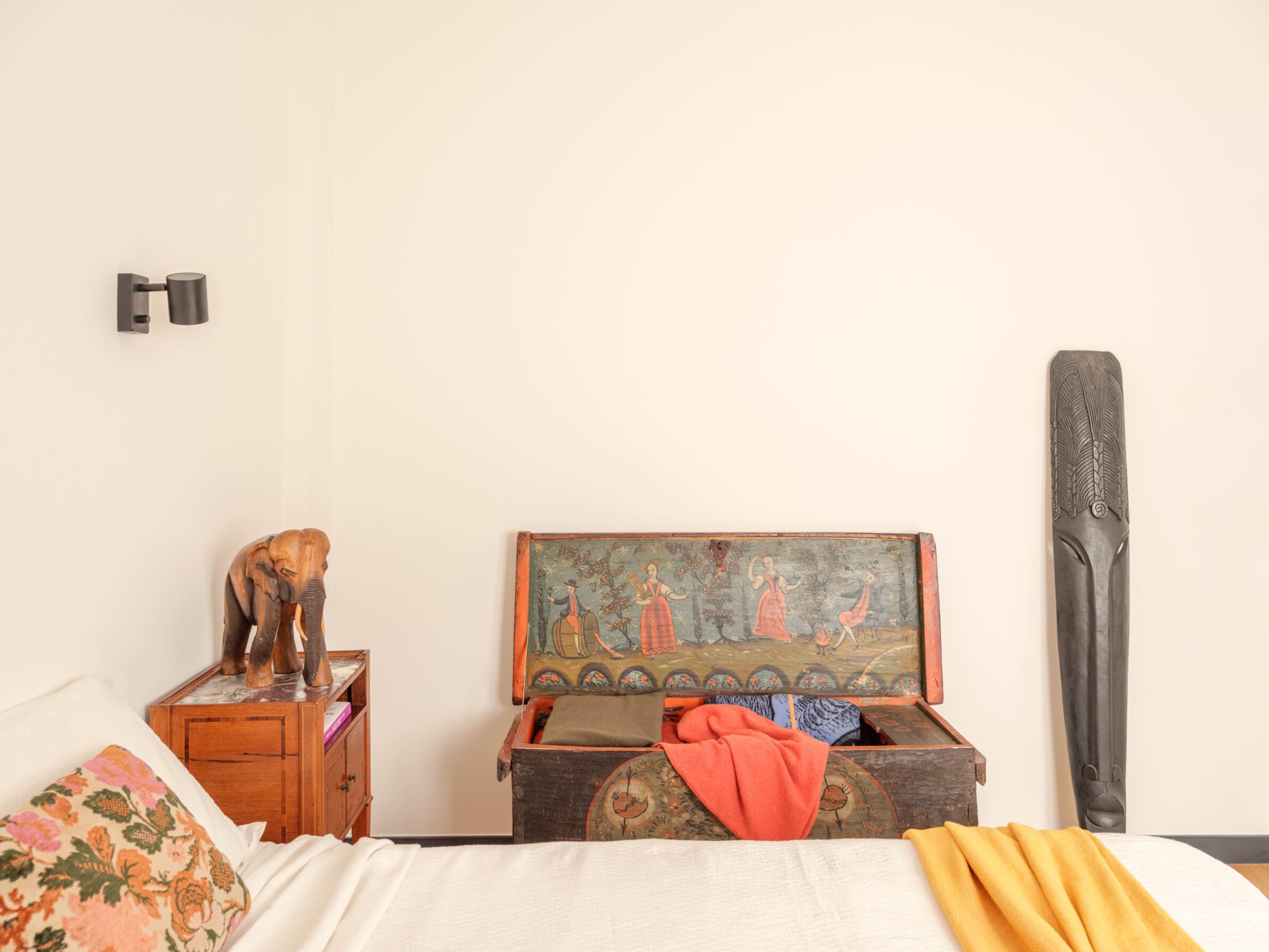
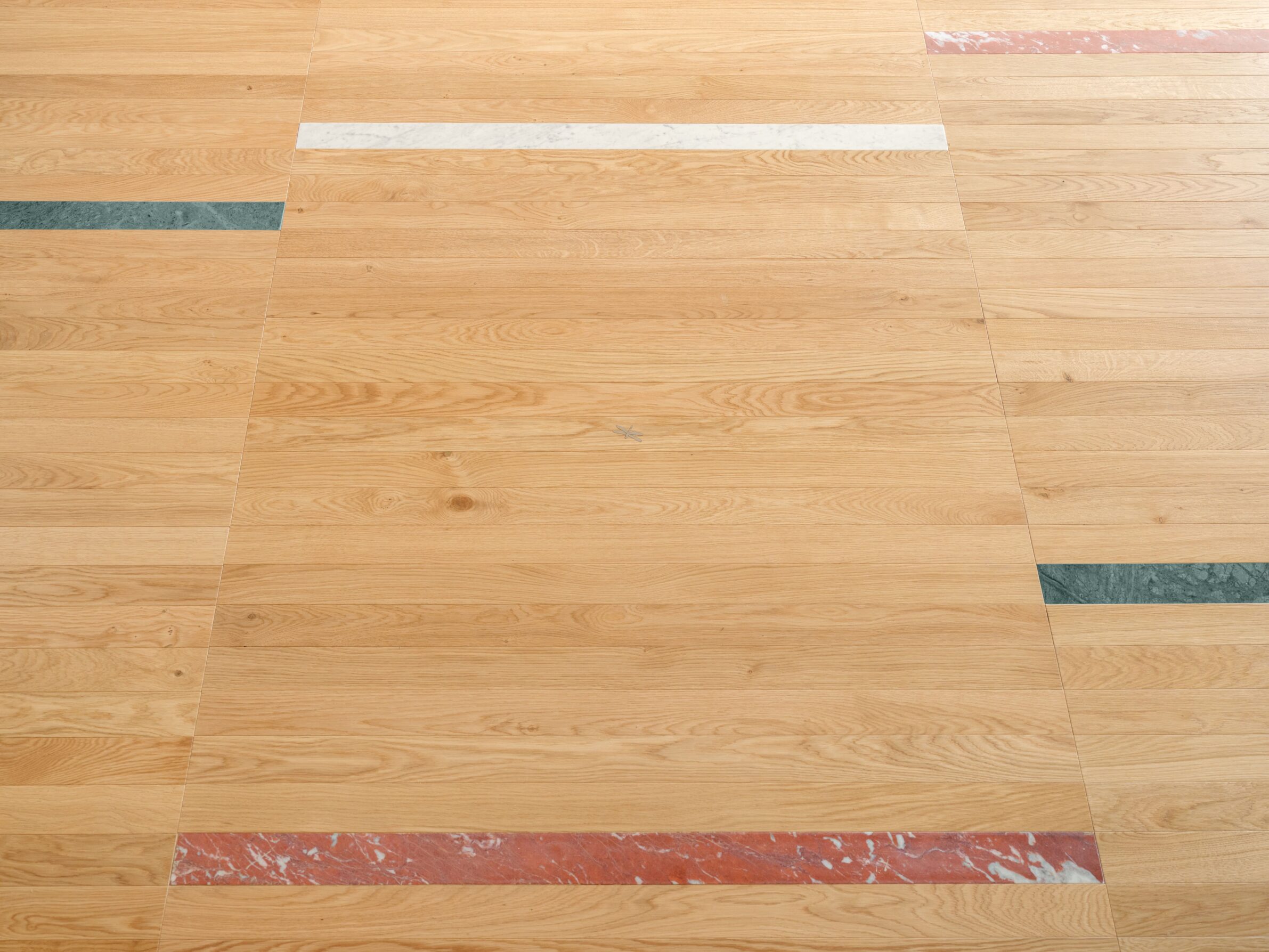
In Bogliasco, on the Ligurian coast, this 100-square-metre apartment followed a rigid 1960s plan in which the kitchen was a service room, isolated from the terrace. DOORI architettura reorganised the layout so that the living spaces open towards the sea, with the Portofino promontory as their backdrop. A narrow-board oak floor runs through the whole flat, laid in staggered parallel rows that the architects relate to the movement of waves, with thin strips of Bianco Carrara, Rosso Levanto and Verde Guatemala marble set into it. The same stones return in the fitted furniture: a red marble top on the entrance bench, a green accent on a suspended chest of drawers and Carrara on the kitchen counter. The repositioned kitchen combines stainless steel and lacquer.
9. The Gold View Apartment by STD Design Consultant
Vietnam, 2024
Photography: Paul Phan
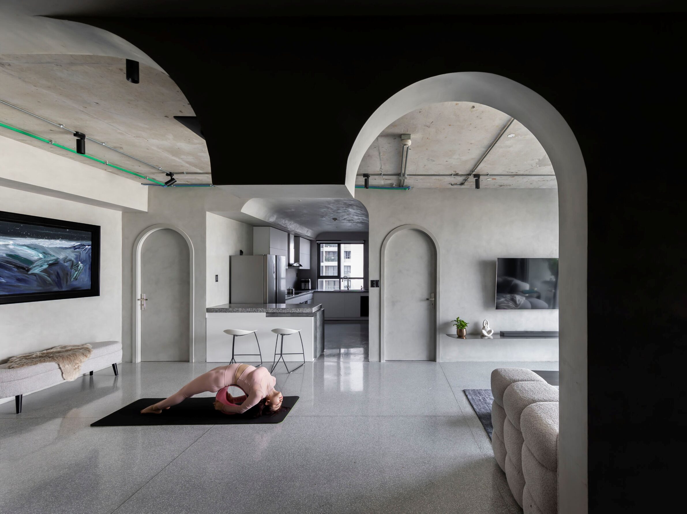
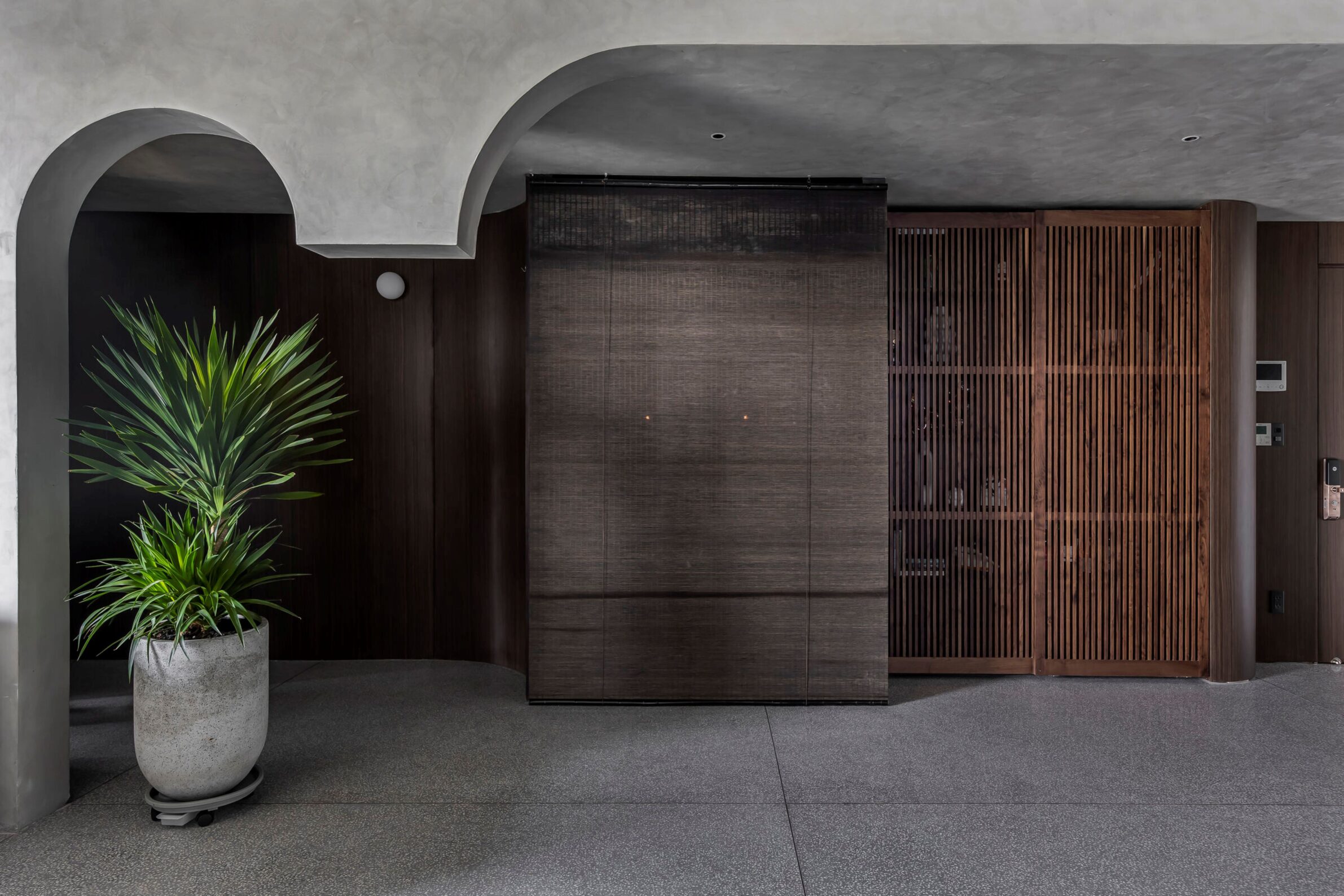
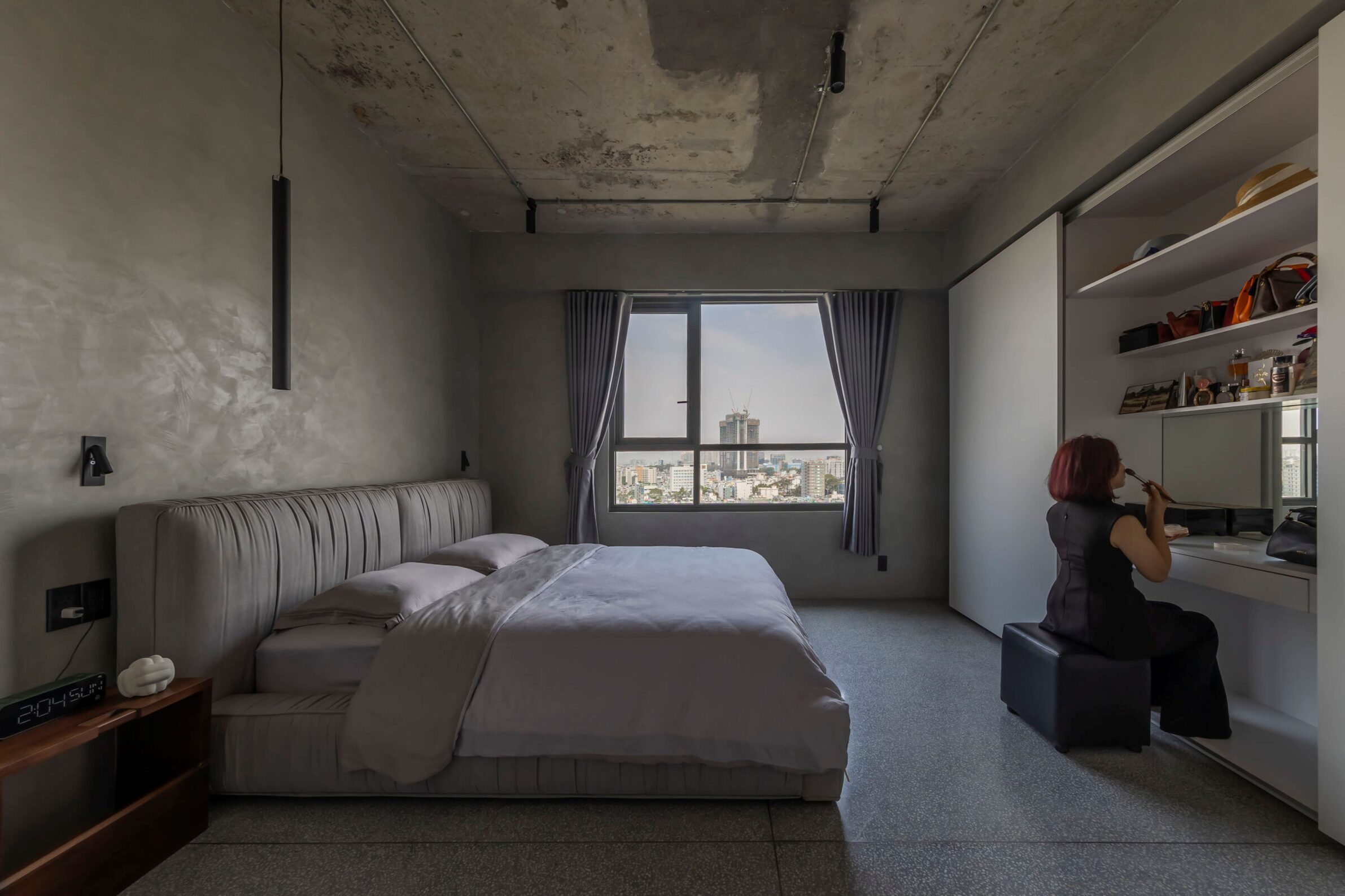
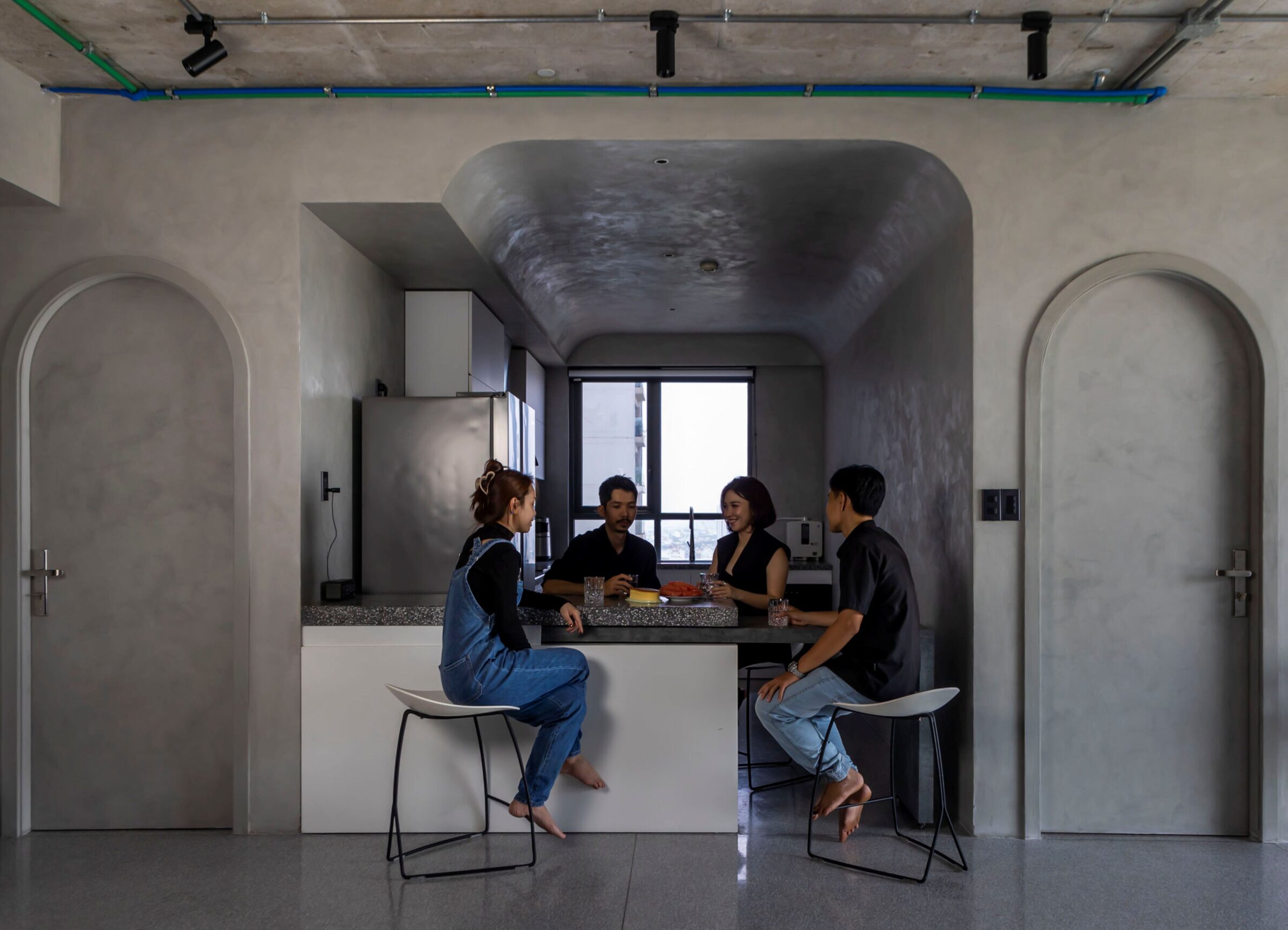
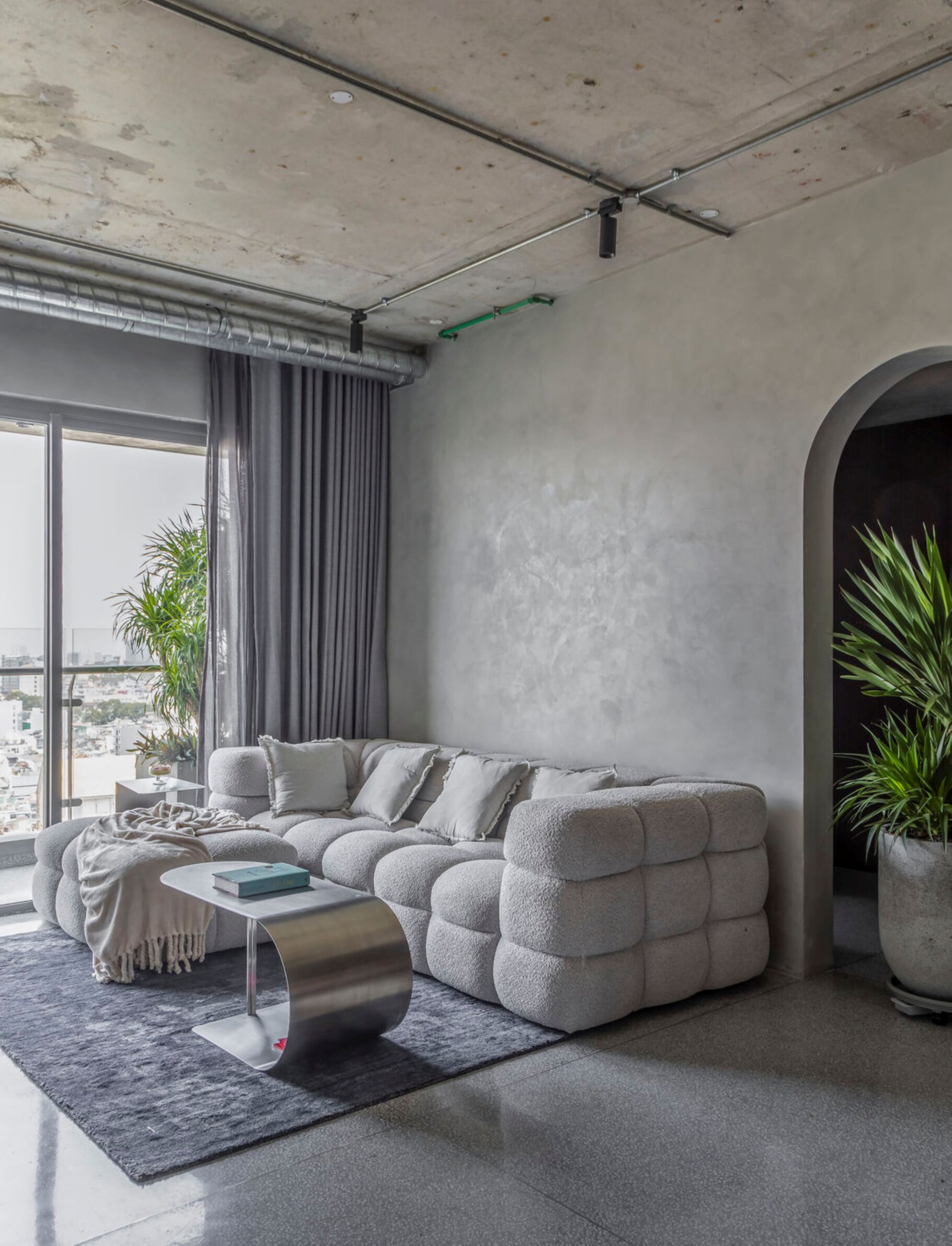
In Ho Chi Minh City, STD Design Consultant turned a 110-square-metre, three-bedroom serviced apartment into a two-bedroom home for a family, working with a feng shui consultant on the layout. The kitchen now stands where a partition between two bedrooms used to be, joining living, dining and cooking into one continuous space. A rotating, extendable dining table works as a bar for two or a table for at least four. In the main bedroom, built-in storage includes a folding desk and a concealed dressing table. Removing the suspended ceiling exposed the concrete structure and added height, and terrazzo floors and walnut furniture complete a restrained palette.
Edited by: Kristina Beltram; Cover image: German Saiz
______
Selections is an editorial series in BIG SEE Magazine that presents carefully curated architecture, interior, and product design projects. Each article explores a specific theme, question or typology, highlighting projects that help us better understand the ideas, values and directions shaping the built environment today.
What do you believe is still worth creating?
We invite you to share your perspective on this season’s question. Your response will help us understand the ideas, challenges and aspirations shaping today’s creative community. As a thank-you for your contribution, participants will receive a complimentary ticket to the upcoming BIG SEE event.
Selected Works
___
Edited by:
Kristina Beltram
Cover image:
German Saiz
Be There.


Powered by