Redesign of existing cafe in Svidník was aiming to preserve and cherish genius of the twenties. Connection of past and traditional space of the former cafe in an unfinished building from the nineties was a challenge. One of the main request from investor was to keep original furniture as much as possible.
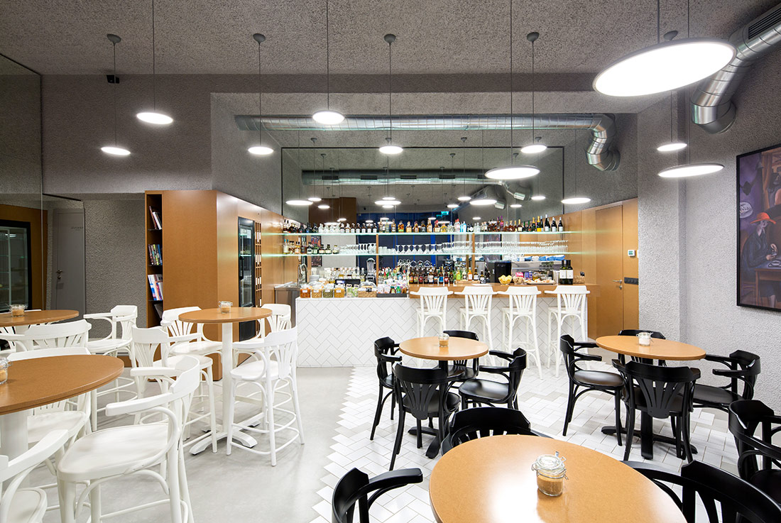
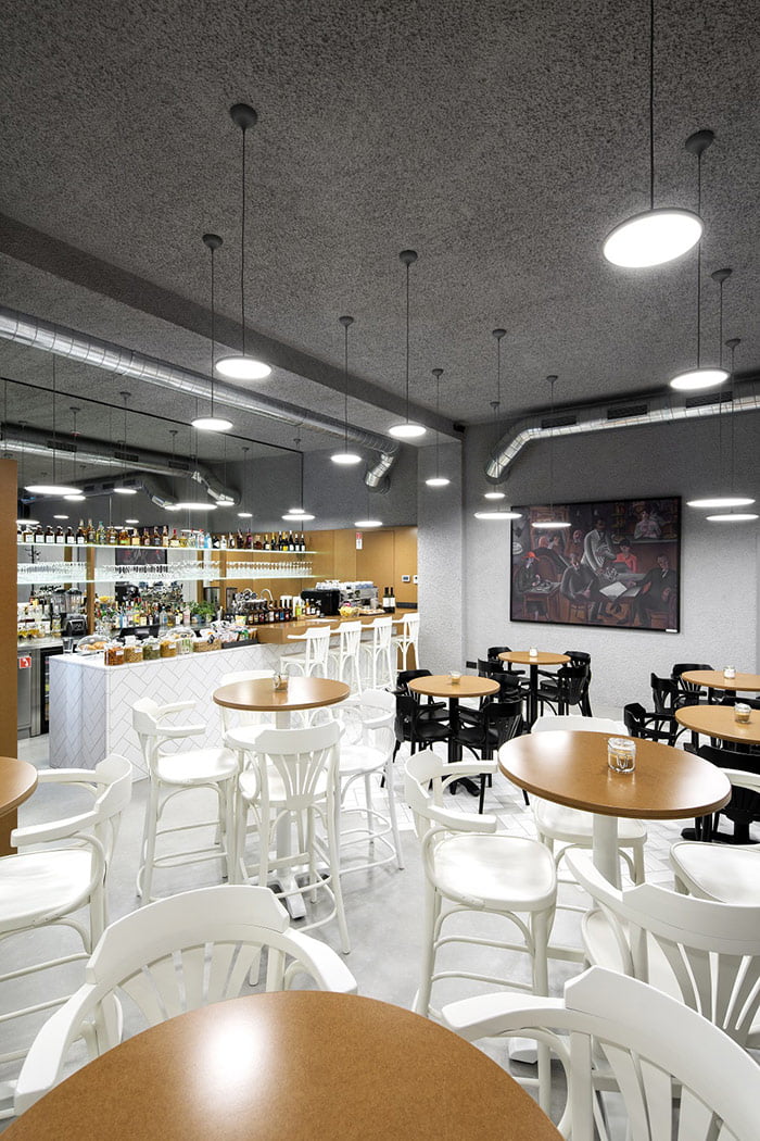
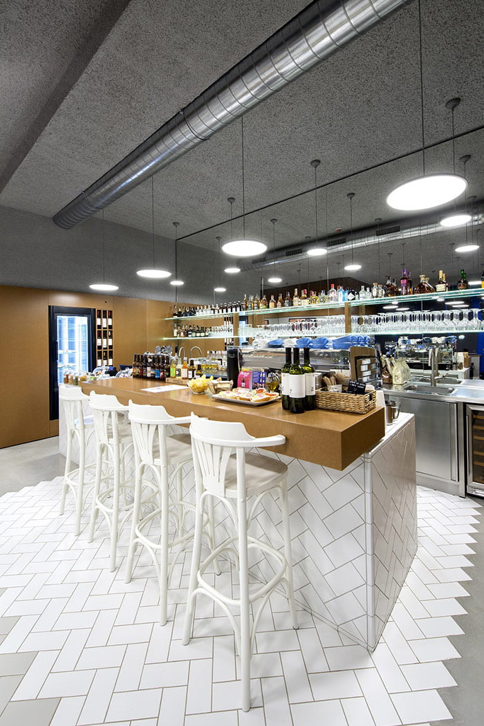
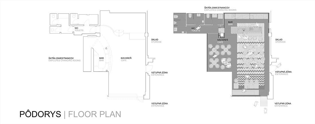
Spatial arrangement was radically changed, previously diverse space is now looking like one compact space which is being open in its corners. Former existing space was dark and tight thus aspiration was to create feeling of openness and lightness. Bar located in the centre of the space does not create boundaries and allows guests to watch preparation of coffee, drinks and snacks.
Rotation of bar by 90 degrees allows better communication between staff and guests. Circulation of the cafe is easy and natural: staff facilities-bar-storage-delivery. Guest sanitary facilities were adapted for capacity and needs of new cafe.
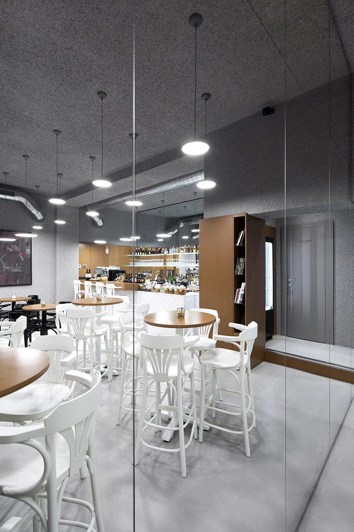
Thanks to visual play with mirrors space seems longer and bigger. Basic grid system used in position of light fixtures allows small changes in cafe furniture. It was not possible to achieve completely multipurpose space due to complicated shape of the space and existing entrances.
Contrast was our main motive when choosing the materials: from small scale to big scale, from smooth surfaces to rough ones, from white colour to grey colour etc.
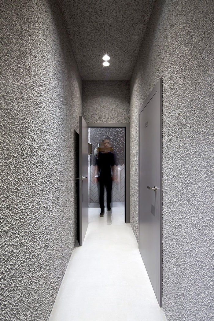
Materials were divided on walls and floors. Connecting element is coarse grain grey plaster. Small light refractions which occurs on its surface creates natural transition between the shades of grey. It creates cosy and safe atmosphere which is so desired while relaxing with coffee.
Emphasis is put on bar and entrance by using large and small formats of panels and tiles. Signs of past can be seen in wooden skirting-boards, herring-bone parquets in contemporary materials. Natural form of materials emphasises authenticity of twenties. Floors are unified by natural cement screed
Rough natural coloured MDF boards, mirrors (in sanitary facilities there are used ceramic tiles laid under 45 degree angle and grey plaster), rough concrete stucco brought light to the proposed space without unpleasant exposition for guests.

Credits
Interior
Architekti Šercel Švec
Client
BYTSERVIS; Peter Pilip
Year of completion
2018
Location
Svidník, Slovakia
Surface
77 m2
Photos
Tomáš Manina
Check out the BIG SEE event here: Interiors 180° / Big See Awards / Month of Design 2018
Project Partners
OK Atelier s.r.o., MALANG s.r.o.


