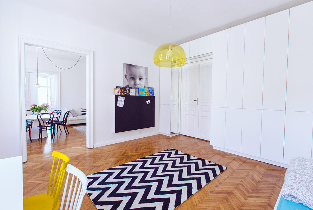
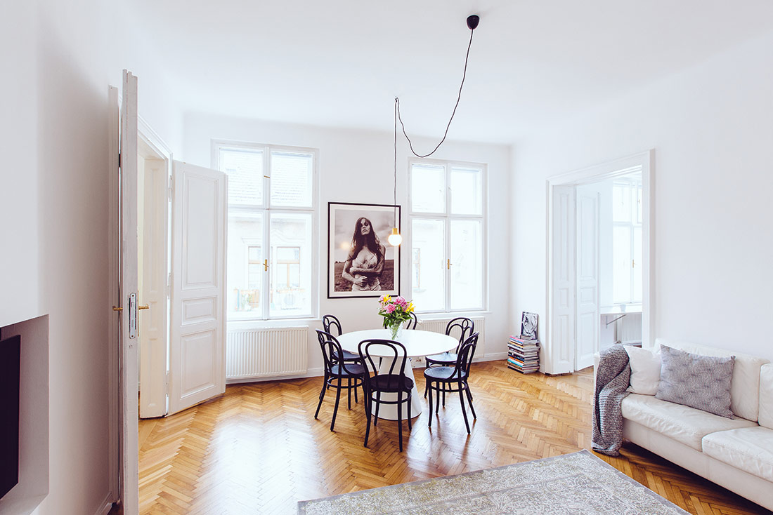
High ceilings – 3.3 meters, sunny and open disposition, the possibility of connecting rooms, the apartment had the potential even before the renovations. Of course, deficiencies were more visible, such as new low-quality laminate flooring, vulgar plasterboard ceilings, ect.
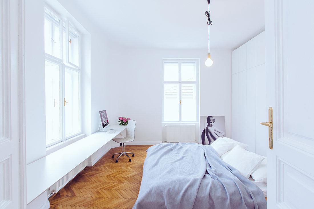
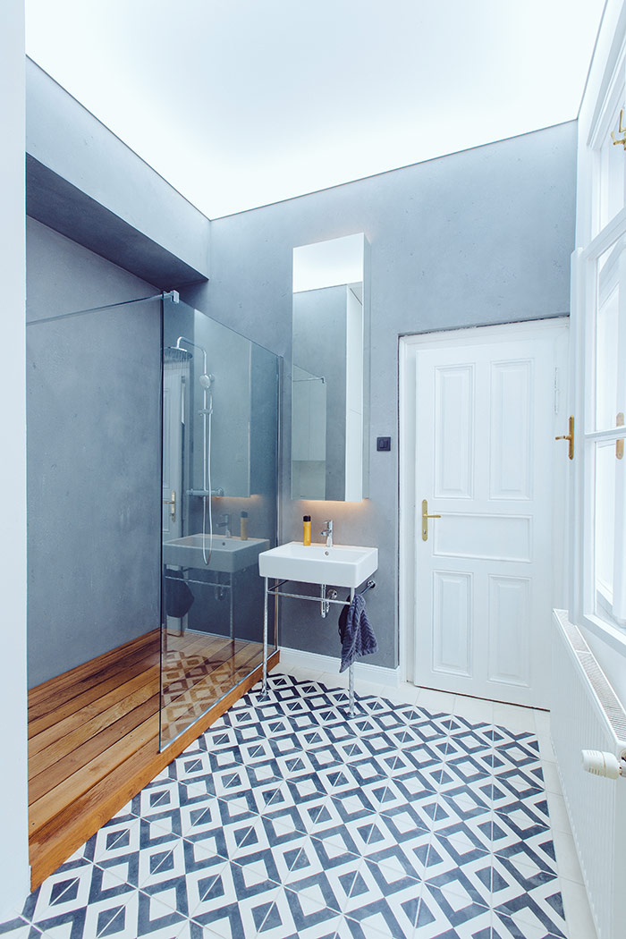
The space was designed in a simple and minimalist way because the budget of the client. It is this limitation that has become an advantage – possibility of designing an interior that has benefited a lot from little.
Although the budget has been decreasing on the basis of new “hidden defects”, there were a few surprises, such as the equally “hidden” oak parquet flooring, or the original two-wing door embedded in the wall.
The windows and doors in the interior were greatly damaged, and they had to be properly renovated. The entrance doors were replaced by a copy.
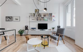
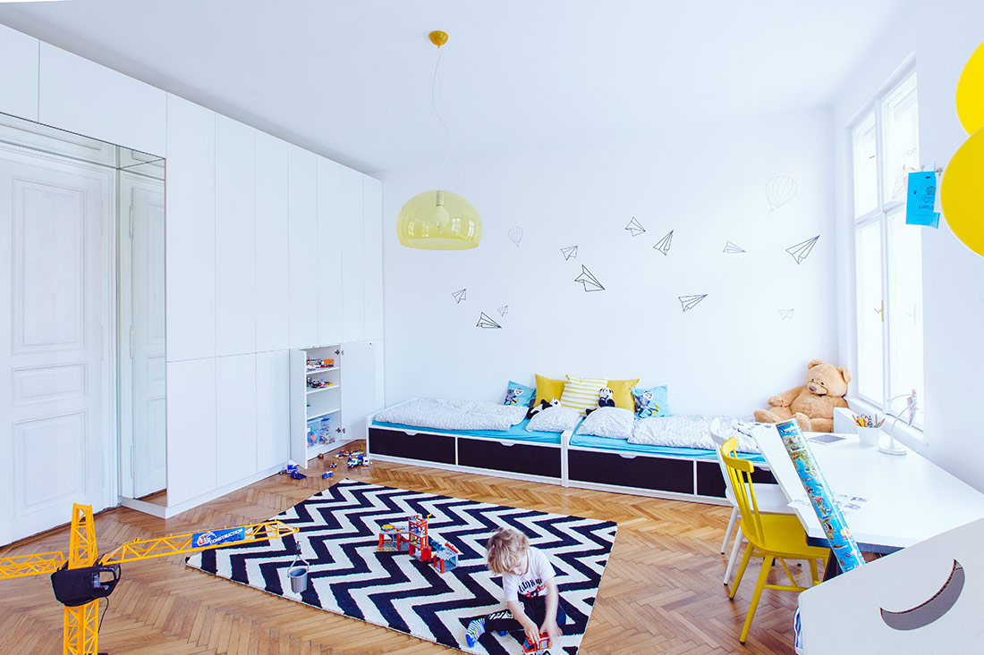
A lot of furniture was bought in the bazaar / second hand (chairs, handles, sofa) – which gave to space a unique character. These pieces minimalistically tailored custom furniture – built-in cabinets, wardrobes and kitchen.
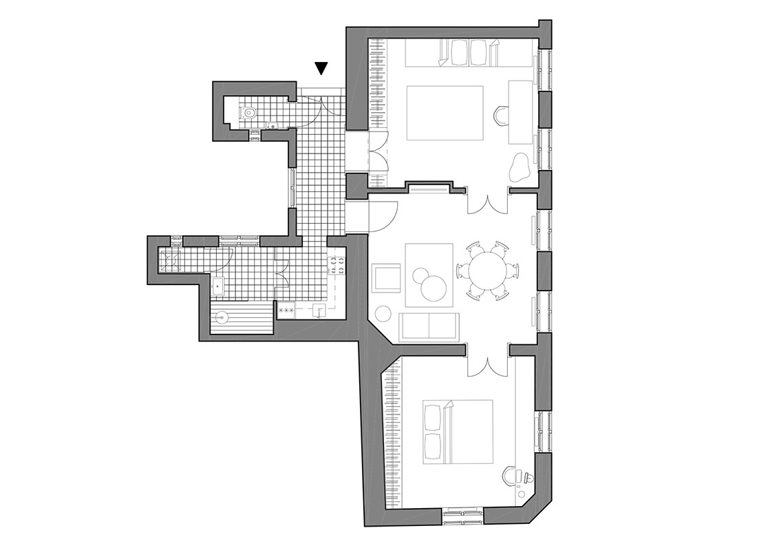
The reconnection of the rooms to one line has brought the original character typical for the first rented apartments from the beginning of the 20th century. Opening rooms into common living area allows the young family to spend time together, even though they are in another room.

Credits
Interior
RB Architects; René Baranyai, Peter Gašpar
Client
Jano Horák
Year of completion
2016
Location
Bratislava, Slovakia
Surface
95 m2
Photos
Jano Horák
Check out the BIG SEE event here: Interiors 180° / Big See Awards / Month of Design 2018
Project Partners
OK Atelier s.r.o., MALANG s.r.o.


