


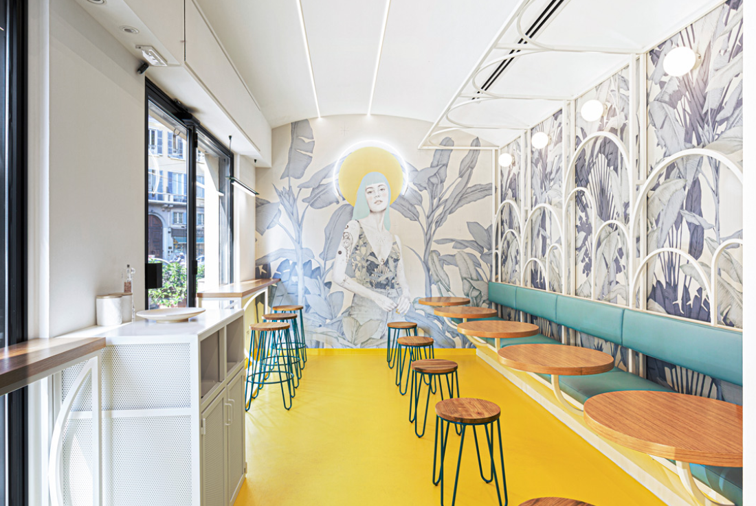
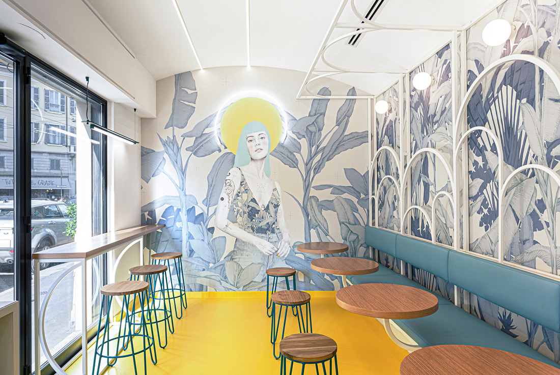
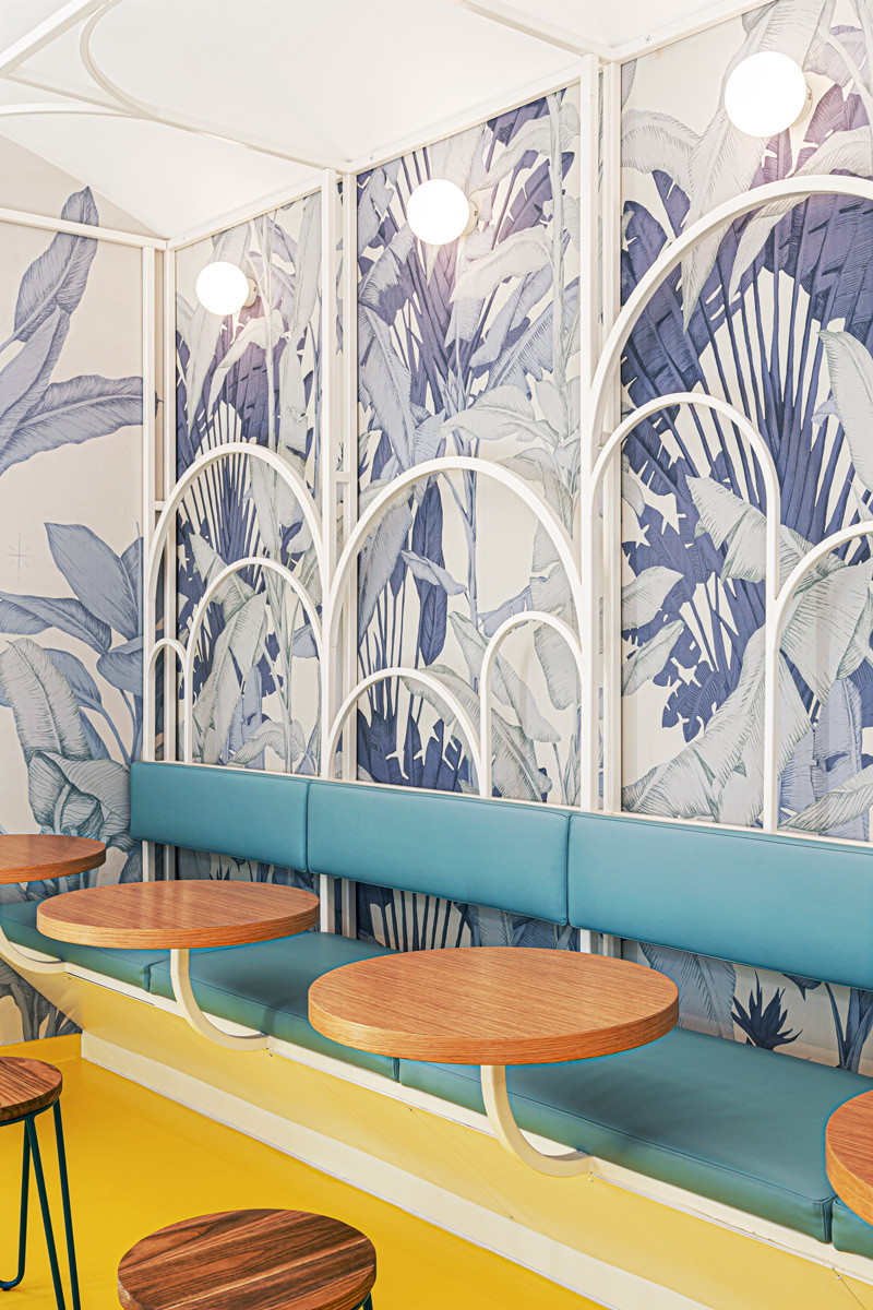
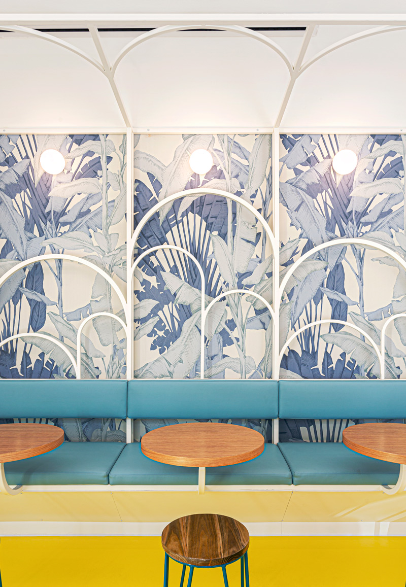
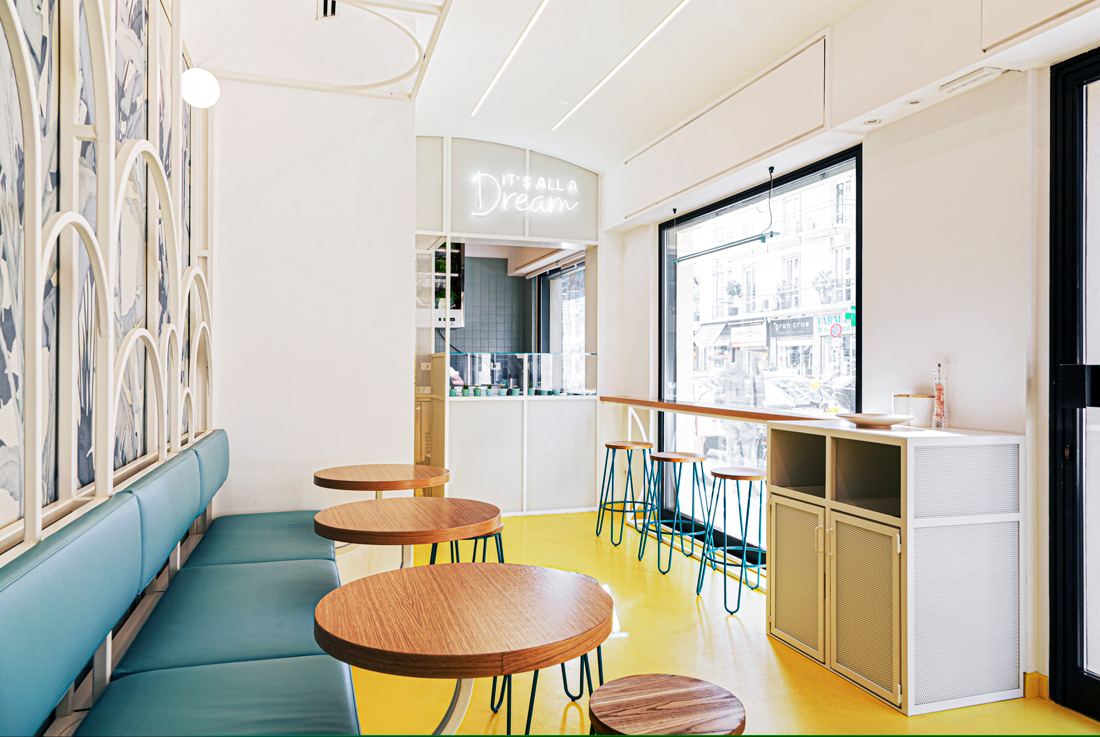
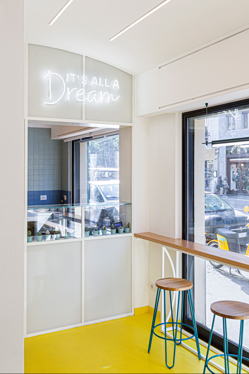
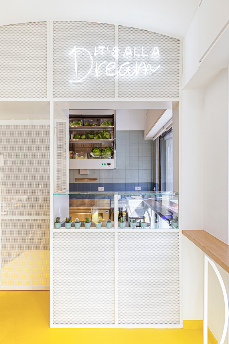
The design of this salad shop in Corso Magenta, in Milan, was born in close collaboration with Asterisco Creative Agency, a creative agency in Turin, which was entrusted with the study of graphics, strategy and communication.The concept proposed and accepted with enthusiasm both by the design team and by the customer startsfrom the idea that the salad is an angelic meal, pure, almost a remedy, which allows not to renounce to taste, getting rid of guilt.The vehicle of this message is a cosmopolitan “Santina” that becomes the protagonist of space; a figure inspired by classical sacred iconography, but at the same time enriched with colors, floral details and poses typical of the Viennese secessionist style, reinterpreted in a contemporary key. Strong is the reference to the “Madonnina”, one of the most identifying symbols of the city of Milan.The “Santina” emerges on the backwall of the room from the tropical foliage that characterizes the wallpaper specially customized for The Pure by Darlingmind Studio in collaboration with Asterisco, the pattern continues on the wall behind the seats, creating an elegant contrast with the light structure laced in iron.The architectural project was therefore conceived as a real scenography where to insert the “Santina”; the choice of the arch as a stylized and symbolic element is strongly inspired by the sacred little chapels that are the habitat of the Madonnas, and by the polyptychs, in which it is precisely the arch that gives an architectural structure to the narration. The arch characterizes the structure in white painted iron of the seating system, “framing” the individual tables, integrated in the structure and together with them the customers.The space has been divided into a selling and dining area and a laboratory. The two areas are divided by the light iron structure and perforated sheet painted white of the counter.The design was thought to be re-proposed in other sales points and to be perfectly adapted to a communication conveyed by an icon other than the Milanese “Santina” in jeans, designed each time for the specific location.Regarding lighting, we chose to use two neon lights, the first, above the counter, shows the motto “It’s all a dream”, the second, like a brushstroke of light, highlights the aureole of “Santina”, that becomes three-dimensional . In general it was chosen to use “pure” light signs, selecting luminous globes and LED strips, in which the metal support practically disappears.

Credits
Interior
Nomade Architettura; Selina Bertola
Team
Elena Prokina, Elena Mascheri
Client
THE PURE
Year of completion
2019
Location
Milano, Italy
Total area
35 m2
Photos
Simone Furiosi
Project Partners
Asterisco design
Related posts
Powered by