Interior of a three-floor apartment in Prague that combines minimalism in details and shapes with the richness of natural materials and decorative surfaces.
Concept and materials
The client asked us to design a refurbishment of an existing triplex with great views and his brief was to create a modern living inspired by American mid-century interiors. Our approach was to keep the interior space clean and simple in shapes and put an emphasis on the surfaces. We tried to minimize all details and hide technical fittings in order to support the natural texture or decor of the materials and their visual and haptic qualities.
The careful choice of materials is projected for example in flooring – each of the three floors and all bathrooms have a different surface that responds to the use of the space. At the same time we used several features that repeat on all floors to visually unite the interior. It’s mainly the wooden surface of natural oak veneer that appears on the wall unit in the living space and also on the cladding with sliding doors facing the staircase on the other two floors, as well as on the cladding in the main bedroom and all furniture units in bathrooms. Another uniting feature are tall doors of floor to ceiling height that make the relativelly low spaces look higher, or the shape of handles on all custom-made elements.
Layout
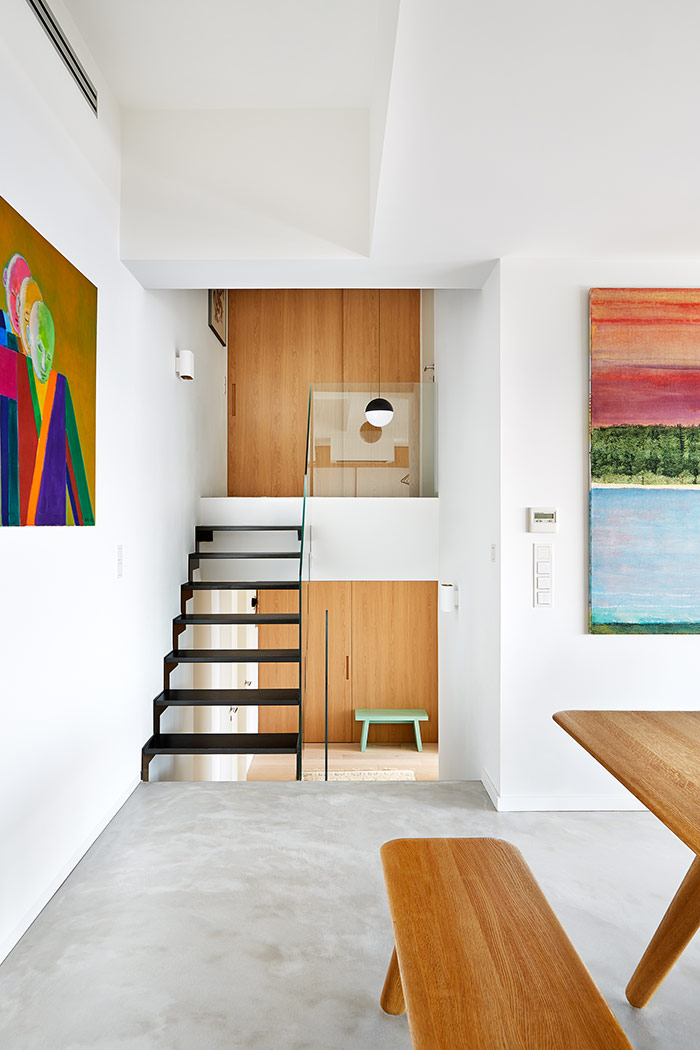
The new layout of the apartment is divided into three parts corresponding to the three floors. The middle entrance floor serves for common activities and gathering of the family in the large living space with an open kitchen corner. From this common area the staircase leads to private parts – a half floor down to the area of children, a half way up to the rooms of parents.
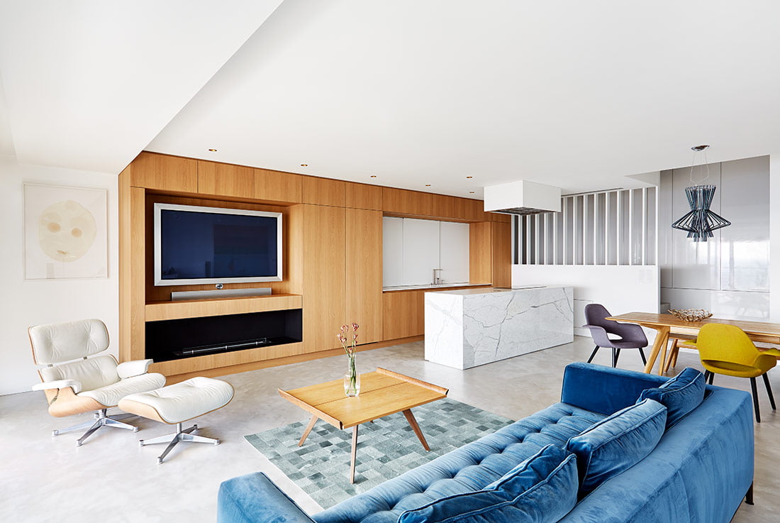
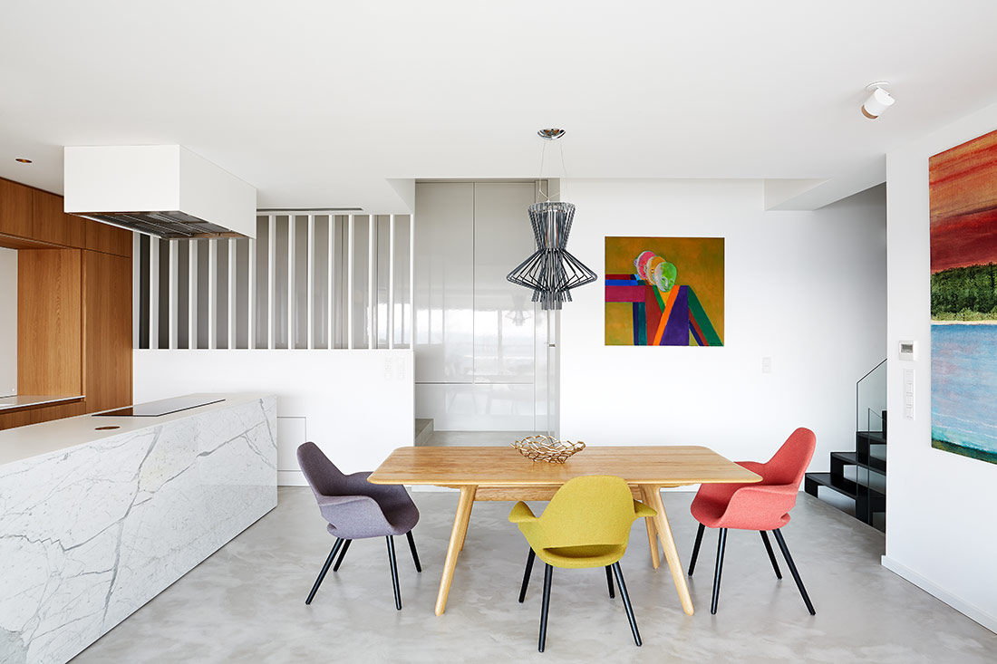
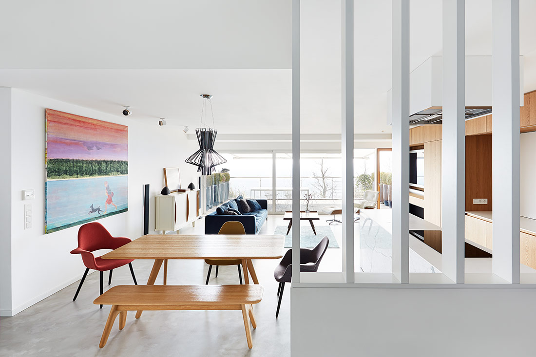
The living space has been purposely left open and undivided. The interior continues outside through a glass wall with large sliding panels to an outdoor terrace and the spacious feeling is enhanced by the generous view over the city. The main feature of the living space is the wooden wall unit that includes facilities both for the lounge and the kitchen. Its uniform look is marked only by a few openings – at one end there is a TV niche, a fireplace and an in-built bar and fitted kitchen units with a desktop in a niche at the other. By putting all necessary equipment to one side of the room we could leave the opposite wall free as a display for paintings. The kitchen part is designed in the way that it can be hidden when not in use, so it doesn’t visually disturb the lounge area – a wooden door can cover a set of appliances, sliding panels of white corian can close the shelving behind the desk in the opening. The kitchen island with cladding in carrara marble stands out in the space as a jewel. For practical reasons the kitchen is complemented by a separate storage room with a desk where all messy things can be made out of sight. The entrance corridor is divided only partially by white vertical slats, so the daylight gets in and even reflects in the glossy surface of closet doors. The slatted partition, the wooden wall unit and the general openness evoke together the mood of American 50s and 60s, which is supported by the selection of furniture including several design icons.
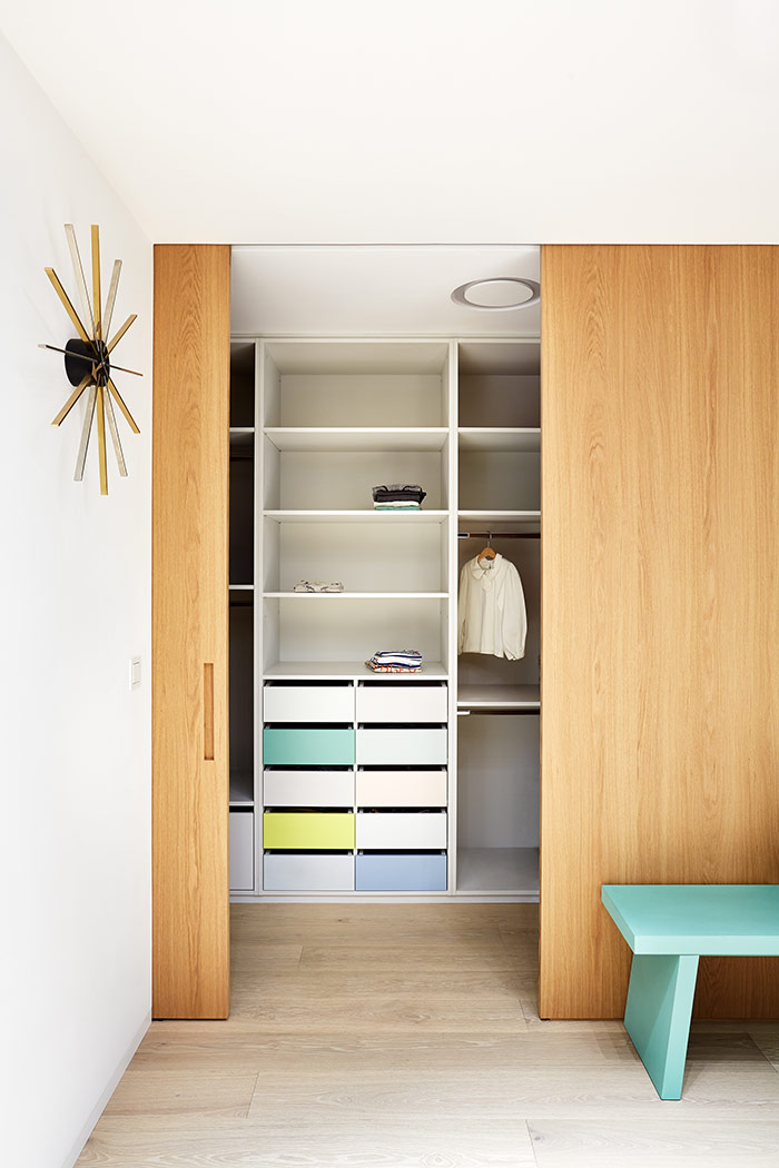
On the way down, the staircase leads to a small hall in front of the children bedrooms that can be used as an extended playroom. The bedrooms are also connected by a sliding door and both have glazed walls with an access to a common outdoor terrace that continues into a garden. Both bedrooms are marked by unique wall illustrations by the talented illustrator Michal Bacak. The children share walk-in closet in pale colours and the bathroom with playful tiles decor. Other doors from the hall lead to a separate toilet that can be used by guests and to a technical room. The parents have their privacy on the floor above the children, beside a small homeoffice there is mainly a bedroom connected with a walk-in closet and a large bathroom.
Atypical solutions
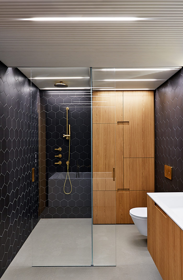
The refurbishment changed substantially the layout of the apartment and its technical equipment including air-conditioning, the relatively low ceiling brought quite a challenge. We tried to reduce all visible components and ventilation grills were incorporated into the custom made furniture. As a reply to a dense technical equipment above the parents bathroom, we designed an atypical false slatted ceiling that includes ventilation, revision openings and lighting. It also supports an intimate atmosphere in the bathroom. The combination of tiles and wooden furniture is supplemented by aged brass fittings and brass cladding behind the mirror cabinet. The water taps are located precisely to match the fissures of the hexagonal tiles. In the children bathroom we used decorative tiles in an original pattern which gradually passes from the floor to walls around the bathtub. A large part of the interior consists of custom-made furniture and components that were designed specifically for the apartment and include details that support both the concept and a practical use.

Credits
Interior
Lenka Míková, Markéta Bromová
Client
private
Year of completion
2016
Location
Prague, Czech Republic
Surface
180 m2
Photos
Veronika Raffajová
Project Partners
OK Atelier s.r.o., MALANG s.r.o.


