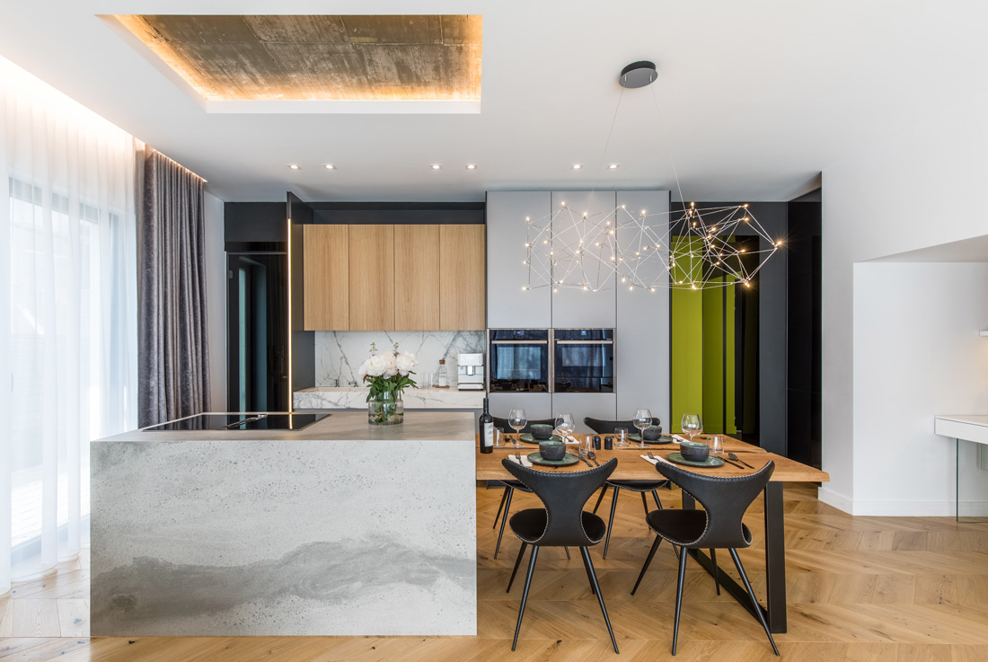
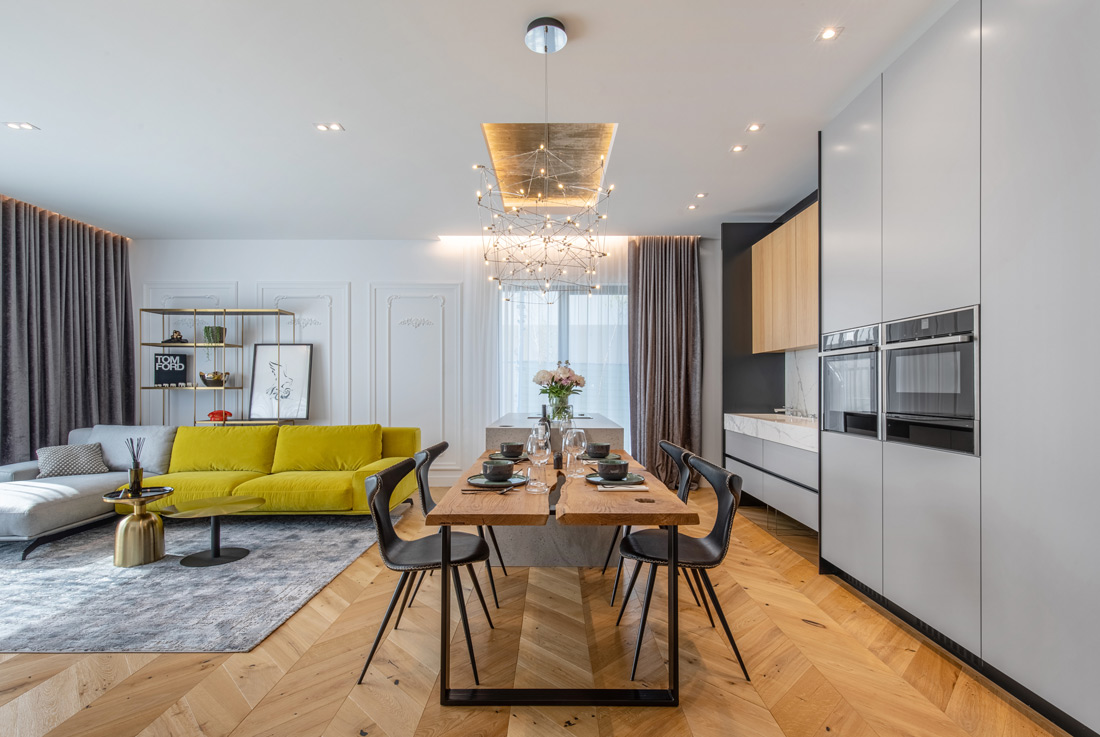
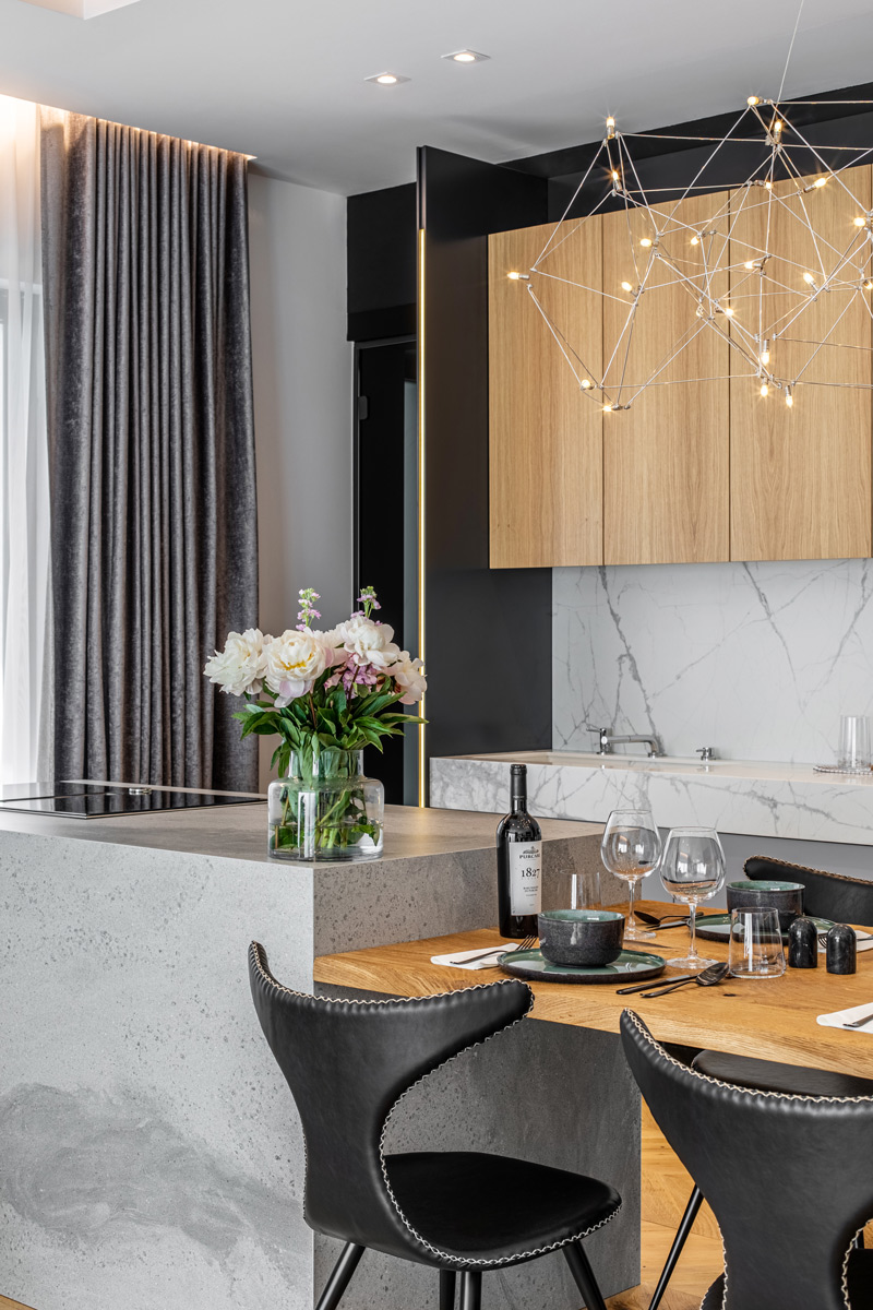
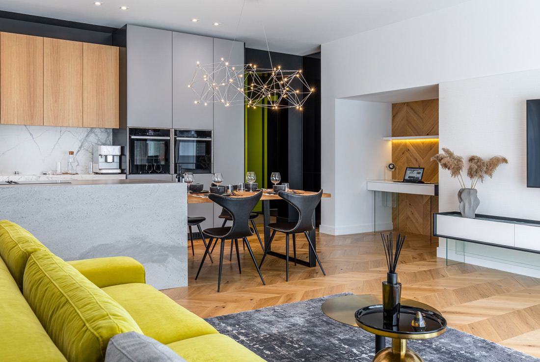
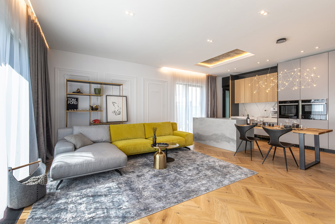
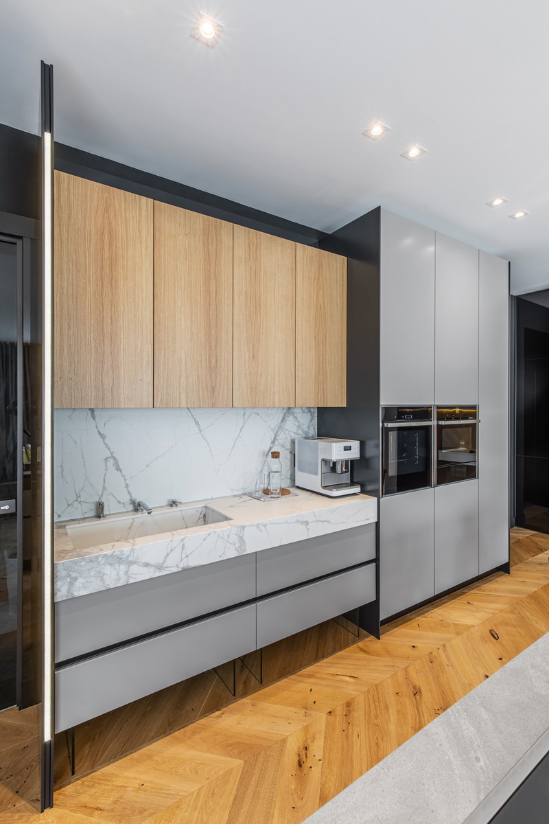
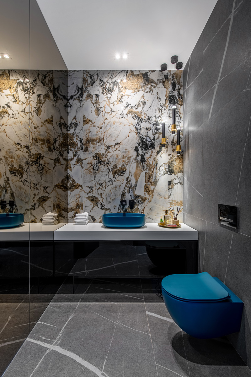
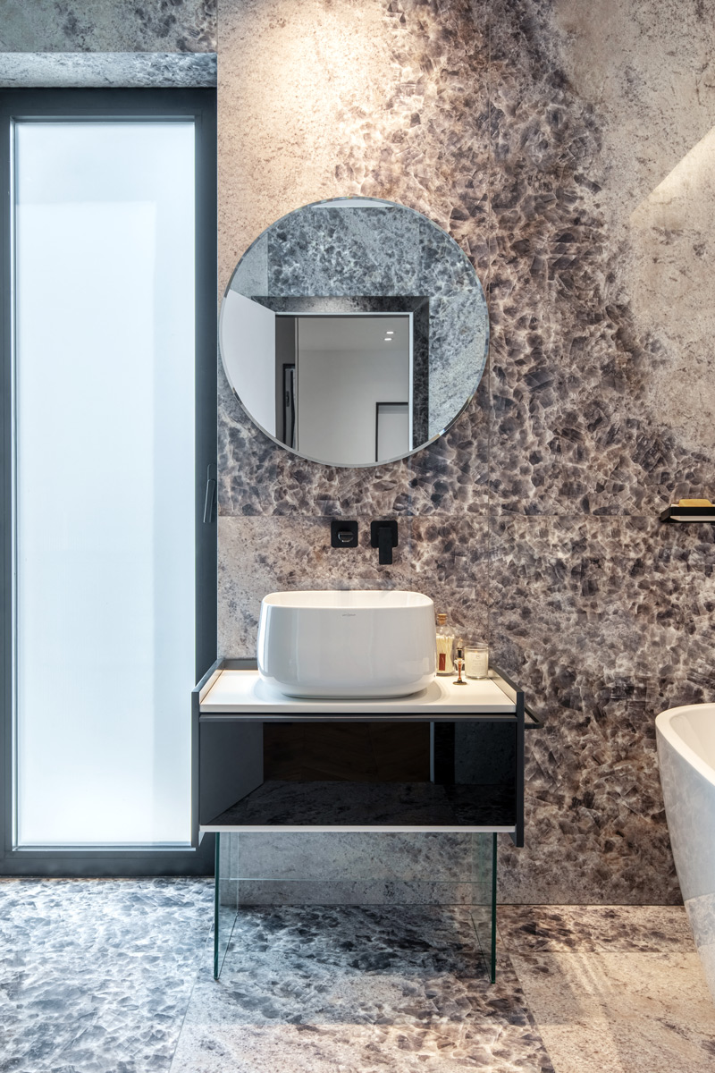
X Duplex is a project that started from the wish of creating a dynamic space for two beneficiaries with different styles. Each room has a surprising element meant to avoid clichés in design or monotonous spaces that lose their charm over time. As soon as you enter the premises, the first door on the right reveals a statement bathroom. Designed just like a work of art, this is not the main bathroom, so we could easily replace some classic elements, such as the central mirror above the sink or the white sanitary. Instead, we chose pieces with impact and powerful colors that impress the eye. One of the surprising statement elements is the wall covered with ceramic tiles from Florim Ceramice, Symphony model (1.20m long, 2.40m high). The visual effect of this slab is doubled by the smoky mirror, while the eclectic-fusion style is balanced and contrasted by the cold nuances of the sanitary ware. The main room comprises the living room, the kitchen, and a work area, in different styles and colors. An element that has become over time part of the Pure-Mess signature is the exposed concrete. Because we wanted an organic space that would convey the fluidity and naturalness of its operation, we thought of organizing it from the beginning in the proportion of gold. Thus, we repositioned both the kitchen and the living room. In the end, the comfort is not affected. The cooking area has a unique marble pattern where we mounted an electric hob with a hood included. In the opposite part, the countertop is a monobloc of exposed concrete, whereas the dining table is attached to it. The fixed part of the kitchen comprises a massive soldier made of painted MDF, and above the sink, we designed storage spaces made of veneered oak. On the right side of the kitchen, one can find two areas, one of them hidden by the black glass cladding. We chose to hide the technical room through this material to keep the entire space in the same line as the kitchen.
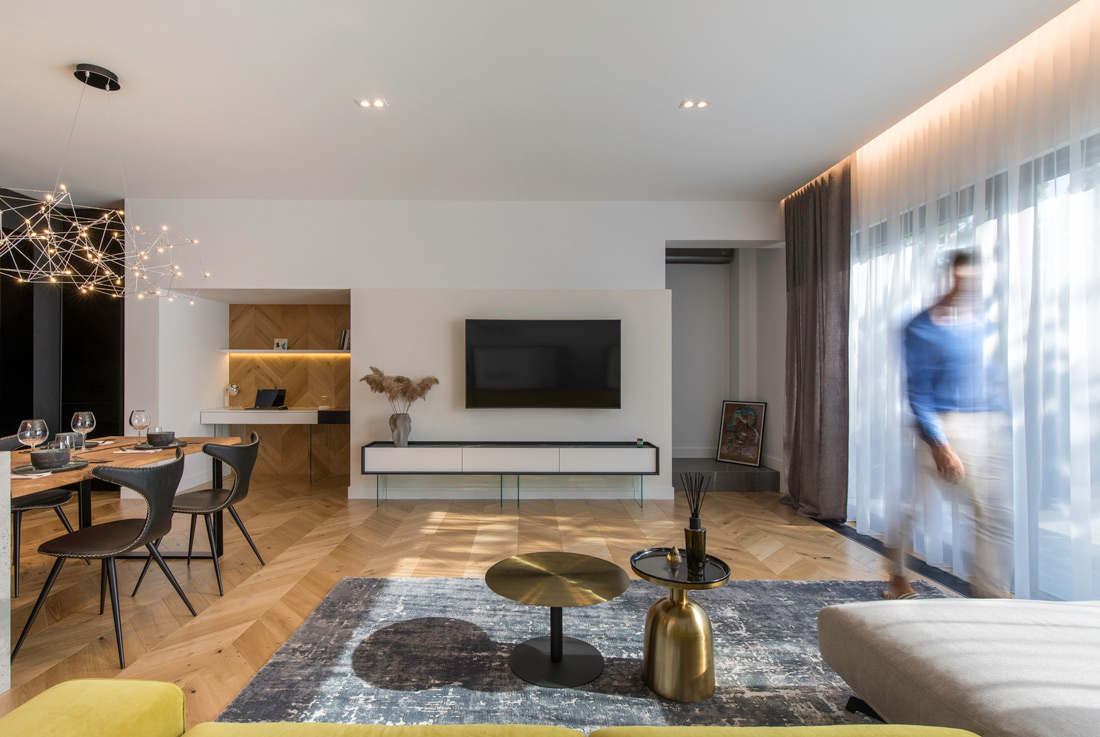
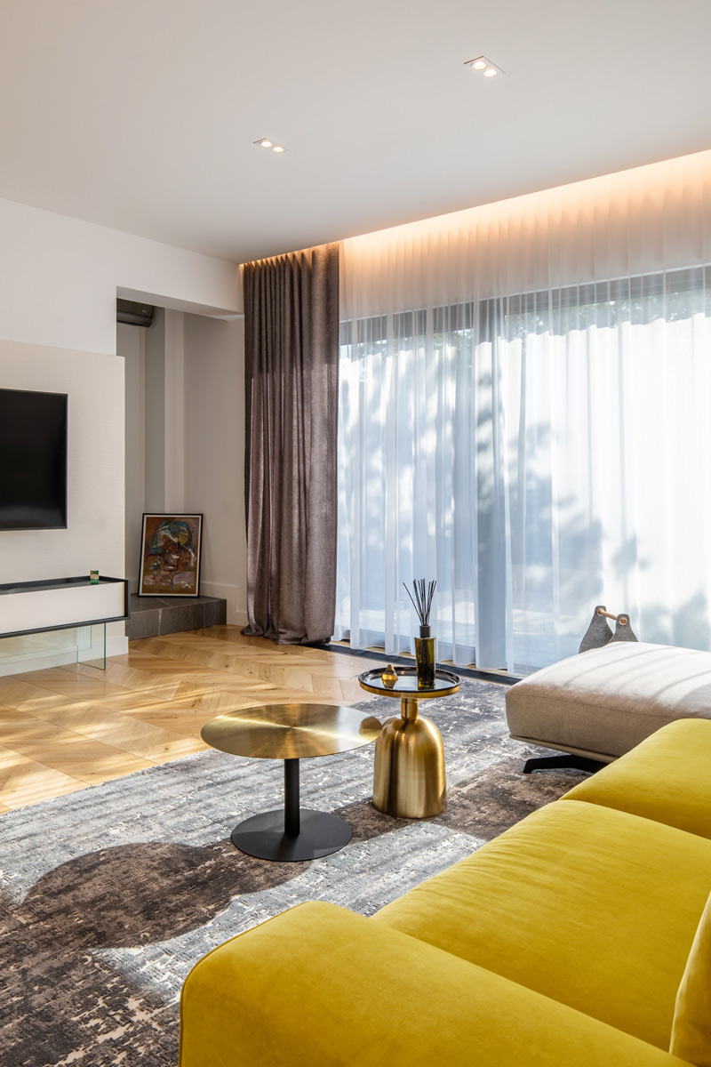
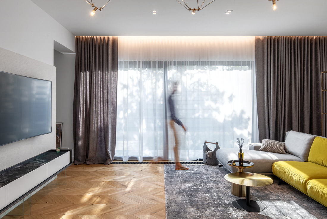
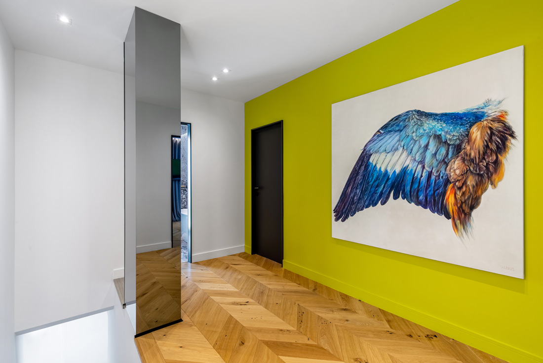
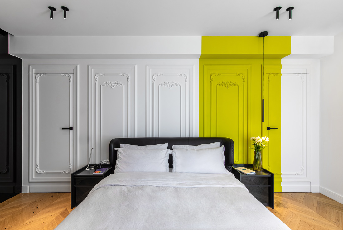
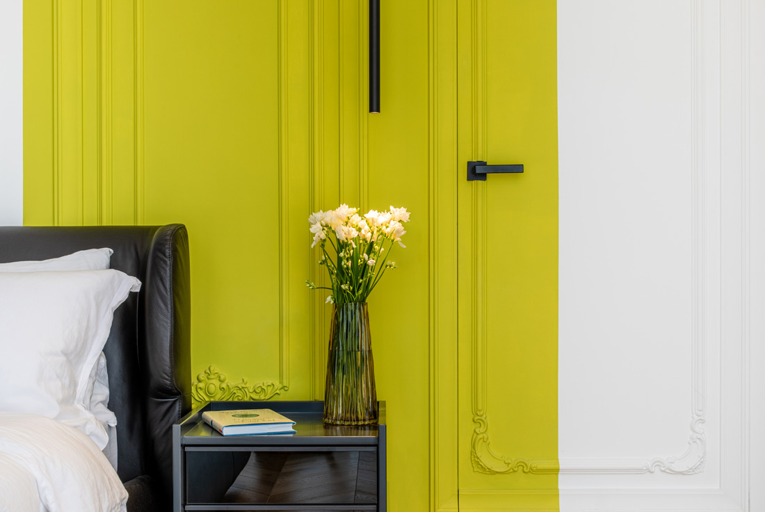
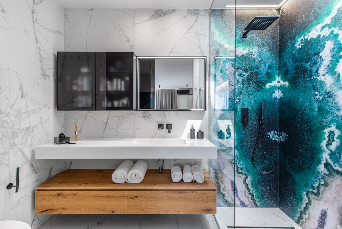
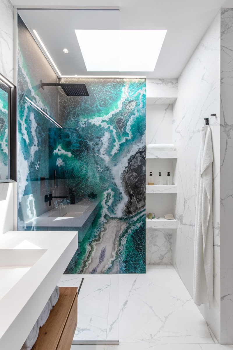
For the dining area, we used the proportion of the kitchen for an empty-full ratio. The effect generated by illuminating the exposed concrete slab and using the stone block on the same axis makes the island seem floating. The upholstered chairs have the same black leather found in the headboard of the master bedroom. The living room is a quiet space, dominated by white and without many details. As you look at the sofa, there are three different planes; the first is a mood derived from the colors, gray and lemon, brought to reality by matte velvet. The one in the back includes the shelf with the distinguished gold frame library. This piece of furniture with the duropolymer frames gives light to the space and creates a relaxed atmosphere. The parquet floor is custom made, oiled oak disposed chevron type, and with a matte appearance. The tiles were cut at CNC, adapting the margins with the niche gap as the final results match the aesthetic. The office area is designed in a minimalist way, being well delimited – where the black glass aspect intervenes, we hid a storage space under the stairs. Here you can put bulky items, skis, suitcases without affecting the design. The stairs lead to the first floor, and the transit area showcases an oversized custom-made painting. The master bedroom has its dressing room, thus is not loaded with furniture or other storage areas. The Ditre Italia headboard line has the details of the chairs in the dining area. Behind the bed, we designed five classic frames that mark two invisible doors (Filomuro doors), the entrance to the room, and the dressing room. At the same time, we inserted a bit of color to mark the personalities of the beneficiaries. Because the bathroom was small, we partially removed the plasterboard wall that separated the space and opted for a black glass closure. The bathroom is organized according to the rule of two-thirds by one-third, where the long part enhances the horizontal volumes given by the countertop and the suspended furniture. The star of this room is by far the shower. We opted for two butterfly slabs from SICIS that have emphasized the volume and inserted a Velux window for more natural light.
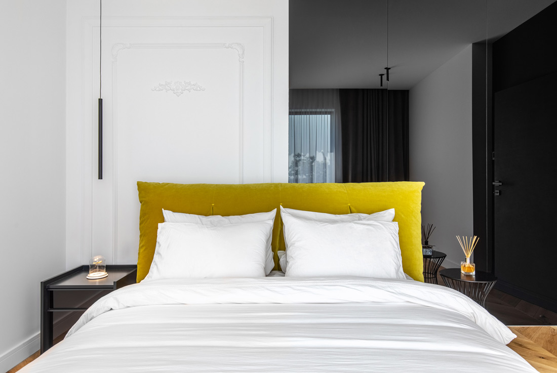
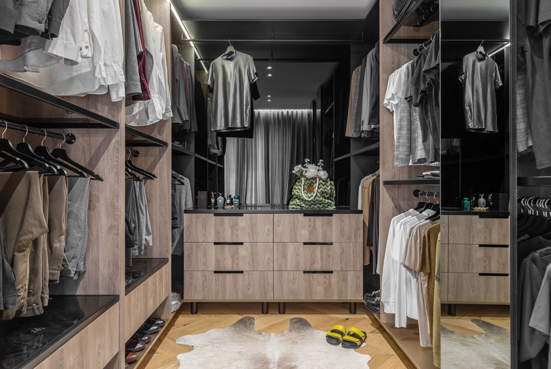
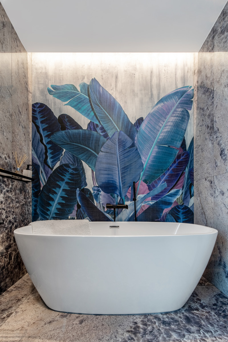
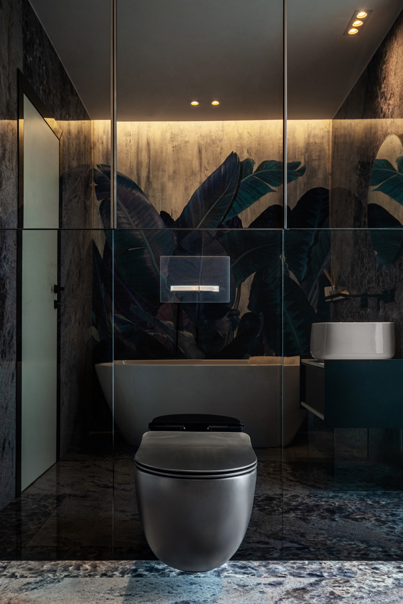
Starting from the inspiration of the showroom shops, we chose the dressing room sliding doors and an end of perspective covered with black glass for brightness and mirroring of the elements. The guest bedroom is a small room we played with to change appearances. The wall behind the bed accentuates the verticality through the two styles with different finishes, developed on two-thirds and one-third. On the left, we have the duropolymer decoration, and on the right, the black glass to obtain the effect of depth. We chose a suspended bed with a massive fluffy headboard, resembling an oversized lemon pillow. The bathroom with access from the hall is the only bathroom with a bathtub. We chose a waterproof wallpaper with jungle inspiration and botanical motifs. The design of the bathroom is a mature and lush one, given by the glossy ceramic tiles that have a slightly three-dimensional pattern. The opposite side of the bathtub is dark, having a matte black toilet bowl and a smoky glass that hides a storage space.

Credits
Interior
Sergiu Călifar, Pure-Mess
Client
Adrian Stan
Year of completion
2021
Location
Otopeni, Romania
Total area
120 m2
Photos
Sabin Prodan
Project Partners
Corp Construct, Artceram SRL, Rubinetterie Treemme, Iris Ceramica, Florim Ceramiche, Inalco, Sicis, Inalco, UrbanWoods, DeltaStudio, Ditre Italia, Kare Romania, Neff Home Romania, Miele Romania, Luminna Romania, Quasar Holland, Inkiostro, Benjamin Moore


