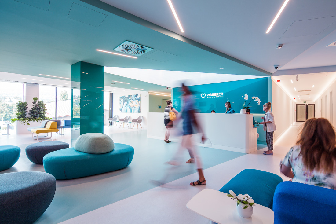
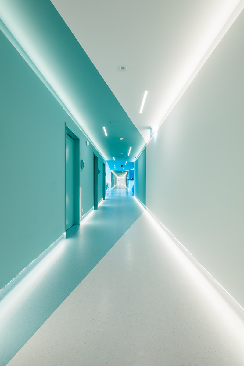
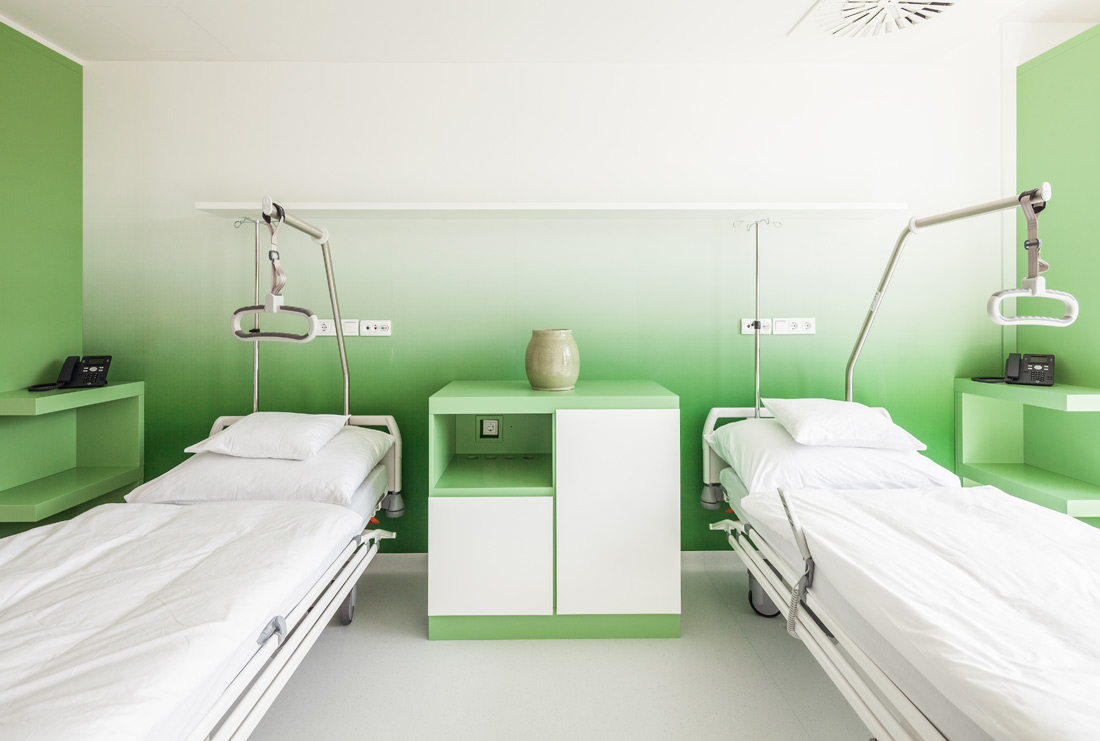
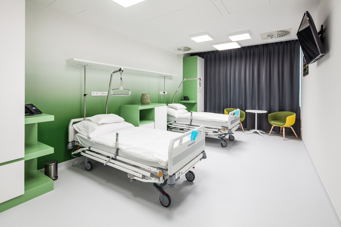
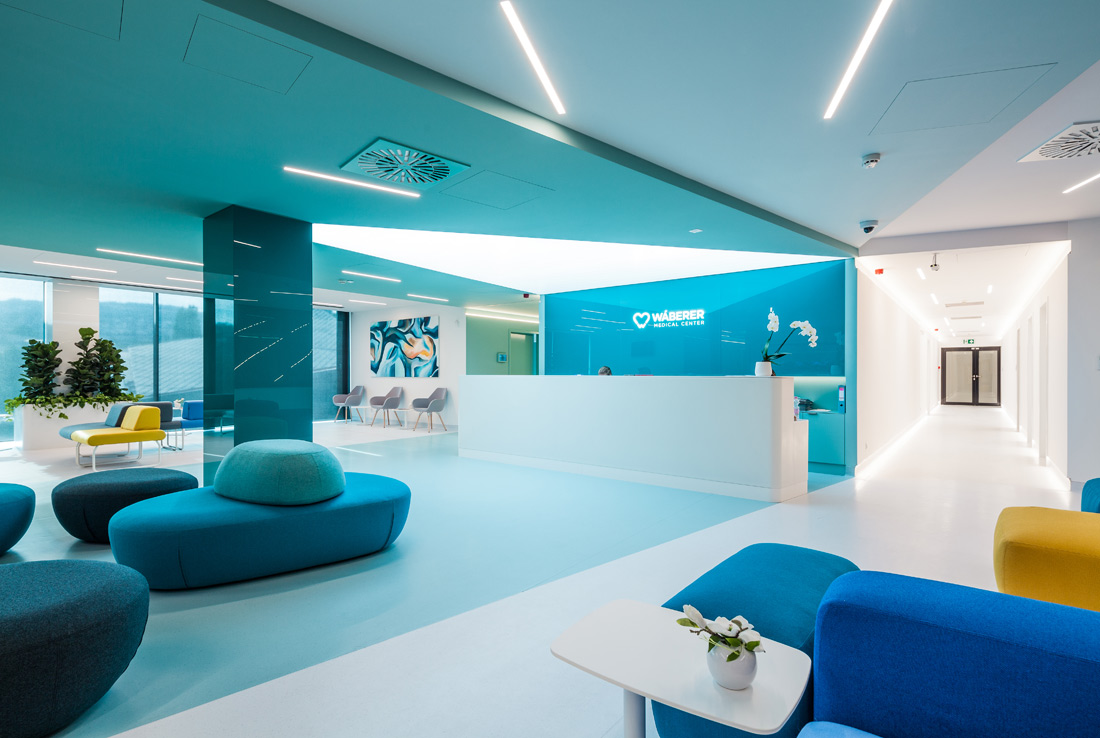
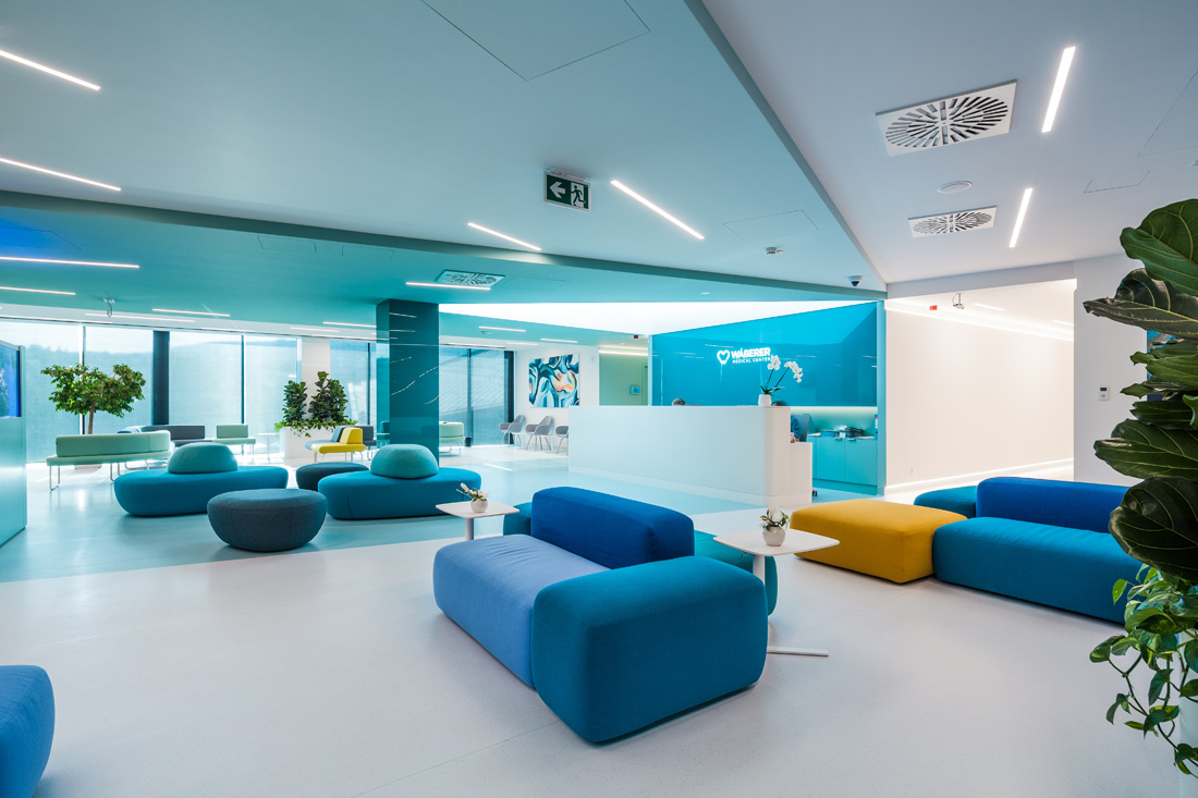
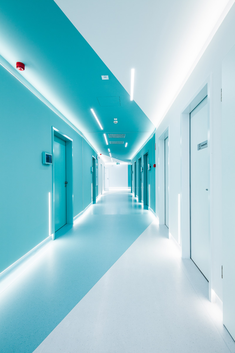
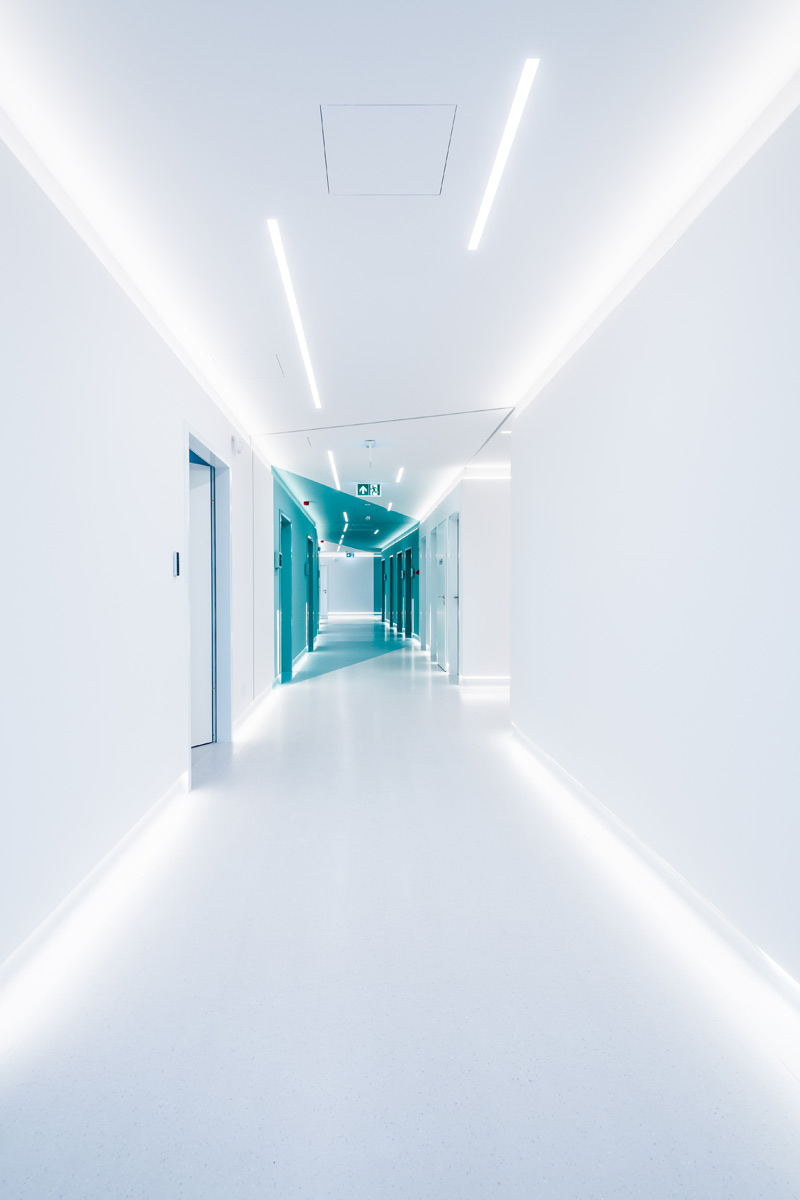
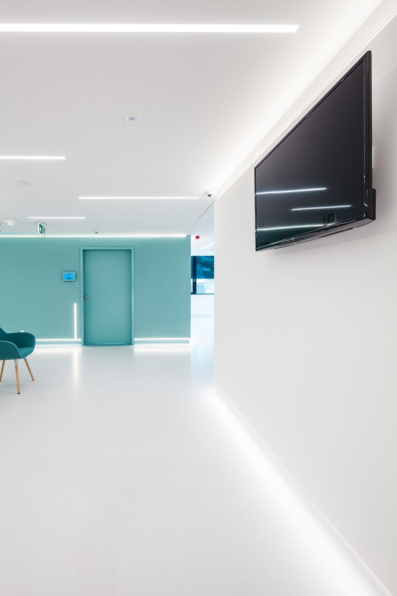
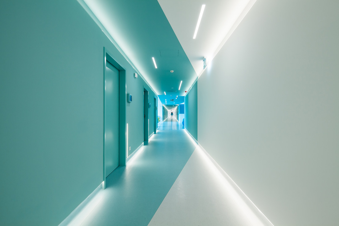
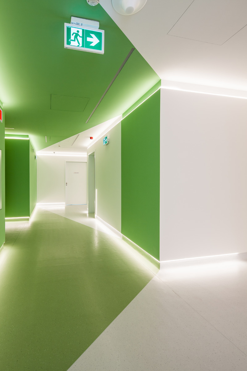
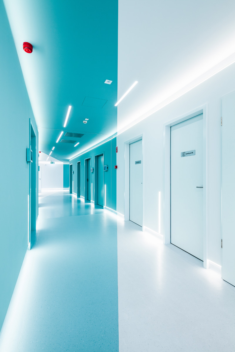
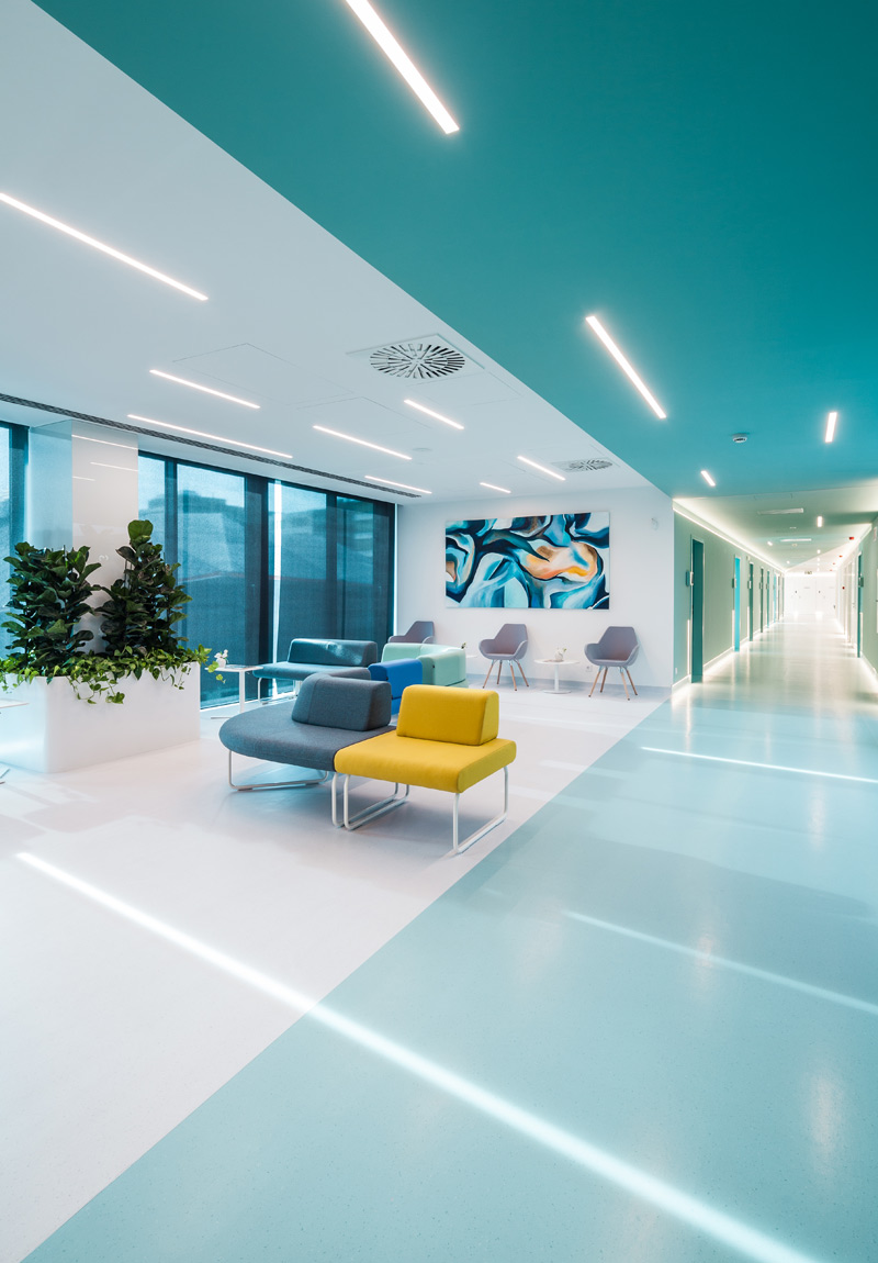
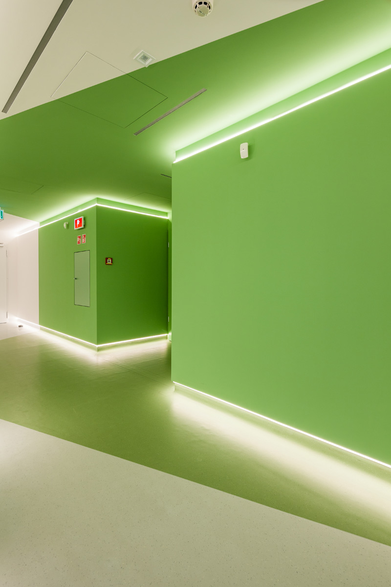
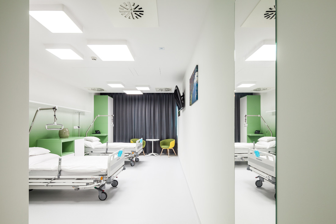
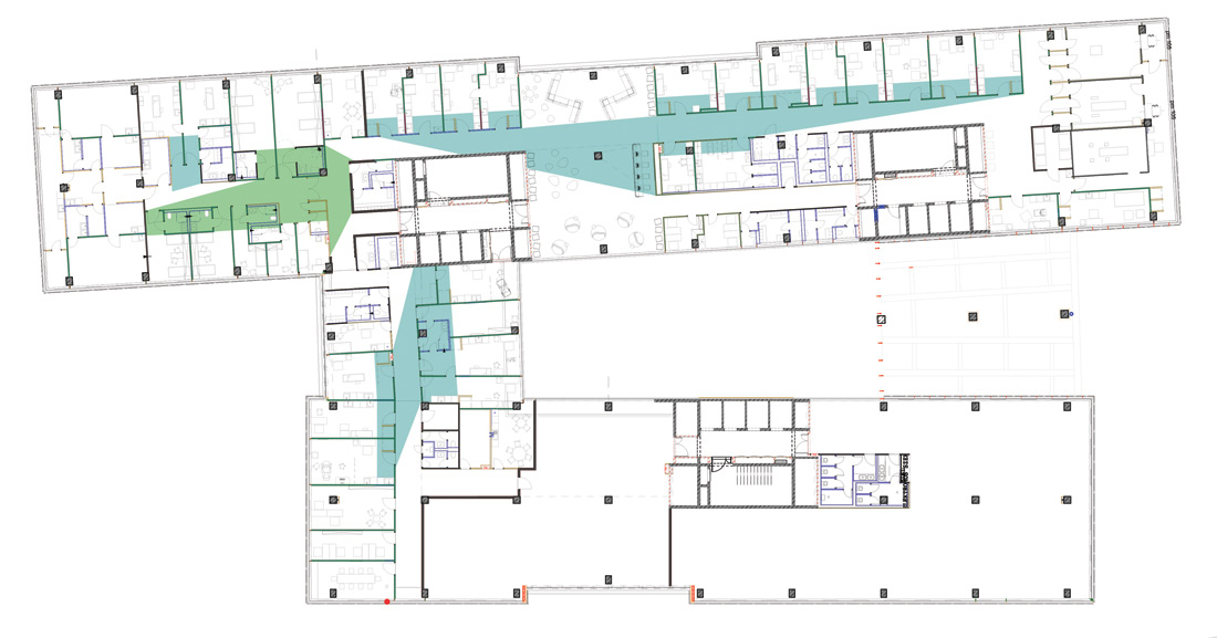
Wáberer Medical Center is a new player on the healthcare market. It is based in the prestigious HillSide Office Building, which works accordingly with its motto that it stands at the edge of the natural, recreational and built environment. When it comes to the design of the clinic, we try to express the same thing, thus, the areas were designed with a similar approach. Along their connections, we formed sharp-cut, broken-line transitions, which were also emphasized by lighting. This characteristic gives the institution its image. The colors encode different functions: green is for multi-day treatment areas, consulting rooms for patients are turquoise, and technology rooms – such as operating rooms – are white.
Design Concept
The Wáberer Medical Center is located in the HillSide Offices in Budapest, on the border of the lively downtown and the green mountains. During the design process of the 2000m2 clinic, this locational duality was the guiding principle to connect the cozy, humanly interior to the high-tech world of modern medicine. In this relationship, the transition elements are interpreted as part of the signalization.
Spatial Concept
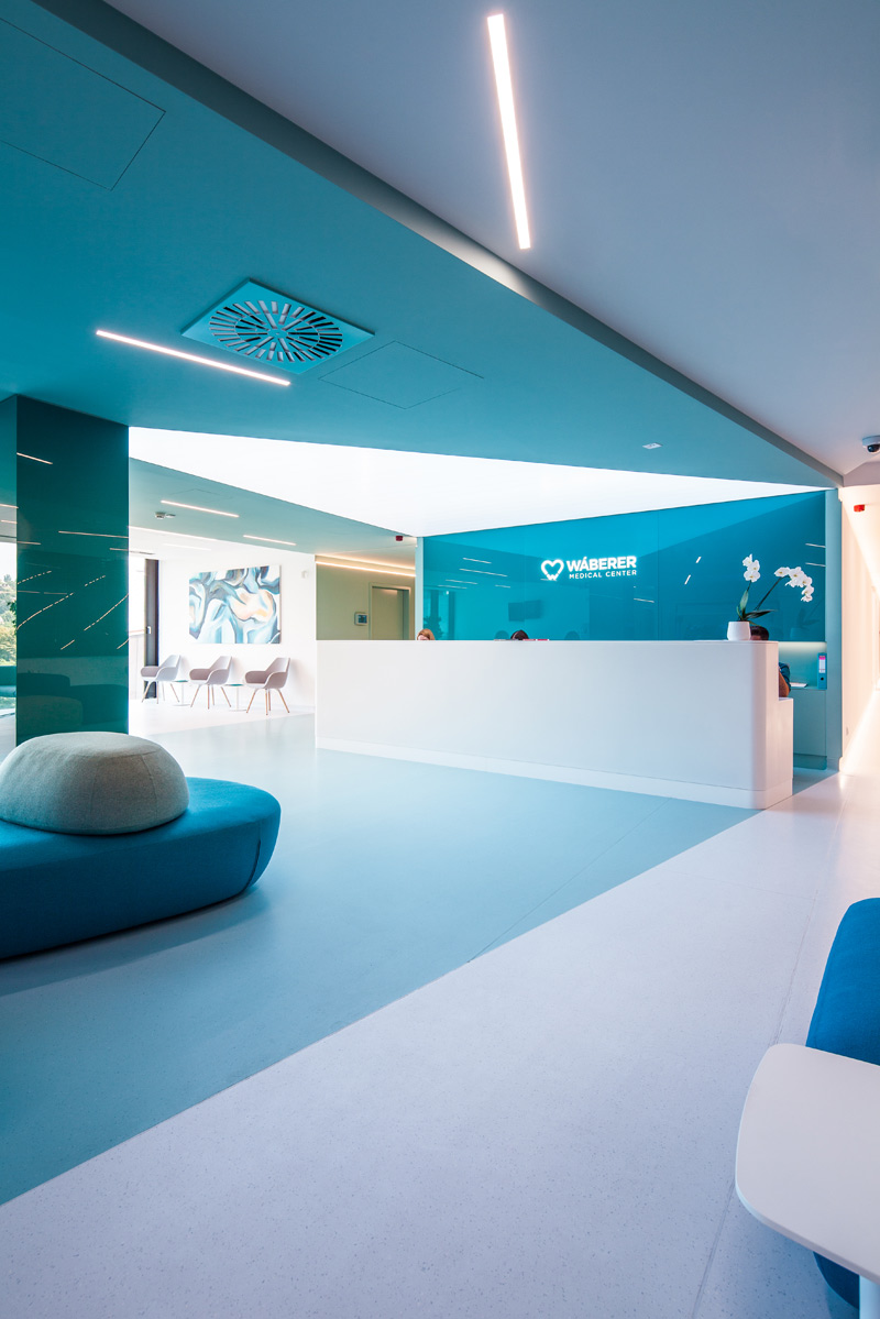
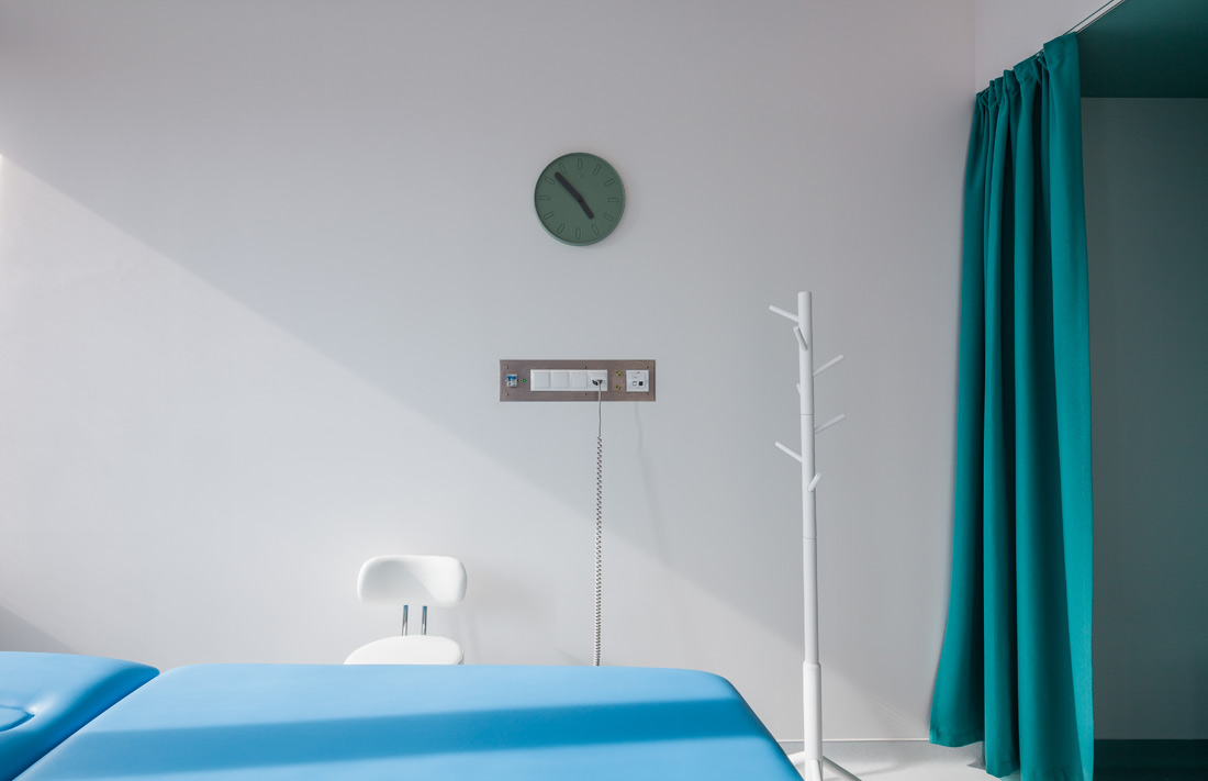
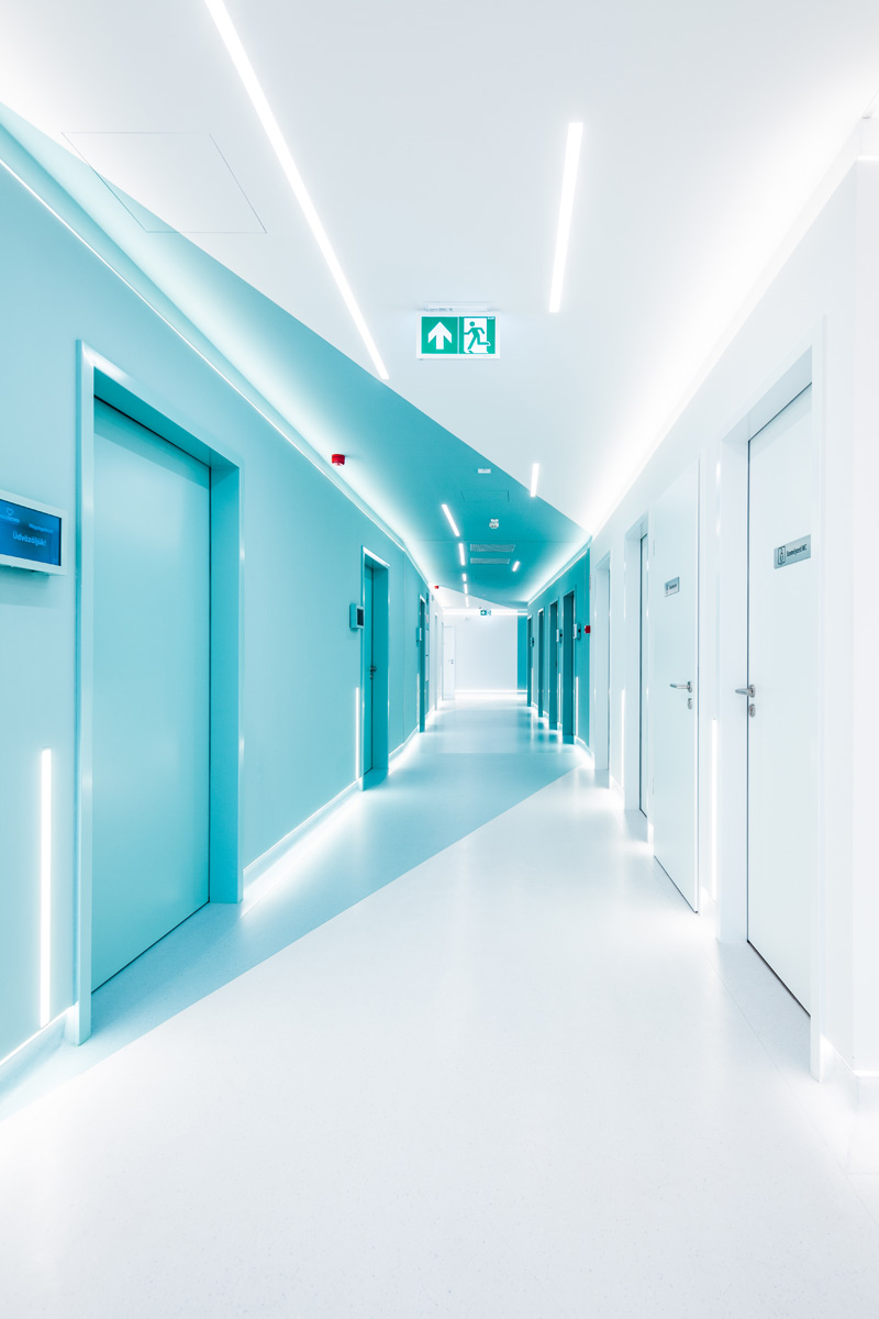
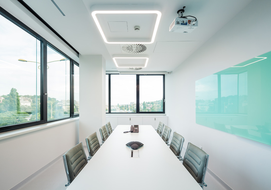
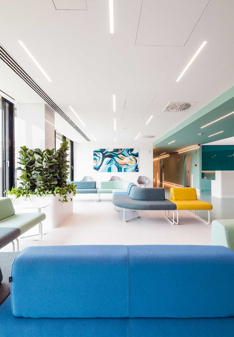
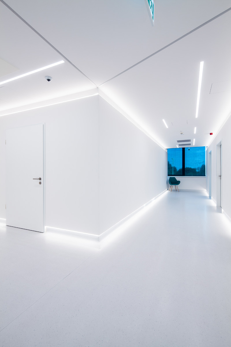
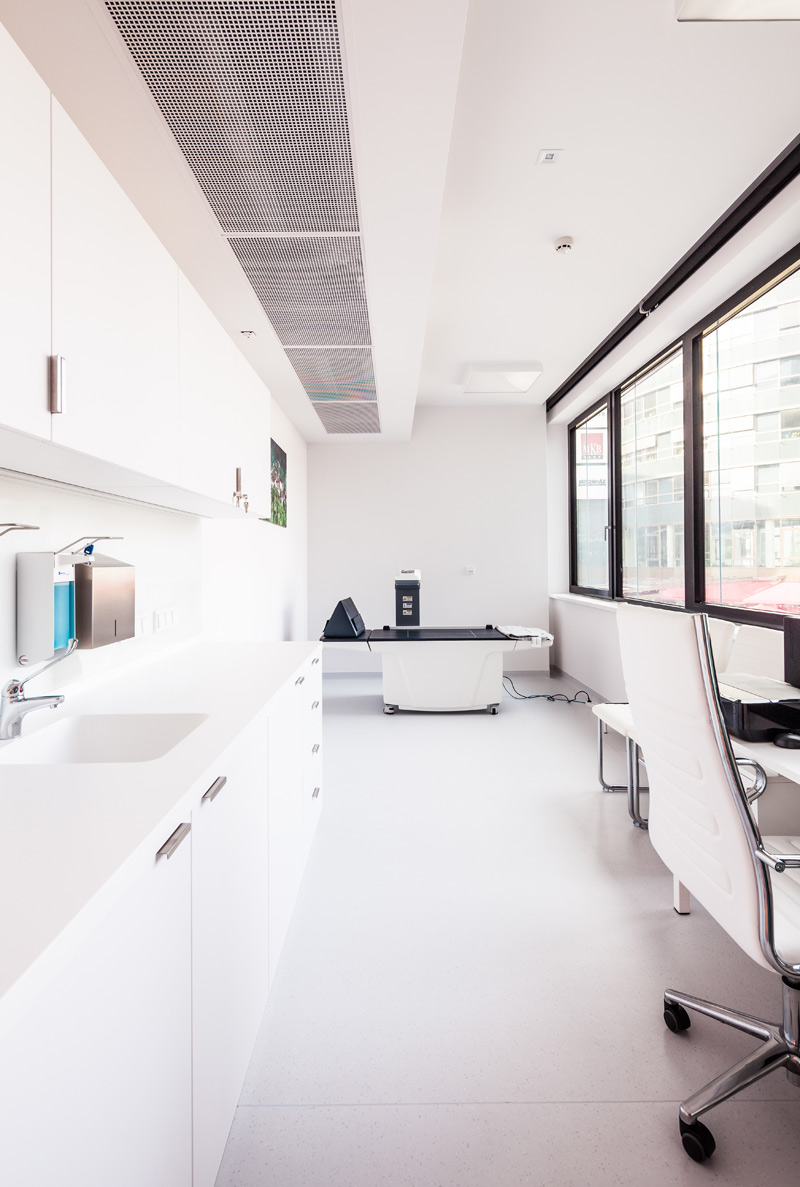
Those who come to the clinic are welcomed by the geometric and colorful system of the central waiting hall, in which the centers of gravity and directions are marked with artificial light. The reception desk with the programmed white lighting front and the illuminated ceiling above attract the customer’s attention, while the lighting structure aligned with the main traffic directions helps to guide the visitor to the different functions, such as outpatient department, operating rooms or patient rooms. The inherently monotonous world of corridors is solved by hidden line lighting and the geometric use of color, which also have a highlighting role, and make it interesting with its visual playfulness. Behind the turquoise doors and walls are the medical offices, while the green ones hide the patient rooms. These two characteristic color bands also turn up in the entrance area of the rooms and in the coloring of the the dressing- or bath units, thus, giving a contrast to the otherwise brilliantly white, sterile interior. The dominant colors of the diagnostic and operating rooms at the end points of the clinic are white and stainless steel. This space completed with high-tech lighting and state-of-the-art equipment evokes a real space world.
Material Use
In addition to its professionalism and attractive appearance, the operational and sustainability aspects of modern medicine are extremely important, thus, the usage of continuous surface finishes, well-cleanable and maintainable coverings, precise custom-made or made furniture and professional lighting was a fundamental design aspect.

Credits
Autors
Minusplus Architecture and Design; lead architects: Zsolt Alexa, Ákos Schreck, Donát Rabb, project leading architect: Sarolta Bessenyey, architects: Dorottya Lázár, Adrienn Béres, Balázs Kis, Emese Edit Kőrösi, Barbara Deák
Client
Waberer Medical Center
Year of completion
design: 2018
construction: 2019
Location
Budapest, Hungary
Total area
2.000 m2
Photos
Tamás Török; Topogram
Project Partners
Market, belight!, Do work Kft., Europa Design, Vivax Kft., Impala Bútorkereskedő Kft., SMH Kft., Cleartex Kft., JAB Kft., BePro Solutions, Merida Kft., Kőszeghy Flóra


