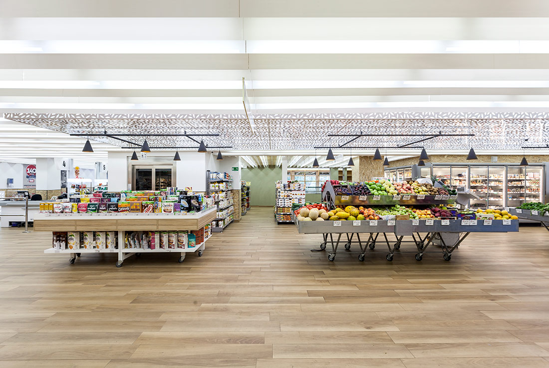
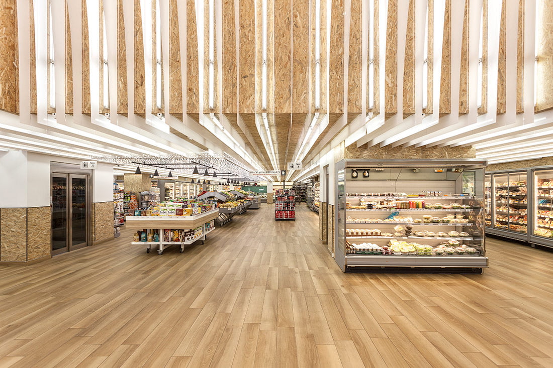
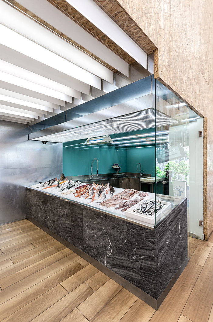
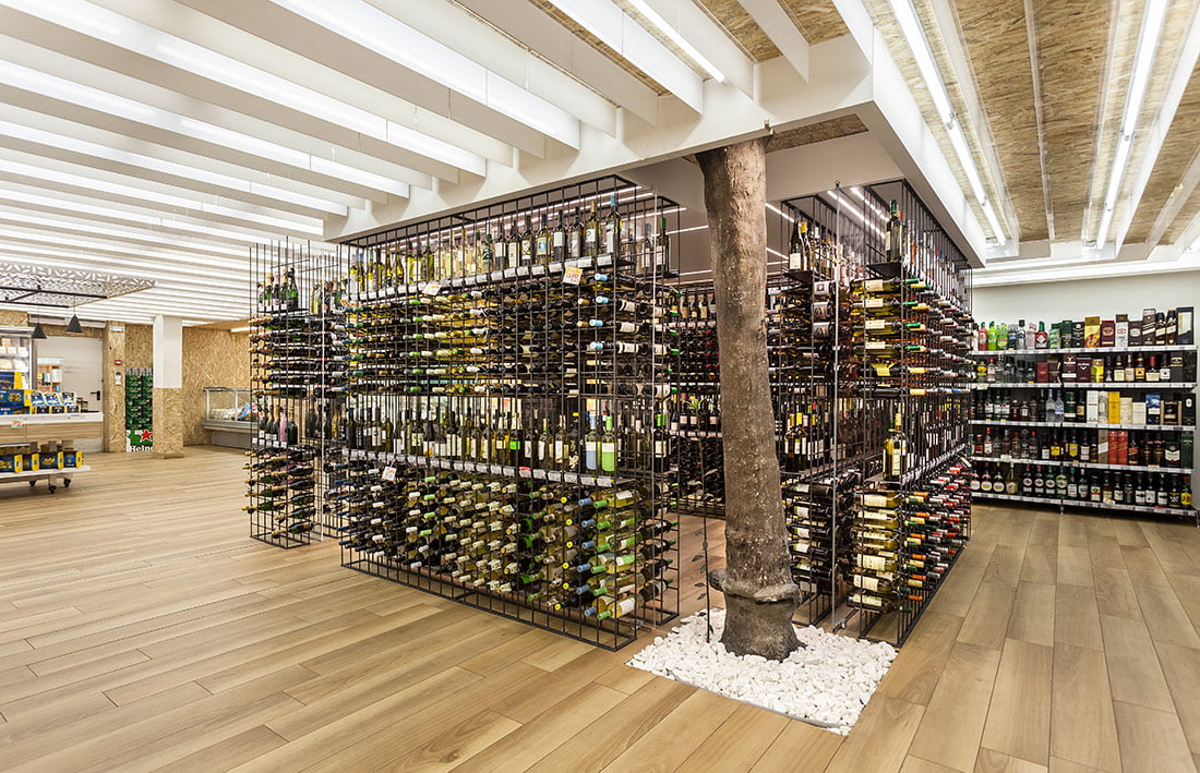
The main idea was to change the notion of the supermarket as it exists today in Greece -indifferent big boxes with long alleys of products. For us, the supermarket had to be resolved as an interpretation of an urban market place where you go to different shops to find different goods and interfere with other people.
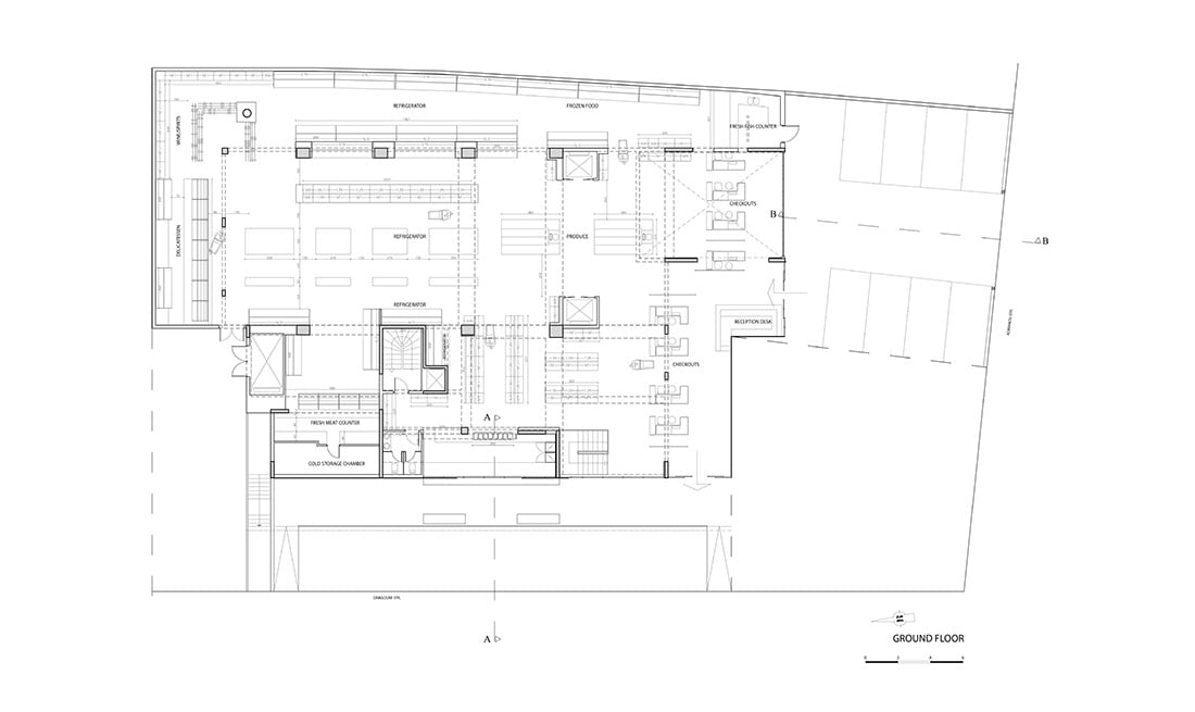
Following the refurbishment, the super market extends to 1500m2 and was limited to two floors occupying a larger area than it did before on three floors. The storage areas, which in the past occupied the majority of the space of the basement, were moved to the 1st and 2nd floors, setting the basement space free for use for the supermarket. Communication between the two floors was altered with the addition of yet another large elevator, since new staircases for servicing and facilitating the customers were designed and constructed. The rearrangement and restructuring of all shelves which was designed based on the needs and habits of the customers.
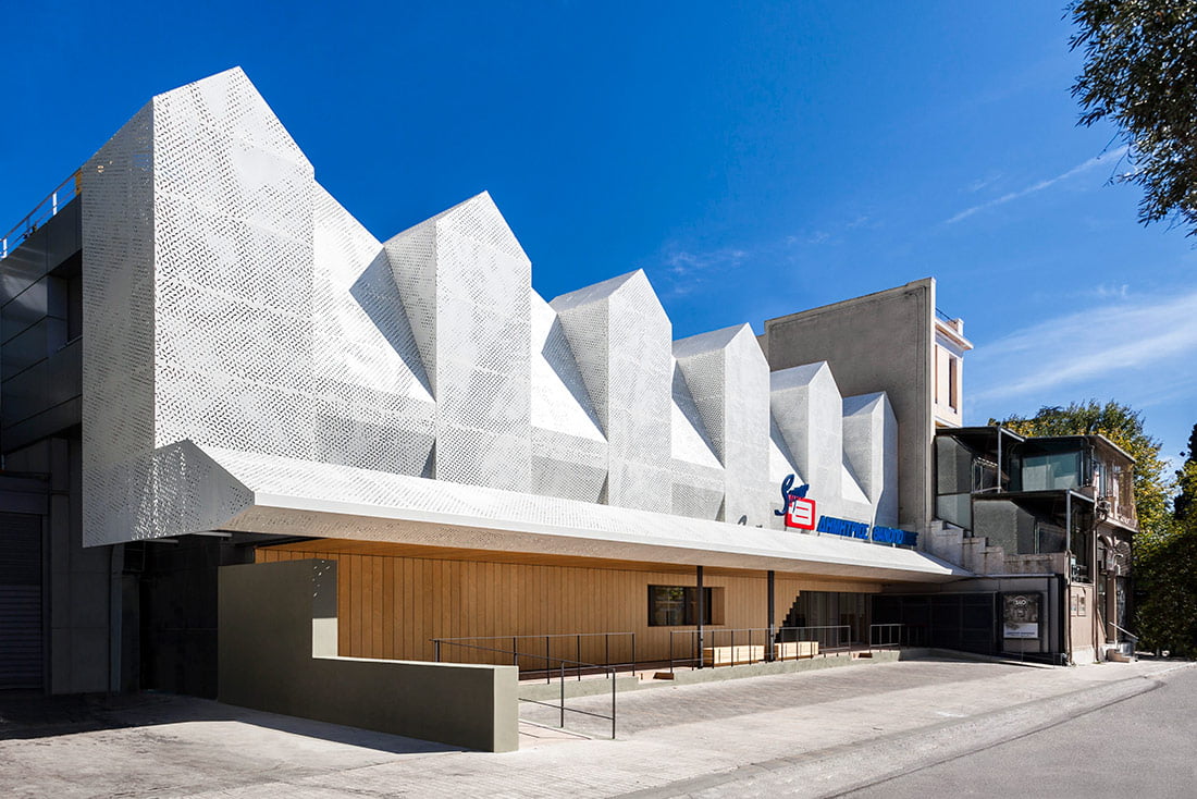
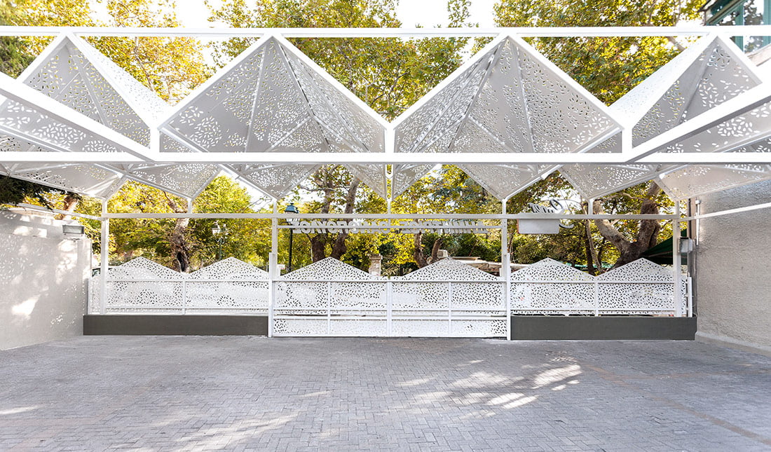
For the interior design, we wanted to maintain a relationship / connection with the new façade. There is a continuity and consistence in materials, aesthetics, and colors we encounter on the front view, while our goal is to create a warm environment for the customer. A dominant element that unites the exterior with the interior is the new metal suspended perforated false ceiling that consolidates new sales outlets specifically created for the the Kifisia store, which is characterized by the passing user of the Railway.

Credits
Interior
Klab Architecture
Client
Thanopoulos Supermarkets
Year of completion
2017
Location
Athens, Greece
Surface
1500 m2
Photos
Mariana Bisti
Check out the BIG SEE event here: Interiors 180° / Big See Awards / Month of Design 2018
Project Partners
OK Atelier s.r.o., MALANG s.r.o.


