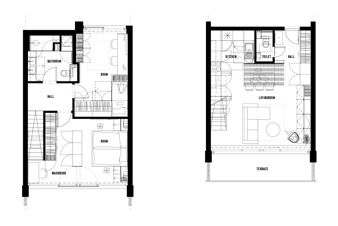
The three-room duplex apartment was changed at the beginning by disposition changes, where we eliminated the corridors and used the floor space to the maximum. Although the flat is on two levels, it is quite small. Especially the lower part, where everything is connected – entrance hall, kitchen, dining room, living room – and there were many operational conflicts.
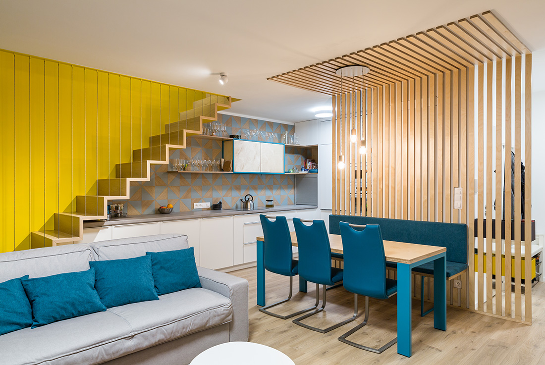
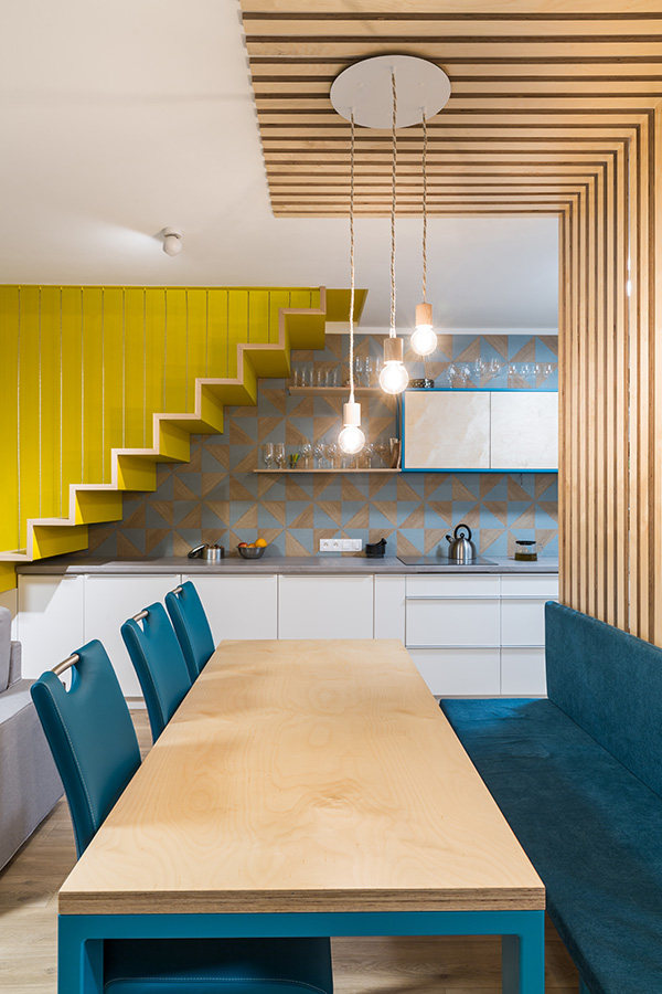
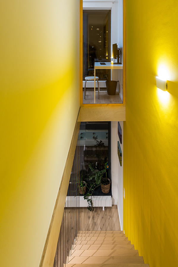
In the original development layout, the kitchen was in the shape of an L and under the stairs by the wall – seating. The owners’ requirement was to have a large open space with a large table, where several people can be comfortably seated. Another requirement was to have fresh and colorful interior, including the kitchen. The problem was the location of the kitchen and the staircase. We decided to make it a dominant feature, whose atmosphere will also appear to the second floor. At the same time, we paid attention to the subtlety of the structure and the airiness of the space.
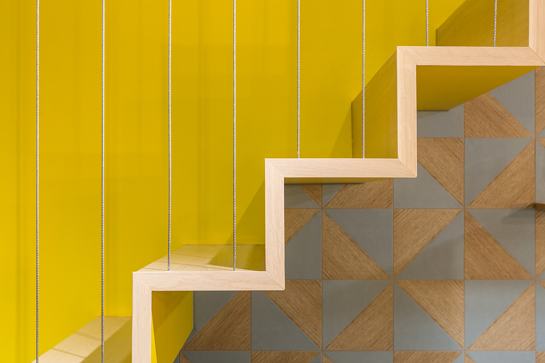
The staircase is made of steel with wooden notch boards; the railing is made of steel wire and is yellow from the bottom. The yellow also appears on the wall and refreshes the entire day area. The kitchen is U-shaped and extends below the stairs. We have created enough workspace and storage space. We chose white color for kitchen doors because of location in the disposition. On the back of the tall kitchen unit there is a coffee maker and on the sides under a roller blind are hidden kitchen appliances.
The mono-block has a built-in fridge / freezer, oven, microwave and storage space. In the upper part are stored seasonal, less used things. The high mass is aerated with niches – shelves for cookbooks. Wooden slats optically separate the washing zone from the kitchen and the dining area.
The floor is vinyl throughout the apartment except the bathroom. It was an investor’s request and technically the only possible floor, because the entrance door was already fitted, allowing only a tiny floor layer.
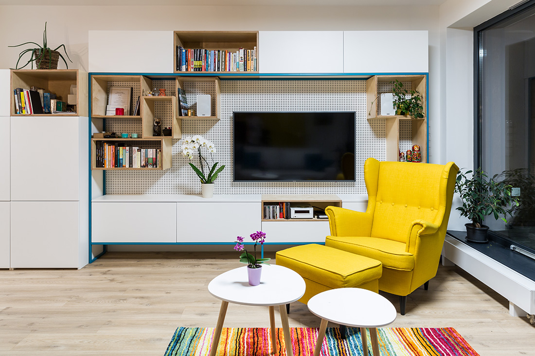
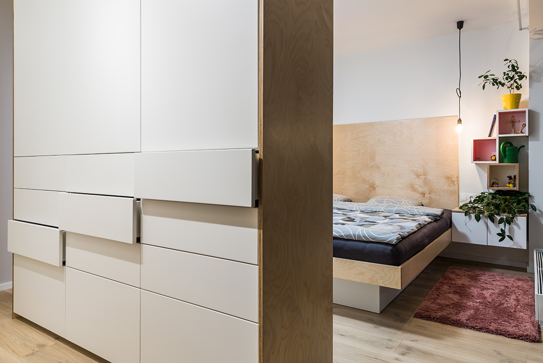
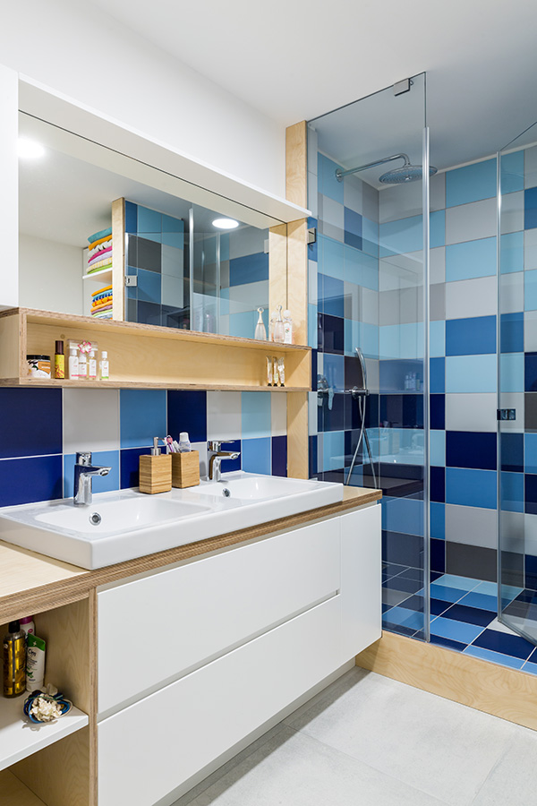
Furniture in the whole apartment is made-to-measure with special steel frame elements in turquoise color; white areas compliment open plywood boxes.
What makes this project one-of-a-kind?
The yellow staircase is unique and dominant of whole apartment. Yellow collar was owners’ requirement.
About the authors
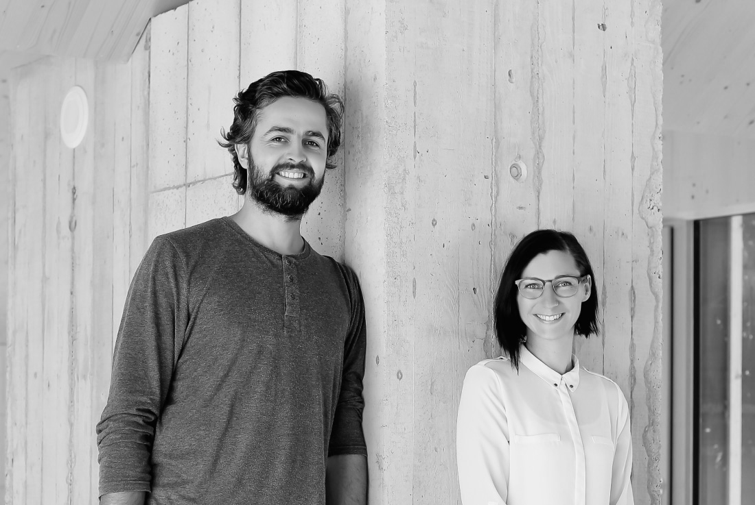
The ARCHHOLIKS studio was founded in 2008 and the name was derived from the qualities we possess. We are workaholics! (not alcoholics :)) Our work is also our hobby, it keeps chasing us and we keep chasing it! Before collaborating under joined name we co-operated on student competitions and in studio projects and during our collaboration, we complemented and elevated each other. Love for architecture and each other kept us going on.
In our work, we strive to create a functional, flexible and environmentally friendly environment. We try to show the investors different vision of space but still meeting their requirements. It is very important for us, that our clients feel comfortable in our interiors, are able to identify with them and afford them. We are always telling our clients at the first meetings that our project is the result of our collaboration, which arises from a continuous dialogue.
We like to use materials that are natural and true and do not pretend to be something else. This is our main ambition and we try to educate our clients, who are often influenced by trends of our chain stores, which often offer kitsch and inelegant products.
We appreciate wood, metal and its perforations, we like to experiment with materials and we look for their unusual use. We are also very fond of recycling.
Text provided by the authors of the project.

Credits
Interior
ARCHHOLIKS; Jana Tartaľová, Michal Tartaľ
Year of completion
2017
Location
Bratislava, Slovakia
Total area
88 m2
Photos
Juraj Starovecký
Project Partners
OK Atelier s.r.o., MALANG s.r.o.


