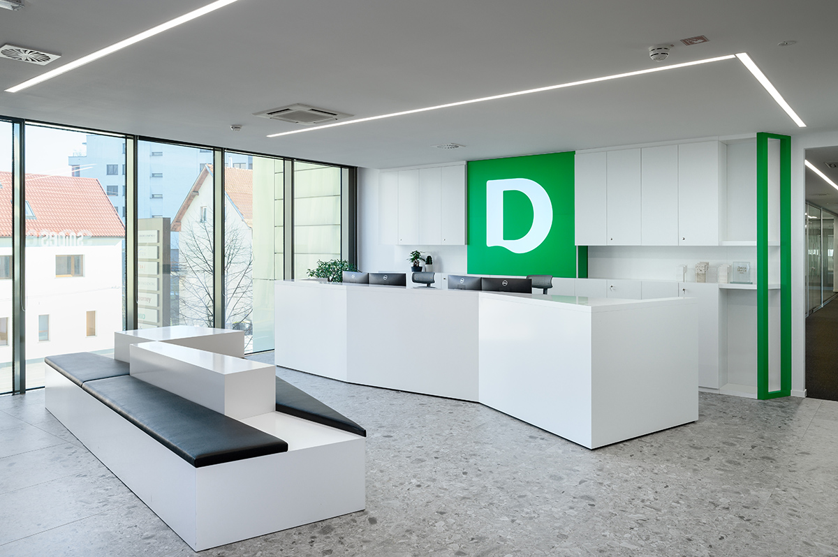
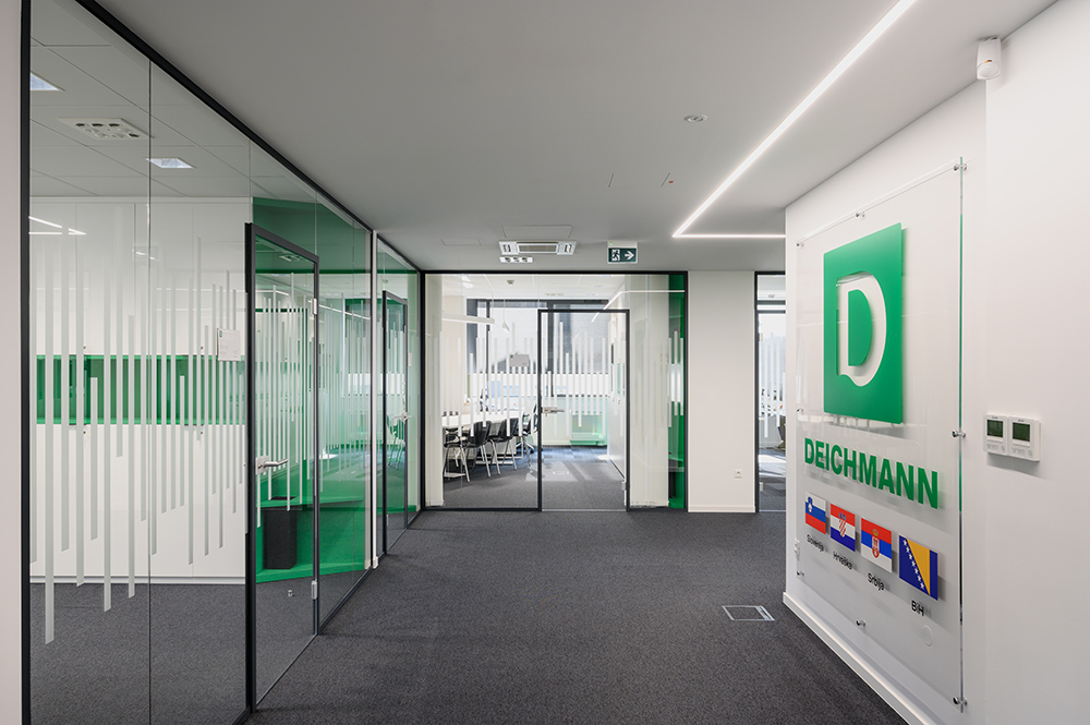
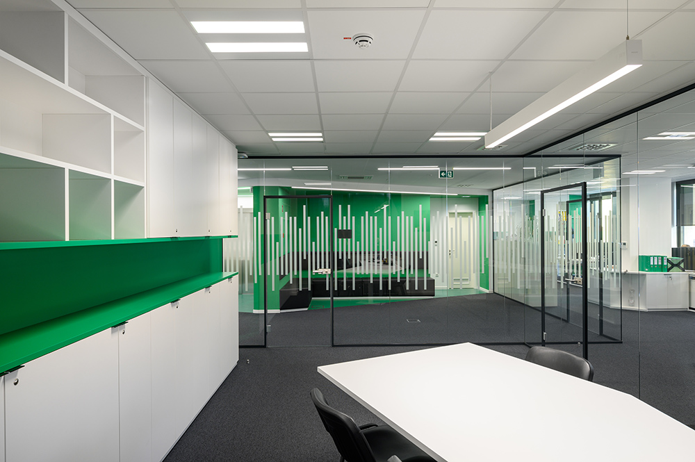
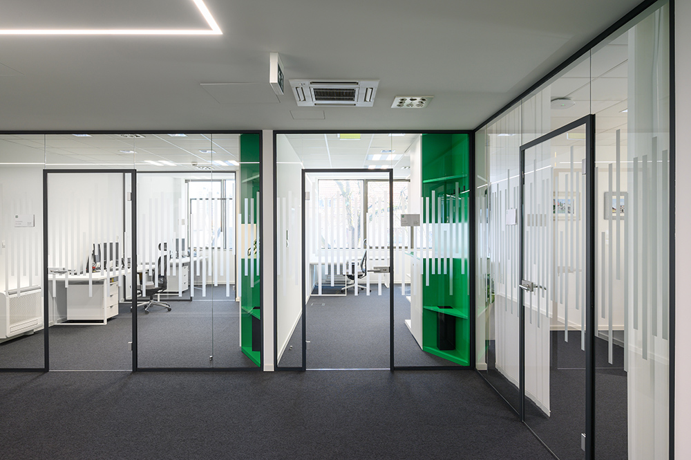
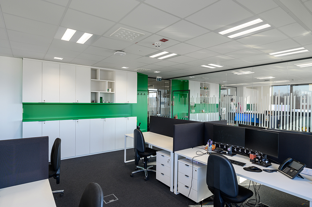
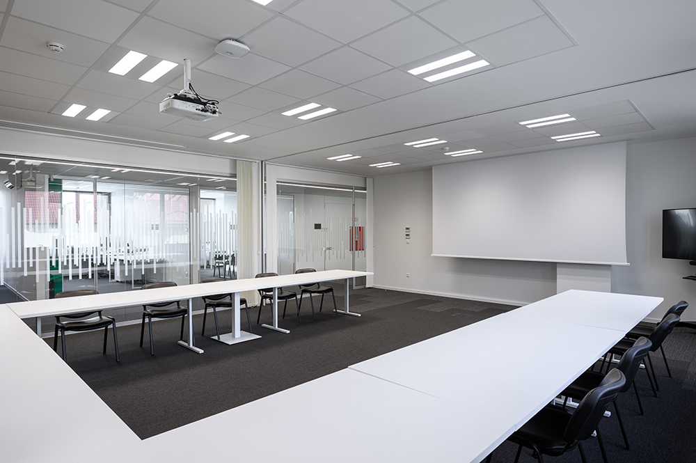
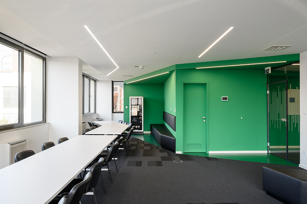
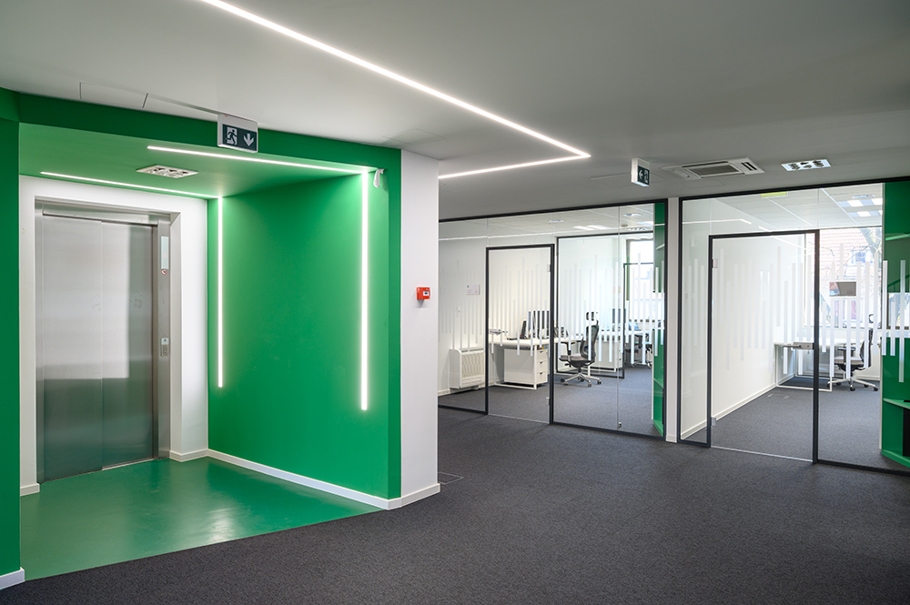
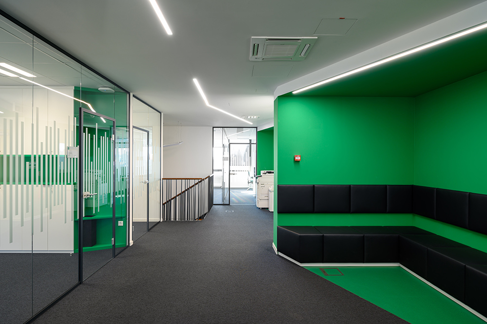
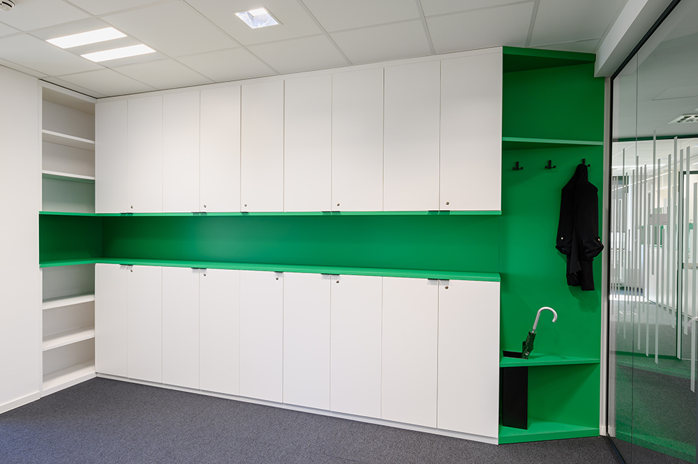
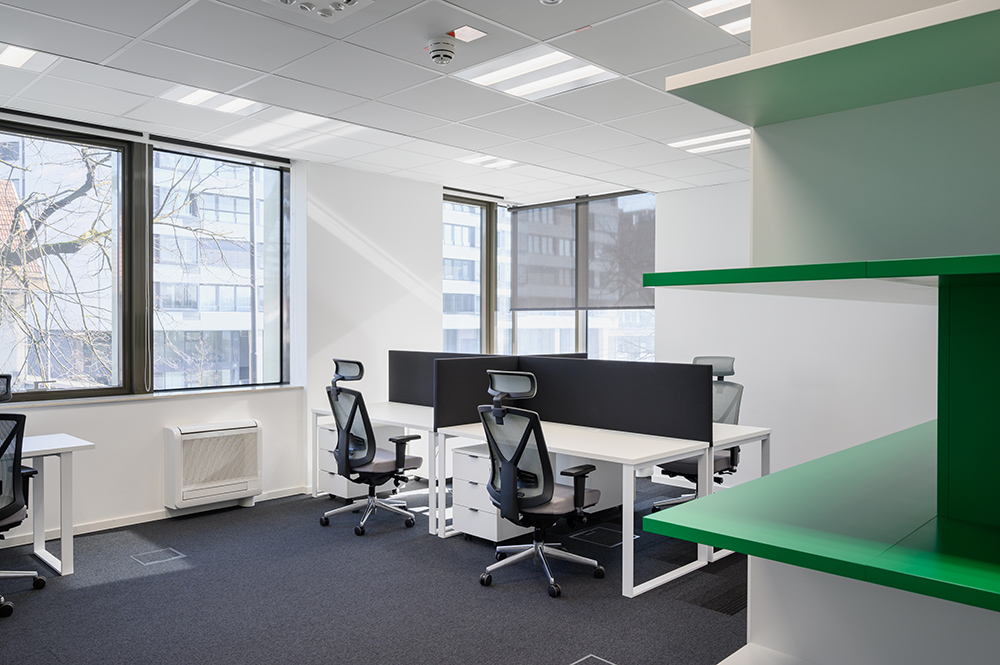
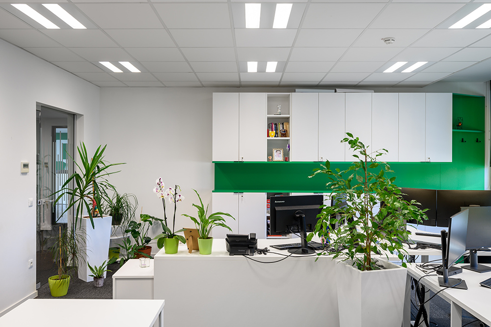
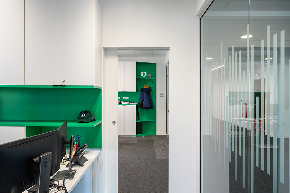
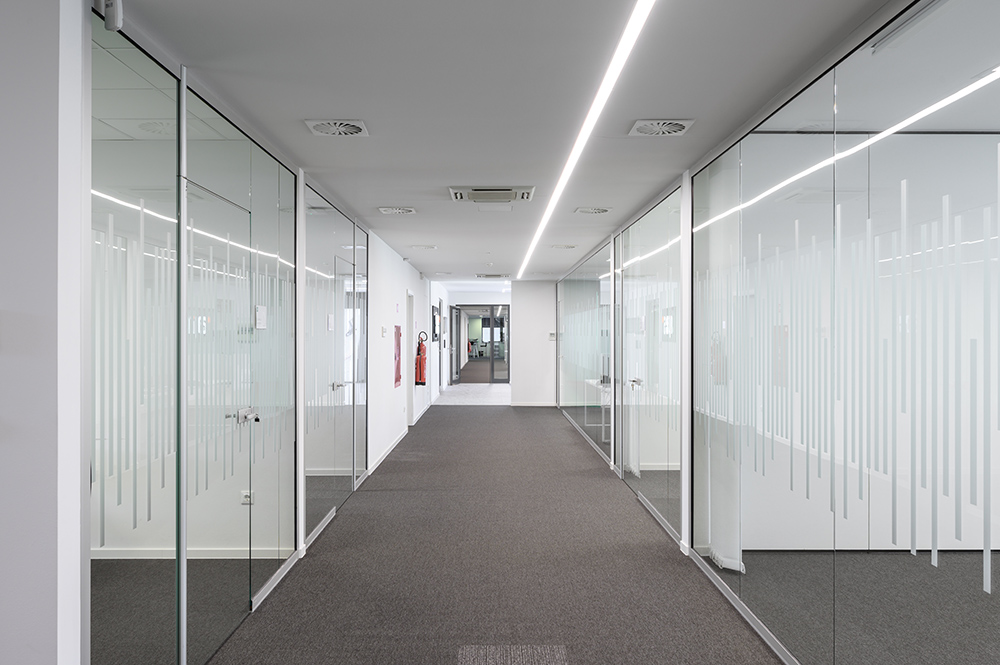
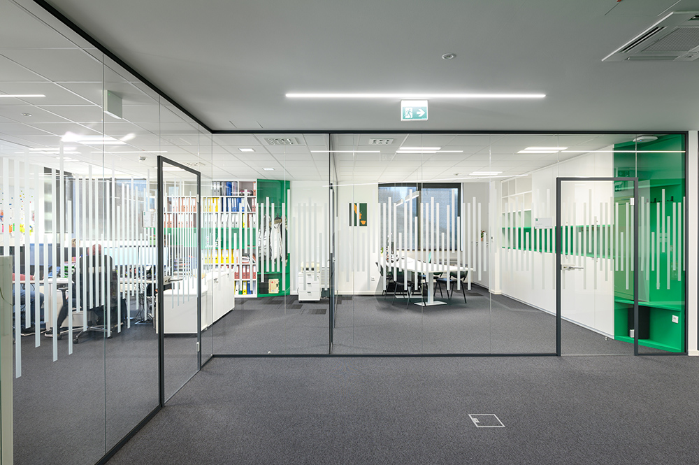
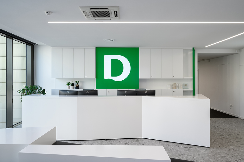
Basic point for creating the conceptual design and the color scheme is taken from the logo and activity of the company. White color gives the space freshness and a sense of light. Green color brings unobtrusive playfulness, accent and stimulation to the working atmosphere. Restrained language of design of the working spaces is accentuated in central space of communications with linear elements that introduce dynamics and deviation from the regular. Basic form of design is square from abstracted sign of corporate identity. It appears in the design of furniture, ceiling, floor and walls. Communications take place centrally and at the same time represent active surfaces, as they enable social area with seating facilities. Interior design follows a restrained modern architectural language, which indicates the seriousness and responsibility of the company. As a design accent, we placed diagonal in the space, which is the connecting thread of the design and brings dynamism, playfulness into the space. Diagonal form in space and in the design of the interior design, adds accent and playfulness. It is found in the ceiling, floor and interior design and shown in green colour.

Credits
Interior
Arhiteza d.o.o.; Mateja Katrašnik, Polona Lipičnik
Client
Deichmann d.o.o.
Year of completion
2021
Location
Ljubljana, Slovenia
Total area
1.150 m2
Photos
Miran Kambič
Stage 180°
Project Partners
Josef Göbel GmbH


