The inspiration brought in by the owner into the first ideas about living came from the interest in the furnishing of old cottages heavily scattered on the surrounding hills of the České Středohoří landscape. Another influence was the client’s love for the sunlit homesteads of Provence. Despite being quite disparate, these visions seemed very concrete. The goal of this project was to combine these inspirations into one compact entirety.
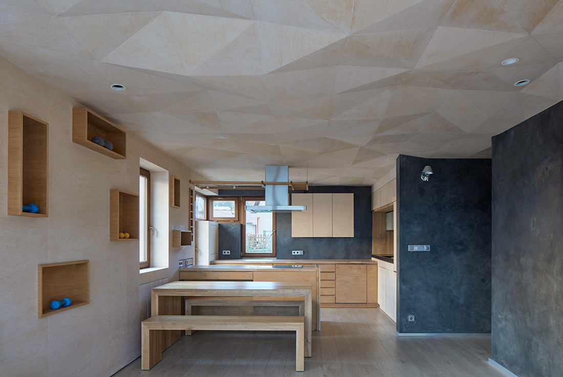
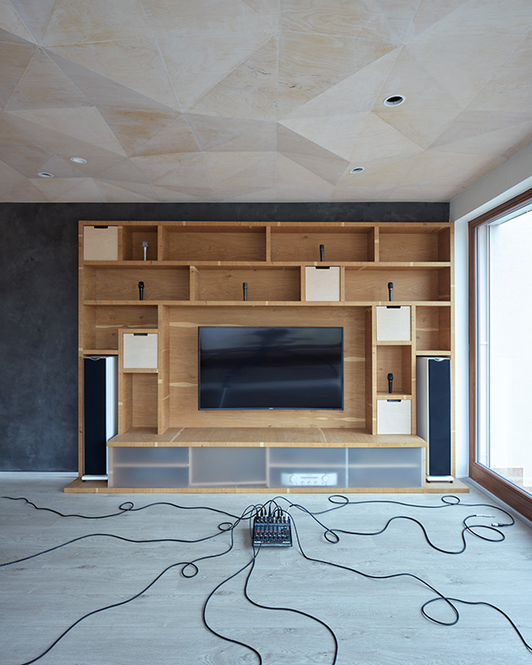
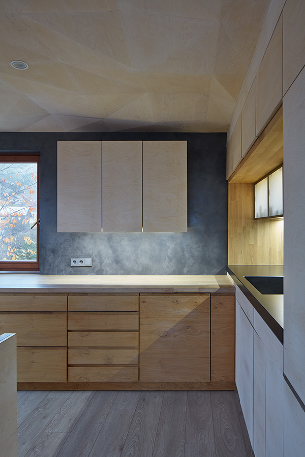
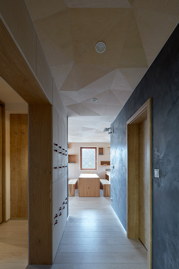
I did not wish the design to get lost and drowned in history and for it to be a story of repeating all the well-known borrowed architectural phrases, but a real and contemporary answer to the specific demands of the customer. In this sense, the design was a search for the atmosphere of these studied references. The selection of materials and their tones was well influenced by the surrounding nature. There are three basic materials in the interior: a dark cement coating, oak wood and a whitened birch plywood.
What makes this project one-of-a-kind?
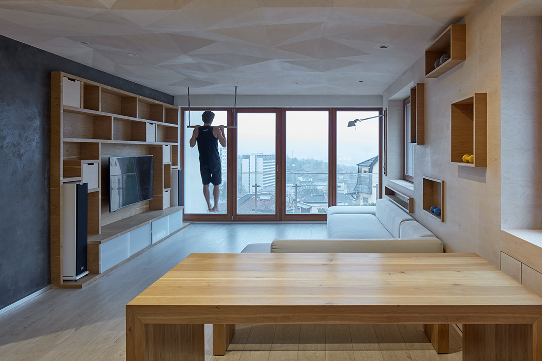
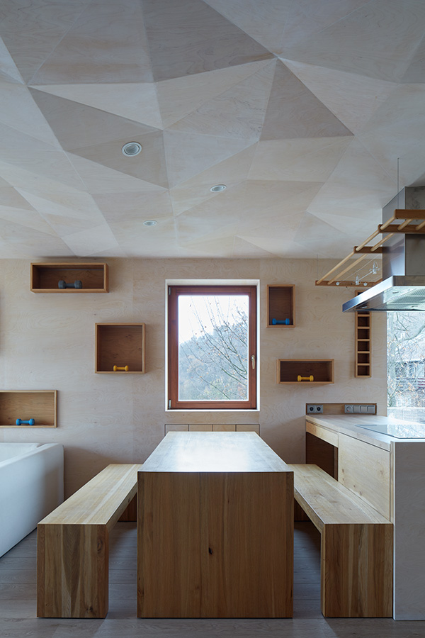
Probably the dynamically modelled dropped ceiling made out of whitened birch plywood cladding that creates wave-like structure. This covers the whole designed space creating a canopy for the living space. Obviously, its complexity has put a lot of pressure on the supplier of the interior, forcing him to focus on every detail that has been thought-out during the design process.
It is the concept working with light in the apartment – awareness of huge amount of light coming through the balcony window – and working with this light within the interior. The coloured and whitened birch plywood is soft enough to relish this quality of light that bends at the edges as if on water surface.
The ceiling hides a system of points for either hanging elements like hammocks or exercising bars and also spot lighting. At the same time, it hides a visually unappealing girder or ventilation above the kitchen island. The decision to implement this lowered and diffracted false ceiling was not easy, because it perceptibly lowers the headway height of the room. However, the distinctiveness and functionality of the ceiling convinced us that this is the right path.
About the authors
It was founded by Štěpán Havlík in the beginning of 2018. Studio a-sh creates architecture, plays with design and projects buildings. “We look at the world around us with “open” (naive) eyes and we try to keep our critical thinking based on experience at the same time.”
Text provided by the authors of the project.


Credits
Interior
Štěpán Havlík; a-sh
Year of completion
2015
Location
Ústí nad Labem, Czech Republic
Total area
69,4 m2 designed area
103 m2 total usable area (includes a recording studio that’s not a part of the project)
Photos
Jakub Skokan, Martin Tůma / BoysPlayNice
Author’s photo: Karoline Eraidiová
Project Partners
OK Atelier s.r.o., MALANG s.r.o.


