


Colour rarely enters an interior without context. It may respond to the history of a building, recall the tones of a surrounding landscape, distinguish one function from another or concentrate attention on a single architectural element. In these projects, it is not applied as a final decorative layer. It helps establish the identity of the space and explains something about its origin, use or inhabitants.
Some of the palettes are broad and immersive, while others depend on one precisely placed accent: an orange volume, a blue staircase or a series of coloured niches. Together, the interiors demonstrate that colour can organise a plan, clarify the relationship between old and new, give warmth to restrained materials or connect a room with a particular place and cultural history.
1. Casa Carmen by cumuloLimbo studio
Spain, 2023
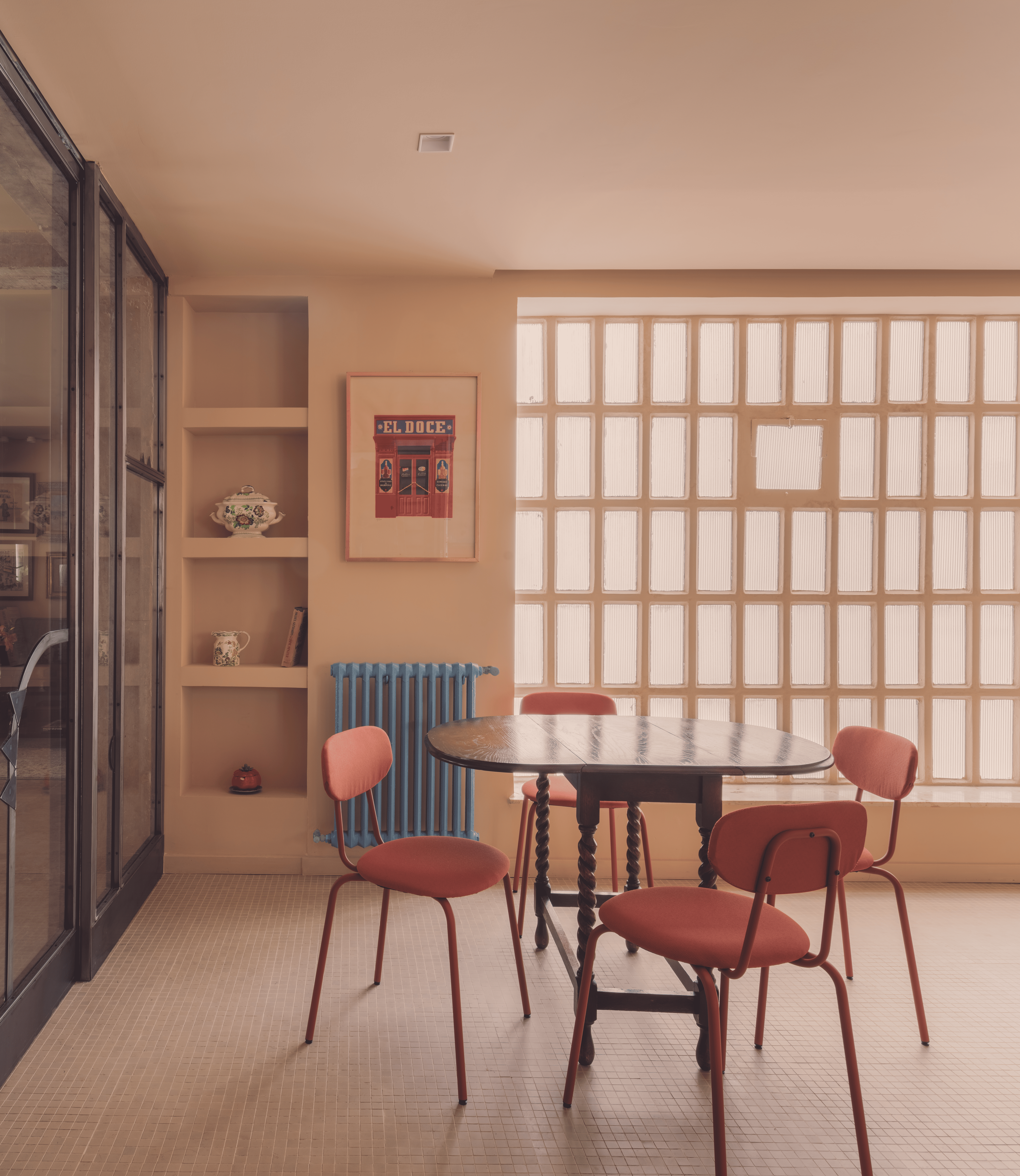
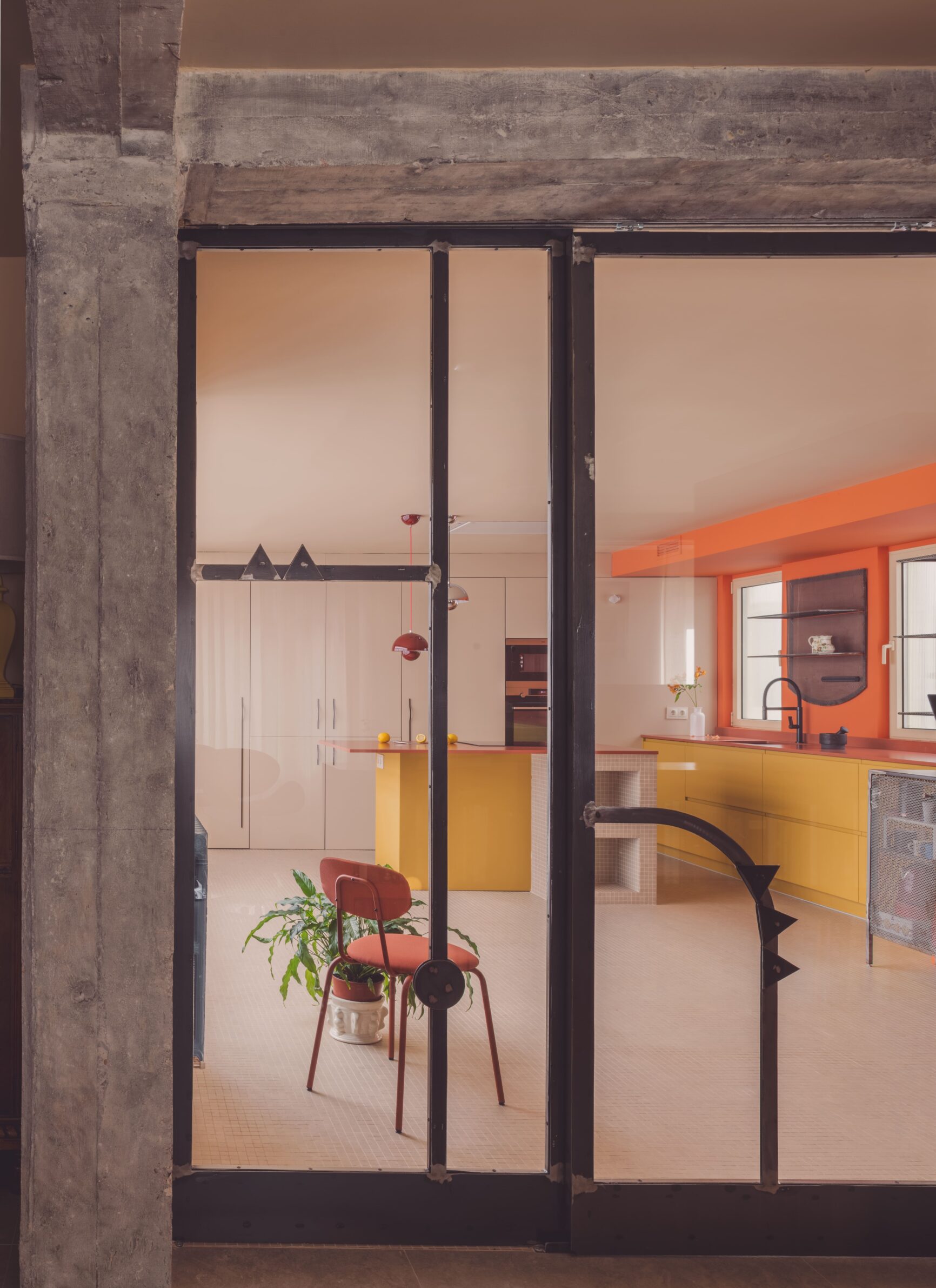
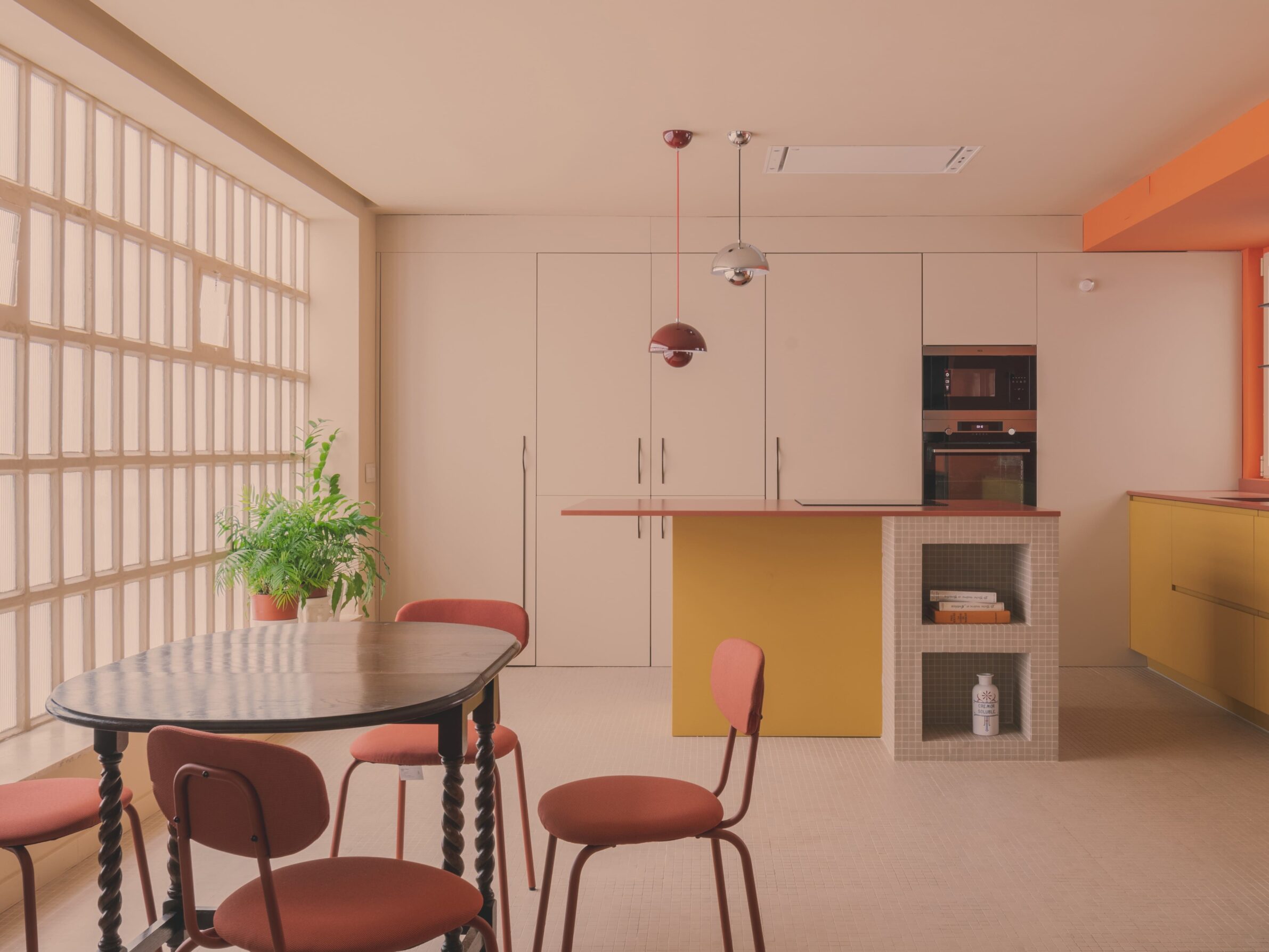
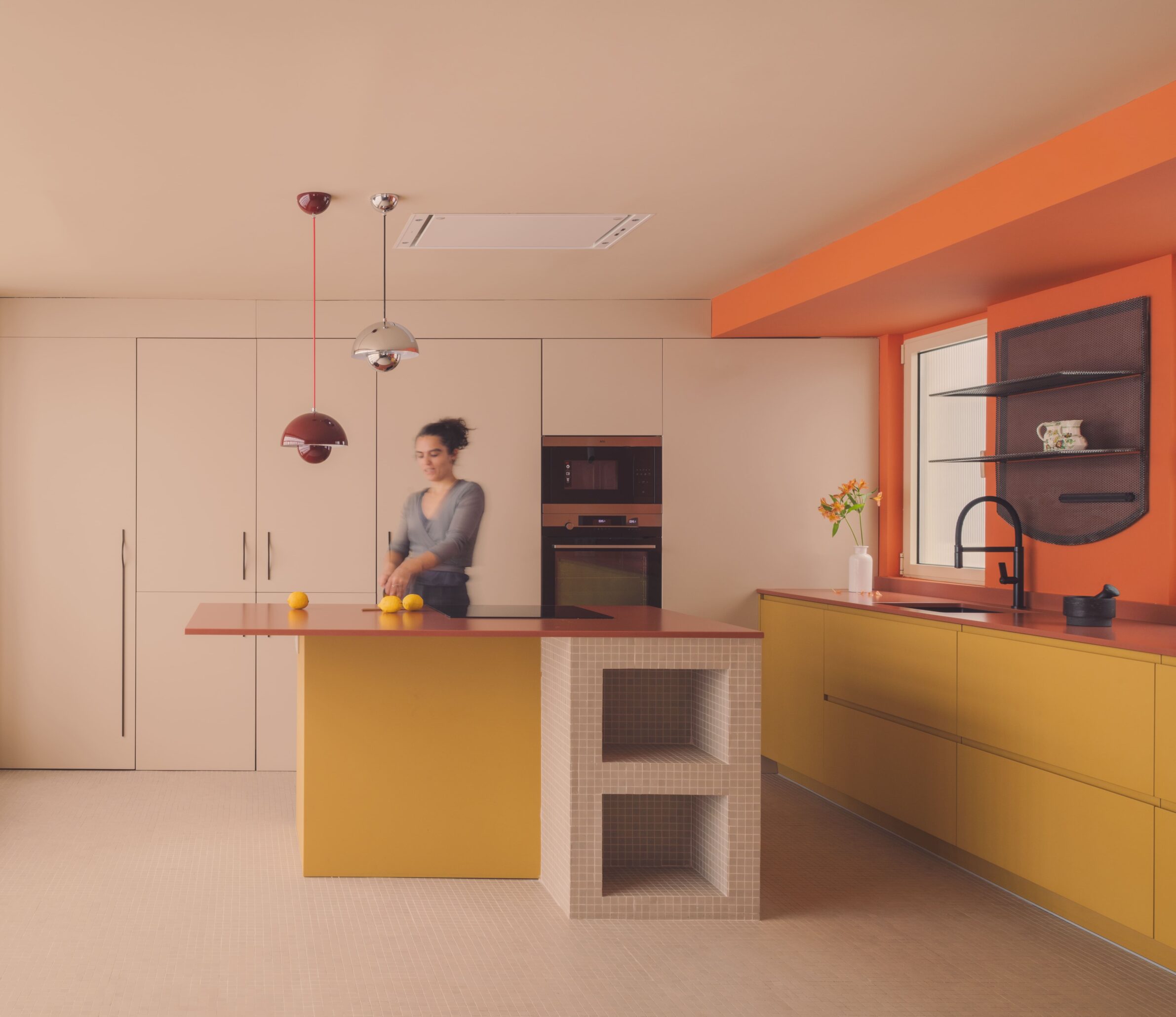
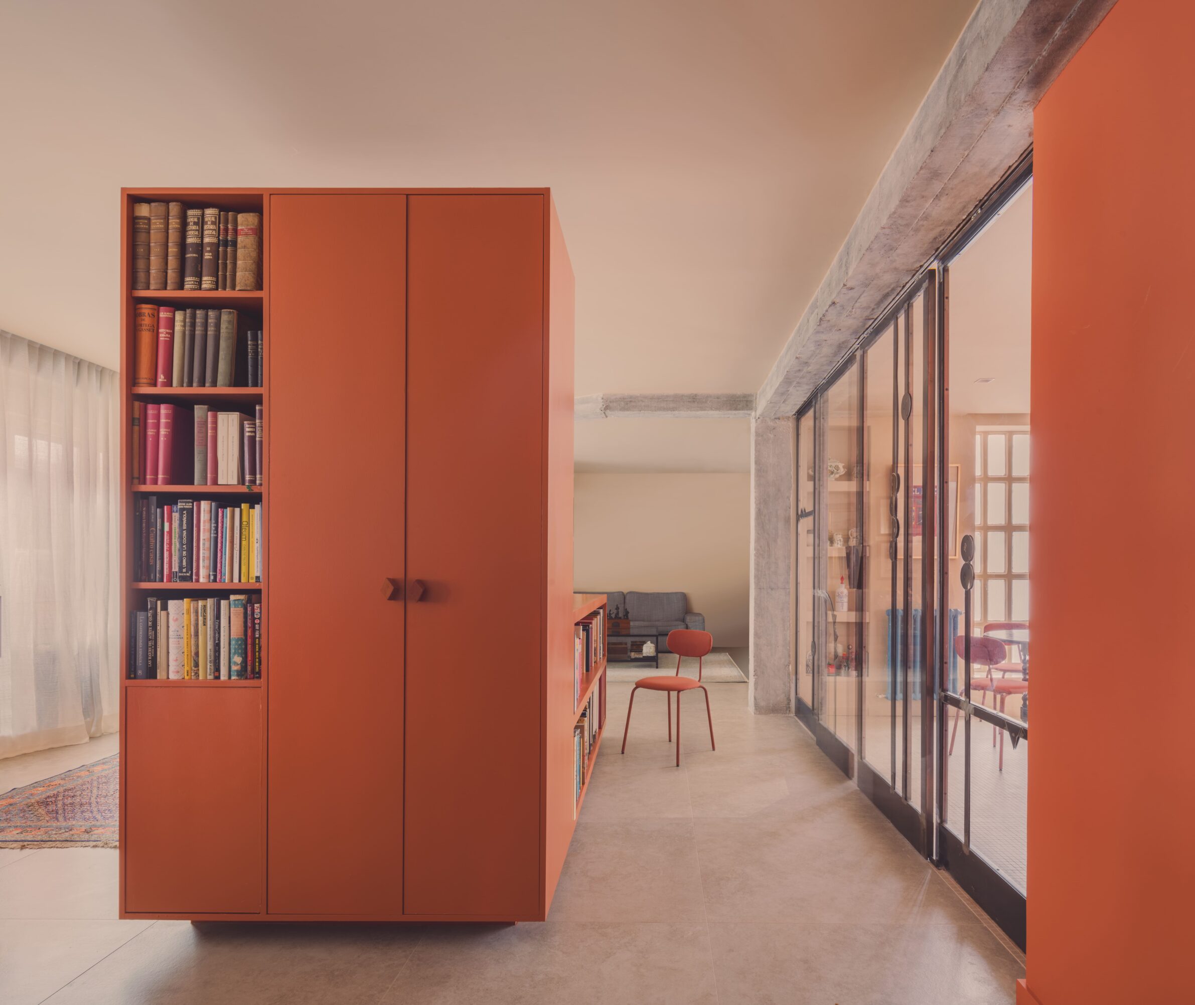
Casa Carmen begins with the character of a 220-square-metre Madrid apartment built in 1963. Concrete columns and beams, glass-block walls and dark period finishes were uncovered and retained, while only a few new elements were introduced to reorganise the open plan. Two coloured objects establish its principal centres: a mustard kitchen island and a large orange timber structure in the living area. The latter acts simultaneously as partition, corridor, cupboard, counter, shelving and sofa. Colour therefore does not merely enliven the existing shell. It makes the new intervention immediately legible and turns a multifunctional piece of furniture into the spatial core of the home.
2. 35 sqm Micro-apartment by Oikonomakis Siampakoulis Architects
Greece, 2024
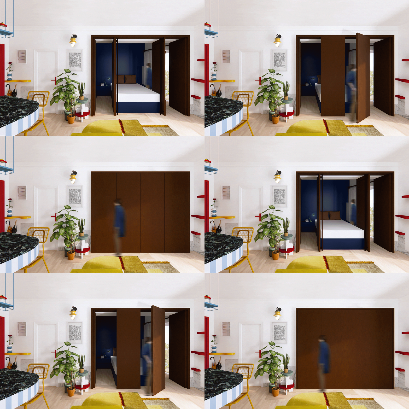
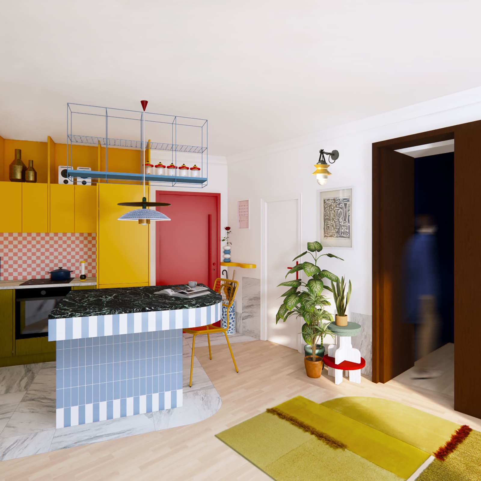
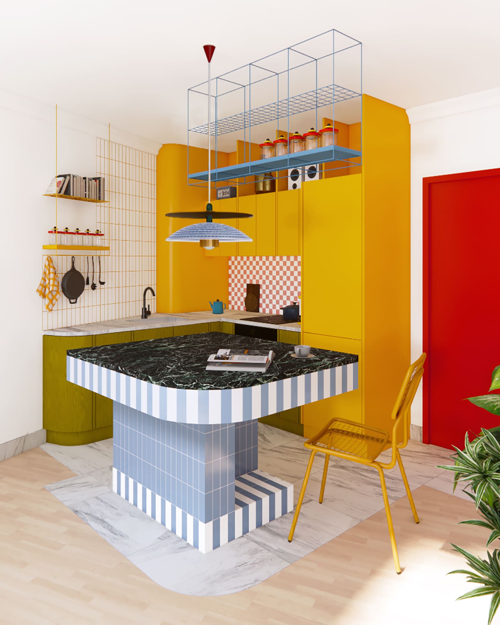
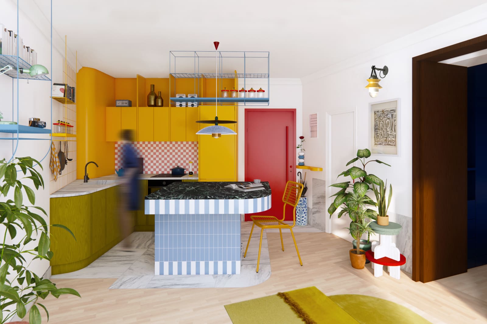
Designed for two owners working in the arts, this compact Athens interior uses colour and material variation to express their creative identities. Original features from the 1980s apartment—including decorative ceiling plasterwork, a marble fireplace with firebrick and natural wood parquet—were retained rather than neutralised. Around them, coloured surfaces and varied textures give definition to the irregular plan. An open kitchen places the island at the centre of daily life, while a four-part timber partition allows the bedroom to be opened to the living area or closed for privacy. In only 35 square metres, the palette helps individual elements remain distinct without fragmenting the apartment further.
3. MM33 Apartment by buno
Thailand, 2023
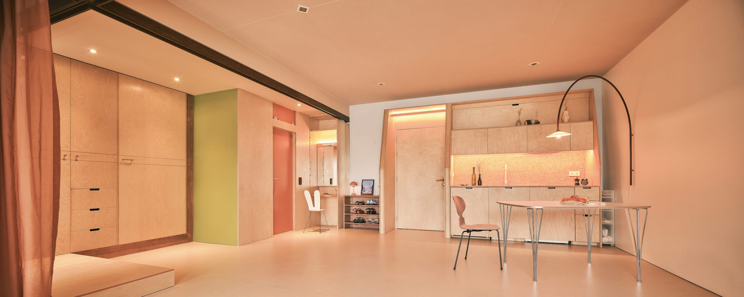
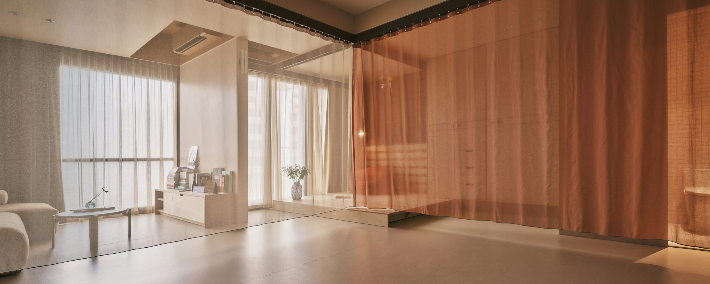
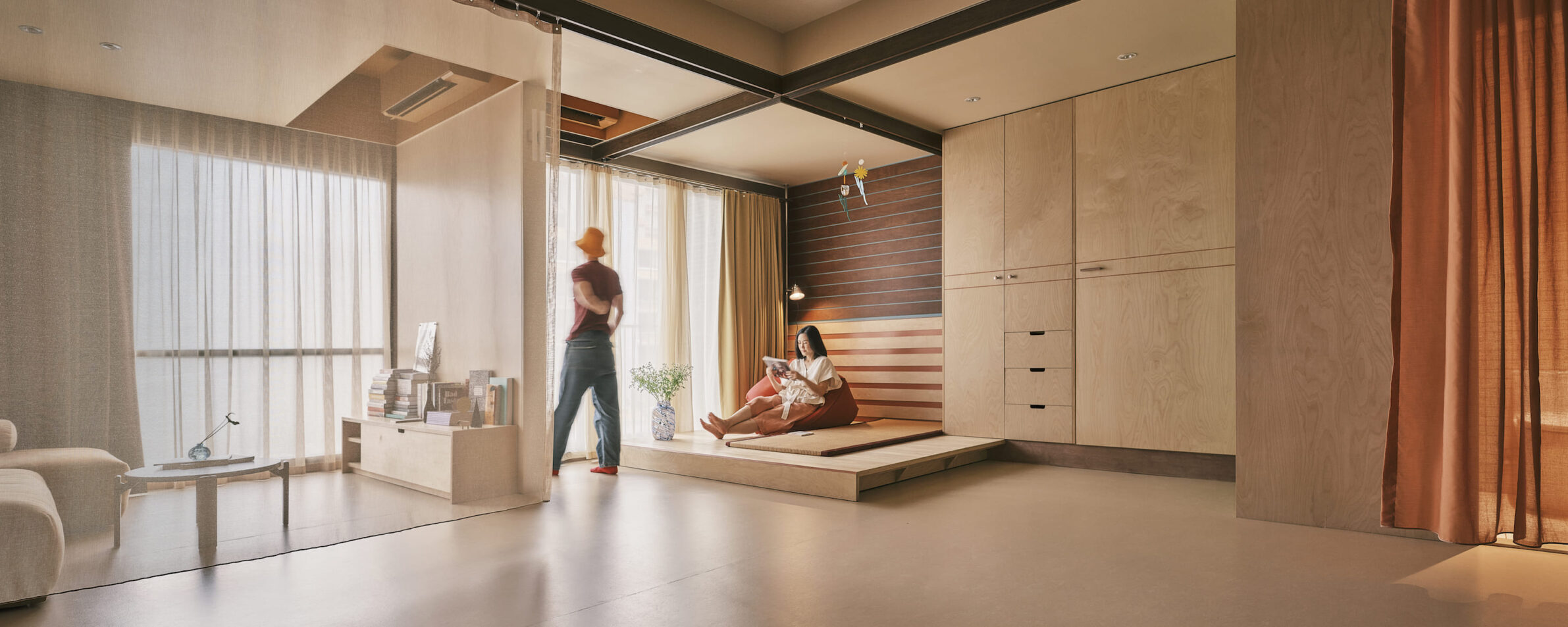
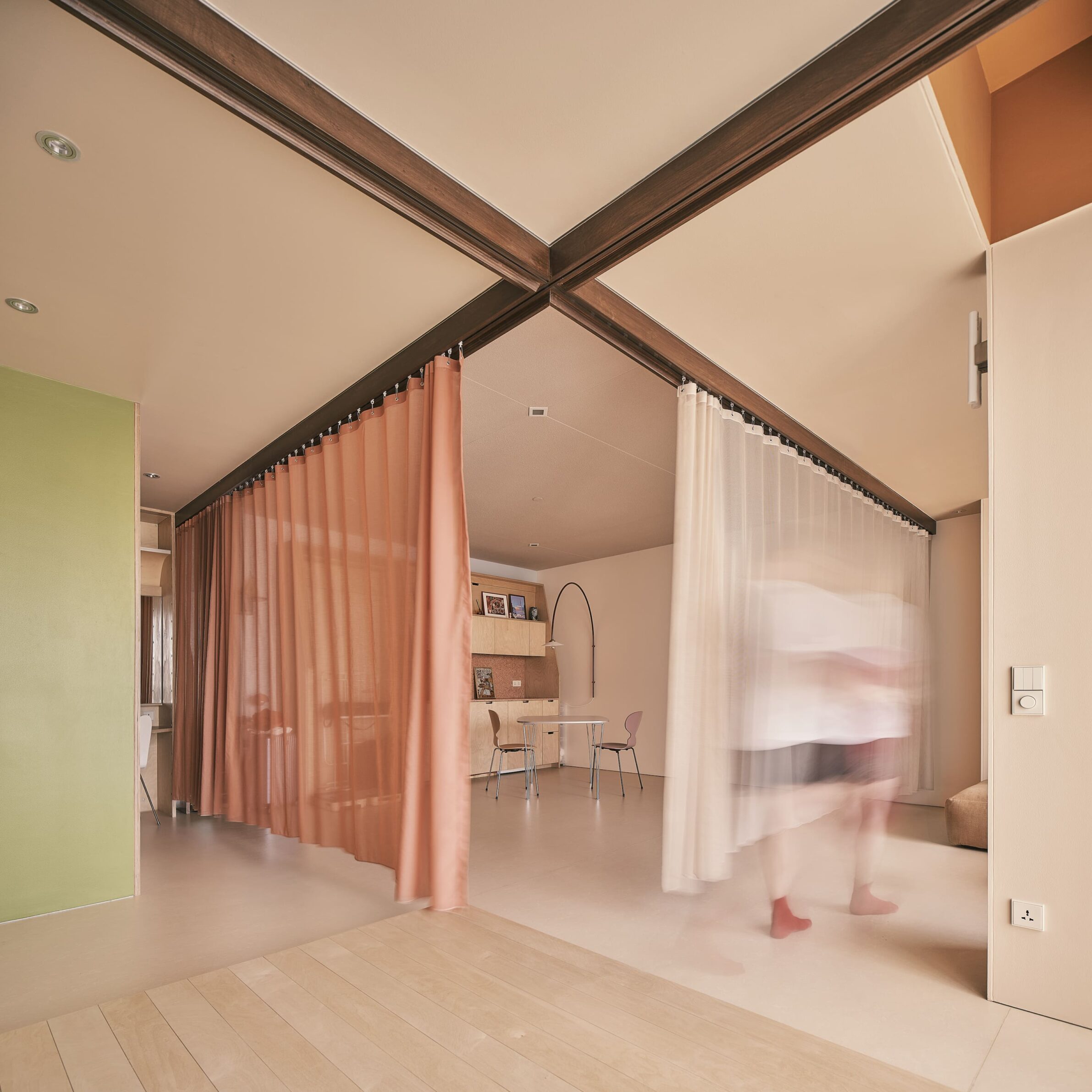
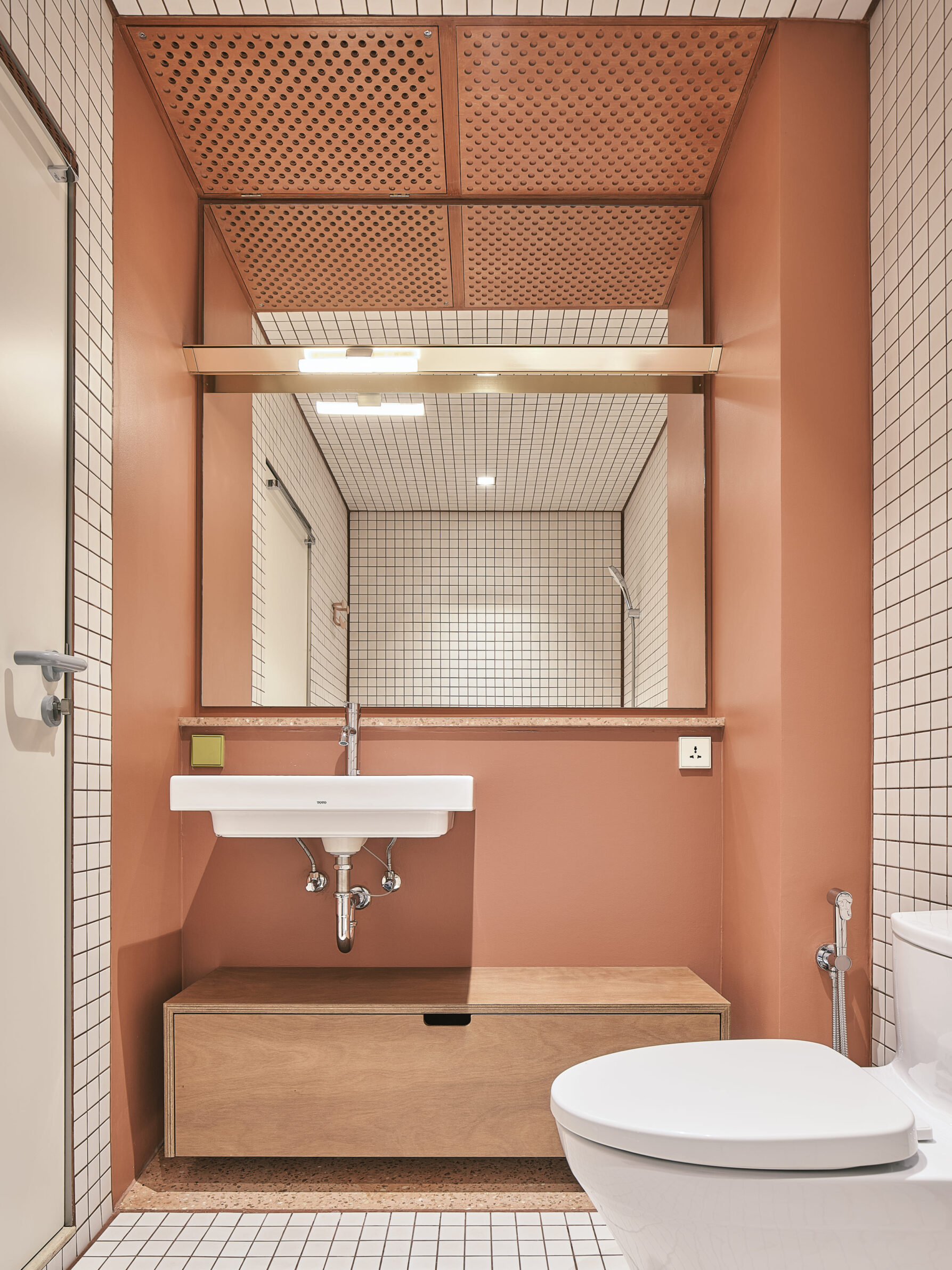
MM33 replaces conventional enclosed rooms with compact functional areas gathered around an open central space for cooking and dining. Sleeping, lounging, dressing and bathing are pushed towards the perimeter, while operable partitions and curtains allow privacy without introducing fixed, opaque walls. Built-in units made from clear-coated structural plywood take on the organisational role usually assigned to architecture. Their differently coloured planes interrupt the perception of each unit as a solid box, making the construction easier to read and allowing furniture and personal objects to be added without having to conform to a monochromatic interior. Here, colour supports flexibility by giving each functional object a recognisable but not overly prescriptive identity.
4. Rotterdam Loft by Kumiki
The Netherlands, 2023
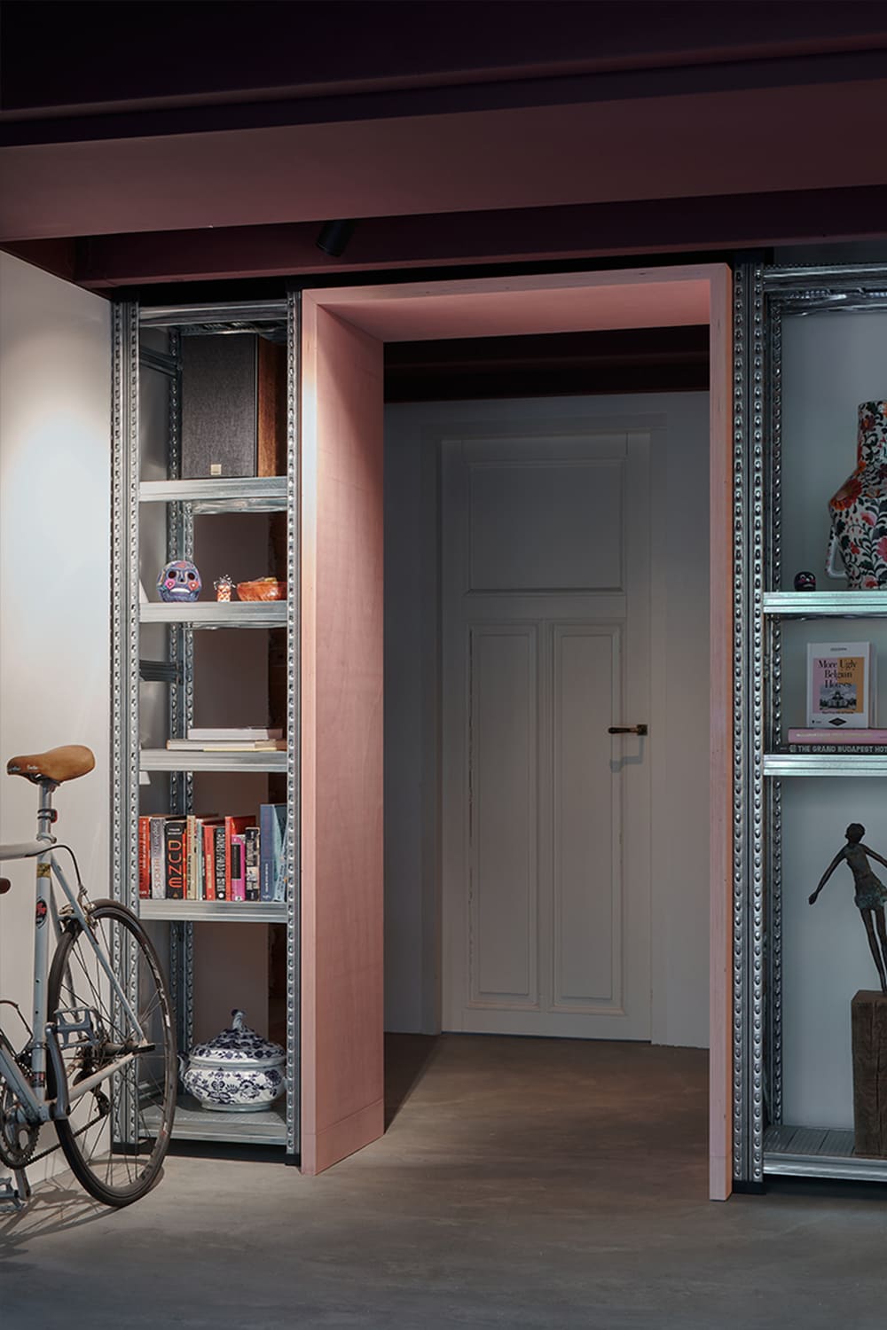
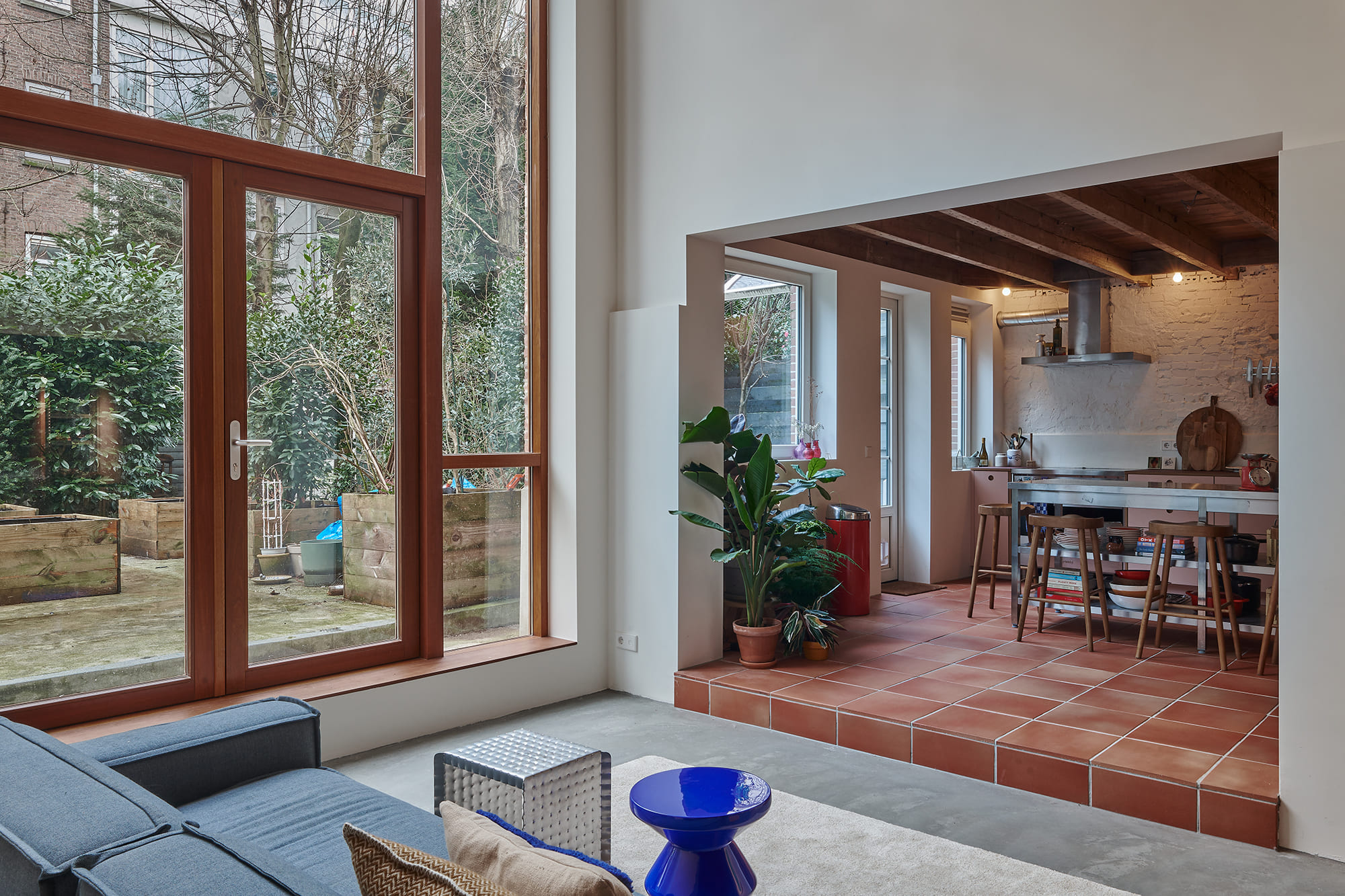
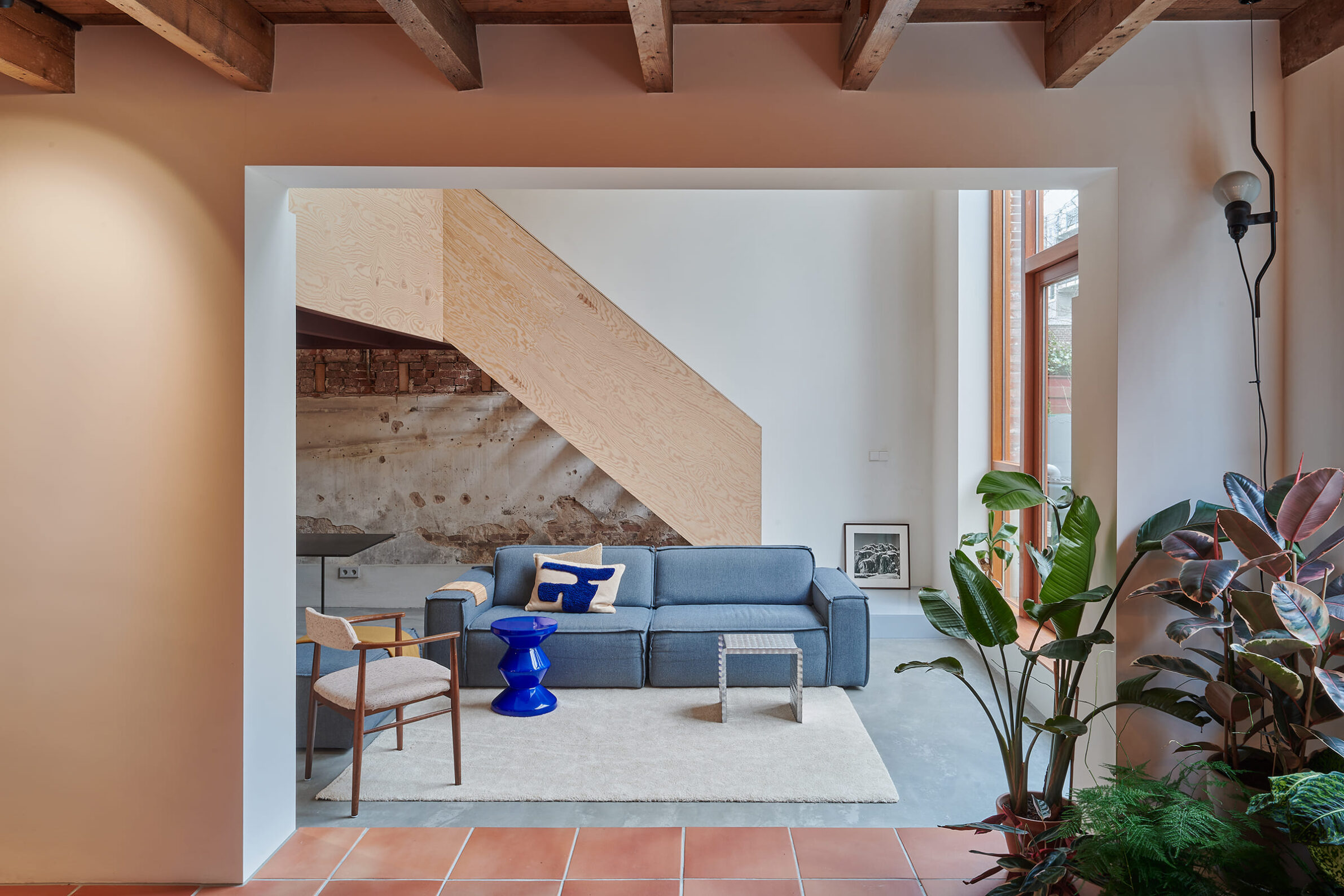
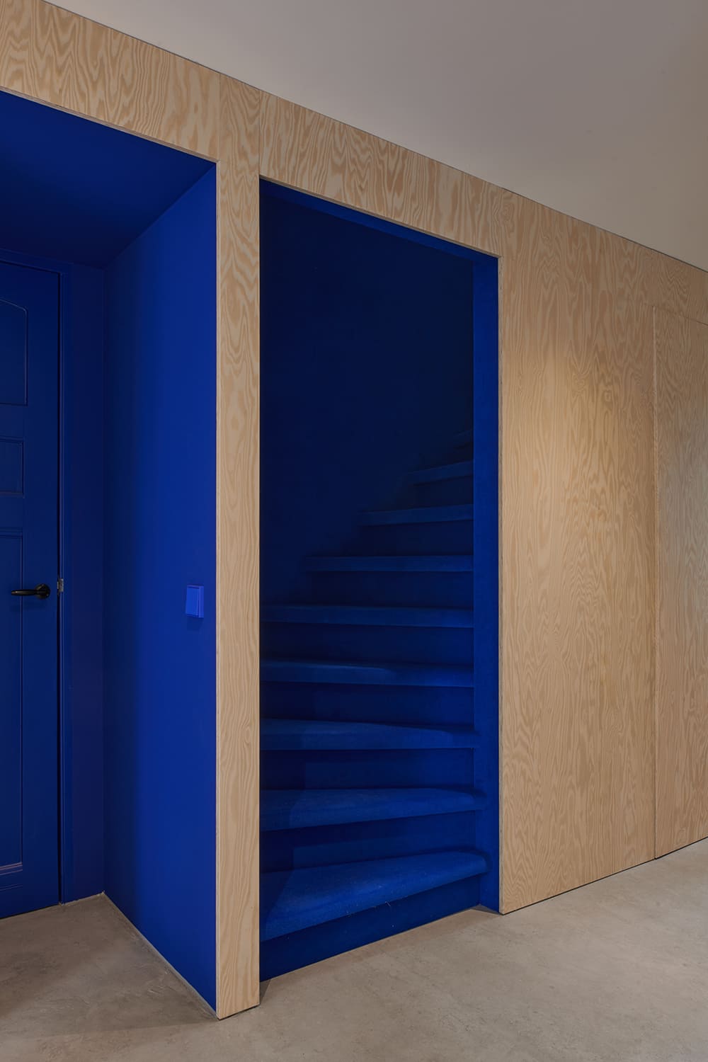
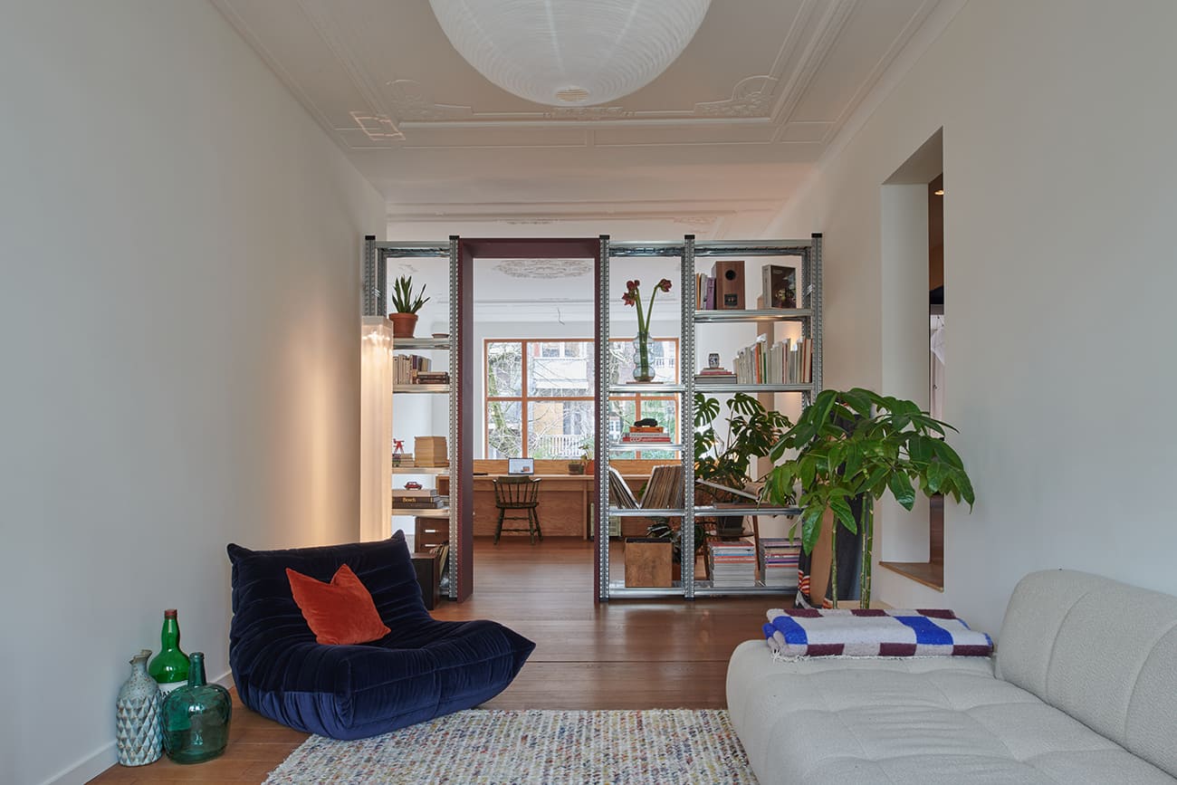
Within this renovated pre-war townhouse, colour is concentrated in the passages leading from shared to more private spaces. A staircase lined with soft blue felt sits beside an open stair, while blue niches continue across both levels towards the bedrooms and bathrooms. The saturated surfaces provide an intimate counterpoint to exposed brick, concrete, steel and timber elsewhere in the interior. Reused industrial frames and new wooden portals divide the larger rooms without closing them off, preserving the loft-like openness of the connected dwellings. Blue becomes both a visual interruption and a navigational device, marking moments of retreat within an otherwise materially raw and continuous home.
5. Steinach 10 by NAEMAS Architekturkonzepte
Italy, 2025
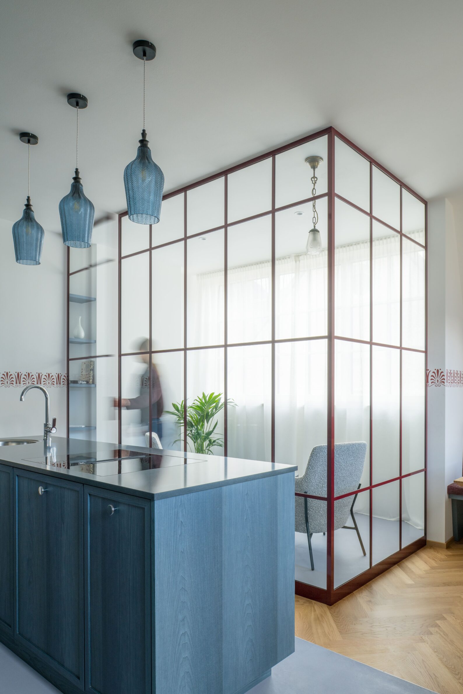
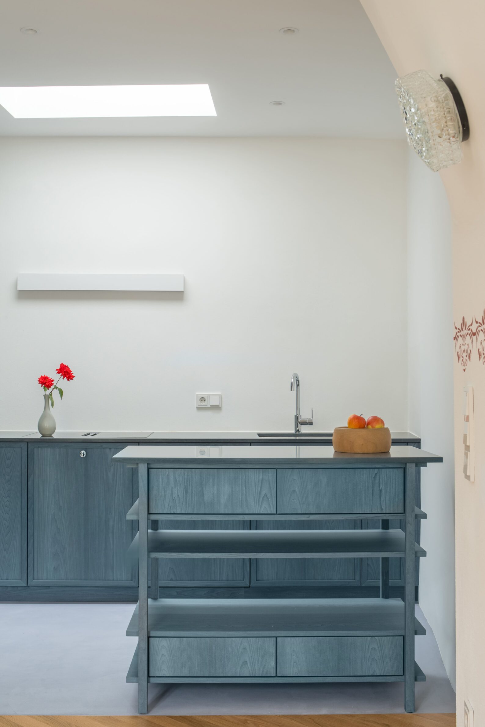
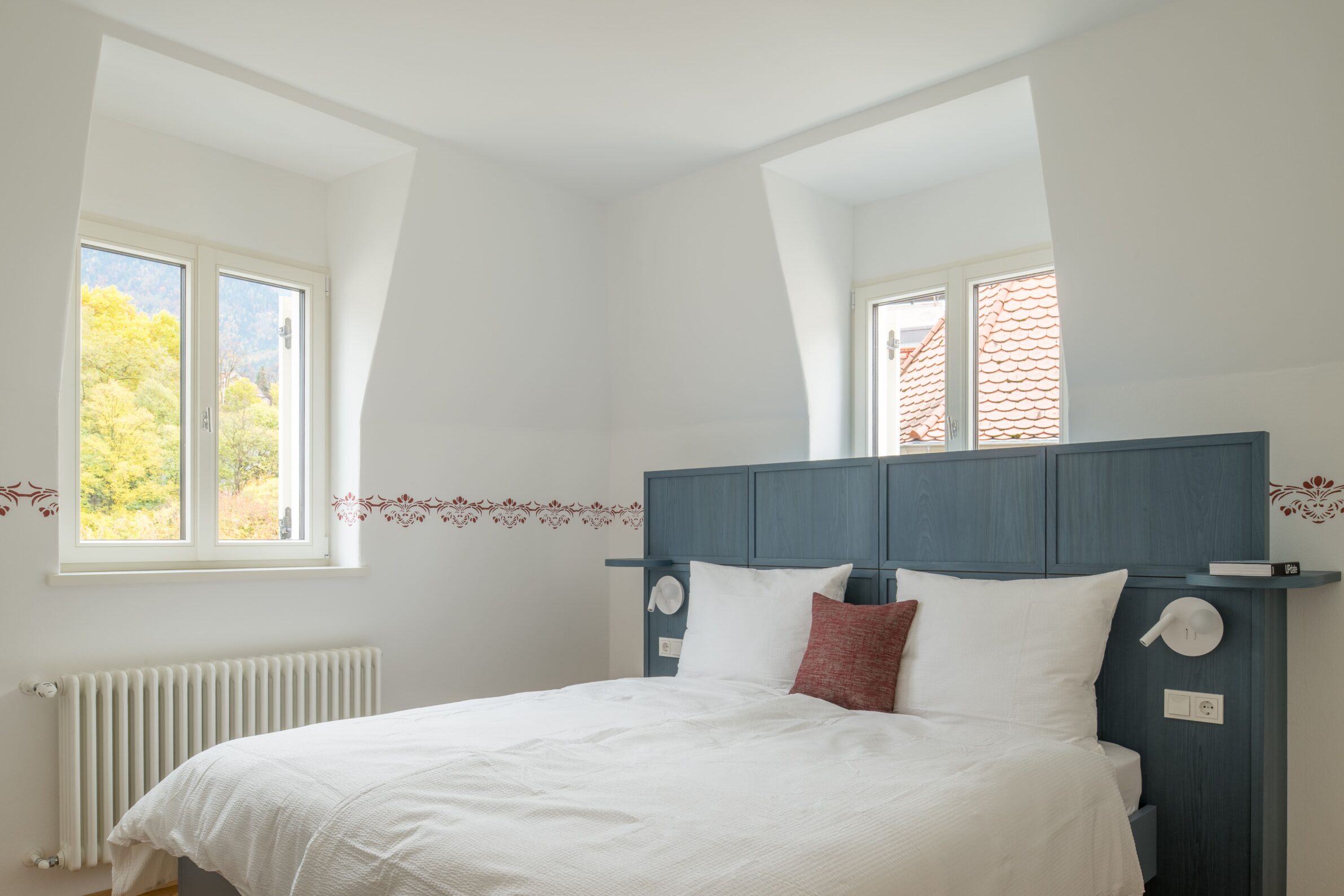
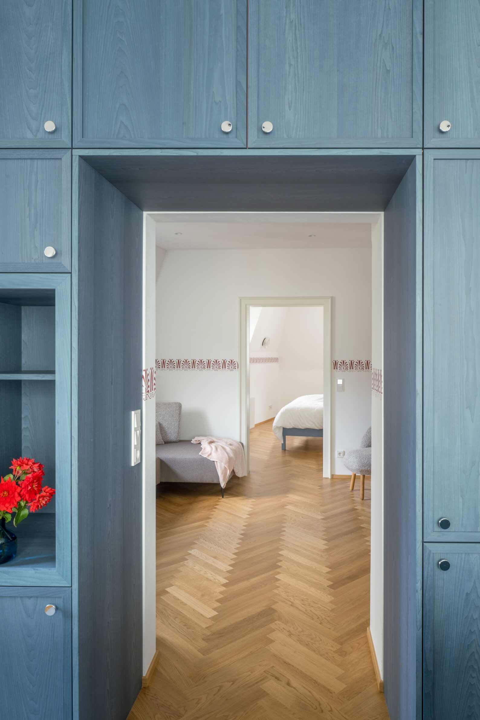
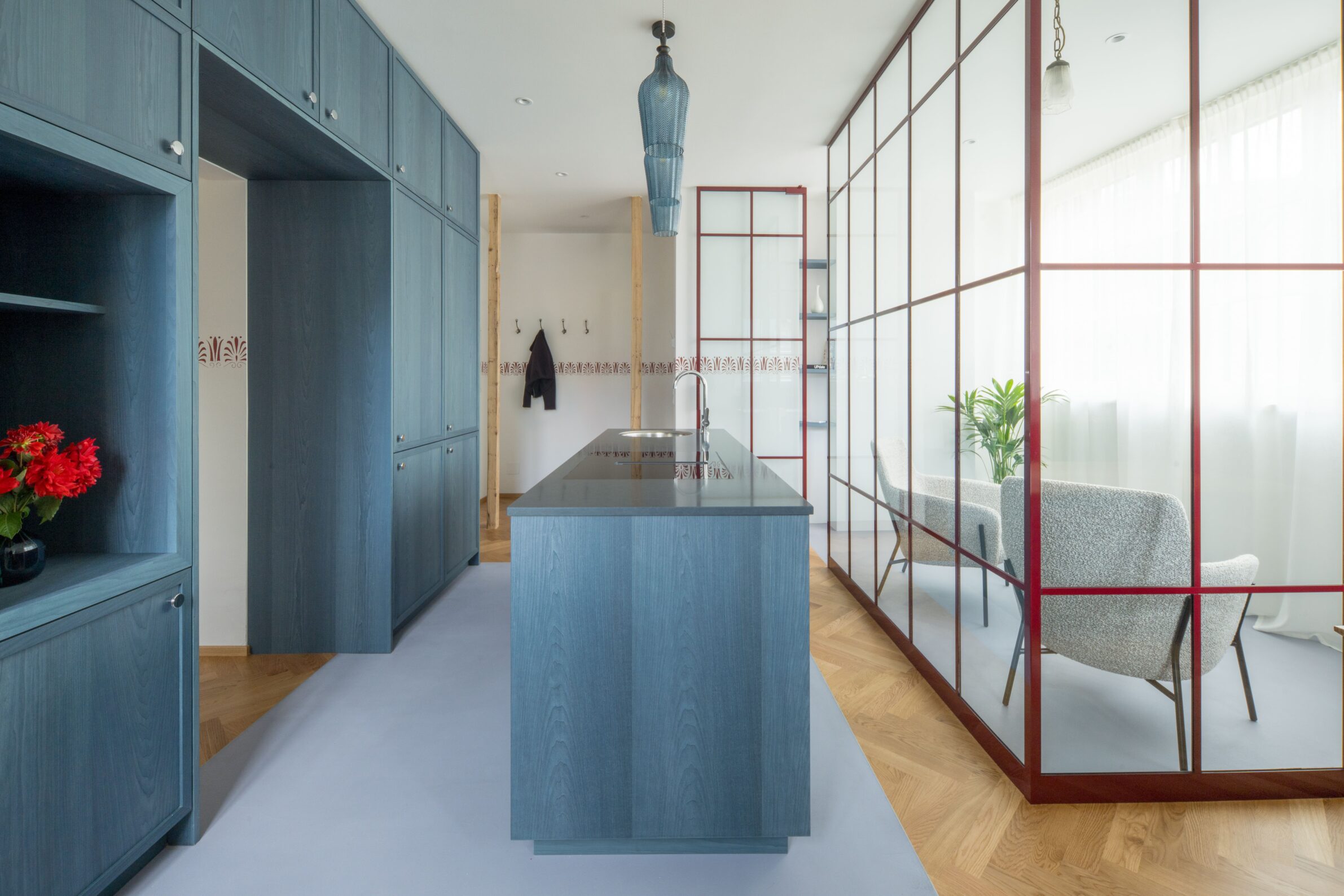
The palette of Steinach 10 comes directly from the Belle Époque building in Merano. Floral façade ornament, curved lines and original decorative window handles informed specially made stencils that transfer the historic language onto the walls of two renovated attic interiors. Restored brown-red tiled stoves are accompanied by Bordeaux skirting boards, pale blue-grey furniture and vividly coloured bathroom basins. Strong Art Nouveau-inspired tones alternate with quieter contrasting surfaces, preventing the historical references from becoming uniform or overly literal. Rather than recreating a period interior, the project extracts colours and motifs from the existing architecture and reorganises them as a contemporary system of accents, furnishings and patterned surfaces.
6. Mesonia by Mestiz Studio
Mexico, 2025
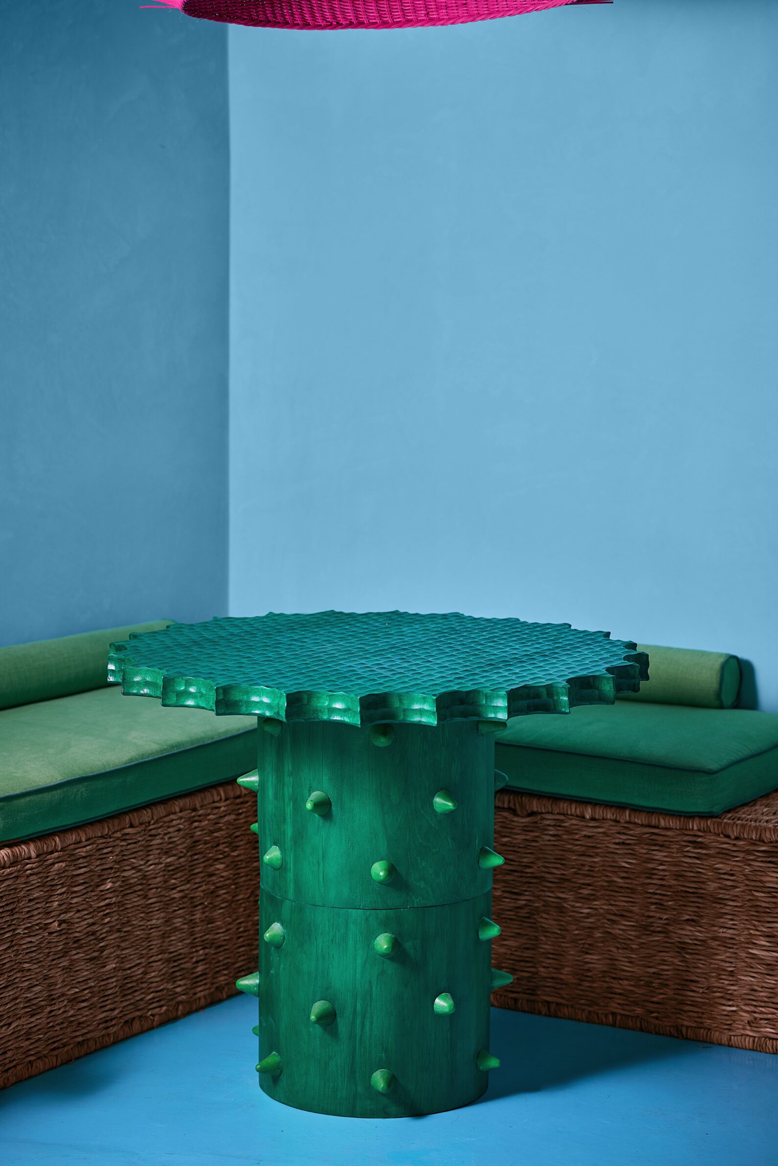
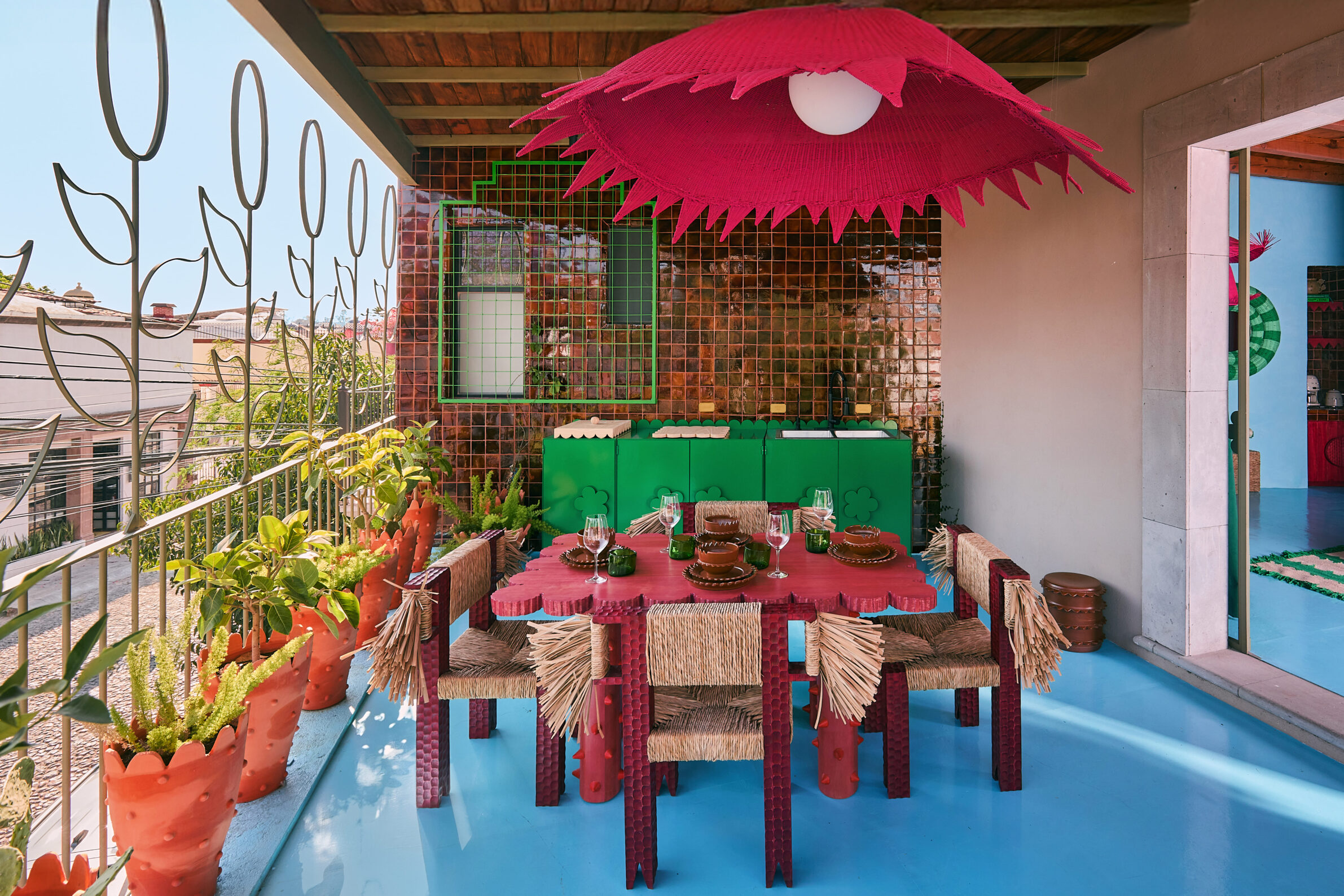
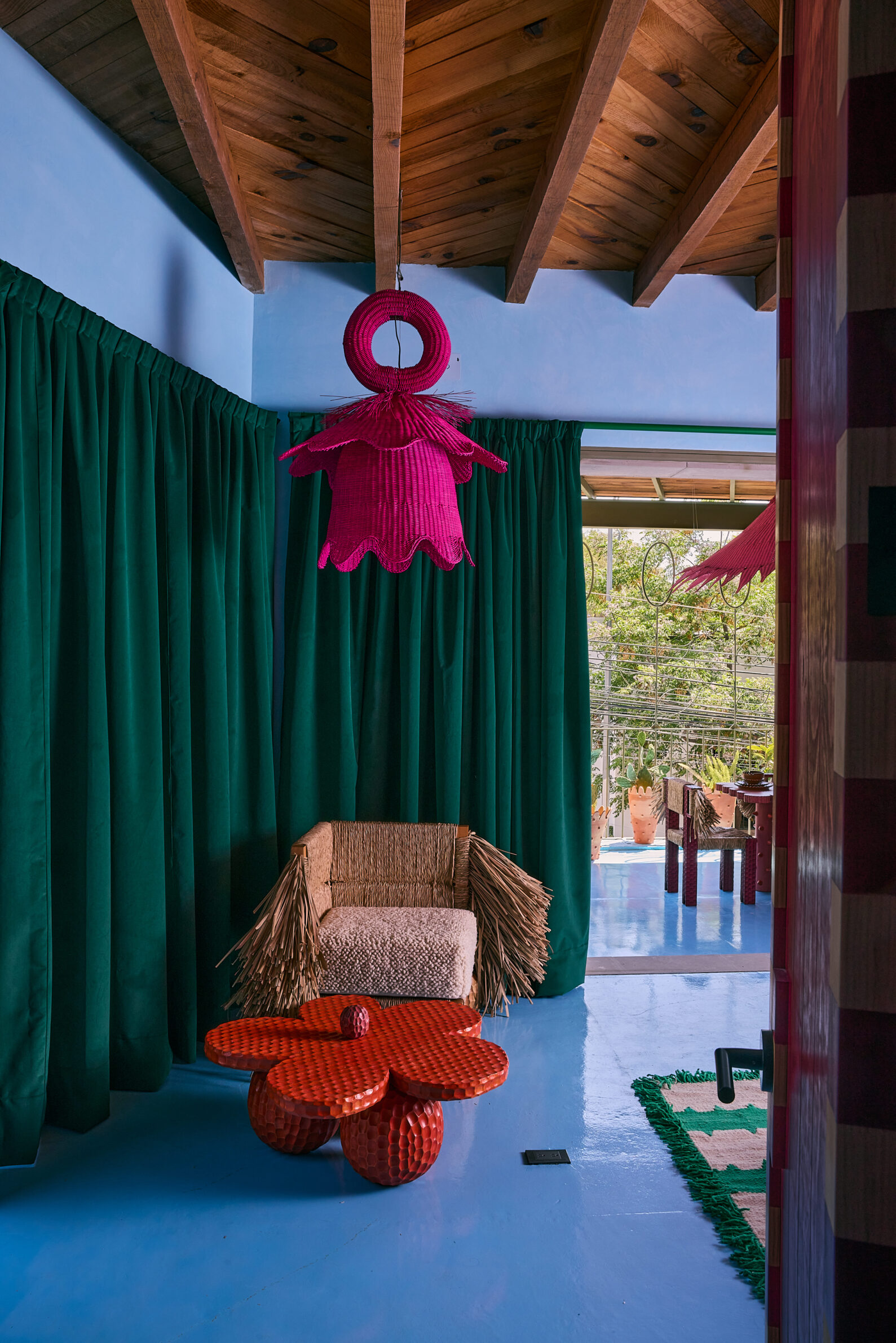
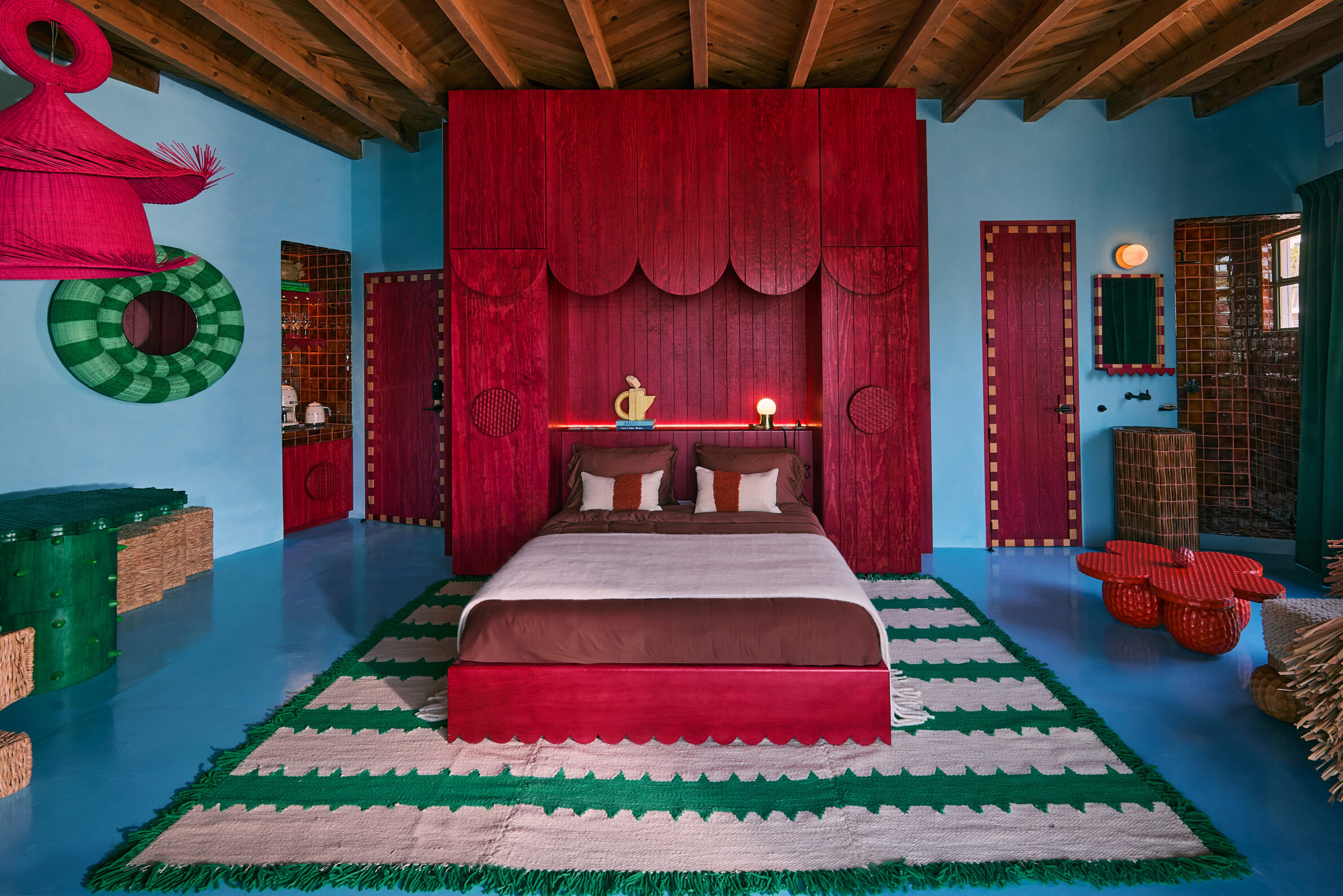
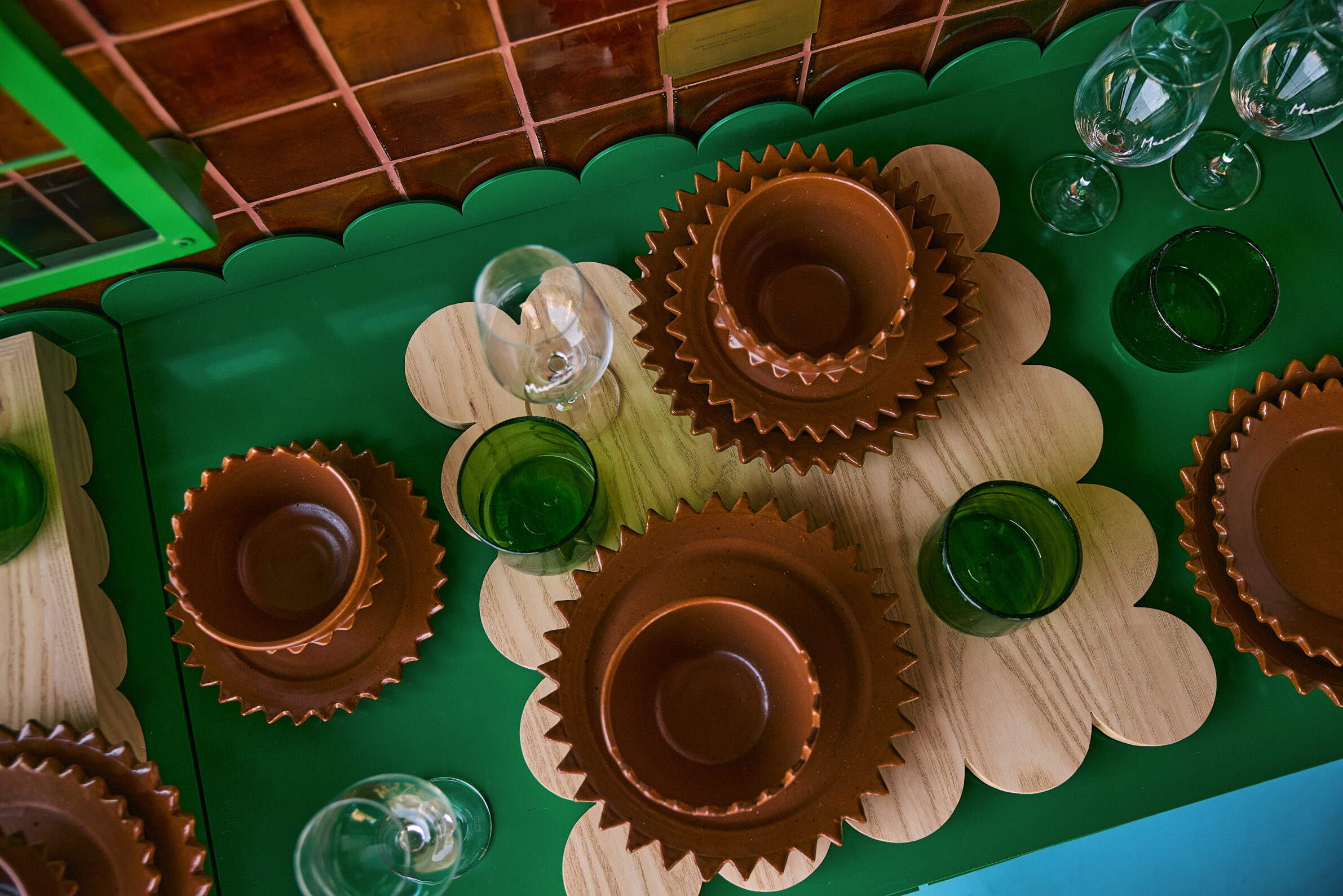
Mesonia uses colour to connect a boutique guest suite with the landscape and craft culture of San Miguel de Allende. Sky-blue walls refer to the open sky, caramel tones recall sunbaked earth, and vivid green draws from the surrounding highlands. Magenta and red details add a more energetic layer across doors, furniture and lighting. The palette continues through custom-made ceramics, woven rugs, fabrics and architectural elements produced with craftspeople from the Bajío region and northern Mexico. Because almost every object was developed specifically for the project, colour is not limited to painted surfaces. It moves across material, texture and technique, allowing the entire interior to function as an inhabitable expression of contemporary Mexican craft.
7. Casa Ñe’é LG by Nildo José + Arquitetos Associados
Brazil, 2024
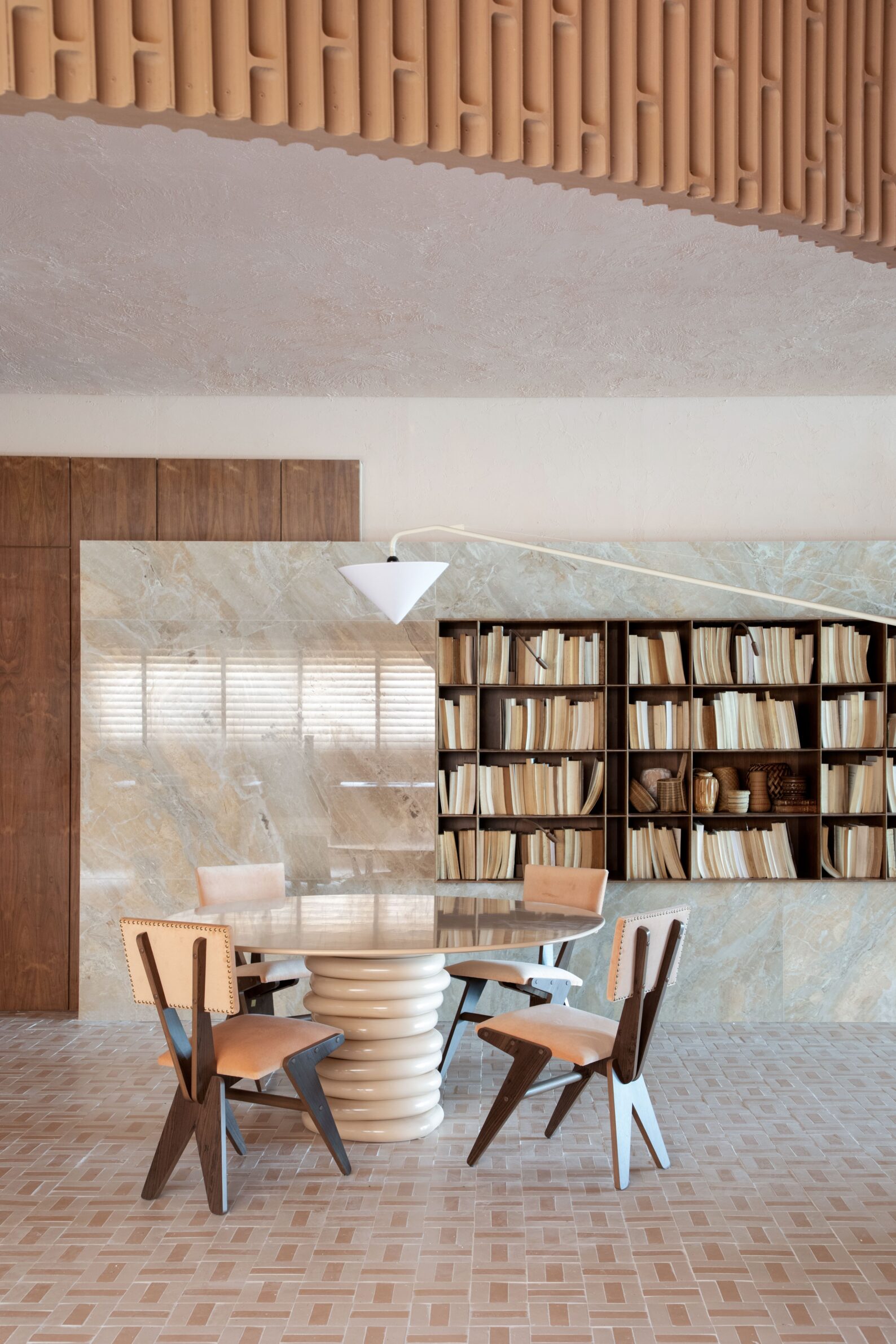
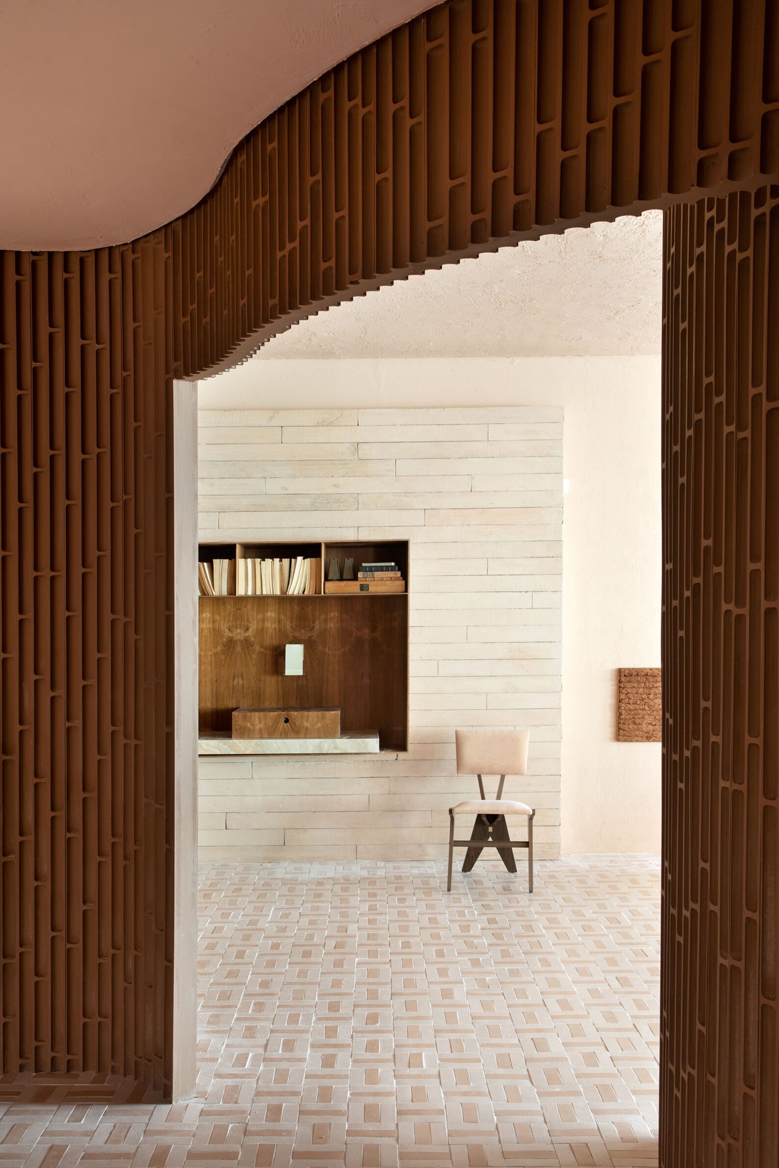
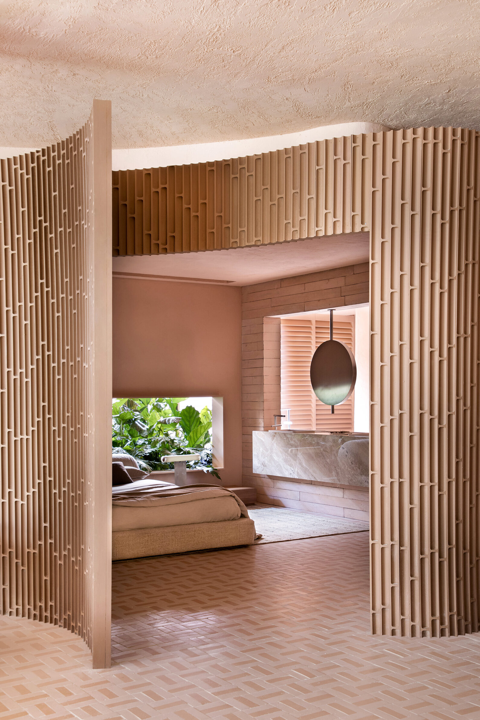
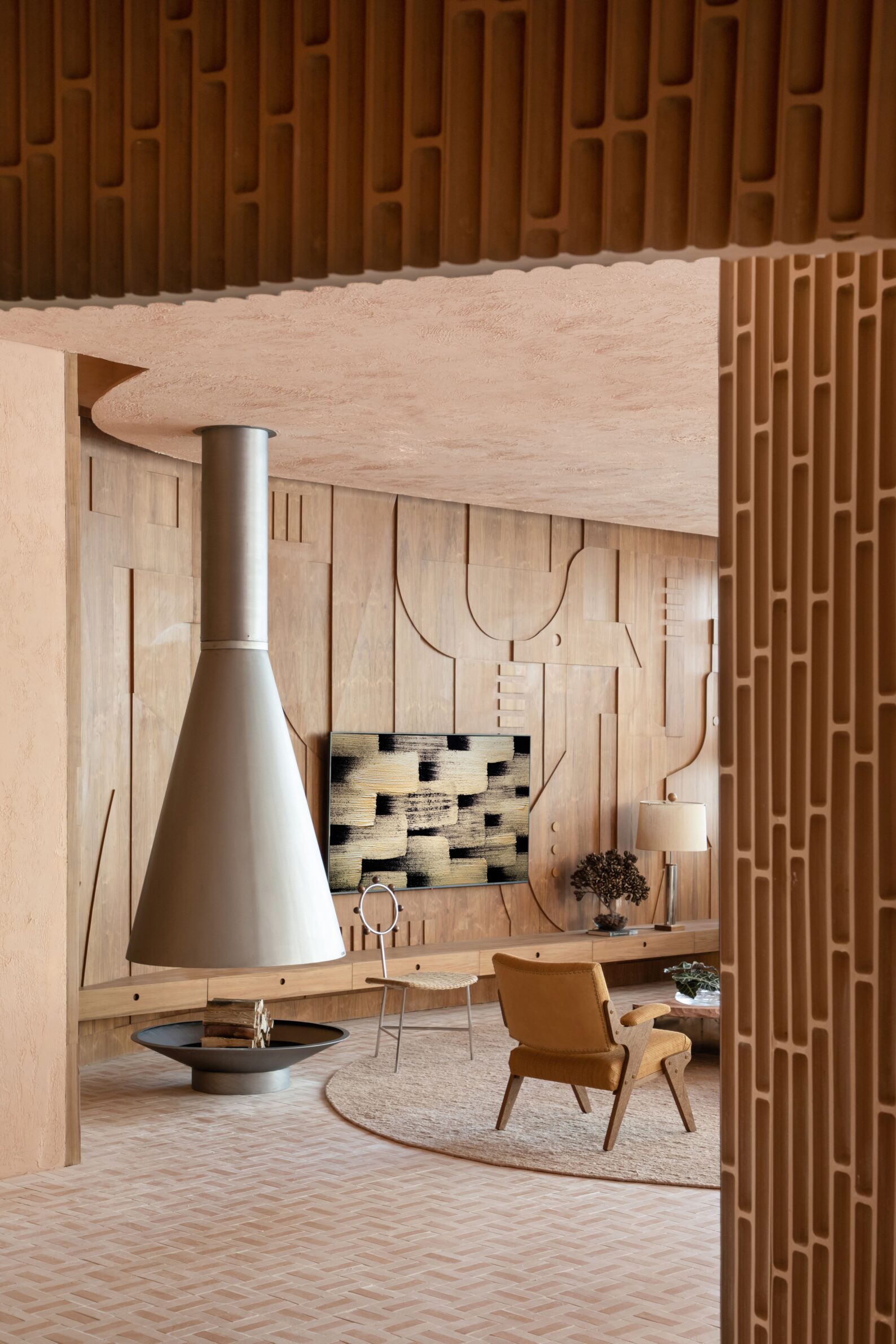
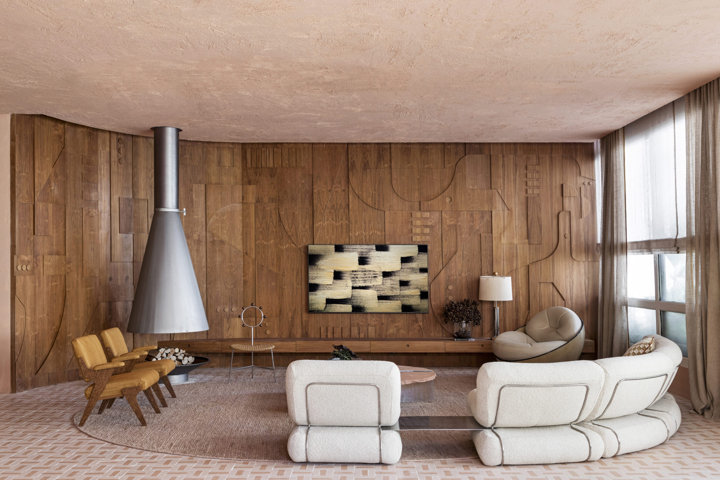
Created for CASACOR São Paulo, Casa Ñe’é LG takes its name from a Guarani word meaning soul. Its colour palette supports a broader exploration of ancestry, belonging and Brazilian identity. Soft pink and earthy shades are contrasted with abundant green, while an MDF wall treatment recalls bamboo stems and creates the impression of a winding route through vegetation. Handmade ceramic flooring is based on the patterns of Brazilian basket weaving, extending across the interior like a large woven rug. Works by Indigenous artists and craftspeople reinforce the cultural framework of the project. Colour appears here as one part of a layered composition involving pattern, landscape, technology and references to material traditions.
8. Pailunga by Atelier Vago
Italy, 2025
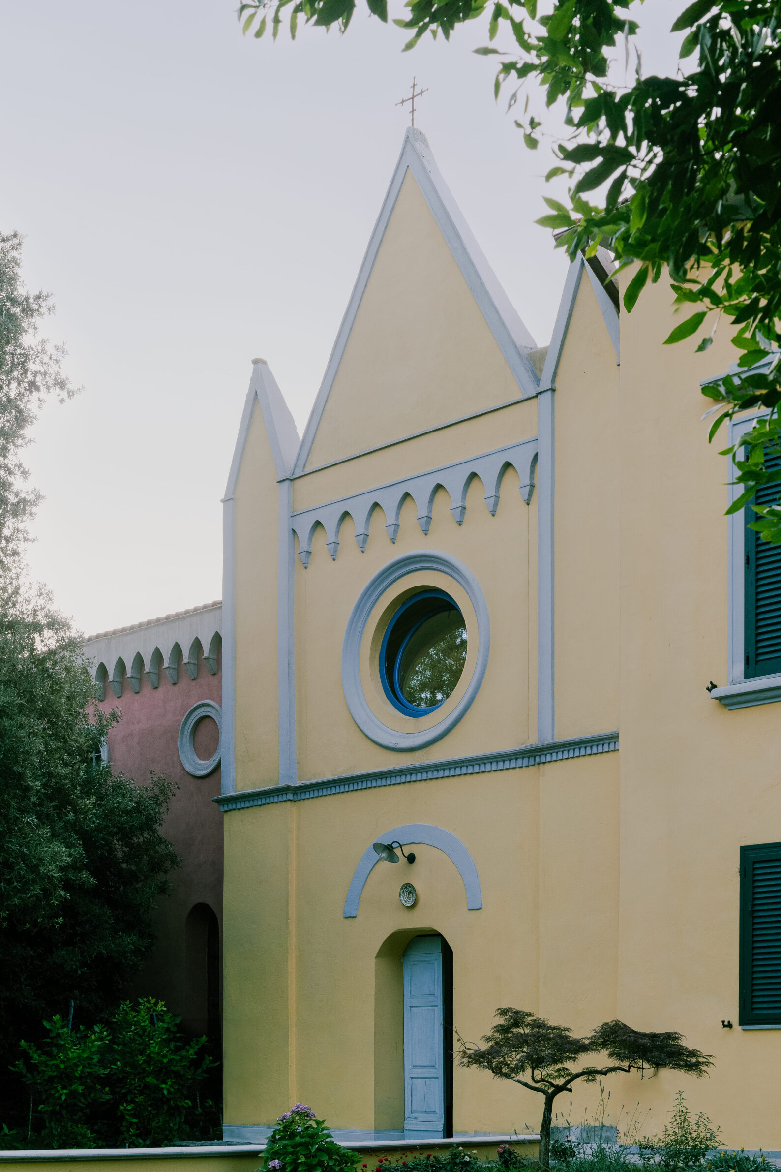
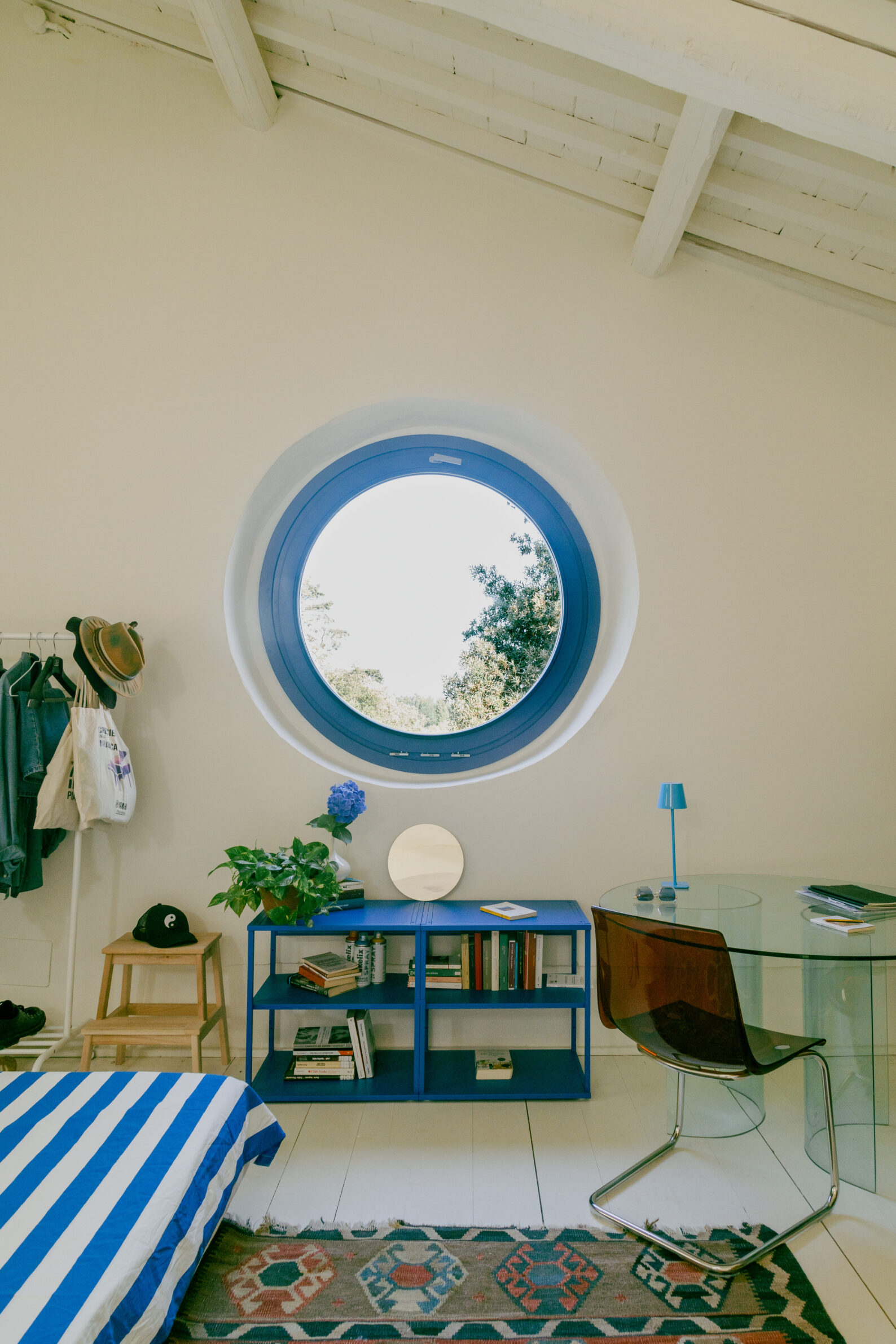
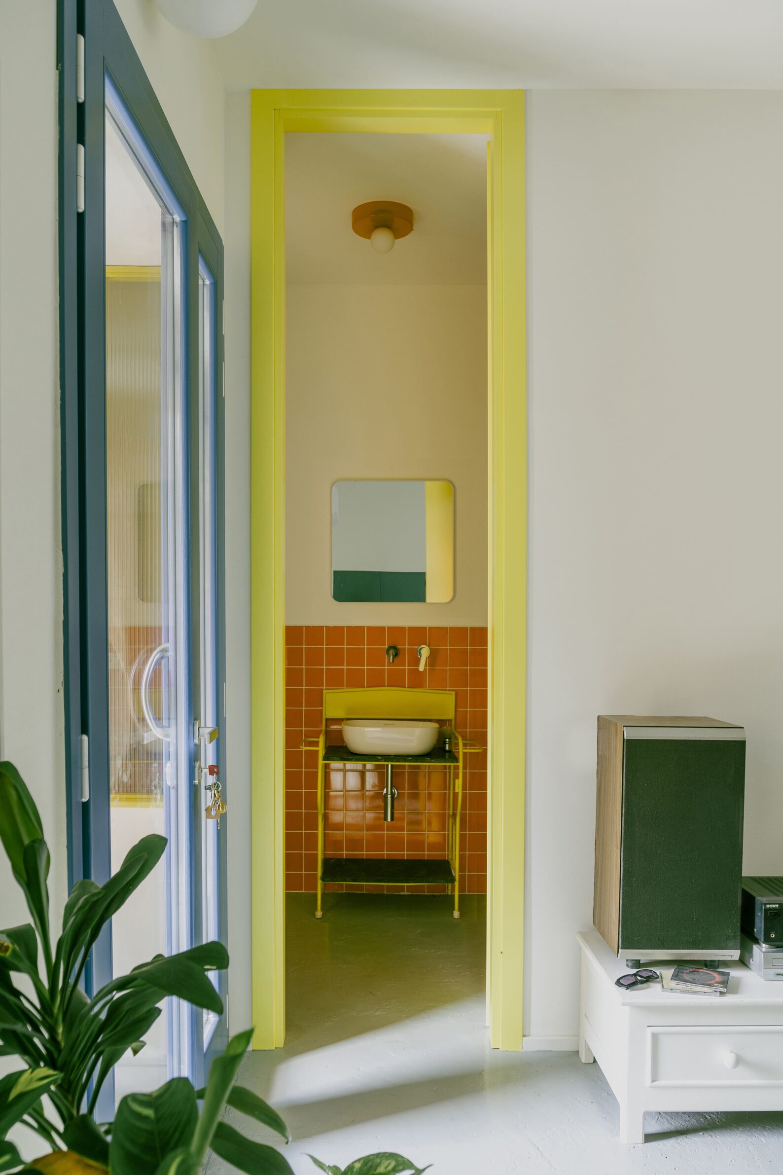
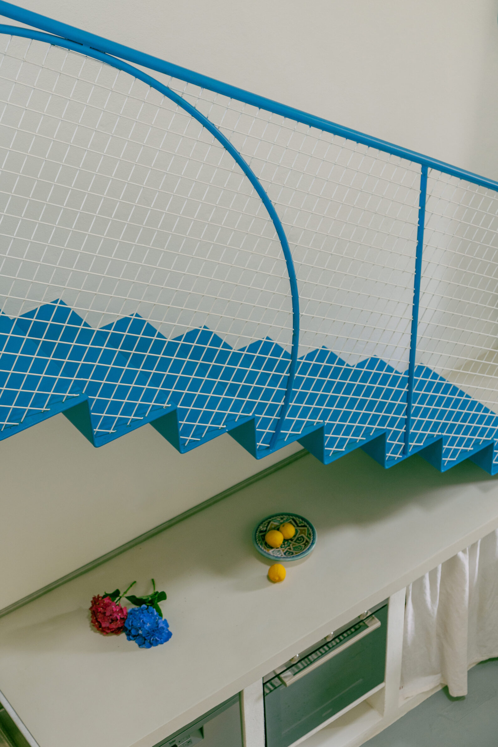
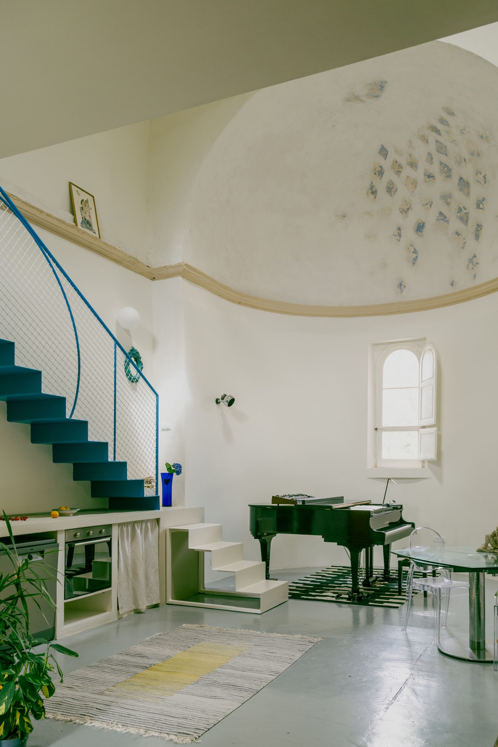
Pailunga transforms a deconsecrated chapel in the Tuscan countryside into a home, artist residency and setting for small cultural events. New domestic functions are inserted without obscuring the original nave, apse and surviving traces of the building’s religious past. The most prominent addition is a bright blue iron staircase leading to a timber sleeping mezzanine. Its colour was drawn from a remaining fragment of fresco in the apse, yet its intensity deliberately distinguishes the contemporary intervention from the historic shell. Other vivid finishes and furnishings continue this contrast. Colour acts as a record of two periods at once: it begins with something discovered in the building, then makes the new layer unmistakably present.
9. Art Curators’ Apartment in Lycabettus Hill by Oikonomakis Siampakoulis Architects
Greece, 2024
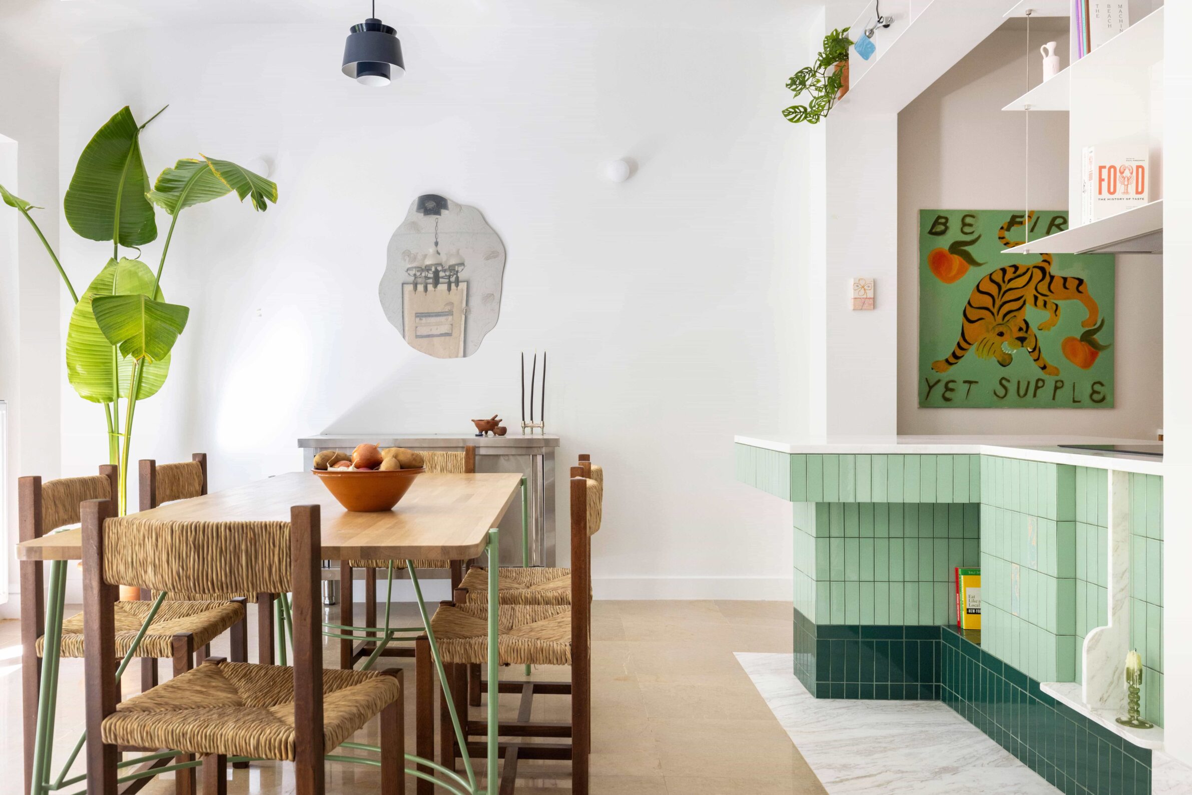
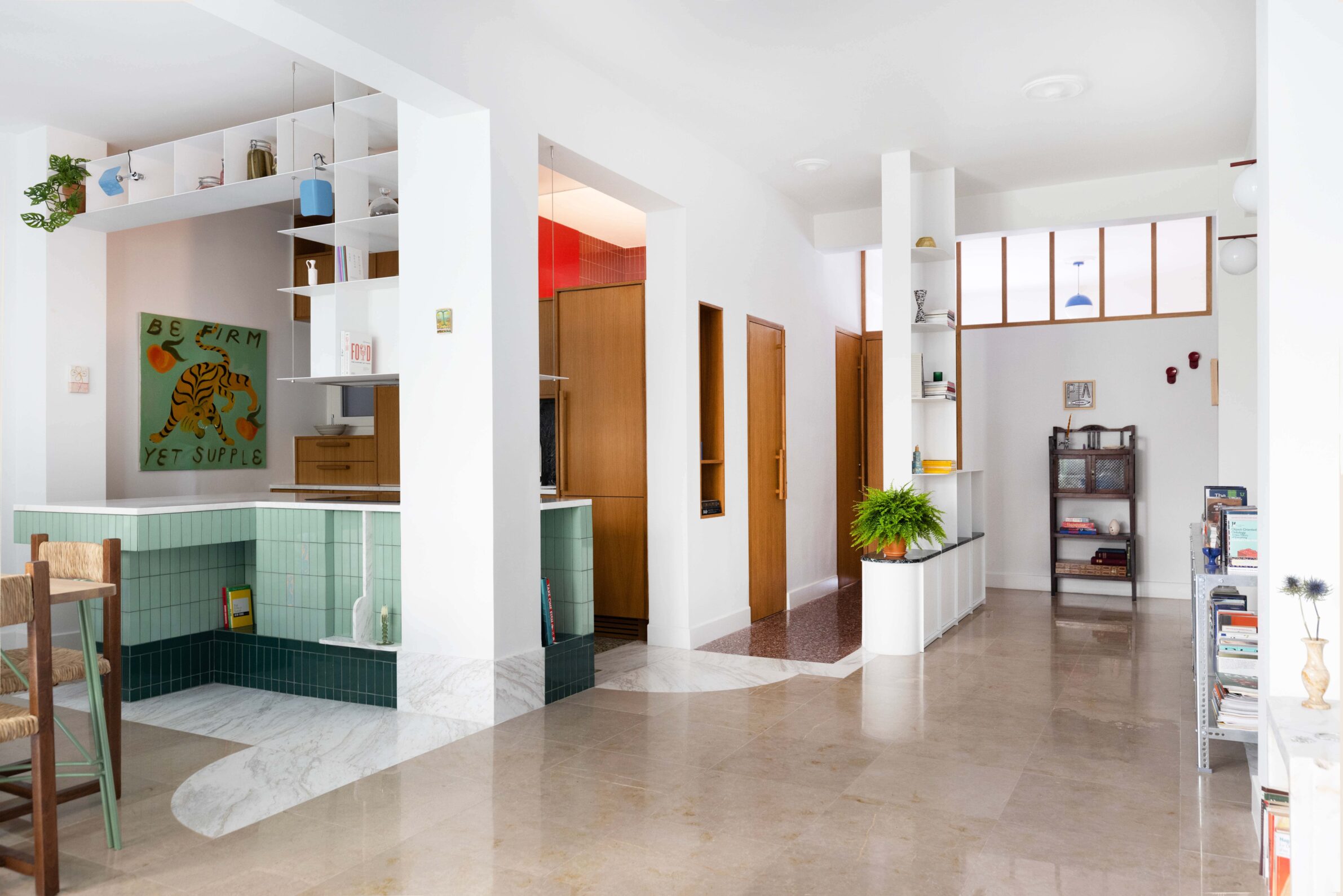
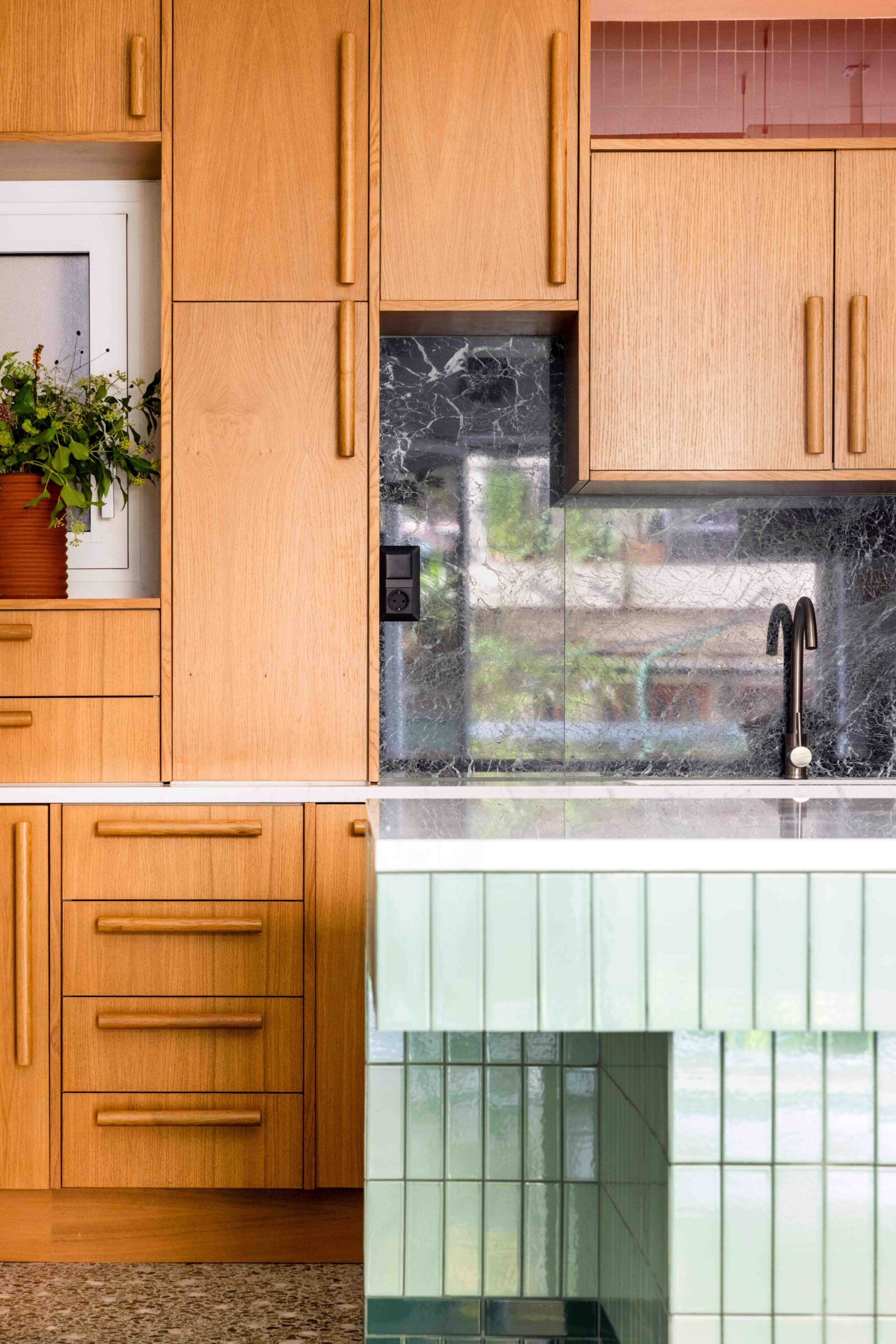
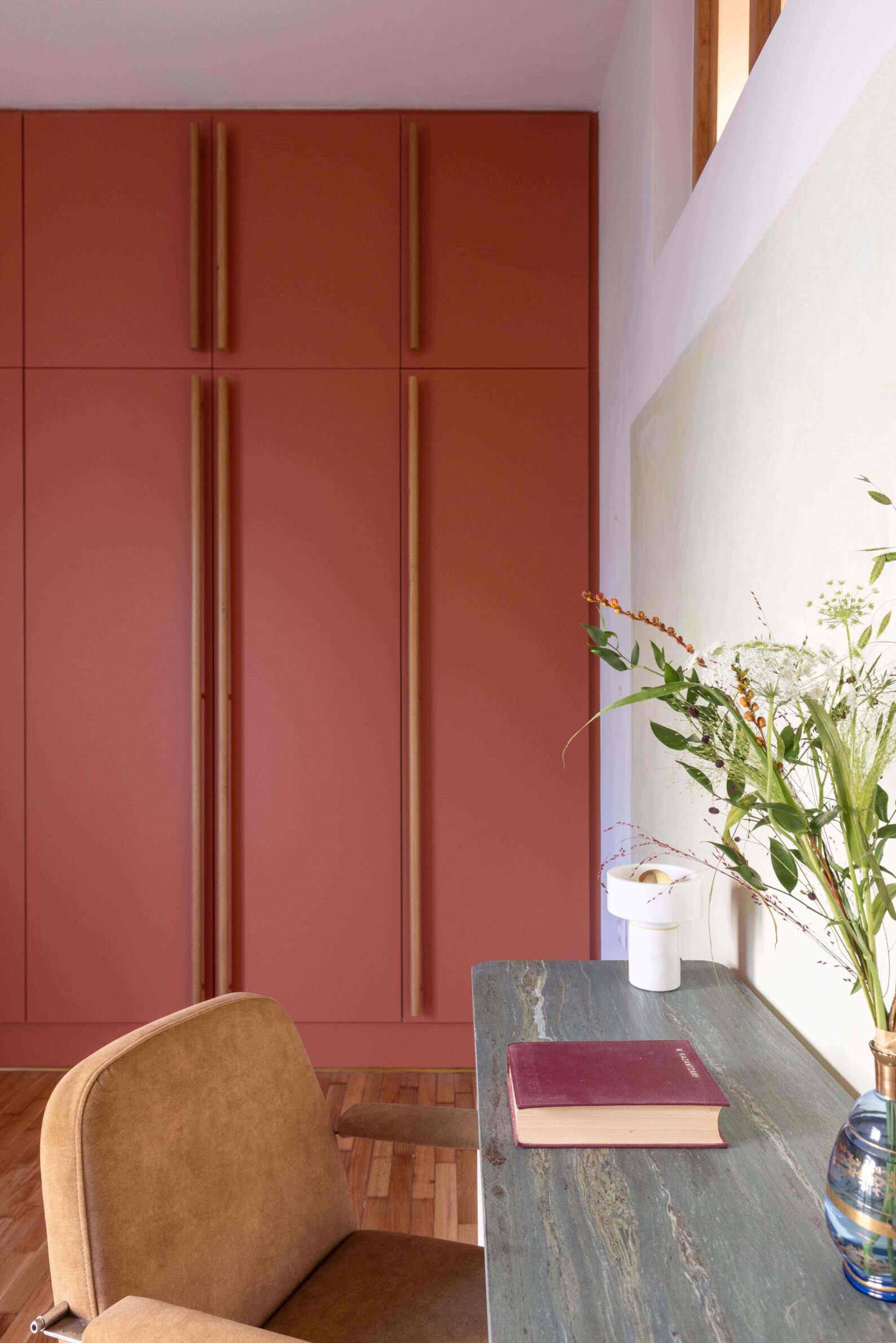
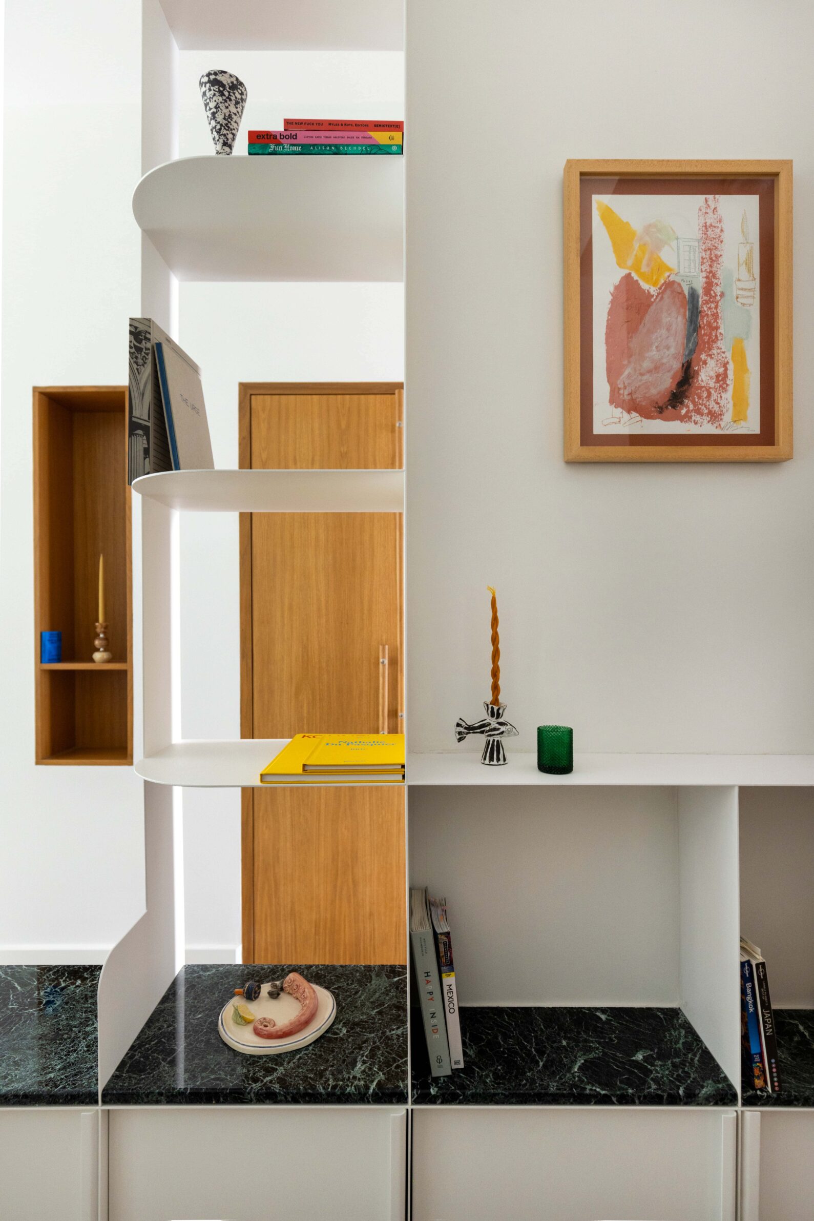
The palette of this Athens apartment develops from original materials, new bespoke elements and the residents’ extensive collection of art, inherited furniture and design objects. Brown marble, colourful terrazzo and a carved marble sink were retained from the 1970s interior, while longitudinal partitions were removed to bring daylight deeper into the plan. A tiled kitchen island, honey-stained oak cupboards and white metal display structures organise the resulting open space. Colour is allowed to accumulate through materials and collected objects rather than being imposed as a uniform scheme, producing an interior capable of accommodating pieces from different periods and places.
10. Corner Apartment by Prokop Hartl
Czech Republic, 2026
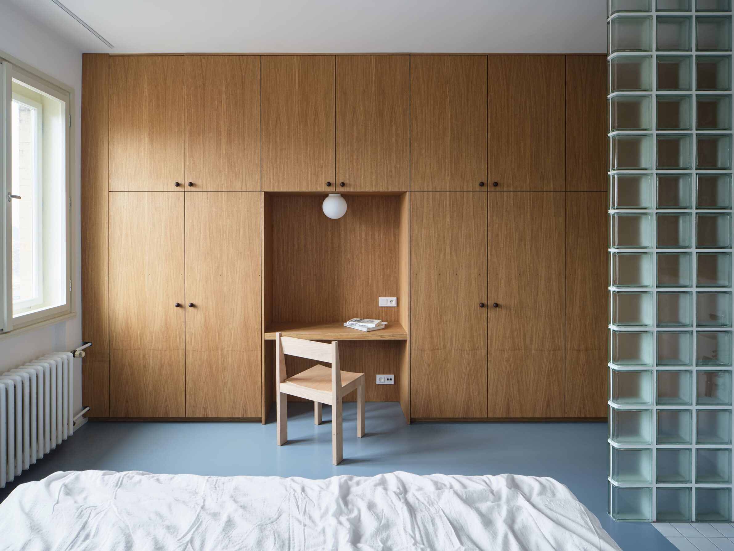
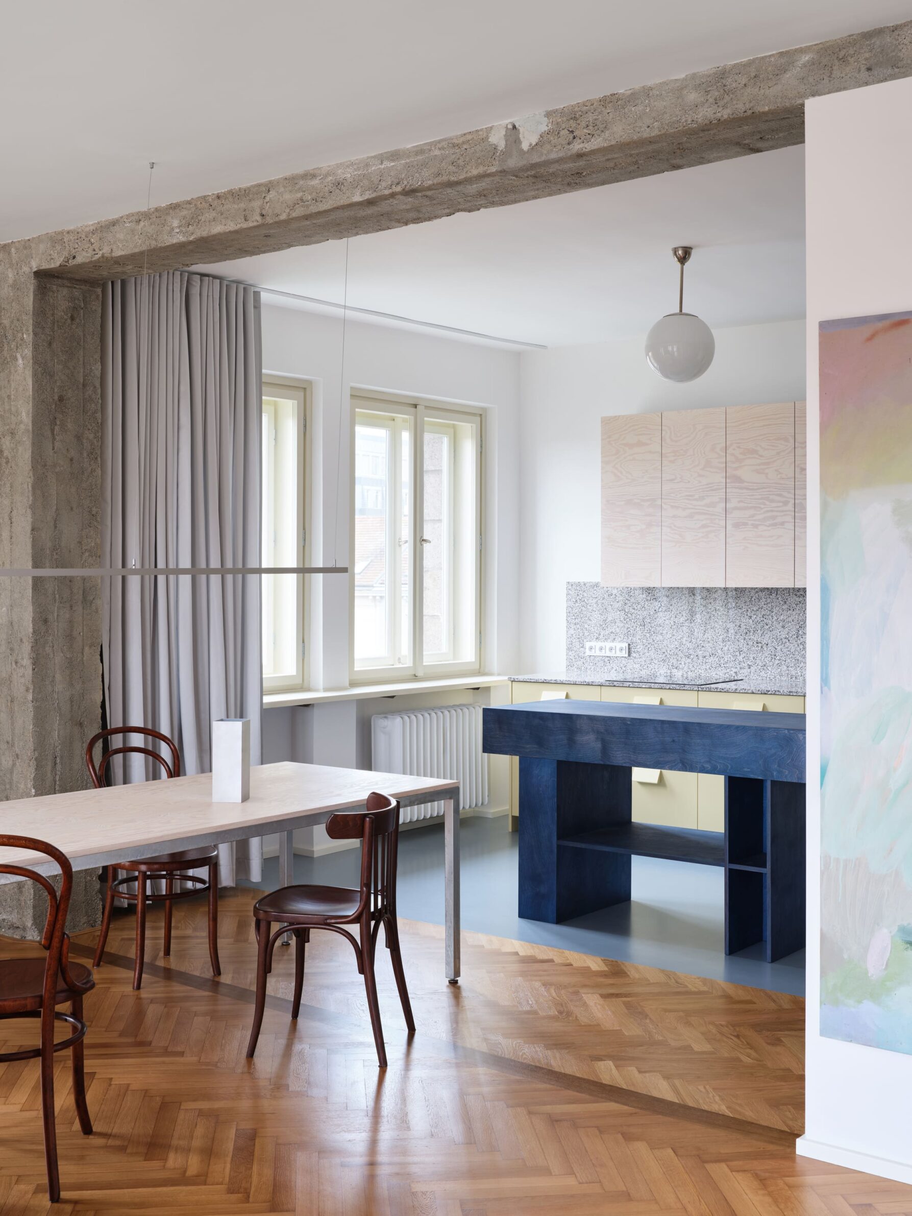
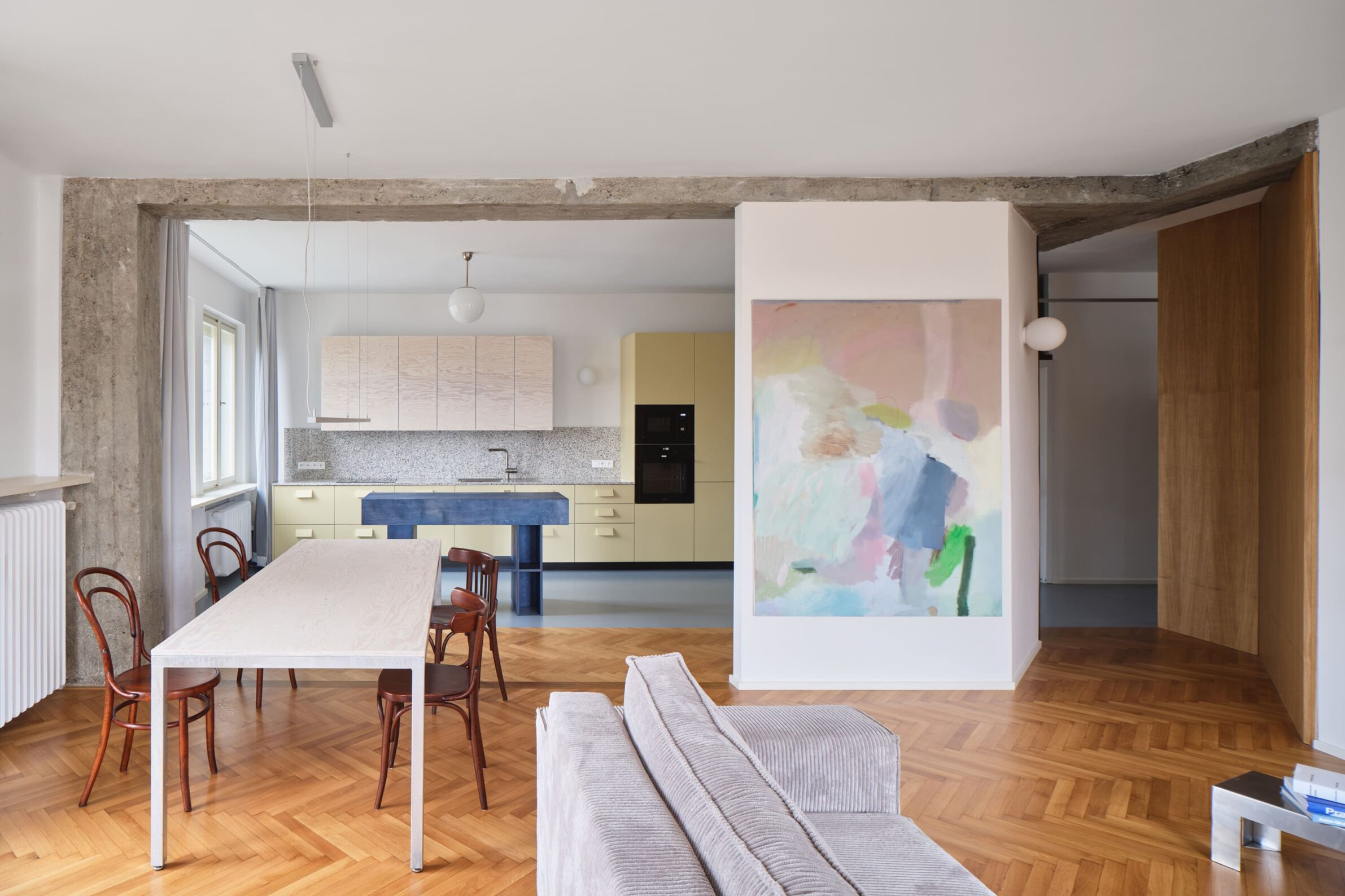
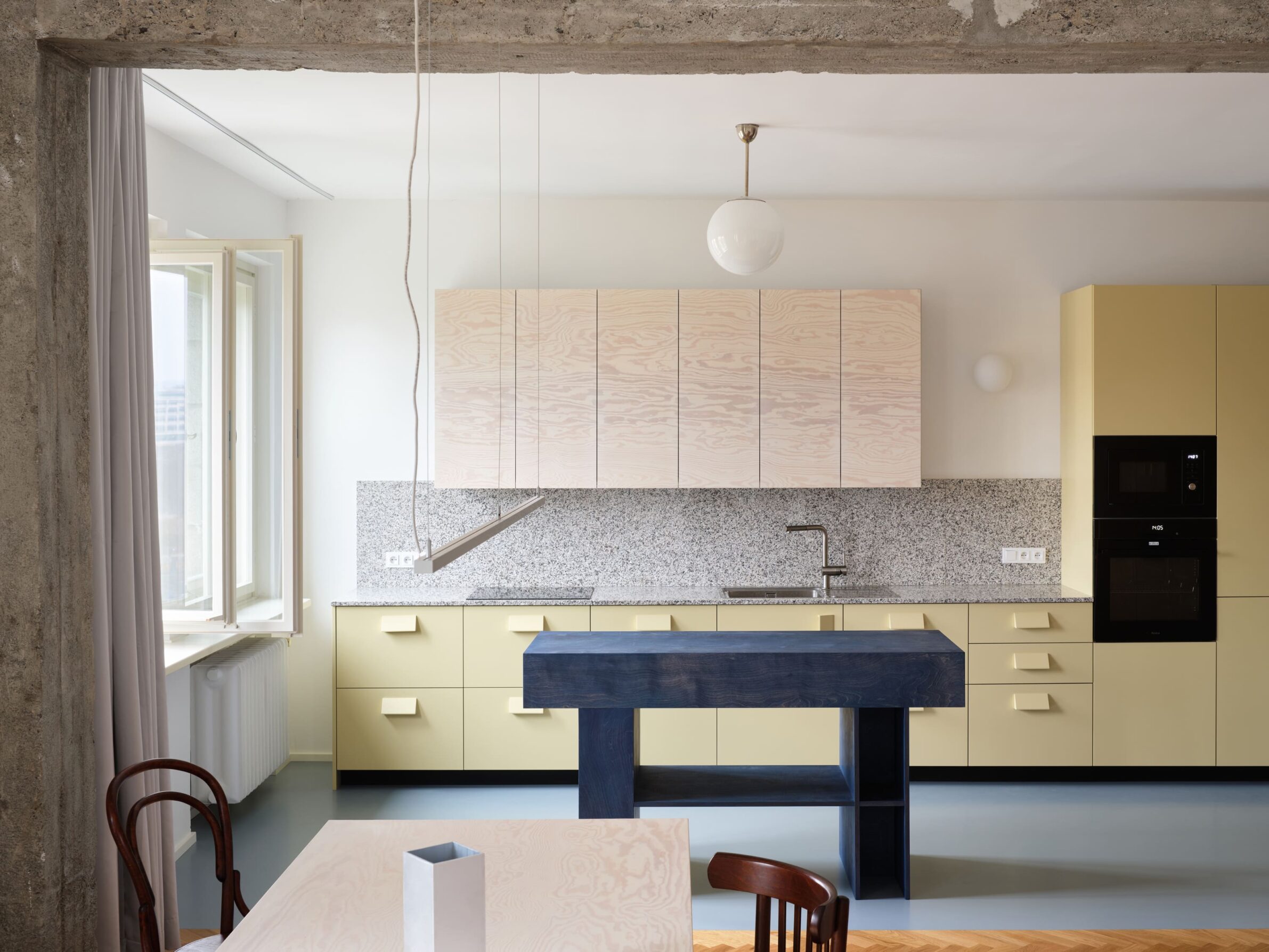
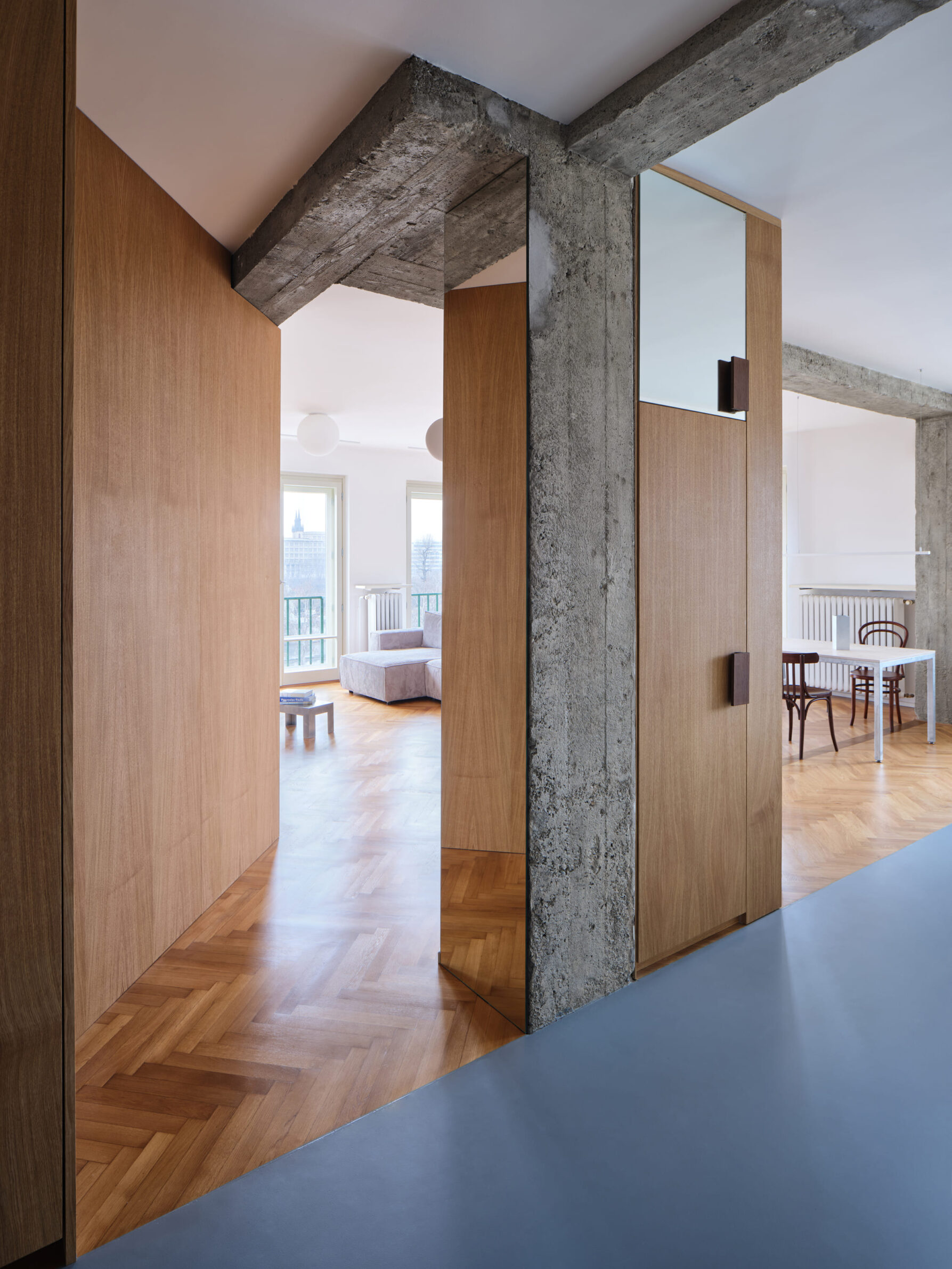
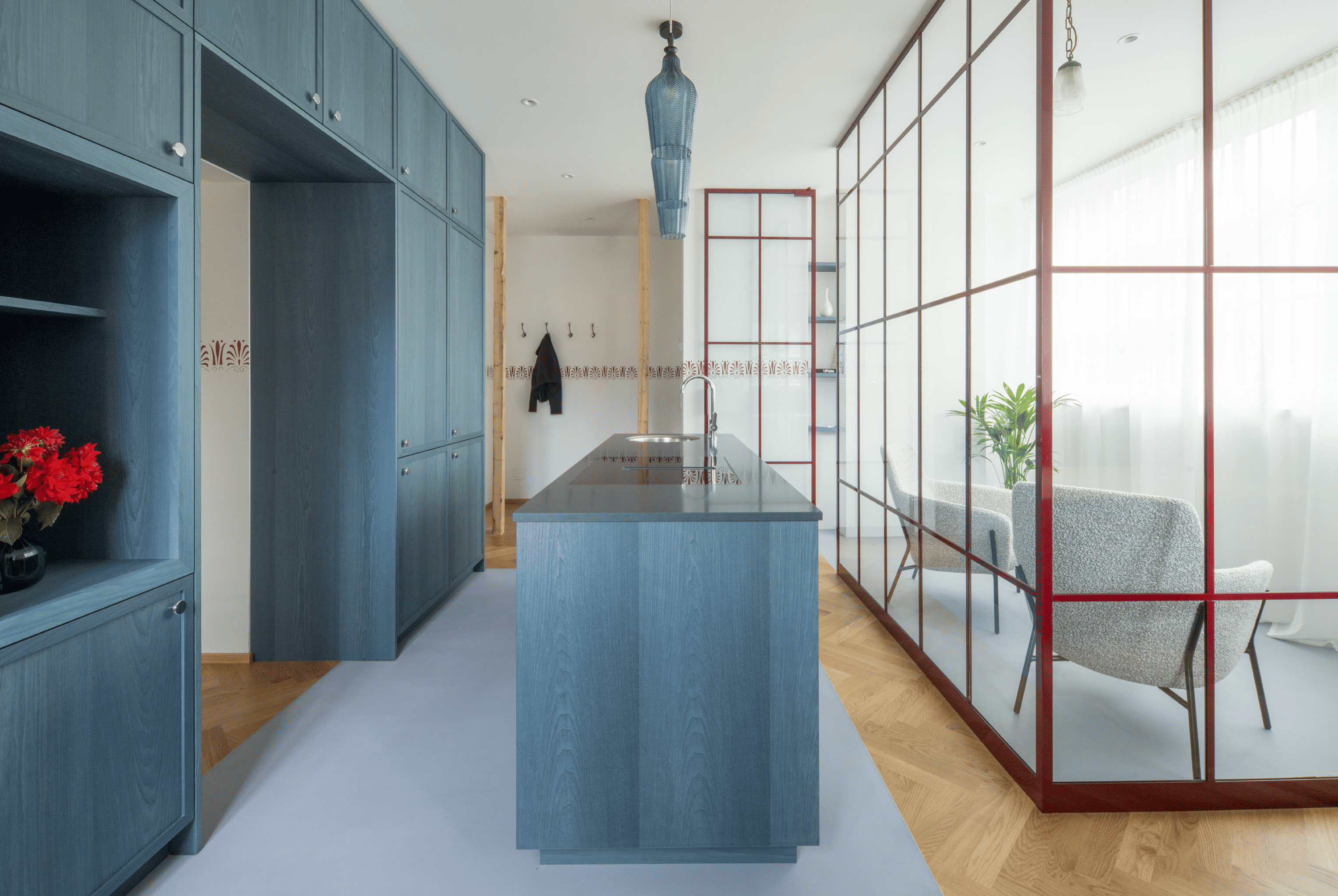
The renovation of this late-1930s Prague apartment combines restored parquet, exposed concrete, oak veneer and dark-stained timber with several concentrated colour interventions. A dark blue kitchen island dominates the enlarged living space, where its saturated finish contrasts with natural granite worktops and the restrained material palette around it. Built-in oak wardrobes emphasise the principal circulation axes and mark the transition between renovated timber flooring and new poured polyurethane surfaces. Rather than distributing colour evenly, the project uses it to establish hierarchy: the island becomes a strong visual centre, while darker timber details create continuity across the 115-square-metre interior.
Colour is most convincing when it has more than one task. It can make a piece of joinery readable as architecture, lead towards private rooms, hold together a varied collection of crafted objects or reveal where a new intervention begins. Its emotional effect may be immediate, but its contribution to an interior can also be practical and organisational.
These projects do not depend on a single attitude towards colour. Some recover tones from an existing building, while others draw from landscape, cultural references or the personalities of their occupants. What connects them is a sense of purpose. The palette does not sit apart from the architecture; it carries part of the project’s meaning.
___
Selections is an editorial series in the BIG SEE Magazine presenting carefully curated selections of architecture, interior and product design projects. Each article explores a specific theme, question or typology – sometimes through a collection of projects, sometimes through a single work that deserves closer attention. Rather than aiming for completeness, Selections highlights projects that help us better understand the ideas, values and directions shaping the built environment today.
Powered by



Edited by:
Tanja Završki
Photography ©:
cumuloLimbo studio:
Javier de Paz
Oikonomakis Siampakoulis Architects:
Alina Lefa
buno
Kumiki:
MWA Hart Nibbrig
NAEMAS Architekturkonzepte:
Tobias Kaser
Mestiz Studio:
PEPE MOLINA
Nildo José + Arquitetos Associados:
Denilson Machado / MCA Estúdio (Brazil)
Atelier Vago:
Carlotta Di Sandro
Prokop Hartl:
RadekÚlehla