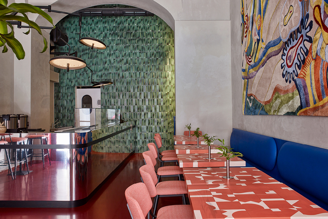
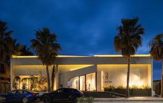
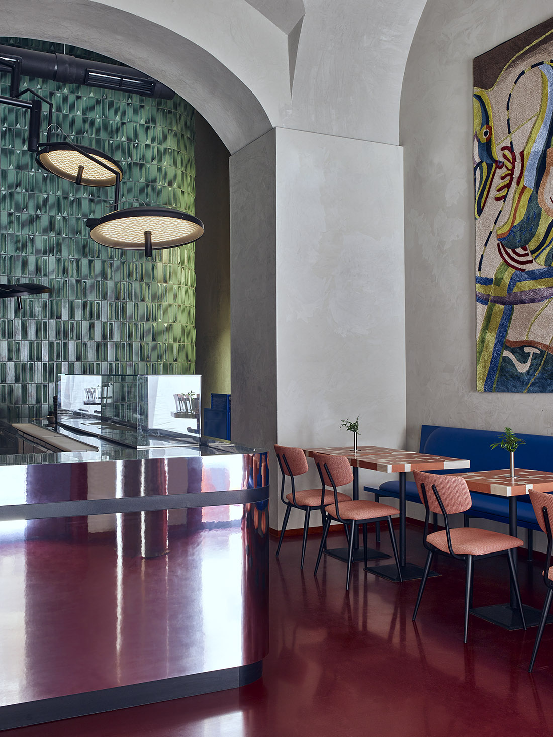
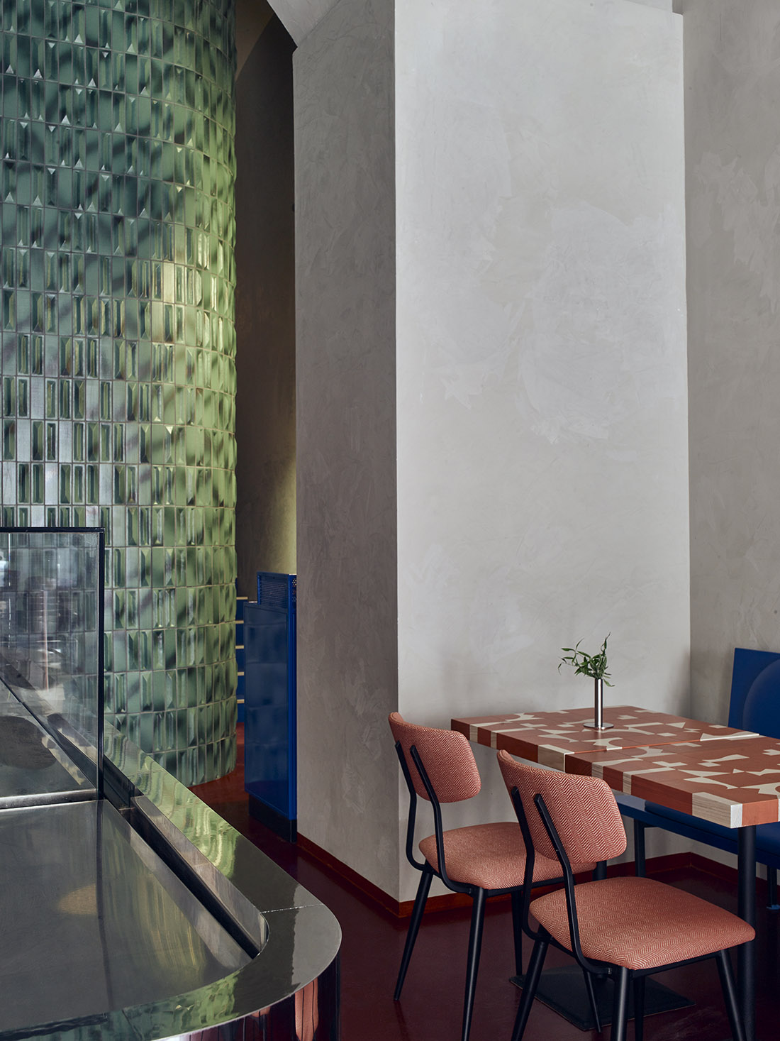
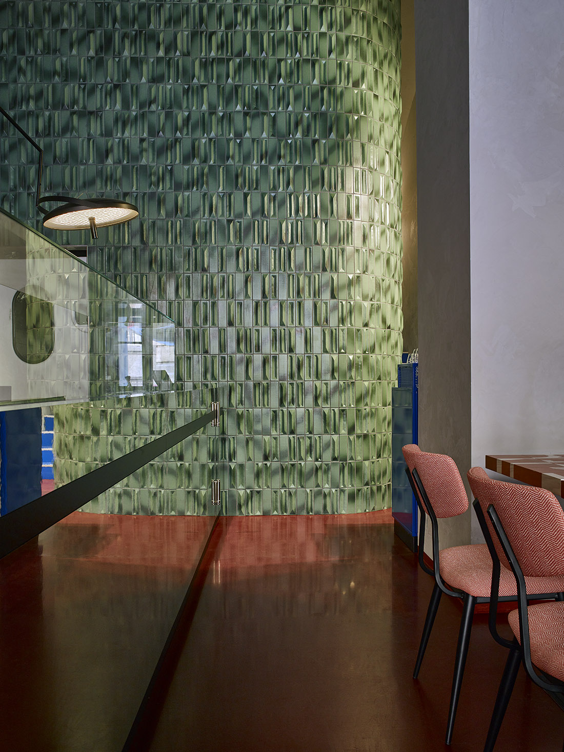
Tucked away in a small street amongst the vibrancy of Budapest’s lively 5th district, on the ground floor of a historically listed 19th-century townhouse stands Pokito. This charming traditional Hawaiian restaurant celebrates the many values of its signature dish, the poke. Attracting healthy eaters and taste enthusiasts, the poke served here has nothing to hide: its raw ingredients are of the finest quality, and except for the marinated proteins and glazing sauces, they are served on warm rice without seasoning. (V hand note: “It’s important if you dine here; you should feel like you are rewarding yourself.”) The honest character of the cuisine allowed Csap to devise an interior that combines the candid architecture of the brutalists with the elegance of Art Deco, underpinned with subtle references to its Hawaiian roots. Between neighboring small shops and cozy eateries on Nádor Street, Pokito modestly blends in with its intricate wooden facade. However, once passersby glance inside, an imposing inner space reveals itself through the grand windows. Entering through a slim, recessed glass door, we are greeted by a lone palm tree. Its giant pot offers reassuring cover until our eyes wander around the surprisingly airy space with its high-rise, arched ceiling towering over us, backed up with a monumental waterfall of natty green tiles. “I was instantly inspired by the strength of the enormous columns and the clean lines of the arches, and I also wanted the space to feel light and undraped, like the cuisine”, explains Csap. Hence he purposefully let the bare shapes of the brutalist structural elements take the lead and underlined their importance with nodes of spotlights illuminating the ceiling arches.
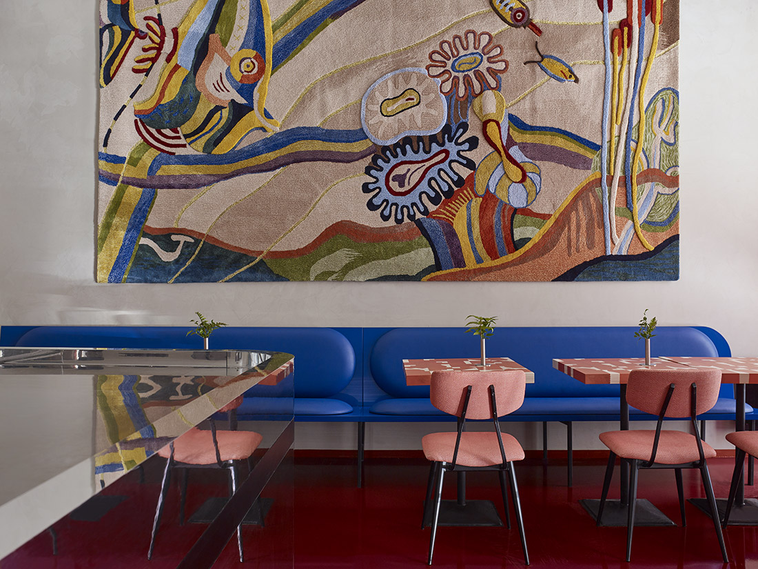
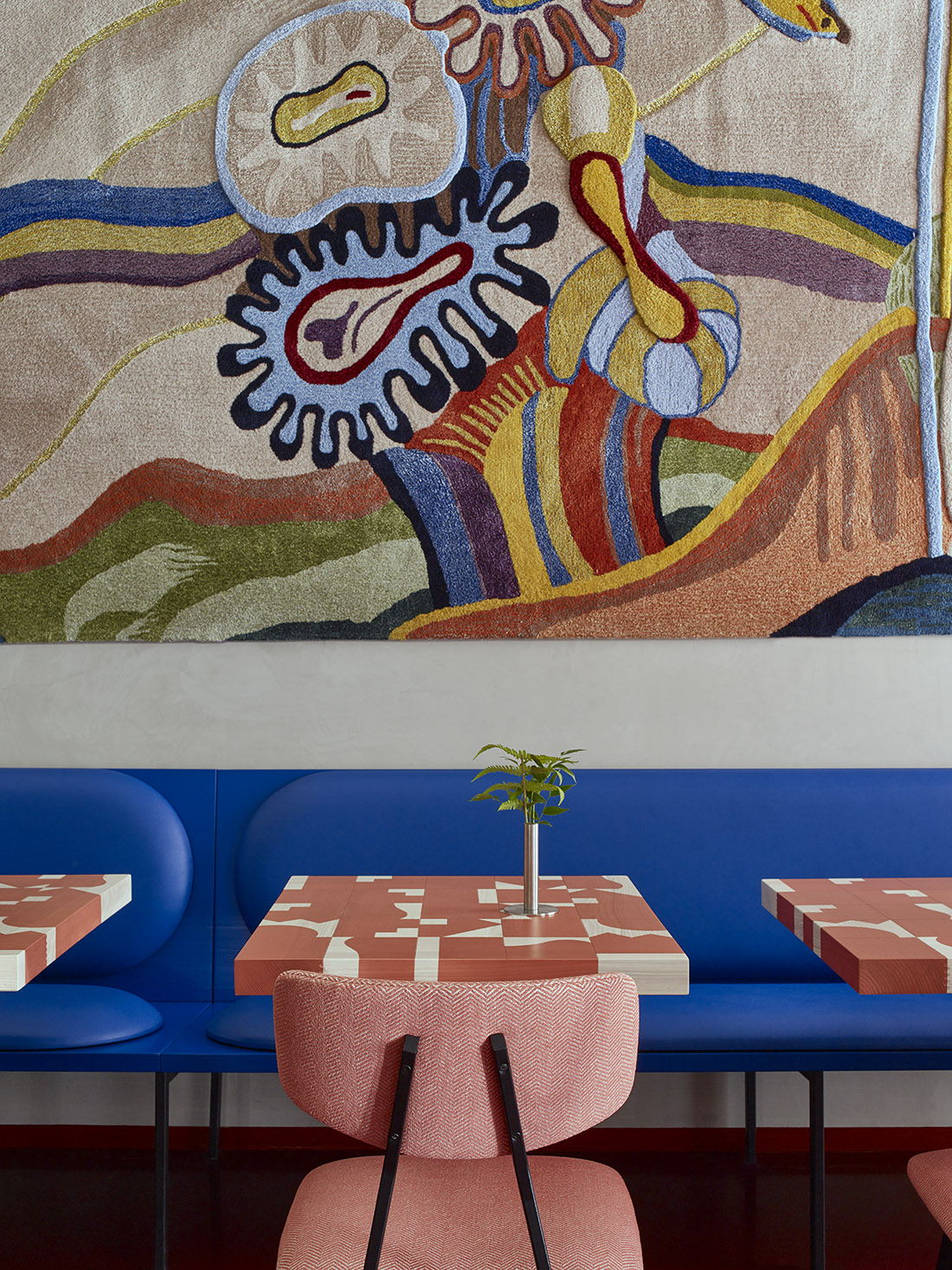
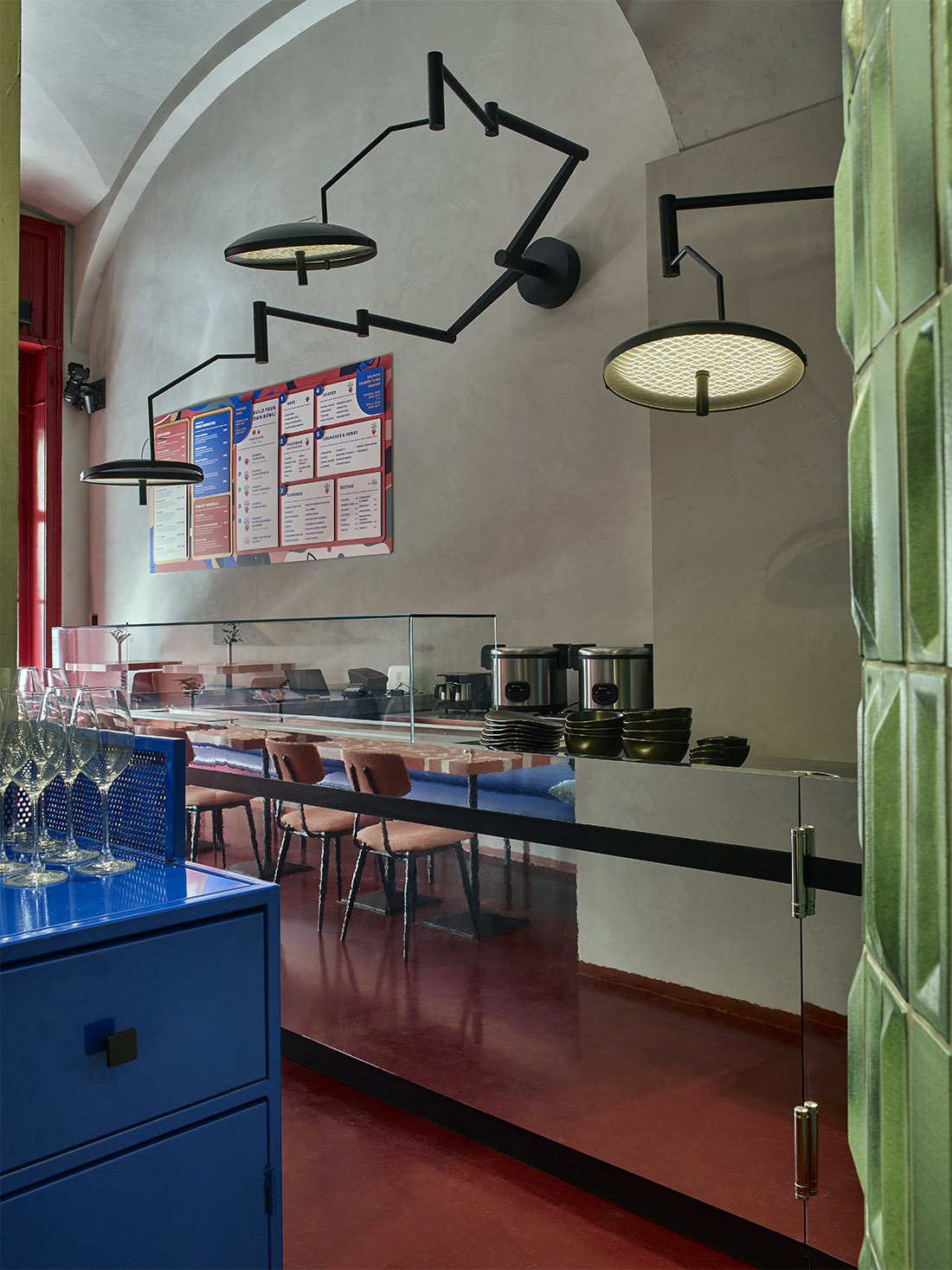
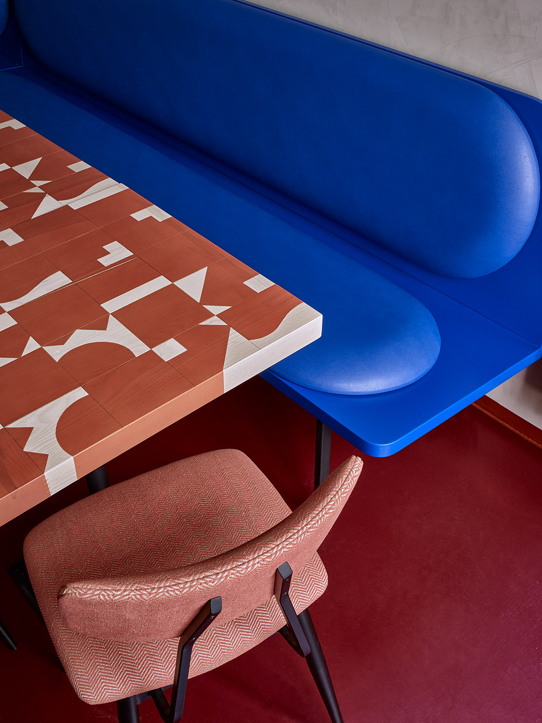
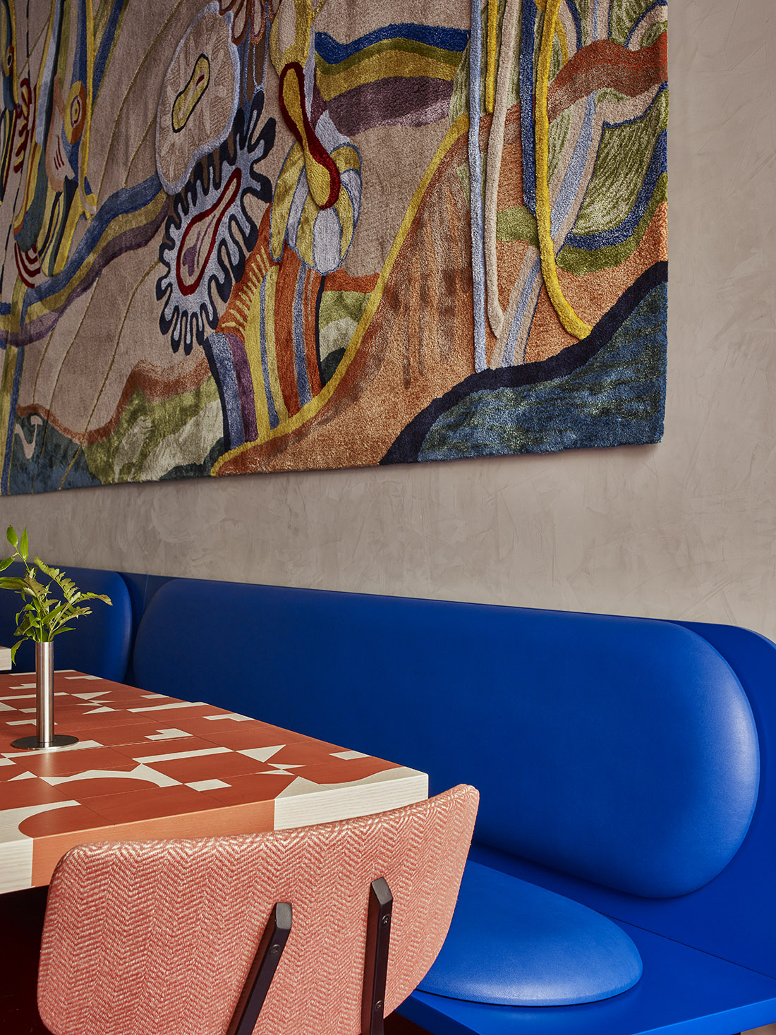
Csap injected bold colors against the warm-toned, lime-washed grey walls to make the restaurant feel cozy and welcoming. Eyecatching burgundy-shade epoxy flooring runs across the open plane, and peachy salmon hues play a geometric rhythm across the custom-made wooden mosaic tables. This shade of warmth extends to the upholstery of the comfortable, wide-seated dining chairs. While all the tones are drawn from the many colorful ingredients of poke, Csap gave a vivid contrast to the space by infusing his embraced shade of cobalt blue in the form of an art deco-style banquette. Its sleek, elongated form elegantly stretches across the wall, framing the main seating area. “Every restaurant needs a banquette”, says Csap, “for the sheer reason that it’s more comfortable than a chair. You are not confined to a single seat, and you can put your bag next to you.” A majestic work of art hangs in the center of the wall above, adorning the space between the high arches and vibrant dining space. Its regal aura claims all the attention a tapestry of its kind deserves: its plush threads run deep and soft, and its hand-woven fabric features differences in level, creating a mesmerizing depth to the underwater scenery it illustrates. (V hand note: “Every environmental impression is for the sake of underlining the quality and peculiarity of the food served.”) An existing brutalist mosaic inspired the design, which got a new mien by being reimagined from soft fabric. Its smooth character gently softens the stark demeanor of the geometric space around it – hinting at the balanced contrast Csap likes to implement in his work. To further alleviate the ambiance, Csap lightened the form of the robust bar counter by covering it with mirror film. He also rounded its most exposed corner to win space for the service route and protect it from everyday damage. Above, three modified, glowing dental lamps hang from the wall, like dark pointy scribbles in the air, dimly illuminating the walls and space around them. Formerly a Georgian gyros bar, the original interior had to be completely torn down. This allowed the floor plan to be fully adapted to the restaurant’s needs. Csap also designed a small storage room and separate scullery to support the back-end operations of the business; all tucked behind the arc of the green tiled wall. “An arc always means we win space on one side, and we lose space on the other”, he states. “We had to round the corner of the tiled wall – hence we used elongated tile shapes – because of the confined walking path to the service counter and restrooms. But we created a hanger for brooms and mops on the other side, which don’t take up much space and can be stored perfectly there.”
Radiating candid, imposing elegance, Pokito was designed to impress its visitors and make them feel like they are treating themselves to something special.

Credits
Interior
Studio Arkitekter
Year of completion
2023
Location
Budapest, Hungary
Total area
135 m2
Photos
Csaba Barbay
Project Partners
Custom lighting: Lumo Concept


