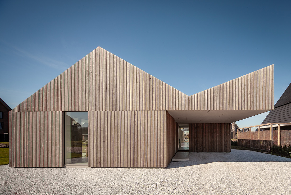
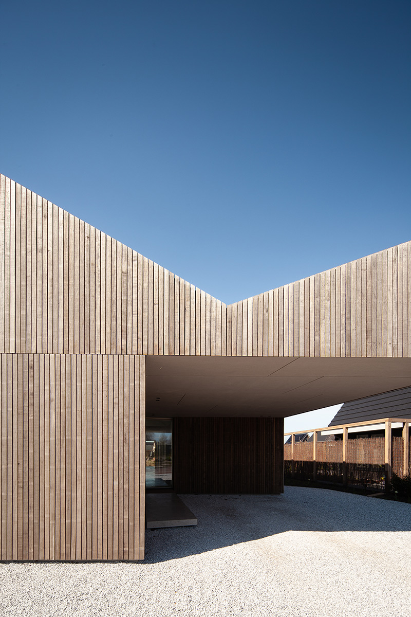
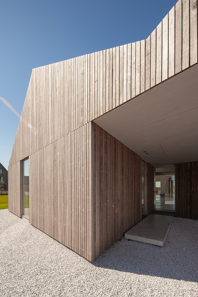
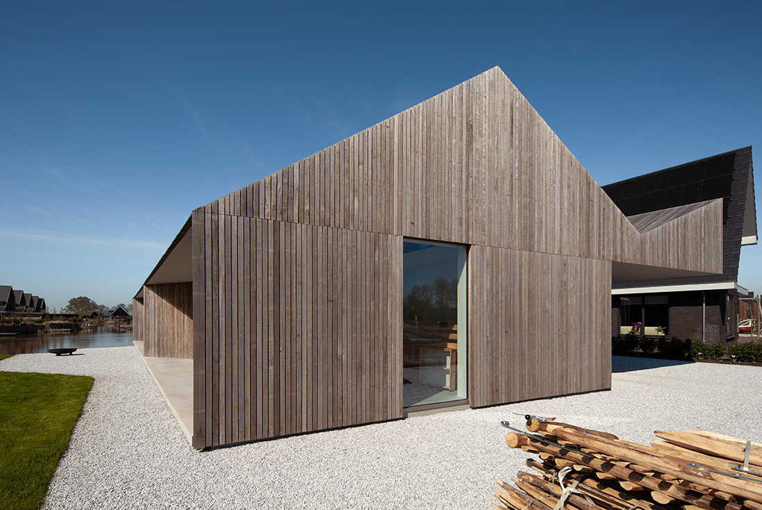
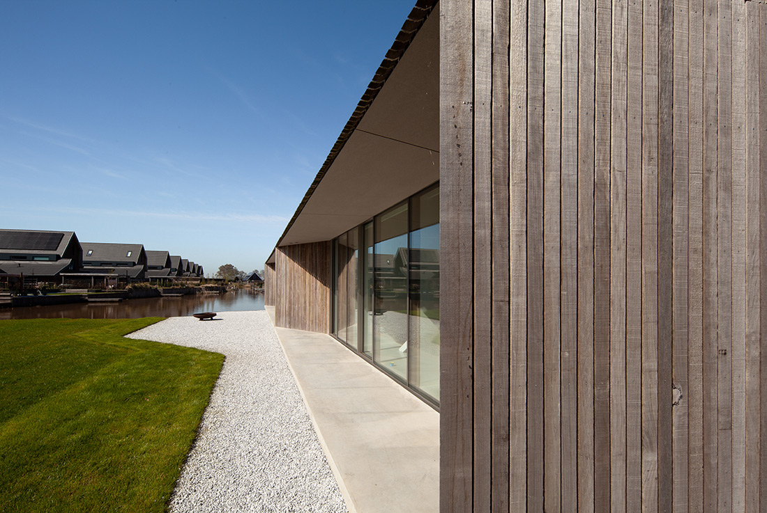
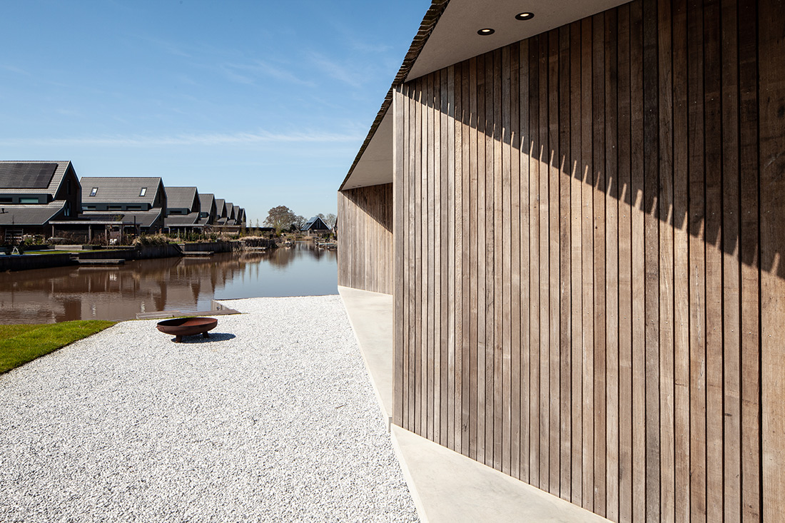
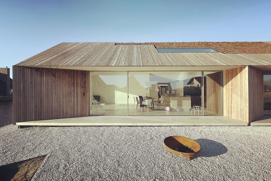
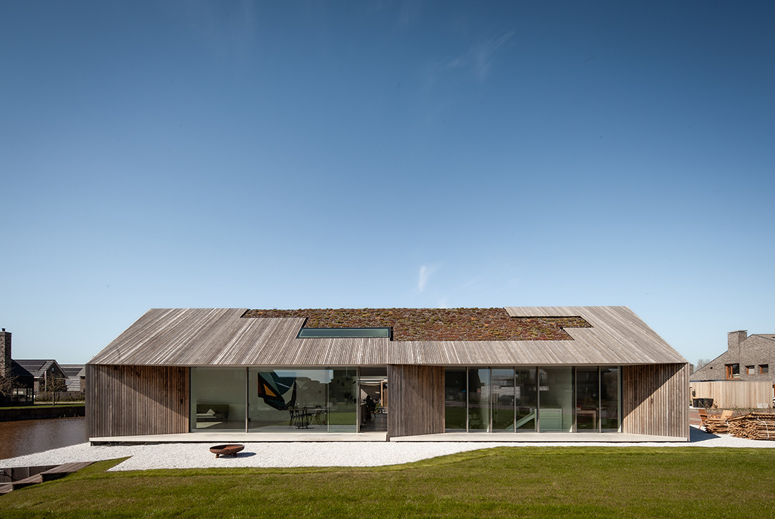
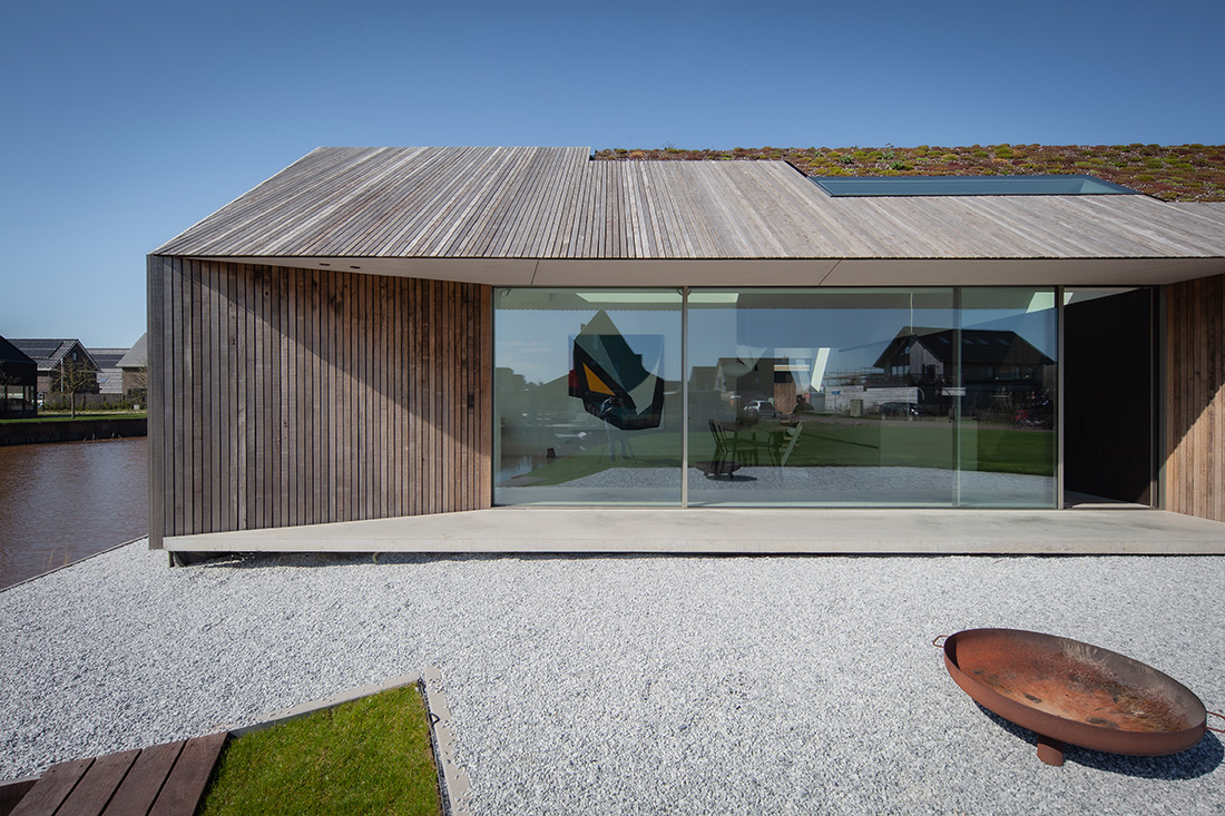
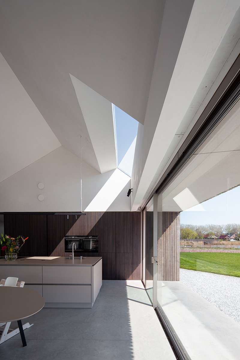
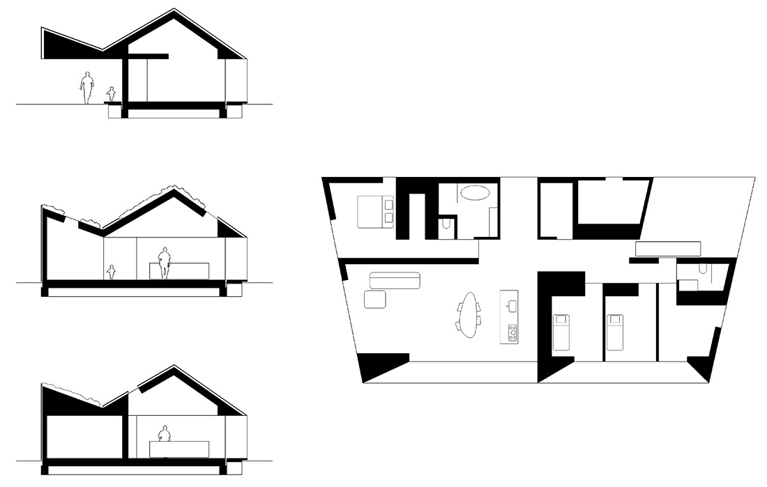
K2 is designed for a family of five in the North of the Netherlands. This area is prone to small earthquakes because of the natural gas winnings over the past 30 years. So building in wood-frame construction instead of the national folklore in bricks was without much discussion. The landscaping and building code mandated an architecture with sloped roofs and natural colours in either black or brown. At first it felt a bit restricted to design within these limitations. But looking at the wider area where this house is build the strictly controlled landscaping and city planning worked out very well. Even though K2 is minimalistic and designed as a bungalow of one story it does fit in well between the more conventional multi story houses that surround K2. Technically K2 is designed to face south with most of its glass facades. The north facade has much less glass. The south facade has an overhang to prevent the sun heating up the house in the summer while letting the sun in freely in the winter. Energy consumptions should almost be none. The house gets its energy from solar panels and a geothermal heat pump. Special attention has been given to the solar panels that can not be seen although The roof is designed to have three sloped roof areas of which the area out of sight has all the solar panels. The roof area facing south and in sight is covered with vegetation and wood siding. This is an important architectural statement. Solar panels are here to stay and a good clean source of energy but we do not need to live with their dominant and slick appearance. Where possible solar panels can do their work out of sight. K2 that way has a much more natural and less technical look than many of the houses around it that have solar panels dominate aesthetics. The material’s of this house are mostly wood, concrete and anodised in a warmer tint aluminium. The aluminium and slender window frames combined with sawn timbers for the siding are left untreated.
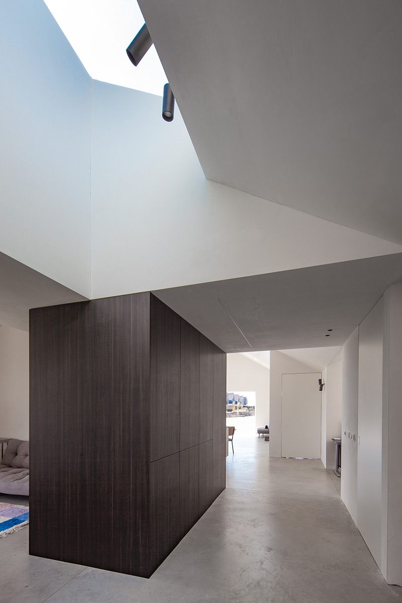
Materials are to be seen as they are in their process of weathering. The house requires little maintenance while getting its final look and feel over the course of the next few years. The vegetation will get higher and more colourful, the wood facing the sun more grey. The aluminium and concrete terraces will hardly change at all making sure the house will keep its modern and fresh look. The house has a large hall considering the usual Dutch hallways. This is an important feature of the house. It’s the hall where you change coats and put your shoes on every day. Its where you receive your guests. It’s the first space of your house that connects to all others. It should be a whole lot more than just functional. The entrance of the house is shaped by a large column free overhang where a car can be parked. Ideal in the Dutch climate with lots of rain and wind. In the winter there is no need to scrape off the frost of car windows when parked underneath the overhang. And with a family of three getting in and out the car is so much more comfortable this way even compared to a garage.
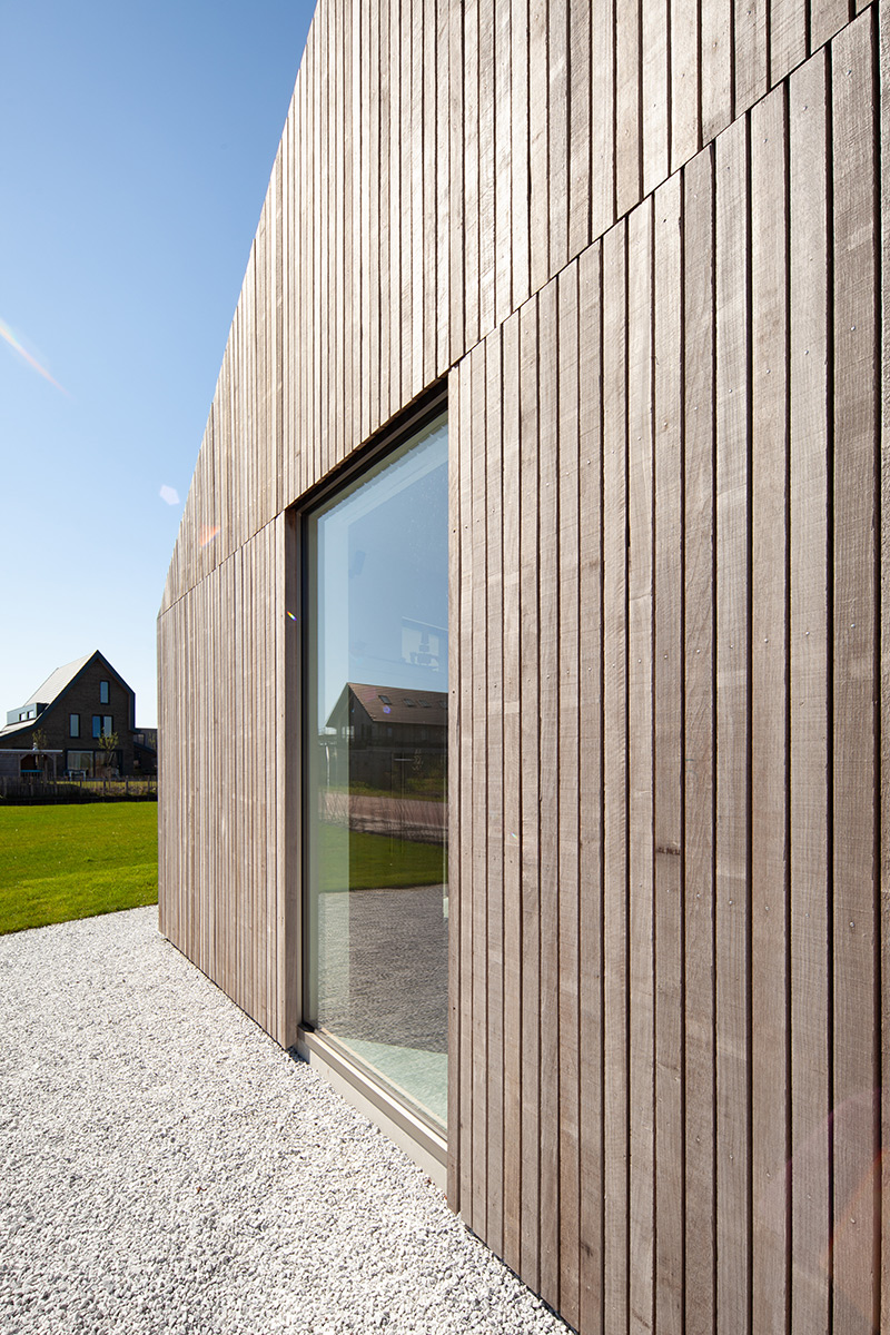
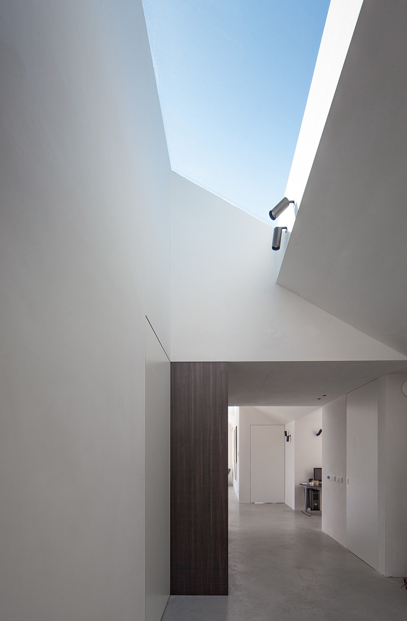
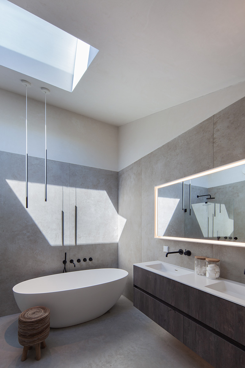
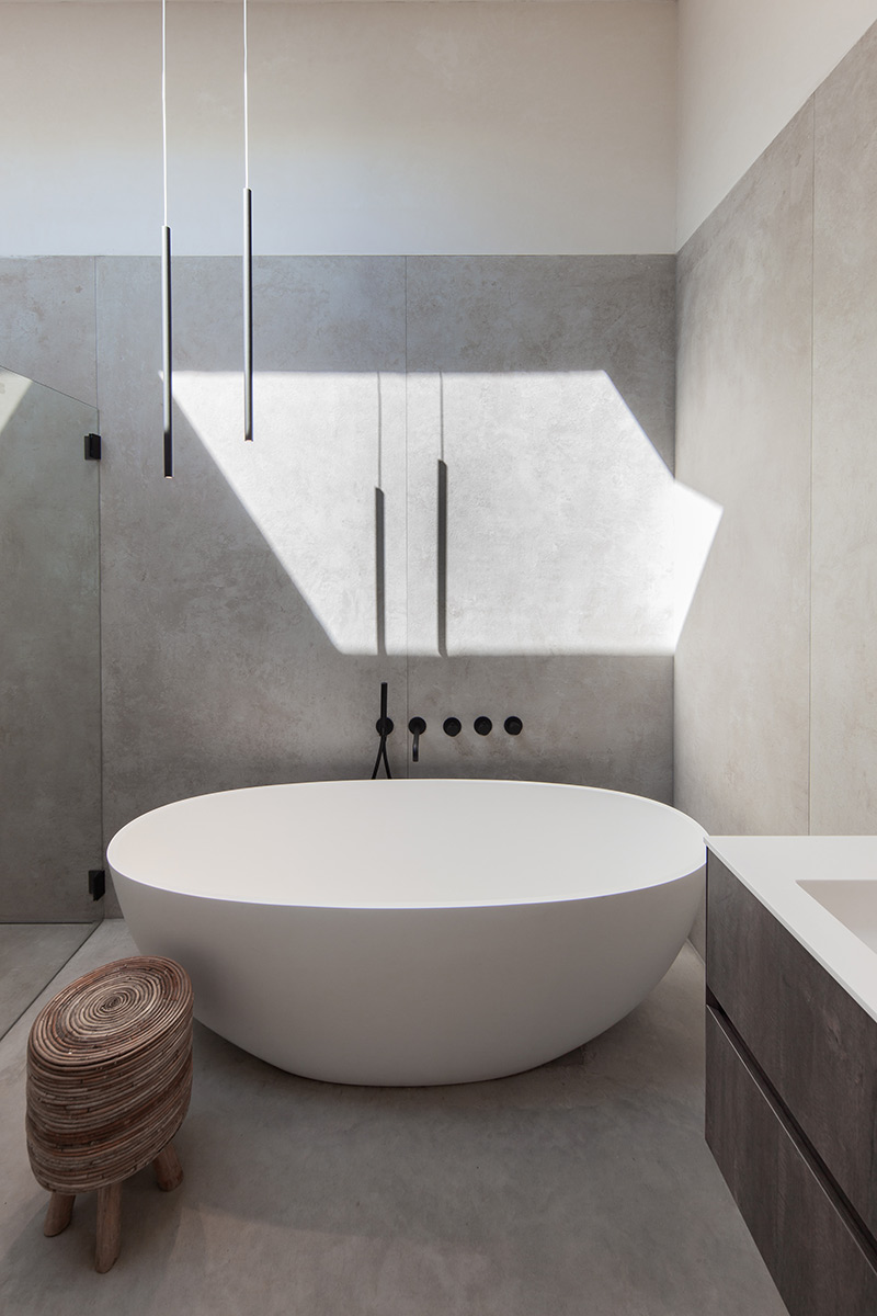
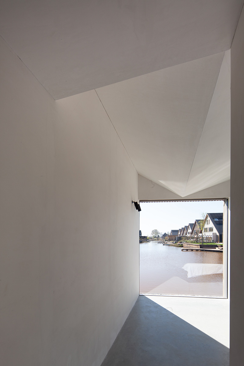
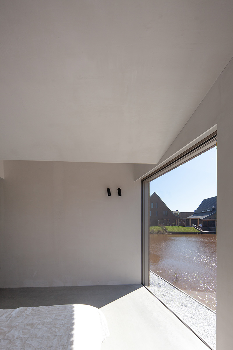
The house has minimalist details, free of gutters and roof edges. The window frames are integrated in the walls and behind the siding. It seems looking through the roof lights as if the walls extend into the sky without any frame between wall stucco and glass. These details are important to make sure they don’t distract from the spacial quality and character of the house. It isn’t always easy to build like this but once all is done most see it was worth it.


Credits
Architecture
Francois Verhoeven architects
Main contractor for wood construction
Bouwderij BV
Lighting Design
Studio Anderlicht
Structural Engineer
Structural Engineer
Building Physics
moBius consult
Client
Private
Year of completion
2022
Location
Eelderwolde, The Netherlands
Total area
250 m2
Site area
1000 m2
Photos
Francois Verhoeven


