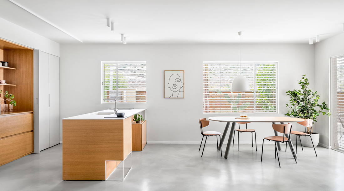
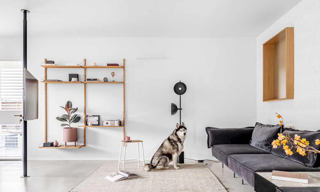
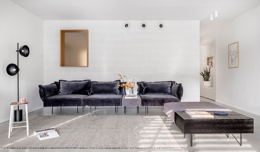
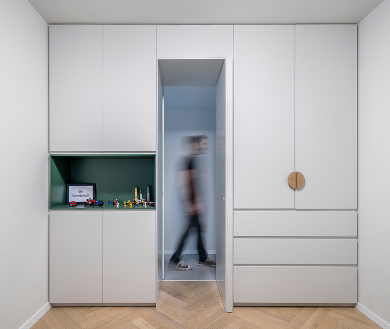
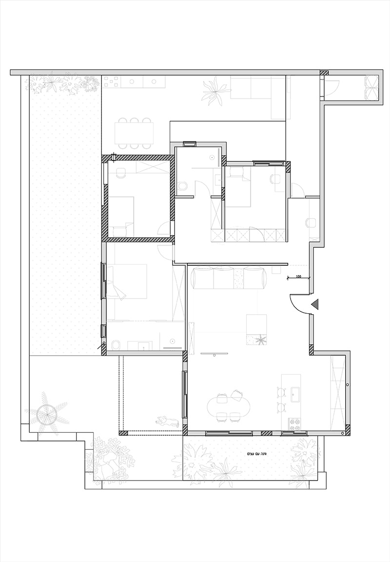
My love for the minimalist design style, and my desire to live and lead a family life in such a rigorous and precise living environment, made me and my family go through a complex process and try to answer one small but not simple question: What do we really need in our living environment?. I realized that the need for a functional living environment does not necessarily contradict the minimum meticulous design, and that the way to combine the two in harmony is to change consumption habits and especially to change thinking habits. The design concept of the apartment is thus influenced by the culture of minimalism: the idea was to create an airy space that simulates levitation, one that will allow you to move freely around the space, free from all distractions, with a clear mind and clear and new thinking. We got rid of all the elements that characterize contractor apartments, such as the shutter houses and the dark aluminum windows, which made the space very heavy. I was required to design and manufacture storage solutions for each of items the family needed, and so it turned out that every closet, niche or shelf, plays an accurate and clear role in the space. Each accessory has its own place, and there is no space for additional things. In the living room were placed a minimal and low gray modular velvet sofas – simple furniture that characterizes the Japanese interior design. Spacious floor space between the few pieces of furniture scattered throughout the space naturally allows for a light and less grounded space for the ground. I chose to give up a coffee table in the center of the living room, a decision also influenced by the Japanese current/ It was very important for me that the children will feel comfortable moving and playing in the living space, without any disruptions or blockages in traffic flow.
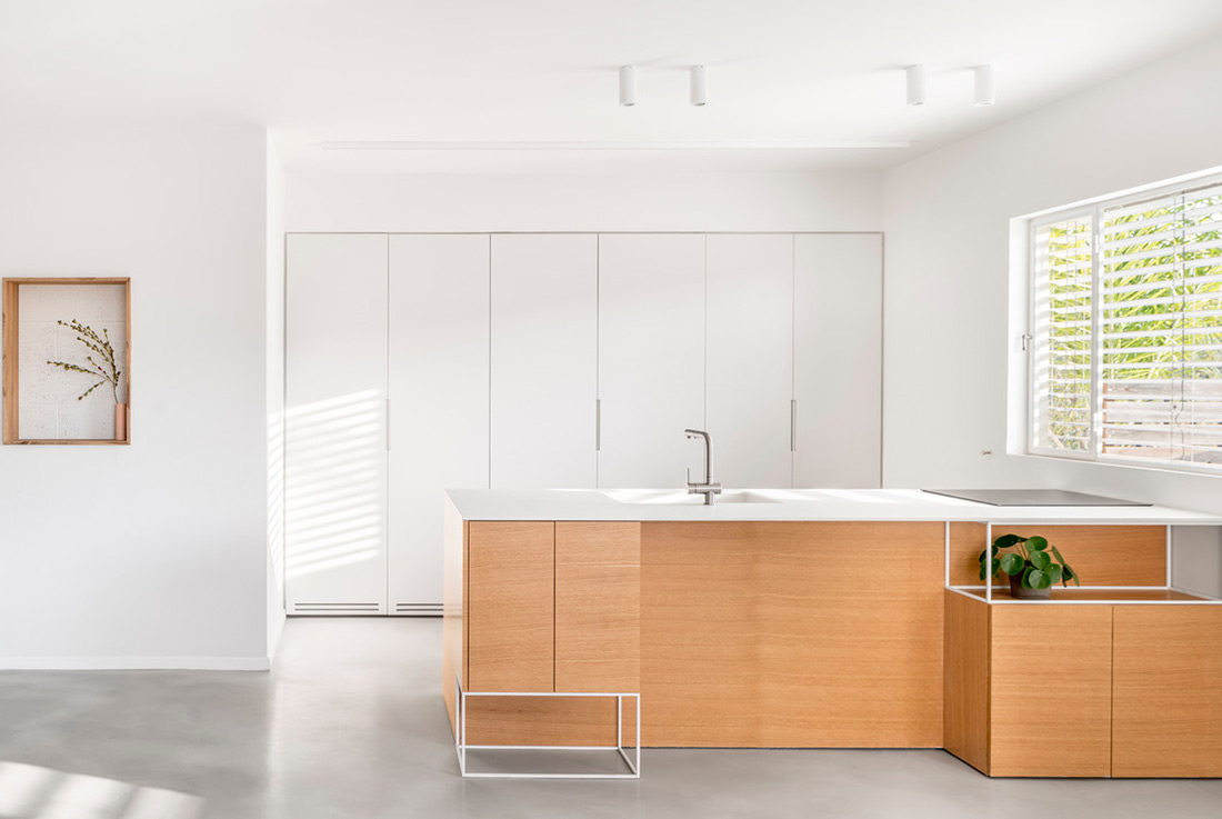
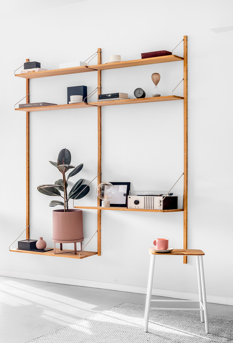
The TV was placed on a pole, also in order to ventilate the space. The ‘Scandinavian’ color palette, of course, in monochromatic shades, which are reflected in the gray concrete floor and the thin white iron windows that are designed with minimal division, so that the central space is flooded with natural light and overlooks a green landscape. To avoid a feeling of too sterile space, an oak tree appears in the space, which is repeated in a variety of elements that radiate gentle warmth: the thin library in the living room is made of natural oak, with decorative items and a small work area. The block wall in the living room serves as a dividing wall between the public space and the private space. The kitchen also continues the design language, the principles of cleanliness, the minimalism and the meticulousness felt throughout the space. The kitchen is designed in rigid and clean lines, while maintaining a minimum of decorations. It is made of oak veneer and white carpentry, and the appliances in it were built into the kitchen carpentry, to maintain a uniform appearance.
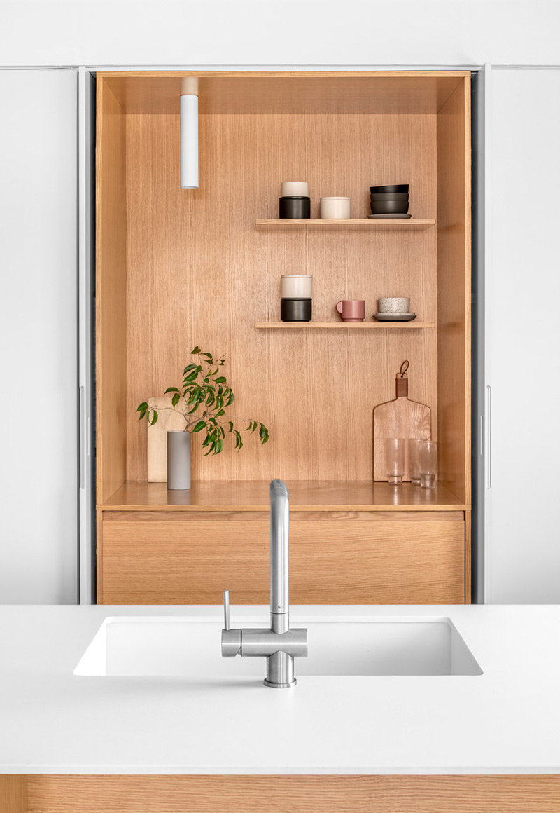
The island stores most of the functions in the kitchen: sink, stove, oven and dishwasher. The use of a work surface from Dekton created a clean and minimalist look. The wall parallel to the island is a uniform white carpentry wall, from floor to ceiling, and includes an integral refrigerator and freezer, a wide pantry and another work area that is revealed by opening two integral doors 160 cm wide. The idea behind the design of the carpentry wall is to allow the kitchen to function in two situations: open and closed, thus adapting it to our needs. When the carpentry doors are closed, the kitchen gets a clean and minimalist look. It is a very convenient solution when guests are surprising or just when there is no desire to arrange too much.
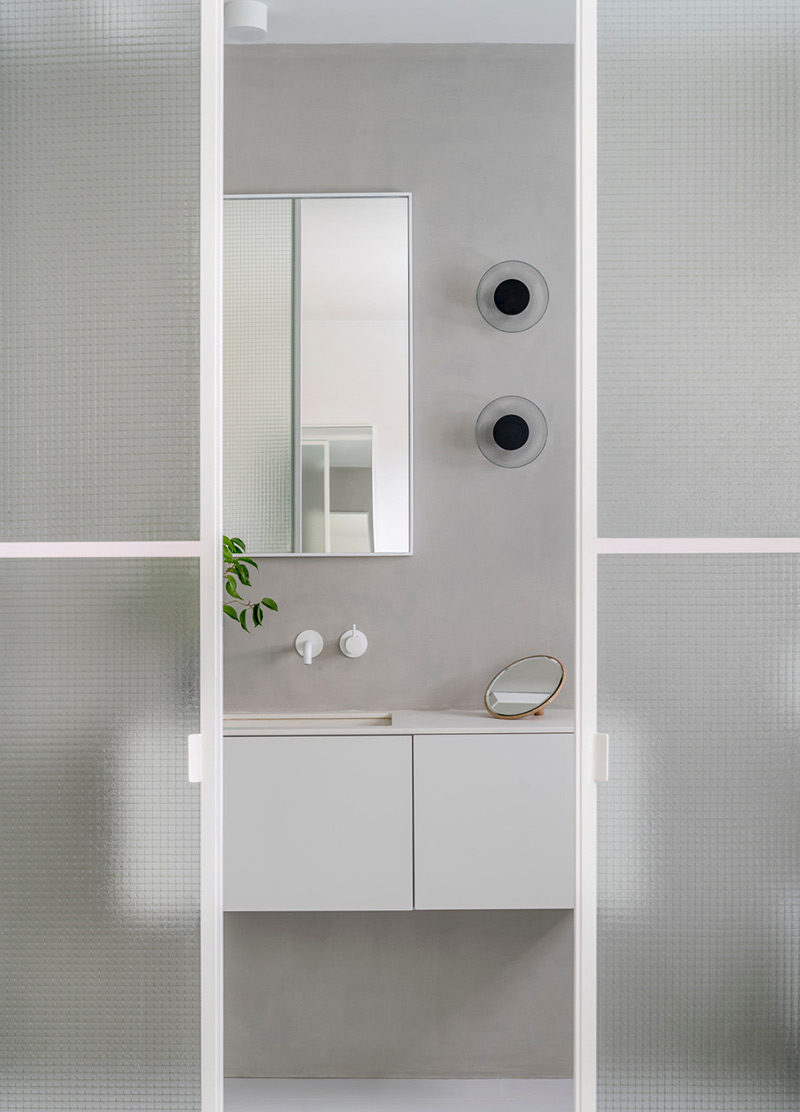
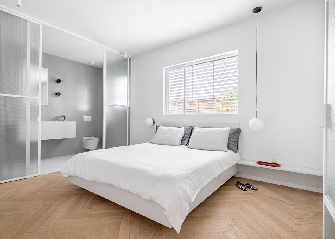
The master bedroom is also characterized by clean and precise language, but in this space a special element stands out: large sliding doors, made of white iron and glass, which separate the bedroom from the bathroom. The doors were designed by the designer herself, and made to order by a locksmith. Fixed iron frames for the floor and ceiling, and two additional iron frames, serve as sliding doors using a rail installed in the ceiling. Old glass is also integrated in these doors, for the sake of spreading light and maintaining privacy. In the bathroom itself, the rest of the walls were covered with light gray microtoping, and the taps and carpentry in the sink were chosen in white. Next to the wall mirror, which was also designed by Der, hung two lighting fixtures from the Marset company, which give the space an additional design layer. In the bedroom, light fixtures were hung next to the bed for reading, in different variations: one hung from the ceiling and the other against a wall, both of the menu company. My desire was to create a wide entrance to the bathroom, and not a standard opening – one that would allow movement and harmonious connection between the two spaces.
What makes this project one-of-a-kind?
Nordic-Scandinavian design, Japanese principles and Israeli living habits meet in a family apartment in Israeli apartment.

Credits
Interior
Eilat Dar Interior Design
Client
Family of 4
Year of completion
2018
Location
Modiin, Israel
Total area
120 m2
Photos
Yoav Peled


