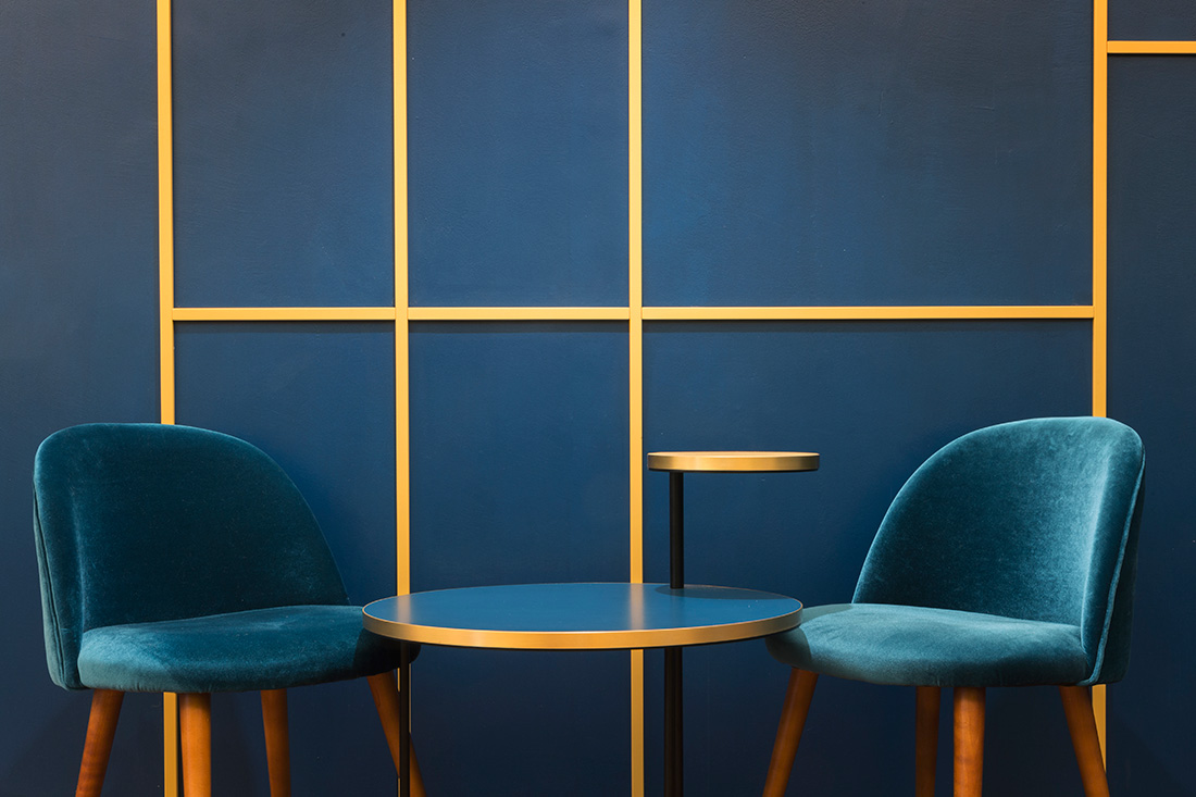
Gaudenti 1971 is a new format that mixes the small, Italian fine pastry shop with a large international bakery. This was the starting point to define a space that could convey both respect for the traditional values of Italian culture and a strong drive for renewal. This premise translated into a careful renovation of existing elements, which were systematically integrated into the new décor. While a different graphic motif was designed for each venue, giving a new interpretation of historical decorative styles, the consistent use of velvet and blue wood ensures the brand is instantly recognizable.
Carlo Felice
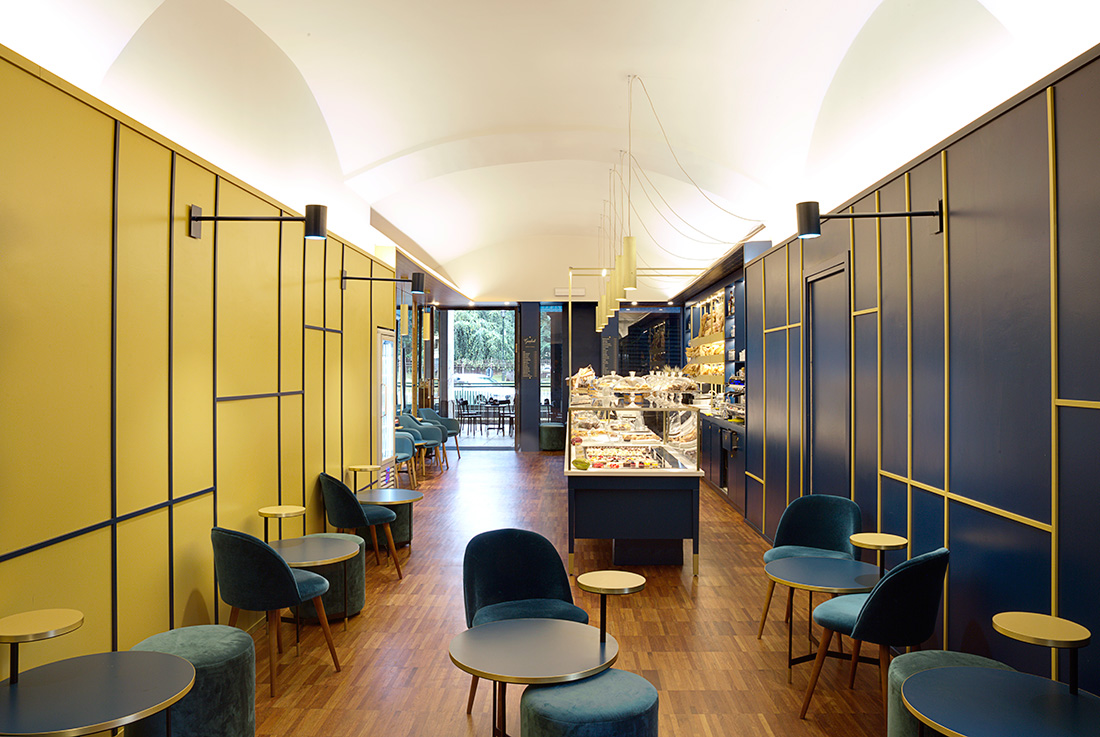
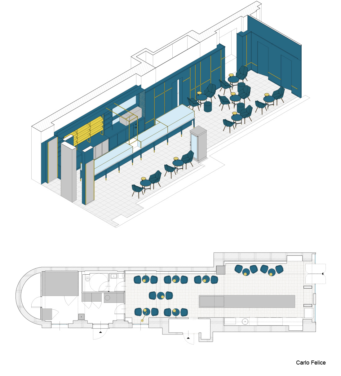
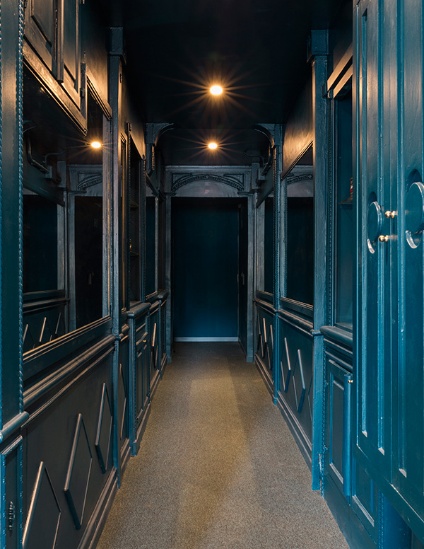
The first phase of the project brought the venue back to its original layout: unnecessary walls were removed to reveal its longitudinal profile, and vault ceilings were unveiled once again. Unlike Vittorio Emanuele, the Carlo Felice space was entirely re-designed – reinterpreting the historical legacy of the first Gaudenti location. Since there was no original panelling on the walls, a geometrical pattern was used to create a sharp contrast with the vault ceilings. Mirrors amplify space in the wing, multiplying it and its beauty. Blue is balanced by a new yellow hue that is warm and elegant, but never oversteps into golden tones.
Po
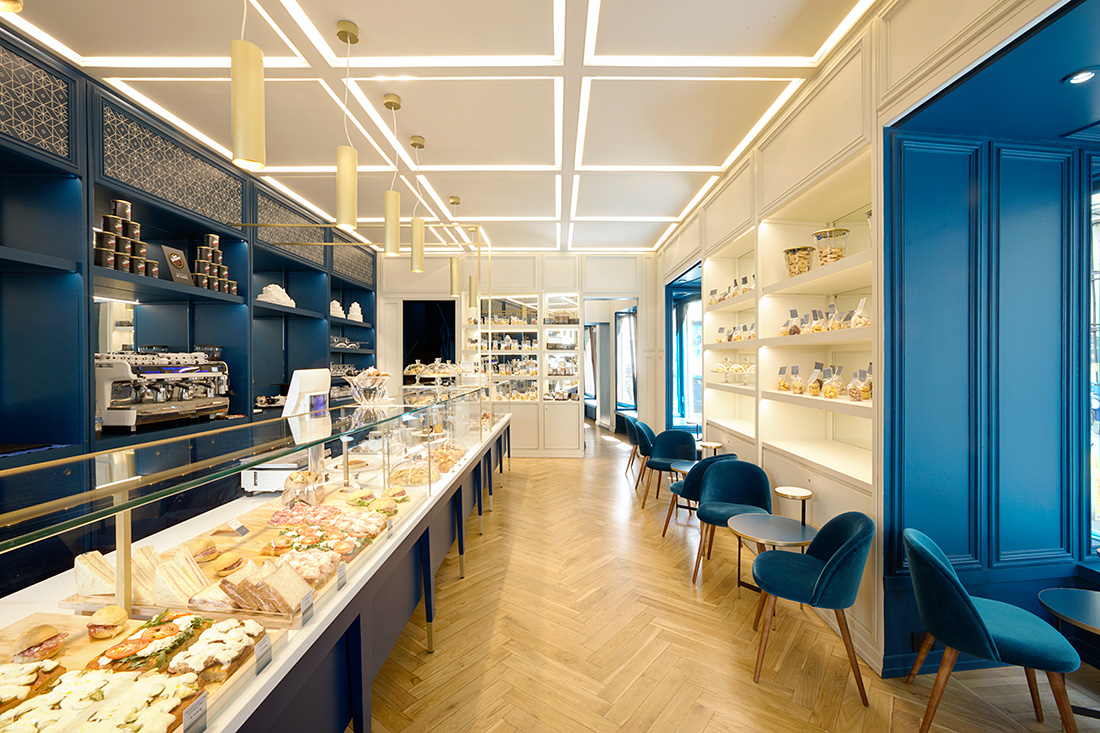
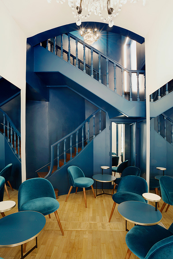
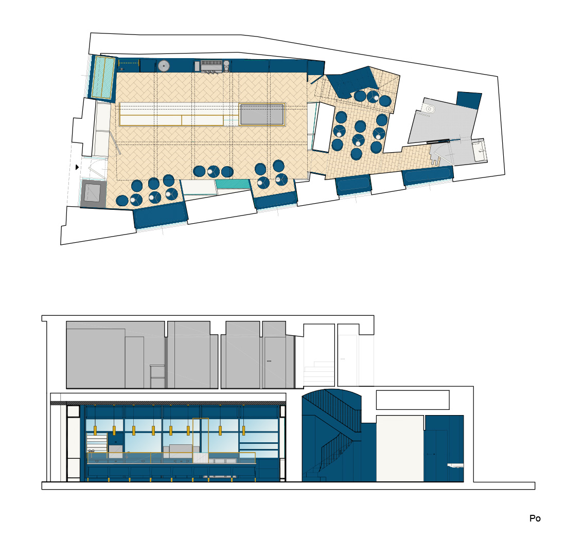
The original wood paneling from the early 1950s was renovated to lighten up overall decor and make it more delicate. In the same way, the ceiling coffers were altered and used for the new LED lighting system that gives the store an evocative luminous grid. Furthermore, blades of light echo the same geometric pattern introduced in the Carlo Felice location. The theatrical staircase that connects the two floors was freed and turned into part of the sitting area. The original hardwood floors had been gravely damaged by previous carpeting, but were recovered almost entirely. When restoration was not possible, they were replaced with resin flooring that clearly declares with its contrast a new solution, instead of hiding it.
Vittorio Emanuele
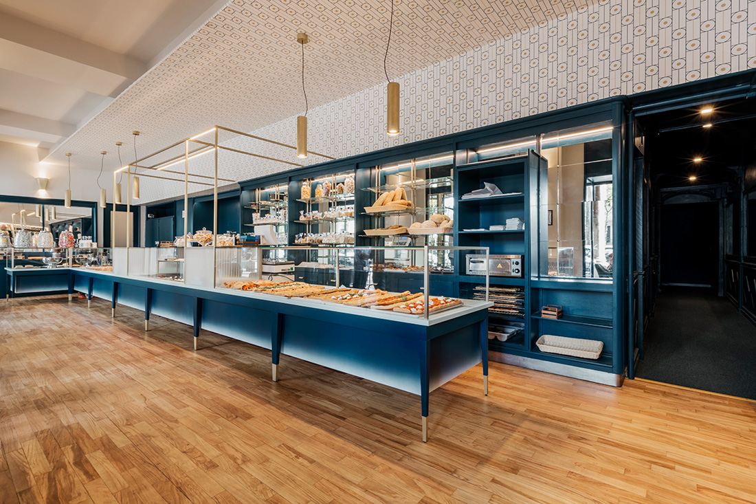
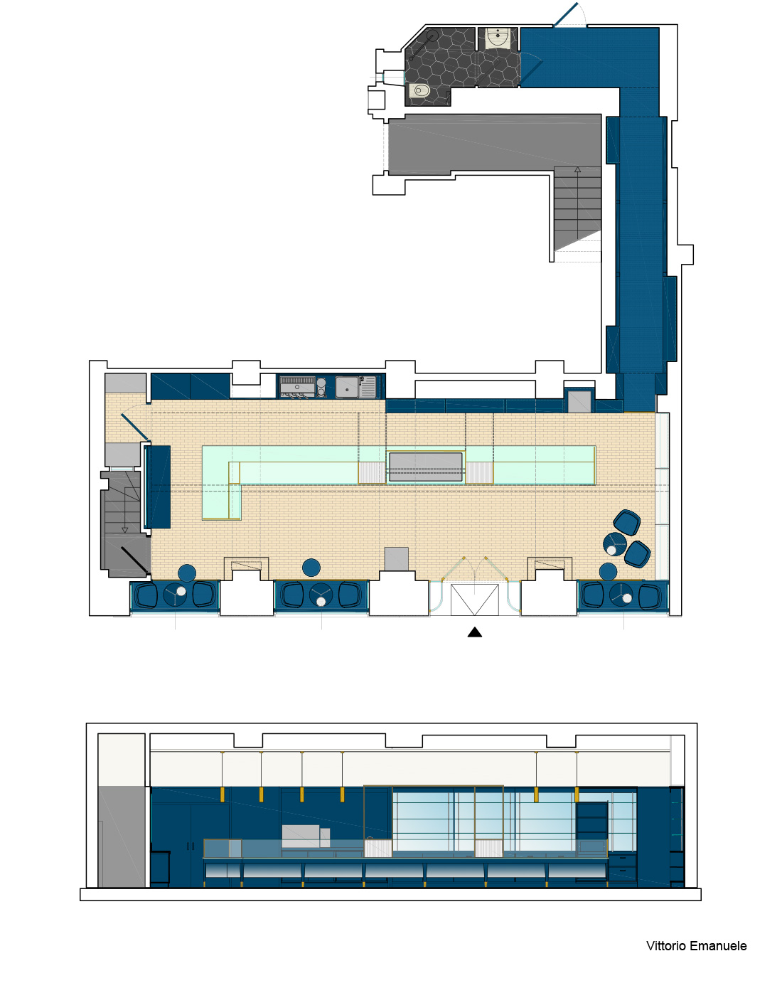
Inside one of Turin’s oldest fine pastry shops, all elements with historical value were recovered and enhanced, while those that hindered optimal use of space were redirected to new use – such as the windows, turned into little deco sitting areas. Any additions were custom designed: the counter, for example, contrasts the wood panelling with its spaceship-like look. Only noble materials were selected to complete the decor, but additional treatments – such as a brushed finish on brass – set a more muted tone throughout.
About the authors
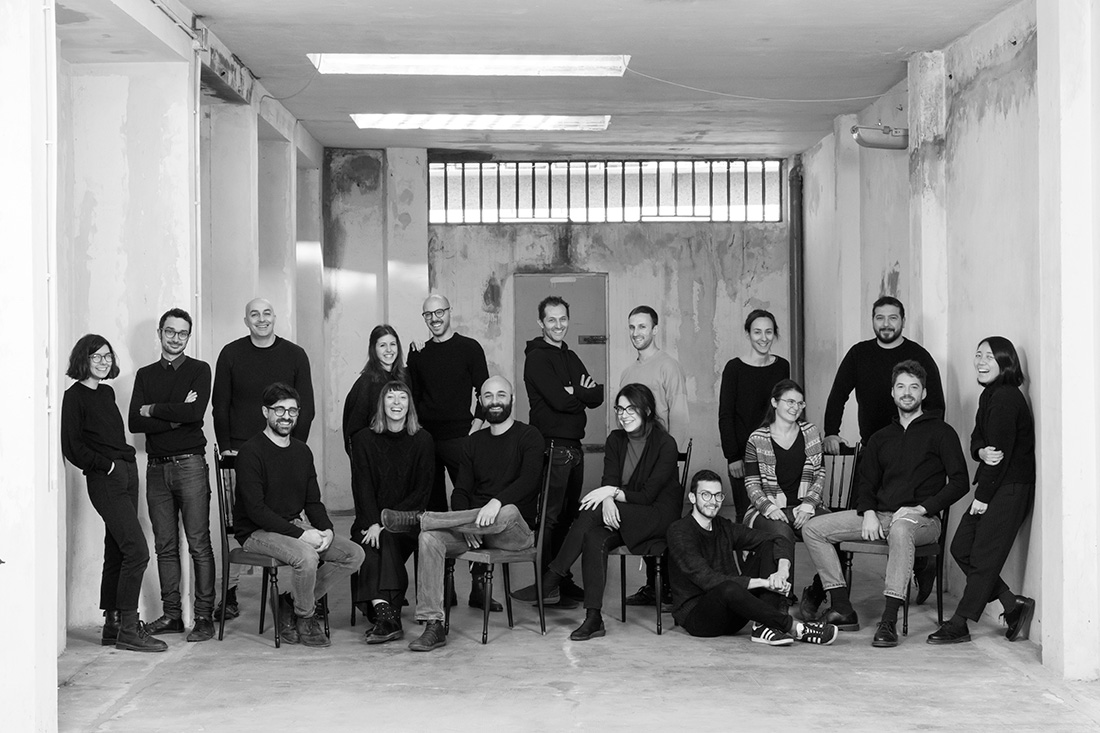
lamatilde is a design firm that builds things – for real. Design, strategy and communication are its favorite tools. With over ten years of experience in Italy and abroad, it promotes quality, research and design culture through renovation, renewal and fit-out projects. From strategic consultancy to final construction details, it leads projects from concept to full completion. It has taken part in international events such as Milan’s Salone del Mobile, the Architecture Biennale in Venice, Biennale Interieur and the London Design Week, winning accolades such as the European Design Award and German Design Award. It is based in Turin, Italy. www.matilde.it
Text provided by the authors of the project.

Credits
Interior
lamatilde
Client
La Dolce Passione s.r.l.
Year of completion
2017 (Carlo Felice)
2018 (Po)
2017 (Vittorio Emanuele)
Location
Turin, Italy
Area
108 m2 (Carlo Felice)
144 m2 (Po)
294 m2 (Vittorio Emanuele)
Photos
PEPEfotografia
Project Partners
OK Atelier s.r.o., MALANG s.r.o.


