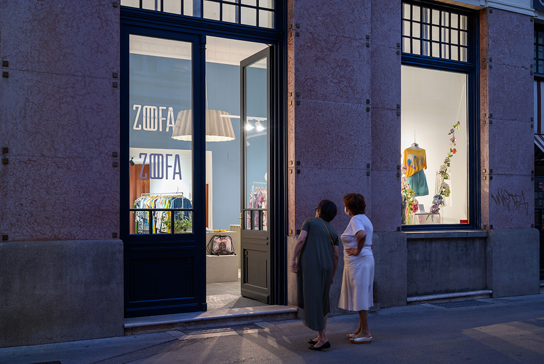
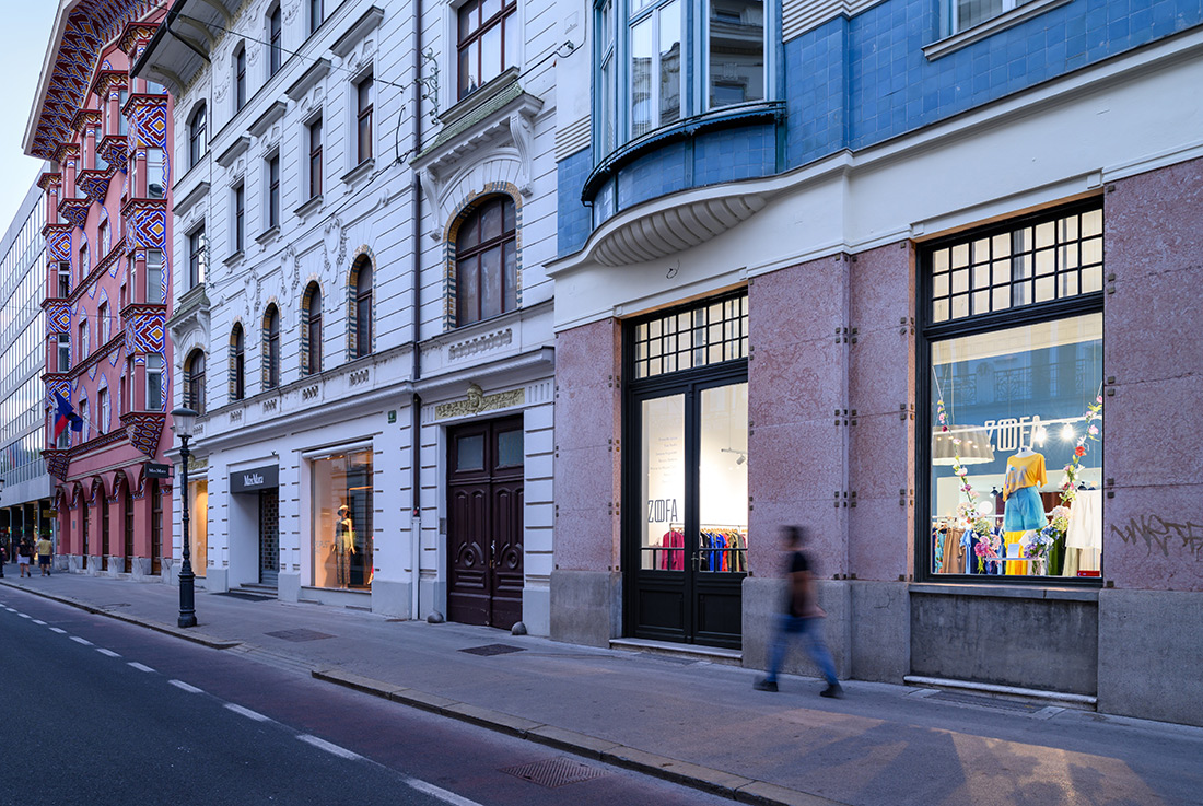
Ljubljana residents and other city’s visitors now have a new reason to take a walk along one of Ljubljana’s most beautiful streets. On Miklošičeva street, where the most famous examples of Slovene Secession can be found, the ZOOFA store, which unites Slovene designers in the field of fashion and applied arts, has come to life in the building of the former People’s Loan Bank (slo. Ljudska posojilnica). It is no coincidence that the store found its place in the example of the first real Art Nouveau building by the architect Josip Vancaš in Ljubljana. Even though he is considered to be one of the main Sarajevo’s architects due to his long stay in Sarajevo and Bosnia and Herzegovina (1883–1921), he managed to convey the spirit of Slovene arts and crafts into the typical Art Nouveau facade, marked by ceramic tiles and shallow balconies. The symmetrical facade of People’s Loan Bank is painted in the colors of the Slovenian tricolour, which is expressed in three different materials: red porphyry tiles on the ground floor, blue glazed tiles on the first floor and white plaster on the upper part of the facade.
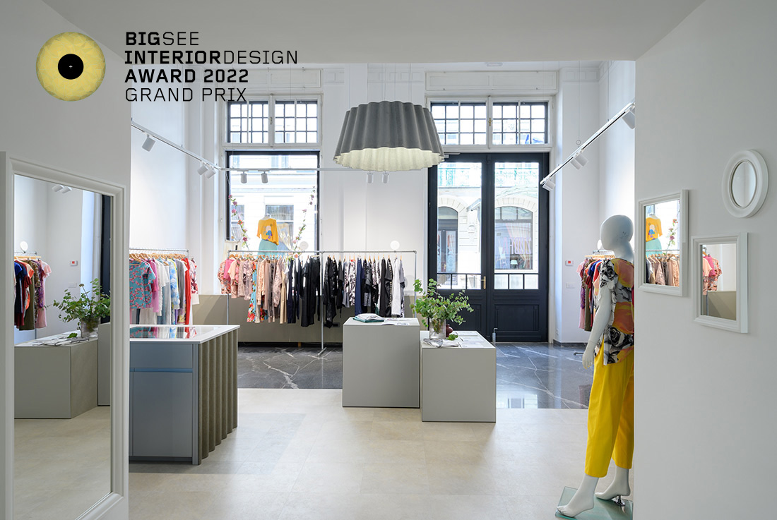
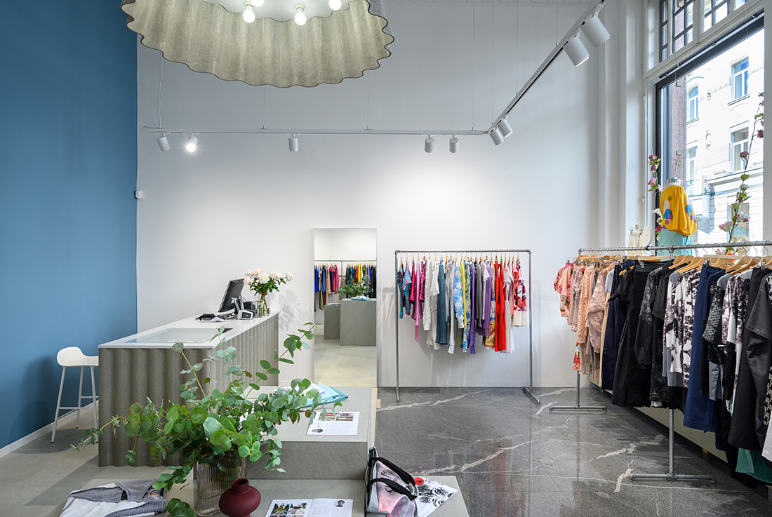
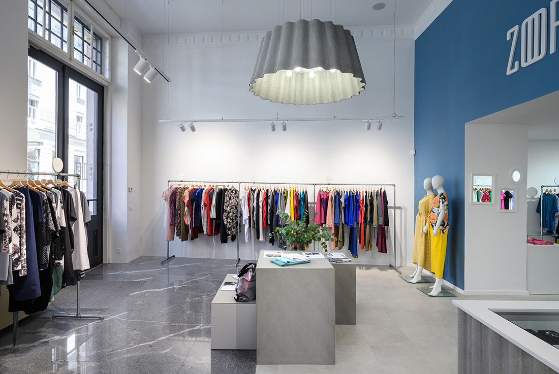
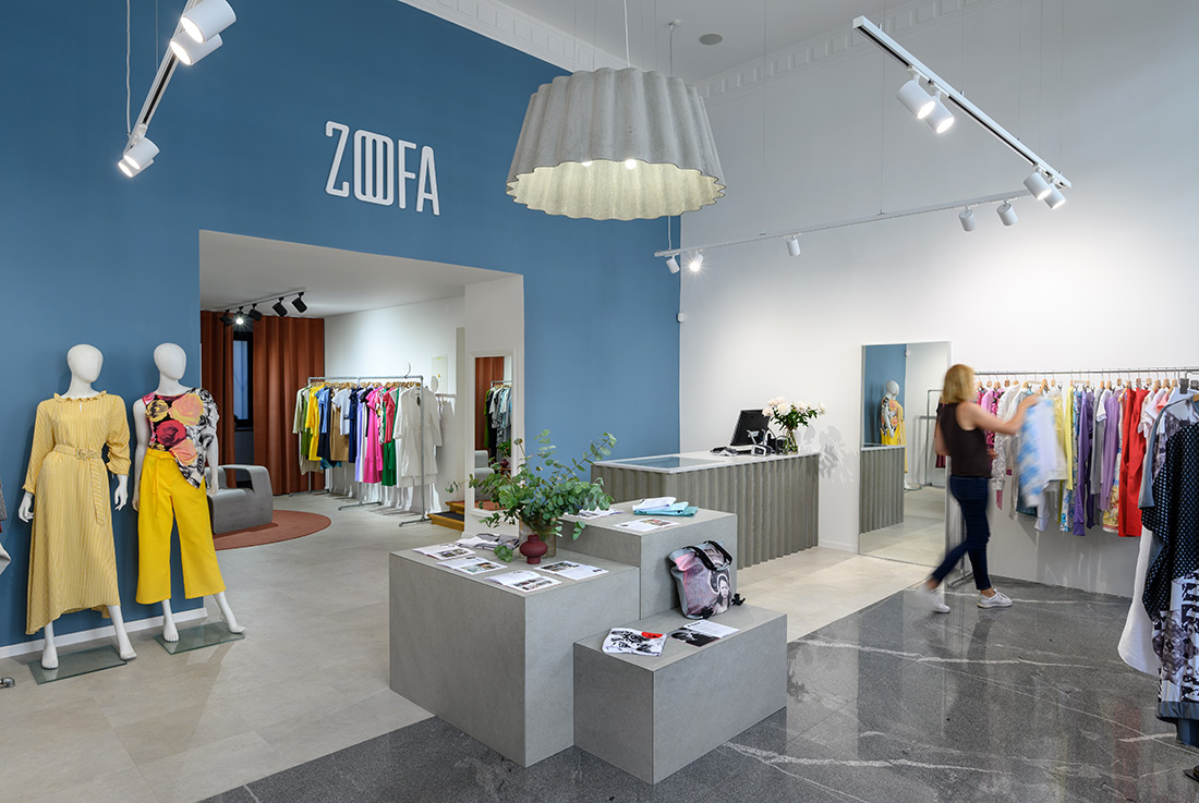
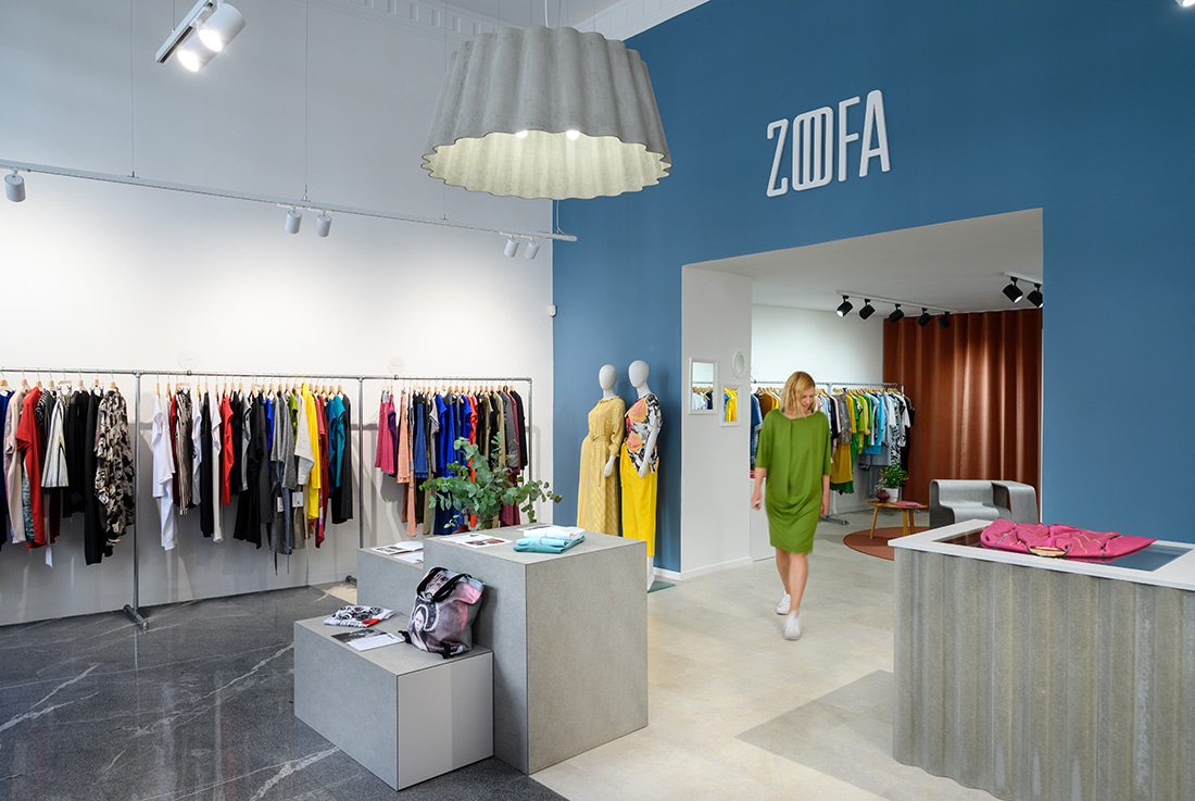
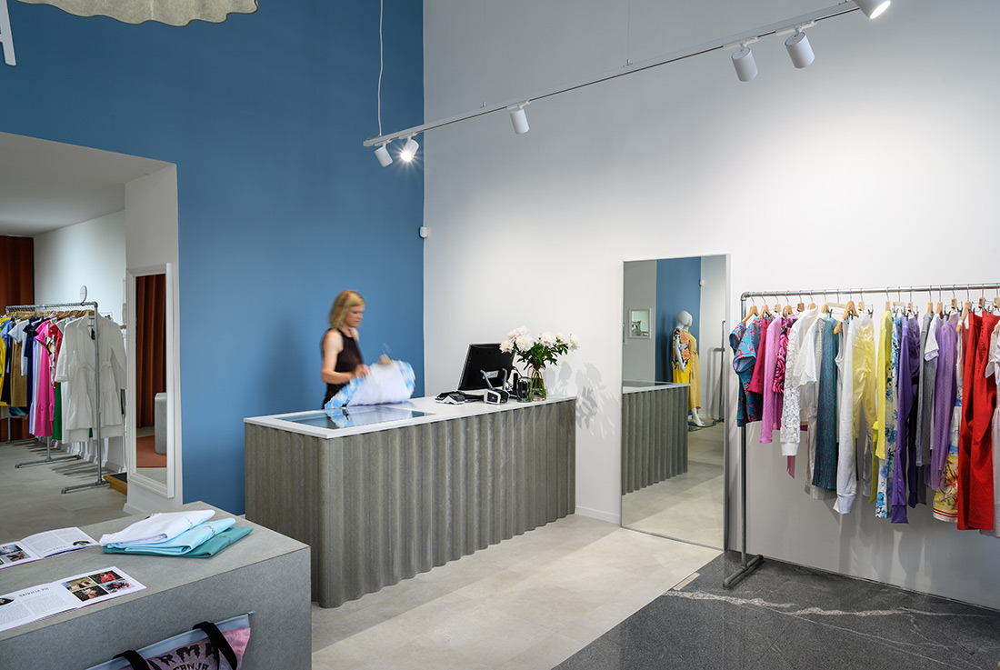
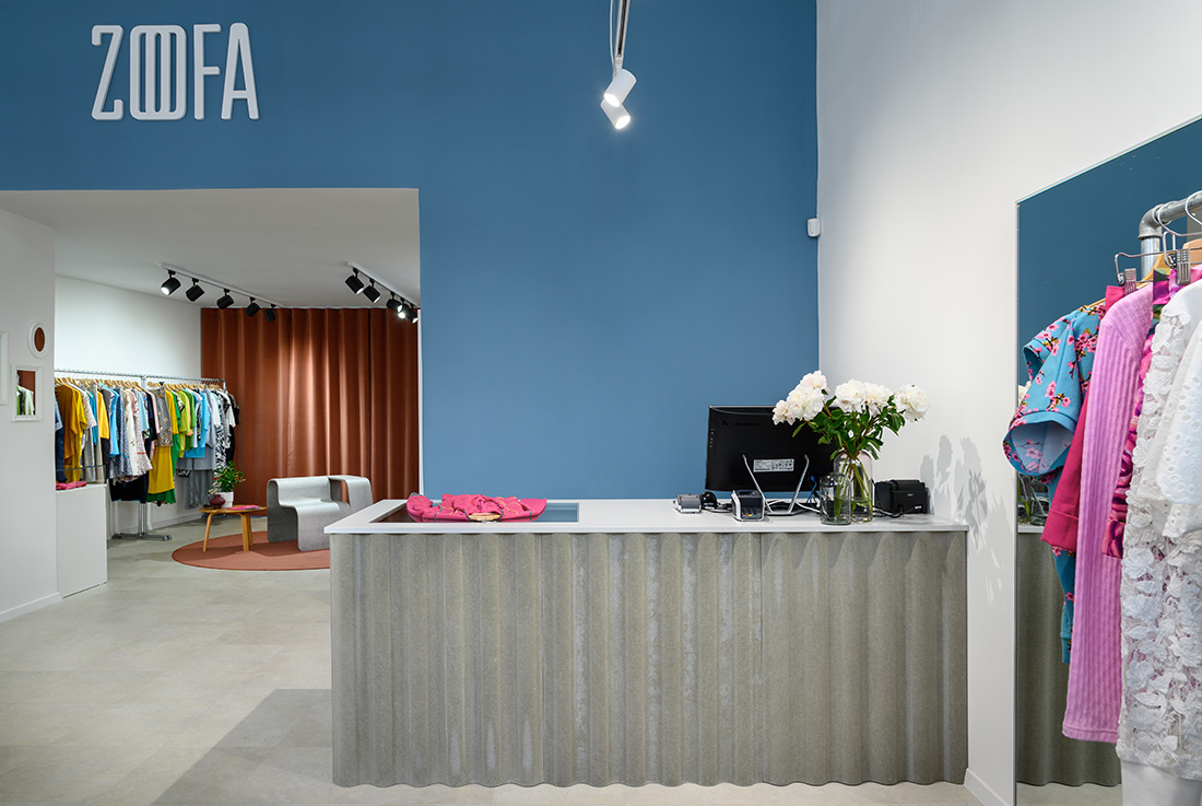
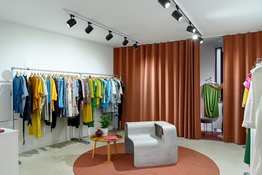
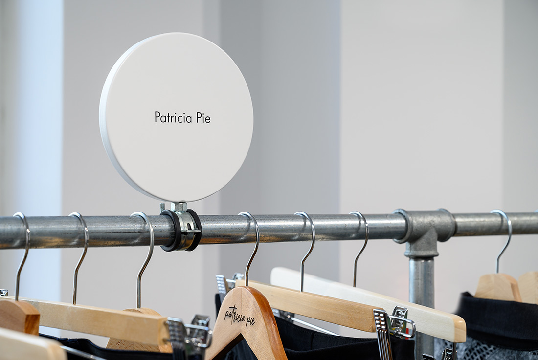
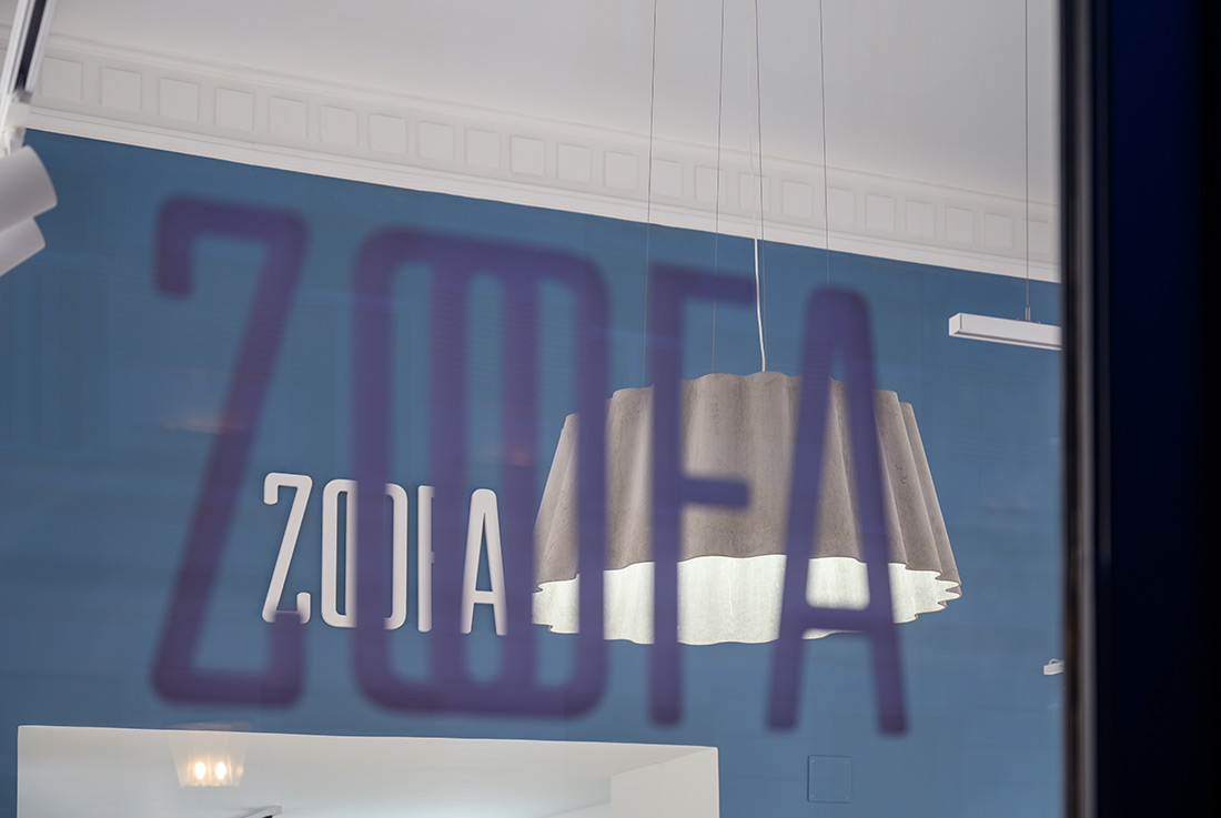
The store consists of two exhibition spaces. The street-view entrance area with its representative 5-meter ceiling and restored stucco calls for various fashion creations to be exhibited. For this purpose, each designer has a stand made of water pipes. Specially adapted signs, made from the plumbing handles, which serve as a holder for the tiles with the names of the designers, are removable, which makes it easy to adjust and change the layout of individual pieces. This seemingly small design quality reflects the key concept of the store. With a scheduled circular change of positions of the exhibited pieces, the store wants to pay equal amount of attention to all the unique and original stories that the collaborating designers tell through their works. The central element of the entrance space, which consists of three blocks of different heights, also provides additional product exposure. The blocks serve as display shelves as well as storage areas as they can be opened. The selected pieces are illuminated by a voluminous chandelier in the shape of a potica (Slovenian traditional pastry), which subtly reminds us that the presented fashion products in this space are works of domestic designers. The floors below the exhibition blocks indicate the store’s transition to the smaller exhibition space. The restored original marble at the entrance was upgraded with pavement of concrete appearance on other surfaces, which is more suitable for trade activities. Through an extended passage, we follow this change of floors’ materials into the space, overlooking the interior atrium. Most of the space is occupied by wardrobes, which are covered with velvet curtains. These allow us to open the space and let in additional light through the atrium windows when the wardrobes are not in use. A special feature of the wardrobe design is the partition curtain, which two friends can unfold during the fitting and help each other with shopping tips. The visual element of the curtains is also found in the entrance area in the form of a corrugated cashier’s desk. When we look back from the store to the street, we notice that the street also came in the store with us. Even though both rooms are dominated by neutral tones, which ensure that the unique creations, colours and patterns of each designer really come to the fore, we are once again faced with the colors of the tricolour. The blue-colored passage, red velvet curtains and white walls not only reflect the Slovenian character of the exhibited pieces, but also bring Miklošičeva street into the space – the red Franciscan Church, the colorful Vurnik building of the United Bank and the facade of the former People’s Loan Bank.

Credits
Interior
Studio Tina Rugelj architecture+design; Tina Rugelj
Associates
Metka Janko, Iza Šentjurc, Urška Škrap
Client
Zoofa, cooperative of local designers
Year of completion
2021
Location
Ljubljana, Slovenia
Total area
72 m2
Photos
Miran Kambič


