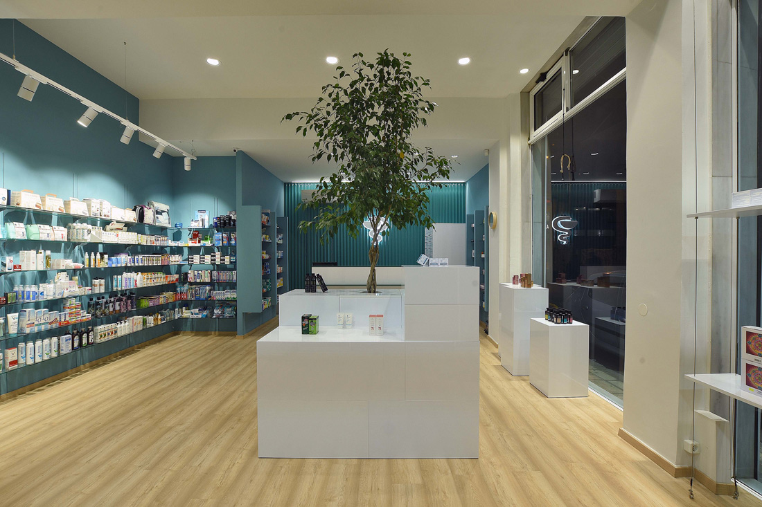
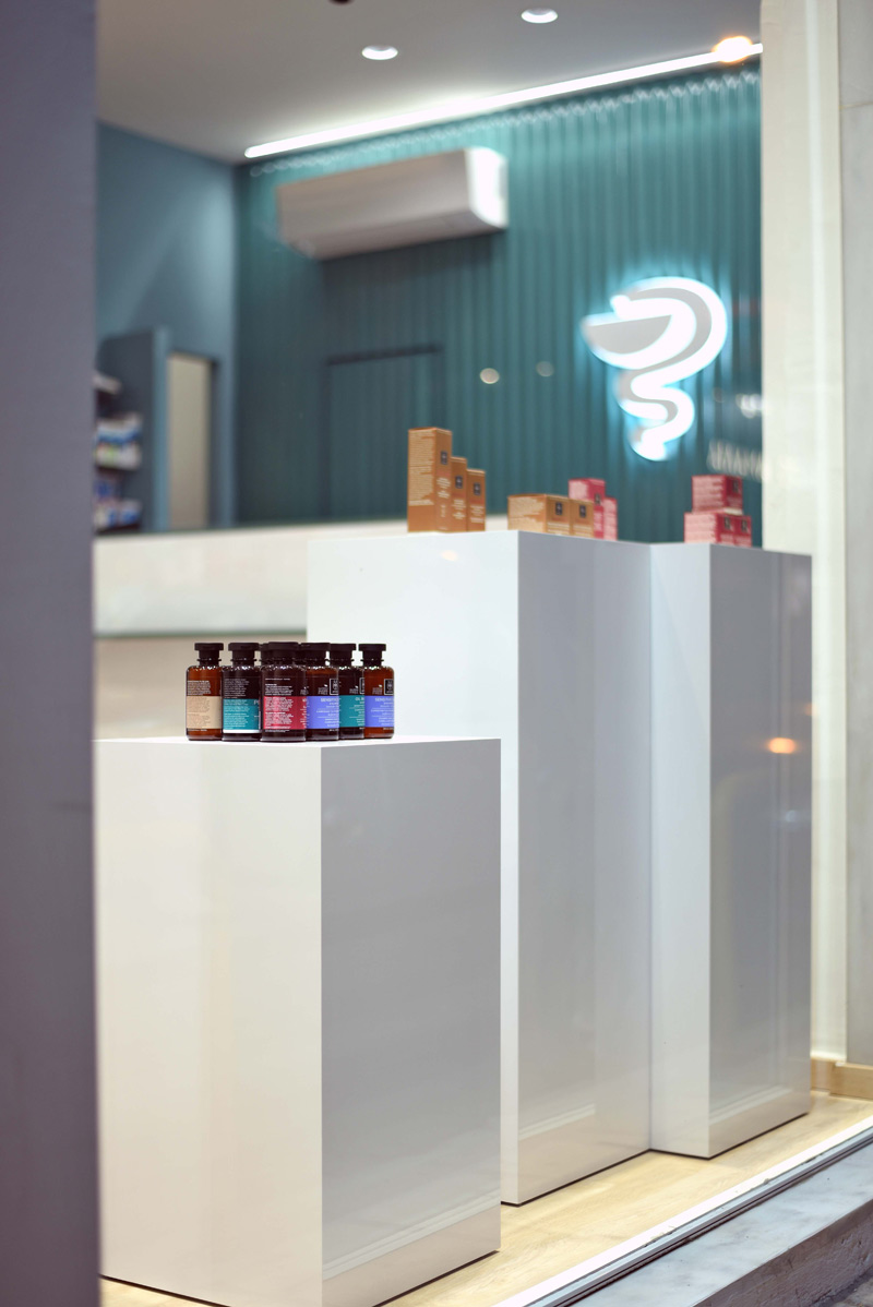
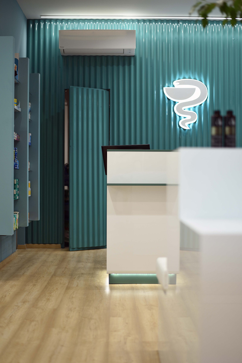
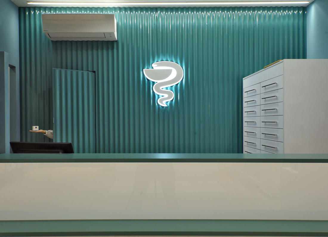
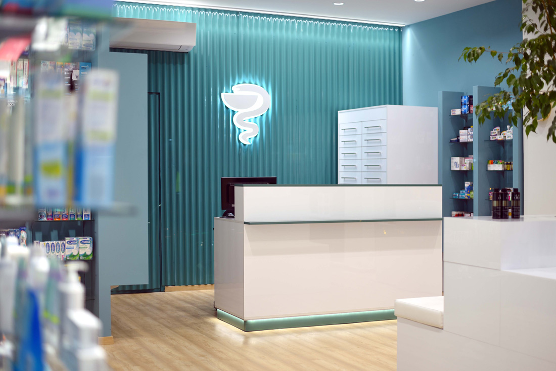
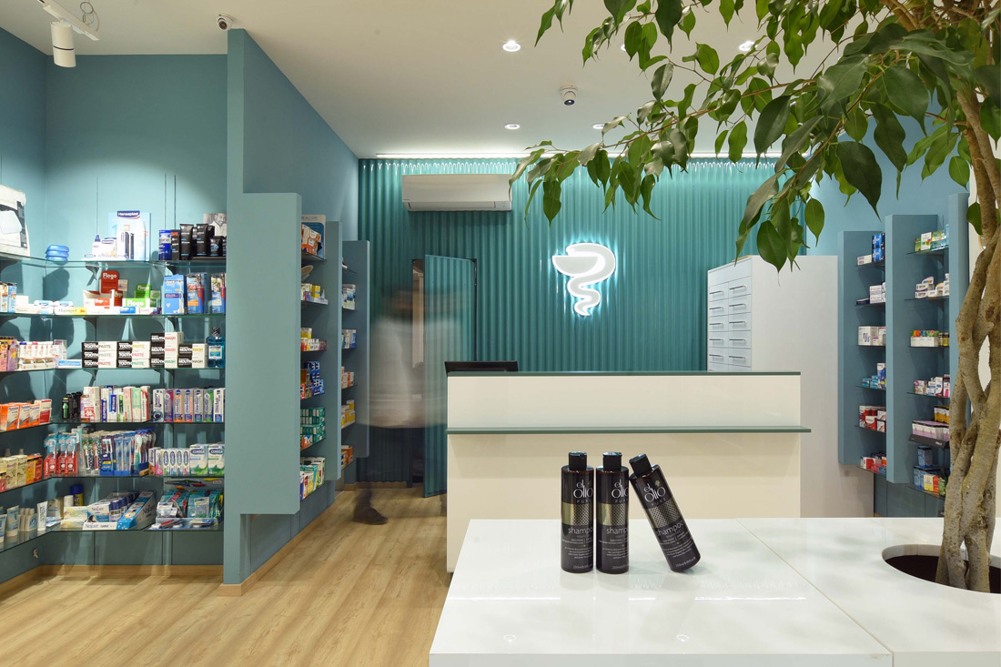
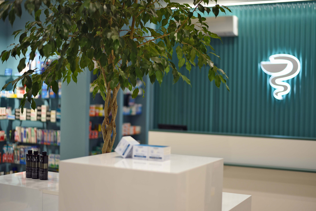
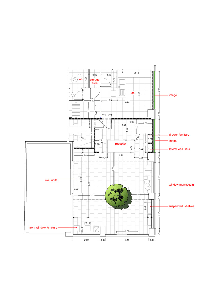
In the architectural design of a professional space, as of the specific pharmacy, the designer should help the owner attract customers, promote his products and services and inspire the employees to be more productive and efficient. In the context of this effort our office was requested to serve the principles of space, color and functional design. The originality of the colors and materials that we selected (natural wood, metal sheet of construction site in electrostatic paint, in mint and white tones) as well as their harmonious composition, make the pharmacy a space of unparalleled aesthetics and functionality, appealing to everyone passing by and capable of making the customer feel that he is moving in a friendly environment that offers comfort and luxury, without sacrificing functionality. The designed space was approached not only in terms of geometry and economics but also as a carrier of messages and values. The island furniture in the center of the space, with the prominent element of the natural tree and in combination with the two tones of mint dominating the space, inspire the customer and create a strong sense of hope and optimism.
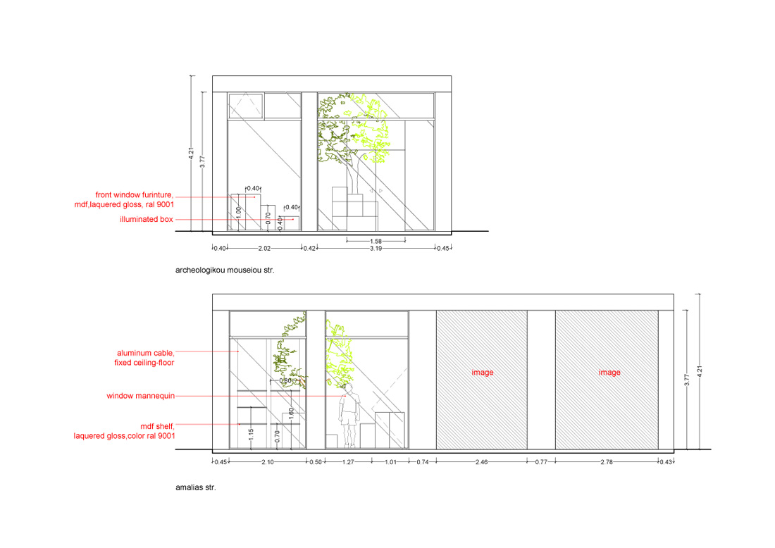
We have taken advantage of every source of natural light in the space, having in mind that an adequate quantity of natural light in the space saves energy and improves employee efficiency and concentration. And in combination with meticulously placed and focused artificial lighting, we have achieved conditions of visual comfort both for the customer and the employee. The central island furniture gives the owner the possibility of a different placement of its volumes each time, depending on the needs of the space. The island consists of cubes in different dimensions. According to their placement different spaces for product displays emerge, as well as different spaces to be used as sitting areas for the elderly customers. This different context of the island furniture confirms the creative utilization of the space. We have also ensured a comfortable and enjoyable movement of the customer within the store, harmonizing and balancing the ergonomics with the aesthetics of the space, as well as the optimal and attractive display of the products. The essence of our design lies in passing from an empty space to a point of reference, which primarily attracts the glance and then highlights the central space of the store as a design that is inevitably related to the human itself, whom is ultimately called upon to serve.

Credits
Autors
(at)2; Agnes Tzouma, Thanasis Tsourekas
Client
Private
Year of completion
2019
Location
Thessaloniki, Greece
Total area
55 m2
Photos
Nikitas Tsoutsanis


