The building in Ostasilor 8 is located in a diffuse, traditional urban fabric of central Bucharest, the protected zone 43: Cobalcescu, in which the urban architectural historical values and the natural environment are protected in their entirety, street texture, built environment, character and urban value alike.
The plot, comprising 924 m2 and privately owned, is located in one of the neighborhoods of diametrically opposite character that converge in the area. On the one hand, the limits of the old city center and Cismigiu Gardens (historically the oldest designed park in Bucharest) point towards a moderate, maybe nostalgic approach, on the other, the proximity of the new and controversial Uranus Boulevard, whose inception has caused a stir due to demolitions of old, derelict areas, pushes towards the exuberance inherent to any beginning.
According to city building regulations (PUG-MB) the edifice is included in subzone CP1, a central area situated inside the protection limits of historical, architectural and urban heritage/assets in which the configuration of traditional urban texture is preserved. The neighborhood is known and appreciated for the quality of the built space, the area possessing a high living standard and a scenic air, its complex functions weaving together.
The investors’ goal for the project was to create a small scale, highly customizable, quality collective housing alternative in the center of Bucharest, as well as offering a space suitable for business at the street level, while capitalizing on the existence of a relatively large, unused piece of land in its property.
Its quality comes from the exquisite views, the vicinity of important urban arteries and the city center, with its cultural, educational and institutional facilities, as well as the quiet, scenic air of the urban built environment and streets, and the proximity of the park.
Taking the architectural standards into consideration as well as notions of spatial and urban quality, the building had thus to respond to this brief, while also considering that the investors’ criteria were first and foremost economically and pragmatically driven.
Thus, following an extensive urban study, which elaborated a set of guidelines to which the building had to comply, the remaining task was to analyze the existing qualities of the contextual surroundings, as well as its potential. After the decantation process, the concept, a lucid and urbanistically liable design, which had to be valid for the investor as well as the architect, emerged.
Our architectural response takes the pragmatic requests of the client into account, tries to be economically rational, without negating the contextual qualities or being blindly conforming. We bring a contemporary interpretation to the existing built environment, wishing that the new volume enters a natural dialogue with the existing, evading relationships like subordination/oppression or antagonism/mimesis.
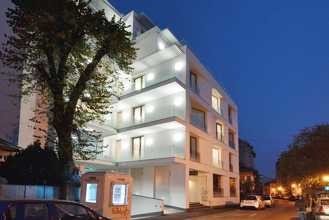
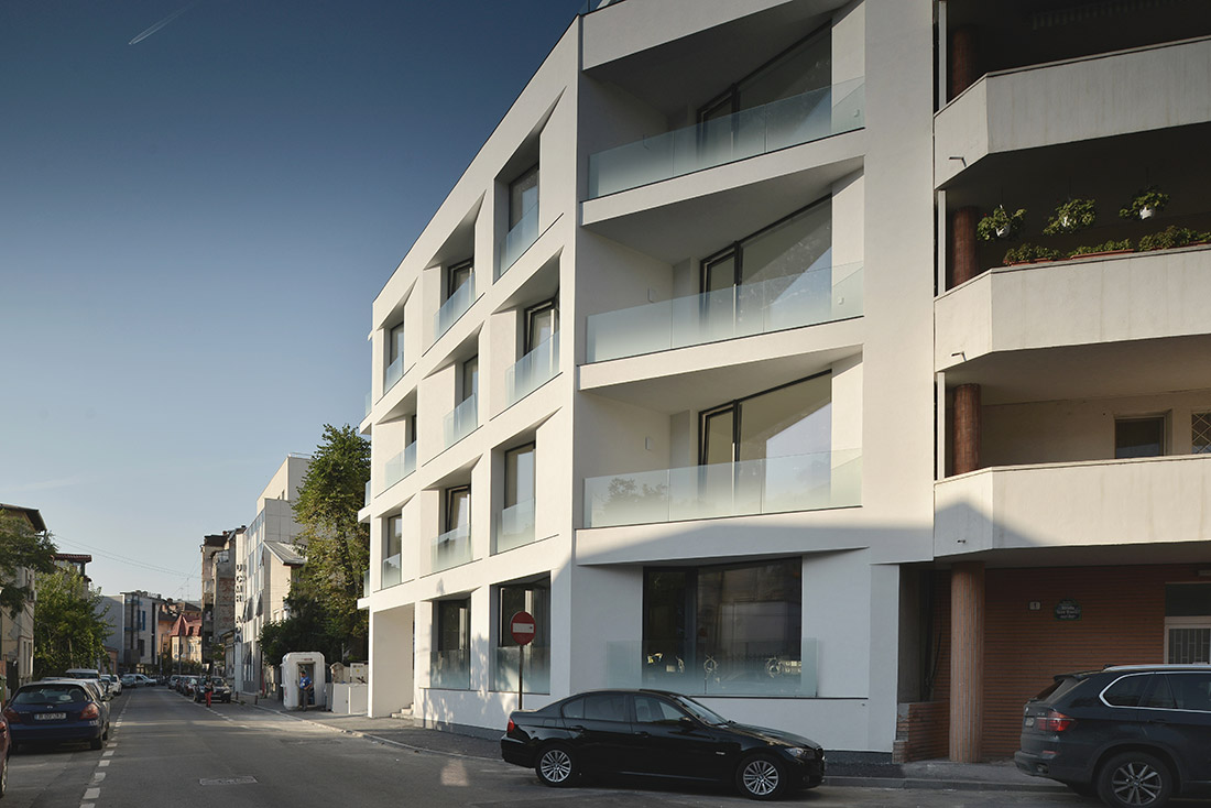
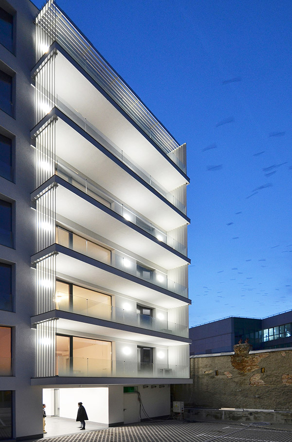
Negotiating the urban requirements and the particular vicinities, the mixture of large volumes (ground floor and 6 stories) aligned to a medium sized street; the building takes on one of the themes of modernist architecture, the terraced volumetric.
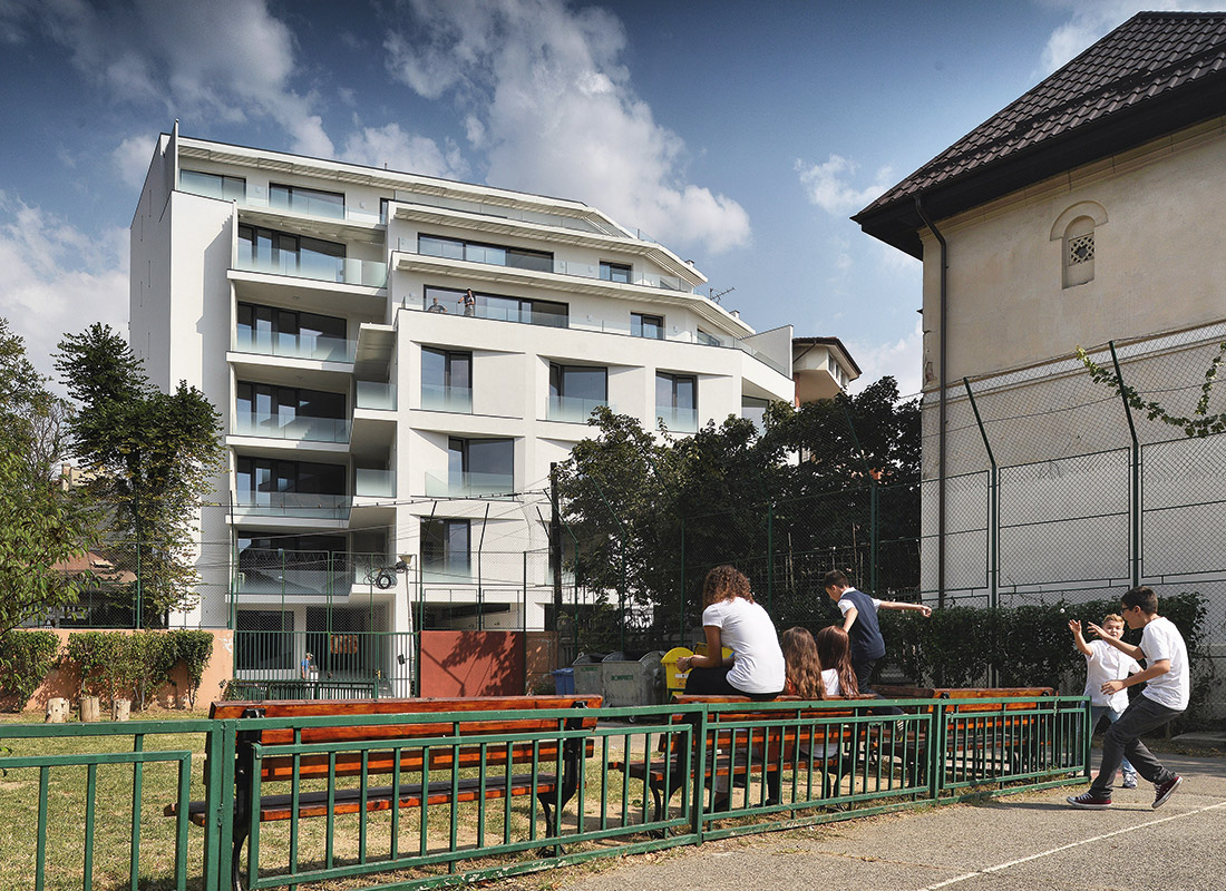
The building successively retracts from the street alignment while the elevation rises towards the opening facing Cobalcescu Boulevard, maintaining therefore the height regime of adjacent buildings and erecting as much as the investment is viable.
The building must find its place between strict boundaries – the blind walls of the two neighboring buildings, the street alignment that must be obeyed, and the receding floor rule – thus preserving the natural illumination of interior spaces becomes the main challenge. Which functions can be completely deprived of natural light, what is the minimum light level to create a pleasing atmosphere in the habitable spaces and how do spaces invaded by light have to be configured, remained questions to be answered by the design.
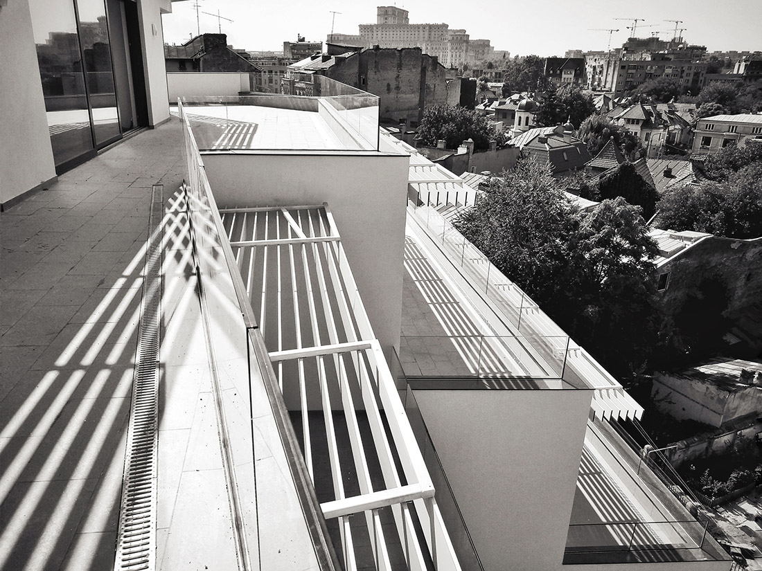
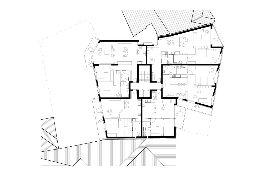
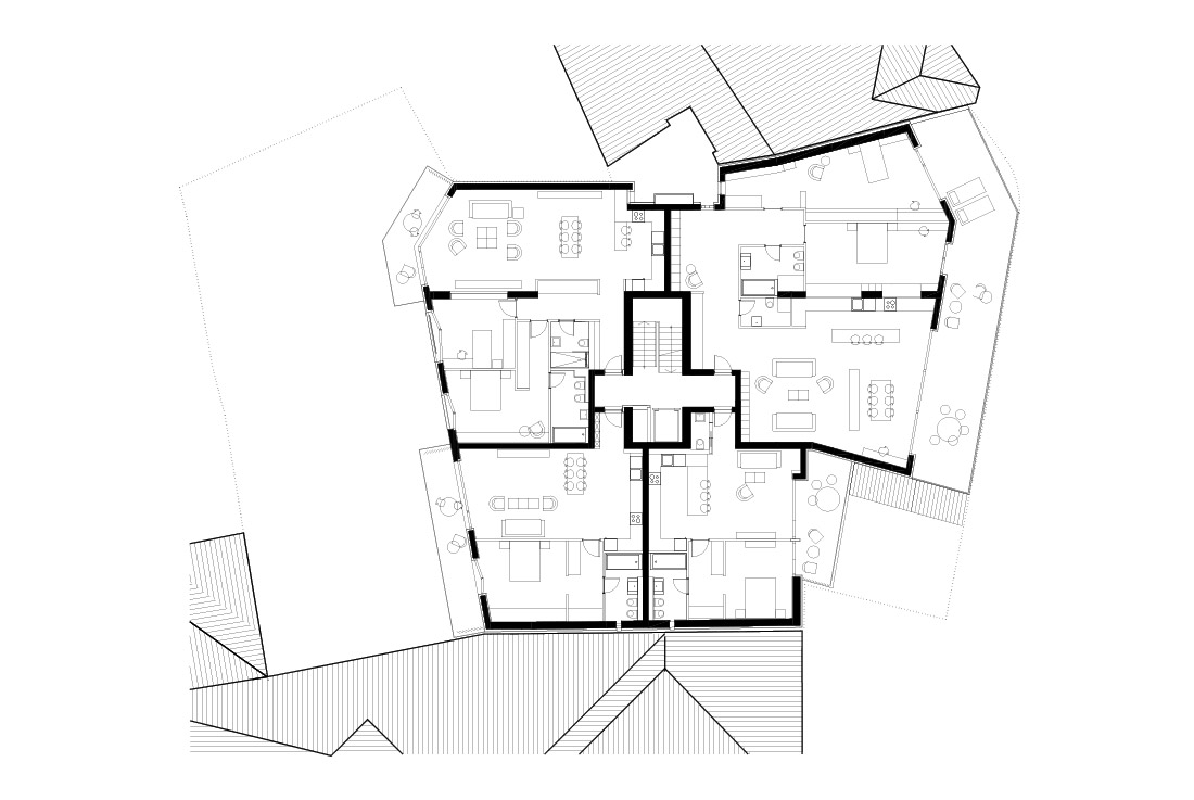
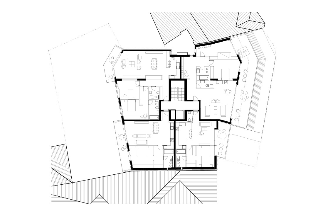
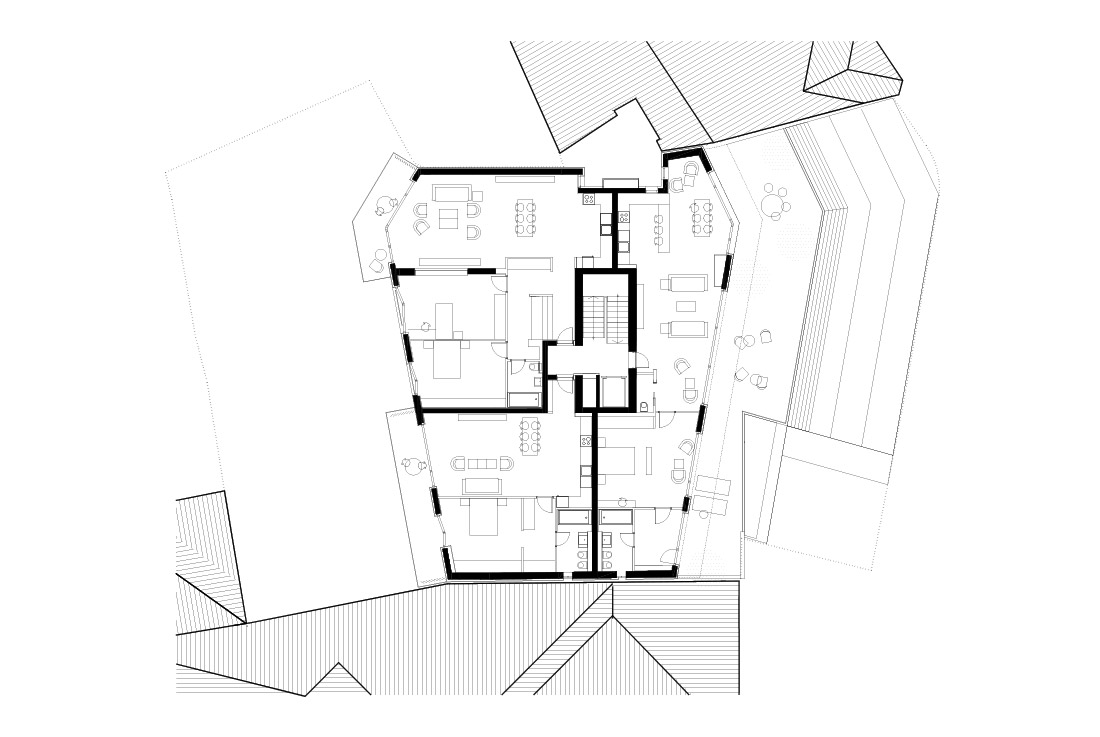
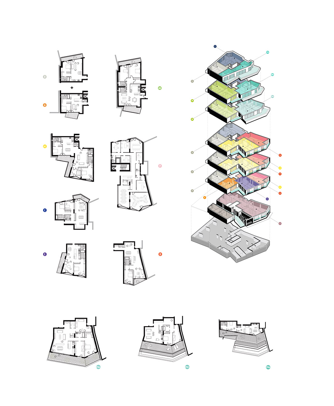
The chosen floor structure is a concrete flat slab sustained by a minimum of concrete pillars, which allows for generous areas liberated from structural constraints in a seismically active country; thus, the stories become open plans allowing variation in apartment typologies or scenarios of use – minimal or generous apartments, corner apartments or double orientation apartments. 28 apartments of which 5 types (A-E) have 2 to 3 rooms and repeat themselves over the 6 floors (A-E from level 1 to 3; apartments B and C on all floors), while the top three floors include 3 different, high standard penthouse apartments (PH4, PH5, PH6, each number corresponding its level and coming with generous terraces). All apartments can be combined and are highly customizable, while large terraces offer enough space for landscaping.
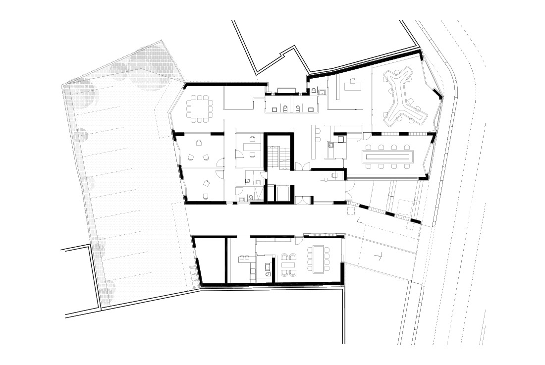
On the ground floor, the spaces are suitable for both living and office space while the passage way allows for backcourt parking as well as a soft transit between public and private. The large basement houses a total of 24 parking lots, while the back yard can house a further 11 vehicles on a surface covered with grass pavers.
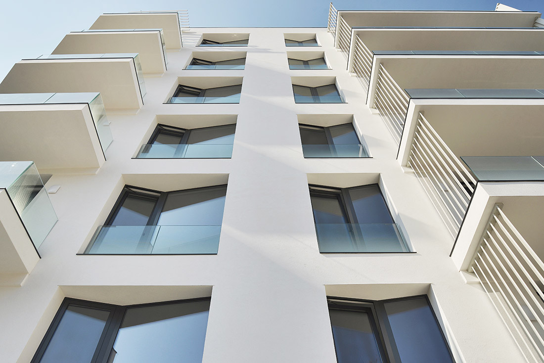
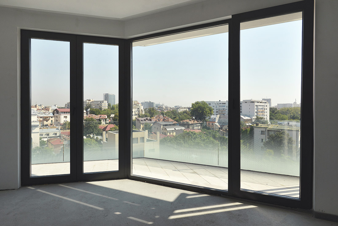
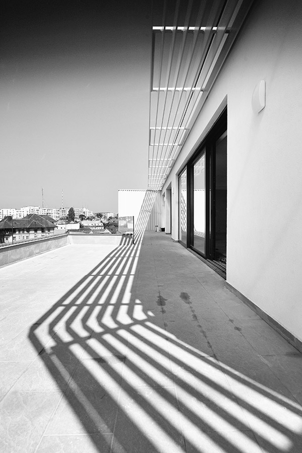
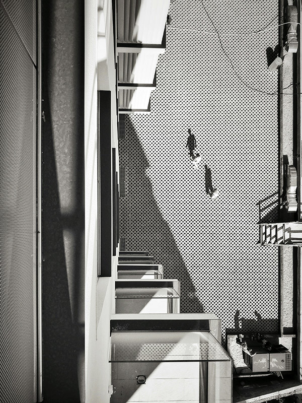
Any intrinsically decorative finishes or textures are forgone. Clean, white surfaces, glass and matte metal are preferred to sustain a sculptural volume and the graphic character of its small units – the Juliet balconies are folded inwards and become small loggias, the angling of the adjacent flanks of the windows further increase interior daylight and create a rhythmic and faceted outer grid with a dynamic play of shadows; the metallic separators between private spaces are extruded and become hard boundaries, the glass railings have a controlled transparency and paint a soft gradient on the façade through the screen-printed dotting, the metallic blinds separating the superior floors trace fine shadowed lines on the recessed terraces.
The building has been in use for a year. In this period most of the apartments have found new tenants who have started to use the spaces or customize them according to their own needs, one of the lofts being even upgraded by further adding an A apartment type.
The main ground floor spaces have become a corporate office headquarters, easily transforming accordingly. It’s ample, folded windows bring the light inside, while the interior division, which allows for a relaxed hierarchy, a working space that’s collaborative, visually permeating but acoustically separated according to functional necessities, further makes use of transparency. None of the spaces are isolated, only secondary functions are hidden from sight (kitchen, toilets, server). The transparency continues back towards the exterior, towards the street, the passageway and the back yard, the activities inside the offices indirectly performing in the urban spectacle and vice versa, according to the public-semiprivate levels. The screen printed dotting of the glass parapets allow for intimacy in the direct street level proximity as well as peering upwards towards the top floors.
Text provided by the architects.


Credits
Architecture
TAG Architecture
Year of completion
2016
Location
Bucharest, Romania
Total area
4 600 m2
Photos
Vlad Eftenie
Project Partners
OK Atelier s.r.o., MALANG s.r.o.


