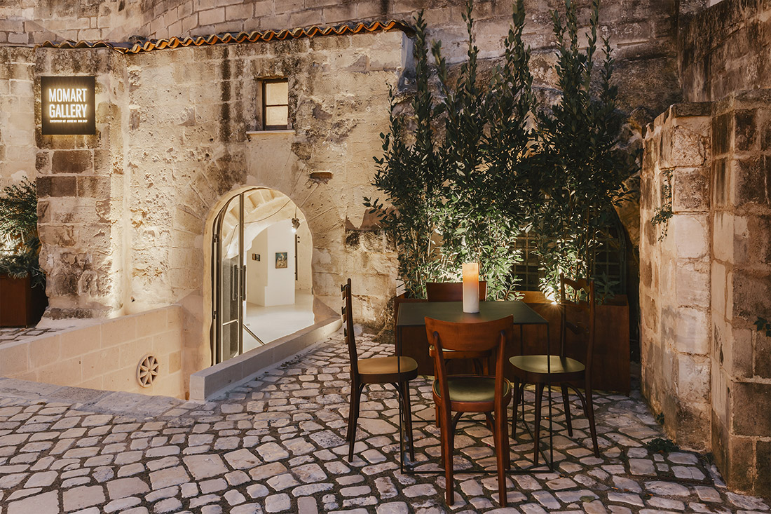
In the heart of the ancient Sassi quarters and founded in 2014 – is Momart Gallery, inside a cave which is situated at the foot of the hill upon which sits the enchanting rupestrian church Madonna dell’ Idris. In 2019 this marvelous cultural space was completely renovated and restored. Alongside Momart Gallery’s founder – Monica Palumbo, is the architect and designer of the new space – Daniela Amoroso.
The entire structure is 150 square meters, in which the slight gradients are interconnected into two main areas:
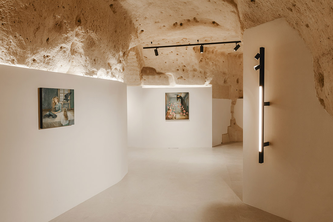
– the art studio/gallery/meeting room / open space = 110 square meters
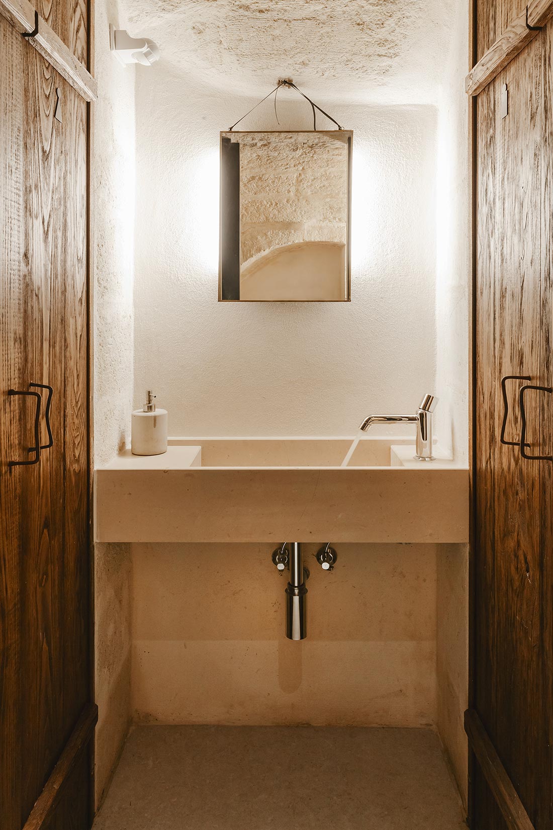
– refreshment and service area = 40 square meters
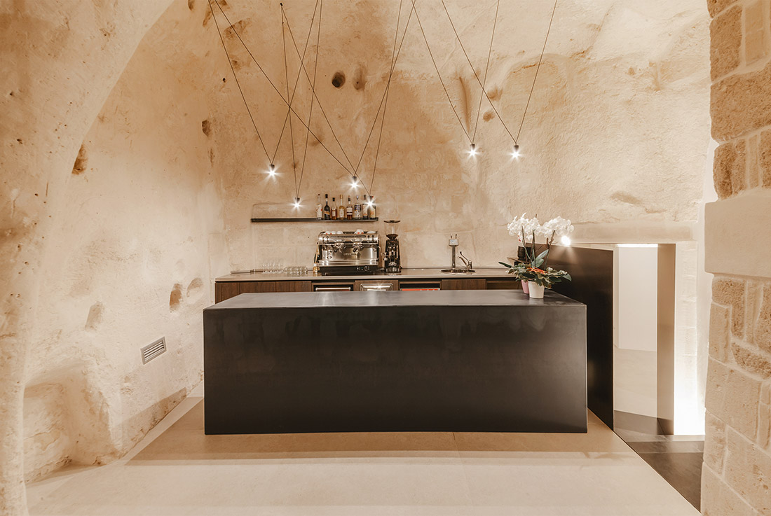
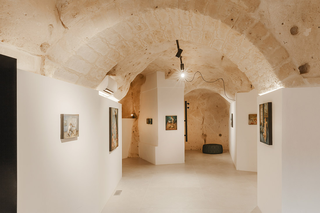
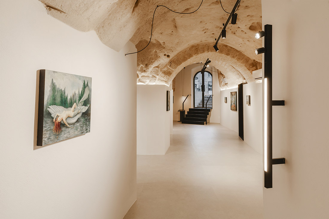
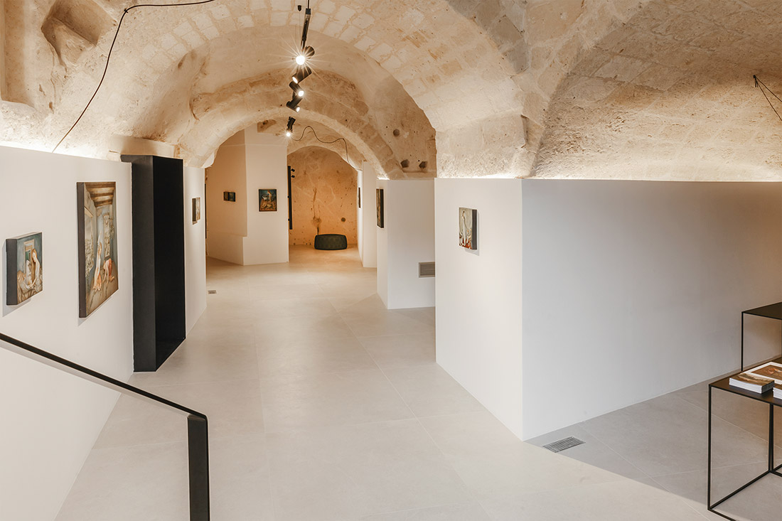
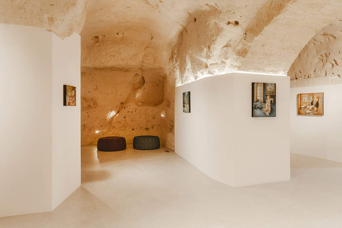
With the exception of the facade, the two spaces are entirely “built” into the cave, with a characteristically intelligent and functional use of underground space that is typical of the area. These are spaces that have been carved out of the limestone rock and have facades that were inspired by the utmost simplicity, with the use of essential lines and structures that convey a sense of solidity and completeness. The design solution proposed by the architect Daniela Amoroso, aims to revisit these spaces, which have a strong identity, in a contemporary way, while at the same time respecting and enhancing the ancient and pre-existing. For this reason, the design concept has essentially been based on a contrast between stone and iron: together they define the atmosphere and general character of these spaces.
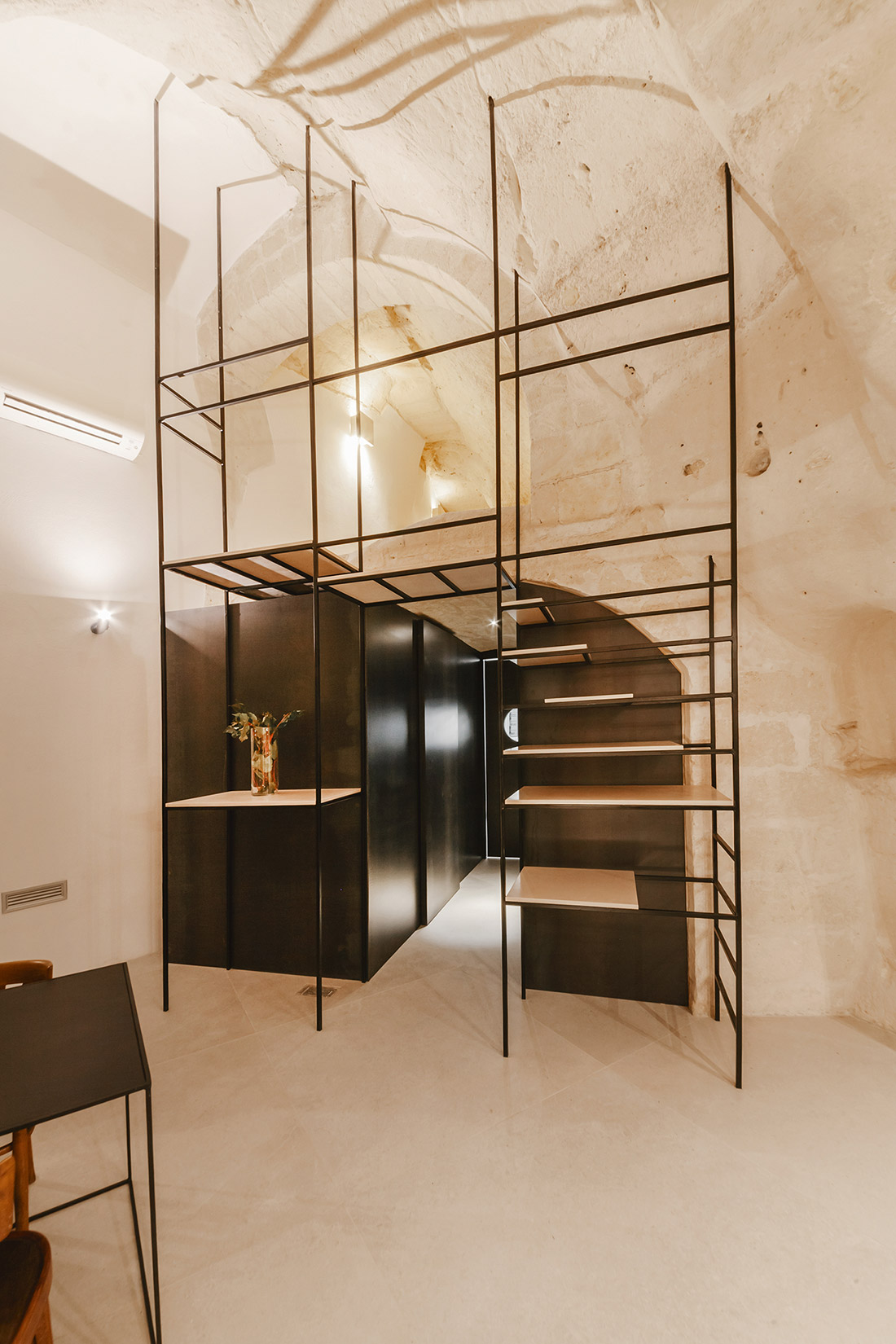
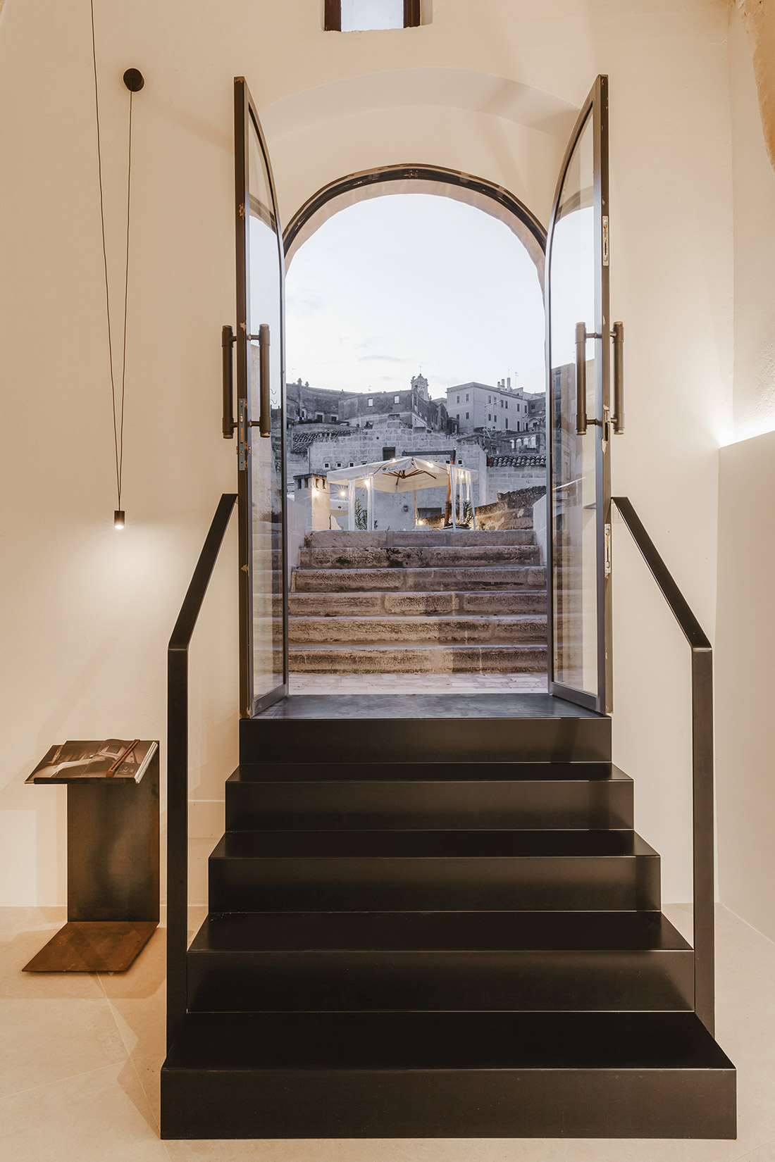
The idea is to play with the dual nature of the project: the lightness of sheet metal and the solidity and fullness of limestone. The new elements, extraneous to the original structure, are evinced through the use of thin, black sheet metal, which highlights the design of the doors, partitions, stairs and shelves, wrapping around and highlighting the entire monochrome space that connects the two main rooms: the refreshment area and the art studio/gallery. The separation between the two rooms has not only been emphasized by the sheet metal walls, but also by the level difference?
The use of the color black helps to divide the spaces, defines their functions and creates movement.
The stone floors, white walls and limestone ceilings provide the perfect neutral background for the black tables, lamps, accessories and furniture, like black ink sketch-work. Consistency is given by the essential shapes, together with the neutral and natural colors of stone and iron: an osmosis of a few well-designed elements, placed with the right balance between form and matter.
Today Momart Gallery is an art studio/gallery, but it is also, more importantly, a reference-point for all forms of contemporary art in the heart of the oldest part of town. It’s a multi-functional space where visual art, teaching/learning and a “nice cup of coffee” all come together, in a highly suggestive historical and architectural context. Each space opens up at ground-floor level onto the large square of Madonna dell’ Idris, which essentially becomes an extension of the internal space. Tables and chairs welcome visitors who can sip a cup of coffee while having a sensory experience connected to art and design – a place where time slows and works of art can be shared and contemplated – communally.

Credits
Authors
Daniela Amoroso
Client
Danimo srls
Photos
Pierangelo Laterza
Year of completion
2019
Location
Matera, Italy
Total area
150,00 m2
Project Partners
Costruzioni industriali srl, Cappiello, Antonio Dinnella, BMD srl, La Moderna edilizia s.r.l., Loperfido project – Supergres, Metal design srl – Altamura


