[fusion_builder_container hundred_percent=”no” hundred_percent_height=”no” hundred_percent_height_scroll=”no” hundred_percent_height_center_content=”yes” equal_height_columns=”no” menu_anchor=”” hide_on_mobile=”small-visibility,medium-visibility,large-visibility” status=”published” publish_date=”” class=”” id=”” link_color=”” link_hover_color=”” border_color=”” border_style=”solid” margin_top=”” margin_bottom=”” padding_top=”” padding_right=”” padding_bottom=”” padding_left=”” gradient_start_color=”” gradient_end_color=”” gradient_start_position=”0″ gradient_end_position=”100″ gradient_type=”linear” radial_direction=”center center” linear_angle=”180″ background_color=”” background_image=”” background_position=”center center” background_repeat=”no-repeat” fade=”no” background_parallax=”none” enable_mobile=”no” parallax_speed=”0.3″ background_blend_mode=”none” video_mp4=”” video_webm=”” video_ogv=”” video_url=”” video_aspect_ratio=”16:9″ video_loop=”yes” video_mute=”yes” video_preview_image=”” filter_hue=”0″ filter_saturation=”100″ filter_brightness=”100″ filter_contrast=”100″ filter_invert=”0″ filter_sepia=”0″ filter_opacity=”100″ filter_blur=”0″ filter_hue_hover=”0″ filter_saturation_hover=”100″ filter_brightness_hover=”100″ filter_contrast_hover=”100″ filter_invert_hover=”0″ filter_sepia_hover=”0″ filter_opacity_hover=”100″ filter_blur_hover=”0″ type=”legacy”][fusion_builder_row][fusion_builder_column type=”3_4″ layout=”3_4″ spacing=”” center_content=”no” link=”” target=”_self” min_height=”” hide_on_mobile=”small-visibility,medium-visibility,large-visibility” class=”” id=”” background_image_id=”” hover_type=”none” border_color=”” border_style=”solid” border_position=”all” border_radius_top_left=”” border_radius_top_right=”” border_radius_bottom_right=”” border_radius_bottom_left=”” box_shadow=”no” box_shadow_vertical=”” box_shadow_horizontal=”” box_shadow_blur=”0″ box_shadow_spread=”0″ box_shadow_color=”” box_shadow_style=”” padding_top=”” padding_right=”40px” padding_bottom=”” padding_left=”” margin_top=”” margin_bottom=”” background_type=”single” gradient_start_color=”” gradient_end_color=”” gradient_start_position=”0″ gradient_end_position=”100″ gradient_type=”linear” radial_direction=”center center” linear_angle=”180″ background_color=”” background_image=”” background_position=”left top” background_repeat=”no-repeat” background_blend_mode=”none” animation_type=”” animation_direction=”left” animation_speed=”0.3″ animation_offset=”” filter_type=”regular” filter_hue=”0″ filter_saturation=”100″ filter_brightness=”100″ filter_contrast=”100″ filter_invert=”0″ filter_sepia=”0″ filter_opacity=”100″ filter_blur=”0″ filter_hue_hover=”0″ filter_saturation_hover=”100″ filter_brightness_hover=”100″ filter_contrast_hover=”100″ filter_invert_hover=”0″ filter_sepia_hover=”0″ filter_opacity_hover=”100″ filter_blur_hover=”0″ last=”false” border_sizes_top=”0″ border_sizes_bottom=”0″ border_sizes_left=”0″ border_sizes_right=”0″ first=”true” spacing_right=””][fusion_separator style_type=”none” hide_on_mobile=”small-visibility,medium-visibility,large-visibility” class=”” id=”” sep_color=”” top_margin=”10px” bottom_margin=”10px” border_size=”” icon=”” icon_size=”” icon_circle=”” icon_circle_color=”” width=”” alignment=”center” /][fusion_text columns=”” column_min_width=”” column_spacing=”” rule_style=”” rule_size=”” rule_color=”” hue=”” saturation=”” lightness=”” alpha=”” content_alignment_medium=”” content_alignment_small=”” content_alignment=”” hide_on_mobile=”small-visibility,medium-visibility,large-visibility” sticky_display=”normal,sticky” class=”” id=”” margin_top=”” margin_right=”” margin_bottom=”” margin_left=”” fusion_font_family_text_font=”” fusion_font_variant_text_font=”” font_size=”” line_height=”” letter_spacing=”” text_transform=”” text_color=”” animation_type=”” animation_direction=”left” animation_speed=”0.3″ animation_offset=””]
A kind and soothing atmosphere permeates through the house. The organic architecture combines nature and modern design in a marriage of durability and utility that does not sacrifice beauty, in fact it enhances it.
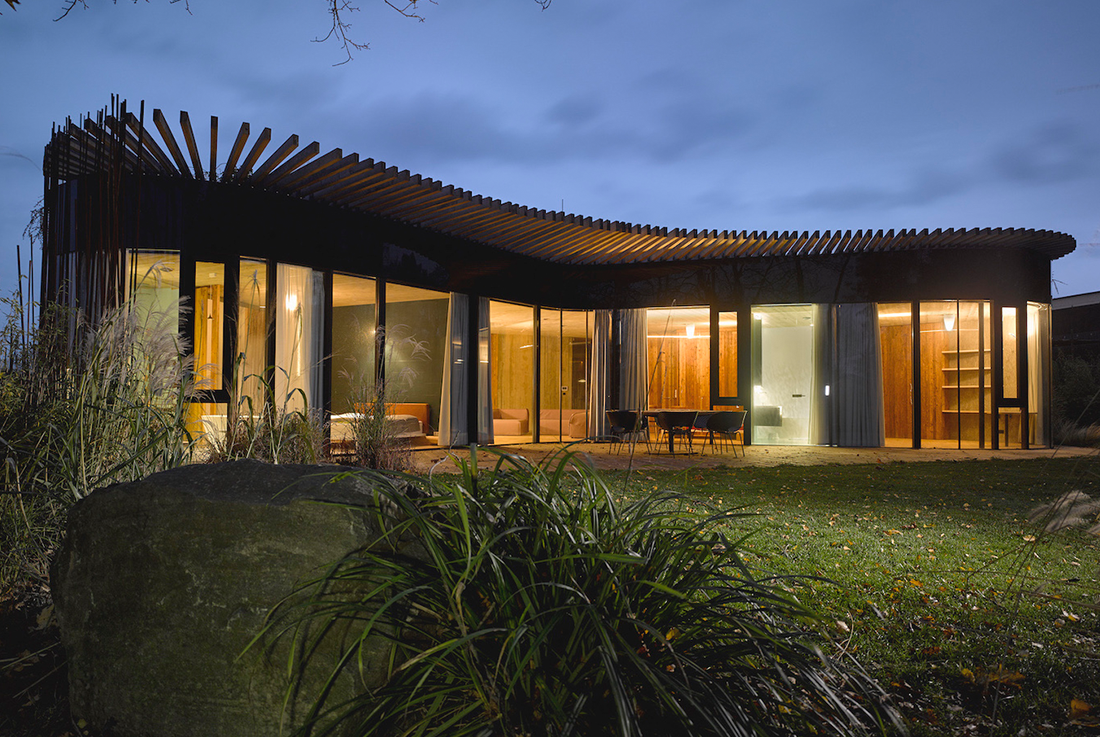
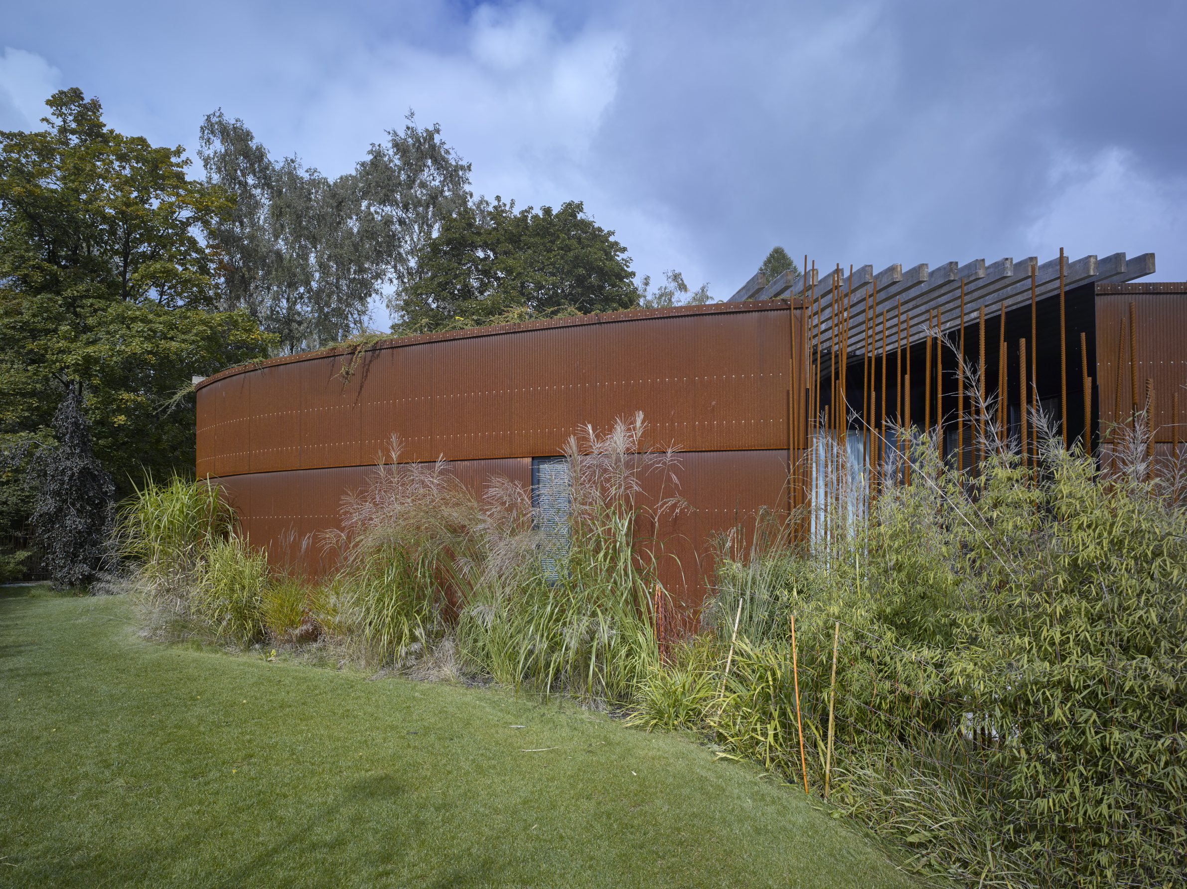
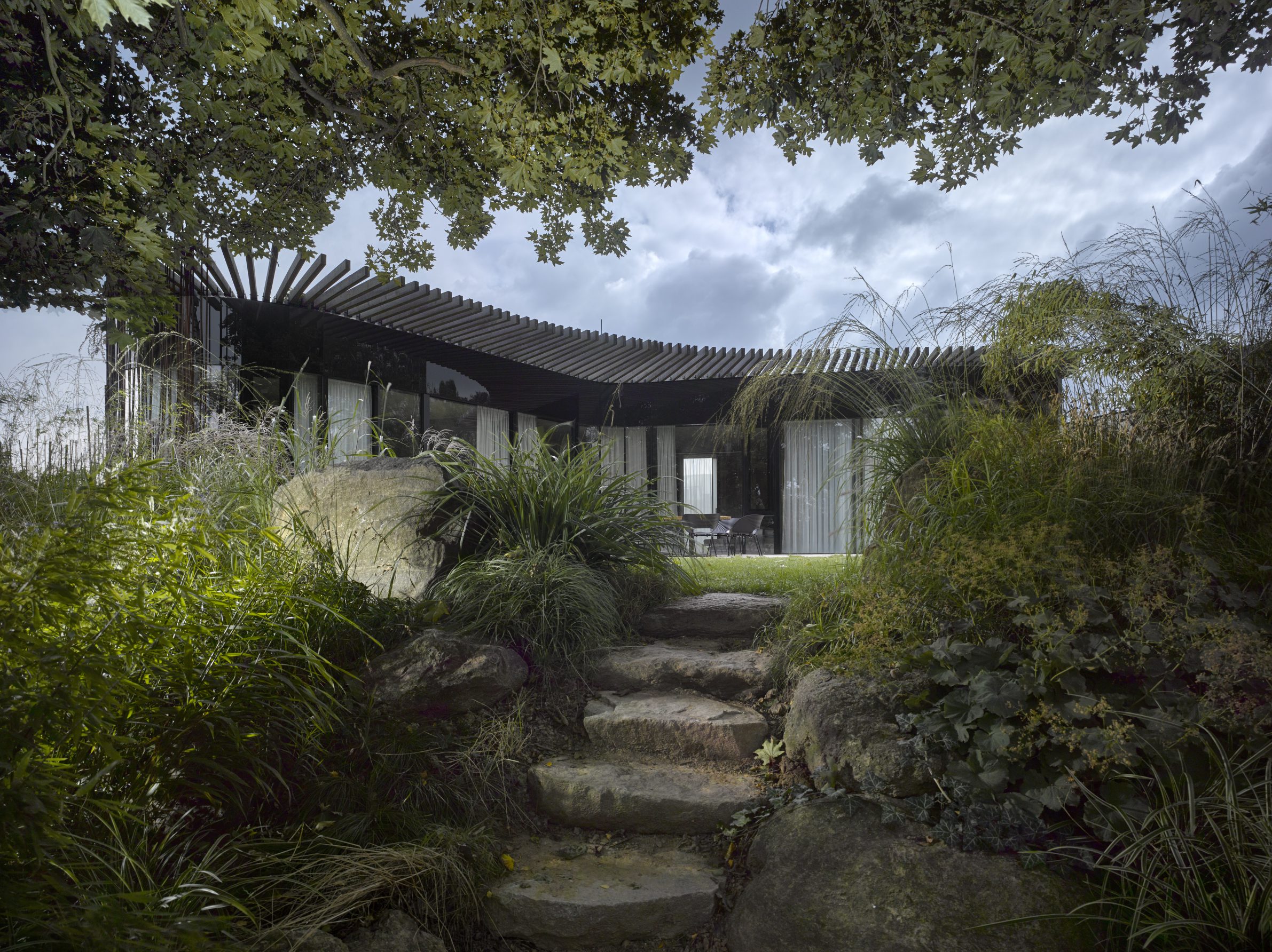
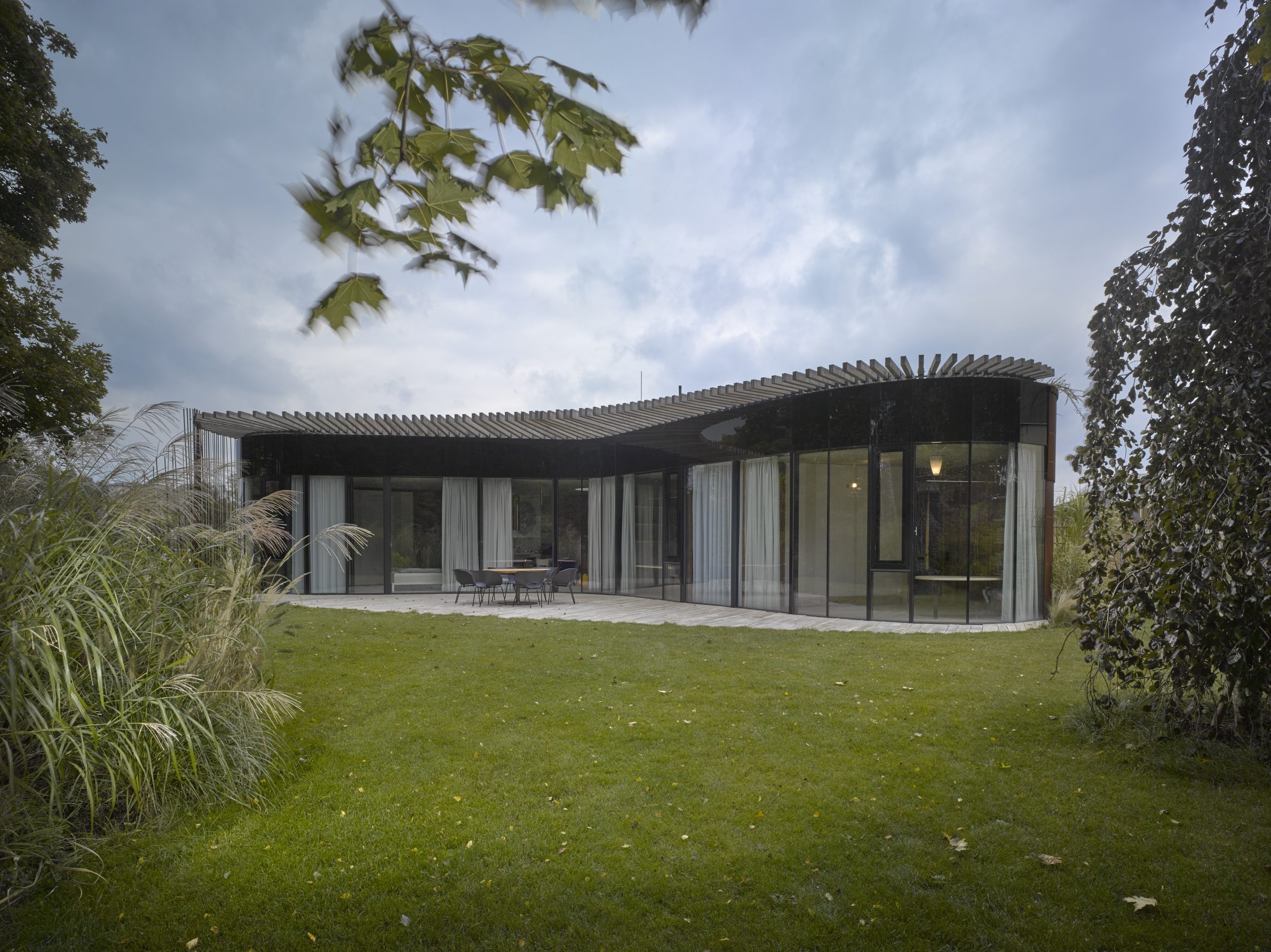
I did not need to turn on my navigation to reach where I needed to be. It was clear that my destination was the house with the unique red and brown facade. The house manages to unpretentiously stand out in the local neighbourhood. It was clear that it was designed with the ambition to build something timeless, progressive that clearly belongs in the 21st century. The street-facing facade sports pre- corroded weathering steel which gives it a characteristic reddish exterior. Weathering steel is immune to basically anything nature can throw at it, as such there will be no need for any real maintenance of the facade in the future. The house is situated on a corner parcel at the end of the street which it manages to perfectly close off with its rounded exterior, indicating that what follows is nothing but a forest. Coming up close gives one a feeling of greeting an old friend, the welcoming feeling is enhanced by long blades of grass pouring from the flat roof, gently swaying in the air, akin to unkempt hair. Later on I will be reminded of this feeling when I visit the garden see the other side of the house, the large windows protected by pergolas like big eyes flanked by a pair of eyebrows kindly observing the garden. One senses that this architectural design is deeply inspired by nature which it closely embraces, shying away from traditional sharp corners and right angles.
Safety and height.
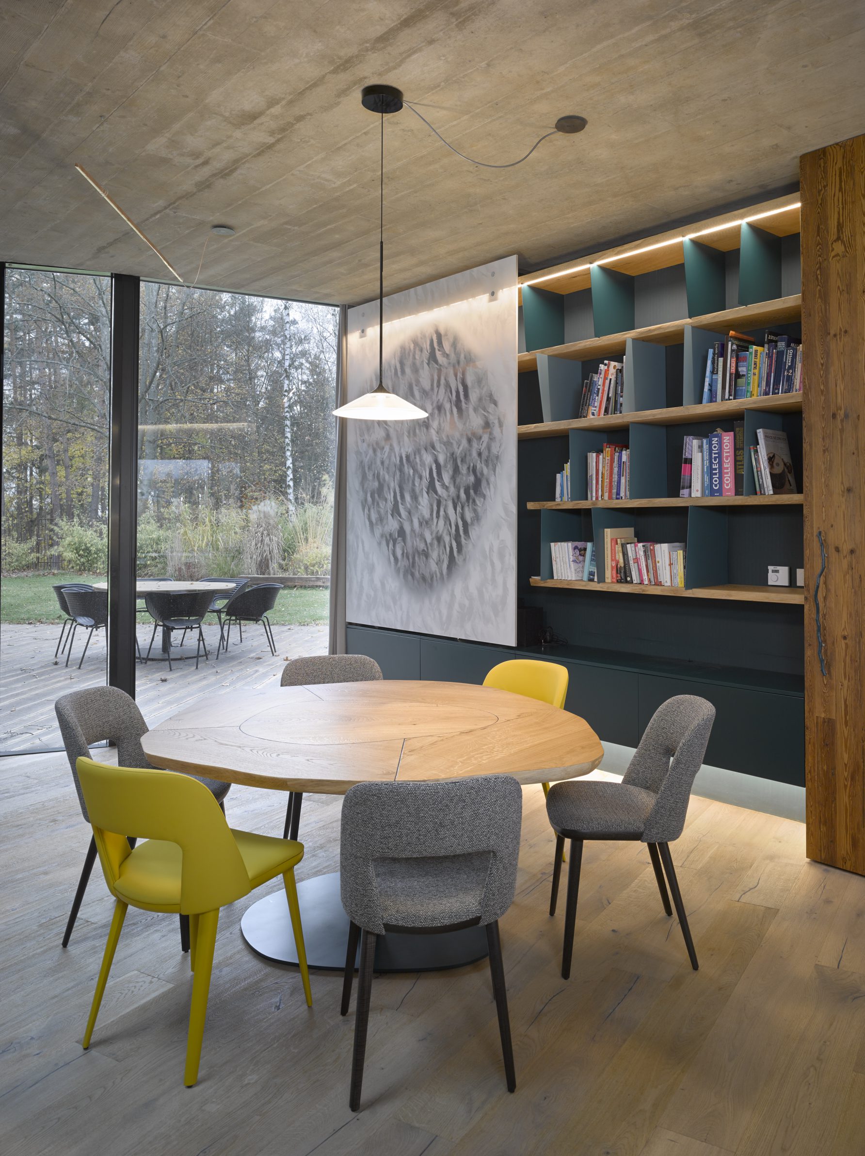
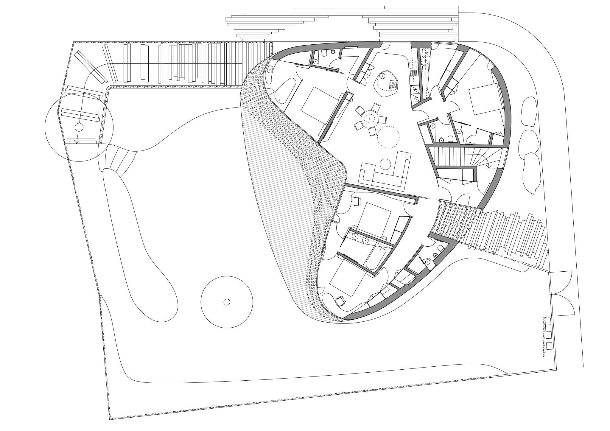
“I had but two requests,” explains the owner. “I wanted the house to give me a feeling of safety and have high ceilings.” “Why?” I inquired further. “Because they evoke uplifting ideas” he answered with a pleasant smile. To get what he wanted, he chose Daniela Polubědovová as his architect. He found her on the internet and deeply appreciated her work. It did not take long to come to an agreement and work began quickly. The architect chose sloping terrain for the base of the house, so that the bottom part could be used for storage, garage, workshop, laundry etc. And the living spaces could sit above the functional part. The core of the characteristically round house is a spacious living room with a three metre high ceiling. From here there is a clear view to the garden. Both the kitchen and the dining room is merged with the living room. There are four additional rooms, guest room, kid’s room and a double bedroom. All of these rooms have access to the wooden terrace. Every member of the household thus has enough privacy and space while also never feeling disconnected from the rest of the house.
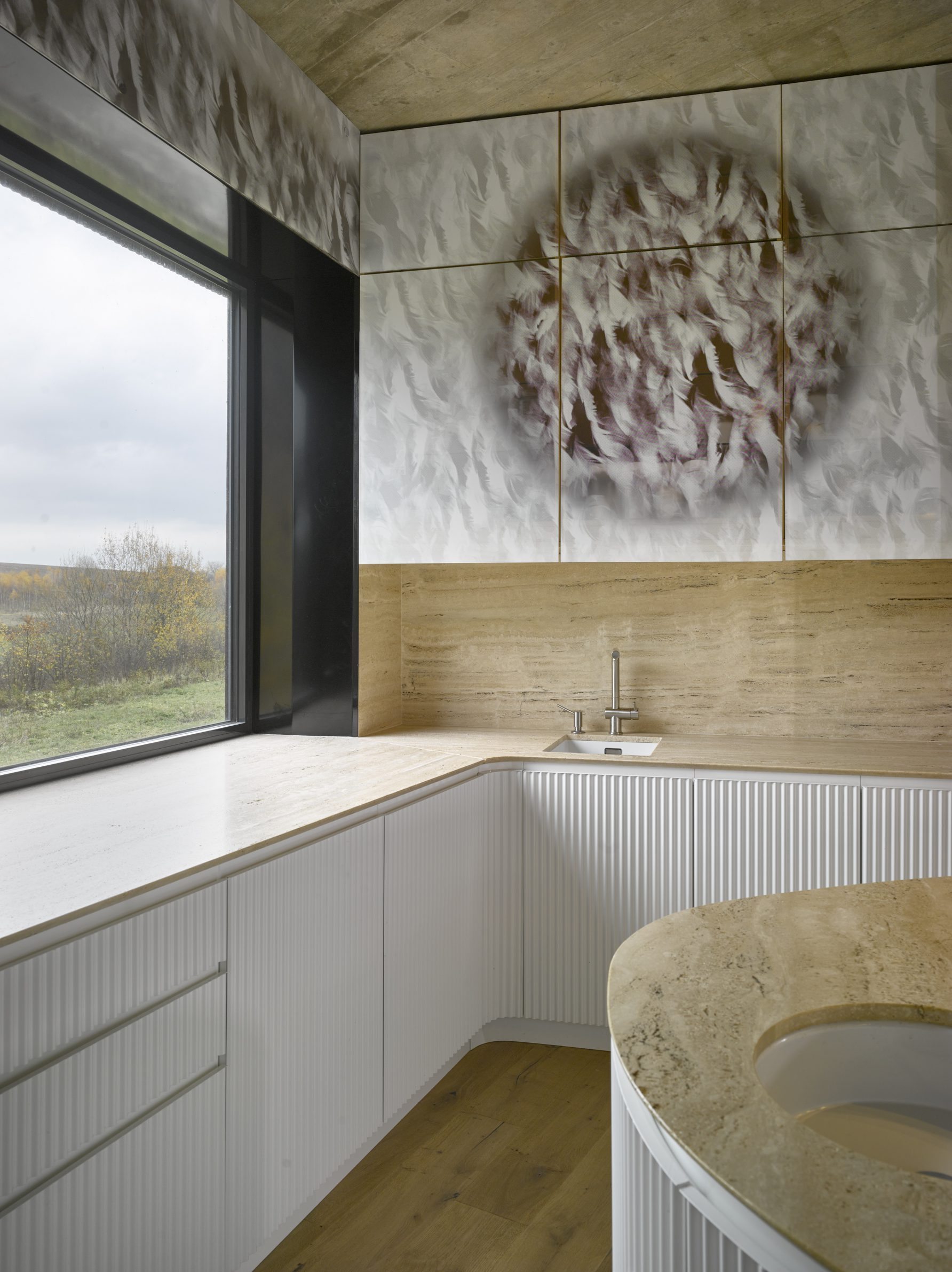
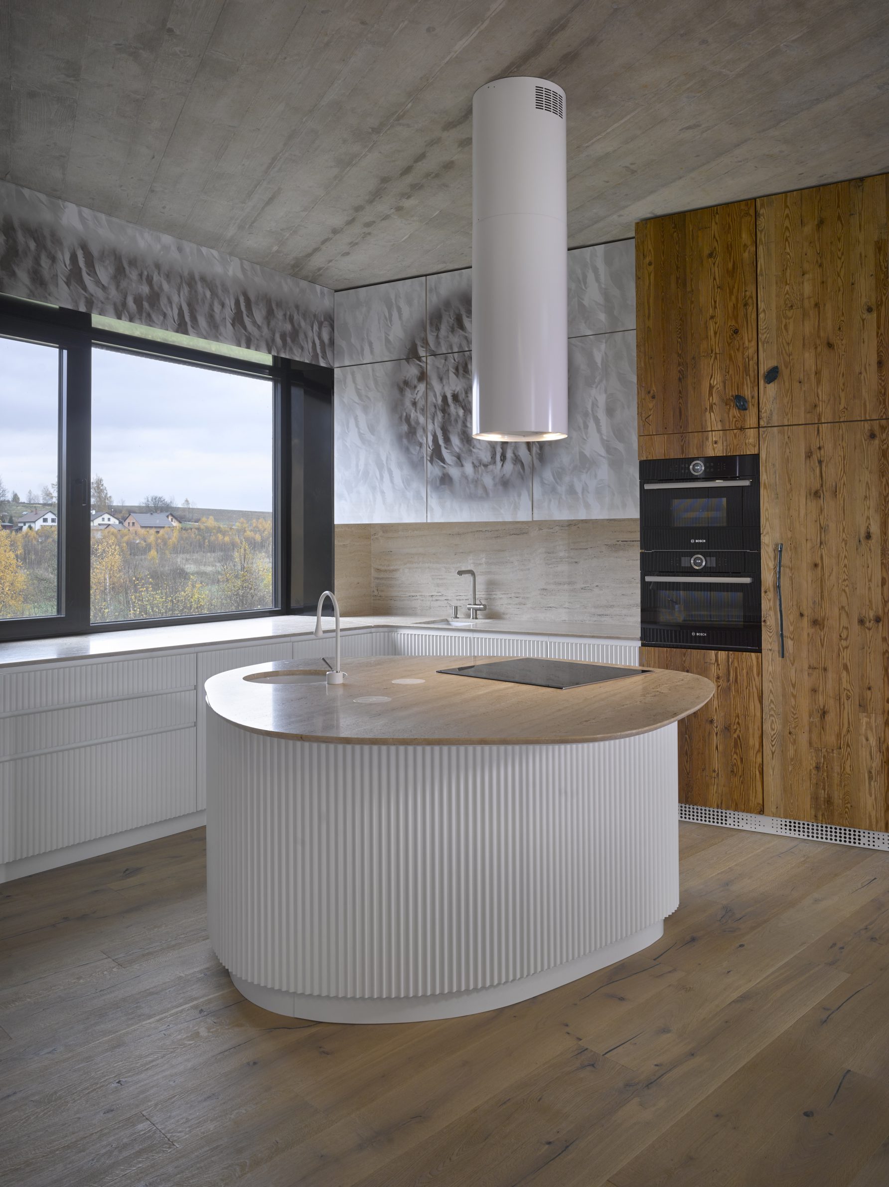
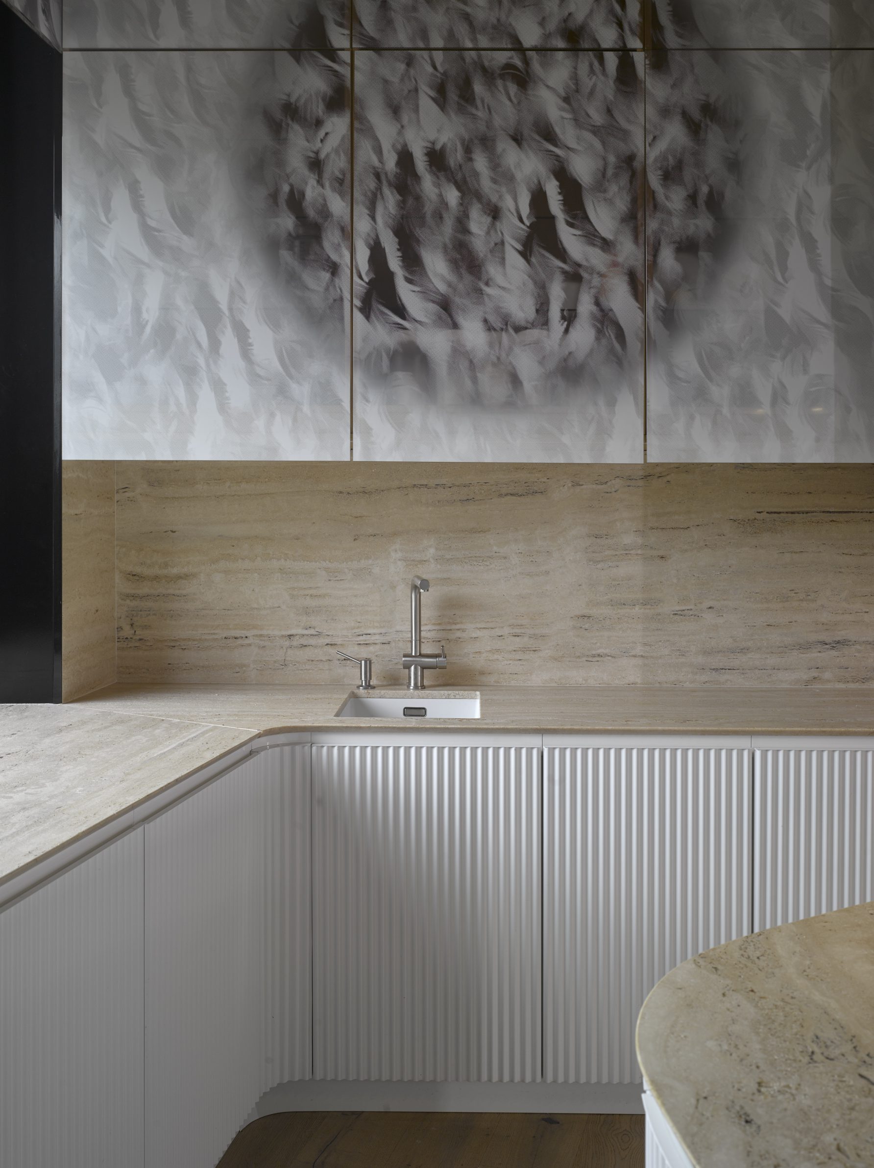
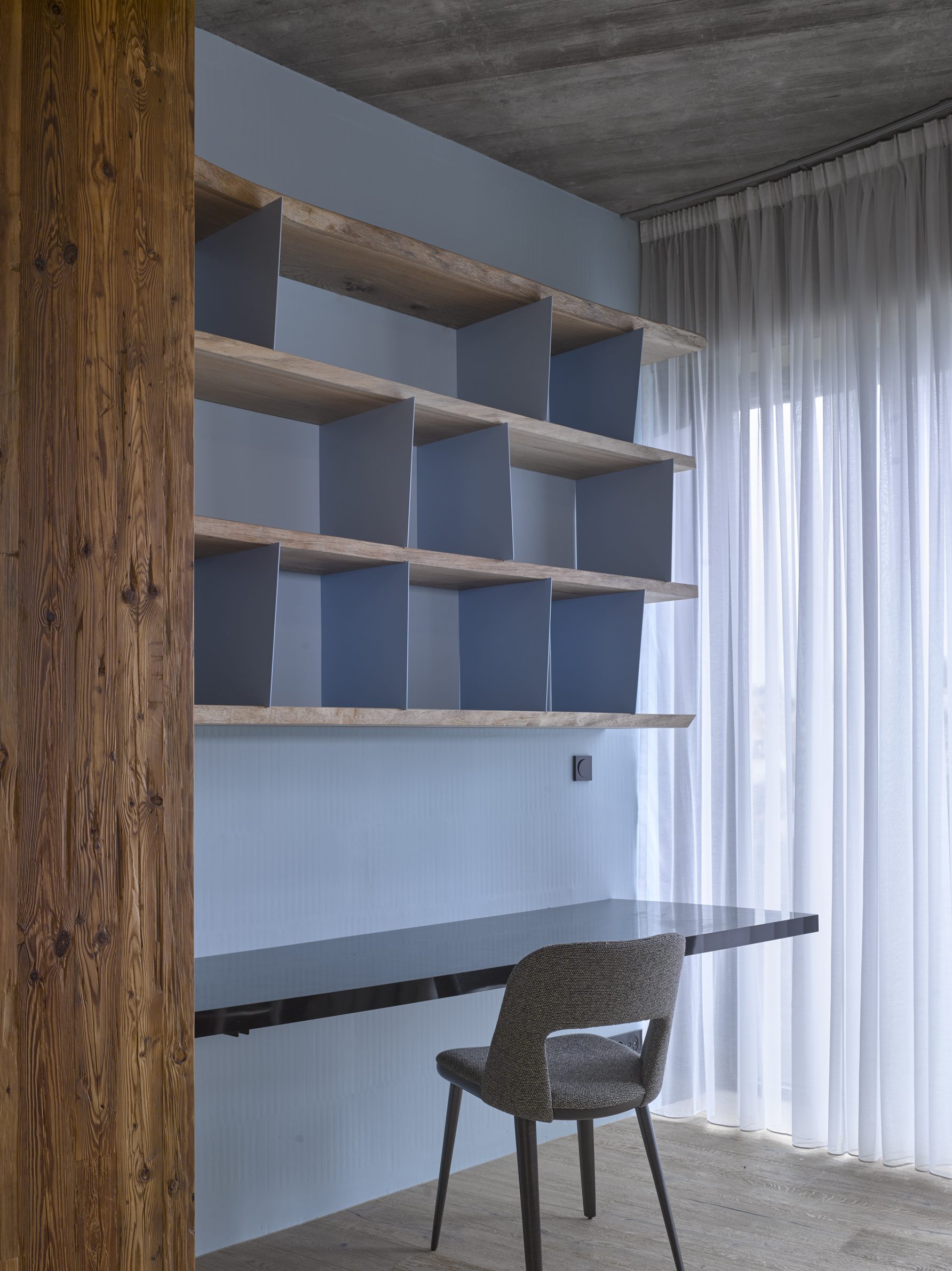
Daniela Polubědovová is both an architect and a designer, and while designing this house she could fully embrace both sides of her profession. The entire house from inside-out has been designed in harmony with itself and its surrounding nature. The Czech architect could fully unshackle her creativity and play with every little detail of the entire building. She designed everything here; the bright wavy features of
the kitchen which mirror the wave of the steel facade on the outside, the beds, the bookshelves, the curtains and even the sink which is installed in a proverbial island swimming in a sea of unadulterated elegance which is unfortunately seldom seen in the conventionally rigid Czech architecture.
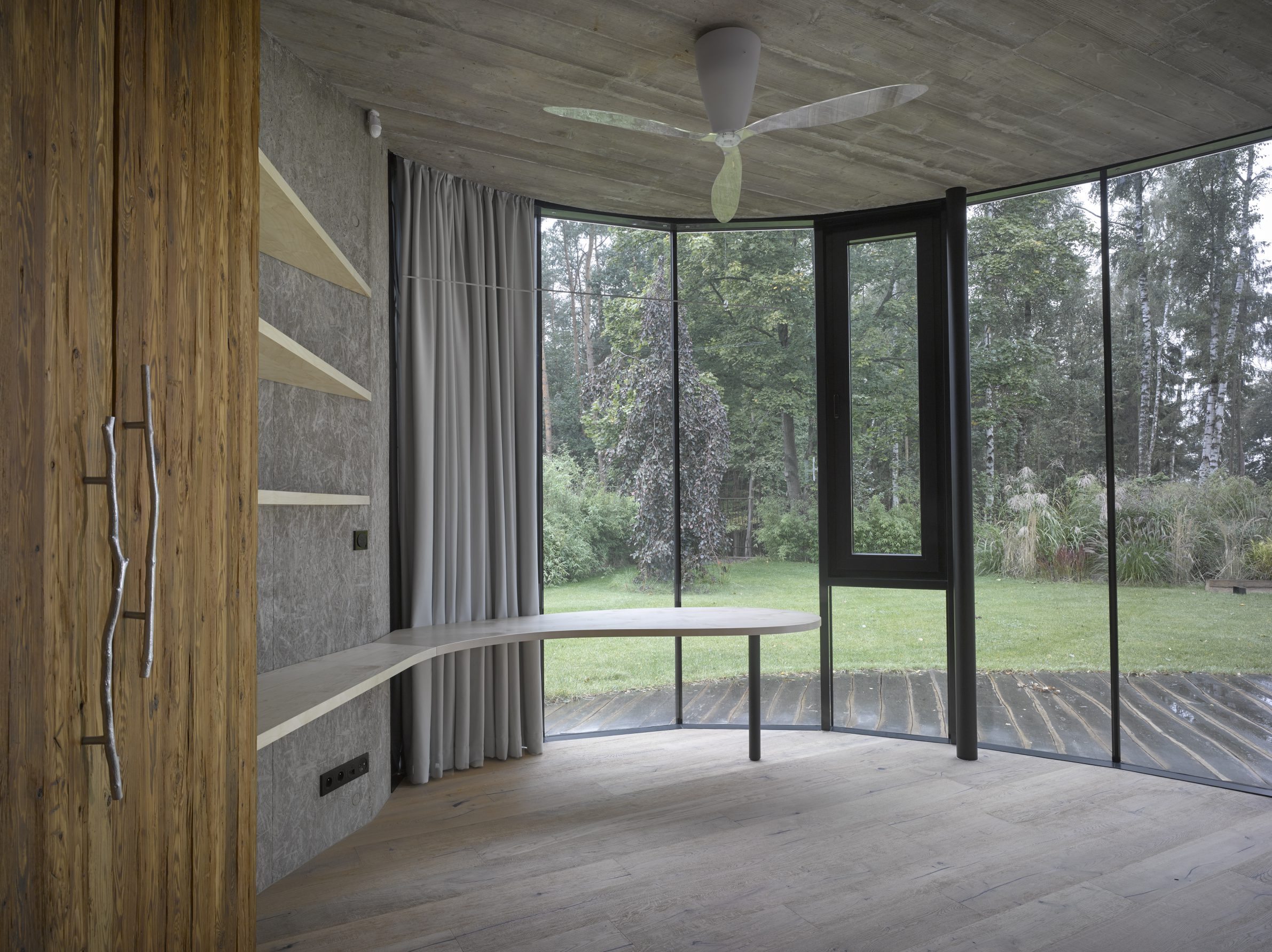
Daniela is a genius conductor of the orchestra of design and architecture. Each detail is singing the perfect melody of this masterful composition and everyone is on their note. For example the planks of wood from which the inside doors are made out of, have been used in other bits of furniture and as such give the interior a feeling of completeness.
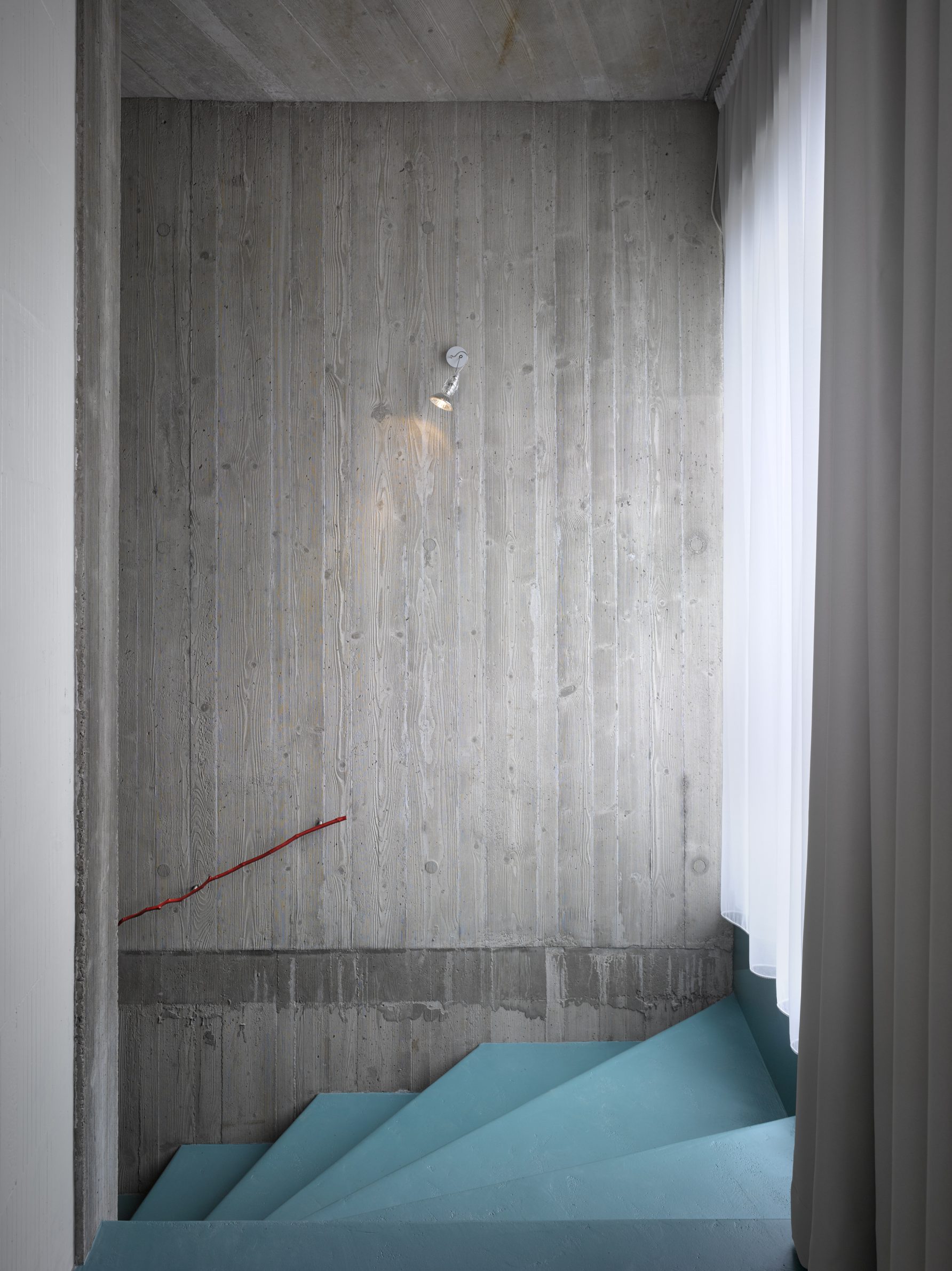
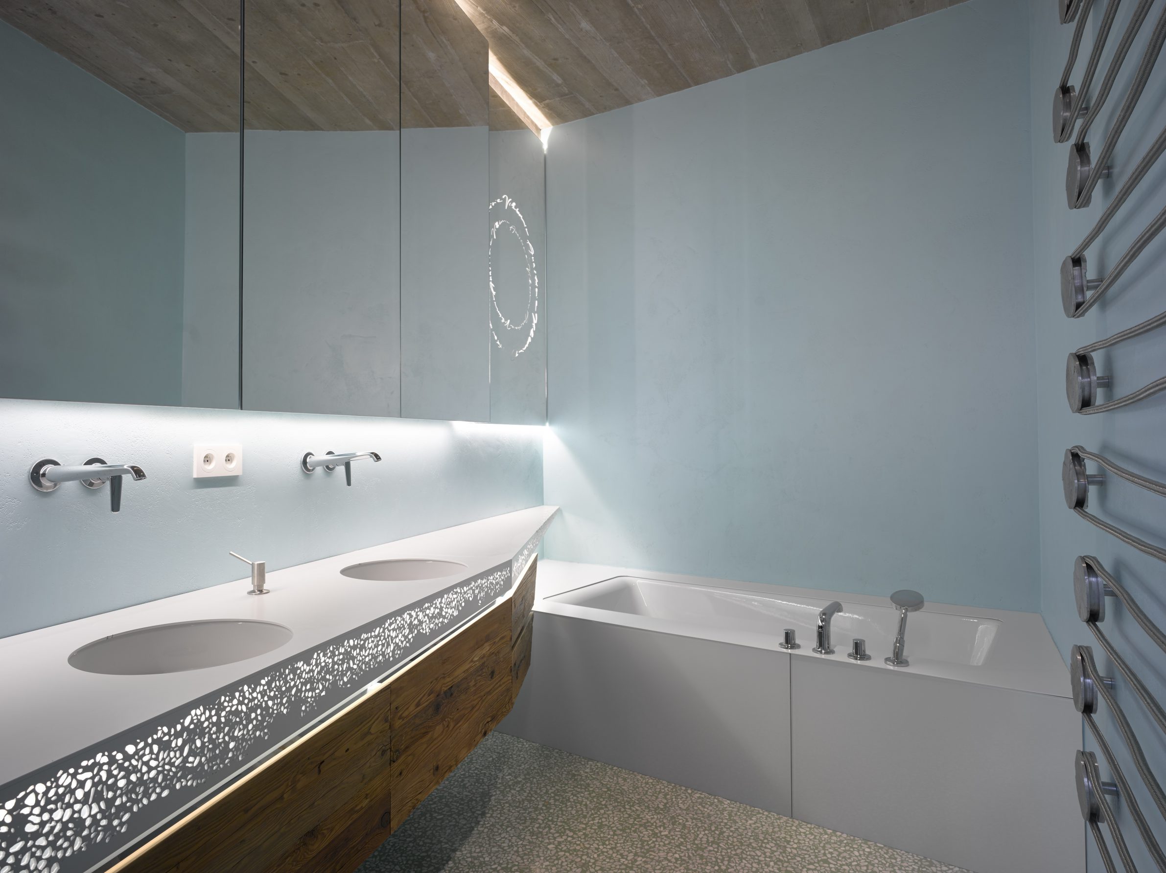
Walking up the stairs you can hold the iron rail which has been cast from the mould of twigs found in a nearby forest. Same method has been used to make the door handle or the keyholes which were cast out of birch leaves. The same is true of the pulleys of bathroom heaters, which are so faithfully derived from wooden blocks that we can, for example, read off the growth rings on the wood. It’s both functional and beautiful. The interior is literally flooded with light. Aside from the window openings, this feeling is enhanced by the colour scheme with its shades of light and dark green, and blue in a sky-blue palette.
Energy flow
Daniela Polubedova says that whatever she thought was appropriate, she could make it happen – the investor gave her complete trust and free rein: “It was the same for me as if I were doing it for myself.” It took five years from the initial sketch, which didn’t need any major changes, to completion. You can tell there was no rush, that’s always a good sign. The garden was therefore being developed at the same time as the house and thus become an integral part of it. Usually the garden is delayed, and sometimes never finished because the financial possibilities have already been exhausted: new houses are then left halfway through without their owners realising it: architects often publish photographs where cement mixers and building materials can still be seen. The local garden is reminiscent of Japanese gardens with its grasses, bamboos, climbing plants, thick turf and stone composition. Simple rebar poles were chosen as a fence towards the neighbouring plot (otherwise used to reinforce the concrete structures) anchored in varying densities, complemented by bamboo stems, and there is a symbiosis between them that one would not expect between industrial and natural materials. This surprisingly positive relationship is good to keep in mind for the future.
The house forms a heart on the property, which the visitor does not realize at first, but finds out once they have walked around the entire perimeter of the building. Or – if one is less perceptive – one will notice it when studying the blueprint, but this is an extreme case. This unusual plan has the advantage of the natural layout of the living area, which is wide open to absorb as much as possible of the garden and the nearby mixed woodland with its mature maples, birches, spruce and pine trees. You can feel the energy pulsing through the house in unbroken currents, because there are no unnaturally sharp edges in the design, so energy can flow freely without forcing it in any way. I don’t want to indulge in mystical or even mysterious musings, but sometimes – in very rare moments – I get the feeling that some houses, in their character, expression and overall deeper essence, are close to a functioning organism in which one is somehow automatically recharged without having to be connected to the electricity grid. Here it is good to pay attention. For this is a magic of sorts. I haven’t encountered it many times in the long time I’ve been house-hunting, but this is exactly the case: you step inside, and immediately everything
becomes clear, because you know you’re in a building that transforms an ordinary day into a holiday. I don’t know if this is due to the fact that it was designed by a woman, however, it strikes me as the best of the possible explanations offered for the anima one can feel here. It is, however, the simplest.
Similarly, to when a famous of the most profound Czech photographers Josef Sudek saw the perfect composition which he wanted to record on a photographic plate, he said he heard music. I have always believed it. Here I heard music – and it wasn’t lingering from hidden speakers, and I wasn’t even hallucinating. When I had to leave again, I didn’t want to, although I had another promising challenge ahead of me … but we’ll talk more about that next year.
[/fusion_text][fusion_separator style_type=”none” hide_on_mobile=”small-visibility,medium-visibility,large-visibility” class=”” id=”” sep_color=”” top_margin=”” bottom_margin=”20px” border_size=”” icon=”” icon_size=”” icon_circle=”” icon_circle_color=”” width=”” alignment=”center” /][fusion_text columns=”” column_min_width=”” column_spacing=”” rule_style=”” rule_size=”” rule_color=”” hue=”” saturation=”” lightness=”” alpha=”” content_alignment_medium=”” content_alignment_small=”” content_alignment=”” hide_on_mobile=”small-visibility,medium-visibility,large-visibility” sticky_display=”normal,sticky” class=”” id=”” margin_top=”” margin_right=”” margin_bottom=”” margin_left=”” fusion_font_family_text_font=”” fusion_font_variant_text_font=”” font_size=”” line_height=”” letter_spacing=”” text_transform=”” text_color=”” animation_type=”” animation_direction=”left” animation_speed=”0.3″ animation_offset=””]







[/fusion_text][fusion_separator style_type=”none” hide_on_mobile=”small-visibility,medium-visibility,large-visibility” class=”” id=”” sep_color=”” top_margin=”” bottom_margin=”20px” border_size=”” icon=”” icon_size=”” icon_circle=”” icon_circle_color=”” width=”” alignment=”center” /][/fusion_builder_column][fusion_builder_column type=”1_4″ layout=”1_4″ spacing=”” center_content=”no” link=”” target=”_self” min_height=”” hide_on_mobile=”small-visibility,medium-visibility,large-visibility” class=”” id=”” background_image_id=”” hover_type=”none” border_color=”” border_style=”solid” border_position=”all” border_radius_top_left=”” border_radius_top_right=”” border_radius_bottom_right=”” border_radius_bottom_left=”” box_shadow=”no” box_shadow_vertical=”” box_shadow_horizontal=”” box_shadow_blur=”0″ box_shadow_spread=”0″ box_shadow_color=”” box_shadow_style=”” padding_top=”” padding_right=”” padding_bottom=”” padding_left=”0″ margin_top=”” margin_bottom=”” background_type=”single” gradient_start_color=”” gradient_end_color=”” gradient_start_position=”0″ gradient_end_position=”100″ gradient_type=”linear” radial_direction=”center center” linear_angle=”180″ background_color=”” background_image=”” background_position=”left top” background_repeat=”no-repeat” background_blend_mode=”none” animation_type=”” animation_direction=”left” animation_speed=”0.3″ animation_offset=”” filter_type=”regular” filter_hue=”0″ filter_saturation=”100″ filter_brightness=”100″ filter_contrast=”100″ filter_invert=”0″ filter_sepia=”0″ filter_opacity=”100″ filter_blur=”0″ filter_hue_hover=”0″ filter_saturation_hover=”100″ filter_brightness_hover=”100″ filter_contrast_hover=”100″ filter_invert_hover=”0″ filter_sepia_hover=”0″ filter_opacity_hover=”100″ filter_blur_hover=”0″ last=”true” border_sizes_top=”0″ border_sizes_bottom=”0″ border_sizes_left=”0″ border_sizes_right=”0″ first=”false”][fusion_title title_type=”text” rotation_effect=”bounceIn” display_time=”1200″ highlight_effect=”circle” loop_animation=”off” highlight_width=”9″ highlight_top_margin=”0″ before_text=”” rotation_text=”” highlight_text=”” after_text=”” hide_on_mobile=”small-visibility,medium-visibility,large-visibility” class=”” id=”” content_align=”left” size=”2″ font_size=”” animated_font_size=”” fusion_font_family_title_font=”” fusion_font_subset_title_font=”” fusion_font_variant_title_font=”” line_height=”” letter_spacing=”” margin_top=”” margin_bottom=”” margin_top_mobile=”” margin_bottom_mobile=”” text_color=”#000000″ animated_text_color=”” highlight_color=”” style_type=”default” sep_color=”” animation_type=”” animation_direction=”left” animation_speed=”0.3″ animation_offset=”” margin_top_small=”” margin_bottom_small=””]
Credits
[/fusion_title][fusion_separator style_type=”none” hide_on_mobile=”small-visibility,medium-visibility,large-visibility” class=”” id=”” sep_color=”” top_margin=”5px” bottom_margin=”5px” border_size=”” icon=”” icon_size=”” icon_circle=”” icon_circle_color=”” width=”” alignment=”center” /][fusion_text columns=”” column_min_width=”” column_spacing=”” rule_style=”” rule_size=”” rule_color=”” hue=”” saturation=”” lightness=”” alpha=”” content_alignment_medium=”” content_alignment_small=”” content_alignment=”” hide_on_mobile=”small-visibility,medium-visibility,large-visibility” sticky_display=”normal,sticky” class=”” id=”” margin_top=”” margin_right=”” margin_bottom=”” margin_left=”” fusion_font_family_text_font=”” fusion_font_variant_text_font=”” font_size=”” line_height=”” letter_spacing=”” text_transform=”” text_color=”” animation_type=”” animation_direction=”left” animation_speed=”0.3″ animation_offset=””]
Authors
Daniela Polubědovová
Original text
Petr VolfŽ
Translated
Nikola Polubědov
Photography
Filip Šlapa
[/fusion_text][fusion_separator style_type=”none” hide_on_mobile=”small-visibility,medium-visibility,large-visibility” class=”” id=”” sep_color=”” top_margin=”20px” bottom_margin=”20px” border_size=”” icon=”” icon_size=”” icon_circle=”” icon_circle_color=”” width=”” alignment=”center” /][fusion_title title_type=”text” rotation_effect=”bounceIn” display_time=”1200″ highlight_effect=”circle” loop_animation=”off” highlight_width=”9″ highlight_top_margin=”0″ before_text=”” rotation_text=”” highlight_text=”” after_text=”” hide_on_mobile=”small-visibility,medium-visibility,large-visibility” class=”” id=”” content_align=”left” size=”2″ font_size=”” animated_font_size=”” fusion_font_family_title_font=”” fusion_font_subset_title_font=”” fusion_font_variant_title_font=”” line_height=”” letter_spacing=”” margin_top=”” margin_bottom=”” margin_top_mobile=”” margin_bottom_mobile=”” text_color=”#000000″ animated_text_color=”” highlight_color=”” style_type=”default” sep_color=”” animation_type=”” animation_direction=”left” animation_speed=”0.3″ animation_offset=”” margin_top_small=”” margin_bottom_small=””]
Related posts
[/fusion_title][fusion_separator style_type=”none” hide_on_mobile=”small-visibility,medium-visibility,large-visibility” class=”” id=”” sep_color=”” top_margin=”5px” bottom_margin=”5px” border_size=”” icon=”” icon_size=”” icon_circle=”” icon_circle_color=”” width=”” alignment=”center” /][fusion_blog layout=”medium” blog_grid_columns=”1″ blog_grid_column_spacing=”” blog_masonry_grid_ratio=”” blog_masonry_width_double=”” equal_heights=”no” number_posts=”4″ post_status=”” offset=”0″ pull_by=”category” cat_slug=”austria” exclude_cats=”” tag_slug=”” exclude_tags=”” orderby=”rand” order=”DESC” thumbnail=”yes” title=”no” title_link=”yes” content_alignment=”” excerpt=”hide” excerpt_length=”” strip_html=”yes” meta_all=”no” meta_author=”yes” meta_categories=”yes” meta_comments=”yes” meta_date=”yes” meta_link=”yes” meta_tags=”yes” scrolling=”no” grid_box_color=”” grid_element_color=”” grid_separator_style_type=”” grid_separator_color=”” padding_top=”” padding_right=”” padding_bottom=”” padding_left=”” hide_on_mobile=”small-visibility,medium-visibility,large-visibility” class=”” id=”” /][fusion_separator style_type=”none” hide_on_mobile=”small-visibility,medium-visibility,large-visibility” class=”” id=”” sep_color=”” top_margin=”30px” bottom_margin=”35px” border_size=”” icon=”” icon_size=”” icon_circle=”” icon_circle_color=”” width=”” alignment=”center” /][fusion_title title_type=”text” rotation_effect=”bounceIn” display_time=”1200″ highlight_effect=”circle” loop_animation=”off” highlight_width=”9″ highlight_top_margin=”0″ before_text=”” rotation_text=”” highlight_text=”” after_text=”” hide_on_mobile=”small-visibility,medium-visibility,large-visibility” class=”” id=”” content_align=”left” size=”2″ font_size=”” animated_font_size=”” fusion_font_family_title_font=”” fusion_font_subset_title_font=”” fusion_font_variant_title_font=”” line_height=”” letter_spacing=”” margin_top=”” margin_bottom=”” margin_top_mobile=”” margin_bottom_mobile=”” text_color=”#000000″ animated_text_color=”” highlight_color=”” style_type=”default” sep_color=”” animation_type=”” animation_direction=”left” animation_speed=”0.3″ animation_offset=”” margin_top_small=”” margin_bottom_small=””]
Powered by
[/fusion_title][fusion_separator style_type=”none” hide_on_mobile=”small-visibility,medium-visibility,large-visibility” class=”” id=”” sep_color=”” top_margin=”5px” bottom_margin=”5px” border_size=”” icon=”” icon_size=”” icon_circle=”” icon_circle_color=”” width=”” alignment=”center” /][fusion_widget_area name=”avada-custom-sidebar-oglas1″ title_size=”” title_color=”” background_color=”” padding_top=”” padding_right=”” padding_bottom=”” padding_left=”” hide_on_mobile=”small-visibility,medium-visibility,large-visibility” class=”” id=”” /][fusion_separator style_type=”none” hide_on_mobile=”small-visibility,medium-visibility,large-visibility” class=”” id=”” sep_color=”” top_margin=”5px” bottom_margin=”5px” border_size=”” icon=”” icon_size=”” icon_circle=”” icon_circle_color=”” width=”” alignment=”center” /][fusion_widget_area name=”avada-custom-sidebar-oglas2″ title_size=”” title_color=”” background_color=”” padding_top=”” padding_right=”” padding_bottom=”” padding_left=”” hide_on_mobile=”small-visibility,medium-visibility,large-visibility” class=”” id=”” /][fusion_widget_area name=”avada-custom-sidebar-oglas3″ title_size=”” title_color=”” background_color=”” padding_top=”” padding_right=”” padding_bottom=”” padding_left=”” hide_on_mobile=”small-visibility,medium-visibility,large-visibility” class=”” id=”” /][/fusion_builder_column][fusion_builder_column type=”1_1″ layout=”1_1″ spacing=”” center_content=”no” link=”” target=”_self” min_height=”” hide_on_mobile=”small-visibility,medium-visibility,large-visibility” class=”” id=”” hover_type=”none” border_color=”” border_style=”solid” border_position=”all” border_radius=”” box_shadow=”no” dimension_box_shadow=”” box_shadow_blur=”0″ box_shadow_spread=”0″ box_shadow_color=”” box_shadow_style=”” padding_top=”” padding_right=”” padding_bottom=”” padding_left=”” margin_top=”” margin_bottom=”” background_type=”single” gradient_start_color=”” gradient_end_color=”” gradient_start_position=”0″ gradient_end_position=”100″ gradient_type=”linear” radial_direction=”center center” linear_angle=”180″ background_color=”” background_image=”” background_image_id=”” background_position=”left top” background_repeat=”no-repeat” background_blend_mode=”none” animation_type=”” animation_direction=”left” animation_speed=”0.3″ animation_offset=”” filter_type=”regular” filter_hue=”0″ filter_saturation=”100″ filter_brightness=”100″ filter_contrast=”100″ filter_invert=”0″ filter_sepia=”0″ filter_opacity=”100″ filter_blur=”0″ filter_hue_hover=”0″ filter_saturation_hover=”100″ filter_brightness_hover=”100″ filter_contrast_hover=”100″ filter_invert_hover=”0″ filter_sepia_hover=”0″ filter_opacity_hover=”100″ filter_blur_hover=”0″ last=”true” border_sizes_top=”0″ border_sizes_bottom=”0″ border_sizes_left=”0″ border_sizes_right=”0″ first=”true”][/fusion_builder_column][/fusion_builder_row][/fusion_builder_container]


