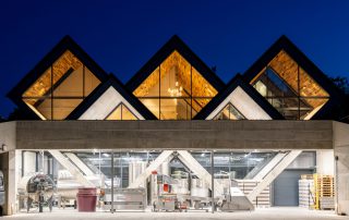
One of Budapest’s most important technology companies, in the heart of Budapest, with restaurants, ruins and tourists. Their wishes to present their thoughts in attractive form at the headquarters of Mercury Palace, built between 1900-1903 for the first telephone centre. The main product of Prezi, a presentation software developed by Ádám Somlai-Fischer. Using the “Zoomable Interface” principle, users can put their thoughts into a spatial narrative – just as the offices provide a spatial framework for the company’s tasks.
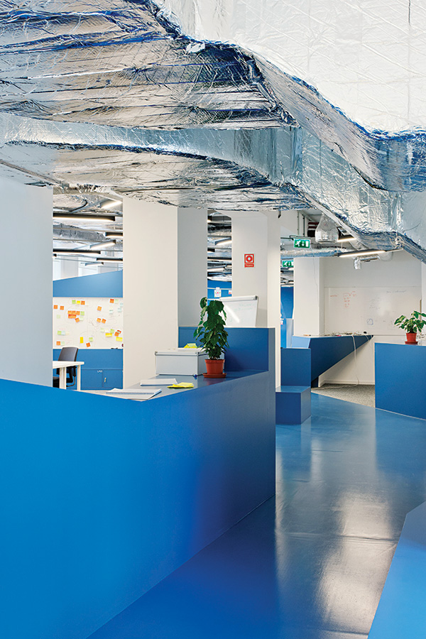
In the light of the gradual expansion of Prezi, we do not want to create a fully-fledged office in a 4,000-square-foot building. We made of semi-finished spaces with movable objects and writing walls, thus encouraging workers to shape their environment. In the spirit of spatial flexibility, Prezi seeks to use simple and inexpensive raw materials. The state-of-the-art cold traffic avoided and untreated materials created its directness, intimacy and community existence.
What makes this project one-of-a-kind?
Written by Polyák Levente for A10 magazin.
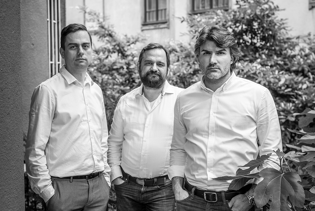
“Minusplus were not only the designers of Prezi’s previous headquarters, but lent their office space and furniture to the tech company in its earliest start-up phase.
The two firms’ shared history informed the design process: similarly to Prezi’s previous offices, the new headquarters were constructed in phases, keeping pace with the company’s expansion.
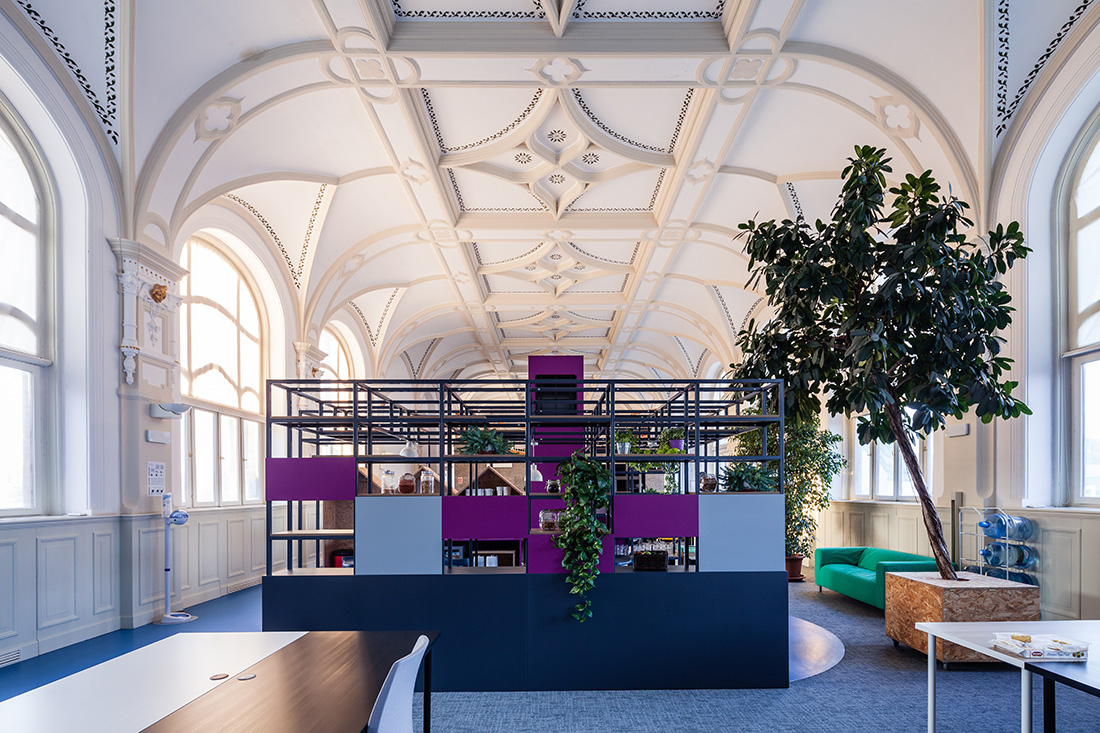
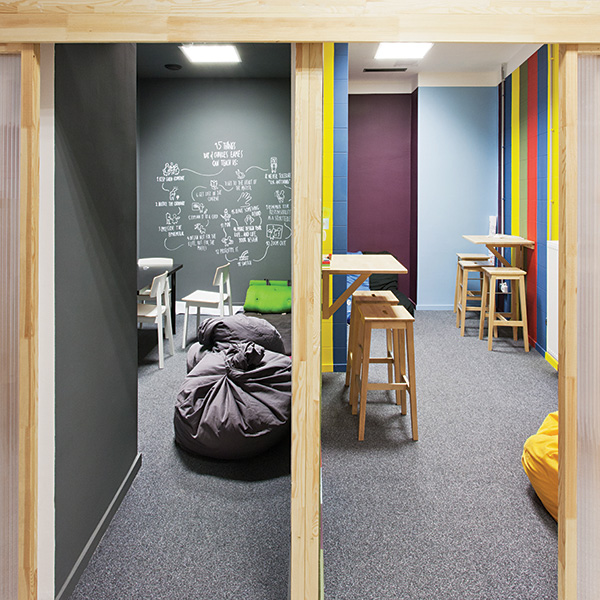
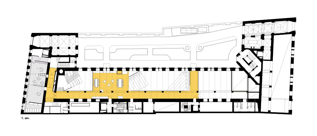
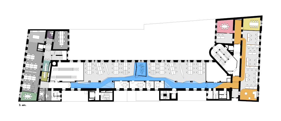
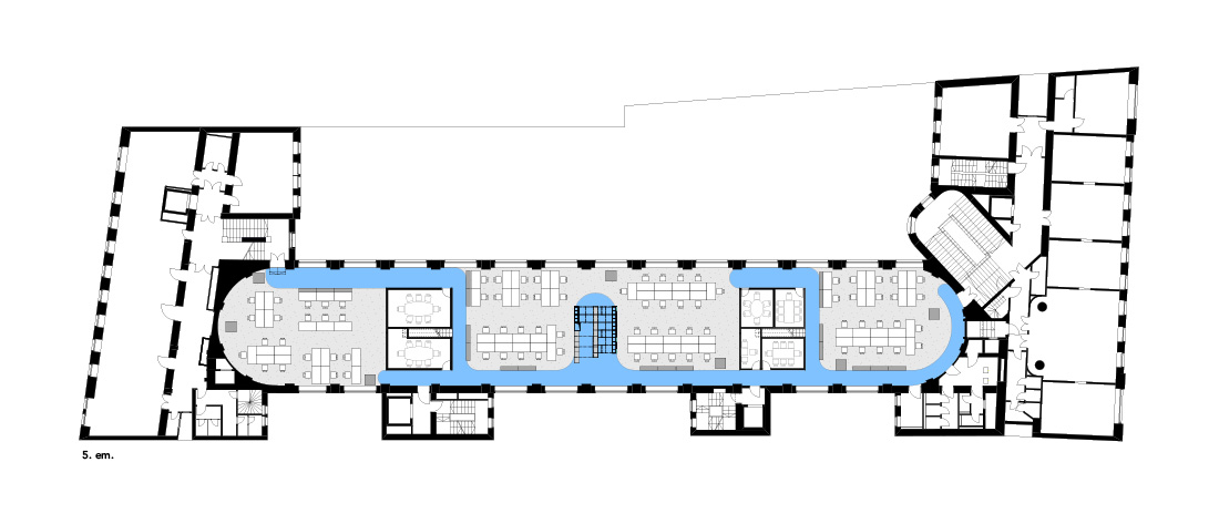
The new headquarters, designed in parallel with the firm’s new San Francisco offices, are situated on four levels of the Mercury Palace. The top floor baptized “ballroom” is an urban garden, a large indoor landscape with hills hiding conference rooms. In the smaller offices, some of the elements are repeated, like the plants and trees separating workspaces, a concept recycled from the company’s previous offices. However, each floor and conference room has a distinct identity: as the nearly 200 people in Prezi’s dynamic work scheme change desks almost every week, each space needs a strong theme in order to help orientation.
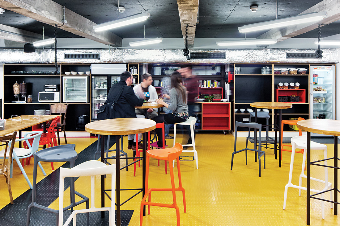
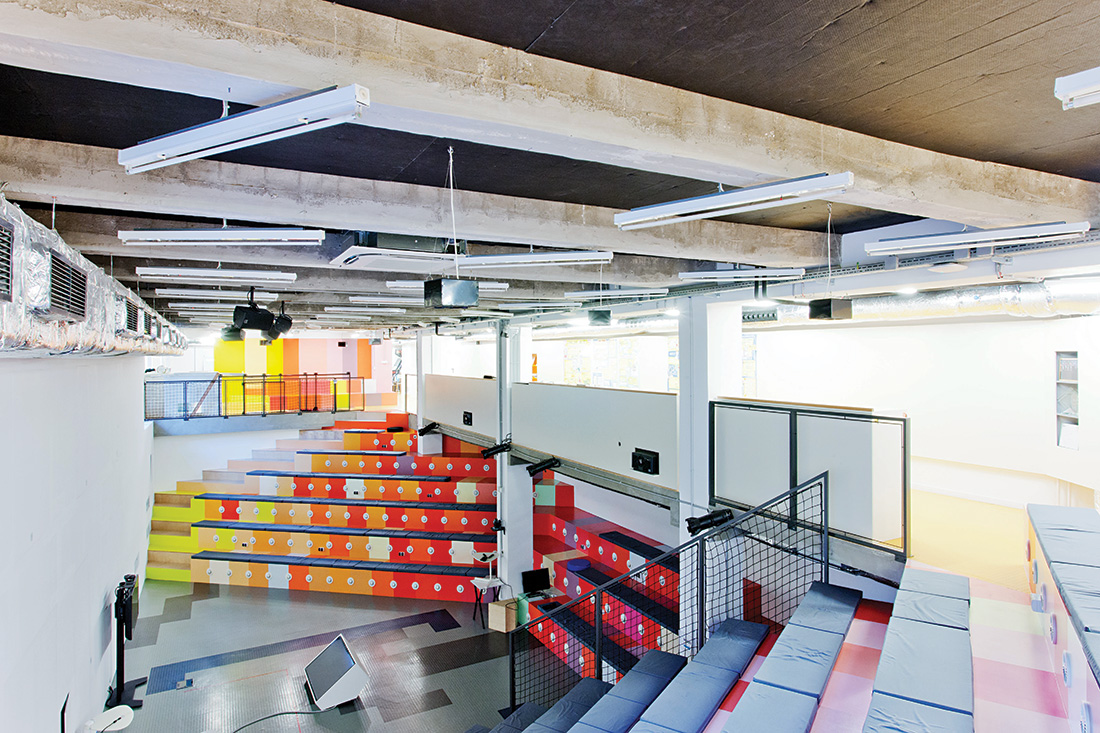
In the absence of fixed working hours, to make people chose to work there; the building has to offer a diversity of situations: “When they wake up in the morning and think about where they could work best – in a coffee house, a dark corner or in bed – we want them to find all this here.” All floors have coffee kitchens or snack corners, inviting workers to engage in social interaction. The entrance area includes a music corner and a bistro that brings visitors to the building’s semi-public auditorium, the “House of Ideas”, where employees meet for general assemblies and for events focusing on technology and culture.
In working with Prezi, Minusplus architects established their role as not only designers but partners in the elaboration of the client’s way of working: “They didn’t expect us to give them plans to be built and then leave but to act as consultants of the whole operation. Design is not only an instant here but a process of constant adjustment: it is custom-made architecture.”

Credits
Architecture
MINUSPLUS Architecture and Design, Zsolt Alexa, Donát Rabb, Ákos Schreck, Gabriella Antal, Tímea Molnár, Balázs Turai Zsófia Bakó, Ágnes Bubla, Péter Debreczeni, Kata Gulyás, Zsófia Hompók, Balázs Kis, Ferenc Kis, Eszter Macsuga, Szabina Pap, Olga Péteri, Tímea Szodorai, Blanka Zvolenszki
Client
Prezi.com
Year of completion
2002-2017
Location
Budapest, Hungary
Total area
5000 m2
Photos
Tamás Bujnovszky, Tamás Török; Topogram


