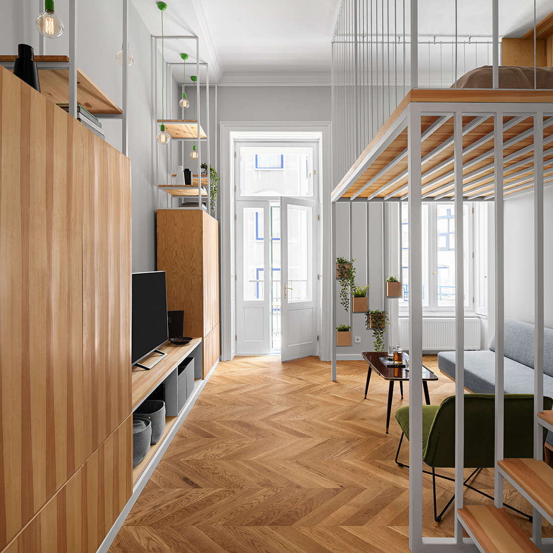
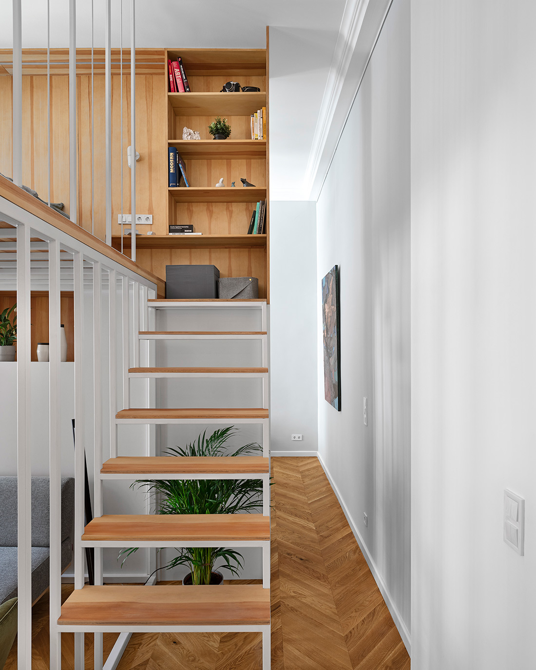
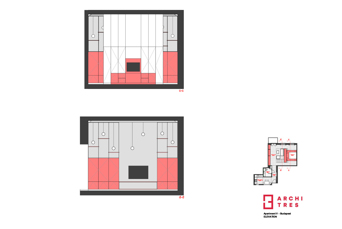
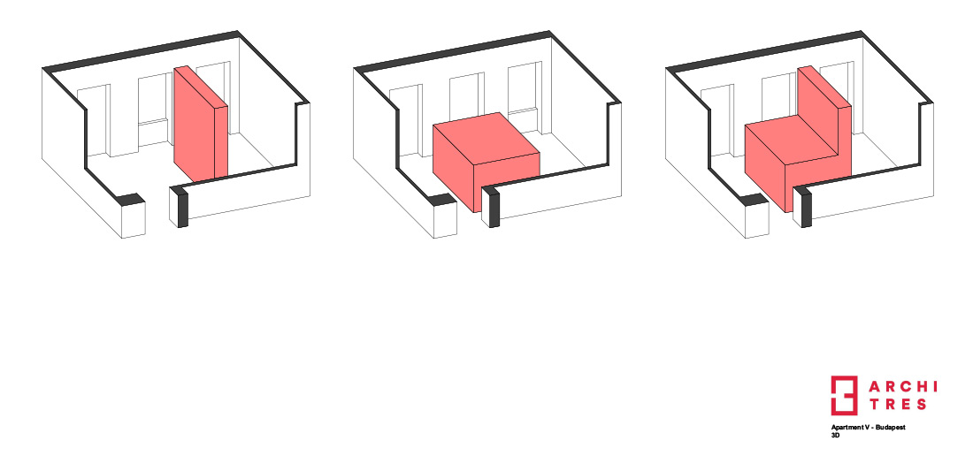
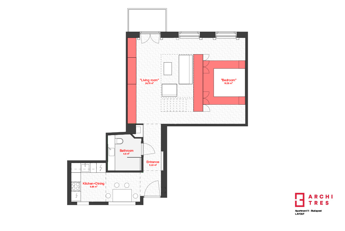
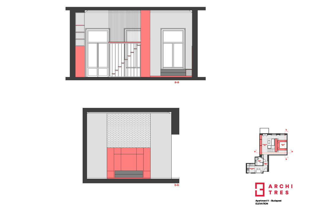
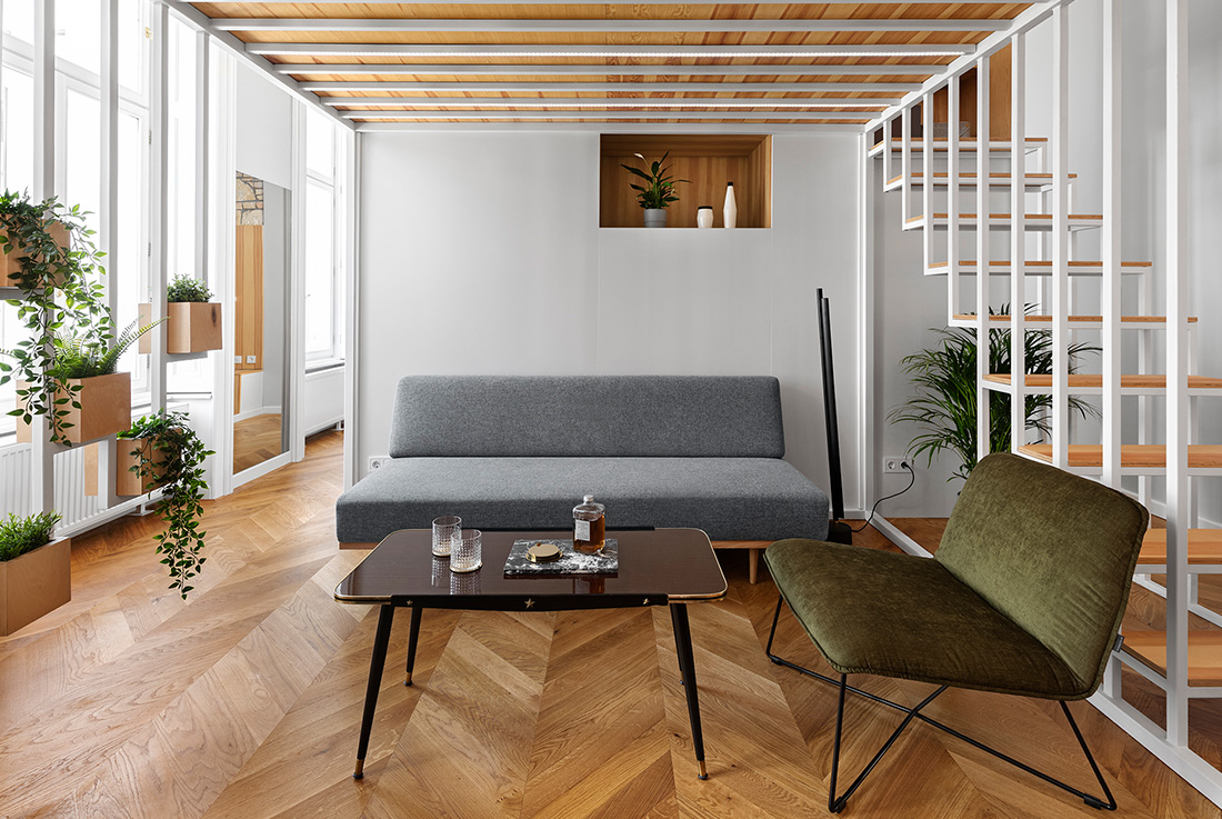
In this apartment renovation in Budapest a single 40 sqm common space was opened up to create a generous, adaptive function-system. The gallery was put in the middle of the space as an estrade instead of having a confined, cave-like element. Meanwhile, it has the opacity to let through natural light, has the airiness to leave the surrounding functions work properly and also serves as a separation piece between functions. This space-inside-a-space system provides simultaneously an elevated private space on the gallery, a lounge area underneath it, and a semi-private part behind it. It lacks massiveness and lets the user perambulate around it while allowing the spaces and functions to flow into each other. This system provides the fundamentals of the freely varying functions around itself.
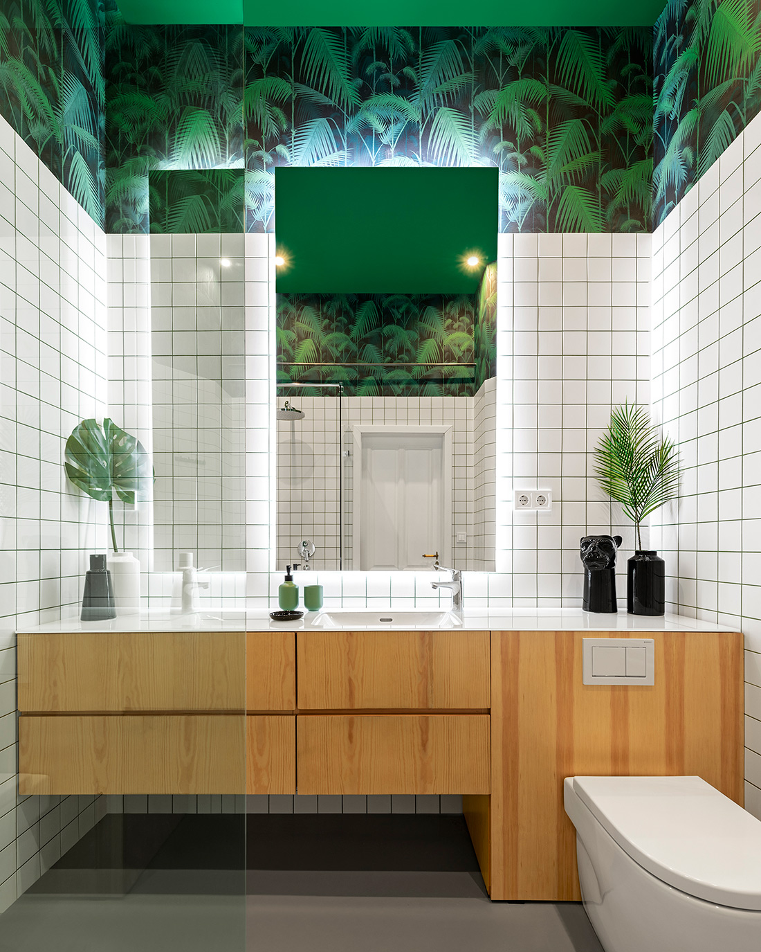
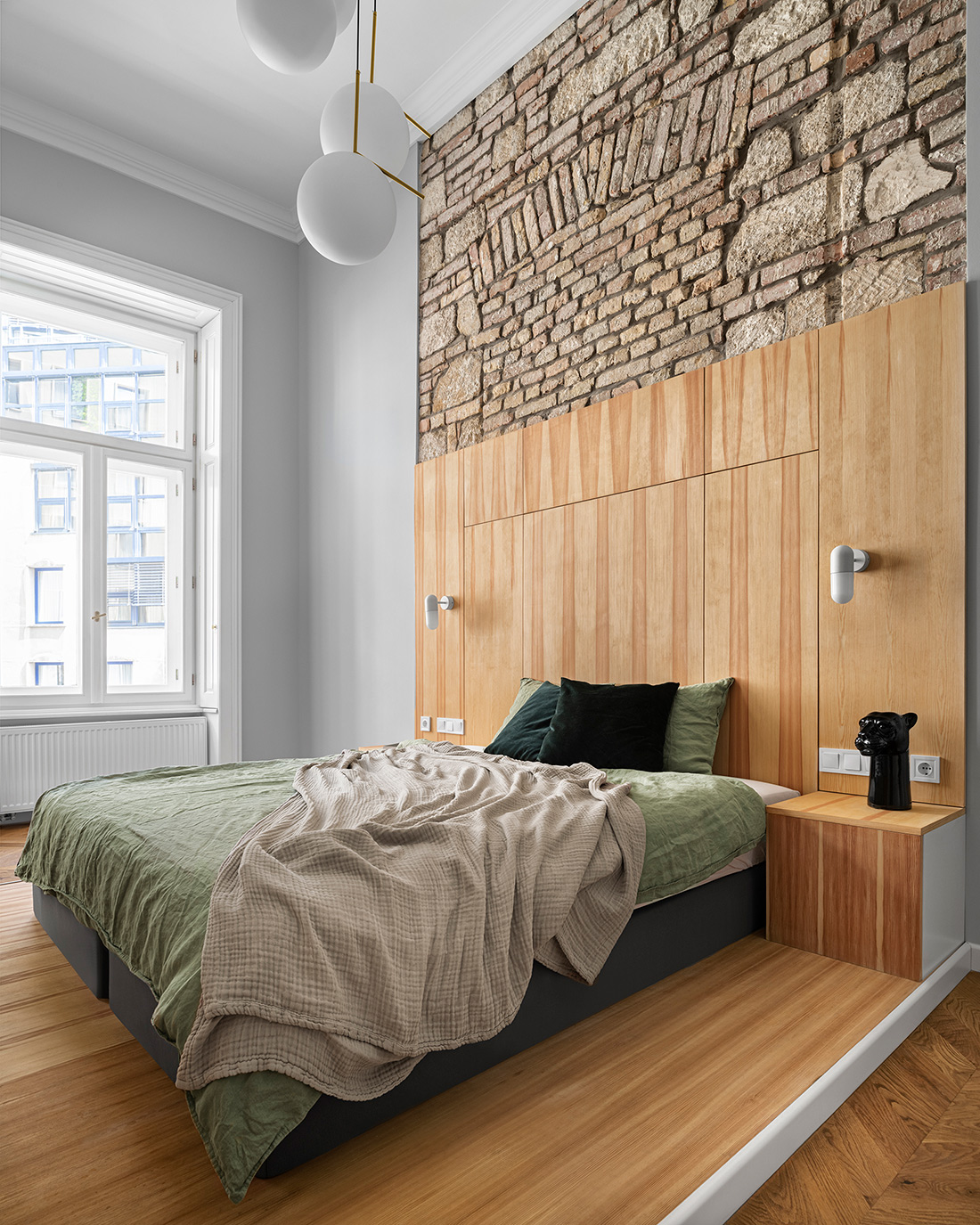
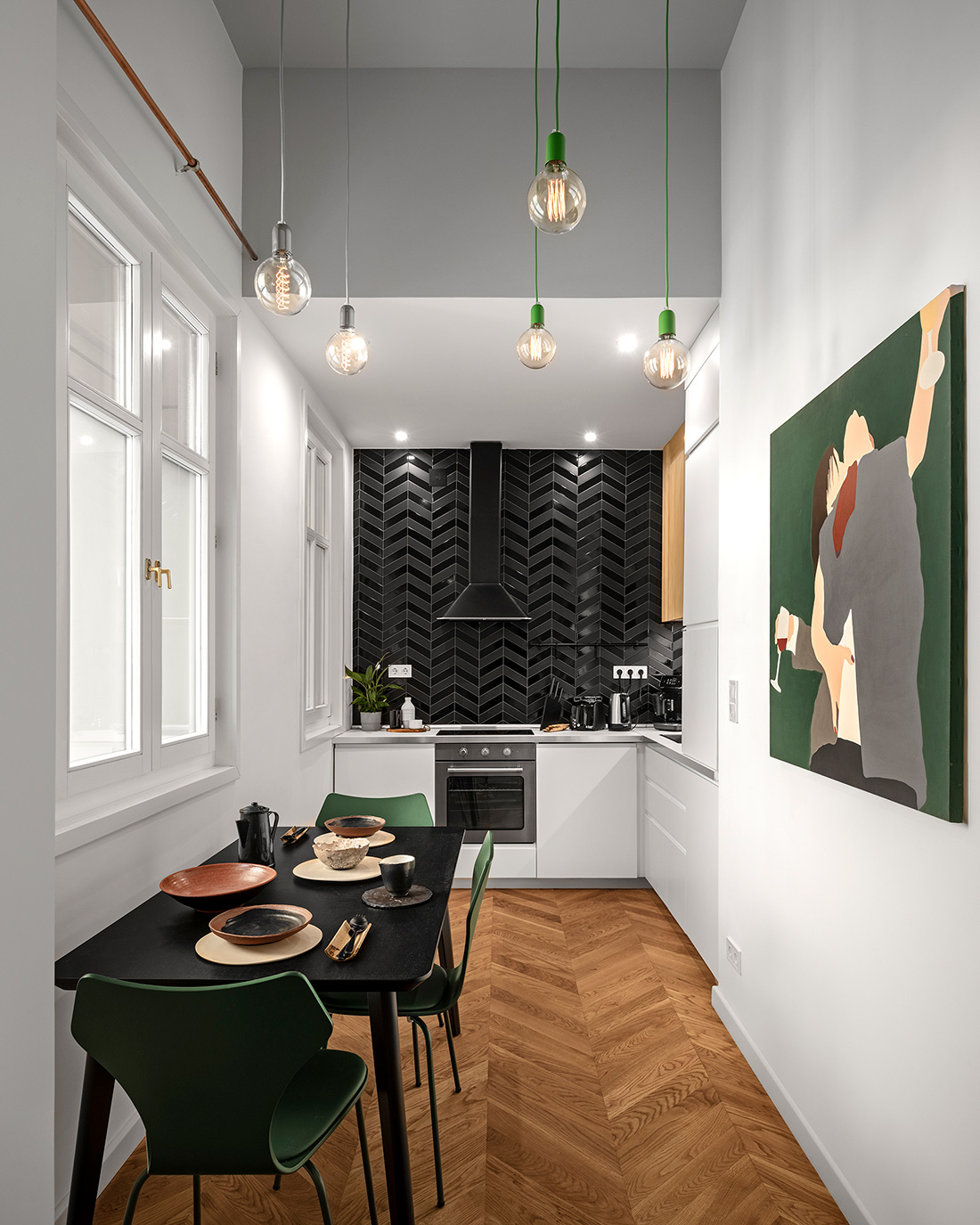
The consistent use of the natural wooden material throughout the spaces was important. The spaces are connected by not only in the use of colours but also material wise. The colour scheme (wood, white, grey) reflects simplicity and clarity that is complemented by a few natural brick surfaces. The powerful green motives of the bathroom appear gently in the other rooms, which joins the relatively disconnected design of this space with other rooms. The architectural approach and the conceptual coherence played an important role in the styling of the flat in which we’ve chosen art from local, contemporary artists such as ceramics from Petra Hidvegi, and paintings from Gabor Koncz and Kata Bereczki by Lavor Collective.
What makes this project one-of-a-kind?
The situation of the gallery. With this move we created many opportunities that allowed us to use the space more creatively and freely.
