


The emergence of a new design aesthetic in commercial post-war Slovenian poster-art.
A simple definition of a poster would be that it is a visual medium using a (complex) combination of words and images to convey a message to the public. And it is precisely this conveying of the message that is the source of many questions, themselves the subject of historical, sociological, market, design and other research. What kind of message does a poster carry? Why, how and whom does it address? How should it be designed in order to achieve its purpose?
The simple transfer of an idea to a poster is not enough, particularly when everything today revolves around creating needs, sales and profits. It’s the result of team (advertising) work, where behaviour patterns, habits, lifestyle etc. are researched and this research is again adapted to the specifics of a group or groups of people. In this process design is of secondary importance. The goal being to sell things that in today’s consumer society create an identity.
Appearance is everything, and the most common way to create one is by using certain objects. Posters use appearance to address and convince us of something; and their development is the result of the need to advertise industrially-created mass-market products. The poster is a form of mass media, and to be visible – or to be able to achieve the desired effect with its conveyed message – it must stand out, must convince with its visual address; it must be different from many other posters that “adorn” our streets.
An effective poster is the one we remember quickly, though at the moment we noticed it its message was not entirely clear to us. The point is that we remember it, think about it; it has convinced us to buy a product, visit an exhibition, attend a theatre performance. A poster must tell a story which has a certain meaning, association, personification. The story builds the identity of the poster’s message, be it a product, a service, or a political party. The content of a visual message is created by using signs that carry certain meanings within the context of the present time. The aim of the poster’s message is to reach out to and be understood by as many people as possible. The use of certain signs is therefore usually a reflection of current events, except in cases where signs with particular historical connotations are used to convey specifically historical meanings.
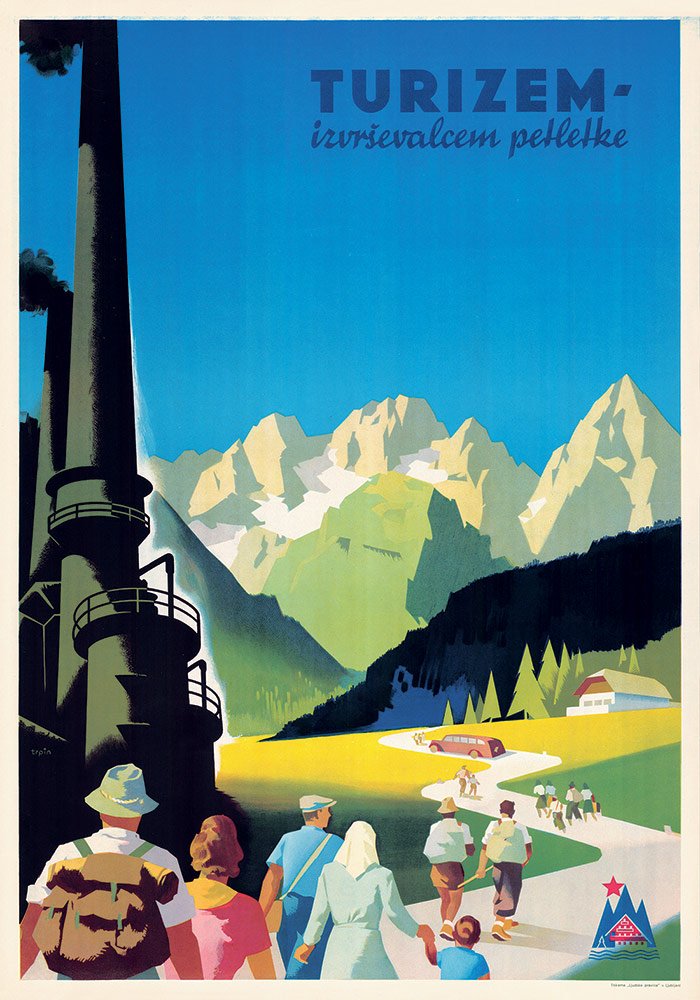
The identity of commercial, cultural and political posters changes alongside with the changes in society: with changes in our way of life, our laws, political systems, ideologies, fashion trends, environmental issues, consumerism. All of these elements have helped shape posters in both form and content throughout history. At the same time, these elements influenced the meaning of certain symbols. At the beginning of the 20th century, a chimney appearing in posters advertising some sort of economic activity was also a symbol of industrialisation, which in itself was a synonym for progress and development. After World War II the symbolism behind the chimney in social-realistic posters remained unchanged, but it also acquired a (new) ideological meaning, symbolising the progress of the political system in force. In the 1970s the chimney symbol acquired different connotations, owing largely to pollution, environmental and ecological issues (with industry the main culprit). The sign that for decades had symbolised progress was, out of direct consequences of this progress, given a negative prefix.
Among Slovenian posters presented we find a handful of commercial posters telling the “story” of the 1950s in Slovenia and Yugoslavia. Looking back today we see story rich in nostalgia, but this only re-affirms the fact that the poster is a medium of the time. It is modern only as long as it serves advertising’s purpose in a public space.
What also makes these posters interesting is that they were created in the early era of socialism, when commercial advertising was not particularly common. On the other side, it is precisely these posters that demonstrate that advertising has always been present in command or non-free market economies.
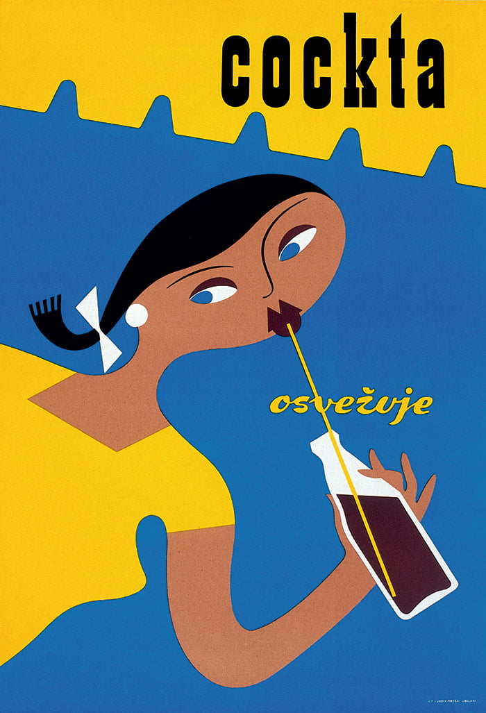
Some, like the Cockta poster, became “icons” of design. For its central motif designer Uroš Vagaja chose a young girl with a ponytail, a sign of the (then) young generation. He used sparse sign language to constitute the essence of a memorable message. By depicting a modern young woman with a ponytail wearing a tight T-shirt he also “defined” our perception of our parents in their role as the young generation of the 1950s and 60s.
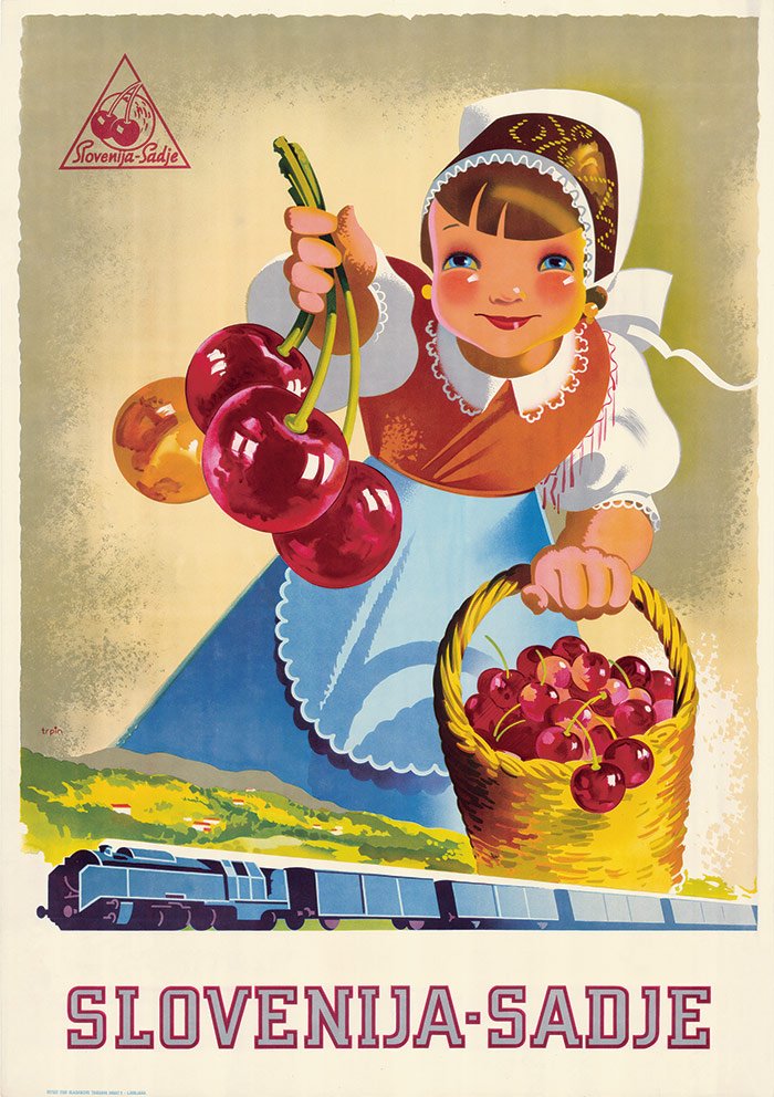
Unlike other posters of the time, with predominantly heroic socialist realistic motifs, his poster employed a motif with whom the (post-war) generation – the target group for this beverage – could identify. Compared to the poster for Slovenija – Sadje by Trpin, featuring a pretty, smiling little girl with red cheeks in national dress proffering cherries, Vagaja’s Cockta poster takes one step beyond direct naturalistic narration towards a sign language with multiple meanings mingling with the high- quality aesthetic imagery of the poster’s message. The Trpin poster for Slovenija – Sadje remains, however, a reflection of the times defined by the creation of a new, socialist, labour-driven political positivism – in short, of a belief in a better future to come.
Commercial posters of the 1950s were characterised by strong colours and by emphasising objects that spoke directly to consumers. They were adorned with short catchphrases or with the name of a product or manufacturer, anticipating the creation of highly-developed brands. Although the Cockta poster was the only commercial poster of its kind in 1950s in terms of its sense of design and form of expression, Slovenian designers did manage to create some poster-work that succeeded in launching some Slovenian and Yugoslav products and entire companies.
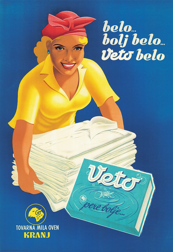
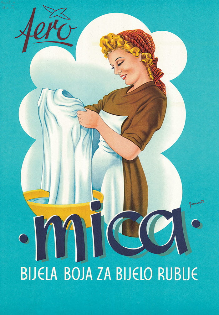
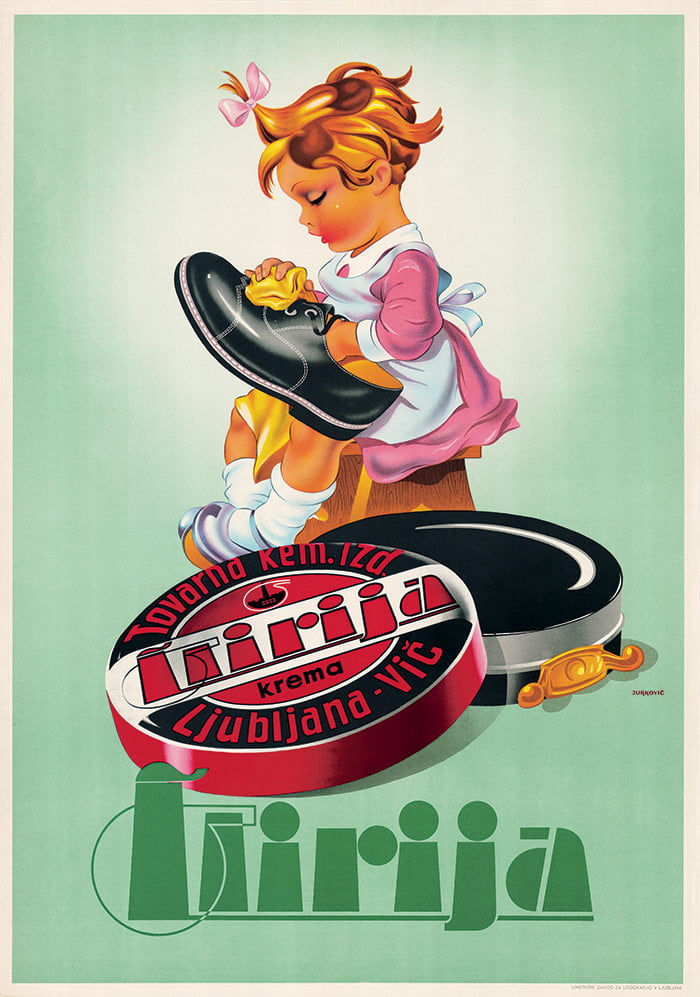
In 1954 architect Valentin Scagnetti created a poster for paint manufacturer Helios which depicted a personified brush “conducting” a colour spectrum. A year previous, Boris Jurkovič designed a poster for Ilirija depicting a little girl sitting on a footstool, polishing shoes effortlessly thanks to Ilirija shoe cream. The widespread – largely unavoidable – motif used to communicate cleaning products is the image of a woman working; this has remained a popular stereotype up till today. Soaps, washing powders, and more are all “offered” by women holding a pile of bright linens, reflecting on the whiteness of a washed shirt or caring for some carefully folded clothes.
The Cockta poster and others like it did not refer to represent a special story of the 1950s, a new story in the shaping of Slovenian graphic design. But they also played an important role in shaping consumer opinion, whether their design was good – good enough to inform design to come.
Text: Cvetka Požar
Image source: Architecture Museum Ljubljana & NUK National Library