
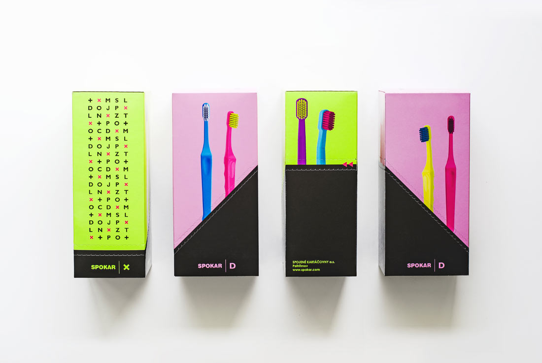
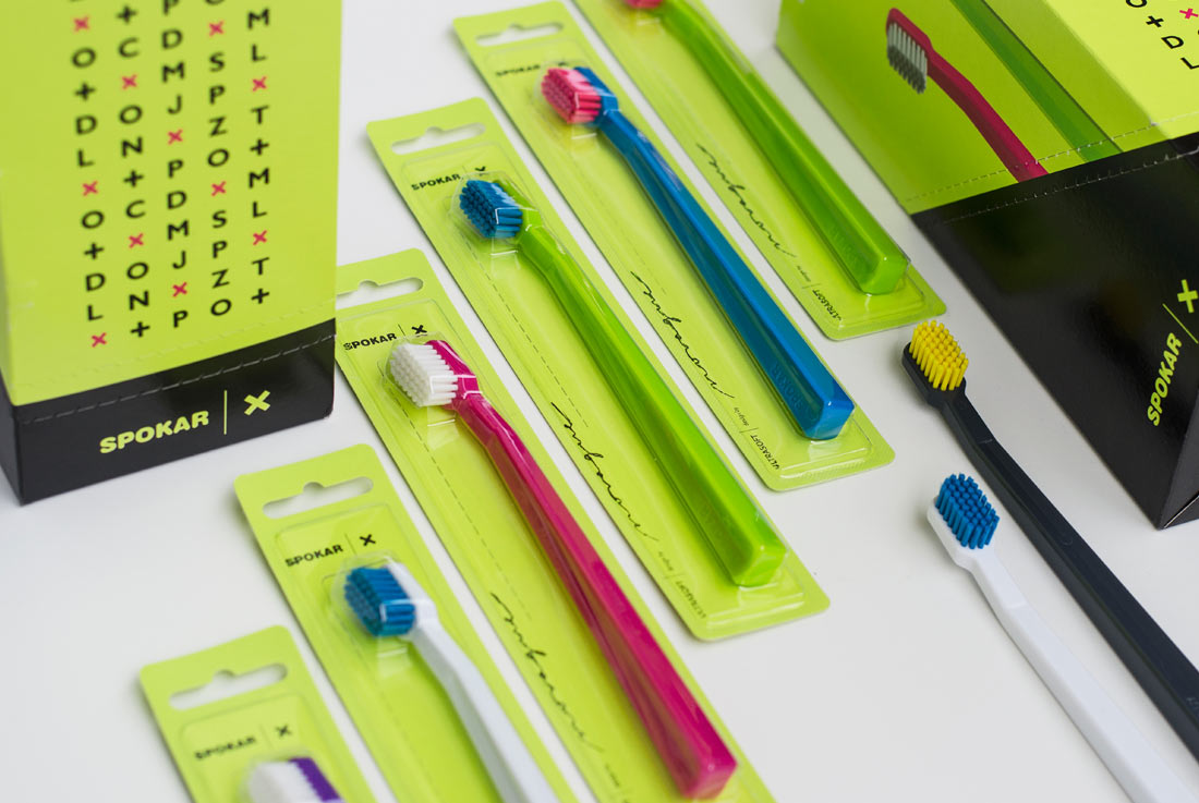
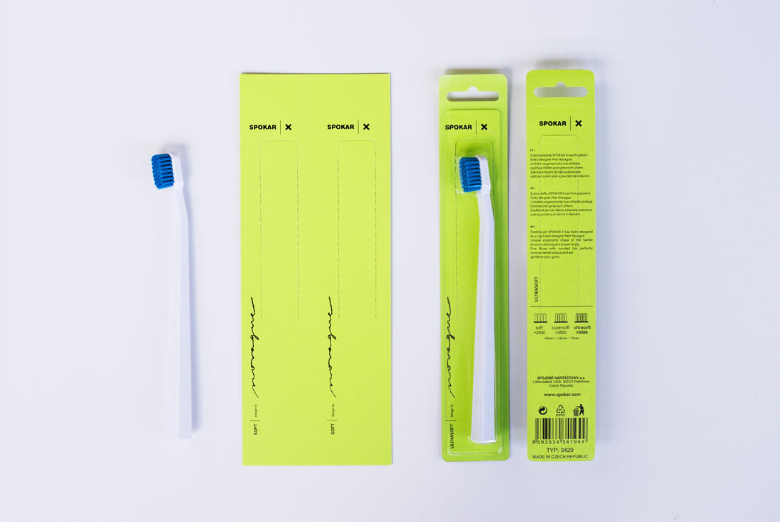
Premium series of toothbrushes X has been designed for the largest manufacturer of toothbrushes in the Czech Republic, the company SPOKAR. The unique design is based on perfect ergonomics for holding the brush in the hand, which significantly improved the availability of head movement at various angles during toothbrushing. The high quality of the product is supported by the use of fine antibacterial fibers that abate irritation of the gum. The entire series is distinguished in several contrasting and very attractive colours, which makes the brush pleasing part of your personal hygiene. This brand new model represents its own product line and graphic identity. The X designation is based on the shape of its profile.
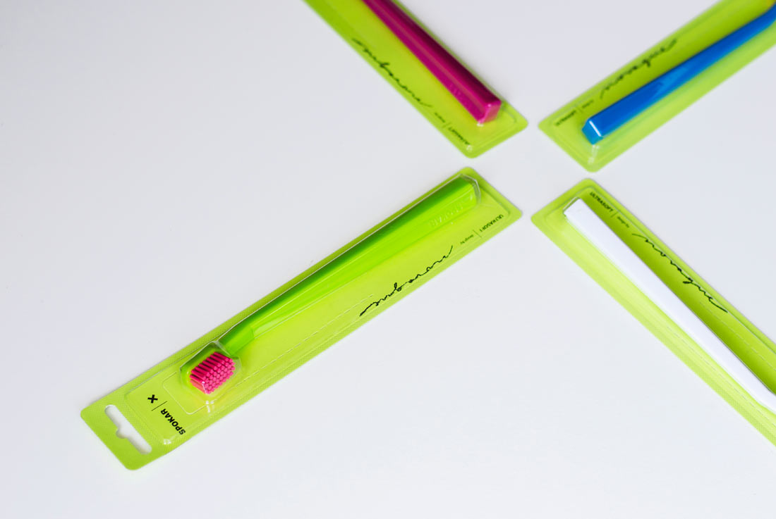
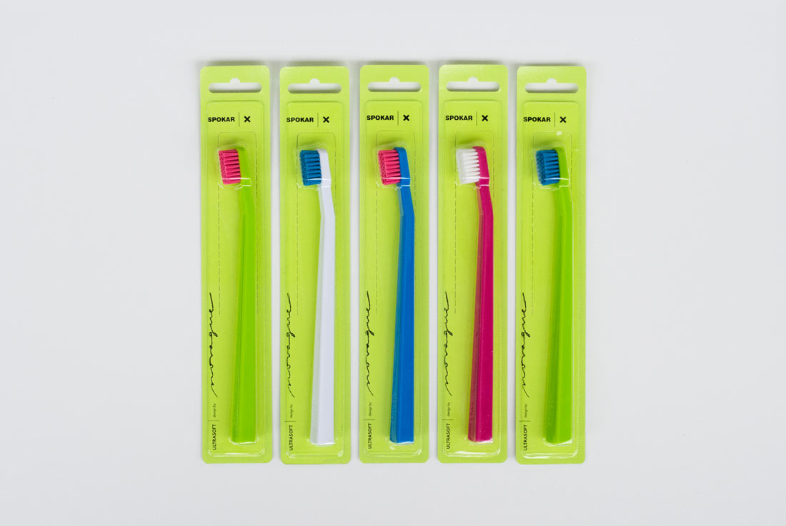
Premium series of toothbrushes X has been designed for the largest manufacturer of toothbrushes in the Czech Republic, the company Spojené kartáčovny a.s. The idea of new graphic identity for products, packaging and corporate prints is based on emphasis the clarity and simplicity in orientation. Each product is newly marked with a single letter or symbol (e.g. X, M, L, O, +, …). In case of toothbrushes SPOKAR X, the letter X symbolizes the shape of the handle. The reflective green colour has been chosen to attract the attention of the consumer who is watching into shelves in the shop. The design of the packaging is using minimalistic techniques, not to be disturbing and still highlight the product itself. The SPOKAR brand is the leading manufacturer on Czech market with dental hygiene products. We felt the importance to create simple, but self-confident corporate design language. At the same time, however, we retained the original logotype of the brand – SPOKAR, with respect to the history of the company.
FILE
Design: Novague Design
Producer: Spojené kartáčovny a.s.
Country of producer: Czech Republic
Photos: Novague Design
Year of production: 2017